flowchart TB
  A[Question and<br/>design<br/>Ch 5] --> B[Import<br/>Ch 1-2]
  B --> C[Clean and<br/>reshape<br/>Ch 3]
  C --> D[Explore and<br/>describe<br/>Ch 4, 6]
  D --> E[Test and<br/>model<br/>Ch 7-10]
  D --> F[Predict and<br/>discover<br/>Ch 11-16]
  E --> G[Report and<br/>share<br/>Ch 17-18]
  F --> G
19 Putting It All Together
A thesis is an argument, and its results chapter is the evidence. Each claim in it rests on a chain of reasoning that runs from a research question, through a hypothesis, a design, measured variables, and an analysis, to a result, a conclusion, and the limits of that conclusion. A thesis convinces when every link in that chain can be seen and checked, and every number in the text can be traced back to the raw data. The methods of this book are the links; this chapter joins them.
In the story, it is the final semester. Elaf’s analyses are spread over two years of scripts, written as she learned each method, and her supervisor’s advice for the last stretch is simple: “Before you write the results chapter, rebuild the whole thing, from the raw export to the last table, as one project that runs from start to finish. Then you will know that every number in your thesis is right, and you can answer any examiner’s question by pointing to the code.” This chapter does exactly that. It sets up a complete research project, runs the analysis from the messy survey export to the tables, figures, and sentences of a results chapter, and traces the chain of reasoning behind three of the research questions. It then steps back: how to report results to the standards journals expect, how to choose a method for a new question, the problems that every researcher meets, and where to go next.
TipBy the end of this chapter you will be able to
- Organise a research project so that it runs from raw data to finished results.
- Combine cleaning, description, modelling, and visualisation in one reproducible pipeline.
- Trace the chain of reasoning from research question to conclusion and limitation.
- Report results in the style expected in a thesis, following published reporting standards, with numbers taken directly from the code.
- Choose an appropriate method for a research question, using the map of this book.
- Recognise common challenges in real research projects, and know where to learn more.
19.1 The shape of a research project
Every quantitative project follows roughly the same path, and this book has followed it too (Figure 19.1).
The path is not a straight line in practice. Exploring the data sends you back to cleaning when you find a problem; a model’s diagnostics send you back to exploring. What matters is that each step is written in code, so that going back and rerunning everything is easy.
19.1.1 Organising the project
A project that others (and your future self) can follow has a predictable structure. The final thesis project looks like this:
wellbeing-thesis/
├── wellbeing-thesis.Rproj      the RStudio Project (Chapter 1)
├── README.txt                  what the project is and how to run it
├── data-raw/
│   └── wellbeing_raw.xlsx      the survey export, never edited by hand
├── data/                       clean data, created by the scripts
├── R/
│   ├── 01-clean-data.R         raw export -> clean tables (Chapter 3)
│   └── 02-analysis.R           models and figures
├── output/                     figures and tables, created by the scripts
├── results.qmd                 the results chapter (Chapter 17)
├── references.bib
└── renv.lock                   package versions (Chapter 17)
Four principles lie behind it. Raw data is read-only: everything in data/ and output/ can be deleted and recreated by running the scripts. Scripts are numbered in the order they run, and each does one job. Paths are relative to the project, using here::here() (Chapter 1), so the project runs on any computer. And the README says in a few lines what the project is and how to run it.
The downloadable project for this chapter has the same structure, with working scripts (its data/ and output/ folders are created when the scripts run, and it has no renv.lock, which you create with renv::init() for your own project). The rest of the chapter walks through what the scripts do.
19.2 From raw export to clean data
The cleaning of Chapter 3, gathered into one script, runs in a few seconds. Here is its core, reading the raw export and producing the clean questionnaire and semester tables:
library(dplyr)
library(tidyr)
library(stringr)
library(readr)
library(readxl)

raw <- read_excel(data2thesis_example("wellbeing_raw.xlsx"))

item_names <- c(paste0("stress_", 1:6), paste0("burnout_", 1:6),
                paste0("support_", 1:6), paste0("satisfaction_", 1:4))

responses <- raw |>
  filter(!str_detect(str_to_upper(`Q1_Student ID`), "^TEST")) |>
  select(-`Response ID`) |>
  distinct() |>
  rename(student_id = `Q1_Student ID`, workshop = `Workshop group`,
         considering_dropout = `Y1_Considered leaving?`) |>
  rename_with(~ item_names, .cols = Q11_1:Q11_22) |>
  mutate(across(all_of(item_names), ~ as.integer(na_if(.x, "99"))))

questionnaire_clean <- responses |>
  select(student_id, all_of(item_names))

semesters_clean <- responses |>
  select(student_id, matches("_S[1-4]$")) |>
  pivot_longer(-student_id, names_to = c(".value", "semester"), names_sep = "_S") |>
  rename(gpa = GPA, sleep_hours = Sleep, study_hours = Study,
         exercise_days = Exercise, caffeine_mg = Caffeine,
         supervisor_meetings = Meetings, wellbeing = Wellbeing) |>
  mutate(
    semester    = as.integer(semester),
    sleep_hours = parse_number(str_replace(sleep_hours, ",", ".")),
    across(c(gpa, study_hours, exercise_days, caffeine_mg, supervisor_meetings, wellbeing),
           parse_number),
    sleep_hours = if_else(sleep_hours > 24, NA, sleep_hours),
    study_hours = if_else(study_hours > 168, NA, study_hours),
    gpa         = if_else(gpa > 4, NA, gpa)
  ) |>
  filter(!if_all(gpa:wellbeing, is.na))
Each step is explained in Chapter 3; the full script in the downloadable project also cleans the background variables. The most important line of any cleaning script is the check at the end, here a comparison with the clean data:
same <- function(mine, theirs) {
  mine   <- as.data.frame(mine)[, names(mine)]
  theirs <- as.data.frame(theirs)[, names(mine)]
  isTRUE(all.equal(mine, theirs, check.attributes = FALSE))
}
same(questionnaire_clean |> arrange(student_id), questionnaire |> arrange(student_id))
[1] TRUEsame(semesters_clean |> arrange(student_id, semester), semesters |> arrange(student_id, semester))[1] TRUEBoth are TRUE. In a real project there is no package to compare with, so the checks are the ones from Chapters 3 and 6: counts of categories, ranges of values, numbers of missing values, and a look at a few rows. From here on, the chapter uses the clean tables, together with the scale scores:
scores <- questionnaire |>
  mutate(
    stress_4 = 6 - stress_4,
    stress   = rowMeans(pick(stress_1:stress_6), na.rm = TRUE),
    burnout  = rowMeans(pick(burnout_1:burnout_6), na.rm = TRUE),
    support  = rowMeans(pick(support_1:support_6), na.rm = TRUE)
  ) |>
  select(student_id, stress, burnout, support)

study <- students |>
  left_join(scores, join_by(student_id)) |>
  left_join(semesters |> filter(semester == 1), join_by(student_id))
The table study has one row per student, with background, questionnaire scores, and first-semester records, as in Chapter 8.
19.3 Describing the sample
Every results chapter begins by describing the participants, often in a table known as “Table 1”. Here the sample is described by programme:
mean_sd <- function(x) sprintf("%.1f (%.1f)", mean(x, na.rm = TRUE), sd(x, na.rm = TRUE))
percent <- function(x) sprintf("%.0f%%", 100 * mean(x, na.rm = TRUE))

describe <- function(d) {
  tibble(
    Characteristic = c("Students", "Age, mean (SD)", "Women", "Part-time",
                       "Stress (1-5), mean (SD)", "Support (1-5), mean (SD)",
                       "Wellbeing in semester 1, mean (SD)", "Considered dropping out"),
    Value = c(nrow(d), mean_sd(d$age), percent(d$gender == "Female"),
              percent(d$study_mode == "Part-time"), mean_sd(d$stress),
              mean_sd(d$support), mean_sd(d$wellbeing),
              percent(d$considering_dropout == "Yes"))
  )
}

describe(filter(study, programme == "Master's")) |>
  rename(`Master's` = Value) |>
  left_join(describe(filter(study, programme == "PhD")) |> rename(PhD = Value),
            join_by(Characteristic)) |>
  left_join(describe(study) |> rename(All = Value), join_by(Characteristic)) |>
knitr::kable(align = "lrrr")| Characteristic | Master’s | PhD | All |
|---|---|---|---|
| Students | 426 | 174 | 600 |
| Age, mean (SD) | 27.9 (3.3) | 34.2 (5.1) | 29.7 (4.8) |
| Women | 52% | 53% | 52% |
| Part-time | 26% | 39% | 30% |
| Stress (1-5), mean (SD) | 3.2 (0.7) | 3.2 (0.7) | 3.2 (0.7) |
| Support (1-5), mean (SD) | 3.2 (0.8) | 3.2 (0.7) | 3.2 (0.8) |
| Wellbeing in semester 1, mean (SD) | 60.9 (12.1) | 59.3 (11.9) | 60.5 (12.0) |
| Considered dropping out | 15% | 14% | 15% |
Two small helper functions, mean_sd() and percent(), format the numbers the way theses report them, and describe() builds the column for any group of students, so the same code makes all three columns. Writing a small function whenever you would otherwise copy and paste code is one of the best habits to take from this book. (The gtsummary package produces such tables automatically, with many options, if you prefer.)
19.4 Answering the research questions
Three of the research questions are answered below with the methods of Parts 2 and 3, each with a sentence written the way it will appear in the thesis. A small function formats p-values in the usual style:
format_p <- function(p) if (p < 0.001) "p < .001" else paste("p =", sub("^0", "", sprintf("%.3f", p)))19.4.1 The workshop and its persistence (RQ3)
Students were randomly invited to the wellbeing workshop after the first semester. The mixed-effects model of Chapter 10 uses all four semesters and every student:
library(lme4)

panel <- semesters |>
  left_join(students, join_by(student_id)) |>
  mutate(time = semester - 1)

workshop_model <- lmer(wellbeing ~ factor(semester) * workshop + (time | student_id),
                       data = panel)

gaps <- expand.grid(semester = 1:4, workshop = c("Invited", "Not invited")) |>
  mutate(time = semester - 1)
gaps$wellbeing <- predict(workshop_model, newdata = gaps, re.form = NA)
gaps <- gaps |>
  pivot_wider(id_cols = semester, names_from = workshop, values_from = wellbeing) |>
  mutate(gap = Invited - `Not invited`)
gaps
# A tibble: 4 × 4
semester Invited `Not invited` gap
<int> <dbl> <dbl> <dbl>
1 1 60.6 60.3 0.380
2 2 65.5 60.2 5.25
3 3 63.1 59.0 4.13
4 4 60.9 58.2 2.64 Wellbeing was similar in the two groups before the workshop (difference 0.4 points). After the workshop, invited students’ wellbeing was 5.3 points higher in semester 2, but the difference narrowed to 4.1 points in semester 3 and 2.6 in semester 4.
19.4.2 Explaining GPA (RQ5)
The multiple regression of Chapter 8, with broom’s tidy() giving the coefficients and their confidence intervals as a data frame:
library(broom)

gpa_model <- lm(gpa ~ sleep_hours + study_hours + stress + support, data = study)

gpa_table <- tidy(gpa_model, conf.int = TRUE)
gpa_table |>
  mutate(across(where(is.numeric), \(x) round(x, 3)))
# A tibble: 5 × 7
term estimate std.error statistic p.value conf.low conf.high
<chr> <dbl> <dbl> <dbl> <dbl> <dbl> <dbl>
1 (Intercept) 2.14 0.145 14.7 0 1.85 2.42
2 sleep_hours 0.106 0.014 7.49 0 0.078 0.134
3 study_hours 0.007 0.001 6.27 0 0.005 0.009
4 stress -0.084 0.018 -4.68 0 -0.119 -0.049
5 support 0.111 0.017 6.63 0 0.078 0.144Each additional hour of sleep was associated with a GPA 0.11 points higher (95% CI 0.08 to 0.13, p < .001), holding study hours, stress, and support constant. Together, the four predictors explained 25% of the variation in first-semester GPA (n = 587).
19.4.3 Considering dropout (RQ9)
The logistic regression of Chapter 8, with odds ratios:
dropout_model <- glm(
  I(considering_dropout == "Yes") ~ stress + support + financial_worry + employment + study_mode,
  data = study, family = binomial
)

dropout_table <- tidy(dropout_model, conf.int = TRUE, exponentiate = TRUE)
dropout_table |>
  mutate(across(where(is.numeric), \(x) round(x, 2)))
# A tibble: 7 × 7
term estimate std.error statistic p.value conf.low conf.high
<chr> <dbl> <dbl> <dbl> <dbl> <dbl> <dbl>
1 (Intercept) 0.02 1.23 -3.26 0 0 0.19
2 stress 3.6 0.24 5.35 0 2.29 5.87
3 support 0.33 0.2 -5.44 0 0.22 0.49
4 financial_worry 1.57 0.12 3.73 0 1.25 2.01
5 employmentNone 0.55 0.44 -1.35 0.18 0.23 1.31
6 employmentPart-time j… 0.58 0.45 -1.19 0.23 0.24 1.41
7 study_modePart-time 1.32 0.37 0.75 0.45 0.63 2.68The wrapper I() lets a condition be used directly as the outcome, and exponentiate = TRUE turns the log-odds into odds ratios and their confidence intervals.
Each one-point increase in stress (on the 1 to 5 scale) was associated with 3.6 times the odds of considering dropping out (95% CI 2.3 to 5.9), and each one-point increase in supervisor support with 0.33 times the odds (95% CI 0.22 to 0.49).
Chapters 11 to 15 went further with this question, asking how well dropout can be predicted; the thesis reports that logistic regression predicted as well as any machine learning model (a test AUC of about 0.84 in Chapter 11), which is itself a finding worth stating.
19.5 One figure for the thesis
A thesis figure often combines panels. The patchwork package joins ggplot2 plots with + (side by side) and / (one above the other), and plot_annotation() labels the panels:
library(ggplot2)
library(patchwork)

panel_a <- gaps |>
  pivot_longer(c(Invited, `Not invited`), names_to = "workshop", values_to = "wellbeing") |>
  ggplot(aes(x = semester, y = wellbeing, colour = workshop)) +
  geom_line(linewidth = 1) +
  geom_point(size = 2.5) +
  scale_colour_viridis_d(end = 0.8) +
  labs(x = "Semester", y = "Predicted wellbeing (0-100)", colour = "Workshop")

panel_b <- ggplot(study, aes(x = sleep_hours, y = gpa)) +
  geom_point(alpha = 0.3) +
  geom_smooth(method = "lm", formula = y ~ x, colour = "#2f6793") +
  labs(x = "Sleep (hours a night)", y = "GPA (semester 1)")

(panel_a + panel_b) +
  plot_annotation(tag_levels = "A") &
  theme_minimal(base_size = 12)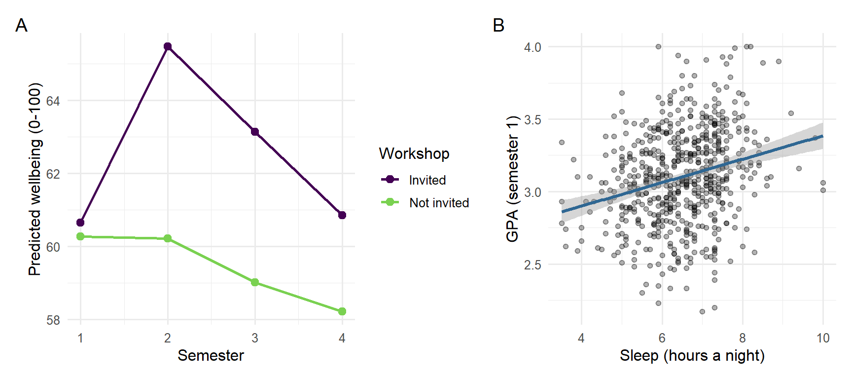
The operator & applies the theme to both panels, and ggsave() saves the figure at the size and resolution a thesis or journal requires (Chapter 4):
ggsave(here::here("output", "figure-1.png"), width = 18, height = 8, units = "cm", dpi = 300)19.6 The chain of reasoning
A result on its own is not yet a conclusion. Between the two lie the design that produced the data, the way the variables were measured, and the limits of both. Table 19.2 traces the whole chain for the three research questions answered above, from the hypotheses stated in Chapter 5 to the limitations that a thesis discussion must acknowledge. Every result in it is filled in by the code of this chapter.
| Step | Workshop (RQ3) | GPA (RQ5) | Considering dropout (RQ9) |
|---|---|---|---|
| Question | Does the workshop improve wellbeing? | What explains students’ GPA? | Who considers dropping out? |
| Hypothesis (Chapter 5) | Invited students have higher wellbeing in semester 2 | More sleep goes with a higher GPA, allowing for study hours, stress, and support | Higher stress raises the odds of considering dropout |
| Design | Randomised invitation within a longitudinal study | Observational, first semester | Observational, baseline and end of year 1 |
| Variables | Wellbeing (0 to 100), invitation, semester | GPA, sleep, study hours, stress, support | Considering dropout (yes/no), stress, support, financial worry, employment, study mode |
| Analysis | Mixed-effects model (Chapter 10) | Multiple regression (Chapter 8) | Logistic regression (Chapter 8) |
| Result | 5.3 points higher in semester 2, narrowing to 2.6 by semester 4 | 0.11 GPA points per hour of sleep (95% CI 0.08 to 0.13) | Odds ratio 3.6 per point of stress (95% CI 2.3 to 5.9) |
| Conclusion | The workshop raised wellbeing, and the effect faded; because the invitation was random, the effect is causal | Sleep is associated with GPA, independently of the other predictors; the null hypothesis is rejected, but the design does not show cause | Stress is associated with higher odds of considering dropout; the null hypothesis is rejected |
| Limitation | One university; the invitation, not attendance, was randomised | Sleep is self-reported, and unmeasured confounders may remain | The outcome is considering dropout, not leaving; stress and the outcome were measured close together |
Reading the table by columns shows how different the three conclusions are, although all three rest on “significant” results. Only the workshop conclusion is causal, because only the workshop was assigned at random (Chapter 5). The GPA and dropout conclusions are associations, and the limitations say what could still explain them. A discussion chapter that keeps each result attached to its design, in this way, claims exactly what the evidence supports.
19.7 The results chapter
The final step is the one Chapter 17 prepared: the tables, figures, and sentences above go into a Quarto document, results.qmd, in which every number is written with inline code. The downloadable project contains such a document, built from this chapter.
What a results chapter must contain is not left to taste. Reporting standards list the information that readers need in order to judge a study. For quantitative research in psychology and neighbouring fields, the American Psychological Association’s Journal Article Reporting Standards (JARS) set out what to report about the participants, the measures, the analysis, and the results, including effect sizes and confidence intervals (Appelbaum et al. 2018). Randomised trials in health research follow CONSORT, and observational studies follow STROBE (von Elm et al. 2007). Checking a draft against the relevant standard is one of the most useful things a student can do before submission, and many journals require it. When the data changes, or an examiner asks for a different model, the code is changed and rendered again, and the whole chapter is updated.
19.8 Choosing a method
The choice of method for a new research question depends on the goal, on the kind of outcome, and on how the observations are related. Figure 19.3 summarises the methods of this book as a guide.
%%{init: {"flowchart": {"nodeSpacing": 18, "rankSpacing": 45}}}%%
flowchart TD
  Q{What is the goal?} -->|Describe| D[Summaries and plots<br/>Ch 4, 6]
  Q -->|Explain or compare| O{Outcome type?}
  Q -->|Predict new cases| P[Machine learning<br/>Ch 11-15]
  Q -->|Find groups or<br/>structure| U[PCA, factor analysis,<br/>clustering<br/>Ch 9, 14]
  Q -->|Forecast over time| T[Time series<br/>Ch 16]
  O -->|Numeric| N{Repeated or<br/>nested data?}
  O -->|Yes / No| L[Chi-square, logistic<br/>regression<br/>Ch 7-8]
  N -->|No| R[t-test, ANOVA,<br/>regression<br/>Ch 7-8]
  N -->|Yes| M[Mixed-effects<br/>models<br/>Ch 10]
Table 19.3 shows how each of the study’s research questions was answered.
| Research question | Method | Chapters |
|---|---|---|
| RQ1 What does graduate life look like? | Plots, descriptive statistics | 4, 6 |
| RQ2 Do students sleep less than 7 hours? | One-sample t-test, confidence interval | 7 |
| RQ3 Does the workshop improve wellbeing? | Two-sample t-test; mixed-effects model | 7, 10 |
| RQ4 Do faculties and study modes differ? | ANOVA, post-hoc tests | 7, 8 |
| RQ5 What explains GPA? | Multiple regression | 8, 13 |
| RQ6 Does the questionnaire measure what it should? | Factor analysis, Cronbach’s alpha | 9 |
| RQ7 Are there student profiles? | Cluster analysis, mixture models | 9, 14 |
| RQ8 How do wellbeing and GPA change? | Mixed-effects models | 10 |
| RQ9 Who considers dropping out? | Logistic regression; classification | 8, 11, 12, 15 |
| RQ10 Can final GPA be predicted? | Regularised regression, boosting | 13 |
| RQ11 What challenges do students describe? | Text coding with a language model | 18 |
| RQ12 How many counselling visits next year? | Time series forecasting | 16 |
19.9 Challenges every researcher meets
Real projects rarely go as planned, and some problems are almost universal. Every real dataset is messy and needs cleaning, which takes longer than the analysis; it is done in code, checked after every step, and never applied to the raw file itself (Chapter 3). Missing data raises the question of why it is missing before anything is done about it, because dropping incomplete cases can bias results when the missing data is not random, as with the students who left the programme (Chapter 6). Small samples give wide confidence intervals and low power (Chapter 7) and make complex models overfit (Chapter 13); the remedies are to report effect sizes with intervals, keep models simple, and plan the sample size before collecting data with a power analysis (Chapter 5).
Analysis brings its own problems. Many tests produce many false alarms, so the main analyses are decided in advance, multiple comparisons are corrected where needed, and exploratory results are reported as exploratory (Chapters 7, 8, and 17). Assumptions are checked with plots rather than with tests alone, with robust tests, non-parametric tests, transformations, and mixed models as the alternatives (Chapters 7, 8, and 10). Correlation is not causation: observational data rarely proves causes, so confounders must be thought through, as sleep was behind the caffeine effect, and randomised designs used where possible, as in the workshop study (Chapters 5 and 8). Prediction and explanation are different aims: a model that predicts well may explain little, and the reverse (Chapter 11). Finally, results must be communicated to supervisors, co-authors, and examiners who may use other software; a clear results chapter with tables, figures, and an appendix of code serves them all, and data can be exported with write_csv() or haven::write_sav() when they need it (Chapter 2).
19.10 Where to go next
This book is a beginning. Depending on your field, the next methods to learn may be:
| Topic | What it is for | Packages |
|---|---|---|
| Structural equation modelling | Confirmatory factor analysis, path models, latent variables | lavaan |
| Bayesian statistics | Models with prior knowledge and full uncertainty | brms, rstanarm |
| Survival analysis | Time until an event, such as dropping out | survival |
| Meta-analysis | Combining results from several studies | metafor |
| Text analysis | Words, sentiment, and topics in documents | tidytext, quanteda |
| Spatial data | Maps and geographic data | sf |
| Publication tables | Automatic, formatted tables of results | gtsummary, modelsummary |
| Interpreting models | Predictions and effects from any model | marginaleffects |
Some of the best resources are free online: R for Data Science (Wickham et al. 2023) for data skills, Regression and Other Stories (Gelman et al. 2020) for regression, An Introduction to Statistical Learning (James et al. 2021) and Tidy Modeling with R (Kuhn and Silge 2022) for machine learning, Forecasting: Principles and Practice (Hyndman and Athanasopoulos 2021) for time series, and Mastering Shiny (Wickham 2021) for dashboards. Appendix E lists more.
You do not have to learn alone. The R community is known for being welcoming to beginners: the Posit Community forum and Stack Overflow answer questions; R-Ladies and local R user groups run meetings around the world; TidyTuesday publishes a new dataset every week for people to practise on and share their plots; and R Weekly collects news and tutorials. Asking a clear question, with a small reproducible example, is itself a skill, and the same skill that makes an AI assistant useful (Chapter 18).
19.11 Common misconceptions
A few misunderstandings are common at the stage of writing up.
- “A significant result answers the research question.” It answers one link of the chain; the design and the measures decide what the result means.
- “The discussion should defend the results.” It should also state their limits; examiners trust a thesis more when it says clearly what it cannot show.
- “Formatting numbers by hand is quicker.” It is quicker once, and wrong the next time the data or the model changes.
- “Choosing a method means choosing the most advanced one.” The right method is the simplest one that matches the goal, the outcome, and the structure of the data.
19.12 Chapter review
19.12.1 Summary
- A research project follows a path from question and design through import, cleaning, exploration, and modelling to reporting and sharing, often going back to earlier steps. Writing every step in code makes going back easy.
- Organise projects with read-only raw data, numbered scripts, relative paths, a README, and a Quarto results document; everything else can be recreated.
- Check the cleaned data at the end of the cleaning script, then describe the sample, answer each research question with the method suited to it, and report results with numbers taken directly from the code.
- Every result rests on a chain of reasoning, from question and hypothesis through design, variables, and analysis to result, conclusion, and limitation. Reporting standards such as the APA’s JARS, CONSORT, and STROBE list what a report must contain.
- Small helper functions (for formatting means, percentages, and p-values) avoid copying and pasting code; broom turns model results into data frames; patchwork combines plots.
- Choose methods by the goal (describe, explain, predict, find structure, forecast), the type of outcome, and how the observations are related.
- Messy and missing data, small samples, many tests, assumptions, and causation are challenges in every project; the chapters of this book give tools for each.
19.12.2 Key terms
Research workflow, project structure, raw data, pipeline, sample description (“Table 1”), helper function, broom, patchwork, reporting sentence, chain of reasoning, reporting standard, method choice.
19.13 Exercises
The playground has these and more, and the downloadable project contains the complete thesis project.
- Download the Chapter 19 project, run
R/01-clean-data.RandR/02-analysis.R, and renderresults.qmd. Then change one cleaning rule (for example, treat ages above 70 as impossible), render again, and note which numbers change. - Add a row to the sample table (Table 19.1) for the share of students with children.
- Write a reporting sentence, with inline numbers, for the effect of support on GPA in the regression model.
- Add a third panel to the thesis figure: wellbeing by faculty as a box plot.
- Choose a research question from your own field. Using Figure 19.3, decide which method you would use, and which chapter of this book you would reread first.
- Complete the chain of reasoning (Table 19.2) for RQ2, whether students sleep less than 7 hours, using the results of Chapter 7.
19.14 Further reading
- R for Data Science (Wickham et al. 2023) covers the whole workflow of this chapter in more depth, and is the natural next book for most readers.
- Regression and Other Stories (Gelman et al. 2020) is an excellent guide to building, checking, and reporting regression models in real research.
References
Appelbaum, Mark, Harris Cooper, Rex B. Kline, Evan Mayo-Wilson, Arthur M. Nezu, and Stephen M. Rao. 2018. “Journal Article Reporting Standards for Quantitative Research in Psychology: The APA Publications and Communications Board Task Force Report.” American Psychologist 73 (1): 3–25. https://doi.org/10.1037/amp0000191.
Gelman, Andrew, Jennifer Hill, and Aki Vehtari. 2020. Regression and Other Stories. Cambridge University Press. https://doi.org/10.1017/9781139161879.
Hyndman, Rob J., and George Athanasopoulos. 2021. Forecasting: Principles and Practice. 3rd ed. OTexts. https://otexts.com/fpp3/.
James, Gareth, Daniela Witten, Trevor Hastie, and Robert Tibshirani. 2021. An Introduction to Statistical Learning: With Applications in r. 2nd ed. Springer. https://doi.org/10.1007/978-1-0716-1418-1.
Kuhn, Max, and Julia Silge. 2022. Tidy Modeling with r: A Framework for Modeling in the Tidyverse. O’Reilly Media. https://www.tmwr.org.
von Elm, Erik, Douglas G. Altman, Matthias Egger, Stuart J. Pocock, Peter C. Gøtzsche, and Jan P. Vandenbroucke. 2007. “The Strengthening the Reporting of Observational Studies in Epidemiology (STROBE) Statement: Guidelines for Reporting Observational Studies.” The Lancet 370 (9596): 1453–57. https://doi.org/10.1016/S0140-6736(07)61602-X.
Wickham, Hadley. 2021. Mastering Shiny. O’Reilly Media. https://mastering-shiny.org.
Wickham, Hadley, Mine Çetinkaya-Rundel, and Garrett Grolemund. 2023. R for Data Science: Import, Tidy, Transform, Visualize, and Model Data. 2nd ed. O’Reilly Media. https://r4ds.hadley.nz.