A table of 600 numbers says almost nothing at a glance; a well-made graph of the same numbers can show in seconds where most values lie, which values are unusual, how groups differ, and how one variable moves with another. Graphs are therefore not decoration added to an analysis at the end. They are one of its main instruments: the first thing a careful researcher does with new data is look at it, and many errors in data, and in reasoning about data, are found only by looking.
A graph is also an argument. The choices behind it, which graph, which scale, which colours, what to leave out, decide what a reader sees first and what they conclude. Those choices can make a pattern clear or hide it, and they can make a small difference look dramatic or a large one look trivial. This chapter therefore begins with the ideas behind good graphs: what graphs are for, how people read them, how to choose a graph for a question, and what makes a graph honest. It then teaches ggplot2, the most widely used package for graphics in R, as a direct expression of those ideas, and uses it to answer the study’s first research question, what graduate student life looks like (RQ1).
TipBy the end of this chapter you will be able to
Explain why graphs are needed alongside numerical summaries, and the difference between graphs for exploring and graphs for explaining.
Explain how people read graphs, and why position and length are read more accurately than angle, area, or colour.
Choose a graph from the research question and the types of the variables involved.
Build graphs with ggplot2 from data, aesthetic mappings, and geometric layers.
Draw histograms, bar charts, box plots, scatter plots, line charts, facets, density plots, and heat maps.
Judge whether a graph is honest, and improve a misleading one.
Prepare and export figures at the size and resolution a journal or thesis requires.
Numerical summaries compress data into a few numbers, and that compression can hide almost anything. The statistician Francis Anscombe made the point with four small datasets that he constructed in 1973 (Anscombe 1973). R includes them as anscombe. Each has 11 pairs of values, and the usual summaries are identical for all four:
# A tibble: 4 × 5
  set   mean_x mean_y  sd_y correlation
  <chr>  <dbl>  <dbl> <dbl>       <dbl>
1 Set 1      9    7.5  2.03        0.82
2 Set 2      9    7.5  2.03        0.82
3 Set 3      9    7.5  2.03        0.82
4 Set 4      9    7.5  2.03        0.82
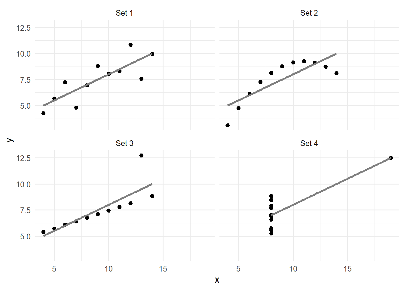
The same means, the same spread, the same correlation of 0.82: judged by the numbers, the four datasets are the same. Figure 4.1 shows that they are not.
ggplot(anscombe_long, aes(x = x, y = y)) +geom_point(size =2) +geom_smooth(method ="lm", se =FALSE, colour ="grey50") +facet_wrap(~ set) +theme_minimal(base_size =12)
Figure 4.1: Anscombe’s four datasets: identical means, standard deviations, and correlations, but four entirely different relationships.
Only the first set is the kind of data the correlation describes well: a straight-line relationship with random scatter. The second is a smooth curve, the third a perfect line spoiled by one outlier, and in the fourth a single unusual point creates the entire relationship. Anyone who analysed these data without looking would draw the same, wrong, conclusion from all four. Looking first is not optional.
Graphs serve two different purposes, and it helps to know which one a graph is for. Exploratory graphs are made for the researcher, quickly and in large numbers, to understand the data: to check distributions, find unusual values, and notice patterns worth testing. They need no polish. Explanatory graphs are made for readers, to show a finding that the researcher already understands, and they need care: a clear message, accurate labels, and nothing that distracts. A thesis contains a few explanatory graphs, chosen from the many exploratory ones made along the way.
4.2 How people read graphs
A graph works by turning numbers into visual properties: positions, lengths, angles, areas, colours. People do not judge all of these equally well. In a series of experiments, the statisticians William Cleveland and Robert McGill asked people to compare values shown in different ways, and found a clear ranking (Cleveland and McGill 1984). Positions along a common scale are judged most accurately, followed by lengths, then angles and slopes, then areas, and finally shades of colour. A good graph therefore puts its most important comparison into position or length.
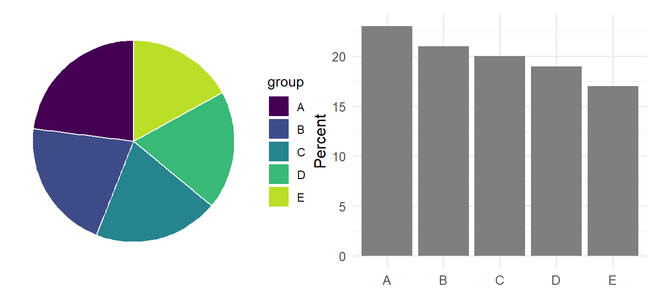
The difference is easy to experience. The code below shows the same five percentages, which differ only slightly, as a pie chart and as a bar chart:
Figure 4.2: The same five percentages as a pie chart (angles and areas) and as a bar chart (lengths on a common scale). The order of the groups is much easier to see in the bars.
In the pie chart, the slices look almost identical, and ranking them requires reading a legend. In the bar chart, the steady decline from A to E is obvious at once, because the comparison is made by length along a shared axis. For this reason, researchers generally prefer bar charts and dot plots to pie charts, and scatter plots to bubble charts. The patchwork package, loaded above, places ggplot2 graphs side by side with a simple +.
The same research gives two further rules of thumb. Comparisons are easiest when the values to be compared sit next to each other on the same scale, so the most important comparison should be placed within one panel, not across panels. And colour is best used to distinguish a few categories, or to show one quantity that does not need to be read precisely, rather than to carry the main message.
4.3 Choosing a graph
The right graph follows from the research question and from the kinds of variables involved (Chapter 2). A question about the distribution of one numeric variable needs a different graph from a question about the relationship between two. Table 4.1 is a starting point for the graphs in this chapter.
Table 4.1: Choosing a graph from the question and the variables
Question
Variables
Graph
geom
How are the values distributed?
One numeric
Histogram, density plot
geom_histogram(), geom_density()
How many cases fall in each category?
One categorical
Bar chart
geom_bar()
Do groups differ?
Numeric by categorical
Box plot, points with averages
geom_boxplot(), geom_jitter()
How are two variables related?
Two numeric
Scatter plot
geom_point()
How does something change over time?
Numeric over time
Line chart
geom_line()
How do many variables relate?
Several numeric
Heat map of correlations
geom_tile()
4.4 The grammar of graphics
The ggplot2 package is built on an idea called the grammar of graphics(Wickham 2016). It follows directly from the previous sections: a graph maps variables to visual properties. Every ggplot2 graph therefore combines three parts. The data is a data frame. The aesthetic mappings, written inside aes(), state which variable goes to which visual property: the x axis, the y axis, the colour, and so on. The geometric layers, called geoms, state which shape represents the data, such as points, bars, or lines. The parts are added together with +. Five students from a pilot study show how:
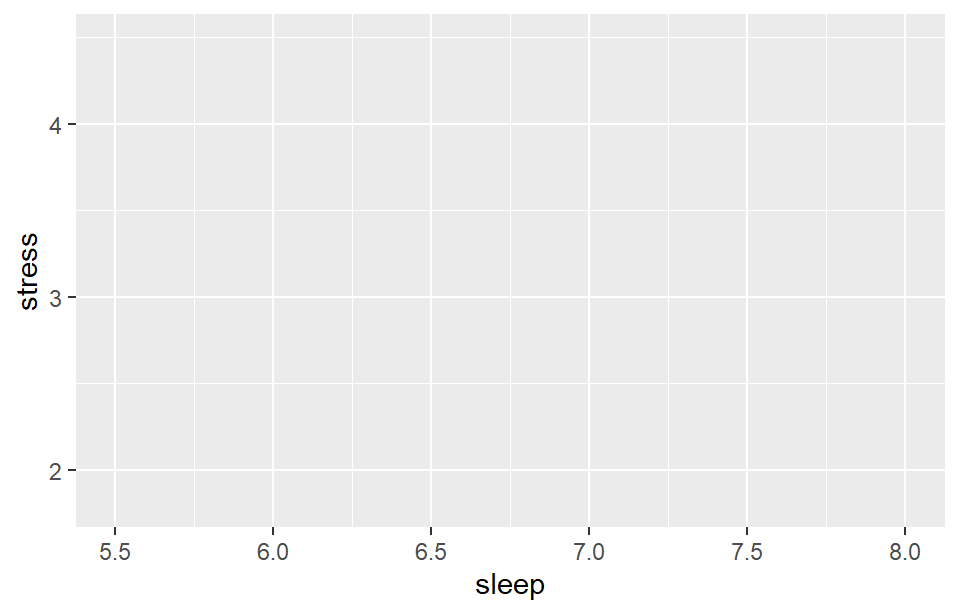
The function ggplot(), given the data and the mappings, sets up an empty canvas with the axes:
ggplot(pilot, aes(x = sleep, y = stress))
Figure 4.3: Data and mappings alone give an empty canvas with the axes.
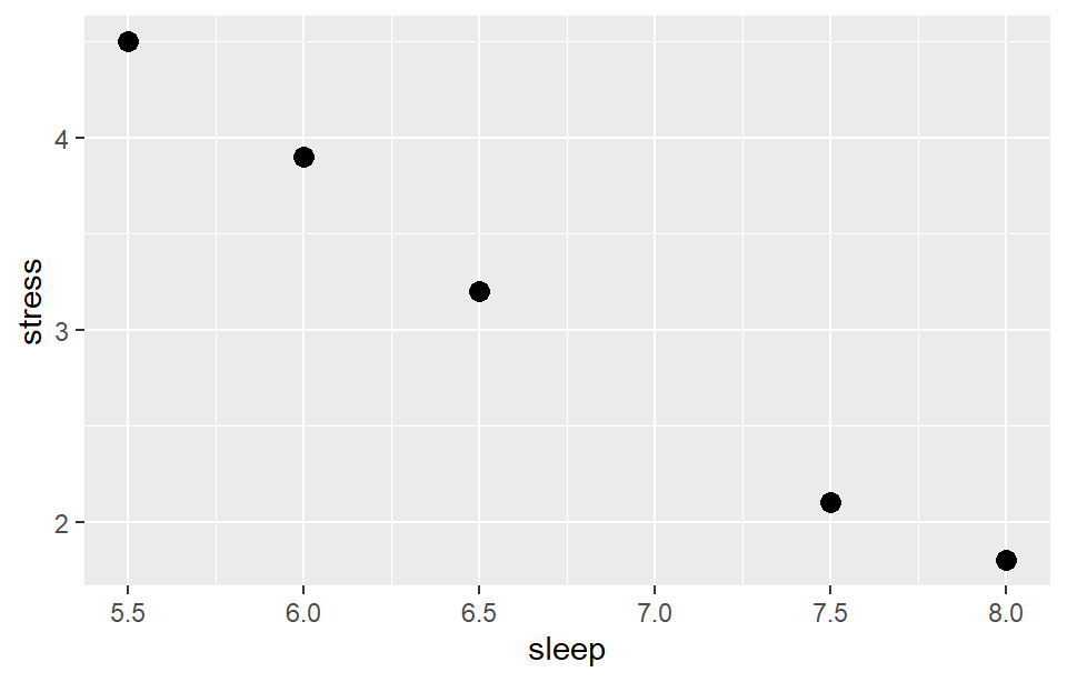
Adding a geom draws the data. The geom geom_point() draws one point per row:
ggplot(pilot, aes(x = sleep, y = stress)) +geom_point(size =3)
Figure 4.4: Adding a layer of points: students who sleep less report more stress.
Every further detail is another +: another layer, a label, a colour scale, a theme. That is the whole idea, and every graph in this chapter, however complex it looks, is more of the same.
For the wellbeing data, one row per student makes most graphs simplest. The code below combines each student’s first-semester record with their background information:
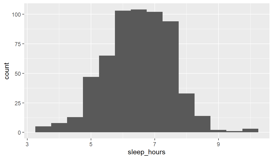
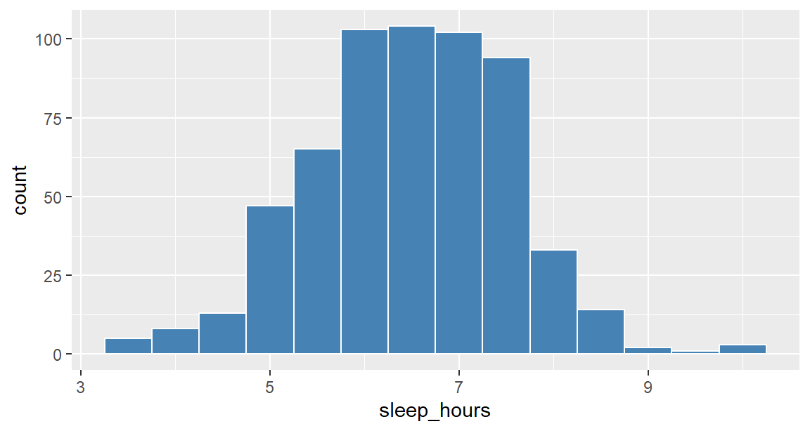
The first question about any numeric variable concerns its distribution: where most values lie, how widely they spread, and whether some are unusual. A histogram answers it by dividing the values into ranges, called bins, and showing how many cases fall into each. Here is the distribution of sleep:
Figure 4.5: Hours of sleep per night in the first semester.
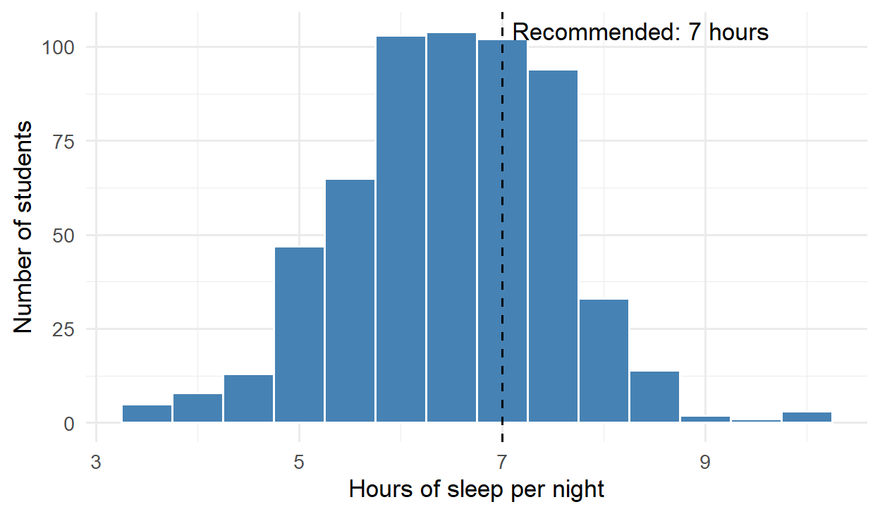
Figure 4.5 shows a roughly symmetrical, bell-shaped distribution, centred a little above 6 hours. Most students sleep less than the recommended 7 hours: 65% of them in the first semester. A few sleep very little, under 4.5 hours; Chapter 6 looks at such unusual values.
The argument binwidth sets the width of each bin, here half an hour. The choice matters: bins that are too wide hide the shape, and bins that are too narrow make it noisy, so it is worth trying a few widths.
4.5.2 Bar charts
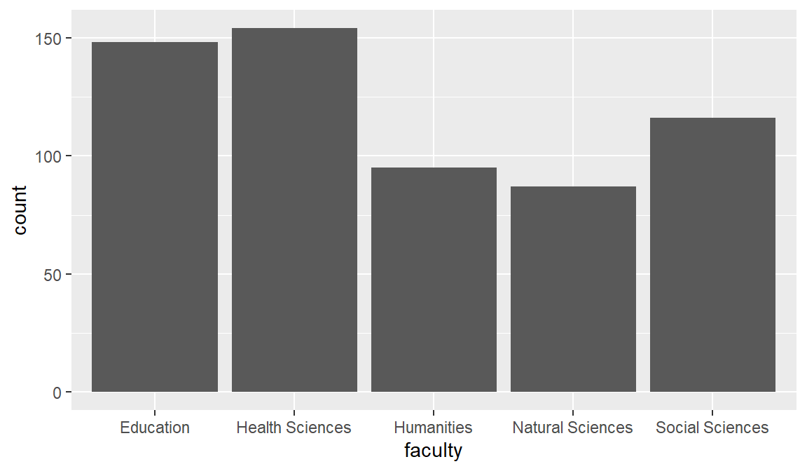
A bar chart shows how many cases fall into each category. The geom geom_bar() does the counting:
ggplot(students, aes(x = faculty)) +geom_bar()
Figure 4.6: Number of students in each faculty.
When the heights have already been calculated, for example averages, geom_col() is used instead, with the calculated value mapped to y. Because a bar represents its value by its length, the axis of a bar chart must start at zero; the section on honest graphs returns to this.
4.5.3 Box plots
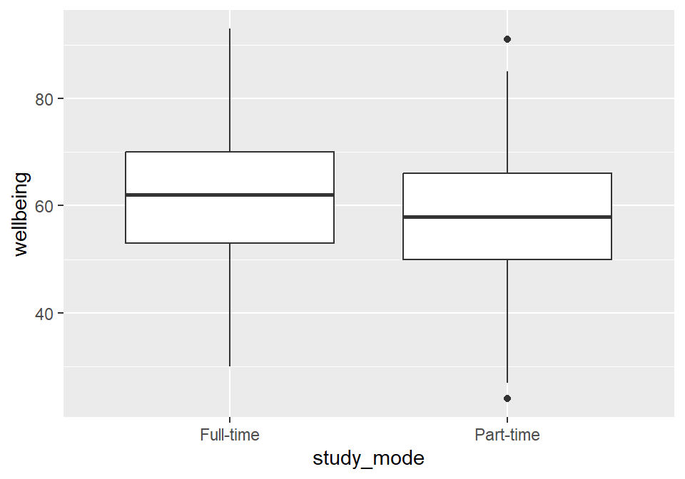
A box plot summarises a numeric variable for each group, which makes it the standard graph for comparing groups. The box covers the middle half of the values, the line inside is the median, the whiskers reach out to the typical range, and points beyond the whiskers mark unusual values. The comparison below concerns wellbeing in full-time and part-time students:
ggplot(first_sem, aes(x = study_mode, y = wellbeing)) +geom_boxplot()
Figure 4.7: Wellbeing in the first semester, by study mode.
Part-time students’ wellbeing is a little lower, but the boxes overlap considerably: many part-time students are doing better than many full-time students. Whether the difference is larger than chance is a question for Chapter 8.
4.5.4 Scatter plots
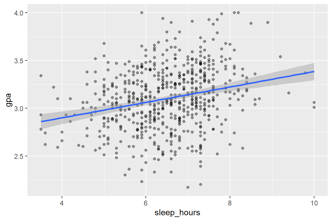
The relationship between two numeric variables, such as sleep and grades, is shown with a scatter plot, which puts one variable on each axis. With 600 students, points pile on top of each other, a problem called overplotting, so alpha makes them partly transparent, and darker areas show where many students are:
Figure 4.8: Sleep and GPA in the first semester, with a straight trend line.
The layer geom_smooth(method = "lm") adds a straight trend line, with a grey band showing its uncertainty. The line rises: students who sleep more tend to have slightly higher GPAs. The points, however, scatter widely around it. Sleep is related to GPA, but it is far from the whole story, and Chapter 8 measures the relationship.
4.5.5 Line charts
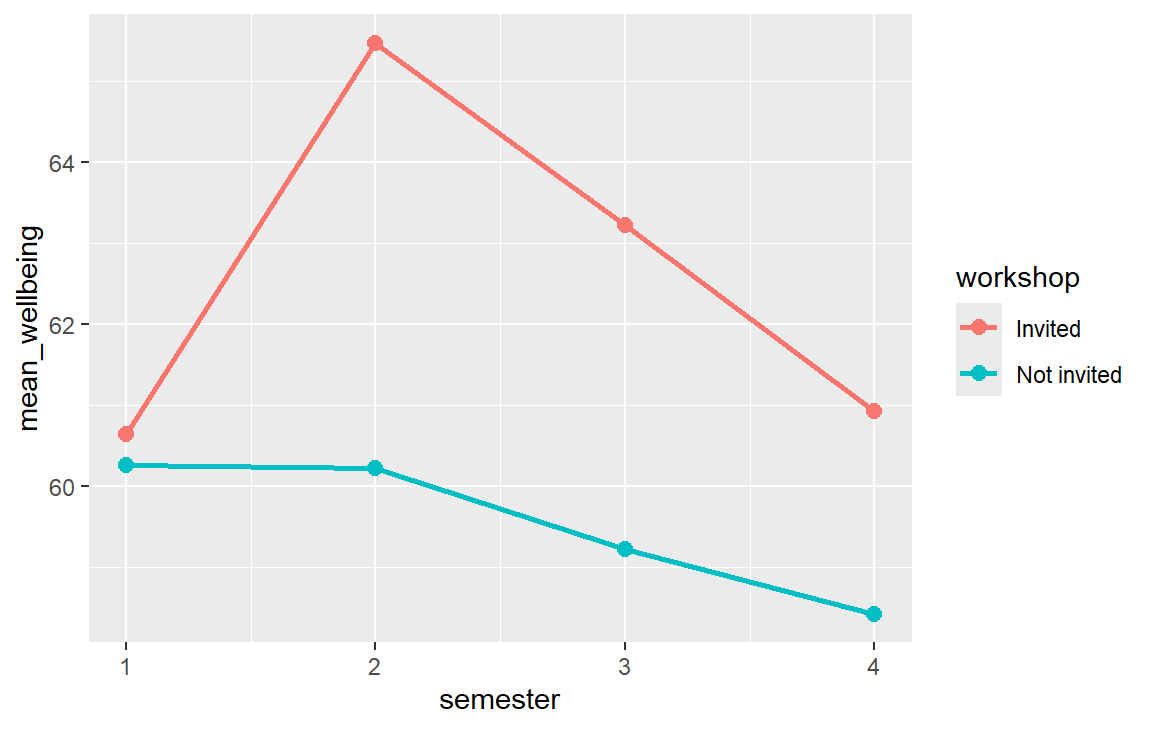
The study followed its students for four semesters, and a line chart shows how the average changed. The averages are calculated first (Chapter 3) and then plotted, with one line per workshop group:
Figure 4.9: Average wellbeing over four semesters, by workshop group.
Figure 4.9 tells the story of the workshop at a glance: the groups start level, the invited students pull ahead in semester 2, and the gap narrows afterwards. Chapters 7 and 10 test whether this pattern is real.
4.6 Mapping and setting
In Figure 4.9, colour = workshop sat inside aes(). That maps colour to a variable: each workshop group gets its own colour, and ggplot2 adds a legend to explain them. To make everything one fixed colour, the colour is setoutsideaes() instead:
ggplot(first_sem, aes(x = sleep_hours)) +geom_histogram(binwidth =0.5, fill ="steelblue", colour ="white")
Figure 4.10: Setting a fixed colour outside aes(): all bars are the same colour, and there is no legend.
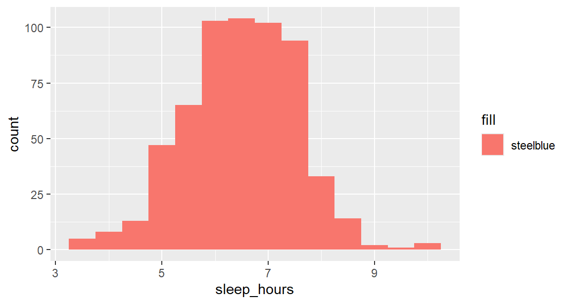
A very common mistake is to put a fixed colour inside aes(). ggplot2 then treats "steelblue" as a variable with one value, colours it with its first default colour (a salmon pink), and adds a pointless legend:
ggplot(first_sem, aes(x = sleep_hours, fill ="steelblue")) +geom_histogram(binwidth =0.5)
Figure 4.11: The mistake: a fixed colour inside aes() is treated as data.
The rule follows from the grammar: insideaes() for anything that should depend on the data, outside for anything that should be the same everywhere. Note also the difference between fill and colour: fill is the inside of a shape such as a bar or box, and colour is its outline, or the colour of points and lines.
4.7 Preparing graphs for publication
The graphs so far are exploratory: good enough for the researcher. An explanatory graph for a thesis or paper needs more care, and every addition below is a design decision with a reason behind it.
4.7.1 Labels
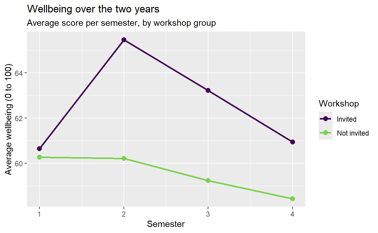
A reader cannot interpret a graph whose axes say mean_wellbeing and semester. Axis labels should state what was measured, with units, and the title or caption should state the message. The function labs() sets the title, subtitle, axis labels, legend title, and caption:
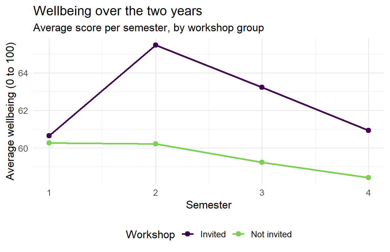
p <-ggplot(wellbeing_by_sem, aes(x = semester, y = mean_wellbeing, colour = workshop)) +geom_line(linewidth =1) +geom_point(size =2.5) +labs(title ="Wellbeing over the two years",subtitle ="Average score per semester, by workshop group",x ="Semester",y ="Average wellbeing (0 to 100)",colour ="Workshop" )p
Figure 4.12: The line chart with clear labels.
Storing the graph in an object, here p, makes it possible to add to it step by step without repeating the code.
4.7.2 Scales and colours
Scales control how data values become positions, colours, and sizes, and each has a scale_ function. Two decisions are needed here. The x axis should show only whole semesters, since there is no semester 2.5. And the colours should come from a palette that people with colour vision deficiency, about one man in twelve, can tell apart. The viridis palettes, built into ggplot2, are designed for exactly that, and they also print well in greyscale:
p <- p +scale_x_continuous(breaks =1:4) +scale_colour_viridis_d(end =0.8)p
Figure 4.13: Whole-number semesters on the x axis and a colour-blind-friendly palette.
Colours can also be chosen by hand, with scale_colour_manual(values = c("Invited" = "#1b9e77", "Not invited" = "#7570b3")). Whatever the choice, colour should never be the only way to tell groups apart in a printed figure: different shapes or line types, or labels placed directly on the lines, keep the graph readable in black and white.
4.7.3 Themes
A theme controls everything that is not data: the background, grid lines, fonts, and the position of the legend. The default grey background of ggplot2 is useful on screen, but most journals prefer a plain look. The complete themes theme_minimal() and theme_bw() provide it, base_size sets the font size, and theme() adjusts individual details:
p <- p +theme_minimal(base_size =13) +theme(legend.position ="bottom")p
Figure 4.14: A clean theme, larger text, and the legend below the graph.
Compared with Figure 4.9, Figure 4.14 shows the same data, but it is now ready for a thesis.
4.7.4 Annotations
A reference value often helps a reader interpret a graph: a recommended amount, a threshold, a mean. The functions geom_vline() and geom_hline() draw reference lines, and annotate() places text:
ggplot(first_sem, aes(x = sleep_hours)) +geom_histogram(binwidth =0.5, fill ="steelblue", colour ="white") +geom_vline(xintercept =7, linetype ="dashed") +annotate("text", x =7.1, y =Inf, label ="Recommended: 7 hours", hjust =0, vjust =1.5) +labs(x ="Hours of sleep per night", y ="Number of students") +theme_minimal(base_size =13)
Figure 4.15: Sleep in the first semester, with the recommended 7 hours marked.
In the annotation, y = Inf places the text at the top of the plot, whatever the height of the bars; hjust = 0 makes it start just right of the line, and vjust = 1.5 moves it slightly down from the edge. The line makes the graph’s message, that most students sleep less than recommended, visible without any further explanation.
4.8 Honest graphs
A graph can be accurate in every detail and still mislead. Most misleading graphs are not deliberate; they come from defaults that nobody questioned. Four choices deserve particular attention.
The first is the axis range. A bar represents its value by its length, so a bar chart whose axis does not start at zero misrepresents every value: a bar twice as long no longer means twice as much. Points and lines represent values by position, so their axes may be zoomed in to show change clearly, as long as the reader is told. The y axis of Figure 4.14, for example, runs only from about 58 to 66, because ggplot2 zooms in on the data, which makes a 5-point gap look large. Either the caption should say so, or the full range of the scale can be shown with coord_cartesian(ylim = c(0, 100)), letting readers judge the size of the difference themselves.
The second is the aspect ratio, the shape of the graph. The same line looks steep in a tall, narrow graph and flat in a wide, short one. A good default is a graph somewhat wider than it is tall, and the same shape for graphs that will be compared.
The third is clutter. Everything in a graph that does not carry information, such as heavy grid lines, a legend that repeats the axis labels, or three-dimensional effects, competes with the data for the reader’s attention. Three-dimensional bars and pies are worst of all, since the perspective distorts exactly the lengths and angles that carry the values.
The fourth is colour. Colours for categories should be clearly different from each other but none should stand out, since no category is more important than another; a qualitative palette such as viridis does this. Colours for quantities should run in one direction, from light to dark (a sequential palette), or away from a meaningful midpoint such as zero in two directions (a diverging palette, as in the heat map later in this chapter). A rainbow palette is poor for both, because its bright bands suggest boundaries that are not in the data.
4.8.1 A graph improved
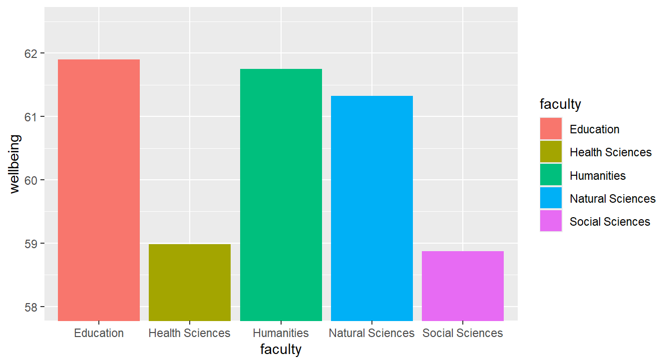
The principles are clearest when applied to one graph. Suppose the question is whether wellbeing differs between faculties. A first attempt, using defaults and a zoomed axis, might look like Figure 4.16:
Figure 4.16: A misleading graph of average wellbeing by faculty: the axis starts at 58, the colours repeat the axis labels, and the spread of the data is invisible.
The graph suggests large differences: the Education bar looks several times taller than the Social Sciences bar. But the axis starts at 58, so the lengths of the bars mean nothing; the averages actually differ by about 3 points on a 100-point scale. The colours add nothing that the axis labels do not already say, the legend repeats them a second time, the faculties appear in alphabetical rather than meaningful order, and the axis titles are variable names. Most seriously, the graph shows only averages, and hides how much students within each faculty differ.
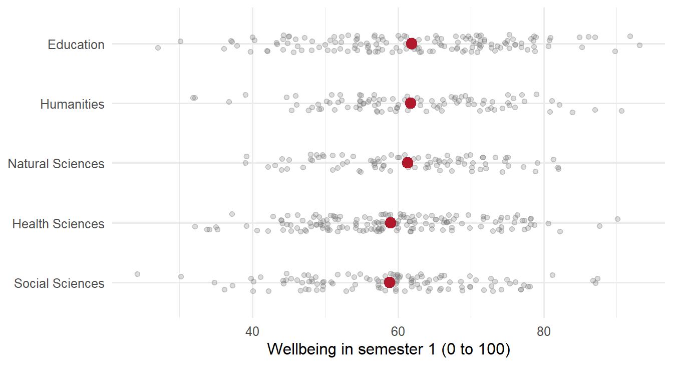
Figure 4.17 shows the same data, redesigned. Every student appears as a faint point, so the spread within each faculty is visible, and the average of each faculty is marked in red. The faculties are ordered by their average, the labels say what was measured, and the legend is gone:
ggplot(first_sem, aes(x = wellbeing, y =reorder(faculty, wellbeing))) +geom_jitter(height =0.15, alpha =0.25, colour ="grey45") +stat_summary(fun = mean, geom ="point", size =3.5, colour ="#b2182b") +labs(x ="Wellbeing in semester 1 (0 to 100)", y =NULL) +theme_minimal(base_size =12)
Figure 4.17: The same data, redesigned: every student as a grey point, each faculty’s average in red, faculties ordered by their average. The differences between faculties are small compared with the differences within them.
The function reorder() orders the faculties by their average wellbeing, geom_jitter() spreads the points a little vertically so that they do not hide each other, and stat_summary() calculates and draws each faculty’s mean. The redesigned graph tells the truth that the first one hid: the differences between faculties are small compared with the differences between students within each faculty. Chapter 8 tests whether they are larger than chance.
4.9 Further kinds of graph
4.9.1 Small multiples
Facets, also called small multiples, split one graph into a panel for each group, all with the same axes, so the groups are easy to compare. The function facet_wrap() takes the variable to split by:
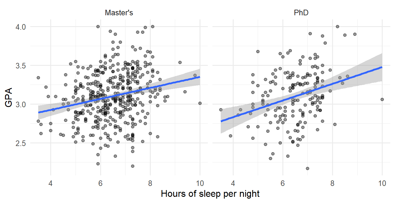
ggplot(first_sem, aes(x = sleep_hours, y = gpa)) +geom_point(alpha =0.4) +geom_smooth(method ="lm") +facet_wrap(~ programme) +labs(x ="Hours of sleep per night", y ="GPA") +theme_minimal(base_size =12)
Figure 4.18: Sleep and GPA in the first semester, one panel per programme.
The relationship looks similar in both programmes. For two grouping variables, facet_grid(rows ~ columns) makes a grid of panels. Because the panels share their axes, facets respect the rule from the section on reading graphs: comparisons are made by position on a common scale.
4.9.2 Density plots
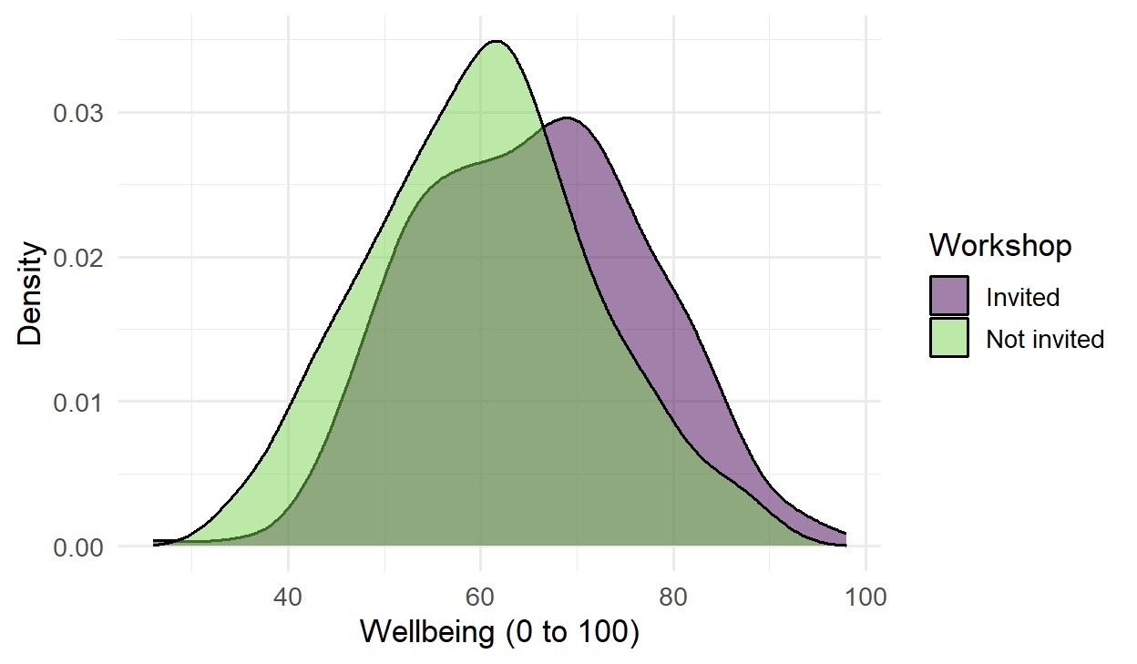
A density plot is a smoothed histogram. Its advantage is that several distributions can be drawn on top of each other and compared. Here, fill is mapped to the workshop group and alpha lets the two curves show through each other:
semesters |>filter(semester ==2) |>left_join(students, join_by(student_id)) |>ggplot(aes(x = wellbeing, fill = workshop)) +geom_density(alpha =0.5) +scale_fill_viridis_d(end =0.8) +labs(x ="Wellbeing (0 to 100)", y ="Density", fill ="Workshop") +theme_minimal(base_size =13)
Figure 4.19: Distribution of wellbeing in the second semester, by workshop group.
In this code, the data flows straight into ggplot() through the pipe. The two curves have the same shape, but the invited group’s is shifted to the right: the whole distribution moved, not just a few students.
4.9.3 Heat maps
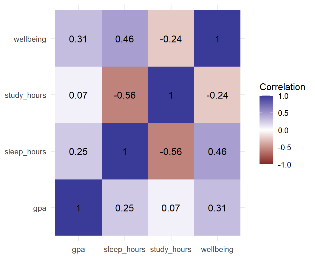
A heat map shows a table of numbers as coloured tiles, and it suits correlation matrices well. Chapter 2 calculated the correlations between four first-semester measurements. To plot them, the matrix is turned into a long table with one row per pair (Chapter 3), and then geom_tile() draws a tile for each pair and geom_text() writes the value on it:
Figure 4.20: Correlations between four first-semester measurements.
The scale scale_fill_gradient2() is a diverging palette: two colours for negative and positive values, with white at zero, so the direction and strength of each correlation are visible at once. Students who study more hours sleep less (a negative correlation), and students who sleep more report higher wellbeing (positive). The numbers written on the tiles matter, because colour alone is read imprecisely. Chapter 6 explains how to read correlations.
4.10 Exporting figures
The function ggsave() saves the most recent graph, or one that is named, to a file. The file type follows from the file name:
A figure should be saved at the size at which it will be printed, in the units of the page: a figure for a single column of a journal is often about 8 cm wide, and a full page about 16 cm. Setting the size when saving, rather than stretching the image later, keeps the text readable and the proportions right. Images such as PNG files need a resolution of at least 300 dpi (dots per inch), which is what most journals require, while vector formats such as PDF and SVG stay sharp at any size and are preferable whenever the journal accepts them. Finally, the text should be checked at the final size, since fonts that look fine on screen are often too small in print; base_size in the theme fixes that.
The code that makes each figure belongs in the analysis script. When a supervisor asks for a larger font or a different colour, one line changes and the figure is saved again.
NoteIn your field: economics and business
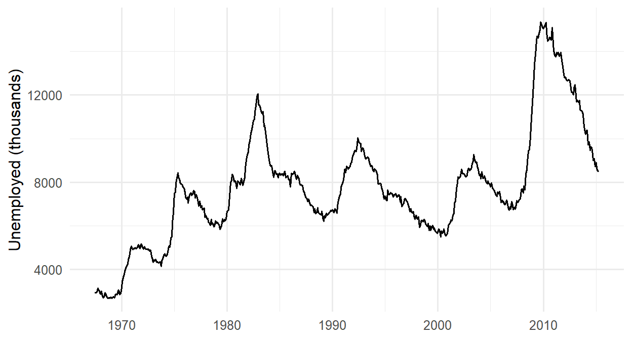
ggplot2 includes economics, real monthly data on the US economy from 1967 to 2015. The same line chart shows the rise and fall of unemployment, with each recession visible as a peak:
ggplot(economics, aes(x = date, y = unemploy)) +geom_line() +labs(x =NULL, y ="Unemployed (thousands)") +theme_minimal(base_size =12)
Figure 4.21: US unemployment, 1967 to 2015 (ggplot2’s economics data).
The graph shows the number of unemployed people, not the unemployment rate, and the population grew greatly over these 48 years. A reader comparing 1970 with 2010 should know that, which is why the axis label names exactly what is shown.
4.11 Common misconceptions
Several beliefs about graphs are widespread, and each leads to graphs that mislead or fail to inform.
“The summary statistics tell the whole story.” Anscombe’s datasets share every summary and differ completely. Always look.
“A graph with more elements is more informative.” Decoration, three-dimensional effects, and repeated labels compete with the data.
“Pie charts are good for proportions.” Angles and areas are judged poorly; a bar chart or dot plot of the same proportions is almost always clearer.
“Zooming in on the axis is always wrong.” It is wrong for bar charts, whose lengths encode values, but acceptable for points and lines, if the reader is told.
“Colour makes a graph clearer.” Colour helps to separate a few categories; used for everything, it becomes noise, and it disappears in black-and-white printing.
4.12 Chapter review
4.12.1 Summary
Numerical summaries can hide very different patterns, as Anscombe’s datasets show, so data should always be graphed. Exploratory graphs help the researcher understand the data; explanatory graphs show readers a finding.
People judge positions and lengths most accurately, then angles, areas, and colours. The most important comparison belongs in position or length, within one panel.
The graph follows from the question and the kinds of variables: histograms for distributions, bar charts for counts, box plots or points for group comparisons, scatter plots for relationships, line charts for change over time.
Every ggplot2 graph combines data, aesthetic mappings in aes(), and geometric layers, joined with +. Map a colour inside aes() when it should depend on the data; set it outside aes() when it should be fixed.
labs() adds labels, scale_ functions control axes and colours (viridis palettes are colour-blind-friendly), and themes control the look.
Honest graphs start bar axes at zero, state when an axis is zoomed, avoid clutter, and use colour appropriately: qualitative palettes for categories, sequential or diverging palettes for quantities.
Facets split a graph into comparable panels; density plots compare distributions; heat maps show tables of numbers.
ggsave() exports figures. Set the size in page units, use at least 300 dpi for images, and prefer PDF or SVG when accepted.
The playground has these and more, with hints and solutions.
Draw a histogram of study_hours in the first semester. Try binwidths of 1, 5, and 10, and explain which shows the shape best.
Draw a bar chart of how many students have each level of employment. Make the bars a single colour of your choice, and order the levels from no job to a full-time job.
Draw box plots of first-semester GPA for each faculty, with clear axis labels.
Draw a scatter plot of caffeine against sleep in the first semester, with a trend line, and describe what it suggests. (Chapter 8 returns to this relationship.)
Take any graph from this chapter and save it as a PNG file, 16 cm wide and 10 cm high, at 300 dpi.
Redraw Figure 4.16 as a bar chart whose axis starts at zero. Compare it with Figure 4.16 and Figure 4.17, and explain which of the three you would put in a thesis, and why.
4.14 Further reading
R for Data Science(Wickham et al. 2023): chapters “Data visualization”, “Layers”, and “Communication”.
Data Visualization: A Practical Introduction(Healy 2018), free online, explains the principles of good graphs and builds them with ggplot2.
ggplot2: Elegant Graphics for Data Analysis(Wickham 2016), by the author of ggplot2, explains the grammar of graphics in depth.
“Graphical perception” (Cleveland and McGill 1984), the experiments behind the ranking of visual properties.
Cleveland, William S., and Robert McGill. 1984. “Graphical Perception: Theory, Experimentation, and Application to the Development of Graphical Methods.”Journal of the American Statistical Association 79 (387): 531–54. https://doi.org/10.1080/01621459.1984.10478080.
Healy, Kieran. 2018. Data Visualization: A Practical Introduction. Princeton University Press. https://socviz.co.
Wickham, Hadley, Mine Çetinkaya-Rundel, and Garrett Grolemund. 2023. R for Data Science: Import, Tidy, Transform, Visualize, and Model Data. 2nd ed. O’Reilly Media. https://r4ds.hadley.nz.