flowchart TB A[report.qmd<br/>text + code] --> B[knitr runs<br/>the R code] B --> C[report.md<br/>text + results] C --> D[Pandoc<br/>converts] D --> E[HTML] D --> F[Word] D --> G[PDF]
17 Reproducible Research
A research finding is credible only if it can be checked. A reader who doubts a result should be able to see exactly how it was obtained, and a second researcher who repeats the analysis should arrive at the same numbers. When that is not possible, the reader has to take the result on trust, and science is built on not having to. The failures that make results uncheckable are rarely dramatic. A table is copied into a draft before the data is corrected, a decision made while exploring is forgotten, a package changes its behaviour between versions, and nobody can say afterwards which of several analyses produced the published number. Reproducibility is therefore a matter of research integrity, not of technical tidiness.
The problem is easy to meet in a thesis. Three weeks before the deadline, Elaf’s supervisor spots that twelve students appear twice in an early version of the survey export. They were removed in Chapter 3, but some tables were copied into the thesis draft before that, and now every table, figure, and number copied by hand from R into Word must be checked and replaced, one at a time, with the risk of missing one. This chapter shows a way of working in which that problem cannot happen. In a reproducible workflow, the text, the code, and the results live together, and the whole report is rebuilt from the raw data with one command, so every number is always up to date. The chapter introduces Quarto for writing such documents, from a single page to a thesis chapter; renv for keeping the same package versions; Shiny for turning an analysis into an interactive dashboard; and the practices of open science that make research checkable by others. An optional section introduces git for keeping the history of a project.
TipBy the end of this chapter you will be able to
- Explain why reproducibility is a matter of research integrity, and why copying results by hand and flexible analyses are risky.
- Write a Quarto document that combines text, code, results, tables, figures, citations, and equations, and render it to HTML, Word, and PDF.
- Keep a project’s package versions with renv, and report software versions.
- Build a small Shiny dashboard with inputs, outputs, and reactive code.
- Apply open science practices: sharing data and code, protecting participants, preregistration, and citing software.
17.1 Reproducibility and credibility
An analysis is reproducible if someone else, or you in a year’s time, can take the same data and code and get exactly the same results. It is replicable if a new study, with new data, reaches the same conclusions. Reproducibility is the minimum standard: if the original results cannot even be recomputed, there is little point asking whether they replicate (Peng 2011).
Most irreproducibility is not fraud but everyday friction: a table copied before the data was corrected, a spreadsheet cell edited by hand, a result produced by clicking through menus that nobody wrote down, a package that changed its default between versions. The previous chapters have already built good habits against these. Every step is written as code, in scripts, so it can be rerun (Chapter 1). Each analysis lives in an RStudio Project with relative paths, so it runs on any computer (Chapter 1). The raw data is never edited by hand, and every cleaning decision is made and recorded in code (Chapter 3). Random steps use set.seed(), so they give the same answer every time (Chapter 7).
This chapter adds the last links: putting the results into the report automatically, fixing the software versions, and sharing everything responsibly. Good practices do not need to be perfect to be useful; even a few of them make research far easier to check (Wilson et al. 2017).
17.2 Documents that contain their own analysis
Quarto is a publishing system for documents that mix text and code. A Quarto document is a plain text file with the extension .qmd. When it is rendered, the code is run, and its results (numbers, tables, figures) are placed into the finished document, which can be a web page, a Word document, a PDF, a slide show, or a whole book. This book is written in Quarto: every number, table, and figure in it was produced by the code shown next to it.
NoteR Markdown
Before Quarto, the same job was done by R Markdown (.Rmd files), and you will meet it in many older projects, templates, and journal guides. The two are very similar: the text, code chunks, and inline code of this chapter work almost unchanged in R Markdown, where documents are rendered with the Knit button or rmarkdown::render(). Quarto is its successor, from the same developers, and works with Python and other languages as well as R. For new work, use Quarto.
17.2.1 A small example
A complete Quarto document can be very short:
---
title: "Three friends' sleep"
author: "Elaf"
format: html
---

My three friends slept `r mean(sleep)` hours on average last night.

```{r}
sleep <- c(6.5, 7, 5.5)
mean(sleep)
```
It has the three parts of every Quarto document. The YAML header, between the two --- lines, holds settings: the title, the author, and the output format. The text is written in Markdown, a simple way of marking formatting: **bold**, *italic*, # Heading, and - for a bullet point. The code chunks, between ```{r} and ```, are run when the document is rendered, and their code and output appear in the document.
The text also contains inline code, r mean(sleep): R code inside a sentence, written between backticks and starting with the letter r and a space. When the document is rendered, the inline code is replaced by its result, so the sentence reads “My three friends slept 6.3333333 hours on average last night.” (Rounding it, with round(mean(sleep), 1), would be better.) If a friend’s number changes, the sentence changes with it. Inline code is the cure for the problem at the start of the chapter: numbers in the text are never typed by hand.
In RStudio, create a Quarto document with File > New File > Quarto Document, and render it with the Render button. RStudio also offers a visual editor, which shows the formatting as in a word processor while writing the same .qmd file underneath.
17.2.2 What happens when you render
Figure 17.1 shows the steps. The knitr package runs the R code and writes a Markdown file with the results in place; Pandoc, a universal document converter, then turns the Markdown into the requested format.
Because the code is run from the beginning every time, a rendered document is a test of reproducibility in itself: if the code depends on something that is not in the document or the project, such as an object created by hand in the Console, rendering fails.
17.3 A results chapter in Quarto
The descriptive results chapter of the thesis, rewritten as a Quarto document, begins like this:
---
title: "Chapter 4: Results"
author: "Elaf"
format: docx
bibliography: references.bib
execute:
  echo: false
---

```{r}
#| label: setup
#| message: false
library(dplyr)
library(ggplot2)
library(data2thesis)
```

The sample included `r nrow(students)` graduate students from
`r n_distinct(students$faculty)` faculties. Their average wellbeing in the
first semester was `r round(mean(semesters$wellbeing[semesters$semester == 1], na.rm = TRUE), 1)`
on the wellbeing index (0 to 100). @tbl-faculty shows wellbeing by faculty.

```{r}
#| label: tbl-faculty
#| tbl-cap: "Wellbeing in the first semester, by faculty."
semesters |>
  filter(semester == 1) |>
  left_join(students, join_by(student_id)) |>
  summarise(Students = n(),
            Mean = mean(wellbeing, na.rm = TRUE),
            SD = sd(wellbeing, na.rm = TRUE),
            .by = faculty) |>
  arrange(faculty) |>
  knitr::kable(digits = 1, col.names = c("Faculty", "Students", "Mean", "SD"))
```

Wellbeing declined over the programme (@fig-wellbeing), as found in
earlier studies [@author2020].
Several new features appear. In the header, format: docx produces a Word document, the format most supervisors want for comments, and bibliography: names a file of references. The setting execute: echo: false hides the code in the finished document, so that a thesis shows only the results; the code is still in the .qmd file for anyone who wants to check it.
In the body, chunk options, the lines starting with #|, control each chunk: label names it, message: false hides package messages, and tbl-cap or fig-cap gives a caption. A chunk labelled tbl-... or fig-... becomes a numbered table or figure, and @tbl-faculty in the text becomes a cross-reference, “Table 1”, with the number filled in automatically. The function knitr::kable() turns a data frame into a formatted table. Finally, [@author2020] is a citation: Quarto looks up the key in the bibliography file, formats the citation, and adds the reference list at the end.
When the document is rendered, the first paragraph becomes:
The sample included 600 graduate students from 5 faculties. Their average wellbeing in the first semester was 60.5 on the wellbeing index (0 to 100). Table 1 shows wellbeing by faculty.
and the table chunk produces Table 17.1:
| Faculty | Students | Mean | SD |
|---|---|---|---|
| Education | 148 | 61.9 | 13.2 |
| Health Sciences | 154 | 59.0 | 11.6 |
| Humanities | 95 | 61.7 | 11.7 |
| Natural Sciences | 87 | 61.3 | 10.5 |
| Social Sciences | 116 | 58.9 | 12.1 |
If the data changes, the document is rendered again, and every number, table, and figure is updated. The supervisor’s problem from the start of the chapter now takes one click to fix.
17.3.1 References and citations
The bibliography file uses the BibTeX format, which almost every reference manager (Zotero, Mendeley, EndNote) can export, and Google Scholar can provide for any paper. One entry looks like this:
@book{kuhn2022,
  author    = {Kuhn, Max and Silge, Julia},
  title     = {Tidy Modeling with R},
  publisher = {O'Reilly Media},
  year      = {2022}
}
The key, kuhn2022, is what goes after the @ in the text. A csl: line in the YAML header chooses the citation style (APA, Vancouver, Harvard, or any of thousands of journal styles from the Citation Style Language collection), so switching styles never means retyping references. With Zotero, RStudio’s visual editor can insert citations directly from your library.
17.3.2 Equations
Equations are written in LaTeX notation between dollar signs: $\bar{x} = \frac{1}{n}\sum x_i$ inside a sentence gives \(\bar{x} = \frac{1}{n}\sum x_i\), and double dollar signs set an equation on its own line:
$$
\text{logit}(p) = \beta_0 + \beta_1 \times \text{stress} + \beta_2 \times \text{support}
$$
\[ \text{logit}(p) = \beta_0 + \beta_1 \times \text{stress} + \beta_2 \times \text{support} \]
The same notation works in HTML, Word, and PDF output. The equations in this book are all written this way.
17.3.3 Output formats
Changing one line of the YAML header changes the output:
| Format | YAML | Notes |
|---|---|---|
| Web page | format: html |
Interactive; good for sharing results online |
| Word | format: docx |
For comments from supervisors; reference-doc: template.docx applies your university’s styles |
format: pdf |
Needs a LaTeX installation: run quarto install tinytex once in the Terminal |
|
| Slides | format: revealjs |
For presentations |
Several formats can be listed at once, and one render then produces all of them. Many journals and universities provide Quarto templates, installed as extensions, that format a document to their requirements. A whole thesis can be written as a Quarto book (project: type: book), with one .qmd file per chapter, exactly like this book.
17.3.4 Parameterised reports
The dean of each faculty would like a one-page summary for their own faculty. Rather than five reports, one report with a parameter serves them all:
---
title: "Wellbeing report"
format: html
params:
  faculty: "Education"
---

```{r}
faculty_semesters <- semesters |>
  left_join(students, join_by(student_id)) |>
  filter(faculty == params$faculty)
```

This report describes the `r n_distinct(faculty_semesters$student_id)` students
of the Faculty of `r params$faculty`.
The value params$faculty is used in the code like any other value. Rendering from the Terminal with a different value produces each faculty’s version:
quarto render faculty-report.qmd -P faculty:"Health Sciences"17.4 Keeping the same package versions
Packages change. A function’s default may change between versions, or a function may be removed, so an analysis that runs today may give different results, or fail, in two years. renv records the exact version of every package a project uses, and can restore them later on any computer. It has three main commands, run in the Console:
renv::init()      # once: give the project its own package library
renv::snapshot()  # after installing or updating packages: record the versions
renv::restore()   # on another computer, or later: install the recorded versions
The first command, renv::init(), creates a file called renv.lock, which lists every package and its version, and gives the project its own private library of packages, so updating a package for one project does not affect the others. Share renv.lock with your code, and anyone can rebuild your exact set of packages.
Even without renv, report the versions of R and the key packages in your methods section. R can tell you:
R.version.string[1] "R version 4.4.3 (2025-02-28 ucrt)"packageVersion("lme4")[1] '1.1.37'The function sessionInfo() lists everything that is loaded, for a full record.
17.5 Interactive dashboards with Shiny
A report answers the questions its author thought of. Sometimes readers want to ask their own: “what about my faculty?”, “what about sleep instead of wellbeing?”. Shiny turns R code into an interactive web application, without any knowledge of web programming.
A Shiny app rests on three ideas. Inputs are the controls the reader uses, such as drop-down menus, buttons, and sliders. Outputs are what the app shows in response, such as plots and tables. Every app therefore has two parts: the user interface (ui), which describes what the user sees, the inputs and the places for the outputs, and the server function, which contains the R code that produces the outputs from the inputs. The third idea is what makes Shiny work: reactivity. Whenever an input changes, Shiny works out which outputs depend on it and reruns only their code. Figure 17.2 shows the connections in a wellbeing dashboard: choosing a different faculty updates both the plot and the table, while choosing a different measure updates them without refiltering the data.
flowchart LR
  F[Input:<br/>faculty] --> S["selected()<br/>filter the data"]
  S --> P[Output:<br/>trend plot]
  S --> T[Output:<br/>summary table]
  M[Input:<br/>measure] --> P
  M --> T
17.5.1 A wellbeing dashboard
The complete app, saved as a file called app.R, is:
library(shiny)
library(bslib)
library(dplyr)
library(ggplot2)
library(data2thesis)

# Semester records with each student's faculty and study mode
wellbeing_data <- semesters |>
  left_join(students |> select(student_id, faculty, study_mode), join_by(student_id))

measures <- c("Wellbeing (0-100)" = "wellbeing",
              "Sleep (hours a night)" = "sleep_hours",
              "Study (hours a week)" = "study_hours")

ui <- page_sidebar(
  title = "Graduate student wellbeing",
  sidebar = sidebar(
    selectInput("faculty", "Faculty", choices = sort(unique(wellbeing_data$faculty))),
    radioButtons("measure", "Measure", choices = measures)
  ),
  card(plotOutput("trend")),
  card(tableOutput("summary"))
)

server <- function(input, output, session) {
  selected <- reactive({
    wellbeing_data |> filter(faculty == input$faculty)
  })

  output$trend <- renderPlot({
    selected() |>
      summarise(mean = mean(.data[[input$measure]], na.rm = TRUE),
                .by = c(semester, study_mode)) |>
      ggplot(aes(x = semester, y = mean, colour = study_mode)) +
      geom_line(linewidth = 1) +
      geom_point(size = 3) +
      labs(x = "Semester", y = names(measures)[measures == input$measure],
           colour = "Study mode") +
      theme_minimal(base_size = 14)
  })

  output$summary <- renderTable({
    selected() |>
      summarise(students = n_distinct(student_id),
                mean = mean(.data[[input$measure]], na.rm = TRUE),
                .by = semester)
  })
}

shinyApp(ui, server)
The code follows the three ideas. The layout comes first: the function page_sidebar() from the bslib package lays out the page, with a title, a sidebar with the inputs, and the main area with two cards, one for the plot and one for the table. The inputs are created by selectInput(), a drop-down menu whose value is available in the server as input$faculty, and by radioButtons(), which creates the input$measure choice; the names in measures are shown to the user, and the values are the column names. The outputs are reserved by plotOutput("trend") and tableOutput("summary"), and the server fills them by assigning to output$trend and output$summary with renderPlot() and renderTable().
Reactivity is handled by reactive(), which creates selected(), the data for the chosen faculty. It is recalculated only when input$faculty changes, and both outputs use it. Finally, the expression .data[[input$measure]] picks the column whose name is stored in input$measure, the usual way to use a column chosen by the user inside dplyr and ggplot2.
Click Run App in RStudio, and the dashboard opens in a window. Figure 17.3 shows the plot it draws for the Faculty of Education and the wellbeing measure.
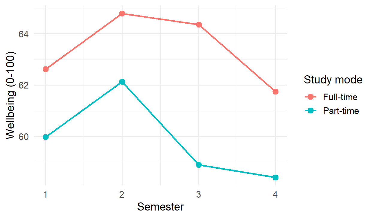
To share an app with people who do not use R, it must run on a server: shinyapps.io offers free hosting for small apps, and many universities run Posit Connect. Shinylive can even turn a simple app into a web page that runs entirely in the reader’s browser, with no server, using the same webR technology as this book’s playground. Like any published result, a dashboard must protect participants: this one shows only averages, never individual students.
17.6 Open science
Reproducibility inside your own project is the first step. Open science goes further: making research checkable and reusable by others.
17.6.2 Protecting participants
Research data about people can only be shared if the people cannot be identified. Removing names and student numbers is not enough: combinations of ordinary variables can identify someone. In the wellbeing data, a few combinations of faculty, study mode, gender, and having children describe only a handful of students:
small_cells <- students |>
  count(faculty, study_mode, gender, has_children) |>
  arrange(n)
head(small_cells, 4)
faculty study_mode gender has_children n
1 Education Part-time Male Yes 3
2 Health Sciences Part-time Male Yes 3
3 Humanities Part-time Female Yes 3
4 Education Part-time Female Yes 4Only 3 students are, for example, part-time male students with children in the Faculty of Education; in a small department, such a description may point to recognisable people. Before sharing, such small cells are protected, for example by grouping categories, removing variables that are not needed, or sharing only summary data. Ethics approval and the consent form set what may be shared: if the consent form told students that only anonymised data would be shared, that is all that may be shared. When the real data cannot be shared at all, a synthetic dataset with the same structure, like the one in this book, lets others run the code.
17.6.3 Preregistration
Every analysis involves choices that are reasonable either way: whether to exclude outliers, whether to transform a skewed variable, which test to use, which control variables to include. Chapter 5 warned that when these choices are made after seeing the data, they can be steered, often unconsciously, towards a significant result. A simulation shows how much this matters. The code below creates data with no real difference between two groups, analyses it in five defensible ways, and records whether the first analysis, and whether any of the five, gives a p-value below 0.05:
forking_paths <- function() {
  group     <- rep(c("A", "B"), each = 30)
  score     <- rexp(60, rate = 1 / 10)       # a skewed score, no real group difference
  covariate <- rnorm(60)
  z <- abs(as.numeric(scale(score)))
  p <- c(
    t_test         = t.test(score ~ group)$p.value,
    no_outliers    = t.test(score[z < 2] ~ group[z < 2])$p.value,
    log_scale      = t.test(log(score) ~ group)$p.value,
    rank_test      = wilcox.test(score ~ group)$p.value,
    with_covariate = summary(lm(score ~ group + covariate))$coefficients[2, 4]
  )
  c(first_analysis = p[["t_test"]] < 0.05, any_analysis = any(p < 0.05))
}

set.seed(17)
false_positives <- rowMeans(replicate(2000, forking_paths()))
false_positives
first_analysis any_analysis
0.0545 0.1085 A single planned analysis gives a false positive in about 5% of the simulated studies, as intended. Choosing afterwards among five reasonable analyses raises the rate to about 11%, although there is nothing to find. No individual choice is wrong; the problem is choosing after seeing the result. This is sometimes called the garden of forking paths, and preregistration is the way out of it.
Preregistration means recording the hypotheses, the design, and the planned analysis before seeing the data, in a time-stamped public registry such as OSF Registries or AsPredicted. It separates confirmatory analyses, planned in advance, from exploratory ones, found along the way, and protects against the temptation, conscious or not, to try analyses until one gives a significant result (Chapter 7). Exploratory findings are still welcome, but they are reported as such. In a registered report, a journal reviews and accepts the plan before the data is collected, so publication does not depend on the results.
17.6.4 Citing software
R and its packages are the work of researchers who depend on being cited. The function citation() gives the recommended citation for R itself, and citation("lme4") for a package:
citation("lme4")To cite lme4 in publications use:
Douglas Bates, Martin Maechler, Ben Bolker, Steve Walker (2015).
Fitting Linear Mixed-Effects Models Using lme4. Journal of
Statistical Software, 67(1), 1-48. doi:10.18637/jss.v067.i01.
A BibTeX entry for LaTeX users is
@Article{,
title = {Fitting Linear Mixed-Effects Models Using {lme4}},
author = {Douglas Bates and Martin M{\"a}chler and Ben Bolker and Steve Walker},
journal = {Journal of Statistical Software},
year = {2015},
volume = {67},
number = {1},
pages = {1--48},
doi = {10.18637/jss.v067.i01},
}A methods section might say: “Analyses were carried out in R version 4.4.3 [R Core Team], with mixed models fitted using lme4 version 1.1.37 [Bates et al., 2015].” Chapter 18 adds the question of disclosing the use of AI tools.
17.7 Keeping a history with git (optional)
As a project grows, files multiply: analysis.R, analysis_v2.R, analysis_final.R, analysis_final_really.R. Version control replaces this with a single copy of each file and a complete history of every change. git is the standard version control system, and GitHub is a website for storing git projects online, sharing them, and working on them with others (Bryan 2018).
git is not required for anything in this book, and it has a learning curve, so this section is an introduction for when you are ready. A repository is a project folder whose history git keeps. A commit is a saved snapshot of the project, with a short message saying what changed (“Remove duplicate survey rows”), and any commit can be returned to. Pushing copies the commits to GitHub, which is also an off-site backup, and pulling brings down changes made elsewhere.
RStudio has a Git pane that does all of this with buttons: tick the changed files, click Commit, write a message, and click Push. The usethis package sets things up from the Console: usethis::use_git() turns the current project into a repository, and usethis::use_github() connects it to GitHub. Never commit private data: list data files in the project’s .gitignore file, and git will leave them out.
17.8 Common misconceptions
Reproducibility is often mistaken for something narrower or more technical than it is.
- “Reproducibility is only about sharing code.” It covers every step from raw data to reported number, including the decisions made along the way and the software versions used.
- “Copying a few numbers by hand is harmless.” It is the most common way that a thesis falls out of step with its analysis.
- “If each analysis choice is defensible, the result is sound.” Choosing among defensible analyses after seeing the results inflates false positives; the choices must be made in advance or reported as exploratory.
- “Removing names makes data anonymous.” Combinations of ordinary variables can identify people; small cells must be protected before data is shared.
17.9 Chapter review
17.9.1 Summary
- Reproducibility is a matter of research integrity: a result that cannot be checked must be taken on trust. Reproducible research can be recomputed from the same data and code; copying results by hand is the most common way that documents fall out of step with the analysis.
- A Quarto document combines a YAML header, Markdown text, code chunks, and inline code. Rendering runs the code and places the results in the output: HTML, Word, PDF, slides, or a book.
- Chunk options control each chunk; labelled tables and figures are numbered and cross-referenced; citations come from a BibTeX file; equations use LaTeX notation; parameters produce several versions of one report. R Markdown works in much the same way.
- renv records and restores package versions; report the versions of R and key packages, and cite them.
- A Shiny app has a user interface of inputs and outputs, and a server that computes the outputs; reactivity updates only what depends on a changed input.
- Choosing among reasonable analyses after seeing the data inflates false positives (the garden of forking paths); preregistration prevents it.
- Open science means sharing data and code with a DOI and a licence, protecting participants from identification, preregistering confirmatory analyses, and citing software.
- git and GitHub keep the history of a project; they are optional but valuable as projects grow.
17.9.2 Key terms
Reproducibility, replicability, Quarto, R Markdown, render, YAML header, Markdown, code chunk, inline code, chunk option, knitr, Pandoc, cross-reference, citation, BibTeX, citation style (CSL), LaTeX, output format, parameter, renv, lockfile, Shiny, user interface, server, input, output, reactivity, reactive expression, open science, DOI, codebook, licence, anonymisation, small cells, synthetic data, garden of forking paths, preregistration, confirmatory analysis, exploratory analysis, registered report, version control, git, repository, commit, push, GitHub.
17.10 Exercises
The playground has these and more, with hints and solutions.
- Create the tiny Quarto document of this chapter, render it, then change one friend’s sleep and render it again. Round the mean to one decimal place with inline code.
- Turn one of your analyses from an earlier chapter into a Quarto document with a numbered table, a numbered figure, and a sentence with inline numbers. Render it to HTML and to Word.
- Add two references to a
references.bibfile, cite them in the document, and switch the citation style with acsl:file. - Add a slider to the Shiny dashboard that chooses the semesters shown.
- Look at the four smallest cells in the table of faculty, study mode, gender, and children. Decide which variable you would remove or group before sharing the data, and explain why.
- Add a sixth analysis to
forking_paths(), such as a t-test that excludes the five highest scores, and describe how the rate of false positives for any analysis changes.
17.11 Further reading
- The Quarto guide at quarto.org covers every feature of this chapter, with examples.
- Mastering Shiny (Wickham 2021), free online, is the definitive introduction to Shiny.
- “Good enough practices in scientific computing” (Wilson et al. 2017) is a short, practical list of habits for researchers who are not programmers.
- “Excuse me, do you have a moment to talk about version control?” (Bryan 2018) makes the case for git in research, in plain language.
References
Bryan, Jennifer. 2018. “Excuse Me, Do You Have a Moment to Talk about Version Control?” The American Statistician 72 (1): 20–27. https://doi.org/10.1080/00031305.2017.1399928.
Open Science Collaboration. 2015. “Estimating the Reproducibility of Psychological Science.” Science 349 (6251): aac4716. https://doi.org/10.1126/science.aac4716.
Peng, Roger D. 2011. “Reproducible Research in Computational Science.” Science 334 (6060): 1226–27. https://doi.org/10.1126/science.1213847.
Wickham, Hadley. 2021. Mastering Shiny. O’Reilly Media. https://mastering-shiny.org.
Wilson, Greg, Jennifer Bryan, Karen Cranston, Justin Kitzes, Lex Nederbragt, and Tracy K. Teal. 2017. “Good Enough Practices in Scientific Computing.” PLOS Computational Biology 13 (6): e1005510. https://doi.org/10.1371/journal.pcbi.1005510.