library(tidymodels)
tidymodels_prefer()

scores <- questionnaire |>
  mutate(
    stress_4     = 6 - stress_4,
    stress       = rowMeans(pick(stress_1:stress_6), na.rm = TRUE),
    burnout      = rowMeans(pick(burnout_1:burnout_6), na.rm = TRUE),
    support      = rowMeans(pick(support_1:support_6), na.rm = TRUE),
    satisfaction = rowMeans(pick(satisfaction_1:satisfaction_4), na.rm = TRUE)
  ) |>
  select(student_id, stress, burnout, support, satisfaction)

dropout_data <- students |>
  left_join(scores, join_by(student_id)) |>
  left_join(semesters |> filter(semester == 1) |> select(-semester), join_by(student_id)) |>
  mutate(considering_dropout = factor(considering_dropout, levels = c("Yes", "No"))) |>
  select(-student_id, -supervisor_id, -workshop, -workshop_sessions)

set.seed(2026)
dropout_split <- initial_split(dropout_data, prop = 0.75, strata = considering_dropout)
dropout_train <- training(dropout_split)
dropout_test  <- testing(dropout_split)

dropout_recipe <- recipe(considering_dropout ~ ., data = dropout_train) |>
  step_impute_median(all_numeric_predictors()) |>
  step_dummy(all_nominal_predictors()) |>
  step_normalize(all_numeric_predictors())

set.seed(2026)
dropout_folds <- vfold_cv(dropout_train, v = 10, strata = considering_dropout)12 Classification Models
A classification model is built to support decisions: which patients to screen further, which applications to review, which students to contact. Two questions follow. The first is technical: whether more flexible methods than logistic regression would rank the cases better. The second matters more, and is often forgotten: what happens when the model’s predictions are turned into decisions. Every decision rule flags some cases wrongly and misses others, and the balance between those two errors is not a statistical matter alone. It depends on what each error costs, and on whom.
This chapter addresses both questions. It introduces four widely used families of classification models, decision trees, random forests, k-nearest neighbours, and support vector machines, each through the idea behind it and the way it separates the classes, and compares them fairly on the wellbeing data. It then looks beyond the AUC at how a model is used: the confusion matrix, precision and recall, the choice of the threshold at which a student is flagged, and what to do when one outcome is rare. In the story, Elaf shows her logistic regression to the student counselling service, which asks whether more powerful methods exist, and how many of the students it would contact are really at risk.
TipBy the end of this chapter you will be able to
- Explain how decision trees, random forests, k-nearest neighbours, and support vector machines classify.
- Fit each of them with tidymodels, and compare several models fairly with cross-validation.
- Read a confusion matrix, and calculate sensitivity (recall), specificity, precision, and the F1 score.
- Choose a classification threshold from the costs of the two kinds of error and the purpose of the model.
- Explain the options for an imbalanced outcome, and what resampling does and does not change.
12.1 Data and resampling
The data, split, recipe, and folds are exactly those of Chapter 11, so every model in this chapter is trained and tested on the same students:
12.2 Decision trees
A decision tree classifies by asking a series of yes-or-no questions, like a flowchart. To see how a tree chooses its questions, take twelve imaginary students:
tiny <- tibble(
  stress  = c(1.5, 2.0, 2.2, 2.8, 3.0, 3.1, 3.4, 3.6, 3.8, 4.0, 4.2, 4.5),
  support = c(4.5, 3.0, 4.0, 2.0, 4.2, 3.8, 2.1, 4.4, 1.8, 2.5, 3.9, 1.5),
  dropout = factor(c("No", "No", "No", "No", "No", "No",
                     "Yes", "No", "Yes", "Yes", "No", "Yes"))
)
Four of the twelve consider dropping out. The tree looks for the single question that best separates the “Yes” students from the “No” students. “Is support below 2.75?” puts seven students, all “No”, on one side, and five students, four “Yes” and one “No”, on the other. The one “No” student among the low-support group has the lowest stress, so a second question, “Is stress 3.1 or more?”, separates the rest perfectly:
library(rpart)
tiny_tree <- rpart(dropout ~ stress + support, data = tiny, method = "class",
                   control = rpart.control(minsplit = 2, cp = 0))
tiny_tree
n= 12
node), split, n, loss, yval, (yprob)
* denotes terminal node
1) root 12 4 No (0.6666667 0.3333333)
2) support>=2.75 7 0 No (1.0000000 0.0000000) *
3) support< 2.75 5 1 Yes (0.2000000 0.8000000)
6) stress< 3.1 1 0 No (1.0000000 0.0000000) *
7) stress>=3.1 4 0 Yes (0.0000000 1.0000000) *Each line is a node: the question that led to it, the number of students, the number misclassified, and the predicted class. The final nodes, marked *, are the leaves. To classify a new student, you follow the questions from the top until you reach a leaf. To choose each question, the tree tries every predictor and every possible cut-off and picks the one that makes the two groups most “pure”, usually measured by the Gini impurity (0 when a group contains only one class).
Decision trees have attractive properties: they are easy to explain, they need no dummy variables or normalisation (a question such as “is stress 3.1 or more?” works the same on any scale), and they capture interactions automatically (stress matters here only for low-support students). For the wellbeing data, a recipe that only fills in missing values is enough:
tree_recipe <- recipe(considering_dropout ~ ., data = dropout_train) |>
  step_impute_median(all_numeric_predictors())

tree_wf <- workflow() |>
  add_recipe(tree_recipe) |>
  add_model(decision_tree(tree_depth = 3, min_n = 10) |> set_mode("classification"))

tree_fit <- fit(tree_wf, data = dropout_train)
A depth of 3 keeps the tree small enough to read. Figure 12.1 draws it with plot() and text() from rpart; the rpart.plot package draws nicer trees if you install it.
tree_engine <- extract_fit_engine(tree_fit)
plot(tree_engine, uniform = TRUE, margin = 0.08)
text(tree_engine, use.n = TRUE, cex = 0.75)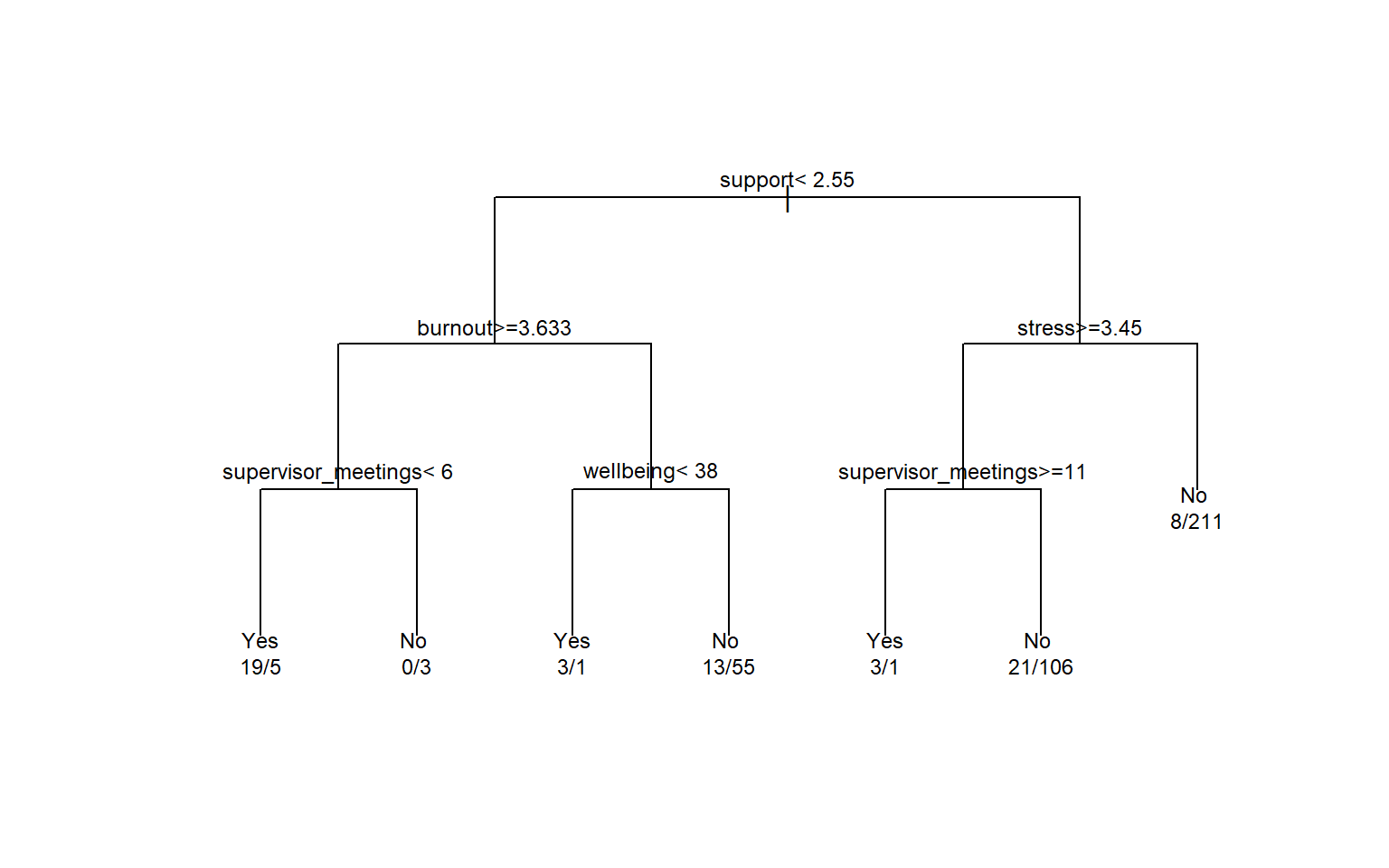
The first question is about support, the strongest single predictor. The numbers under each leaf are the training students in it (Yes/No). The tree is easy to read, but a single tree has a serious weakness: it is unstable. A slightly different sample of students can produce a completely different tree, and, as Chapter 11 showed, a deep tree overfits. The next method turns this weakness into a strength.
12.3 Random forests
A random forest grows hundreds of trees, each on a slightly different version of the data, and lets them vote. Two sources of randomness make the trees different. Each tree is grown on a bootstrap sample of the training data (Chapter 7), students drawn at random with replacement. And at each split, the tree may only choose from a random subset of the predictors; the size of this subset, mtry, is a hyperparameter.
Each individual tree overfits in its own way, but because the trees differ, many of their errors cancel out when the trees vote. The predicted probability of “Yes” is the share of trees that vote “Yes”. Averaging many models in this way is called an ensemble; a random forest is an ensemble of trees (Breiman 2001).
The ranger package fits random forests quickly. importance = "permutation" asks it to also measure how much each predictor matters:
forest_spec <- rand_forest(trees = 500) |>
  set_engine("ranger", importance = "permutation") |>
  set_mode("classification")

forest_wf <- workflow() |>
  add_recipe(tree_recipe) |>
  add_model(forest_spec)

set.seed(2026)
forest_fit <- fit(forest_wf, data = dropout_train)
A forest of 500 trees cannot be drawn, so it is a “black box”. Permutation importance opens it a little: for each predictor in turn, the values are shuffled randomly, and the drop in the model’s accuracy is recorded. Shuffling an important predictor hurts the predictions; shuffling an unimportant one does not. Figure 12.2 shows the result.
importance <- extract_fit_engine(forest_fit)$variable.importance

tibble(predictor = names(importance), importance = importance) |>
  ggplot(aes(x = importance, y = reorder(predictor, importance))) +
  geom_col(fill = "#2f6793") +
  labs(x = "Permutation importance (drop in accuracy)", y = NULL) +
  theme_minimal(base_size = 12)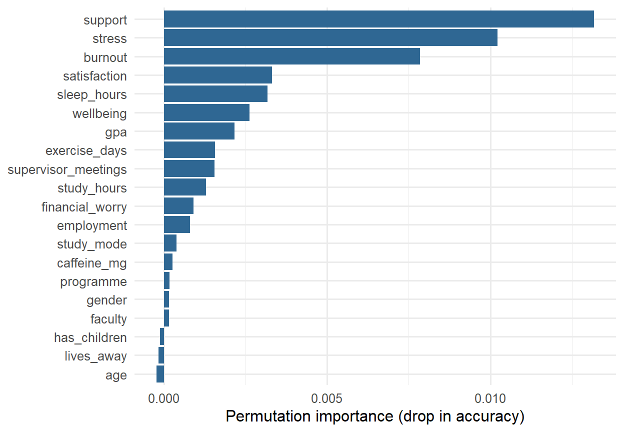
The forest relies most on support, stress, and burnout, and hardly at all on the students’ background, which agrees with the logistic regression of Chapter 8. Importance says which predictors the model uses, not what causes dropout; everything Chapter 8 said about confounding still applies.
12.4 k-nearest neighbours
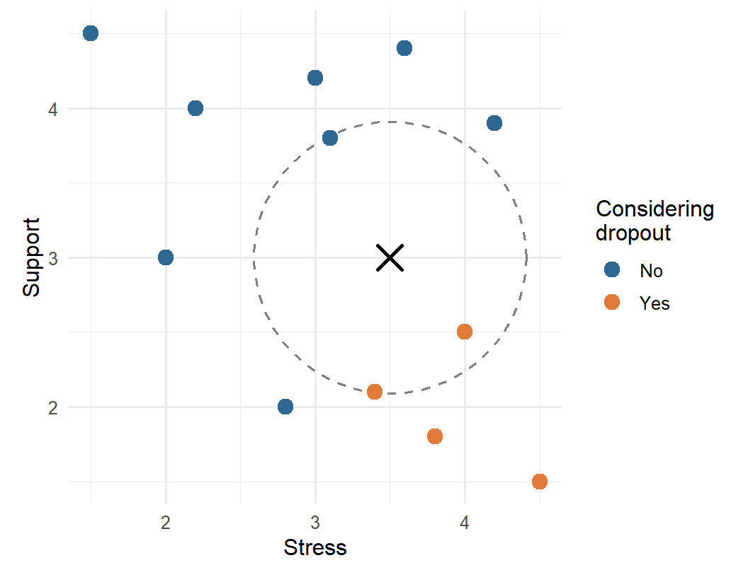
k-nearest neighbours (k-NN), met briefly in Chapter 11, classifies a new student by finding the \(k\) most similar students in the training data and letting them vote. “Similar” means close together when the predictors are drawn as a map. Suppose a new student in the tiny example has a stress score of 3.5 and a support score of 3.0. The distance to each training student is the straight-line distance on the stress-support map:
tiny |>
  mutate(distance = sqrt((stress - 3.5)^2 + (support - 3.0)^2)) |>
  arrange(distance) |>
  head(3)
# A tibble: 3 × 4
stress support dropout distance
<dbl> <dbl> <fct> <dbl>
1 4 2.5 Yes 0.707
2 3.1 3.8 No 0.894
3 3.4 2.1 Yes 0.906With \(k = 3\), two of the three nearest students considered dropping out, so the predicted probability of “Yes” is 2/3. Figure 12.3 shows the picture.
Because k-NN is based on distances, the predictors must be on the same scale. Otherwise a variable measured in large numbers, such as caffeine in milligrams, would dominate the distance, and a variable measured on a 1-5 scale would hardly count. That is why the recipe normalises every predictor.
The number of neighbours, \(k\), is a hyperparameter. With \(k = 1\), the model copies the nearest student and overfits badly (Chapter 11); with a large \(k\), it averages over many students and becomes smoother. Tuning shows which works best for the wellbeing data:
knn_wf <- workflow() |>
  add_recipe(dropout_recipe) |>
  add_model(nearest_neighbor(neighbors = tune()) |> set_mode("classification"))

set.seed(2026)
knn_tuning <- tune_grid(knn_wf, resamples = dropout_folds,
                        grid = tibble(neighbors = c(1, 5, 11, 21, 41, 81)),
                        metrics = metric_set(roc_auc))
collect_metrics(knn_tuning) |> select(neighbors, mean, std_err)
# A tibble: 6 × 3
neighbors mean std_err
<dbl> <dbl> <dbl>
1 1 0.525 0.0200
2 5 0.623 0.0222
3 11 0.673 0.0256
4 21 0.708 0.0266
5 41 0.734 0.0286
6 81 0.746 0.0303The AUC keeps rising up to the largest \(k\) tried. When the best value lies at the edge of the grid, the usual advice is to extend the grid, but here the result is informative in itself: the more neighbours k-NN averages over, the smoother its predictions become, and the better it does. The wellbeing data has a smooth pattern (risk rises steadily with stress and falls steadily with support), which a smooth model such as logistic regression captures directly. k-NN is at its best when the pattern is irregular and there is a lot of data.
12.5 Support vector machines
A support vector machine (SVM) separates the two classes with a boundary that is as far as possible from the students on either side. Imagine drawing a line between the “Yes” and “No” points on the stress-support map: of all the lines that separate them, the SVM picks the one with the widest empty “street” around it, the margin. Only the students closest to the boundary, the support vectors, determine where it goes. When the classes overlap, as they always do in real data, some students are allowed inside the margin or on the wrong side, at a cost set by a hyperparameter.
A straight boundary is a linear SVM. With a kernel, the SVM can draw curved boundaries: the popular radial basis function (RBF) kernel lets the boundary bend around groups of points. Both are available in tidymodels through the kernlab package:
svm_linear_spec <- svm_linear() |>
  set_engine("kernlab") |>
  set_mode("classification")

svm_rbf_spec <- svm_rbf() |>
  set_mode("classification")
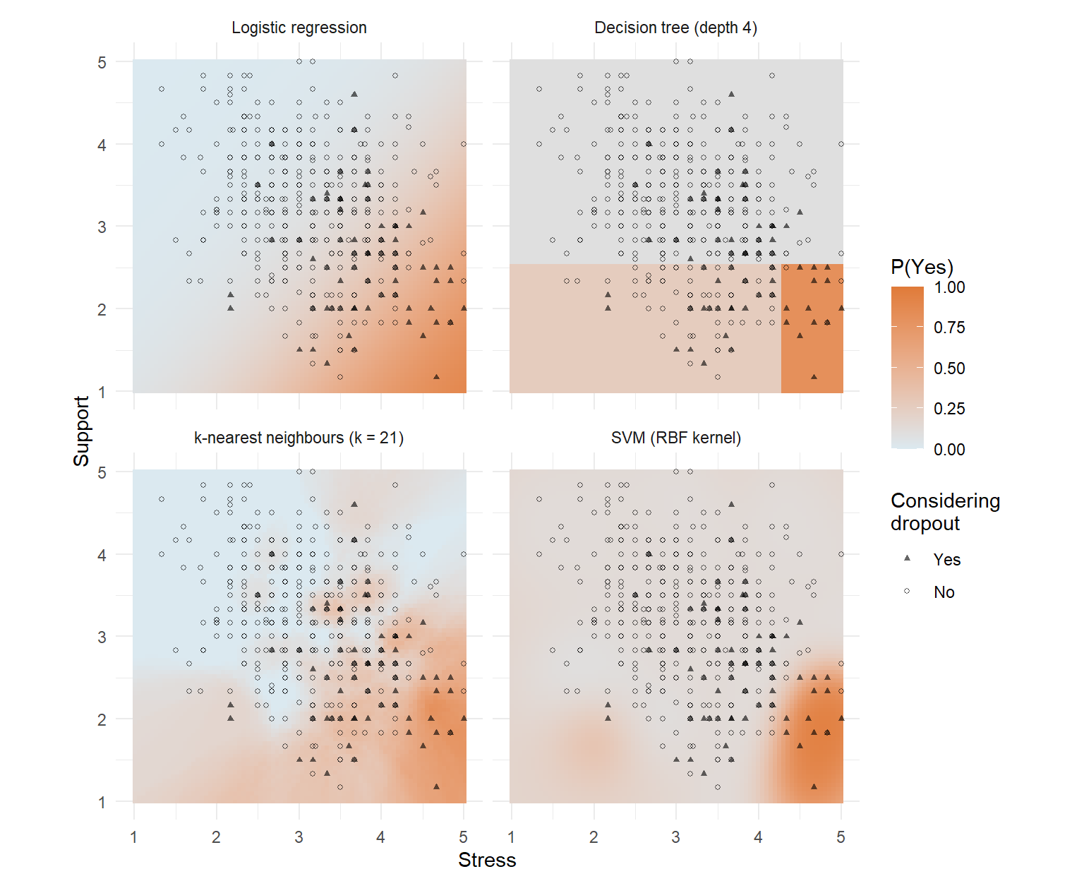
Like k-NN, SVMs are based on distances, so they need normalised predictors. Figure 12.4 shows how differently the four families draw their boundaries, using just stress and support so the result can be drawn as a map.
12.6 Comparing models fairly
The fair way to compare the models is cross-validation on the same folds, and the workflowsets package (part of tidymodels) does it for several models at once. workflow_set() combines each recipe with each model, and workflow_map() runs cross-validation for every combination:
dropout_models <- workflow_set(
  preproc = list(tree_data = tree_recipe),
  models  = list(
    tree   = decision_tree(tree_depth = 4, min_n = 10) |> set_mode("classification"),
    forest = rand_forest(trees = 500) |> set_engine("ranger") |> set_mode("classification")
  )
) |>
  bind_rows(workflow_set(
    preproc = list(normalised = dropout_recipe),
    models  = list(
      logistic   = logistic_reg(),
      knn        = nearest_neighbor(neighbors = 41) |> set_mode("classification"),
      svm_linear = svm_linear_spec,
      svm_rbf    = svm_rbf_spec
    )
  ))

dropout_comparison <- workflow_map(dropout_models, "fit_resamples",
                                   resamples = dropout_folds,
                                   metrics = metric_set(roc_auc), seed = 2026)

rank_results(dropout_comparison, rank_metric = "roc_auc") |>
  select(wflow_id, mean, std_err)
# A tibble: 6 × 3
wflow_id mean std_err
<chr> <dbl> <dbl>
1 normalised_logistic 0.804 0.0303
2 normalised_svm_linear 0.787 0.0313
3 tree_data_forest 0.781 0.0380
4 normalised_svm_rbf 0.762 0.0393
5 normalised_knn 0.734 0.0286
6 tree_data_tree 0.728 0.0250The trees and forest use the simple recipe, and the others the normalised one. bind_rows() joins the two sets of workflows into one.
The winner, with a cross-validated AUC of 0.80, is plain logistic regression. The linear SVM (0.79), which also draws a straight boundary, comes close, followed by the random forest (0.78). The standard errors, between 0.02 and 0.04, show that the smaller differences at the top could be due to chance, but none of the flexible models beats the simple one. This is not a failure of the methods: it says something about the data. The risk of considering dropout rises smoothly with stress and falls smoothly with support, with no sharp thresholds or complicated interactions for a tree or a forest to find. On data with such structure, and with larger samples, forests and SVMs often do win. The lesson is the one from Chapter 11: compare, and let the simpler model stand unless a complex one clearly does better.
Logistic regression is therefore kept. It predicts as well as any model here, and it can be explained to the counselling service in one sentence.
12.7 The confusion matrix
The AUC measures how well a model ranks students. But the counselling service needs a decision: contact this student or not. A model makes a decision by comparing each predicted probability with a threshold; by default, a student is classified “Yes” when the probability of “Yes” is above 0.5. The confusion matrix counts how those decisions turn out.
Take a tiny example first. A screening questionnaire is given to 100 students, 10 of whom are truly at risk. It flags 12 students, 8 of whom are among the 10 at risk:
| Truly at risk | Not at risk | Total | |
|---|---|---|---|
| Flagged | 8 (true positives) | 4 (false positives) | 12 |
| Not flagged | 2 (false negatives) | 86 (true negatives) | 88 |
| Total | 10 | 90 | 100 |
Every classification ends in one of four cells. A true positive is a student at risk who is flagged; a false negative is a student at risk who is missed; a false positive is a student flagged by mistake; a true negative is a student correctly left alone.
The key measures come from these four counts, and each answers a different practical question. Sensitivity, also called recall, is the share of students at risk who are flagged, here 8/10 = 80%: it measures how many of the students who need help are found. Specificity is the share of students not at risk who are left alone, 86/90 = 96%. Precision is the share of flagged students who are truly at risk, 8/12 = 67%: it measures how often a contact is justified. The F1 score balances precision and recall in a single number (their harmonic mean), here 0.73, and it is high only when both are high. Accuracy, the share classified correctly, is (8 + 86)/100 = 94%, but, as Chapter 11 showed, it is dominated by the large “No” group.
For the study’s logistic regression, conf_mat() produces the confusion matrix for the test students:
logistic_wf <- workflow() |>
  add_recipe(dropout_recipe) |>
  add_model(logistic_reg())
logistic_fit <- fit(logistic_wf, data = dropout_train)

test_results <- augment(logistic_fit, new_data = dropout_test)
test_results |> conf_mat(truth = considering_dropout, estimate = .pred_class)
Truth
Prediction Yes No
Yes 5 7
No 18 121The yardstick package calculates the measures. The function metric_set() bundles several, and because “Yes” is the first level of the outcome, they treat “Yes” as the event of interest:
class_metrics <- metric_set(accuracy, sensitivity, specificity, precision, f_meas)
test_results |> class_metrics(truth = considering_dropout, estimate = .pred_class)
# A tibble: 5 × 3
.metric .estimator .estimate
<chr> <chr> <dbl>
1 accuracy binary 0.834
2 sensitivity binary 0.217
3 specificity binary 0.945
4 precision binary 0.417
5 f_meas binary 0.286This is sobering. Of the 23 test students who considered dropping out, the model flags only 5: a sensitivity of 22%. The high accuracy and high specificity come almost entirely from correctly leaving alone the large majority who were never at risk. The AUC showed the model ranks students well, so the problem is not the model but the threshold: with only 15% of students at risk, few students ever get a predicted probability above 0.5.
12.8 Choosing the threshold
The threshold of 0.5 is a default, not a law. Lowering it flags more students: more of those at risk are found (higher recall), at the price of more false alarms (lower precision). Which balance is right depends on what the decision costs. Here, a flagged student is offered a conversation with a counsellor: cheap, and harmless if unnecessary. Missing a student who then leaves is costly. So a threshold well below 0.5 makes sense. If the decision were costly or stigmatising, a high threshold would be needed.
The threshold is a choice made while building the model, so it must be chosen without the test set. Cross-validation can provide predictions for every training student from a model that did not see them; save_pred = TRUE keeps them:
set.seed(2026)
logistic_cv <- fit_resamples(logistic_wf, resamples = dropout_folds,
                             control = control_resamples(save_pred = TRUE))
cv_predictions <- collect_predictions(logistic_cv)
The ROC curve shows every possible threshold at once. For each threshold, it plots the sensitivity against the false-positive rate (1 − specificity). A useless model follows the diagonal; a good one bends towards the top-left corner, and the AUC is the area under the curve:
roc_points <- cv_predictions |>
  roc_curve(truth = considering_dropout, .pred_Yes)

marked <- roc_points |>
  slice(sapply(c(0.5, 0.2), \(t) which.min(abs(.threshold - t))))

ggplot(roc_points, aes(x = 1 - specificity, y = sensitivity)) +
  geom_path(colour = "#2f6793", linewidth = 1) +
  geom_abline(linetype = "dashed", colour = "grey60") +
  geom_point(data = marked, size = 3, colour = "#e07b39") +
  geom_text(data = marked, aes(label = paste("threshold", round(.threshold, 1))),
            hjust = -0.15, vjust = 1.2) +
  coord_equal() +
  labs(x = "False positive rate (1 - specificity)", y = "Sensitivity (recall)") +
  theme_minimal(base_size = 12)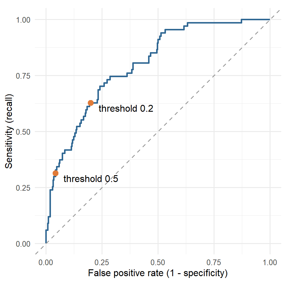
A table makes the trade-off concrete. For several thresholds, it shows the share of students flagged, and the resulting recall, precision, and specificity:
threshold_table <- map(c(0.5, 0.4, 0.3, 0.2, 0.15, 0.1), \(t) {
  cv_predictions |>
    mutate(flag = factor(if_else(.pred_Yes >= t, "Yes", "No"), levels = c("Yes", "No"))) |>
    summarise(
      threshold   = t,
      flagged     = mean(flag == "Yes"),
      recall      = sensitivity_vec(considering_dropout, flag),
      precision   = precision_vec(considering_dropout, flag),
      specificity = specificity_vec(considering_dropout, flag)
    )
}) |>
  list_rbind()

threshold_table
# A tibble: 6 × 5
threshold flagged recall precision specificity
<dbl> <dbl> <dbl> <dbl> <dbl>
1 0.5 0.0824 0.313 0.568 0.958
2 0.4 0.127 0.403 0.474 0.921
3 0.3 0.183 0.493 0.402 0.872
4 0.2 0.263 0.627 0.356 0.801
5 0.15 0.327 0.716 0.327 0.741
6 0.1 0.419 0.746 0.266 0.639The function map() runs the same calculation for each threshold, and list_rbind() stacks the results into one table. The _vec() versions of the yardstick functions take two vectors instead of a data frame.
12.8.1 Costs of the two errors
Moving the threshold trades one error for the other, so the choice depends on how much each error costs. The costs are not statistical quantities; they are judgements about consequences, and they should be made explicitly. Suppose the counselling service judges that missing a student who is at risk is ten times as costly as an unnecessary conversation. The total cost of each threshold can then be calculated from the cross-validated predictions:
cost_miss        <- 10   # a student at risk who is not contacted
cost_false_alarm <- 1    # an unnecessary conversation

cost_curve <- map(seq(0.02, 0.6, by = 0.02), \(t) {
  cv_predictions |>
    summarise(threshold    = t,
              misses       = sum(.pred_Yes < t & considering_dropout == "Yes"),
              false_alarms = sum(.pred_Yes >= t & considering_dropout == "No"),
              flagged      = mean(.pred_Yes >= t))
}) |>
  list_rbind() |>
  mutate(total_cost = cost_miss * misses + cost_false_alarm * false_alarms)

best_cost <- cost_curve |> slice_min(total_cost, n = 1, with_ties = FALSE)
best_cost
# A tibble: 1 × 5
threshold misses false_alarms flagged total_cost
<dbl> <int> <int> <dbl> <dbl>
1 0.04 5 195 0.572 245ggplot(cost_curve, aes(x = threshold, y = total_cost)) +
geom_line(linewidth = 1, colour = "#2f6793") +
geom_point(data = best_cost, size = 3, colour = "#e07b39") +
labs(x = "Threshold", y = "Total cost (arbitrary units)") +
theme_minimal(base_size = 12)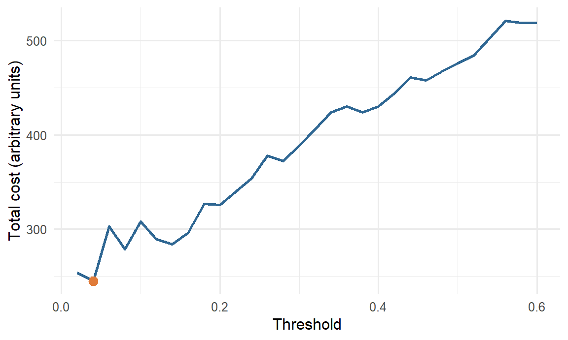
With these costs, the cheapest threshold is about 0.04, at which the model flags 57% of students. A simple rule from decision theory points in the same direction: when the predicted probabilities are accurate, the cost-minimising threshold is the cost of a false alarm divided by the sum of the two costs, here \(1 / (1 + 10) \approx 0.09\). The two do not match exactly. The rule assumes perfectly accurate probabilities, and the cost curve is estimated from only 67 students at risk, so its minimum is not precise: a threshold of 0.10, for example, costs 26% more. Both approaches agree on what matters for the decision: with these costs, the threshold belongs far below 0.5. Different costs give different thresholds. If a false alarm carried a real cost, such as a letter that stigmatised the student, the threshold would rise; if missing a student carried a greater one, it would fall further.
The costs, and therefore the threshold, are a research decision with an ethical side. They should be set with the people who will use the model, stated in the thesis, and, where the consequences are serious, examined for their effects on different groups of students.
Practical limits matter as well. The counselling service cannot talk to every student the cost analysis would flag, and after discussing the table with Elaf it settles on a threshold of 0.2: the model then flags about 26% of students, finds about 63% of those at risk, and about 36% of the students it flags are truly at risk. Only now is the chosen threshold applied to the test students:
test_results <- test_results |>
  mutate(flag = factor(if_else(.pred_Yes >= 0.2, "Yes", "No"), levels = c("Yes", "No")))

test_results |> conf_mat(truth = considering_dropout, estimate = flag)
Truth
Prediction Yes No
Yes 13 22
No 10 106test_results |> class_metrics(truth = considering_dropout, estimate = flag)# A tibble: 5 × 3
.metric .estimator .estimate
<chr> <chr> <dbl>
1 accuracy binary 0.788
2 sensitivity binary 0.565
3 specificity binary 0.828
4 precision binary 0.371
5 f_meas binary 0.448On new students, the model now finds 13 of the 23 at risk instead of 5, while flagging 35 students in all. About one flagged student in 3 is truly at risk. The test numbers are a little lower than the cross-validated ones, as expected with only 23 at-risk students in the test set. Accuracy has fallen, and it does not matter: accuracy was never the goal.
ImportantReport the threshold
Sensitivity, specificity, precision, and F1 all depend on the threshold, so a paper that reports them must say which threshold was used, and why. The AUC does not depend on the threshold, which is why it is the standard measure for comparing models, and the threshold-dependent measures are the ones for describing how a model will be used.
12.9 Imbalanced outcomes
When one outcome is rare, as considering dropout is, models tend to predict the common one. Besides moving the threshold, there are two other common remedies. Resampling changes the training data so that the classes are balanced: upsampling repeats rare-class students, downsampling drops common-class students, and SMOTE creates new, artificial rare-class students between existing ones. The themis package adds all three to a recipe. Class weights instead make mistakes on the rare class count more when the model is fitted, and some model engines support them directly.
Upsampling with themis looks like this; over_ratio = 1 repeats “Yes” students until there are as many as “No” students:
library(themis)

upsample_recipe <- dropout_recipe |>
  step_upsample(considering_dropout, over_ratio = 1)

upsample_wf <- workflow() |>
  add_recipe(upsample_recipe) |>
  add_model(logistic_reg())

set.seed(2026)
upsample_cv <- fit_resamples(upsample_wf, resamples = dropout_folds,
                             metrics = metric_set(roc_auc, sensitivity, precision))
collect_metrics(upsample_cv) |> select(.metric, mean)
# A tibble: 3 × 2
.metric mean
<chr> <dbl>
1 precision 0.314
2 roc_auc 0.789
3 sensitivity 0.671Resampling steps are applied only to the training data; when the model predicts for new students, the step is skipped automatically, so the test set keeps its real balance.
With the usual 0.5 threshold, the upsampled model has a sensitivity of about 67%, far higher than before. But its AUC, 0.79, has not improved. Upsampling did not make the model better at telling students apart; it pushed all the predicted probabilities upwards, which has much the same effect as lowering the threshold. That is often how it works out, and for a model that produces probabilities, choosing the threshold directly is simpler and keeps the probabilities meaningful (after upsampling, a “probability” of 0.6 no longer means a 60% chance). Resampling is most useful for models that do not produce good probabilities, and when the rare class is very rare.
WarningDoes the model work equally well for everyone?
Among the test students, the model with a threshold of 0.2 finds 7 of the 13 at-risk women and 6 of the 10 at-risk men, similar shares; but with only 23 at-risk students in the test set, any difference would be hard to detect. Before a model like this is used, its sensitivity and precision should be checked for each group that matters (gender, faculty, full- and part-time study) on as much data as possible, as Chapter 11 recommended. A threshold that works on average can still miss one group of students much more often than another.
12.10 Chapter review
12.10.1 Summary
- A decision tree classifies by a series of yes-or-no questions. Trees are easy to explain and need no normalisation, but a single tree is unstable and overfits easily.
- A random forest averages hundreds of trees grown on bootstrap samples with random subsets of predictors. Permutation importance shows which predictors it relies on.
- k-nearest neighbours classifies by the vote of the \(k\) most similar training cases; it needs normalised predictors, and \(k\) must be tuned.
- A support vector machine separates the classes with the widest possible margin; kernels allow curved boundaries.
- Compare models with cross-validation on the same folds (
workflow_set()). On the wellbeing data, with its smooth pattern, logistic regression predicts as well as any flexible model. - The confusion matrix counts true and false positives and negatives. Sensitivity (recall) is the share of positives found; precision is the share of flagged cases that are positive; F1 balances the two.
- The threshold turns probabilities into decisions. Choose it from the costs of the two errors and the practical limits of its use, using cross-validated predictions, and report it.
- For imbalanced outcomes, moving the threshold, resampling, and class weights all shift the balance between recall and precision; resampling rarely improves the AUC.
12.10.2 Key terms
Decision tree, node, leaf, Gini impurity, random forest, bootstrap sample, ensemble, mtry, permutation importance, k-nearest neighbours, distance, support vector machine, margin, support vector, kernel, radial basis function, workflow set, threshold, confusion matrix, true positive, false positive, true negative, false negative, sensitivity, recall, specificity, precision, F1 score, ROC curve, misclassification cost, upsampling, downsampling, SMOTE, class weights.
12.11 Exercises
The playground has these and more, with hints and solutions.
- Draw the decision tree for the wellbeing data with
tree_depth = 2. Name the predictors it uses, and explain the tree in plain words, as you would to a counsellor. - Tune the random forest’s
mtryoverc(2, 5, 10)with cross-validation, and compare the best value with the default. - Extend the k-NN grid to
neighbors = c(81, 161, 301), describe what happens to the AUC, and explain what happens to a k-NN model as \(k\) approaches the number of training students. - Using the tiny example’s confusion matrix (Table 12.1), calculate the F1 score yourself from precision and recall (\(F_1 = 2 \times \text{precision} \times \text{recall} / (\text{precision} + \text{recall})\)).
- Suppose the counselling service can only contact 10% of new students. Using
threshold_table, recommend a threshold and report the recall and precision it would give. - Replace
step_upsample()withstep_downsample(), and compare the sensitivity and AUC with upsampling. - Repeat the cost analysis with a cost of 3 for a missed student instead of 10. Report the new cheapest threshold, and compare it with the decision-theory rule.
12.12 Further reading
- Tidy Modeling with R (Kuhn and Silge 2022) covers workflow sets, model comparison, and class imbalance in depth.
- An Introduction to Statistical Learning (James et al. 2021) explains trees, random forests, and support vector machines, with clear illustrations of how each draws its boundaries.
- Breiman’s original paper on random forests (Breiman 2001) is still readable and explains why averaging many trees works.
References
Breiman, Leo. 2001. “Random Forests.” Machine Learning 45 (1): 5–32. https://doi.org/10.1023/A:1010933404324.
Horst, Allison M., Alison Presmanes Hill, and Kristen B. Gorman. 2022. “Palmer Archipelago Penguins Data in the Palmerpenguins R Package: An Alternative to Anderson’s Irises.” The R Journal 14 (1): 244–54. https://doi.org/10.32614/RJ-2022-020.
James, Gareth, Daniela Witten, Trevor Hastie, and Robert Tibshirani. 2021. An Introduction to Statistical Learning: With Applications in r. 2nd ed. Springer. https://doi.org/10.1007/978-1-0716-1418-1.
Kuhn, Max, and Julia Silge. 2022. Tidy Modeling with r: A Framework for Modeling in the Tidyverse. O’Reilly Media. https://www.tmwr.org.