flowchart TD
  A["<b>Topic</b><br/>Graduate student wellbeing"] --> B["<b>Problem</b><br/>Many graduate students report stress and exhaustion,<br/>and some leave their programmes"]
  B --> C["<b>Focus</b><br/>Can the university do something about it?"]
  C --> D["<b>Research question</b><br/>Does a six-week wellbeing workshop improve graduate students'<br/>wellbeing by the end of the following semester?"]
5 From Research Question to Data
Part 1 gave you the tools: you can import data, clean it, and draw it. Part 2 uses those tools to answer research questions. Before any statistics, though, comes a step that no software can do for you: deciding what exactly you are asking, what result would answer it, and whether your data can give that answer at all.
Most problems that examiners find in a thesis start here, not in the analysis: a question too vague to answer, a hypothesis that no result could contradict, a questionnaire that measures something other than what the title promises, or a sample that cannot support the conclusion. No statistical test can fix those problems afterwards. This chapter follows the path from a research topic to data that can answer a question, using the student wellbeing study as the example throughout. It is more conceptual than the other chapters, but it still uses R wherever R helps you see an idea: simulations, checks of how variables are measured, and a first calculation of sample size.
TipBy the end of this chapter you will be able to
- Explain what data analysis is for in research: describing, explaining, and predicting.
- Turn a research topic into a focused research question, and tell a good question from a weak one.
- Write a hypothesis that is testable and falsifiable, and state its null hypothesis.
- Explain how an abstract idea, such as stress, becomes a measured variable, and judge its level of measurement.
- Name the roles variables play: outcome, predictor, confounder, moderator, and mediator.
- Distinguish reliability from validity.
- Explain what experimental, observational, cross-sectional, and longitudinal designs can and cannot show.
- Explain why a biased sample cannot be fixed by making it larger.
- Plan an analysis before collecting data, including a first estimate of the sample size, and use R to check levels of measurement, balance between groups, and sampling by simulation.
5.1 What data analysis is for
In one sentence: data analysis tests claims against evidence.
Research makes claims about the world: graduate students sleep too little; a workshop improves wellbeing; supervisor support protects against dropout. A claim is only as strong as the evidence behind it, and data analysis is the part of research that confronts claims with evidence. It does three kinds of work. Describing establishes what the world looks like: how long graduate students sleep, or how many consider dropping out. Explaining asks why it looks like that: whether the workshop causes higher wellbeing, or which factors go together with a higher GPA. Predicting concerns what will happen in new cases, such as which of next year’s students are likely to consider leaving.
Each kind of work asks a different kind of question, is judged by a different standard, and leads to different methods, as Table 5.1 shows.
| Aim | Example question | Judged by | Methods | Chapters |
|---|---|---|---|---|
| Describe | How long do graduate students sleep? | Accuracy of the summary; who it applies to | Summaries, graphs, confidence intervals | 4, 6, 7 |
| Explain | Does the workshop improve wellbeing? | Whether rival explanations are ruled out | Tests, regression, mixed models | 7 to 10 |
| Predict | Who will consider dropping out? | Accuracy on new cases | Machine learning | 11 to 16 |
Keep the aim in mind, because the same numbers can serve different aims. A regression model can explain GPA (which predictors matter, and how much?) or predict it (how close are the predictions for new students?). The model may be identical; the question, and how the answer is judged, are not.
5.2 From a topic to a research question
In one sentence: a research question is a topic narrowed until data can answer it.
Nobody starts with a research question. They start with a topic, something that interests or worries them, such as “the wellbeing of graduate students”. A topic is too broad to study: it contains hundreds of possible questions. The work of the first months of a thesis is narrowing it:
The problem says why the topic matters: something is wrong, unknown, or disputed. The research question says precisely what the study will find out. A good research question is specific: it names who (graduate students at one university), what (wellbeing, measured with an index), and when (the end of semester 2). It is answerable with data, in the sense that the researcher can say what data would answer it and can collect that data. It is not already answered, because the literature leaves a gap or the setting is new. It is feasible within the time, money, skills, and access available. And it is worth answering: someone would act differently depending on the answer. Table 5.2 shows weak questions and how they can be improved.
| Weak question | Problem | Better question |
|---|---|---|
| Are students stressed? | Stressed compared with what? Which students? | Do part-time graduate students report higher stress than full-time students? |
| What affects students’ success? | Too broad; “success” is undefined | Is average sleep in a semester associated with semester GPA, allowing for study hours? |
| Is the workshop good? | “Good” cannot be measured | Does the workshop raise wellbeing scores at the end of the following semester? |
| Why do students drop out? | Needs students who left, and years of follow-up | Which baseline characteristics are associated with considering dropout in the first year? |
5.2.1 Three kinds of question
Research questions come in three kinds, and each kind needs a different design and analysis. Descriptive questions ask what is, such as how many hours graduate students sleep; they need a sample that represents the population well. Relational questions ask what goes with what, such as whether students who sleep more have higher GPAs; they need measurements of both variables, and they establish association, not cause. Causal questions ask what leads to what, such as whether the workshop improves wellbeing; they need a design that rules out other explanations, ideally an experiment.
The kind of question decides the kind of claim you can make. Much confusion in published research comes from asking a relational question and answering it in causal words (“sleep improves grades”). The section on study designs below returns to this.
5.3 From a question to a hypothesis
In one sentence: a hypothesis is a prediction precise enough to be wrong.
A research question asks; a hypothesis answers in advance. It is the researcher’s best prediction, based on theory and earlier studies, of what the data will show. The workshop question becomes:
Hypothesis: Students invited to the workshop will have higher wellbeing at the end of semester 2 than students not invited.
The hypothesis is useful because the data can disagree with it.
5.3.1 Falsifiability
The philosopher Karl Popper argued that what separates a scientific claim from other claims is not that it can be proved, but that it can be refuted: it forbids certain results (Popper 1959). A claim that is compatible with every possible result tells us nothing. Compare:
| Hypothesis | Could any result contradict it? |
|---|---|
| “The workshop affects students in some way.” | No. Whatever happens, some effect on someone can be found. Unfalsifiable. |
| “The workshop helps students who are ready for it.” | No, unless “ready” is defined before the study; otherwise any student who did not improve was “not ready”. Unfalsifiable. |
| “Invited students will have higher wellbeing at the end of semester 2 than students not invited.” | Yes: equal or lower wellbeing in the invited group would contradict it. Falsifiable. |
A good test of your own hypothesis is to write down, before seeing any data, what result would count against it. If you cannot, the hypothesis is not yet precise enough. If you can, you have also protected yourself against a common temptation: finding, after the fact, a reason why the disappointing result supports your idea after all.
A good hypothesis therefore has four properties. It is about a stated population and stated variables: graduate students at this university, and wellbeing measured with the index. It is testable with the data available, because the variables are measured and there are enough cases. It is falsifiable: it names the result that would contradict it. And it is stated before the data is analysed, since a hypothesis written after seeing the data is a description of the data, not a test of it.
5.3.2 Directional and non-directional hypotheses
A directional hypothesis predicts the direction of an effect (“invited students will have higher wellbeing”). A non-directional hypothesis predicts only that there is a difference (“wellbeing will differ between faculties”). Use a directional hypothesis when theory gives you a clear prediction; use a non-directional one when it does not. Note that the direction of the hypothesis and the choice of a one-tailed or two-tailed test are separate decisions: many researchers state a directional hypothesis but still use a two-tailed test, the cautious choice explained in Chapter 7.
5.3.3 The null hypothesis
Statistical tests do not test the researcher’s hypothesis directly. They test its opposite, the null hypothesis (\(H_0\)): the claim that nothing is going on, no difference and no relationship. The researcher’s hypothesis becomes the alternative hypothesis (\(H_1\)). For the workshop, \(H_1\) states that invited and not-invited students differ in average wellbeing at the end of semester 2, and \(H_0\) that they have the same average wellbeing.
Testing the opposite of what one believes may seem strange, but the null hypothesis has one great advantage: it is precise enough to calculate with. “The workshop helps” does not say how much, but “the workshop makes no difference” makes a sharp prediction: any difference between the groups is due to chance alone, to which students happened to be invited. If we know how large chance differences usually are, we can ask whether the difference in the data is larger than chance would easily produce.
You can see this world of chance by simulation. Suppose the workshop truly does nothing. Then being invited is just a label on students whose wellbeing is unaffected. The code below creates 300 imaginary students with wellbeing scores similar to those in the study (average 60, standard deviation about 11), splits them into two random groups of 150, and records the difference between the group averages. It then repeats this 5,000 times:
set.seed(2026)
chance_differences <- replicate(5000, {
  wellbeing <- rnorm(300, mean = 60, sd = 11)
  group     <- sample(rep(c("Invited", "Not invited"), 150))
  mean(wellbeing[group == "Invited"]) - mean(wellbeing[group == "Not invited"])
})
summary(chance_differences)
Min. 1st Qu. Median Mean 3rd Qu. Max.
-5.188460 -0.871667 0.001230 -0.008296 0.838404 4.688888 The function replicate() runs the code in curly brackets many times and collects the results, rnorm() draws random numbers from a normal distribution, and sample() shuffles the labels. Figure 5.2 shows the 5,000 differences:
library(ggplot2)
ggplot(data.frame(difference = chance_differences), aes(x = difference)) +
  geom_histogram(binwidth = 0.5, fill = "grey70", colour = "white") +
  geom_vline(xintercept = quantile(chance_differences, c(0.025, 0.975)),
             linetype = "dashed") +
  labs(x = "Difference in average wellbeing (invited minus not invited)",
       y = "Number of simulated studies")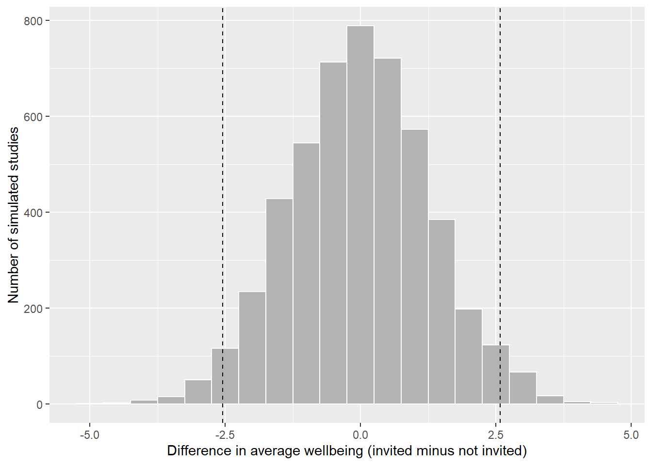
Even when the workshop does nothing, the two groups almost never have exactly the same average: chance alone produces differences, usually small ones. In 95% of the simulated studies, the difference lies between -2.5 and 2.6 points (the dashed lines). A real study that found a difference of 5 points would therefore be hard to explain by chance, and would count as evidence against \(H_0\). A difference of 1 point would not: it is exactly what chance produces. Chapter 7 turns this idea into the p-value, using the real data.
Two things follow from this picture. First, rejecting \(H_0\) is not proving \(H_1\): it says only that “nothing is going on” is a poor explanation of the data. Second, not rejecting \(H_0\) is not proving it: a small study can fail to detect a real effect, just as a blurred photograph can fail to show a real face.
5.3.4 Hypotheses for the whole study
Table 5.4 writes out the study’s research questions in this form. Some questions are confirmatory: they test a hypothesis stated in advance. Others are exploratory: they look for patterns without a prior prediction, and their results suggest hypotheses for future studies rather than confirming them. Both are legitimate, as long as they are labelled honestly.
| Research question | Hypothesis (\(H_1\)) | Null hypothesis (\(H_0\)) | What would count against \(H_1\) | Chapters |
|---|---|---|---|---|
| RQ1 What does graduate life look like? | Descriptive: no hypothesis | none | none | 4, 6 |
| RQ2 Do students sleep less than 7 hours? | Average sleep is below 7 hours | Average sleep is 7 hours | An average of 7 hours or more, or a confidence interval that includes 7 | 7 |
| RQ3 Does the workshop improve wellbeing? | Invited students have higher wellbeing in semester 2 | The groups have the same average wellbeing | A difference near zero or negative, with a narrow confidence interval | 7, 10 |
| RQ4 Do faculties and study modes differ? | Stress differs between faculties (non-directional) | All faculties have the same average stress | Similar averages in every faculty | 7, 8 |
| RQ5 What explains GPA? | More sleep goes with a higher GPA, allowing for study hours, stress, and support | The sleep coefficient is zero | A coefficient near zero or negative | 8 |
| RQ6 Do the questionnaire items measure what they should? | The 22 items form four scales: stress, burnout, support, satisfaction | none (checked by model fit, not a single test) | Items that do not group as intended | 9 |
| RQ7 Are there student profiles? | Exploratory: no hypothesis | none | none | 9, 14 |
| RQ8 How do wellbeing and GPA change? | Wellbeing declines over the two years | The average slope over semesters is zero | A slope near zero or positive | 10 |
| RQ9 Who considers dropping out? | Higher stress raises the odds of considering dropout | The odds ratio for stress is 1 | An odds ratio of 1 or below | 8, 12 |
| RQ10 Can final GPA be predicted? | Predictive: year-1 data predicts better than the average alone | none (judged on new cases) | Test-set error no better than predicting the average | 13 |
| RQ11 What challenges do students describe? | Exploratory: no hypothesis | none | none | 18 |
The later chapters return to this table: each restates its hypothesis before the analysis, and ends by saying whether the data contradicts the null hypothesis.
NoteThink before you analyse
From this chapter on, every main analysis in the book starts with the same four questions. Answer them in writing, before you run any code:
- What is the question, and is it descriptive, relational, or causal?
- What is the unit of analysis? Students, semesters, supervisors?
- Which variables, of what level of measurement, play which role?
- What result would support the hypothesis, and what would count against it?
5.4 Variables and measurement
In one sentence: a variable is a decision about how to turn an idea into a number.
5.4.1 Cases and the unit of analysis
As Chapter 2 showed, data is a table of cases (rows) and variables (columns). The first question about any dataset is what one row represents: the unit of analysis. The wellbeing study has three, in different tables:
nrow(students) # one row per student[1] 600nrow(semesters) # one row per student per semester[1] 2326nrow(supervisors) # one row per supervisor[1] 120The unit of analysis decides what a question means. “Do students who sleep more have higher GPAs?” is a question about students, so each student should count once, for example with their first-semester values or their average over the semesters. Treating the 2326 semester rows as 2326 independent cases would count each student up to four times, and make the evidence look stronger than it is. Chapter 10 shows how to use all the rows correctly.
5.4.2 From constructs to variables
Many things researchers care about cannot be observed directly: stress, wellbeing, motivation, intelligence, job satisfaction, quality of life. Such ideas are called constructs. To study a construct, you must decide how to measure it, a step called operationalisation. Every operationalisation is a choice, and a different choice could give a different answer.
Table 5.5 shows how the wellbeing study operationalises some of its constructs.
| Construct | Operationalisation | Variable(s) |
|---|---|---|
| Sleep | Self-reported average hours per night in the semester | sleep_hours |
| Stress | The average of six questionnaire items on a 1 to 5 scale | stress_1 to stress_6 |
| Wellbeing | A 0 to 100 wellbeing index, from a validated instrument | wellbeing |
| Academic performance | Semester GPA from university records | gpa |
| Thoughts of dropping out | “Have you seriously considered leaving your programme?” | considering_dropout |
Stress is a good example. No single question captures it, so the questionnaire asks six, each about one aspect, and averages the answers. Look at the items, and at how the answers of the first few students differ from item to item:
library(dplyr)
questionnaire |>
  select(student_id, stress_1:stress_6) |>
  head(5)
student_id stress_1 stress_2 stress_3 stress_4 stress_5 stress_6
1 S0001 3 2 4 4 3 5
2 S0002 4 3 NA 2 5 3
3 S0003 4 4 2 1 4 3
4 S0004 4 5 5 1 4 5
5 S0005 4 4 4 3 4 2One item, stress_4 (“I feel confident handling problems in my studies”), is worded in the opposite direction: agreeing with it means less stress. Before averaging, it must be reversed, so that 5 becomes 1 and 1 becomes 5. You did this in Chapter 3:
stress <- questionnaire |>
  mutate(stress_4 = 6 - stress_4,
         stress   = rowMeans(pick(stress_1:stress_6), na.rm = TRUE)) |>
  select(student_id, stress)
summary(stress$stress)
Min. 1st Qu. Median Mean 3rd Qu. Max.
1.333 2.667 3.167 3.216 3.667 5.000 The resulting score is the study’s operational definition of stress. Anyone who reads the thesis should be able to see exactly how it was built, which is why the methods chapter of a thesis describes every measure, and why the questionnaire items go in an appendix.
NoteSelf-report is a measurement choice
Sleep, study hours, and caffeine in the wellbeing study are self-reported: students estimate them. People tend to overestimate their sleep and underestimate their caffeine, and they may give the answers they think are expected. Records (such as GPA from the university) or devices (such as a sleep tracker) avoid some of these problems, but are more expensive or intrusive. Every measure has weaknesses; say what they are.
5.4.3 Levels of measurement
Not all numbers are numbers in the same sense. The psychologist S. S. Stevens proposed four levels of measurement, each allowing more than the one before (Stevens 1946):
| Level | What the values mean | Meaningful summaries | Examples in the study | In R |
|---|---|---|---|---|
| Nominal | Categories with no order | Counts, percentages, mode | faculty, gender, workshop |
factor |
| Ordinal | Ordered categories; distances between them unknown | Also median and percentiles | employment, financial_worry, single questionnaire items |
ordered factor, or numbers used with care |
| Interval | Equal distances; no true zero | Also mean, standard deviation, differences | wellbeing (0 to 100 index), scale scores (arguably) |
numeric |
| Ratio | Equal distances and a true zero | Also ratios (“twice as much”) | sleep_hours, study_hours, caffeine_mg, age |
numeric |
The level decides which summaries and tests make sense. The average faculty is meaningless. “Twice as much caffeine” is meaningful (caffeine has a true zero); “twice as much wellbeing” is not (a score of 0 does not mean no wellbeing at all).
R does not know the level of measurement; you have to tell it. Look at how R stores employment:
table(students$employment)
Full-time job          None Part-time job
           97           307           196
R lists the categories in alphabetical order, which puts “Full-time job” before “None”. For a nominal variable, that would not matter. But employment is ordinal: none, part-time, full-time is a real order, and tables and graphs should show it. Tell R with an ordered factor:
students <- students |>
  mutate(employment = factor(employment,
                             levels = c("None", "Part-time job", "Full-time job"),
                             ordered = TRUE))
table(students$employment)
         None Part-time job Full-time job
          307           196            97
Now tables and graphs follow the natural order, and comparisons such as employment > "None" work.
The opposite mistake is more common: an ordinal variable stored as numbers, such as financial_worry (1 = not at all worried, 5 = extremely worried). R will happily calculate its mean, but the distance from “not at all” to “a little” need not equal the distance from “very” to “extremely”. For a single ordinal item, report the distribution or the median:
table(students$financial_worry, useNA = "ifany")
   1    2    3    4    5 <NA>
84 139 172 111 56 38 median(students$financial_worry, na.rm = TRUE)[1] 3Scale scores, the average of several items, are usually treated as interval data, and the book does so. Averaging several items smooths out the unequal steps of each one. This is a convention with good support, not a law; if an examiner asks, say that you followed it, and why.
5.4.4 The roles variables play
In an analysis, variables also have roles. The outcome, or dependent variable, is what the researcher wants to explain or predict, such as wellbeing, GPA, or considering dropout. A predictor, also called an independent or explanatory variable, is what is used to explain or predict it, such as the workshop, sleep, or stress. Three further roles concern a third variable that affects the relationship between the two. A confounder is related to both the predictor and the outcome, and can create a misleading association between them. A moderator changes the strength or direction of a relationship, so that the effect of the predictor depends on it. A mediator lies on the path between predictor and outcome: it is how the predictor has its effect.
The roles are not properties of the variables; they come from the research question. Stress is an outcome in one question (whether the workshop reduces stress) and a predictor in another (whether stress predicts dropout).
Figure 5.3 draws the three less familiar roles as diagrams, using examples from the study: arrows show which variable is thought to influence which.
flowchart LR
  subgraph Confounder
    S1[Sleep] --> C1[Caffeine]
    S1 --> G1[GPA]
    C1 -. "apparent link" .- G1
  end
  subgraph Moderator
    SU[Support] --> G2[GPA]
    P[Programme:<br/>Master's or PhD] --> M((" "))
    M -.-> G2
  end
  subgraph Mediator
    W[Workshop] --> ST[Lower stress] --> WB[Wellbeing]
  end
The confounder is the most important of the three, because it can produce an association that is not a cause. In the wellbeing data, students who take more caffeine have lower GPAs. But students who take more caffeine also sleep less:
first_sem <- semesters |> filter(semester == 1)
first_sem |>
  select(caffeine_mg, sleep_hours, gpa) |>
  cor(use = "complete.obs") |>
  round(2)
caffeine_mg sleep_hours gpa
caffeine_mg 1.00 -0.64 -0.18
sleep_hours -0.64 1.00 0.25
gpa -0.18 0.25 1.00Caffeine and GPA are negatively correlated (-0.19), but caffeine and sleep are strongly negatively correlated (-0.64). Caffeine might be harming grades, or short-sleeping students might both drink more coffee and get lower grades; the correlation alone cannot tell which. Chapter 8 answers the question with a regression that compares students with the same amount of sleep. The general lesson is that before you interpret any relationship, you should ask what else could produce it, and measure it if you can.
5.5 Reliability and validity
In one sentence: a reliable measure gives consistent results; a valid measure measures the right thing.
Two properties decide whether a measure can be trusted. Reliability is consistency: a student should get a similar stress score if they filled in the questionnaire again next week, with nothing changed, and the six stress items should agree with each other. Validity is whether the measure captures what it claims to measure: the stress score should reflect stress, and not something else, such as general negativity or tiredness on the day of the survey.
The classic picture is a target. Each shot is a measurement, and the centre is the true value. The code below simulates four measures, each shooting 30 times, and draws them; it is intuition code, written to show an idea rather than to analyse data:
set.seed(1)
shots <- function(label, centre_x, centre_y, spread) {
  data.frame(measure = label,
             x = rnorm(30, centre_x, spread),
             y = rnorm(30, centre_y, spread))
}
target_data <- rbind(
  shots("Reliable and valid",         0,   0,   0.15),
  shots("Reliable but not valid",     0.9, 0.8, 0.15),
  shots("Valid on average, not reliable", 0, 0, 0.7),
  shots("Neither reliable nor valid", 0.8, -0.6, 0.7)
)
rings <- expand.grid(angle = seq(0, 2 * pi, length.out = 100), radius = 1:3 / 2)
rings$x <- rings$radius * cos(rings$angle)
rings$y <- rings$radius * sin(rings$angle)

ggplot(target_data, aes(x, y)) +
  geom_path(data = rings, aes(group = radius), colour = "grey70") +
  geom_point(colour = "#b2182b", alpha = 0.8) +
  annotate("point", x = 0, y = 0, shape = 3, size = 4) +
  facet_wrap(~ measure) +
  coord_equal(xlim = c(-1.7, 1.7), ylim = c(-1.7, 1.7)) +
  theme_void() +
  theme(strip.text = element_text(size = 11, margin = margin(b = 4)))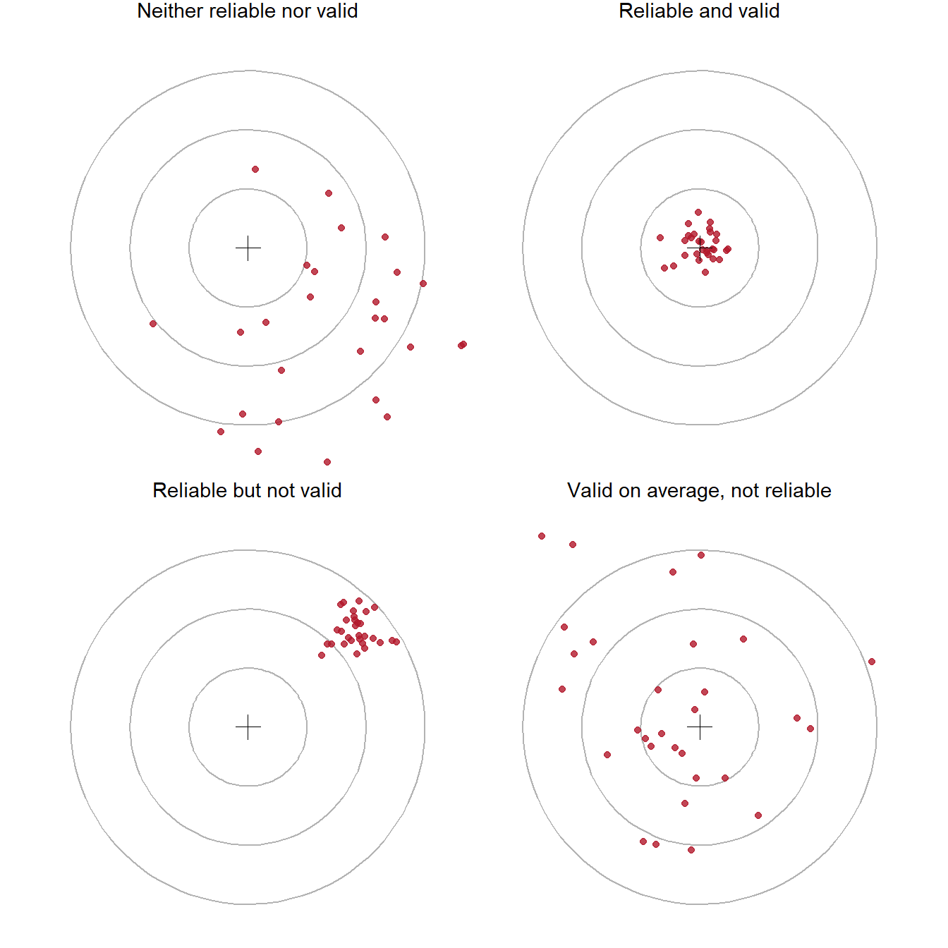
A measure that is reliable but not valid is precise about the wrong thing: a bathroom scale that always shows two kilograms too much. A measure that is unreliable cannot be very valid, because its random errors hide whatever it measures. Reliability is therefore necessary for validity, but not enough.
5.5.1 Kinds of reliability
Reliability can be assessed in three main ways. Internal consistency is the extent to which the items of a scale agree with each other; it is measured with Cronbach’s alpha (Chapter 9). Test-retest reliability is the extent to which the same person gets a similar score on two occasions when nothing has changed. Inter-rater reliability is the extent to which two people who code the same material agree; it is measured with Cohen’s kappa (Chapter 18, where a language model is one of the coders).
5.5.2 Kinds of validity
Validity has several meanings. For a measure, content validity concerns whether the items cover the whole construct: a stress scale about deadlines only would miss stress about money or family. Construct validity concerns whether the score behaves as the construct should. It should correlate with measures of related constructs (convergent validity) and correlate less with unrelated ones (discriminant validity) (Cronbach and Meehl 1955).
The second kind can be checked in the wellbeing data. If the stress score measures stress, it should correlate strongly with burnout (a closely related construct), less strongly and negatively with supervisor support and satisfaction:
scale_scores <- questionnaire |>
  mutate(
    stress_4     = 6 - stress_4,
    stress       = rowMeans(pick(stress_1:stress_6), na.rm = TRUE),
    burnout      = rowMeans(pick(burnout_1:burnout_6), na.rm = TRUE),
    support      = rowMeans(pick(support_1:support_6), na.rm = TRUE),
    satisfaction = rowMeans(pick(satisfaction_1:satisfaction_4), na.rm = TRUE)
  ) |>
  select(stress, burnout, support, satisfaction)
round(cor(scale_scores), 2)
stress burnout support satisfaction
stress 1.00 0.65 -0.33 -0.41
burnout 0.65 1.00 -0.24 -0.38
support -0.33 -0.24 1.00 0.41
satisfaction -0.41 -0.38 0.41 1.00Stress and burnout correlate at 0.65: related, as expected, but far from identical, so the two scales are not measuring the same thing twice. The negative correlations with support and satisfaction fit the idea that stressed students feel less supported and less satisfied. This is not proof of validity, which is built from many pieces of evidence, but it is the kind of evidence a thesis should report. Chapter 9 tests the structure of the whole questionnaire with factor analysis.
For a study as a whole, two further kinds of validity matter. Internal validity is the extent to which a study can rule out other explanations for its results; it is highest in randomised experiments. External validity is the extent to which the results apply beyond the study, to other people, places, and times; it depends on the sample. The next two sections are about these.
5.6 Study designs
In one sentence: the design, not the statistics, decides whether a study can show cause.
A study design is the plan for who is measured, on what, when, and under which conditions. Table 5.7 summarises the main designs.
| Design | What happens | Can it show cause? | In the wellbeing study |
|---|---|---|---|
| Randomised experiment | The researcher assigns the treatment by chance | Yes, for the treatment | The workshop invitation |
| Quasi-experiment | Groups receive different treatments, but not by chance | Only with care; other differences must be ruled out | Comparing students who chose to attend many sessions |
| Observational, cross-sectional | Variables measured once, at one time | No; association only | The baseline questionnaire |
| Observational, longitudinal | The same people measured repeatedly over time | Stronger evidence of order, but still association | The four semesters |
5.6.1 Why random assignment works
Suppose the workshop had been open to anyone who wanted to come. The students who came would probably have had more energy, more time, and less stress to start with. If the attenders later had higher wellbeing, the cause could be the workshop or who they already were, and the two explanations could not be separated. This is self-selection, a form of confounding.
A simulation makes the problem visible. Take the real stress scores of the 600 students, and imagine that less stressed students are more likely to volunteer. Then compare the baseline stress of volunteers and non-volunteers, and do the same for a random invitation:
set.seed(11)
stress_scores <- scale_scores$stress

# Volunteering: the chance of volunteering falls as stress rises
chance_to_volunteer <- plogis(-2 * (stress_scores - mean(stress_scores)))
volunteered <- runif(600) < chance_to_volunteer

# Random invitation: a coin toss for every student
invited <- sample(rep(c(TRUE, FALSE), 300))

data.frame(
  design       = c("Volunteers", "Random invitation"),
  stress_in    = c(mean(stress_scores[volunteered]), mean(stress_scores[invited])),
  stress_out   = c(mean(stress_scores[!volunteered]), mean(stress_scores[!invited]))
) |>
  mutate(difference = stress_in - stress_out) |>
  mutate(across(where(is.numeric), \(x) round(x, 2)))
design stress_in stress_out difference
1 Volunteers 2.83 3.63 -0.80
2 Random invitation 3.25 3.19 0.06In this code, plogis() turns any number into a probability between 0 and 1, and runif() draws a random number between 0 and 1 for each student; a student volunteers when their random number is below their probability. The volunteers start the study 0.8 points less stressed than the others, before any workshop. Any later difference in wellbeing would mix the workshop’s effect with this head start. With random invitation, the two groups start almost the same, because chance does not favour any kind of student.
Randomisation balances not only the variables you measured, but also the ones you did not: motivation, family support, health, and everything else. That is why a randomised experiment can support a causal claim. The real invitation in the wellbeing study, which was random, can be checked in the same way:
students |>
  left_join(stress, join_by(student_id)) |>
  group_by(workshop) |>
  summarise(students        = n(),
            average_age     = mean(age, na.rm = TRUE),
            percent_female  = 100 * mean(gender == "Female"),
            percent_phd     = 100 * mean(programme == "PhD"),
            financial_worry = mean(financial_worry, na.rm = TRUE),
            stress          = mean(stress, na.rm = TRUE)) |>
  mutate(across(where(is.double), \(x) round(x, 1)))
# A tibble: 2 × 7
workshop students average_age percent_female percent_phd financial_worry
<chr> <int> <dbl> <dbl> <dbl> <dbl>
1 Invited 300 29.6 50.3 28.7 2.8
2 Not invited 300 29.8 53.7 29.3 2.9
# ℹ 1 more variable: stress <dbl>The two groups look very similar at baseline. A balance table like this belongs in any thesis with an experiment: it shows the reader that the randomisation worked.
WarningRandomisation is about the treatment only
The random invitation allows causal claims about the workshop invitation, and nothing else. The study’s other questions, about sleep, stress, caffeine, and GPA, are observational: nobody assigned students their sleep. For those, the thesis can report associations, allow for the confounders that were measured, and discuss the ones that were not. Note, too, that what was randomised is the invitation, not attendance: many invited students attended only some sessions. Comparing students by the number of sessions they attended is a quasi-experiment again, because students chose how many sessions to attend.
5.6.2 Cross-sectional and longitudinal designs
A cross-sectional design measures everything at one time. It is quick and cheap, but it cannot show which came first: stress might reduce sleep, or short sleep might produce stress. A longitudinal design measures the same people repeatedly, so it can show change and the order of events. The four semesters make the wellbeing study longitudinal, which Chapter 10 uses to model how wellbeing changes. The price is attrition: some people leave the study, and those who leave are rarely a random selection, as the next section shows.
5.7 Samples and populations
In one sentence: a large sample reduces random error, but not bias.
The population is everyone the conclusions are meant to apply to: graduate students, perhaps at one university, perhaps everywhere. The sample is the people actually studied. Since the results come from the sample and the conclusions are about the population, the central question is always how well the sample represents the population.
5.7.1 Ways to draw a sample
In simple random sampling, every member of the population has the same chance of being chosen. It is the ideal, and rarely possible, because it needs a complete list of the population, called a sampling frame. In stratified sampling, the population is divided into groups (strata), such as faculties, and a random sample is drawn from each, to make sure every group is represented. In cluster sampling, whole groups are sampled, such as all the students of randomly chosen supervisors; it is cheaper, but students in the same cluster are alike, which the analysis must allow for (Chapter 10). Convenience sampling takes whoever is easy to reach, such as the people who answer an online survey shared on social media, or the students in the researcher’s own classes. It is very common in theses, and it is the weakest basis for generalising.
5.7.2 Random error and bias
A sample estimate can be wrong in two ways. Random error is the difference caused by which people happened to be selected: a different random sample would give a slightly different answer. Bias is a systematic difference: the sampling method tends to select certain kinds of people, so the estimate is off in one direction, every time.
The difference matters because they respond differently to sample size. A simulation shows it. Treat the study’s 600 students as a complete population, whose true average first-semester wellbeing is 60.5. Draw many samples in two ways: at random, and as a convenience sample where students with higher wellbeing are more likely to answer (a common pattern: people who are struggling are less likely to fill in surveys). Try samples of 50 and 200:
population <- first_sem$wellbeing
true_mean  <- mean(population)

# A student's chance of answering a voluntary survey rises with their wellbeing
chance_to_answer <- plogis((population - true_mean) / 10)

draw_samples <- function(n, method) {
  replicate(2000, {
    if (method == "Random") {
      chosen <- sample(length(population), n)
    } else {
      chosen <- sample(length(population), n, prob = chance_to_answer)
    }
    mean(population[chosen])
  })
}

set.seed(5)
sampling_results <- expand.grid(n = c(50, 200), method = c("Random", "Voluntary")) |>
  rowwise() |>
  mutate(estimate = list(draw_samples(n, method))) |>
  tidyr::unnest(estimate) |>
  mutate(sample_size = paste(n, "students"))

sampling_results |>
  group_by(method, sample_size) |>
  summarise(average_estimate = round(mean(estimate), 1),
            spread           = round(sd(estimate), 2),
            .groups = "drop")
# A tibble: 4 × 4
method sample_size average_estimate spread
<fct> <chr> <dbl> <dbl>
1 Random 200 students 60.4 0.73
2 Random 50 students 60.5 1.63
3 Voluntary 200 students 65.3 0.6
4 Voluntary 50 students 65.9 1.43In this simulation, sample() with prob chooses students with unequal chances, like a voluntary survey; rowwise() and unnest() run the simulation once for each combination of sample size and method and collect the results in one table. Figure 5.5 draws them:
ggplot(sampling_results, aes(x = estimate, fill = method)) +
  geom_histogram(binwidth = 0.4, alpha = 0.7, position = "identity") +
  geom_vline(xintercept = true_mean, linetype = "dashed") +
  facet_wrap(~ sample_size, ncol = 1) +
  scale_fill_manual(values = c(Random = "grey50", Voluntary = "#d6604d")) +
  labs(x = "Estimated average wellbeing", y = "Number of samples", fill = "Sample")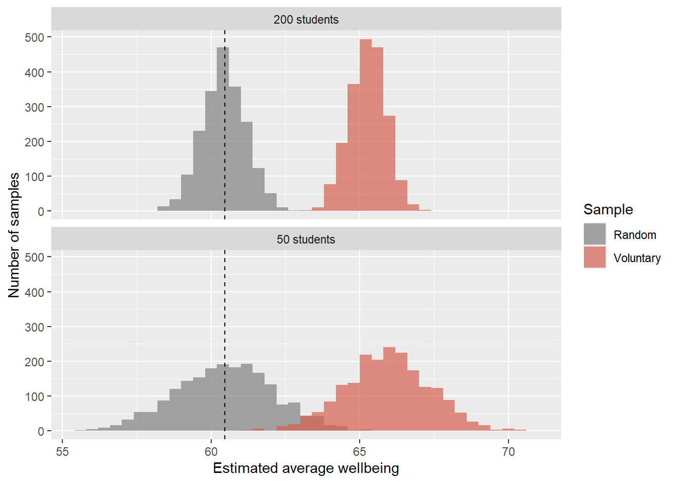
Random samples are centred on the true value; larger random samples are simply more precise. Voluntary samples miss the true value, and the larger voluntary sample misses it just as much, only more confidently. A biased sample cannot be fixed by making it bigger. The only remedies are a better sampling method, or knowing enough about the bias to correct for it.
5.7.3 Non-response and attrition
The same problem appears in the real data. Not every student answered the final open-ended question, and some left the study after the first year. The comparison below shows whether the students who remained are like those who did not:
leavers <- setdiff(students$student_id,
                   semesters$student_id[semesters$semester == 4])

students |>
  mutate(stayed = if_else(student_id %in% leavers, "Left after year 1", "Stayed")) |>
  group_by(stayed) |>
  summarise(students = n(),
            percent_considered_dropout = round(100 * mean(considering_dropout == "Yes")))
# A tibble: 2 × 3
stayed students percent_considered_dropout
<chr> <int> <dbl>
1 Left after year 1 37 59
2 Stayed 563 12Of the 37 students who left, 59% had considered dropping out, compared with 12% of those who stayed. Any analysis of semesters 3 and 4 is therefore based on a group that is less likely to be struggling than the students who started. Chapter 6 describes this missing data in detail, and Chapter 10 uses a model that makes the best use of the incomplete records.
5.7.4 Generalising from the sample
The wellbeing study’s sample is all graduate students at one university who agreed to take part. Its results apply most directly to that university, and to others like it, only by argument: similar students, similar programmes, similar pressures. A thesis should say this plainly in its limitations section. Claiming less than the data allows is rarely criticised; claiming more is.
5.8 Planning the analysis before the data
In one sentence: decide how you will judge your hypotheses before the data can influence you.
5.8.1 An analysis plan
For every hypothesis, the plan names the variables, the analysis, and what would count as support. Writing it before collecting data forces you to check that you will collect everything you need, in a form you can analyse:
| Hypothesis | Outcome | Predictor(s) | Analysis | Support if |
|---|---|---|---|---|
| Students sleep less than 7 hours | sleep_hours (semester 1) |
none | One-sample t-test against 7 | The 95% confidence interval lies below 7 |
| The workshop raises wellbeing | wellbeing (semester 2) |
workshop |
Two-sample t-test; mixed model over semesters | Invited students higher; interval excludes 0 |
| Stress raises the odds of considering dropout | considering_dropout |
stress score, with background variables | Logistic regression | Odds ratio above 1; interval excludes 1 |
5.8.2 Sample size
The simulation of the null world showed that chance differences are smaller with larger groups. So the size of the sample decides how small an effect a study can detect. The power of a study is the probability that it detects an effect of a given size, if the effect is real. A common target is 80%.
Power depends on three things: the sample size, the size of the effect, and the significance level. Effect sizes are often expressed as Cohen’s d: the difference between groups divided by the standard deviation (Chapter 7). Before her study, Elaf’s reading suggested that brief wellbeing programmes improve wellbeing by roughly 0.4 to 0.5 standard deviations. Base R’s power.t.test() calculates how many students each group needs to detect \(d = 0.45\) with 80% power:
power.t.test(delta = 0.45, sd = 1, sig.level = 0.05, power = 0.80)
     Two-sample t test power calculation

              n = 78.49181
          delta = 0.45
             sd = 1
      sig.level = 0.05
          power = 0.8
    alternative = two.sided

NOTE: n is number in *each* group
With sd = 1, delta is the effect in standard deviations, which is Cohen’s d. The answer, about 79 students per group, is well below the study’s 300 per group. Smaller effects need far larger samples:
effect_sizes <- c(small = 0.2, medium = 0.5, large = 0.8)
sapply(effect_sizes, \(d) ceiling(power.t.test(delta = d, power = 0.80)$n))
small medium large
394 64 26 Halving the effect size roughly quadruples the sample needed. If the effect you expect is small, and your sample is small, a non-significant result tells you very little: the study could not have detected the effect even if it were there. Plan the sample size before collecting data, and report the calculation in the methods chapter. Chapter 7 returns to power, with a simulation that shows what it means. The pwr package covers many more designs than power.t.test().
5.8.3 Preregistration and honest analysis
Every analysis involves many small decisions: which students to exclude, which variables to control for, how to handle outliers, which test to use. Made after seeing the data, each decision can be nudged, often unconsciously, towards the result the researcher hoped for. With enough such choices, “significant” findings appear from pure noise.
The protection is to decide in advance. Preregistration means writing the hypotheses and analysis plan down, with a date, before analysing the data, for example on the Open Science Framework (Nosek et al. 2018). Afterwards, analyses that follow the plan are reported as confirmatory, and anything else is reported honestly as exploratory. Preregistration does not forbid exploring; it only makes clear which results were predicted and which were found. Chapter 17 returns to this as part of reproducible research.
5.8.4 Ethics
Research with people requires ethical approval before any data is collected. The committee will ask the questions in this chapter, too: what the question is, why the data is needed, how participants are recruited and informed, and how their data is stored and anonymised. A clear research question and analysis plan make the application much easier, and they justify collecting only the data you need.
TipWriting it up
The methods chapter of a thesis reports the decisions of this chapter, usually under the headings Design, Participants, Measures, and Analysis. A short example for the wellbeing study, with the numbers filled in by R:
Design. A two-year longitudinal study with an embedded randomised experiment: at the end of semester 1, half the participants were randomly invited to a six-week wellbeing workshop.
Participants. 600 graduate students from 5 faculties took part, supervised by 120 supervisors; 37 (6%) left the study after the first year.
Measures. Stress, burnout, supervisor support, and academic satisfaction were measured at baseline with a 22-item questionnaire (1 = strongly disagree, 5 = strongly agree; items in Appendix A); scale scores are item averages, with one reverse-worded item reversed. Wellbeing (0 to 100), sleep, study hours, caffeine, and exercise were self-reported each semester; GPA was taken from university records.
Analysis. Hypotheses and the analysis plan were written before the data was analysed. With 300 students per group, the workshop comparison had 80% power to detect an effect of d = 0.23 at \(\alpha\) = .05.
The last sentence uses power.t.test() the other way round: given the sample size and the power, it finds the smallest effect the study could reliably detect.
5.9 Common misconceptions
- “A hypothesis is a question.” A hypothesis is a prediction: it says what the answer will be, precisely enough to be wrong.
- “Rejecting the null hypothesis proves my hypothesis.” It shows only that “nothing is going on” explains the data poorly. Other explanations, including confounders, remain possible unless the design rules them out.
- “A non-significant result proves there is no effect.” It may only mean the study was too small to detect it.
- “A big sample makes the results representative.” Size reduces random error, not bias. A large convenience sample is still a convenience sample.
- “If it is a number, I can average it.” The level of measurement decides which summaries are meaningful.
- “A reliable measure is a valid measure.” A measure can be consistent and still measure the wrong thing.
- “Correlation with a control variable proves cause.” Only randomisation balances the confounders you did not measure.
5.10 Chapter review
5.10.1 Summary
- Data analysis tests claims against evidence. It describes, explains, or predicts, and each aim is judged differently.
- A research question narrows a topic until data can answer it. Good questions are specific, answerable, feasible, and worth answering; they are descriptive, relational, or causal.
- A hypothesis is a prediction stated in advance. It must be falsifiable: it names the result that would count against it. Directional hypotheses predict a direction; non-directional ones predict a difference.
- Tests compare the data with the null hypothesis, the world where nothing is going on. Simulation shows the differences chance alone produces.
- Constructs are operationalised as variables. The unit of analysis says what a row is. Levels of measurement (nominal, ordinal, interval, ratio) decide which summaries make sense, and R must be told about ordered categories.
- Variables play roles: outcome, predictor, confounder, moderator, mediator. Confounders can create associations that are not causes.
- Reliability is consistency; validity is measuring the right thing. Internal validity is about ruling out other explanations; external validity is about who the results apply to.
- Only randomised experiments support causal claims directly, because randomisation balances measured and unmeasured variables. Observational designs show associations; longitudinal designs show change and order.
- A larger sample reduces random error but not bias. Non-response and attrition can bias a sample.
- Plan the analysis before the data: hypotheses, variables, analyses, and sample size (power). Preregistration separates confirmatory from exploratory results.
5.10.2 Key terms
Research question, descriptive question, relational question, causal question, hypothesis, falsifiability, directional hypothesis, non-directional hypothesis, null hypothesis, alternative hypothesis, confirmatory analysis, exploratory analysis, unit of analysis, construct, operationalisation, self-report, level of measurement, nominal, ordinal, interval, ratio, ordered factor, outcome, predictor, confounder, moderator, mediator, reliability, validity, internal consistency, test-retest reliability, inter-rater reliability, content validity, construct validity, internal validity, external validity, study design, randomised experiment, quasi-experiment, self-selection, cross-sectional design, longitudinal design, attrition, population, sample, sampling frame, simple random sampling, stratified sampling, cluster sampling, convenience sampling, random error, bias, power, preregistration.
5.11 Exercises
The playground has these and more, with hints and solutions.
- Improve these research questions so that data could answer them: (a) “Is exercise good for students?” (b) “What makes supervisors effective?” For each, say whether your version is descriptive, relational, or causal.
- Write a falsifiable hypothesis, its null hypothesis, and the result that would count against it, for the question: “Do students with children study fewer hours per week?”
- For each variable in
students, give its level of measurement. Then convertfinancial_worryinto an ordered factor with the labels “Not at all”, “A little”, “Moderately”, “Very”, and “Extremely”, and make a table of it. - Change the null-world simulation to groups of 30 students instead of 150. Between which values do 95% of the chance differences now lie? What does this mean for a small study of the workshop?
- Check the balance of the random workshop invitation on three other baseline variables:
study_mode,has_children, andlives_away. - Use
power.t.test()to find how many students per group a study needs to detect a difference of 0.3 standard deviations with 80% power, and with 90% power.
5.12 Further reading
- Introduction to Modern Statistics (Çetinkaya-Rundel and Hardin 2024), chapters 1 and 2, introduces variables, study designs, and sampling with many short examples.
- Experimental and Quasi-Experimental Designs for Generalized Causal Inference (Shadish et al. 2002) is the standard reference on designs and the kinds of validity.
- “The preregistration revolution” (Nosek et al. 2018) explains why and how to preregister, in a few pages.
- The Logic of Scientific Discovery (Popper 1959), for falsifiability in Popper’s own words.
References
Çetinkaya-Rundel, Mine, and Johanna Hardin. 2024. Introduction to Modern Statistics. 2nd ed. OpenIntro. https://openintro-ims.netlify.app.
Crampton, E. W. 1947. “The Growth of the Odontoblasts of the Incisor Tooth as a Criterion of the Vitamin c Intake of the Guinea Pig.” The Journal of Nutrition 33 (5): 491–504. https://doi.org/10.1093/jn/33.5.491.
Cronbach, Lee J., and Paul E. Meehl. 1955. “Construct Validity in Psychological Tests.” Psychological Bulletin 52 (4): 281–302. https://doi.org/10.1037/h0040957.
Nosek, Brian A., Charles R. Ebersole, Alexander C. DeHaven, and David T. Mellor. 2018. “The Preregistration Revolution.” Proceedings of the National Academy of Sciences 115 (11): 2600–2606. https://doi.org/10.1073/pnas.1708274114.
Popper, Karl R. 1959. The Logic of Scientific Discovery. Hutchinson.
Shadish, William R., Thomas D. Cook, and Donald T. Campbell. 2002. Experimental and Quasi-Experimental Designs for Generalized Causal Inference. Houghton Mifflin.
Stevens, S. S. 1946. “On the Theory of Scales of Measurement.” Science 103 (2684): 677–80. https://doi.org/10.1126/science.103.2684.677.