Much of the data that organisations keep is recorded over time: patients admitted each day, products sold each month, rainfall each week. Such a sequence of measurements taken at regular intervals is a time series, and it calls for a different way of thinking from the surveys of the previous chapters. The observations are not independent: this week’s value is related to last week’s, and the order of the observations carries information. The patterns are also of a particular kind. A series usually combines a slow trend, a seasonal pattern that repeats over a fixed period, and irregular noise, and understanding a series largely means separating these parts. Finally, the future of a series can never be known exactly, so a forecast is honestly a range of plausible values, not a single number.
This chapter develops these ideas and the methods built on them, using the fable family of packages. The example comes from outside the thesis. The doctors at the university counselling service have heard about Elaf’s wellbeing study and ask her to analyse their records: five years of weekly visit counts, with the service overwhelmed before exams and quiet in the summer, and staffing planned by guesswork. They want to know how many visits to expect next year, week by week. This is an internal analysis, done for the service rather than for publication, and a common situation for anyone who knows some data analysis: being asked to analyse someone else’s data.
TipBy the end of this chapter you will be able to
Explain dependence over time, the parts of a time series (trend, seasonality, and noise), and why forecasts are ranges.
Store a time series as a tsibble, and plot it.
Recognise trend, seasonality, and unusual observations, using time plots, seasonal plots, and autocorrelation.
Decompose a series into trend, seasonal, and remainder components with STL.
Produce benchmark forecasts, and forecasts from exponential smoothing (ETS) and ARIMA models, with fable.
Evaluate forecasts on a test period, and report forecasts with prediction intervals.
Most of this book’s methods assume that observations are independent: one student’s answers tell you nothing about another’s. In a time series the opposite is true. The number of visits this week is closely related to the number last week, and the order of the observations is essential. The methods of this chapter are built around that dependence.
16.1.1 A small example
Two weeks of daily visits to a small clinic, starting on a Monday, show how a time series is stored:
A tsibble (time series tibble) is a data frame that knows which column is time, its index. Here the index is the day number; the output header shows that the observations are one unit apart ([1]). tsibbles check that each time appears only once, and fable’s functions use the index to keep everything in order. There is a clear weekly pattern: busy at the start of the week, quiet at the weekend.
16.1.2 The parts of a pattern
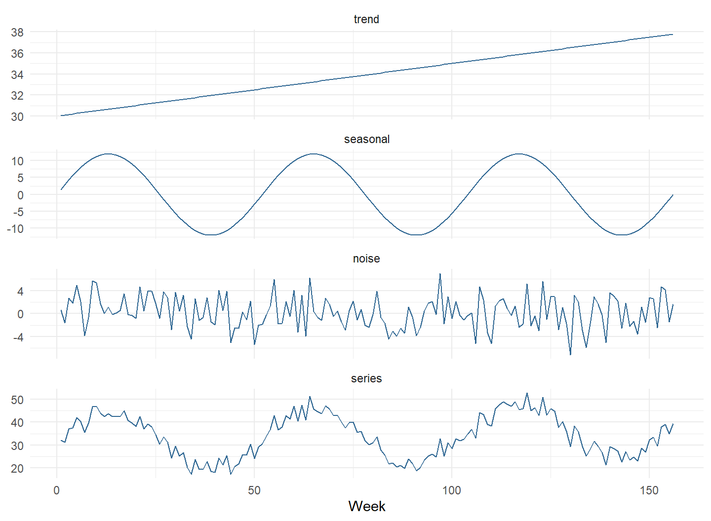
A time series is easiest to understand as a sum of parts. The code below builds an artificial weekly series for three years from three ingredients: a trend that rises slowly, a seasonal pattern that repeats every 52 weeks, and random noise. Figure 16.1 shows each part and their sum.
Figure 16.1: An artificial weekly series built from three parts: a rising trend, a seasonal pattern that repeats every 52 weeks, and random noise. The bottom panel is their sum.
In a real series, only the bottom panel is observed; the parts must be recovered from it. The trend says where the series is heading, the seasonal pattern says what happens at each point in the year, and the noise is what no pattern explains. Forecasting extends the trend and the seasonal pattern into the future. The noise cannot be forecast, and it is the main reason every forecast comes with a range. The decomposition later in this chapter recovers these parts from the counselling data.
16.2 The counselling service data
The counselling records are in counselling_visits: the date of the Monday of each week, and the number of visits that week.
The data covers five academic years, from September 2020 to August 2025, 260 weeks in all. The function yearweek() turns each date into a week, which becomes the index:
The header now reads [1W]: one week between observations. The first step with any time series is to plot it, and autoplot() from the fable family draws a time plot:
autoplot(visits, visits) +labs(x =NULL, y ="Visits per week") +theme_minimal(base_size =12)
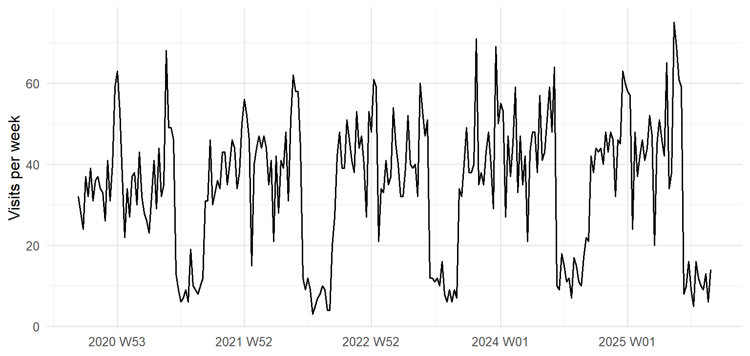
Figure 16.2: Weekly visits to the university counselling service, September 2020 to August 2025.
Figure 16.2 shows the parts of a pattern described above, and one feature the doctors did not mention. There is a seasonal pattern that repeats every academic year: peaks before and during the two exam periods, dips during the breaks, and very few visits in the summer, when the service is reduced. There is a gentle upward trend, each year a little busier than the last, and there is noise, week-to-week variation that follows no pattern. Finally, there is one unusual week, in the autumn of 2023, far busier than the weeks around it.
16.2.1 Seasonal patterns
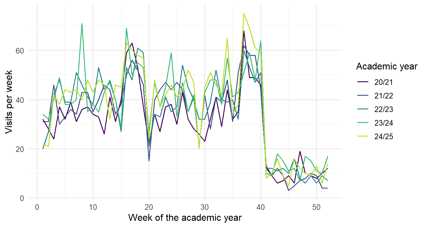
A seasonal plot puts the years on top of each other, so the seasonal pattern and the differences between years are easier to see. The academic year starts in September, so the weeks are numbered from the start of each academic year:
visits |>mutate(academic_year =paste0(20+ (row_number() -1) %/%52, "/", 21+ (row_number() -1) %/%52),week_of_year = (row_number() -1) %%52+1) |>ggplot(aes(x = week_of_year, y = visits, colour = academic_year)) +geom_line() +scale_colour_viridis_d(end =0.9) +labs(x ="Week of the academic year", y ="Visits per week", colour ="Academic year") +theme_minimal(base_size =12)
Figure 16.3: Seasonal plot: weekly visits by week of the academic year, one line per year.
Every year has the same shape, and later years lie slightly above earlier ones. The period of the seasonal pattern is 52 weeks.
16.2.2 Autocorrelation
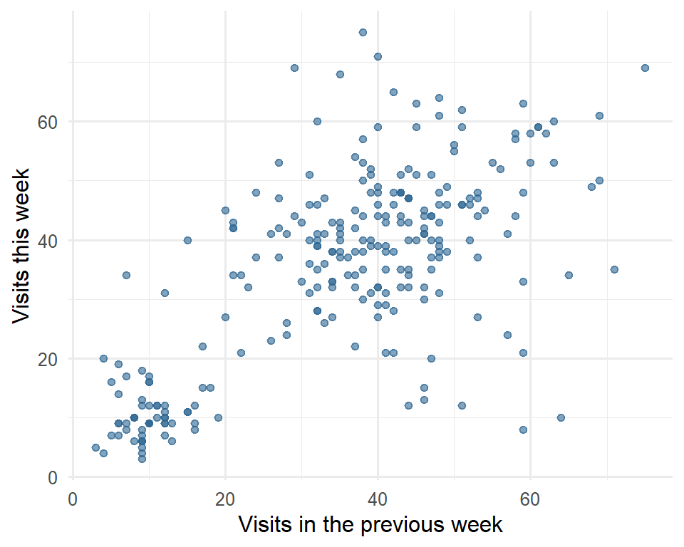
Dependence over time can be seen directly by plotting each week’s visits against the visits one week earlier, as in Figure 16.4.
visits |>mutate(last_week =lag(visits)) |>ggplot(aes(x = last_week, y = visits)) +geom_point(alpha =0.6, colour ="#2f6793") +labs(x ="Visits in the previous week", y ="Visits this week") +theme_minimal(base_size =12)
Figure 16.4: Weekly visits against the visits of the previous week. Busy weeks tend to follow busy weeks, and quiet weeks quiet weeks.
The points rise from left to right: knowing last week’s visits says a good deal about this week’s. The autocorrelation at lag \(k\) puts a number on this relationship: it is the correlation between the series and itself \(k\) steps earlier, between each week and the week before (lag 1), two weeks before (lag 2), and so on. The function ACF() calculates it:
# A tsibble: 4 x 2 [1W]
       lag    acf
  <cf_lag>  <dbl>
1       1W  0.690
2       2W  0.572
3      26W -0.244
4      52W  0.684
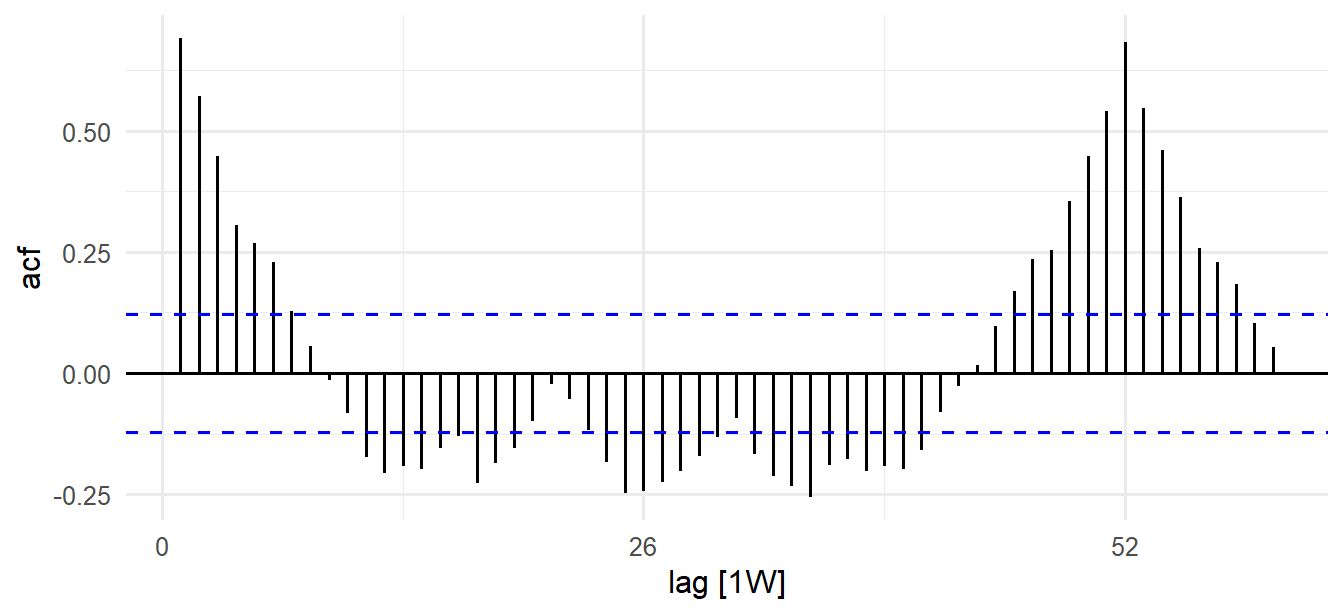
The autocorrelation is 0.69 at lag 1, as the scatter plot suggested, and 0.68 at lag 52: a week tends to be like the same week a year earlier. At lag 26 it is negative: half a year apart, a busy term week is often matched with a quiet summer week. Figure 16.5 shows all the lags. Strong autocorrelation at the seasonal lag is the signature of seasonality; if a series had no autocorrelation at all, there would be nothing to forecast beyond its average.
Figure 16.5: Autocorrelation of weekly visits for lags of 1 to 60 weeks. The dashed lines mark the range expected for a series with no autocorrelation.
16.3 Decomposition
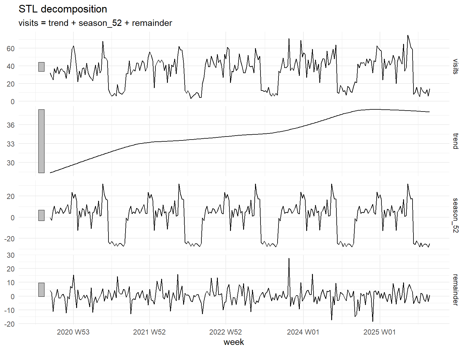
Decomposition recovers the parts of a pattern from an observed series: a smooth trend, a repeating seasonal component, and the remainder, what is left over, which corresponds to the noise of Figure 16.1. STL (seasonal and trend decomposition using loess) is a flexible, widely used method. season(period = 52) tells it the length of the seasonal pattern, and robust = TRUE stops unusual weeks from distorting the trend and season:
Figure 16.6: STL decomposition of weekly visits into trend, seasonal pattern, and remainder.
In Figure 16.6 the series is the sum of the three components below it, just as in the artificial example. The trend rises from about 28 to about 38 visits a week, levelling off in the last year; the seasonal component repeats the academic year; and the remainder is mostly small noise. The largest remainder is the unusual week:
visits_stl |>as_tibble() |>slice_max(abs(remainder), n =3) |>select(week, visits, trend, season_52, remainder)
In the week of 23 October 2023, there were 71 visits, about 28 more than trend and season would predict. When asked, the doctors remember at once: it was the university’s mental health awareness week, with posters everywhere encouraging students to seek help. The remainder is where such events show up. It is a real week, not an error, so it is kept, and the robust decomposition makes sure it does not distort the forecasts.
Notice also that the seasonal swings grow slightly as the trend rises: the peaks get higher and the summer lows stay low. When the seasonal pattern grows in proportion to the level of the series, it is usual to model the logarithm of the series, on which the swings become constant. fable handles this automatically: write log(visits) in the model, and the forecasts are transformed back to visits.
16.4 Forecasting
16.4.1 Simple benchmarks
Every forecasting method should be compared with simple benchmark methods, just as every predictive model in Chapters 11 to 13 was compared with a baseline. The three most common are the mean method, which forecasts the average of all past observations; the naive method, which forecasts the last observed value; and the seasonal naive method, which forecasts the value from the same season in the last cycle (the same day last week, or the same week last year). For the clinic example, with its weekly cycle of 7 days, they give:
The function model() fits several models at once, each named; forecast(h = 7) forecasts 7 steps ahead; and .mean holds the point forecasts. The mean method forecasts 8.2 visits every day; the naive method repeats the last value, a quiet Sunday, for the whole week; and the seasonal naive method repeats last week’s pattern, which for this series is clearly the most sensible.
16.4.2 Two families of models
Two families of models go beyond the benchmarks. Exponential smoothing (ETS) forecasts with weighted averages of past observations, with weights that decrease the further back the observations are, so that recent weeks count most. ETS models can track a changing level, a trend, and a seasonal pattern, each estimated from the data; the name stands for the three components it models, error, trend, and season. ARIMA models describe how each observation depends on earlier observations and on earlier random shocks, and use the autocorrelation of the series to forecast it.
The functions ETS() and ARIMA() in fable choose the details of each model automatically, by a criterion like the BIC of Chapter 14. Both work best with short seasonal periods, such as 4 quarters, 7 days, or 12 months. A 52-week season is long, so two strategies are common for weekly data. The first is to decompose first: remove the seasonal pattern with STL, forecast the seasonally adjusted series (trend and remainder) with ETS, and add the seasonal pattern back, all of which decomposition_model() does in one step. The second uses Fourier terms: the seasonal pattern is described with a few smooth waves (sines and cosines) of different lengths, used as predictors in an ARIMA model; fourier(period = 52, K = 6) uses six pairs of waves.
16.4.3 Training and test periods
As in machine learning, forecasts must be judged on data the model has not seen. For time series, the test data must come after the training data, because a forecast can only use the past. The models are trained on the first four academic years and tested on the fifth:
In the STL model, ETS(season_adjust ~ season("N")) forecasts the seasonally adjusted series with no seasonal component of its own (“N” for none), because the seasonal pattern is added back from the decomposition. In the Fourier model, PDQ(0, 0, 0) tells ARIMA not to model the season itself, because the Fourier terms do that.
Each model forecasts the 52 weeks of the test year, and accuracy() compares the forecasts with what actually happened, using the RMSE and MAE of Chapter 13:
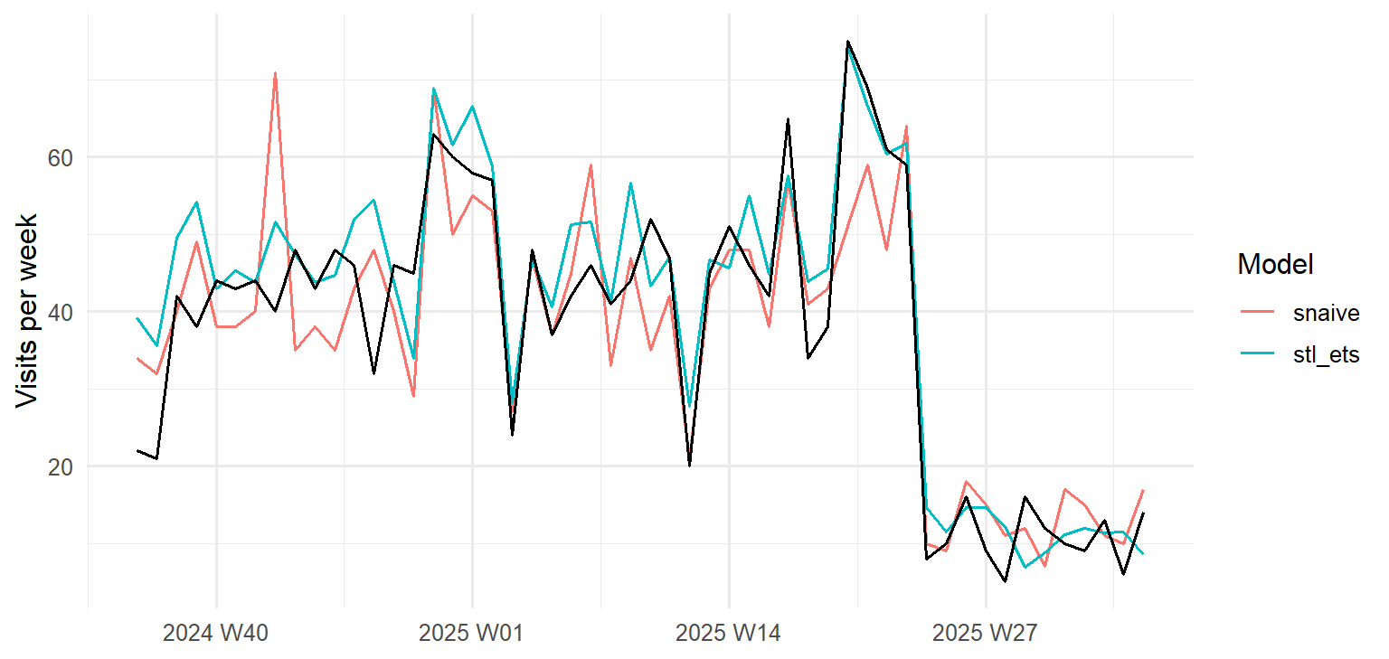
The STL and ETS model is best: its forecasts are off by 5.6 visits a week on average (MAE), against 7.0 for the seasonal naive benchmark, which simply repeats the previous year. The mean and naive methods, which ignore the seasonal pattern, are far worse. The Fourier model does worse than the seasonal naive benchmark: the counselling service’s pattern has sharp steps (the summer drop happens from one week to the next), and smooth waves struggle to follow them. Figure 16.7 compares the two best models with the actual visits.
visits_fc |>filter(.model %in%c("stl_ets", "snaive")) |>autoplot(visits_test, level =NULL) +labs(x =NULL, y ="Visits per week", colour ="Model") +theme_minimal(base_size =12)
Figure 16.7: Forecasts for the test year (September 2024 to August 2025) from the STL and ETS model and the seasonal naive benchmark, with the actual visits in black.
The seasonal naive forecast copies last year’s noise along with its pattern: it even repeats the awareness week of October 2023 as a spike in October 2024. The STL and ETS model smooths the noise away and adds the trend, so its forecasts are both smoother and closer.
16.4.4 Forecasting next year
With the model chosen, it is refitted on all five years, so the forecasts use the most recent information, and the next 52 weeks are forecast:
next_year |>autoplot(visits |>filter(week_start >=as.Date("2023-09-01"))) +labs(x =NULL, y ="Visits per week") +theme_minimal(base_size =12)
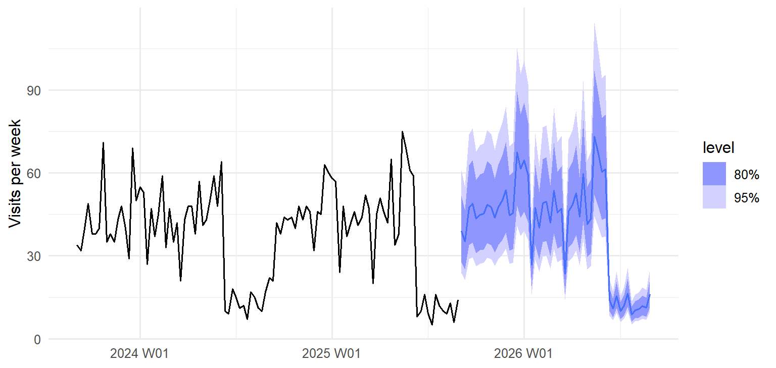
Figure 16.8: Forecast of weekly visits for the academic year 2025/26, with 80% and 95% prediction intervals, after the last two years of data.
A forecast is never a single number. The shaded bands in Figure 16.8 are prediction intervals: the ranges within which the actual visits are expected to fall with 80% and 95% probability. The function hilo() shows them as numbers:
In the first week of the new year, about 39 visits are expected, but anything from about 24 to 61 would not be surprising. The doctors also asked for the year as a whole. Adding up the weekly forecasts gives the expected total, but not its uncertainty, because weeks do not vary independently. The function generate() solves this by simulation: it produces 1,000 possible futures from the model, and the totals of those futures show the range of likely totals:
The report to the service therefore says: about 2,111 visits are expected in 2025/26 (95% interval 1,952 to 2,286), compared with 1,954 in 2024/25; the busiest weeks will again be just before and during the two exam periods, when they should plan the most staff; and an awareness campaign can raise demand sharply for a week, so extra capacity should be planned for any such event.
WarningForecasts assume the future resembles the past
Every forecast in this chapter assumes that the patterns of the last five years continue. A change the data cannot know about, such as a new online booking system, a change in the exam calendar, or a crisis like the COVID-19 pandemic, can make any forecast wrong. Report forecasts with their intervals, say what they assume, and update them as new data arrives. (You may also meet Prophet, a forecasting tool from Meta that was popular for business data; it is no longer actively developed, and fable’s models are a well-supported alternative.)
NoteIn your field: environmental science
R’s co2 dataset records the monthly concentration of carbon dioxide in the atmosphere, measured at the Mauna Loa observatory in Hawaii from 1959 to 1997: a famous series with a strong upward trend and a yearly cycle, as plants absorb CO2 in the northern summer. With a 12-month season, ETS and ARIMA can model the seasonal pattern directly. Training on the years to 1990 and testing on 1991 to 1997:
The function as_tsibble() converts R’s older time series objects, and h = "7 years" gives the forecast horizon in words. Both ETS and ARIMA forecast seven years ahead with an average error (MAE) of only 1.0 and 1.2 parts per million, while the seasonal naive method, which ignores the trend, falls further behind every year.
16.5 Common misconceptions
Time series have their own traps, most of them versions of forgetting that time has an order.
“A forecast is a prediction of the exact value.” A forecast is a range; the point forecast is only its centre, and the noise in a series makes exact prediction impossible.
“More history always gives better forecasts.” Only if the old patterns still hold; a change in circumstances can make older data misleading.
“The test data can be any random subset.” In a time series, the test period must come after the training period, since a forecast can only use the past.
“An unusual week should be removed.” It is part of the record; robust methods keep it from distorting the forecast, and it may be exactly what the service needs to plan for.
16.6 Chapter review
16.6.1 Summary
A time series is a sequence of observations over time, in which order matters and neighbouring observations are related. It can be understood as a sum of parts: trend, seasonal pattern, and noise. A tsibble stores it with a time index.
Time plots, seasonal plots, and the autocorrelation function reveal trend, seasonality, and unusual observations.
STL decomposes a series into trend, seasonal, and remainder components; unusual events show up in the remainder. A logarithm makes growing seasonal swings constant.
Compare every forecasting method with benchmarks: mean, naive, and seasonal naive.
ETS forecasts with weighted averages that favour recent observations; ARIMA uses the autocorrelation of the series. For long seasons such as 52 weeks, decompose first or use Fourier terms.
Evaluate forecasts on a test period that comes after the training period, and report forecasts with prediction intervals. Simulating futures with generate() gives intervals for totals.
The playground has these and more, with hints and solutions.
Predict which of the three benchmarks would be best for a series with a trend but no seasonality, then test your prediction on clinic after adding a steady increase of one visit a day.
Plot the seasonally adjusted series (season_adjust in visits_stl), and describe what it shows that the original series hides.
Refit the Fourier model with K = 2 and K = 12, and explain how and why the test accuracy changes.
Train the models on the first three years and test on the fourth, and check whether the STL and ETS model is still the best.
Use generate() to estimate how many visits to expect in the four weeks before the first exam period of 2025/26, with a 95% interval.
Write a short paragraph for the counselling service explaining what a 95% prediction interval means.
In the artificial series of Figure 16.1, double the standard deviation of the noise. Describe how the sum changes, and explain what this would mean for the width of forecast intervals.
16.8 Further reading
Forecasting: Principles and Practice(Hyndman and Athanasopoulos 2021), free online, is the standard introduction to forecasting, written around the fable packages used in this chapter.
References
Hyndman, Rob J., and George Athanasopoulos. 2021. Forecasting: Principles and Practice. 3rd ed. OTexts. https://otexts.com/fpp3/.