library(dplyr)
library(ggplot2)

scores <- questionnaire |>
  mutate(
    stress_4 = 6 - stress_4,
    stress   = rowMeans(pick(stress_1:stress_6), na.rm = TRUE),
    support  = rowMeans(pick(support_1:support_6), na.rm = TRUE)
  ) |>
  select(student_id, stress, support)

study <- students |>
  left_join(scores, join_by(student_id)) |>
left_join(semesters |> filter(semester == 1), join_by(student_id))8 ANOVA and Regression
Most research questions involve more than two groups or more than one explanation. A researcher may want to compare five faculties rather than two, to know which of several factors go together with better grades, or to find what makes a student more likely to consider leaving a programme. Each of these questions asks, in one way or another, how much of the variation in an outcome can be traced to other variables. Students differ in stress, grades, and wellbeing; the task is to find which part of those differences is connected with faculty, sleep, or support, and which part remains unexplained.
This chapter introduces the two families of methods built on that idea, which together are probably the most widely used tools in quantitative research. Analysis of variance (ANOVA) compares the averages of three or more groups by splitting variation into the part between groups and the part within them. Regression models how an outcome depends on one or more predictors: linear regression for numeric outcomes such as GPA, and logistic regression for yes-or-no outcomes such as considering dropout. In the study, they answer three research questions: whether stress differs between faculties and study modes (RQ4), what explains students’ grades (RQ5), and who considers dropping out (RQ9).
TipBy the end of this chapter you will be able to
- Explain how ANOVA partitions variation into between-group and within-group parts, and what the F statistic compares.
- Compare three or more groups with one-way ANOVA, and find which groups differ with post-hoc tests.
- Analyse two grouping factors and their interaction with two-way ANOVA.
- Explain regression as a model of the average outcome at each value of the predictors, and fit and interpret simple and multiple linear regression models, including categorical predictors.
- Use regression to separate a real effect from a confounder, and model curves and interactions.
- Recognise violated assumptions in diagnostic plots.
- Fit and interpret a logistic regression model in terms of odds ratios and probabilities.
- Report ANOVA and regression results in a thesis.
The chapter uses each student’s first-semester records, their background information, and their questionnaire scores, calculated as in Chapter 3:
8.1 One-way ANOVA
The first question is whether stress differs between the five faculties. One approach would be a t-test for every pair of faculties, but that is 10 tests. Chapter 7 showed that each test has a 5% chance of a false alarm, and that the risks accumulate: across 10 independent tests, the chance of at least one false alarm is about 40%. Analysis of variance (ANOVA) avoids the problem by asking one question first: whether the faculty averages differ at all.
8.1.1 Partitioning variation
ANOVA compares two kinds of variation. Stress scores for three small groups show the idea:
group_scores <- tibble(
  group  = rep(c("A", "B", "C"), each = 4),
  stress = c(2.5, 3.0, 2.8, 3.1,   3.4, 3.8, 3.5, 3.9,   2.9, 3.3, 3.0, 3.4)
)
group_scores |> summarise(mean = mean(stress), .by = group)
# A tibble: 3 × 2
group mean
<chr> <dbl>
1 A 2.85
2 B 3.65
3 C 3.15Figure 8.1 draws the twelve scores, the average of each group, and the overall average. The group averages differ from the overall average: that is variation between groups. The scores also differ from their own group’s average: that is variation within groups.
group_means <- group_scores |> summarise(mean = mean(stress), .by = group)

ggplot(group_scores, aes(x = group, y = stress)) +
  geom_hline(yintercept = mean(group_scores$stress), linetype = "dashed") +
  geom_point(size = 2.5, position = position_nudge(x = rep(c(-0.09, -0.03, 0.03, 0.09), 3))) +
  geom_errorbar(data = group_means, aes(y = mean, ymin = mean, ymax = mean), width = 0.4,
                linewidth = 1) +
  labs(x = "Group", y = "Stress score") +
  theme_minimal(base_size = 12)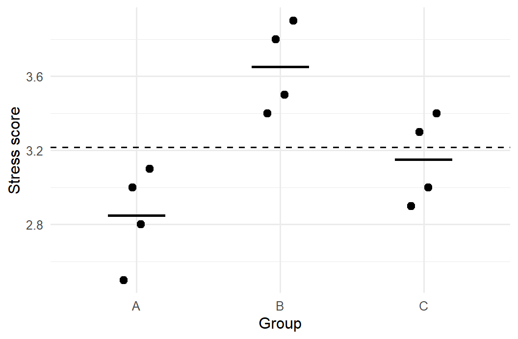
If the groups really come from populations with the same average, the between-group variation should be no larger than the within-group variation would lead one to expect: group averages always differ a little by chance. ANOVA’s F statistic is the ratio of the two:
\[ F = \frac{\text{variation between groups}}{\text{variation within groups}} \]
An F close to 1 means that the group averages differ no more than chance would produce; a large F means that they differ more. The function aov() fits the model, and summary() shows the test:
summary(aov(stress ~ group, data = group_scores)) Df Sum Sq Mean Sq F value Pr(>F)
group 2 1.307 0.6533 10.69 0.00419 **
Residuals 9 0.550 0.0611
---
Signif. codes: 0 '***' 0.001 '**' 0.01 '*' 0.05 '.' 0.1 ' ' 1The p-value is small: these three groups differ.
The ratio matters more than the size of the differences between averages. The next code keeps the three group averages exactly as they are, but places the scores either close to their averages or far from them, and calculates F each time:
offsets <- rep(c(-0.3, -0.1, 0.1, 0.3), 3)
group_avg <- rep(group_means$mean, each = 4)

tight <- group_scores |> mutate(stress = group_avg + 0.5 * offsets)
wide  <- group_scores |> mutate(stress = group_avg + 4 * offsets)

c(tight = summary(aov(stress ~ group, data = tight))[[1]][["F value"]][1],
  wide  = summary(aov(stress ~ group, data = wide))[[1]][["F value"]][1])
tight wide
39.2000 0.6125 The group averages are identical in both versions, yet F is large when the scores cluster tightly around their averages and small when they spread widely. Differences of about half a point between groups are convincing when students within a group hardly differ, and unremarkable when they differ by more than two points. This is the whole logic of ANOVA, and it is why group averages should never be compared without looking at the spread within groups (Chapter 4).
8.1.2 The student wellbeing data
The data comes first. Figure 8.2 shows stress in each faculty.
ggplot(study, aes(x = faculty, y = stress)) +
  geom_boxplot() +
  labs(x = NULL, y = "Stress score (1 to 5)") +
  theme_minimal(base_size = 12)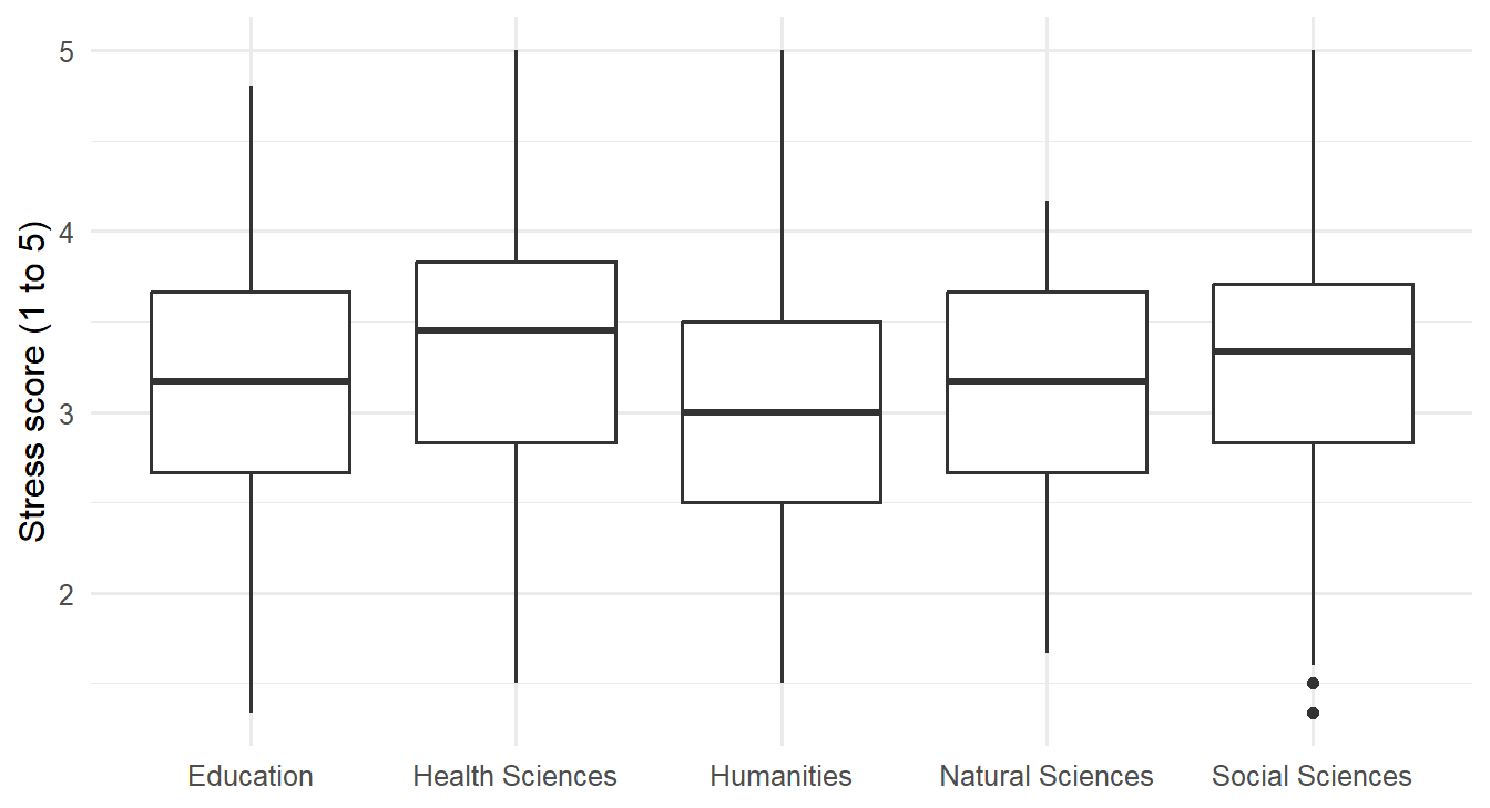
The faculties overlap a lot, but Health Sciences sits a little higher and Humanities a little lower. The ANOVA tests whether these differences exceed what chance would produce:
stress_anova <- aov(stress ~ faculty, data = study)
summary(stress_anova)
Df Sum Sq Mean Sq F value Pr(>F)
faculty 4 8.72 2.1788 4.152 0.00252 **
Residuals 595 312.19 0.5247
---
Signif. codes: 0 '***' 0.001 '**' 0.01 '*' 0.05 '.' 0.1 ' ' 1The p-value is 0.003, so the faculties do differ in stress. The size of the difference is measured by eta squared (\(\eta^2\)), the share of all the variation in stress that lies between faculties:
ss <- summary(stress_anova)[[1]][["Sum Sq"]]
ss[1] / sum(ss)
[1] 0.02715776Only about 3% of the differences in stress between students have to do with their faculty; the rest is about the individual students. By common guidelines, an \(\eta^2\) of 0.01 is small, 0.06 medium, and 0.14 large (Cohen 1988), so this is a real but small effect. For the research question, the answer is that faculty matters, but knowing a student’s faculty says very little about how stressed that student is.
8.1.3 Post-hoc tests
ANOVA says that the faculties differ, but not which ones. Post-hoc tests compare every pair while keeping the overall chance of a false alarm at 5%. Tukey’s test is the most common:
TukeyHSD(stress_anova) Tukey multiple comparisons of means
95% family-wise confidence level
Fit: aov(formula = stress ~ faculty, data = study)
$faculty
diff lwr upr p adj
Health Sciences-Education 0.19429917 -0.033842346 0.42244068 0.1367660
Humanities-Education -0.14304647 -0.403603347 0.11751041 0.5614602
Natural Sciences-Education -0.05877343 -0.326527149 0.20898029 0.9749738
Social Sciences-Education 0.12216527 -0.123607736 0.36793827 0.6535324
Humanities-Health Sciences -0.33734564 -0.595910542 -0.07878073 0.0035331
Natural Sciences-Health Sciences -0.25307260 -0.518888282 0.01274309 0.0707118
Social Sciences-Health Sciences -0.07213390 -0.315794100 0.17152630 0.9275445
Natural Sciences-Humanities 0.08427304 -0.209834619 0.37838070 0.9352210
Social Sciences-Humanities 0.26521174 -0.009035651 0.53945912 0.0635851
Social Sciences-Natural Sciences 0.18093870 -0.100155231 0.46203263 0.3973784Each row compares two faculties: the difference in average stress, its confidence interval, and an adjusted p-value (p adj). Only one comparison is significant: Health Sciences students are more stressed than Humanities students, by about 0.34 points on the 1-to-5 scale. The other differences are small enough to be chance.
8.1.4 Assumptions of ANOVA
ANOVA makes the same assumptions as the t-test: independent observations, roughly normal data within each group (or large groups), and similar spread in each group. The spread can be checked with Levene’s test, from the car package:
library(car)
leveneTest(stress ~ factor(faculty), data = study)
Levene's Test for Homogeneity of Variance (center = median)
Df F value Pr(>F)
group 4 0.9429 0.4386
595 The p-value is large, so there is no evidence that the spread differs between faculties. When the assumptions fail, the Kruskal-Wallis test is the non-parametric alternative, comparing ranks instead of averages:
kruskal.test(stress ~ faculty, data = study)
    Kruskal-Wallis rank sum test

data:  stress by faculty
Kruskal-Wallis chi-squared = 15.46, df = 4, p-value = 0.003836
It agrees with the ANOVA.
8.2 Two-way ANOVA
Wellbeing might depend on the programme (Master’s or PhD), on study mode (full-time or part-time), or on a combination of both. A two-way ANOVA examines all three possibilities at once. The main effect of programme is the difference between Master’s and PhD students on average, and the main effect of study mode is the difference between full-time and part-time students. The interaction asks whether the effect of study mode depends on the programme: part-time study might, for example, be harder on PhD students than on Master’s students.
An interaction plot shows the group averages as lines. If the lines are parallel, there is no interaction: the effect of study mode is the same in both programmes.
study |>
  summarise(wellbeing = mean(wellbeing), .by = c(programme, study_mode)) |>
  ggplot(aes(x = programme, y = wellbeing, colour = study_mode, group = study_mode)) +
  geom_line(linewidth = 1) +
  geom_point(size = 3) +
  scale_colour_viridis_d(end = 0.8) +
  labs(x = NULL, y = "Average wellbeing", colour = "Study mode") +
  theme_minimal(base_size = 13)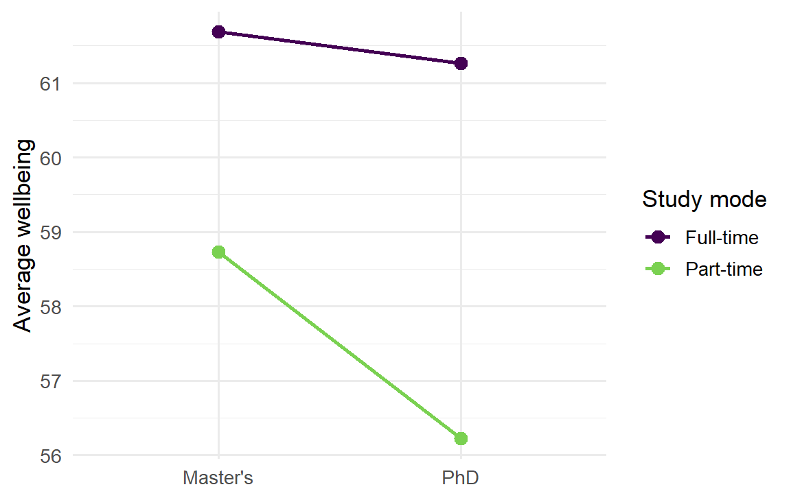
Part-time students have lower wellbeing in both programmes, and the lines are close to parallel. In the formula, programme * study_mode asks for both main effects and their interaction:
summary(aov(wellbeing ~ programme * study_mode, data = study)) Df Sum Sq Mean Sq F value Pr(>F)
programme 1 316 315.6 2.230 0.135913
study_mode 1 1640 1640.2 11.587 0.000709 ***
programme:study_mode 1 119 118.6 0.838 0.360341
Residuals 596 84364 141.6
---
Signif. codes: 0 '***' 0.001 '**' 0.01 '*' 0.05 '.' 0.1 ' ' 1Study mode has a clear effect. Programme does not, and neither does the interaction: part-time study lowers wellbeing by about the same amount whether a student is doing a Master’s or a PhD. When an interaction is significant, it should be interpreted before the main effects, because it means that no single “effect of study mode” describes everyone.
8.3 Linear regression
ANOVA compares groups. Regression goes further: it models how an outcome changes with one or more predictors, which can be numeric or categorical. It is the workhorse of quantitative research, and ANOVA is in fact a special case of it.
8.3.1 The regression line
At its heart, regression describes the average outcome for given values of the predictors. For sleep and GPA, the question is what the average GPA is among students who sleep 5 hours, among those who sleep 6 hours, and so on. These averages can be calculated directly, by grouping students into half-hour bands of sleep:
sleep_bands <- study |>
  filter(!is.na(sleep_hours)) |>
  mutate(sleep_band = round(sleep_hours * 2) / 2) |>
  summarise(mean_gpa = mean(gpa), students = n(), .by = sleep_band) |>
  arrange(sleep_band)
sleep_bands
sleep_band mean_gpa students
1 3.5 2.882000 5
2 4.0 2.901250 8
3 4.5 2.939231 13
4 5.0 3.022340 47
5 5.5 3.021385 65
6 6.0 3.054951 103
7 6.5 3.094519 104
8 7.0 3.120000 102
9 7.5 3.175957 94
10 8.0 3.320606 33
11 8.5 3.206429 14
12 9.0 3.720000 2
13 9.5 3.160000 1
14 10.0 3.146667 3Figure 8.4 places these averages over the individual students, together with a straight regression line.
ggplot(study, aes(x = sleep_hours, y = gpa)) +
  geom_point(alpha = 0.2, colour = "grey40") +
  geom_smooth(method = "lm", se = FALSE) +
  geom_point(data = sleep_bands, aes(x = sleep_band, y = mean_gpa, size = students),
             colour = "#b2182b") +
  labs(x = "Hours of sleep per night", y = "GPA", size = "Students") +
  theme_minimal(base_size = 12)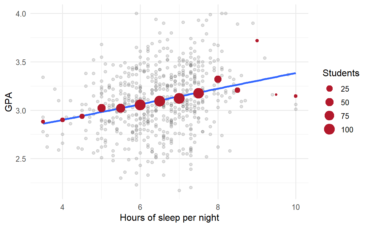
The band averages rise gently with sleep, and the line passes close to them, especially where there are many students. The regression line is a smooth summary of these conditional averages: it assumes that the average GPA changes by the same amount for each extra hour of sleep, and estimates that amount from all the students at once. The spread of the grey points around the line is what the model does not explain.
A small example shows the calculation. Here are five students’ sleep and GPA:
five <- tibble(
  sleep = c(5, 6, 6.5, 7, 8),
  gpa   = c(2.8, 3.0, 3.2, 3.1, 3.4)
)
Simple linear regression fits the straight line that best describes how GPA changes with sleep:
\[ \text{GPA} = b_0 + b_1 \times \text{sleep} + \text{error} \]
The coefficient \(b_0\) is the intercept, the predicted GPA for a student who sleeps zero hours, and \(b_1\) is the slope, the change in predicted GPA for each extra hour of sleep. “Best” means the line that makes the squared vertical distances between the points and the line, the residuals, as small as possible, a method called least squares. The function lm(), for linear model, finds it:
lm(gpa ~ sleep, data = five)
Call:
lm(formula = gpa ~ sleep, data = five)

Coefficients:
(Intercept)        sleep
      1.865        0.190
Each extra hour of sleep goes with a GPA that is about 0.19 higher. The intercept is where the line would cross zero hours of sleep, which no one does; it is needed to place the line, but it rarely means anything on its own.
8.3.2 The student wellbeing data
For all 600 students, summary() gives the full results:
gpa_simple <- lm(gpa ~ sleep_hours, data = study)
summary(gpa_simple)
Call:
lm(formula = gpa ~ sleep_hours, data = study)

Residuals:
     Min       1Q   Median       3Q      Max
-0.97283 -0.20475 -0.00188  0.21898  0.94606

Coefficients:
            Estimate Std. Error t value Pr(>|t|)
(Intercept)  2.57713    0.08316   30.99  < 2e-16 ***
sleep_hours  0.08081    0.01267    6.38 3.57e-10 ***
---
Signif. codes:  0 '***' 0.001 '**' 0.01 '*' 0.05 '.' 0.1 ' ' 1

Residual standard error: 0.3189 on 592 degrees of freedom
  (6 observations deleted due to missingness)
Multiple R-squared:  0.06433,   Adjusted R-squared:  0.06275
F-statistic:  40.7 on 1 and 592 DF,  p-value: 3.573e-10
The output contains three results that matter for the research question. The coefficients table gives the estimate of each coefficient, its standard error, a t statistic, and a p-value testing whether it is zero. The slope for sleep_hours is about 0.08: each extra hour of sleep goes with a GPA about 0.08 higher, and the p-value shows that this is not chance. R-squared is the share of the variation in GPA that the model explains; here it is only 0.06, so sleep explains about 6% of the differences in GPA. Sleep matters, but it is far from the whole story, as the scatter plot suggested. Finally, the residual standard error is the typical distance between a student’s actual GPA and the line, about 0.32 grade points.
8.3.3 Multiple regression
Many things affect grades at once. Multiple regression includes several predictors in one model:
gpa_model <- lm(gpa ~ sleep_hours + study_hours + stress + support, data = study)
summary(gpa_model)
Call:
lm(formula = gpa ~ sleep_hours + study_hours + stress + support,
    data = study)

Residuals:
     Min       1Q   Median       3Q      Max
-0.86953 -0.19437  0.00526  0.18957  0.76429

Coefficients:
             Estimate Std. Error t value Pr(>|t|)
(Intercept)  2.137403   0.145279  14.712  < 2e-16 ***
sleep_hours  0.106041   0.014163   7.487 2.62e-13 ***
study_hours  0.006928   0.001105   6.270 7.06e-10 ***
stress      -0.083526   0.017827  -4.685 3.48e-06 ***
support      0.110733   0.016696   6.632 7.57e-11 ***
---
Signif. codes:  0 '***' 0.001 '**' 0.01 '*' 0.05 '.' 0.1 ' ' 1

Residual standard error: 0.2857 on 582 degrees of freedom
  (13 observations deleted due to missingness)
Multiple R-squared:  0.2525,    Adjusted R-squared:  0.2473
F-statistic: 49.14 on 4 and 582 DF,  p-value: < 2.2e-16
Each coefficient now means the change in predicted GPA for a one-unit increase in that predictor, holding the other predictors constant. Among students with the same study hours, stress, and support, each extra hour of sleep goes with a GPA about 0.11 higher. Each extra hour of study per week adds about 0.007, each point of stress lowers GPA by about 0.08, and each point of supervisor support raises it by about 0.11. All four are significant.
Together, the four predictors explain about 25% of the variation in GPA. That may sound modest, but grades depend on many things no survey measures, from ability to luck on exam day. In social and educational research, models that explain a quarter of the variation are common and useful. The adjusted R-squared is slightly lower, because it corrects for the number of predictors: adding any predictor, even a useless one, raises R-squared a little, but only a useful one raises the adjusted version.
The output also contains the line (13 observations deleted due to missingness): lm() leaves out students with a missing value in any variable of the model. The number of students each model is based on should always be reported.
8.3.4 Categorical predictors
Categorical variables can be predictors too. Gender, for example, can be added to the model to see whether it matters once the other predictors are taken into account:
gpa_gender <- lm(gpa ~ sleep_hours + study_hours + stress + support + gender, data = study)
summary(gpa_gender)$coefficients
Estimate Std. Error t value Pr(>|t|)
(Intercept) 2.123737610 0.147260520 14.4216360 1.592391e-40
sleep_hours 0.106600187 0.014203710 7.5050947 2.318148e-13
study_hours 0.006995075 0.001111694 6.2922647 6.163042e-10
stress -0.082830266 0.017877519 -4.6332081 4.447816e-06
support 0.110525008 0.016709773 6.6143931 8.474218e-11
genderMale 0.013815196 0.023831664 0.5796992 5.623422e-01R turns a categorical predictor into a comparison with a reference category, by default the first in alphabetical order: here Female. The coefficient genderMale is the difference between men and women, holding everything else constant. It is tiny and far from significant: there is no evidence that gender affects GPA. That is a finding too, and worth reporting.
For a variable with more categories, such as faculty, R compares each category with the reference, giving one coefficient for each of the others. A different reference is chosen with relevel(factor(faculty), ref = "Humanities").
8.3.5 Separating an effect from a confounder
Chapters 5 and 6 found that students who take more caffeine have lower GPAs, but also sleep less. Two explanations are possible, and Figure 8.5 draws them. In the first, caffeine itself harms grades. In the second, sleep is a common cause: students who sleep less both drink more coffee and get lower grades, and caffeine has no effect of its own.
flowchart LR
  subgraph "Caffeine as a cause"
    C1[Caffeine] --> G1[GPA]
  end
  subgraph "Sleep as a confounder"
    S2[Sleep] --> C2[Caffeine]
    S2 --> G2[GPA]
    C2 -. "apparent link" .- G2
  end
Regression can tell the two apart, by comparing students who sleep the same amount. Caffeine alone comes first:
summary(lm(gpa ~ caffeine_mg, data = study))$coefficients Estimate Std. Error t value Pr(>|t|)
(Intercept) 3.1849088129 2.195535e-02 145.063026 0.000000e+00
caffeine_mg -0.0004331688 9.239351e-05 -4.688303 3.418851e-06Caffeine has a significant negative association with GPA. Sleep is then added to the model:
summary(lm(gpa ~ caffeine_mg + sleep_hours, data = study))$coefficients Estimate Std. Error t value Pr(>|t|)
(Intercept) 2.6380932284 0.1238298172 21.3041841 4.534485e-75
caffeine_mg -0.0000780726 0.0001194238 -0.6537443 5.135321e-01
sleep_hours 0.0738597698 0.0165663746 4.4584148 9.891313e-06Once sleep is held constant, caffeine’s coefficient shrinks to almost nothing and is no longer significant, while sleep stays significant. Among students who sleep the same amount, caffeine makes no difference to grades. Caffeine looked harmful only because heavy caffeine users sleep less: sleep was a confounder, and the data supports the second explanation.
The general rule is that a confounder is a common cause of the predictor and the outcome. Adjusting for it in a regression compares like with like, students who are the same on the confounder, and removes the misleading part of the association.
ImportantRegression adjusts only for what you include
Regression can remove the effect of a confounder only if you measured it and put it in the model. It cannot adjust for anything you did not measure. That is why, outside a randomised experiment like the workshop, regression shows associations adjusted for the variables in the model, not proof of cause.
8.3.6 Curved relationships
A straight line assumes that every extra hour of study adds the same amount to GPA, which is hard to believe: the difference between 5 and 15 hours a week is probably larger than the difference between 45 and 55. Adding a squared term lets the line curve:
gpa_curve <- lm(gpa ~ study_hours + I(study_hours^2), data = study)
summary(gpa_curve)$coefficients
Estimate Std. Error t value Pr(>|t|)
(Intercept) 2.8630064457 5.380474e-02 53.211044 3.718109e-227
study_hours 0.0183480169 3.914705e-03 4.686947 3.448155e-06
I(study_hours^2) -0.0002874497 6.488183e-05 -4.430358 1.121887e-05In the formula, I() tells R to calculate study_hours^2 before fitting. The squared term is negative and significant: the line bends downwards. Figure 8.6 shows the shape.
ggplot(study, aes(x = study_hours, y = gpa)) +
  geom_point(alpha = 0.3) +
  geom_smooth(method = "lm", formula = y ~ x + I(x^2)) +
  labs(x = "Study hours per week", y = "GPA") +
  theme_minimal(base_size = 13)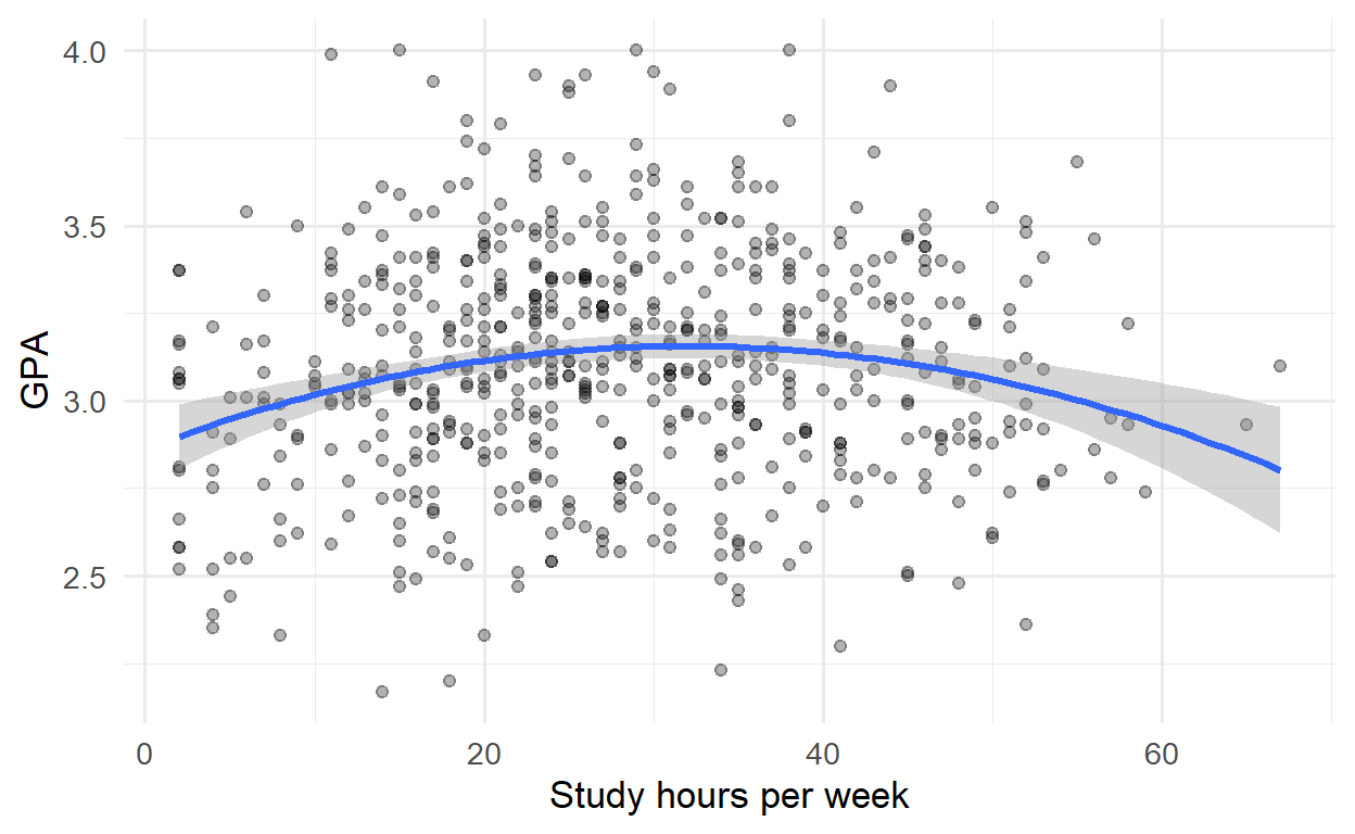
The first hours of study make a real difference; the curve then flattens, and reaches its highest point at about 32 hours a week, beyond which more study brings nothing extra. Economists call this diminishing returns, and it is worth knowing for any student tempted to study all night instead of sleeping.
8.3.7 Interactions
The effect of supervisor support need not be the same for every student. An interaction term lets the effect of one predictor depend on another. In the formula, support * programme gives the effect of support, the effect of programme, and how the effect of support differs between programmes. To make the coefficients easier to read, support is first centred: the average is subtracted, so that zero means “average support”:
study <- study |> mutate(support_c = support - mean(support))
gpa_interaction <- lm(gpa ~ support_c * programme + sleep_hours + study_hours, data = study)
summary(gpa_interaction)$coefficients
Estimate Std. Error t value Pr(>|t|)
(Intercept) 2.15459277 0.112180214 19.2065312 5.044803e-64
support_c 0.10210747 0.018389506 5.5524856 4.288901e-08
programmePhD 0.01173221 0.026136331 0.4488851 6.536819e-01
sleep_hours 0.11771209 0.014038094 8.3851901 3.842792e-16
study_hours 0.00656252 0.001109605 5.9142870 5.691946e-09
support_c:programmePhD 0.13416356 0.035844599 3.7429227 1.999717e-04For Master’s students (the reference category), each point of support goes with a GPA about 0.10 higher. The interaction coefficient, support_c:programmePhD, says that for PhD students the effect is larger, by about 0.13, making it about 0.24. Supervisor support matters about 2.3 times as much for PhD students, which makes sense: a PhD depends more heavily on the supervisor.
8.3.8 Model diagnostics
Linear regression assumes that the relationship is linear (or modelled as curved, as above), that the residuals have similar spread everywhere, and that they are roughly normal. Violations show up as patterns in a plot of the residuals against the fitted values. It helps to know what those patterns look like before judging a real model, and simulated data can show them. The code below creates three datasets: one that meets the assumptions, one with a curved relationship fitted by a straight line, and one whose spread grows with the predictor. It fits a straight line to each and plots the residuals:
set.seed(10)
x <- runif(200, 0, 10)
simulated <- list(
  "Assumptions met"  = 2 + 0.5 * x + rnorm(200),
  "Curved"           = 2 + 0.25 * x^2 + rnorm(200),
  "Spread increases" = 2 + 0.5 * x + rnorm(200, sd = 0.2 + 0.3 * x)
)

residual_data <- bind_rows(lapply(names(simulated), function(name) {
  fit <- lm(simulated[[name]] ~ x)
  tibble(case = name, fitted = fitted(fit), residual = resid(fit))
}))
residual_data$case <- factor(residual_data$case, levels = names(simulated))

ggplot(residual_data, aes(x = fitted, y = residual)) +
  geom_hline(yintercept = 0, linetype = "dashed") +
  geom_point(alpha = 0.5, size = 1) +
  facet_wrap(~ case, scales = "free") +
  labs(x = "Fitted values", y = "Residuals") +
  theme_minimal(base_size = 11)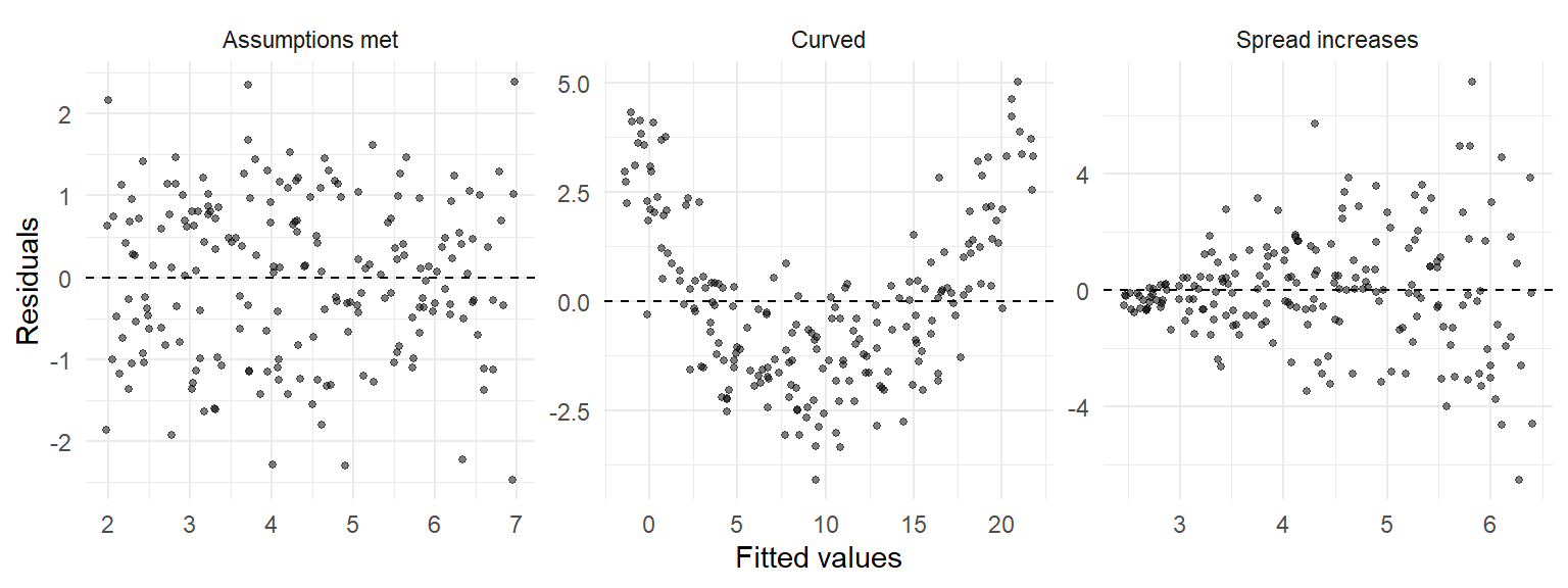
A U-shaped or curved pattern means that the model has missed a curve, and a squared term or a transformation may be needed. A funnel means that the spread is not constant, which makes standard errors, and therefore p-values and confidence intervals, unreliable. With these pictures in mind, the real model can be checked. Calling plot() on a model draws four diagnostic plots, of which the first two matter most:
par(mfrow = c(1, 2))
plot(gpa_model, which = 1:2)
par(mfrow = c(1, 1))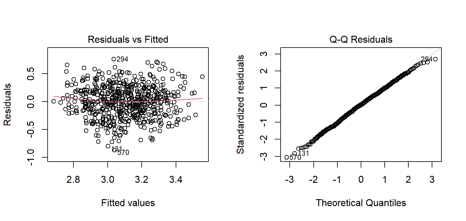
The left plot resembles the first simulated panel: a shapeless band around zero, with no curve and no funnel. In the right plot, the residuals follow the line, so they are close to normal. Both look good for the GPA model. Points far off the line in either plot would point to unusual cases worth looking at.
8.3.9 Reporting a regression
The broom package turns model results into tidy tables, ready for a thesis. The function tidy() gives the coefficients with confidence intervals, and glance() the overall fit:
library(broom)
tidy(gpa_model, conf.int = TRUE)
# A tibble: 5 × 7
term estimate std.error statistic p.value conf.low conf.high
<chr> <dbl> <dbl> <dbl> <dbl> <dbl> <dbl>
1 (Intercept) 2.14 0.145 14.7 6.89e-42 1.85 2.42
2 sleep_hours 0.106 0.0142 7.49 2.62e-13 0.0782 0.134
3 study_hours 0.00693 0.00111 6.27 7.06e-10 0.00476 0.00910
4 stress -0.0835 0.0178 -4.69 3.48e- 6 -0.119 -0.0485
5 support 0.111 0.0167 6.63 7.57e-11 0.0779 0.144 glance(gpa_model)# A tibble: 1 × 12
r.squared adj.r.squared sigma statistic p.value df logLik AIC BIC
<dbl> <dbl> <dbl> <dbl> <dbl> <dbl> <dbl> <dbl> <dbl>
1 0.252 0.247 0.286 49.1 1.25e-35 4 -95.0 202. 228.
# ℹ 3 more variables: deviance <dbl>, df.residual <int>, nobs <int>
TipWriting it up
A multiple regression of first-semester GPA on sleep, study hours, stress, and supervisor support explained 25% of the variance in GPA, F(4, 582) = 49.14, p < .001, N = 587. Holding the other predictors constant, each additional hour of sleep was associated with a GPA 0.11 points higher (95% CI [0.08, 0.13]). The hypothesis that more sleep goes with a higher GPA (Chapter 5) was therefore supported: the null hypothesis of a zero sleep coefficient was rejected.
8.4 Logistic regression
The third research question concerns a yes-or-no outcome: whether a student has considered dropping out. Linear regression is the wrong tool here, because it could predict probabilities below 0 or above 1, which make no sense. Logistic regression models the probability of a “yes” in a way that always stays between 0 and 1.
8.4.1 Odds and odds ratios
Logistic regression works with odds rather than probabilities. The odds of an event are the probability that it happens divided by the probability that it does not. The table from Chapter 7 shows how they are calculated:
jobs <- table(students$employment, students$considering_dropout)
jobs
                 No Yes
  Full-time job  72  25
  None          265  42
  Part-time job 173  23
odds_full <- jobs["Full-time job", "Yes"] / jobs["Full-time job", "No"]
odds_none <- jobs["None", "Yes"] / jobs["None", "No"]
c(full_time_job = odds_full, no_job = odds_none, odds_ratio = odds_full / odds_none)full_time_job no_job odds_ratio
0.3472222 0.1584906 2.1908069 Among students with a full-time job, 25 have considered dropping out and 72 have not, which gives odds of about 0.35. Among students without a job, the odds are 42 to 265, about 0.16. The odds ratio compares the two: students with a full-time job have about 2.2 times the odds of considering dropout. An odds ratio of 1 means no difference, above 1 means higher odds, and below 1 means lower odds.
8.4.2 A model for dropout
The function glm(), for generalised linear model, fits logistic regression when told family = binomial. The outcome must be coded 0 and 1:
study <- study |> mutate(dropout = as.integer(considering_dropout == "Yes"))

dropout_model <- glm(
  dropout ~ stress + support + financial_worry + employment + study_mode,
  data = study, family = binomial
)
summary(dropout_model)$coefficients
Estimate Std. Error z value Pr(>|z|)
(Intercept) -4.0185658 1.2316928 -3.262636 1.103811e-03
stress 1.2822937 0.2398794 5.345576 9.012973e-08
support -1.1102419 0.2039547 -5.443572 5.222263e-08
financial_worry 0.4537396 0.1216263 3.730605 1.910209e-04
employmentNone -0.5892840 0.4378768 -1.345776 1.783748e-01
employmentPart-time job -0.5387011 0.4522237 -1.191227 2.335644e-01
study_modePart-time 0.2763818 0.3674127 0.752238 4.519079e-01The coefficients are on the scale of log-odds, which is hard to interpret directly. The function exp() turns them into odds ratios, and confint.default() gives their confidence intervals:
exp(cbind(odds_ratio = coef(dropout_model), confint.default(dropout_model))) |>
  round(2)
odds_ratio 2.5 % 97.5 %
(Intercept) 0.02 0.00 0.20
stress 3.60 2.25 5.77
support 0.33 0.22 0.49
financial_worry 1.57 1.24 2.00
employmentNone 0.55 0.24 1.31
employmentPart-time job 0.58 0.24 1.42
study_modePart-time 1.32 0.64 2.71Holding the other predictors constant, each extra point of stress multiplies the odds of considering dropout by about 3.6, and each extra point of financial worry by about 1.6. Each extra point of supervisor support multiplies them by about 0.33, which cuts them by about 67%. The hypothesis stated in Chapter 5, that higher stress raises the odds of considering dropout, is supported: the confidence interval for stress lies entirely above 1.
Something interesting has happened to employment. In Chapter 7, and in the odds ratio above, students with full-time jobs had about twice the odds of considering dropping out. In this model, the confidence intervals for both employment categories include 1: once stress and financial worry are taken into account, having a job adds little on its own. The likely explanation is that a full-time job matters because of the stress and money pressure that come with it. This is the kind of insight multiple regression makes possible.
8.4.3 Predicted probabilities
Odds ratios are hard for many readers; predicted probabilities are easier. The model can predict the probability of considering dropout for two example students who are identical except for their stress and support:
examples <- tibble(
  stress          = c(2.5, 4.0),
  support         = c(4.0, 2.0),
  financial_worry = 3,
  employment      = "None",
  study_mode      = "Full-time"
)
predict(dropout_model, newdata = examples, type = "response") |> round(2)
1 2
0.01 0.42 The argument type = "response" asks for probabilities rather than log-odds. A student with low stress and good support has about a 1% chance of considering dropout; a stressed student with little support, about 42%. For a thesis’s recommendations, that contrast is more persuasive than any coefficient.
Whether the model can predict who will consider dropping out, and how that should be tested fairly, is a different question, about prediction rather than explanation. It is the subject of Chapters 11 and 12.
8.5 Common misconceptions
Regression output is easy to produce and easy to misread. Four misreadings are especially common.
- “A significant coefficient shows a cause.” Outside a randomised experiment, a coefficient is an association adjusted for the variables in the model, and only for those.
- “A low R-squared means the model is useless.” A predictor can have a real and important effect while explaining little of the total variation, as sleep does for GPA.
- “Each coefficient describes the predictor on its own.” In multiple regression, each coefficient is the effect holding the others constant, and it can change when predictors are added or removed, as caffeine’s did.
- “A significant ANOVA shows that all groups differ.” It shows only that at least one group differs from the others; post-hoc tests say which.
8.6 Chapter review
8.6.1 Summary
- ANOVA partitions variation into the part between groups and the part within them. The F statistic is their ratio, so the same group averages are convincing when groups are tight and unremarkable when they are spread out. \(\eta^2\) measures the size of the effect.
- One-way ANOVA tests whether three or more group averages differ with one test instead of many. Post-hoc tests, such as Tukey’s, find which groups differ while controlling false alarms. Levene’s test checks equal spread; Kruskal-Wallis is the non-parametric alternative.
- Two-way ANOVA tests two main effects and their interaction. An interaction means the effect of one factor depends on the other; parallel lines in an interaction plot mean no interaction.
- Regression models the average outcome at each value of the predictors. A slope is the change in the average outcome for a one-unit change in the predictor; in multiple regression, holding the other predictors constant. R-squared is the share of variation explained.
- Categorical predictors are compared with a reference category. A confounder is a common cause of predictor and outcome; adding it to the model can remove a misleading association, but only confounders that were measured.
- Squared terms model curves; interaction terms let one predictor’s effect depend on another. Residual plots reveal missed curves (a U shape) and unequal spread (a funnel).
- Logistic regression models the probability of a yes-or-no outcome.
exp()of its coefficients gives odds ratios;predict(..., type = "response")gives probabilities.
8.6.2 Key terms
ANOVA, F statistic, between-group variation, within-group variation, eta squared, post-hoc test, Tukey’s test, Levene’s test, Kruskal-Wallis test, two-way ANOVA, main effect, interaction, interaction plot, linear regression, predictor, outcome, intercept, slope, residual, least squares, R-squared, adjusted R-squared, multiple regression, reference category, confounder, quadratic term, diminishing returns, centring, diagnostic plot, logistic regression, odds, odds ratio, log-odds, predicted probability.
8.7 Exercises
The playground has these and more, with hints and solutions.
- Test whether first-semester wellbeing differs between faculties with a one-way ANOVA, calculate \(\eta^2\), and, if the ANOVA is significant, run Tukey’s test.
- Fit a simple regression of first-semester wellbeing on sleep hours, and interpret the slope and R-squared.
- Add stress and support to the model from Exercise 2, and describe what happens to the slope of sleep and to R-squared.
- Add
study_modeto the model from Exercise 3. Name the reference category and explain what its coefficient means. - Fit a logistic regression of considering dropout on
burnoutscore alone (calculate it from the questionnaire first), report its odds ratio, and explain what it means. - Draw a diagram, like Figure 8.5, of a confounder that might explain an association in your own field, and describe how a regression could separate the two explanations.
8.8 Further reading
- Introduction to Modern Statistics (Çetinkaya-Rundel and Hardin 2024): chapters “Linear regression with a single predictor”, “Linear regression with multiple predictors”, “Logistic regression”, and “Inference for comparing many means”.
- Regression and Other Stories (Gelman et al. 2020) is an excellent next step, with a strong focus on interpreting and checking regression models in real research.
References
Çetinkaya-Rundel, Mine, and Johanna Hardin. 2024. Introduction to Modern Statistics. 2nd ed. OpenIntro. https://openintro-ims.netlify.app.
Cohen, Jacob. 1988. Statistical Power Analysis for the Behavioral Sciences. 2nd ed. Lawrence Erlbaum Associates.
Gelman, Andrew, Jennifer Hill, and Aki Vehtari. 2020. Regression and Other Stories. Cambridge University Press. https://doi.org/10.1017/9781139161879.