flowchart TB
  A[Research question] --> B[Import]
  B --> C[Clean]
  C --> D[Explore:<br/>describe and visualise]
  D --> E[Test or predict]
  E --> F[Report]
  E -. surprising result .-> D
6 Descriptive Statistics and Exploratory Data Analysis
Before a study can test anything, it has to say what it found in the plainest sense: who took part, what a typical value of each variable looks like, how much the participants differ, and whether anything in the data is unusual or missing. These are the questions of descriptive statistics, the numbers that summarise what data looks like. They are the first results in almost every thesis, and they are not a formality. The shape of a variable decides which later tests are appropriate, an unusual value can dominate an analysis, and missing data can quietly change who the results are about.
This chapter develops the ideas behind the main descriptive statistics: what “typical” means, what spread measures, why the shape of a distribution matters, how to think about unusual and missing values, and how two variables can be described together. It answers the study’s first research question, what graduate student life looks like (RQ1), with numbers, and checks the data for the problems that could mislead every later analysis. In the story, the data is now clean and has been graphed; Elaf is eager to test her hypotheses, and her supervisor asks her to describe the sample first.
TipBy the end of this chapter you will be able to
- Explain the place of exploratory analysis in the research workflow.
- Choose a summary that suits the level of measurement and the shape of a variable.
- Summarise the centre and spread of a variable, and explain what the standard deviation measures.
- Describe the shape of a distribution, and check it against the normal distribution.
- Find unusual values, and decide what to do with them.
- Describe how much data is missing, why it is missing, and why that matters.
- Measure and interpret correlations, and explain why correlation is not causation.
- Present a description of your sample in a thesis, with every number accompanied by its spread and its sample size.
6.1 The place of exploration
Chapter 5 distinguished three aims of data analysis: describing, explaining, and predicting. They correspond to three kinds of analysis. Exploratory analysis gets to know the data through summaries, graphs, unusual values, and missing values; it is open-ended, it proves nothing, but it often suggests questions worth testing, and this chapter is exploratory. Inferential analysis uses a sample to draw conclusions about a wider population and asks whether a result could be due to chance, such as whether the workshop improves wellbeing for graduate students in general, not just for these 600; Chapters 7 to 10 are inferential. Predictive analysis builds models that make accurate predictions for new cases, such as which students are likely to consider dropping out next year; Part 3 is predictive.
The three fit into one workflow, shown in Figure 6.1. Exploration comes first, and the researcher returns to it whenever a later result is surprising.
6.2 The centre of a distribution
The first thing to know about any variable is its typical value. Three measures describe it. The mean is the average: add up the values and divide by how many there are. In symbols, for values \(x_1, x_2, \ldots, x_n\):
\[ \bar{x} = \frac{1}{n} \sum_{i=1}^{n} x_i \]
The median is the middle value when the values are sorted: half the values are below it and half above. The mode is the most common value, which is mainly useful for categories.
The mean and median can tell very different stories. Here is the daily caffeine intake, in milligrams, of five students:
caffeine <- c(0, 120, 150, 180, 900)
mean(caffeine)
[1] 270median(caffeine)[1] 150One student who takes 900 mg a day pulls the mean up to 270 mg, higher than four of the five students. The median, 150 mg, stays with the typical student. The mean is sensitive to extreme values; the median is not.
The same two measures for the study data use each student’s first-semester record, together with their background information:
library(dplyr)
library(ggplot2)

first_sem <- semesters |>
  filter(semester == 1) |>
  left_join(students, join_by(student_id))

first_sem |>
  summarise(
    mean_sleep      = mean(sleep_hours, na.rm = TRUE),
    median_sleep    = median(sleep_hours, na.rm = TRUE),
    mean_caffeine   = mean(caffeine_mg, na.rm = TRUE),
    median_caffeine = median(caffeine_mg, na.rm = TRUE)
  )
mean_sleep median_sleep mean_caffeine median_caffeine
1 6.483502 6.5 189.4054 160For sleep, the mean and median are almost identical. For caffeine, the mean is well above the median, just as in the five-student example: a minority of heavy caffeine users pull the mean up. Figure 6.2 shows why.
ggplot(first_sem, aes(x = caffeine_mg)) +
  geom_histogram(binwidth = 50, fill = "grey70", colour = "white") +
  geom_vline(xintercept = mean(first_sem$caffeine_mg, na.rm = TRUE), linewidth = 1) +
  geom_vline(xintercept = median(first_sem$caffeine_mg, na.rm = TRUE),
             linewidth = 1, linetype = "dashed") +
  labs(x = "Caffeine per day (mg)", y = "Number of students") +
  theme_minimal(base_size = 13)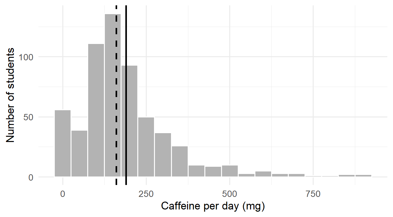
For categories, the mode is simply the most common category, which count() shows at the top when sorted:
students |> count(faculty, sort = TRUE) faculty n
1 Health Sciences 154
2 Education 148
3 Social Sciences 116
4 Humanities 95
5 Natural Sciences 876.2.1 Choosing a summary
Which summary is meaningful depends first on the level of measurement of the variable (Chapter 5), and then on its shape. The average faculty does not exist, so a nominal variable is described by counts and percentages. An ordinal variable, such as the five answers to the question about money worries, has a meaningful middle but uneven steps, so the median and percentages suit it better than the mean. Numeric variables can be described by the mean, but only when they are roughly symmetrical and without extreme values; otherwise the median describes the typical case more faithfully. Table 6.1 brings these rules together.
| Variable | Centre | Spread | Examples in the study |
|---|---|---|---|
| Nominal | Mode; percentage in each category | none | faculty, gender |
| Ordinal | Median; percentage in each category | Interquartile range | financial worry, single questionnaire items |
| Numeric, roughly symmetrical | Mean | Standard deviation | sleep, wellbeing |
| Numeric, skewed or with extreme values | Median | Interquartile range | caffeine, age |
6.3 The spread of a distribution
Two groups can have the same average and still be very different. The sleep of two small groups of students shows how:
group_a <- c(6.0, 6.5, 6.5, 7.0, 6.5)
group_b <- c(4.0, 8.5, 5.0, 9.0, 6.0)
mean(group_a)
[1] 6.5mean(group_b)[1] 6.5Both average 6.5 hours, but in group A everyone sleeps about the same, while group B ranges from 4 to 9 hours. Measures of spread capture this difference, and a mean reported without one hides half of the story.
The range is the difference between the largest and smallest values. It is simple, but it depends only on the two most extreme values:
range(group_b)[1] 4 96.3.1 The standard deviation
The standard deviation (SD) measures how far values typically lie from the mean. The idea is easiest to see in a picture. Figure 6.3 shows the five students of group B, the mean as a dashed line, and each student’s distance from the mean as a red line. These distances are the deviations, \(x_i - \bar{x}\).
deviations <- tibble(student = 1:5, sleep = group_b)

ggplot(deviations, aes(x = student, y = sleep)) +
  geom_hline(yintercept = mean(group_b), linetype = "dashed") +
  geom_segment(aes(xend = student, yend = mean(group_b)), colour = "#b2182b", linewidth = 1) +
  geom_point(size = 3) +
  labs(x = "Student", y = "Hours of sleep") +
  theme_minimal(base_size = 12)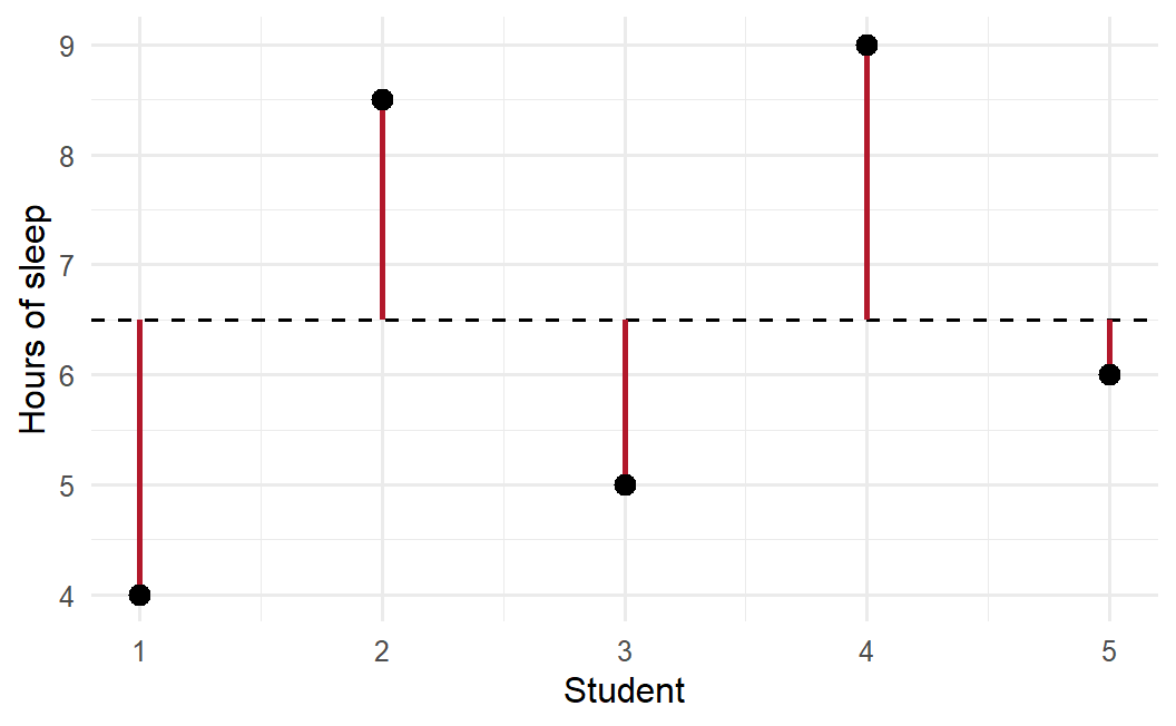
The standard deviation summarises the red lines. Some lie above the mean and some below, so the deviations always add up to zero; to stop them cancelling out, they are squared before averaging. The average squared deviation is the variance, and its square root is the standard deviation:
\[ s = \sqrt{\frac{1}{n-1} \sum_{i=1}^{n} (x_i - \bar{x})^2} \]
Dividing by \(n - 1\) rather than \(n\) gives a slightly better estimate when working with a sample. The square root brings the result back to the original units, so the standard deviation of sleep is measured in hours:
sd(group_a)[1] 0.3535534sd(group_b)[1] 2.179449mean(abs(group_b - mean(group_b))) # the average length of the red lines[1] 1.8The standard deviation of group B, 2.18 hours, is close to the average length of the red lines, 1.8 hours; it is a little larger because squaring gives more weight to the longest lines. Group A’s small standard deviation says that its students hardly differ at all.
6.3.2 The interquartile range
The interquartile range (IQR) is the spread of the middle half of the values. The quartiles split the sorted values into four equal parts: a quarter of the values lie below the first quartile (\(Q_1\)), half below the median, and three quarters below the third quartile (\(Q_3\)). The IQR is \(Q_3 - Q_1\). Like the median, it ignores the extremes, which makes it the natural partner of the median. A box plot’s box is exactly the IQR.
quantile(first_sem$caffeine_mg, c(0.25, 0.5, 0.75), na.rm = TRUE)25% 50% 75%
105 160 240 IQR(first_sem$caffeine_mg, na.rm = TRUE)[1] 135The same summarise() calculates spread for several variables at once:
first_sem |>
  summarise(
    sd_sleep   = sd(sleep_hours, na.rm = TRUE),
    sd_gpa     = sd(gpa, na.rm = TRUE),
    iqr_caffeine = IQR(caffeine_mg, na.rm = TRUE)
  )
sd_sleep sd_gpa iqr_caffeine
1 1.033795 0.329459 135The standard deviation of sleep is about 1 hours: a typical student sleeps within about an hour of the average of 6.5 hours. The mean belongs with the SD, and the median with the IQR.
6.4 The shape of a distribution
The centre and spread do not describe everything. The shape of a distribution matters too, because it decides which summaries and which tests are appropriate. A distribution is symmetrical if its two sides mirror each other, in which case the mean and median are about equal. It is skewed to the right, or positively skewed, if it has a long tail of high values, as caffeine does; the mean then lies above the median. It is skewed to the left, or negatively skewed, if it has a long tail of low values, and the mean lies below the median. A distribution with one peak is unimodal, and one with two peaks is bimodal, which often means that two different groups are mixed together. Figure 6.4 compares the shape of sleep and caffeine in the study.
library(tidyr)

first_sem |>
  select(sleep_hours, caffeine_mg) |>
  pivot_longer(everything(), names_to = "variable", values_to = "value") |>
  ggplot(aes(x = value)) +
  geom_density(fill = "grey80") +
  facet_wrap(~ variable, scales = "free") +
  labs(x = NULL, y = "Density") +
  theme_minimal(base_size = 12)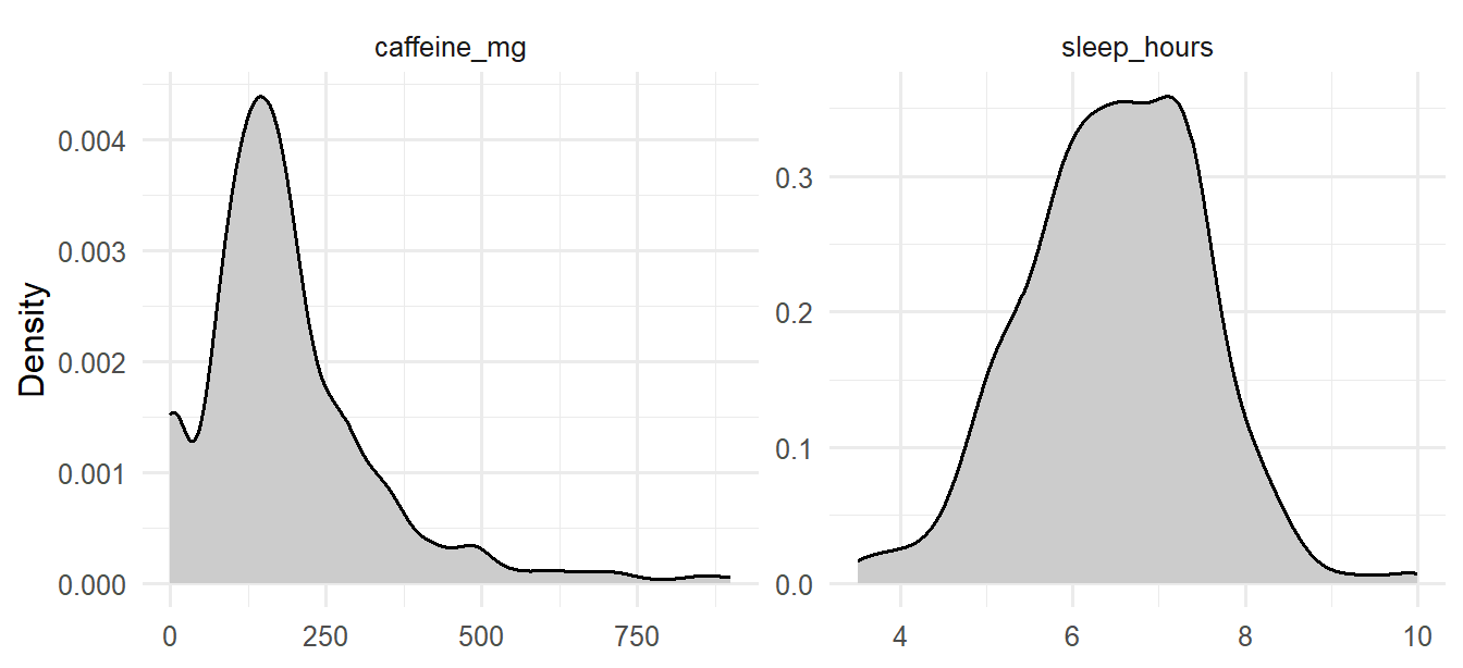
The argument scales = "free" lets each panel have its own axes, since hours and milligrams are on very different scales.
The skewness statistic puts a number on the asymmetry: 0 for perfect symmetry, positive for a tail to the right, negative for a tail to the left. As a rough guide, values between −1 and +1 are mild. The psych package calculates it (install it once with install.packages("psych")):
library(psych)
skew(first_sem$sleep_hours, na.rm = TRUE)
[1] -0.09604954skew(first_sem$caffeine_mg, na.rm = TRUE)[1] 1.739451skew(students$age, na.rm = TRUE)[1] 1.340088Sleep is almost perfectly symmetrical, while caffeine and age are clearly skewed to the right: most graduate students are in their twenties, and fewer are older.
6.4.1 The normal distribution
Many variables in nature and in research have a similar symmetrical, bell-shaped distribution, called the normal distribution. It matters because many statistical tests assume that data, or at least averages of data, follow it approximately (Chapter 7 explains why).
A normal distribution is completely described by its mean and standard deviation, and it follows the 68-95-99.7 rule: about 68% of values lie within one standard deviation of the mean, 95% within two, and 99.7% within three. The sleep data can be checked against the rule:
sleep <- first_sem$sleep_hours[!is.na(first_sem$sleep_hours)]
z <- (sleep - mean(sleep)) / sd(sleep)
c(within_1_sd = mean(abs(z) < 1),
  within_2_sd = mean(abs(z) < 2),
  within_3_sd = mean(abs(z) < 3))
within_1_sd within_2_sd within_3_sd
0.7070707 0.9579125 0.9949495 The proportions are very close to the rule. The values z are z-scores: how many standard deviations each value is from the mean. They put any variable on the same scale, which makes them useful for spotting unusual values too.
A graph gives a better check than any single number. A Q-Q plot (quantile-quantile plot) compares the data with what a normal distribution would give. If the data is normal, the points fall along a straight line:
first_sem |>
  select(sleep_hours, caffeine_mg) |>
  pivot_longer(everything(), names_to = "variable", values_to = "value") |>
  ggplot(aes(sample = value)) +
  stat_qq(alpha = 0.4) +
  stat_qq_line() +
  facet_wrap(~ variable, scales = "free") +
  labs(x = "Expected if normal", y = "Observed") +
  theme_minimal(base_size = 12)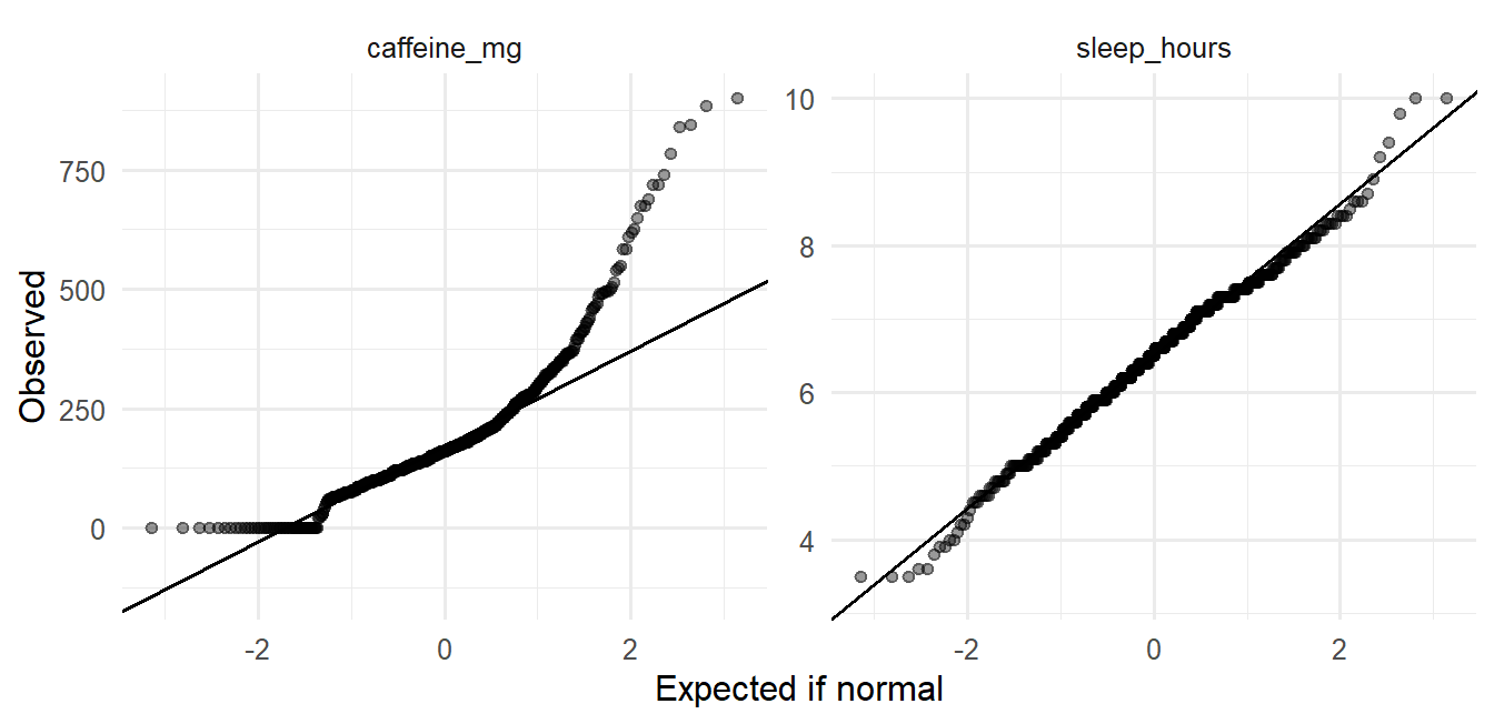
Sleep sits on the line. Caffeine bends away at the upper end, because its largest values are much larger than a normal distribution would produce: the long right tail again.
6.5 Unusual values
An outlier is a value far from the rest. Chapter 3 set values that were impossible, such as an age of 250, to missing. Outliers are different: they are possible, just unusual, and they are information before they are a problem. An unusual value may be an error that cleaning missed, a participant who misunderstood a question, or a real case that the research should pay attention to. The first task is therefore to find unusual values and look at them, not to remove them.
Two common rules flag them. The box plot rule flags values more than 1.5 × IQR below the first quartile or above the third quartile; these are the points a box plot draws separately. The z-score rule flags values more than 3 standard deviations from the mean, and suits roughly normal variables. For caffeine, which is skewed, the box plot rule is the better choice:
q1 <- quantile(first_sem$caffeine_mg, 0.25, na.rm = TRUE)
q3 <- quantile(first_sem$caffeine_mg, 0.75, na.rm = TRUE)
upper_fence <- q3 + 1.5 * (q3 - q1)
upper_fence
75%
442.5 sum(first_sem$caffeine_mg > upper_fence, na.rm = TRUE)[1] 35In all, 35 students take more caffeine than the upper fence of 442 mg. For sleep, which is roughly normal, the z-score rule flags 3 students. The most extreme cases combine both:
first_sem |>
  filter(sleep_hours <= 4.5, caffeine_mg >= 600) |>
  select(student_id, sleep_hours, caffeine_mg, study_hours, wellbeing)
student_id sleep_hours caffeine_mg study_hours wellbeing
1 S0105 3.5 740 58 52
2 S0124 4.0 845 46 58
3 S0195 3.6 840 59 58
4 S0310 3.5 885 57 38
5 S0312 3.9 785 67 51
6 S0371 4.1 650 36 53
7 S0530 4.3 720 65 44
8 S0554 3.5 900 26 56
9 S0599 3.6 610 50 47These students sleep very little, take a lot of caffeine, and study long hours. Nothing about these values is impossible, and they describe a real and worrying group of students: exactly the kind of case the thesis is about.
ImportantNever delete a value just because it is unusual
First check whether it is an error (Chapter 3). If it is a real value, keep it: it is part of what you are studying. Report it, and choose summaries and tests that are not thrown off by it, such as the median, or check whether your conclusions change when the unusual cases are left out (a sensitivity analysis). Removing inconvenient values to get a cleaner result is a form of research misconduct.
6.6 Missing data
Almost every dataset has gaps, and the study’s data has three kinds, each with its own lesson. The first step is to count them in every variable:
semesters |> summarise(across(everything(), ~ sum(is.na(.x)))) student_id semester gpa sleep_hours study_hours exercise_days caffeine_mg
1 0 0 1 21 23 20 25
supervisor_meetings wellbeing
1 0 0students |> summarise(across(everything(), ~ sum(is.na(.x)))) student_id supervisor_id age gender faculty programme study_mode employment
1 0 0 1 0 0 0 0 0
has_children lives_away financial_worry workshop workshop_sessions
1 0 0 38 0 0
considering_dropout
1 0A few semester measurements are missing (about 1% each), and 38 students did not answer the question about money worries.
What matters most is not how much is missing, but why. Statisticians distinguish three situations. Data is missing completely at random when the gaps have nothing to do with anything, as when a student skips a question by accident; analyses of the remaining data are then unbiased, just a little less precise. Data is missing at random when the gaps depend on something that was measured, such as study mode; analyses can be corrected for it if they include what it depends on. Data is missing not at random when the gaps depend on the missing value itself. Students with the most serious money worries, for example, might be the least willing to answer the question about money. This is the hardest case, because the students who answered are no longer typical.
The most important gap in the study’s data is not a skipped question: it is the students who left the study after the first year. Chapter 3 found 37 of them. Their first-semester records show whether they resembled everyone else:
left_ids <- setdiff(students$student_id,
                    semesters$student_id[semesters$semester == 3])

first_sem |>
  mutate(left_study = student_id %in% left_ids) |>
  summarise(
    students            = n(),
    wellbeing           = mean(wellbeing),
    gpa                 = mean(gpa, na.rm = TRUE),
    considering_dropout = mean(considering_dropout == "Yes"),
    .by = left_study
  )
left_study students wellbeing gpa considering_dropout
1 FALSE 563 60.66075 3.107620 0.1207815
2 TRUE 37 57.35135 3.012973 0.5945946They did not. The students who left already had lower wellbeing in their first semester, and most of them had said they were considering dropping out. The students still in the study in semesters 3 and 4 are therefore, on average, the ones who were doing better, and a simple average of the later semesters would overestimate how well graduate students were doing.
At a minimum, a thesis should report how many participants left and how they differed, as above. Some methods cope with this kind of gap better than others: the mixed-effects models of Chapter 10 use every observation each student provided, including the first year of those who left. More advanced techniques, such as multiple imputation, are beyond this book, but worth knowing about when a large share of the data is missing.
6.7 Relationships between variables
Descriptive statistics also describe how variables go together. The correlation coefficient, written \(r\), measures how closely two numeric variables follow a straight-line relationship. It runs from −1 to +1. A value near +1 means that as one variable rises, the other rises too; a value near −1 means that as one rises, the other falls; and a value near 0 means that there is no straight-line relationship, although, as Anscombe’s datasets in Chapter 4 showed, there may still be a curved one. In the social and behavioural sciences, correlations of about 0.1, 0.3, and 0.5 (positive or negative) are often described as small, medium, and large (Cohen 1988). These are rough guides, not rules.
The questionnaire scores are needed here. They are calculated as in Chapter 3, reversing stress_4 first:
scores <- questionnaire |>
  mutate(
    stress_4     = 6 - stress_4,
    stress       = rowMeans(pick(stress_1:stress_6), na.rm = TRUE),
    burnout      = rowMeans(pick(burnout_1:burnout_6), na.rm = TRUE),
    support      = rowMeans(pick(support_1:support_6), na.rm = TRUE),
    satisfaction = rowMeans(pick(satisfaction_1:satisfaction_4), na.rm = TRUE)
  ) |>
  select(student_id, stress, burnout, support, satisfaction)

first_sem <- first_sem |> left_join(scores, join_by(student_id))

first_sem |>
  select(stress, burnout, support, wellbeing, gpa) |>
  cor(use = "pairwise.complete.obs") |>
  round(2)
stress burnout support wellbeing gpa
stress 1.00 0.65 -0.33 -0.53 -0.31
burnout 0.65 1.00 -0.24 -0.51 -0.27
support -0.33 -0.24 1.00 0.36 0.36
wellbeing -0.53 -0.51 0.36 1.00 0.32
gpa -0.31 -0.27 0.36 0.32 1.00The option use = "pairwise.complete.obs" uses every student who has both values for each pair. The table is rich. Stress and burnout go together strongly; students who feel supported by their supervisor report less stress; stress and burnout go with lower wellbeing; support goes with higher GPA.
A scatter plot matrix shows the same relationships as graphs, one small scatter plot for each pair of variables:
pairs(first_sem[, c("stress", "support", "wellbeing", "gpa")],
      pch = 16, col = rgb(0, 0, 0, 0.25))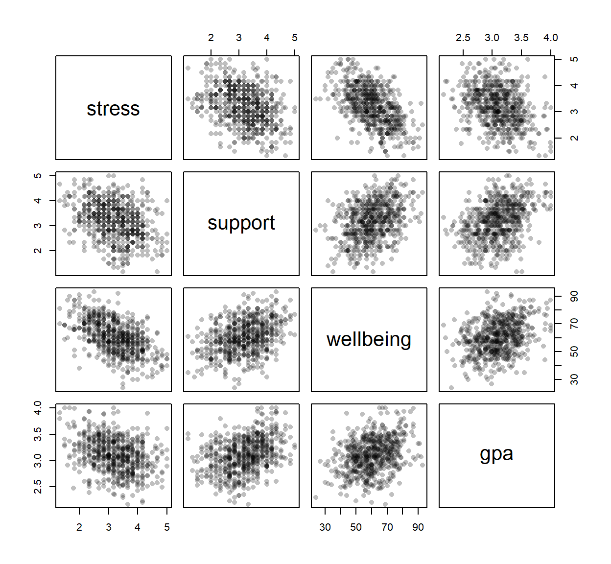
The function pairs() comes with R; pch = 16 draws filled dots, and the rgb() colour makes them transparent.
6.7.1 Correlation is not causation
A correlation says that two variables go together. It does not say that one causes the other. Chapter 5 introduced the example of caffeine and GPA:
first_sem |>
  select(caffeine_mg, sleep_hours, gpa) |>
  cor(use = "pairwise.complete.obs") |>
  round(2)
caffeine_mg sleep_hours gpa
caffeine_mg 1.00 -0.64 -0.19
sleep_hours -0.64 1.00 0.25
gpa -0.19 0.25 1.00Students who take more caffeine have lower GPAs, but that does not show that caffeine harms grades. Caffeine also goes strongly with less sleep, and sleep goes with higher grades, so caffeine may only look harmful because heavy caffeine users sleep less. A third variable that produces a misleading correlation like this is a confounder. Chapter 8 shows how regression can separate the two explanations. For now, the lesson is to describe correlations as associations, not as causes.
6.8 Describing your sample in a thesis
The methods chapter of almost every thesis includes a description of the sample: who took part, and what the main variables look like. It is usually a table, which dplyr builds directly:
first_sem |>
  summarise(
    students       = n(),
    female_pct     = 100 * mean(gender == "Female"),
    phd_pct        = 100 * mean(programme == "PhD"),
    part_time_pct  = 100 * mean(study_mode == "Part-time"),
    age_mean       = mean(age, na.rm = TRUE),
    age_sd         = sd(age, na.rm = TRUE)
  ) |>
  round(1)
students female_pct phd_pct part_time_pct age_mean age_sd
1 600 52 29 29.5 29.7 4.8A summary is complete only with its spread and the number of cases it is based on. A mean of 6.4 hours says little until the reader knows whether students differ by minutes or by hours, and whether the mean comes from 20 students or 600. When values are missing, the number of cases also differs from variable to variable, so it must be reported for each. The second table therefore gives, for each main variable, the number of values, the mean and SD for symmetrical variables, the median and IQR for skewed ones, and the number missing:
describe_var <- function(x) {
  c(n = sum(!is.na(x)),
    mean = mean(x, na.rm = TRUE), sd = sd(x, na.rm = TRUE),
    median = median(x, na.rm = TRUE), iqr = IQR(x, na.rm = TRUE),
    missing = sum(is.na(x)))
}
sapply(first_sem[, c("sleep_hours", "study_hours", "caffeine_mg", "gpa", "wellbeing")],
       describe_var) |>
  t() |>
  round(2)
n mean sd median iqr missing
sleep_hours 594 6.48 1.03 6.5 1.40 6
study_hours 592 27.64 13.06 26.0 19.00 8
caffeine_mg 597 189.41 143.62 160.0 135.00 3
gpa 600 3.10 0.33 3.1 0.45 0
wellbeing 600 60.46 12.01 60.0 17.00 0The small function describe_var(), written for this chapter, calculates the six summaries for one variable, and sapply() applies it to each column; t() turns the result so that each variable is a row. Writing your own functions is a skill for later; for now, you can reuse this one.
In the text, the sample is described in a sentence or two, for example:
The sample consisted of 600 graduate students (52% female; 29% PhD students), aged 23 to 52 (M = 29.7, SD = 4.8). Students slept 6.5 hours per night on average (SD = 1.0), and 65% slept less than the recommended 7 hours.
Every number in that sentence comes from the code, so it cannot drift out of step with the data.
TipAn exploration checklist
Before any test, check for each variable you will use:
- How many values are missing, and why?
- What is the typical value, and how spread out are the values?
- What is the shape: symmetrical or skewed, one peak or two?
- Are there unusual values, and are they errors or real?
- How does it relate to the other variables?
NoteIn your field: earth sciences
R’s faithful dataset records 272 eruptions of the Old Faithful geyser in Yellowstone National Park. The duration of the eruptions is a classic bimodal distribution: most eruptions last either about 2 minutes or about 4.5 minutes, and few last in between.
ggplot(faithful, aes(x = eruptions)) +
  geom_histogram(binwidth = 0.2, fill = "grey70", colour = "white") +
  labs(x = "Eruption duration (minutes)", y = "Number of eruptions") +
  theme_minimal(base_size = 12)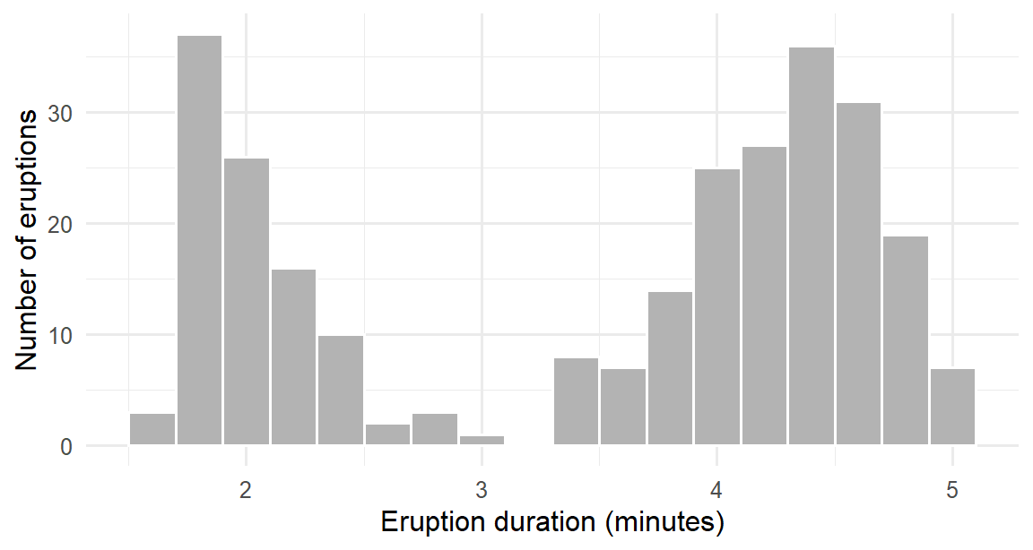
The mean of these durations, about 3.5 minutes, describes almost no actual eruption. For a bimodal variable, report the two groups separately, and look for what separates them.
6.9 Common misconceptions
Descriptive statistics look simple, and that is exactly why their mistakes are common.
- “The mean is the typical value.” Only for roughly symmetrical variables. For skewed ones, such as caffeine or income, the median is.
- “A mean on its own is a result.” Without its spread and the number of cases, a reader cannot judge it.
- “Outliers should be removed.” Real unusual values are part of the data; they are reported and handled with suitable methods, not deleted.
- “A few missing values do not matter.” Why data is missing matters more than how much. A small but systematic gap can bias the results.
- “A correlation of zero means no relationship.” It means no straight-line relationship. A strong curved relationship can have a correlation near zero.
6.10 Chapter review
6.10.1 Summary
- Exploratory analysis describes the data; inferential analysis draws conclusions about a population; predictive analysis predicts new cases. Exploration comes first.
- The level of measurement and the shape of a variable decide which summary is meaningful: percentages for categories, the median for ordinal and skewed variables, the mean for symmetrical ones.
- The mean is sensitive to extreme values; the median is not. The standard deviation is roughly the typical distance of the values from the mean. Report the mean with the SD, and the median with the IQR.
- The shape of a distribution can be symmetrical or skewed, and unimodal or bimodal. Skewness measures asymmetry; histograms, density plots, and Q-Q plots show it.
- The normal distribution follows the 68-95-99.7 rule. z-scores give each value’s distance from the mean in standard deviations.
- Outliers are information before they are a problem. Flag them with the box plot rule or z-scores, check them, and never delete real values just because they are unusual.
- Why data is missing matters more than how much. Students who leave a study are rarely a random selection.
- The correlation \(r\) measures a straight-line relationship, from −1 to +1. Correlation is not causation: a confounder can create a misleading association.
- Every summary in a thesis is reported with its spread and its number of cases.
6.10.2 Key terms
Descriptive statistics, exploratory analysis, inferential analysis, predictive analysis, mean, median, mode, range, deviation, variance, standard deviation, quartile, interquartile range, skewness, symmetrical, unimodal, bimodal, normal distribution, z-score, Q-Q plot, outlier, missing completely at random, missing at random, missing not at random, attrition, correlation coefficient, confounder.
6.11 Exercises
The playground has these and more, with hints and solutions.
- Calculate the mean, median, SD, and IQR of first-semester
study_hours. Decide whether the variable is closer to symmetrical or skewed, and which pair of summaries you would report. - Draw a Q-Q plot of first-semester
wellbeing, and judge whether it looks normal. - Using the box plot rule, count the students with unusually high
study_hoursin the first semester, and look at their other values. - Compare the first-semester
sleep_hoursof students who later left the study with those who stayed, and say whether they differ in sleep as they did in wellbeing. - Find the correlation between
supportandsatisfaction, classify it with Cohen’s guidelines, and explain why it does not show that support causes satisfaction. - For each variable in
students, choose the summary you would report in a thesis, using Table 6.1, and justify each choice in one sentence.
6.12 Further reading
- R for Data Science (Wickham et al. 2023): chapters “Exploratory data analysis” and “Missing values”.
- Statistical Power Analysis for the Behavioral Sciences (Cohen 1988) is the source of the small, medium, and large guidelines for effect sizes, including correlations.
References
Cohen, Jacob. 1988. Statistical Power Analysis for the Behavioral Sciences. 2nd ed. Lawrence Erlbaum Associates.
Wickham, Hadley, Mine Çetinkaya-Rundel, and Garrett Grolemund. 2023. R for Data Science: Import, Tidy, Transform, Visualize, and Model Data. 2nd ed. O’Reilly Media. https://r4ds.hadley.nz.