flowchart TB
  subgraph R1[" "]
    direction LR
    A[Question] --> B[Import] --> C[Clean]
  end
  subgraph R2[" "]
    direction LR
    D[Explore] --> E[Test or predict] --> F[Report]
  end
  R1 --> R2
Descriptive Statistics and Exploratory Data Analysis
Descriptive Statistics and Exploratory Data Analysis
Say what you found, in the plainest sense
Chapter 6
Polla Fattah
By the end of today you can
- explain the place of exploratory analysis in research;
- choose a summary that suits the level and shape of a variable;
- summarise centre and spread, and explain the standard deviation;
- describe shape, and check it against the normal distribution;
- find unusual values, and decide what to do with them;
- describe how much data is missing, and why;
- interpret correlations, and why correlation is not causation;
- describe a sample in a thesis.
Description is not a formality
- the shape of a variable decides which tests are appropriate;
- an unusual value can dominate an analysis;
- missing data can quietly change who the results are about.
Descriptive statistics are the first results in almost every thesis.
Three kinds of analysis
| Kind | Does | Chapters |
|---|---|---|
| exploratory | gets to know the data; proves nothing | 6 |
| inferential | draws conclusions about a population | 7 to 10 |
| predictive | predicts new cases | 11 to 16 |
Exploration comes first
Return to exploration whenever a later result surprises you.
Three measures of the centre
| Measure | Definition | Useful for |
|---|---|---|
| mean | the average: sum divided by count | symmetrical numbers |
| median | the middle value when sorted | skewed numbers, ordinal data |
| mode | the most common value | categories |
\[ \bar{x} = \frac{1}{n} \sum_{i=1}^{n} x_i \]
One heavy user moves the mean
The mean is higher than four of the five students.
The mean is sensitive to extreme values; the median is not.
Mean and median in the study
first_sem |>
  summarise(mean_sleep      = mean(sleep_hours, na.rm = TRUE),
            median_sleep    = median(sleep_hours, na.rm = TRUE),
            mean_caffeine   = mean(caffeine_mg, na.rm = TRUE),
median_caffeine = median(caffeine_mg, na.rm = TRUE))| Mean | Median | |
|---|---|---|
| sleep (hours) | 6.48 | 6.5 |
| caffeine (mg) | 189 | 160 |
Why caffeine’s mean is higher
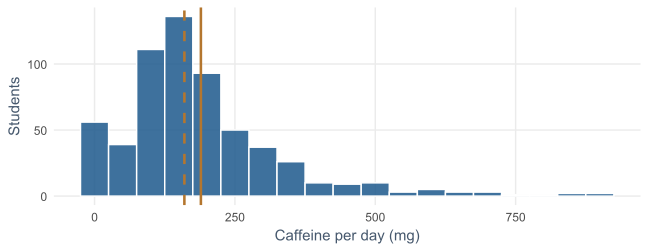
A minority of heavy users pull the mean (solid) above the median (dashed).
Choosing a summary
| Variable | Centre | Spread | Examples |
|---|---|---|---|
| nominal | mode, percentages | none | faculty, gender |
| ordinal | median, percentages | IQR | financial worry, one item |
| numeric, symmetrical | mean | SD | sleep, wellbeing |
| numeric, skewed | median | IQR | caffeine, age |
The level of measurement comes first, then the shape.
Same average, different stories
Both average 6.5 hours.
In group A everyone sleeps about the same; group B ranges from 4 to 9 hours.
A mean without a measure of spread hides half the story.
Deviations from the mean
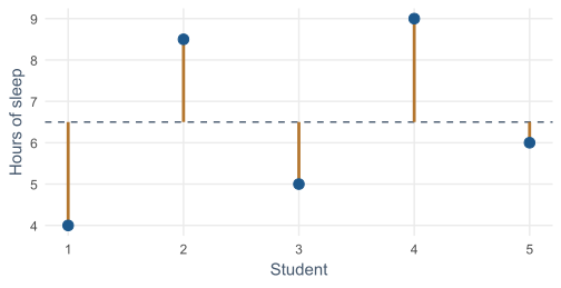
Each copper line is a deviation, \(x_i - \bar{x}\). The standard deviation summarises them.
The standard deviation
\[ s = \sqrt{\frac{1}{n-1} \sum_{i=1}^{n} (x_i - \bar{x})^2} \]
- deviations add to zero, so they are squared first;
- the average squared deviation is the variance;
- its square root returns to the original units.
Dividing by \(n - 1\) gives a better estimate from a sample.
The SD is roughly the typical distance
Group B’s SD is close to the average length of the copper lines.
It is a little larger, because squaring weights the longest lines more.
The interquartile range
quantile(first_sem$caffeine_mg, c(0.25, 0.5, 0.75), na.rm = TRUE)
#> 25% 50% 75%
#> 105 160 240
IQR(first_sem$caffeine_mg, na.rm = TRUE)
#> [1] 135
The spread of the middle half: \(Q_3 - Q_1\). It ignores the extremes, like the median.
A box plot’s box is exactly the IQR.
Pairs that belong together
| Centre | Spread |
|---|---|
| mean | standard deviation |
| median | interquartile range |
Sleep: SD ≈ 1 hours, so a typical student sleeps within about an hour of 6.5.
The shape of a distribution
| Shape | Meaning | Mean and median |
|---|---|---|
| symmetrical | two sides mirror each other | about equal |
| skewed right | a long tail of high values | mean above median |
| skewed left | a long tail of low values | mean below median |
| bimodal | two peaks | often two groups mixed |
Sleep is symmetrical, caffeine is not
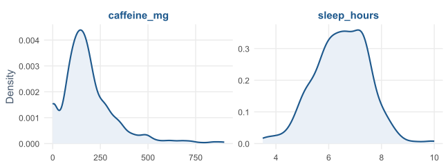
scales = "free" gives each panel its own axes: hours and milligrams differ greatly.
Skewness puts a number on it
library(psych)
skew(first_sem$sleep_hours, na.rm = TRUE)   #> -0.10
skew(first_sem$caffeine_mg, na.rm = TRUE)   #>  1.74
skew(students$age, na.rm = TRUE)            #>  1.34
0 is symmetrical, positive a tail to the right. Between −1 and +1 is mild.
Most graduate students are in their twenties, fewer are older.
The normal distribution
Symmetrical and bell-shaped, described completely by its mean and SD.
Many tests assume data, or averages of data, follow it approximately (Chapter 7).
| Within | Share of values |
|---|---|
| 1 SD of the mean | about 68% |
| 2 SD | about 95% |
| 3 SD | about 99.7% |
Checking sleep against the rule
z <- (sleep - mean(sleep)) / sd(sleep)
c(within_1_sd = mean(abs(z) < 1),
  within_2_sd = mean(abs(z) < 2),
  within_3_sd = mean(abs(z) < 3))
#> 0.707  0.958  0.995
Very close to 68-95-99.7.
z-scores give each value’s distance from the mean in standard deviations.
Q-Q plots compare with the normal
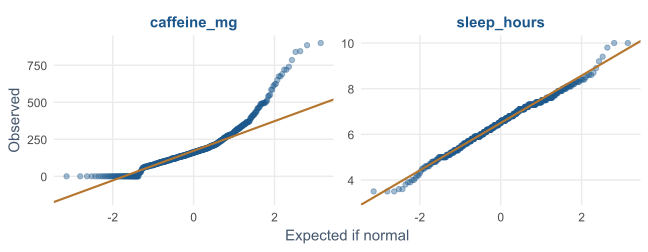
Sleep sits on the line. Caffeine bends away at the top: its long right tail.
Outliers are information first
Impossible values were set to NA in Chapter 3. Outliers are possible, just unusual.
An unusual value may be:
- an error that cleaning missed;
- a participant who misunderstood a question;
- a real case the research should pay attention to.
Find them and look at them before anything else.
Two rules for flagging
| Rule | Flags values | Suits |
|---|---|---|
| box plot rule | beyond 1.5 × IQR from the quartiles | skewed variables |
| z-score rule | more than 3 SD from the mean | roughly normal variables |
The box plot rule for caffeine
q1 <- quantile(first_sem$caffeine_mg, 0.25, na.rm = TRUE)
q3 <- quantile(first_sem$caffeine_mg, 0.75, na.rm = TRUE)
upper_fence <- q3 + 1.5 * (q3 - q1)
sum(first_sem$caffeine_mg > upper_fence, na.rm = TRUE)
#> [1] 35
35 students take more than the upper fence of 443 mg.
For sleep, roughly normal, the z-score rule flags 3 students.
The most extreme cases
first_sem |>
  filter(sleep_hours <= 4.5, caffeine_mg >= 600) |>
  select(student_id, sleep_hours, caffeine_mg, study_hours, wellbeing)
Nine students sleep 3.5 to 4.3 hours, take 610 to 900 mg of caffeine, and study up to 67 hours a week.
Nothing impossible: a real and worrying group, exactly what the thesis is about.
Never delete a value just because it is unusual
- Check whether it is an error (Chapter 3).
- If it is real, keep it and report it.
- Choose summaries that are not thrown off by it, such as the median.
- Check whether conclusions change without it: a sensitivity analysis.
Removing inconvenient values for a cleaner result is research misconduct.
Count the gaps first
semesters |> summarise(across(everything(), ~ sum(is.na(.x))))
students  |> summarise(across(everything(), ~ sum(is.na(.x))))
About 1% of each semester measurement is missing.
38 students did not answer the question about money worries.
Why data is missing matters more than how much
| Kind | The gaps depend on | Consequence |
|---|---|---|
| missing completely at random | nothing | unbiased, a little less precise |
| missing at random | something measured | correctable by including it |
| missing not at random | the missing value itself | the answers left are not typical |
Students most worried about money may be the least willing to say so.
The biggest gap: students who left
left_ids <- setdiff(students$student_id,
                    semesters$student_id[semesters$semester == 3])
first_sem |>
  mutate(left_study = student_id %in% left_ids) |>
  summarise(students = n(), wellbeing = mean(wellbeing),
            considering_dropout = mean(considering_dropout == "Yes"),
.by = left_study)| Students | Wellbeing | Considered dropout | |
|---|---|---|---|
| stayed | 563 | 60.7 | 12% |
| left | 37 | 57.4 | 59% |
What attrition does to the later semesters
The students still present in semesters 3 and 4 were, on average, doing better.
A simple average of the later semesters overestimates how well students were doing.
- report how many left and how they differed;
- mixed models (Chapter 10) use every observation each student gave;
- multiple imputation exists for large gaps.
The correlation coefficient
\(r\) measures how closely two numeric variables follow a straight line, from −1 to +1.
| \(r\) (either sign) | Often called |
|---|---|
| about 0.1 | small |
| about 0.3 | medium |
| about 0.5 | large |
Rough guides, not rules. A curved relationship can have \(r\) near zero.
A correlation matrix
first_sem |>
  select(stress, burnout, support, wellbeing, gpa) |>
cor(use = "pairwise.complete.obs") |> round(2)| burnout | support | wellbeing | GPA | |
|---|---|---|---|---|
| stress | 0.65 | −0.33 | −0.53 | −0.31 |
| support | −0.24 | 1 | 0.36 | 0.36 |
pairwise.complete.obs uses every student with both values for each pair.
A scatter plot matrix
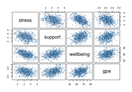
pairs() draws one small scatter plot for each pair of variables.
Correlation is not causation
first_sem |>
  select(caffeine_mg, sleep_hours, gpa) |>
  cor(use = "pairwise.complete.obs") |> round(2)
flowchart LR
S["Less sleep"] --> C["More caffeine"]
S --> G["Lower GPA"]
C -. "correlation −0.18" .- G
Caffeine may only look harmful because heavy users sleep less: a confounder (Chapter 8).
Describing the sample
first_sem |>
  summarise(students      = n(),
            female_pct    = 100 * mean(gender == "Female"),
            phd_pct       = 100 * mean(programme == "PhD"),
            part_time_pct = 100 * mean(study_mode == "Part-time"),
            age_mean      = mean(age, na.rm = TRUE),
            age_sd        = sd(age, na.rm = TRUE)) |>
  round(1)
Who took part: the first table in the methods chapter.
Every summary needs its spread and its n
A mean of 6.4 hours says little until the reader knows:
- whether students differ by minutes or by hours;
- whether it comes from 20 students or 600.
With missing values, the n differs from variable to variable, so report it for each.
A description table for the main variables
describe_var <- function(x) {
  c(n = sum(!is.na(x)),
    mean = mean(x, na.rm = TRUE), sd = sd(x, na.rm = TRUE),
    median = median(x, na.rm = TRUE), iqr = IQR(x, na.rm = TRUE),
    missing = sum(is.na(x)))
}
sapply(first_sem[, c("sleep_hours", "study_hours", "caffeine_mg",
                     "gpa", "wellbeing")], describe_var) |> t() |> round(2)
sapply() applies the function to each column; t() makes each variable a row.
Writing it up
The sample consisted of 600 graduate students (52% female; 29% PhD students), aged 23 to 52 (M = 29.7, SD = 4.8). Students slept 6.5 hours per night on average (SD = 1.0), and 65% slept less than 7 hours.
Every number comes from the code.
An exploration checklist
- How many values are missing, and why?
- What is the typical value, and how spread out are the values?
- What is the shape: symmetrical or skewed, one peak or two?
- Are there unusual values, and are they errors or real?
- How does it relate to the other variables?
In your field: earth sciences
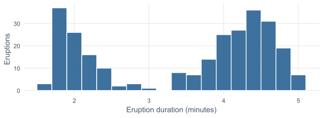
Old Faithful: eruptions last about 2 or about 4.5 minutes. The mean, 3.5, describes almost none of them. Report the two groups separately.
Practical lab: the Chapter 6 playground
Work through the playground exercises in your browser, with hints and solutions.
Every exercise also runs in RStudio, from the downloadable chapter project.
Practical exercises 1–3: summaries and shape
- Mean, median, SD, and IQR of study hours: which pair would you report?
- A Q-Q plot of wellbeing: does it look normal?
- Count unusually high study hours with the box plot rule, and look at those students.
Practical exercises 4–6: gaps and relationships
- Compare the sleep of students who left with those who stayed.
- Classify the support–satisfaction correlation, and explain why it is not causal.
- Choose and justify a summary for every variable in
students.
Try this yourself
Take three variables from your own data.
- report centre, spread, n, and missing for each;
- draw each one’s shape and name it;
- flag unusual values and decide whether they are errors;
- write two sentences describing your sample.
Troubleshooting guide (Part 1)
| Symptom | Likely cause |
|---|---|
| the mean seems too high | a skewed variable; report the median |
| a mean with nothing beside it | spread and n left out |
| many outliers in a skewed variable | the z-score rule used on skewed data |
| a mean describes no real case | a bimodal variable |
Troubleshooting guide (Part 2)
| Symptom | Likely cause |
|---|---|
| later semesters look better | students who were struggling left |
| r near zero for a clear pattern | a curved relationship |
| a strong correlation read as cause | a confounder not considered |
| different n for each variable | missing values; report n per variable |
Completion checklist
Misconceptions to leave behind (Part 1)
| Misconception | Better mental model |
|---|---|
| the mean is the typical value | only for roughly symmetrical variables |
| a mean on its own is a result | it needs its spread and n |
| outliers should be removed | real values are reported and handled |
Misconceptions to leave behind (Part 2)
| Misconception | Better mental model |
|---|---|
| a few missing values do not matter | why they are missing matters more |
| r = 0 means no relationship | no straight-line relationship |
| correlation shows cause | a confounder can create it |
The chapter in one sentence
Describe every variable by its centre, spread, shape, gaps, and unusual values before you test anything.
Next: Chapter 7
The next chapter moves from describing the sample to inference:
- sampling distributions and standard errors;
- confidence intervals and the bootstrap;
- the logic of a test, built by shuffling;
- t-tests, effect sizes, and chi-square tests.
Questions
Which variable in your own data is most likely to be skewed?
Who is most likely to be missing from your data, and why?