library(dplyr)
library(ggplot2)

first_sem <- semesters |>
  filter(semester == 1) |>
  left_join(students, join_by(student_id))

caffeine <- first_sem$caffeine_mg[!is.na(first_sem$caffeine_mg)]

set.seed(2026)
means_5  <- replicate(1000, mean(sample(caffeine, 5)))
means_30 <- replicate(1000, mean(sample(caffeine, 30)))7 Hypothesis Testing and Statistical Inference
Research is almost always about more people than it can measure. A study of 600 graduate students is interesting because of what it says about graduate students in general, and a clinical trial of 200 patients matters because of the patients who will be treated after it. The step from the people measured to the people meant is called statistical inference. It rests on one uncomfortable fact: a different sample would have given different numbers. Inference is the discipline of saying how different, and of deciding when a pattern in a sample is strong enough to be believed.
This chapter builds that discipline from the ground up. It starts with what happens when samples are drawn again and again, which leads to standard errors and confidence intervals. It then develops the logic of hypothesis testing by simulation, shuffling group labels until the meaning of a p-value can be seen, before turning to the formal tests that appear in almost every thesis. The hypotheses come from Chapter 5: whether graduate students sleep less than the recommended 7 hours (RQ2), and whether the wellbeing workshop improved wellbeing (RQ3).
TipBy the end of this chapter you will be able to
- Explain sampling distributions, the standard error, and the central limit theorem.
- Calculate and interpret confidence intervals, including bootstrap intervals.
- Explain the logic of a hypothesis test through a permutation test, and interpret a p-value correctly.
- Explain the two kinds of error, statistical power, and the problem of multiple testing, and demonstrate each by simulation.
- Carry out one-sample, two-sample, and paired t-tests, and measure the size of an effect.
- Judge the assumptions of a test, and choose a non-parametric test when they fail.
- Test relationships between categorical variables with chi-square tests.
- Choose an appropriate test for a question, and report the result in a thesis.
7.1 Samples and populations
The population is everyone the conclusions are meant to cover: here, graduate students. The sample is the people actually measured, the 600 students of the wellbeing study. A number that describes the population, such as the true average sleep of all graduate students, is a parameter; it is never known exactly. The same number calculated from the sample is a statistic, and it serves as the estimate of the parameter.
A second sample would give a slightly different estimate, and a third another. The size of this variation cannot be seen in a single study, but it can be seen in a simulation. For a moment, treat the 600 students as if they were the whole population, draw many small samples from them, and watch how the estimates behave.
7.1.1 Sampling distributions
Caffeine intake is strongly skewed (Chapter 6): most students take a moderate amount, and a few take a great deal. The simulation draws a sample of 5 students and records their average caffeine, repeats this a thousand times, and then does the same with samples of 30. In the code, sample() draws a random sample and replicate() repeats the whole step:
The line set.seed(2026) fixes R’s random number generator, so that the “random” samples are the same every time the code runs and the results match this book. Any analysis that involves randomness should fix the seed in this way.
The thousand averages form a sampling distribution: the distribution of a statistic over many possible samples. Figure 7.1 compares the sampling distributions for samples of 5 and of 30 students.
tibble(
  mean_caffeine = c(means_5, means_30),
  sample_size   = rep(c("Samples of 5", "Samples of 30"), each = 1000)
) |>
  mutate(sample_size = factor(sample_size, levels = c("Samples of 5", "Samples of 30"))) |>
  ggplot(aes(x = mean_caffeine)) +
  geom_histogram(bins = 40, fill = "grey70", colour = "white") +
  facet_wrap(~ sample_size) +
  labs(x = "Average caffeine in the sample (mg)", y = "Number of samples") +
  theme_minimal(base_size = 12)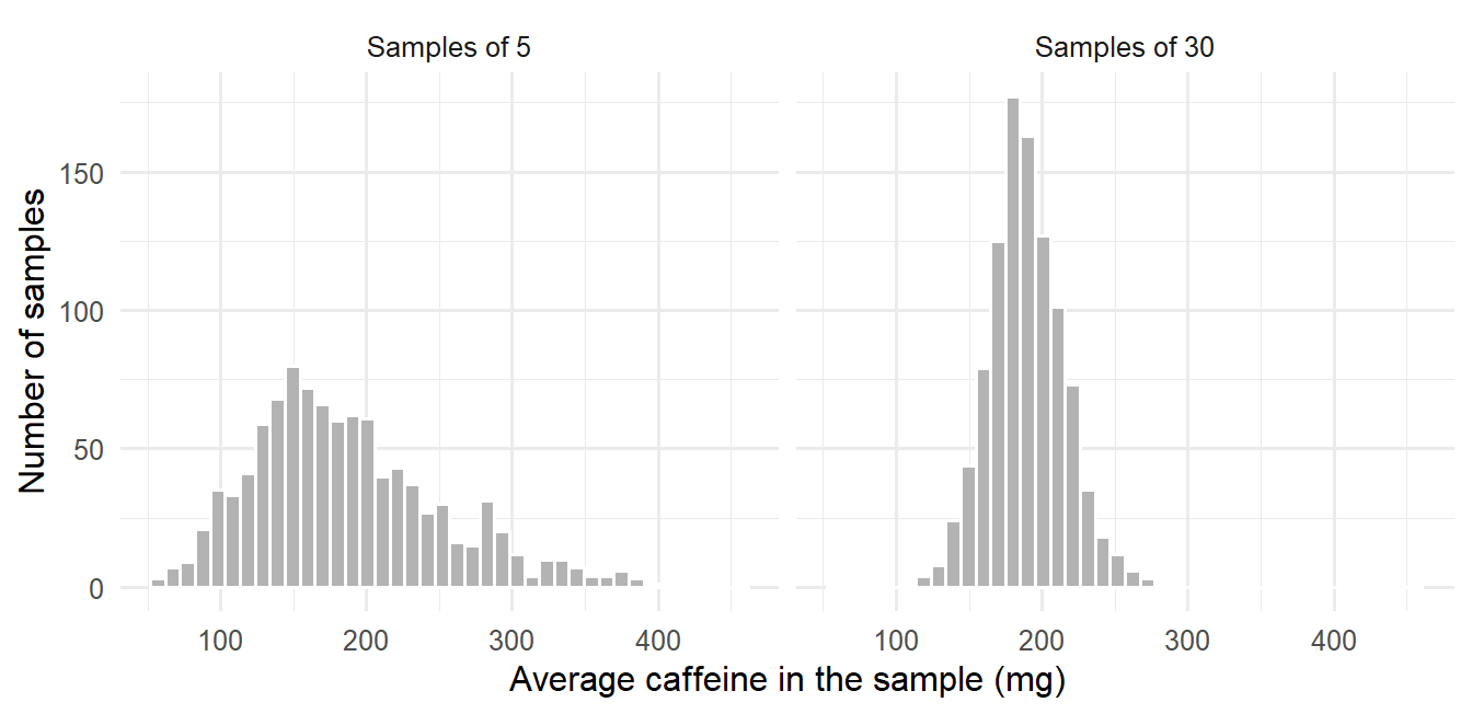
The figure carries the three ideas on which the rest of the chapter depends. Both distributions are centred on the average of all 600 students, 189 mg, which means that a sample average neither overestimates nor underestimates on average: it is an unbiased estimate. The averages of 30 students are packed far more tightly than the averages of 5, so larger samples give more precise estimates. Finally, although caffeine itself is strongly skewed, and so are the averages of 5 students, the averages of 30 students are almost symmetrical and bell-shaped.
This last observation is the central limit theorem: whatever the shape of the data, the averages of reasonably large samples follow an approximately normal distribution. It explains why methods based on the normal distribution work for so many kinds of data. As a rule of thumb, samples of 30 or more are large enough unless the data is extremely skewed.
7.1.2 The standard error
The spread of a sampling distribution has its own name, the standard error (SE). It measures how much an estimate would vary from sample to sample, which is precisely the uncertainty a researcher needs to know. A real study has only one sample and cannot draw a thousand, but for an average the standard error can be calculated from that single sample:
\[ SE = \frac{s}{\sqrt{n}} \]
where \(s\) is the standard deviation and \(n\) the sample size. The formula and the simulation can be compared directly:
sd(means_30) # spread of the 1,000 simulated averages[1] 25.69209sd(caffeine) / sqrt(30) # the formula, from the data[1] 26.22184The two agree closely. The square root in the formula has a practical consequence that every researcher planning a study should remember: halving the standard error requires four times as many participants.
7.1.3 Confidence intervals
An estimate on its own says nothing about its precision. A confidence interval (CI) adds that information: a range of values that are plausible for the population parameter, given the data. A 95% confidence interval for a mean is approximately
\[ \bar{x} \pm 2 \times SE \]
where, more precisely, the 2 is a value from the t-distribution that R works out. The function t.test() calculates the interval; here it is for the average first-semester sleep:
t.test(first_sem$sleep_hours)$conf.int[1] 6.400196 6.566808
attr(,"conf.level")
[1] 0.95The average sleep of graduate students is plausibly between 6.40 and 6.57 hours. The interval is narrow because the sample is large.
The “95%” describes the method rather than this particular interval. If the study were repeated many times, and a 95% confidence interval calculated each time, about 95% of those intervals would contain the true population value. Any single interval either contains it or does not; the confidence lies in the procedure that produced it.
WarningMean ± SE is not a confidence interval
Theses often report “mean ± SE” and treat it as if it were a confidence interval. It is not: the SE is only half the width of an approximate 95% CI. Report the confidence interval itself, and say what it is.
7.1.4 Bootstrap confidence intervals
The formula above works for averages. For other statistics, such as the median, there is no simple formula. The bootstrap solves this with an idea of remarkable simplicity: treat the sample as if it were the population, and draw many new samples from it with replacement, so that each new sample contains some people twice and leaves others out. The spread of the statistic across these resamples estimates its sampling distribution.
Suppose the survey had reached only 40 students, and a confidence interval were needed for their median caffeine intake:
set.seed(1)
small_sample <- sample(caffeine, 40)
median(small_sample)
[1] 150boot_medians <- replicate(2000, median(sample(small_sample, replace = TRUE)))
quantile(boot_medians, c(0.025, 0.975)) 2.5% 97.5%
110.0 177.5 Sampling with replacement, the argument replace = TRUE, is what makes this a bootstrap. The middle 95% of the 2,000 bootstrap medians, from the 2.5th to the 97.5th percentile, forms the 95% bootstrap confidence interval. The median of all 600 students, 160 mg, lies inside it. The same few lines work for almost any statistic.
7.2 The logic of hypothesis testing
A confidence interval describes which values are plausible. A hypothesis test addresses a sharper question: whether the data is consistent with a particular claim. The claim that is tested is the null hypothesis, \(H_0\), the statement that nothing is going on: no difference, no relationship. The researcher’s own expectation is the alternative hypothesis, \(H_1\). For the workshop, \(H_0\) states that the workshop has no effect on wellbeing, and \(H_1\) that it does.
Chapter 5 explained why tests are built around the null hypothesis: it is precise enough to calculate with. If the workshop had no effect, any difference between the invited and the not-invited students would be due only to which students happened to receive an invitation. The test asks whether the observed difference is larger than such chance differences usually are. That question can be answered directly, by simulation, before any formula is introduced.
NoteThink before you analyse
Question: does the workshop improve wellbeing (RQ3)? It is a causal question, and the random invitation allows a causal answer. Unit of analysis: the student, with one wellbeing score each, at the end of semester 2. Variables: wellbeing (0 to 100, interval) is the outcome; the invitation (nominal, two groups) is the predictor. Evidence against \(H_1\): a difference near zero, or in favour of the students who were not invited.
7.2.1 A permutation test
The data needed is each student’s workshop group together with their wellbeing at the end of semester 2:
semester2 <- semesters |>
  filter(semester == 2) |>
  left_join(students, join_by(student_id))
nrow(semester2)
[1] 600observed_gap <- mean(semester2$wellbeing[semester2$workshop == "Invited"]) -
mean(semester2$wellbeing[semester2$workshop == "Not invited"])
observed_gap[1] 5.25Invited students scored 5.2 points higher. If the null hypothesis were true, the labels “Invited” and “Not invited” would carry no information about wellbeing: each student would have had the same score whichever label they had received. Under that assumption the labels can be shuffled at random among the students, and the difference recalculated. Each shuffle shows one difference that chance alone could have produced. Repeating the shuffle thousands of times builds the null distribution, the range of differences to expect when the workshop does nothing:
set.seed(2026)
shuffled_gaps <- replicate(5000, {
  shuffled <- sample(semester2$workshop)
  mean(semester2$wellbeing[shuffled == "Invited"]) -
    mean(semester2$wellbeing[shuffled == "Not invited"])
})
summary(shuffled_gaps)
Min. 1st Qu. Median Mean 3rd Qu. Max.
-3.6033 -0.6367 0.0100 0.0130 0.6633 3.2700 Here sample() without a size simply shuffles the whole column. Figure 7.2 places the observed difference against the 5,000 shuffled ones.
ggplot(data.frame(gap = shuffled_gaps), aes(x = gap)) +
  geom_histogram(binwidth = 0.25, fill = "grey70", colour = "white") +
  geom_vline(xintercept = observed_gap, colour = "#b2182b", linewidth = 1) +
  labs(x = "Difference in average wellbeing (invited minus not invited)",
       y = "Number of shuffles") +
  theme_minimal(base_size = 12)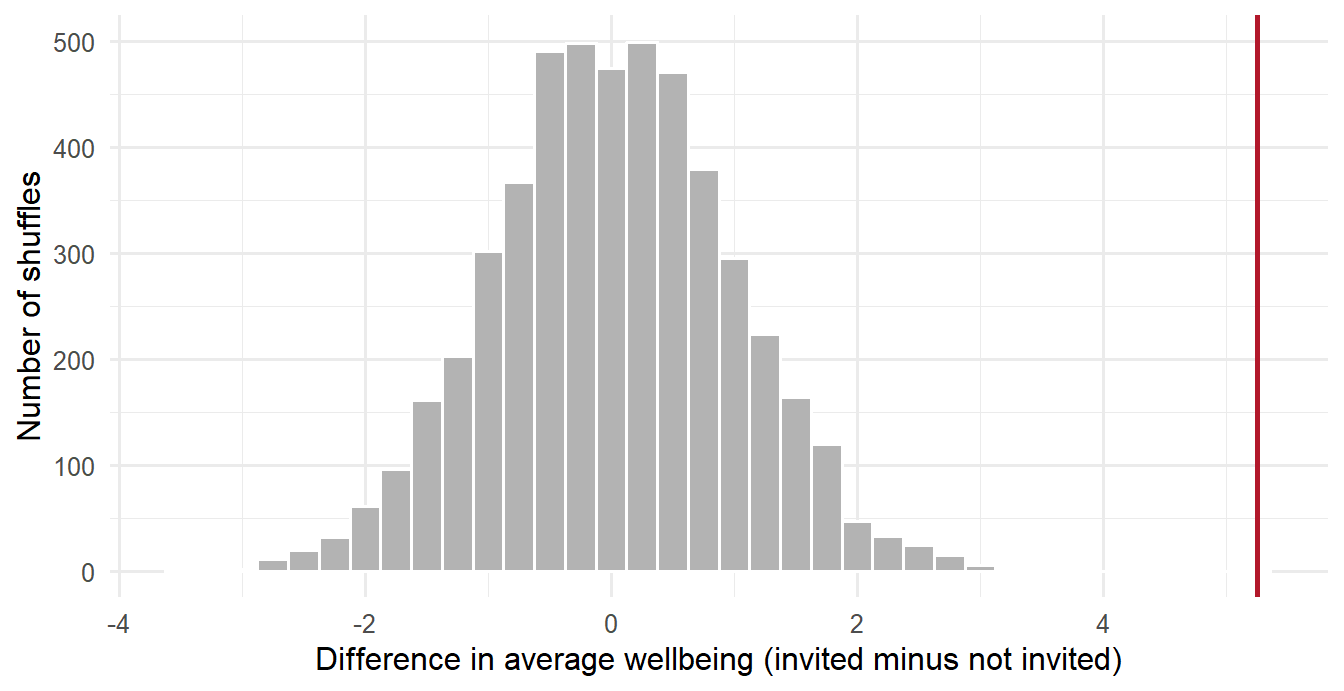
Shuffled differences cluster around zero and rarely exceed 3 points in either direction. The observed difference lies far beyond all of them. The proportion of shuffles that produce a difference at least as large as the observed one, in either direction, is the p-value:
mean(abs(shuffled_gaps) >= abs(observed_gap))[1] 0Not one of the 5,000 shuffles matched the observed difference. The p-value is not literally zero: a finite number of shuffles can only show that it is smaller than about 1 in 5,000, so it is reported as p < .001. Chance alone is a very poor explanation of the data, and the null hypothesis can be rejected.
A test does not always end this way, and the contrast is instructive. Chapter 5 listed GPA by gender as a comparison where no difference was expected. The same shuffling procedure gives a very different picture:
gpa_gap <- mean(first_sem$gpa[first_sem$gender == "Female"]) -
  mean(first_sem$gpa[first_sem$gender == "Male"])

set.seed(2026)
shuffled_gpa <- replicate(5000, {
  shuffled <- sample(first_sem$gender)
  mean(first_sem$gpa[shuffled == "Female"]) - mean(first_sem$gpa[shuffled == "Male"])
})
c(observed = gpa_gap, p_value = mean(abs(shuffled_gpa) >= abs(gpa_gap)))
observed p_value
-0.01286325 0.63240000 The average GPA of women and men differs by only 0.01 grade points, and more than half of the shuffles produce a difference at least that large. Such a difference is exactly what chance produces, so the data gives no reason to reject the null hypothesis.
This procedure is a permutation test. It contains the whole logic of hypothesis testing, and every test in the rest of the chapter follows it: assume the null hypothesis, work out which results it makes likely, and see where the observed result falls. The formal tests differ mainly in using mathematics instead of shuffling to find the null distribution, which is faster and, when their assumptions hold, gives almost the same answer.
7.2.2 The p-value
The p-value is the probability of a result at least as extreme as the one observed, if the null hypothesis were true. A small p-value means the data would be surprising in a world where nothing is going on, and the null hypothesis is rejected. By convention, “small” means below 0.05, a threshold called the significance level, \(\alpha\), and such a result is called statistically significant. A large p-value means the data is consistent with the null hypothesis, which is then not rejected. This is not proof that the null hypothesis is true; it means only that the data does not provide strong evidence against it.
ImportantWhat a p-value is not
A p-value is not the probability that the null hypothesis is true, and not the probability that the result happened by chance. It is the probability of data like yours, assuming the null hypothesis is true. A p-value of 0.03 means: if the workshop had no effect, a difference at least this large would appear in only 3% of studies like this one.
7.2.3 Type I and Type II errors
Because a test works with probabilities, its decision can be wrong in two ways, shown in Table 7.1.
| \(H_0\) is really true | \(H_0\) is really false | |
|---|---|---|
| Reject \(H_0\) | Type I error (a false alarm) | Correct |
| Do not reject \(H_0\) | Correct | Type II error (a missed effect) |
The significance level controls Type I errors: with \(\alpha = 0.05\), about 5% of tests of a true null hypothesis will be “significant” by chance alone. This can be demonstrated. The simulation below splits the students into two groups completely at random, so that no real difference can exist, tests whether their wellbeing differs, and repeats the whole procedure a thousand times:
set.seed(7)
p_values <- replicate(1000, {
  random_group <- sample(rep(c("A", "B"), 300))
  t.test(first_sem$wellbeing ~ random_group)$p.value
})
mean(p_values < 0.05)
[1] 0.065About 6% of the tests are “significant”, even though every difference is pure chance, close to the 5% that the significance level predicts. A single significant result is therefore never the final word.
7.2.4 Statistical power
A Type II error, missing an effect that is really there, depends mainly on two things: the size of the effect and the size of the sample. A stricter significance level also makes effects harder to detect, which is one reason not to lower it without cause. The probability that a study detects an effect of a given size, when the effect is real, is its power (Chapter 5). Power is easiest to understand by simulation. The function below imagines a study of the workshop in which the true effect is 5 points (with a standard deviation of 11, as in the real data), runs a t-test, and reports whether the result was significant. Running it 2,000 times for each group size shows how often studies of that size succeed:
simulate_study <- function(n_per_group, effect = 5, sd = 11) {
  invited     <- rnorm(n_per_group, mean = 60 + effect, sd = sd)
  not_invited <- rnorm(n_per_group, mean = 60, sd = sd)
  t.test(invited, not_invited)$p.value < 0.05
}

set.seed(3)
group_sizes <- c(10, 20, 40, 80, 150)
simulated_power <- sapply(group_sizes, \(n) mean(replicate(2000, simulate_study(n))))
data.frame(students_per_group = group_sizes, power = round(simulated_power, 2))
students_per_group power
1 10 0.17
2 20 0.29
3 40 0.53
4 80 0.82
5 150 0.97power_curve <- data.frame(n = 5:160)
power_curve$power <- power.t.test(n = power_curve$n, delta = 5, sd = 11)$power
ggplot(power_curve, aes(x = n, y = power)) +
geom_line(colour = "grey50") +
geom_point(data = data.frame(n = group_sizes, power = simulated_power), size = 2.5) +
geom_hline(yintercept = 0.8, linetype = "dashed") +
labs(x = "Students per group", y = "Power") +
theme_minimal(base_size = 12)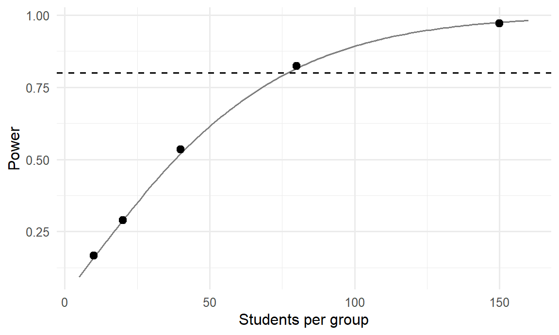
With 10 students per group, a real 5-point effect is detected only about 17% of the time; such a study would usually end with “no significant difference”, even though the workshop works. Around 80 students per group are needed to reach the conventional 80% power, marked by the dashed line. The study’s 300 per group gives power close to 100%. The line, calculated with power.t.test(), agrees with the simulation, which shows what that function computes. A non-significant result from a small study should therefore be read with great caution: it may say more about the size of the study than about the effect.
7.2.5 Multiple testing
The 5% false alarm rate applies to each test. A study that runs many tests will almost certainly produce some false alarms. With 20 independent tests of true null hypotheses, the chance of at least one “significant” result is
1 - 0.95^20[1] 0.6415141about 64%. A simulation confirms it. Each simulated study below runs 20 t-tests on pure noise and records whether any of them came out significant:
set.seed(8)
any_false_alarm <- replicate(1000, {
  p <- replicate(20, t.test(rnorm(30), rnorm(30))$p.value)
  any(p < 0.05)
})
mean(any_false_alarm)
[1] 0.653Roughly two studies in three find “something”, although there is nothing to find. This is why the main hypotheses of a thesis should be stated in advance (Chapter 5), why a study that reports only its significant results misleads, and why the tests in Chapter 8 correct for multiple comparisons.
7.2.6 One-tailed and two-tailed tests
A two-tailed test looks for a difference in either direction: the workshop might raise or lower wellbeing. A one-tailed test looks in one direction only. One-tailed tests are easier to pass, which makes them tempting, but they are justified only when the opposite direction is truly impossible or irrelevant, and when the direction was decided before seeing the data. Two-tailed tests are the standard choice, and R’s tests are two-tailed by default. The permutation test above was two-tailed as well: it counted shuffles that were extreme in either direction.
7.2.7 Statistical and practical significance
A statistically significant result is not necessarily an important one. With a large enough sample, even a tiny, meaningless difference becomes significant. Every result should therefore be reported with its size, not only with its significance, and the rest of this chapter does so for each test.
7.3 The one-sample t-test
The second research question asks whether graduate students sleep less than the recommended 7 hours (RQ2). Chapter 5 stated the hypothesis with a direction: average sleep is below 7 hours. The test is nevertheless two-tailed, with the null hypothesis that average sleep is 7 hours and the alternative that it is not, the cautious choice explained in the section on one-tailed and two-tailed tests. The direction of the result is then read from the estimate. A one-sample t-test compares a sample average with a fixed value, given by the argument mu:
sleep_test <- t.test(first_sem$sleep_hours, mu = 7)
sleep_test
    One Sample t-test

data:  first_sem$sleep_hours
t = -12.177, df = 593, p-value < 2.2e-16
alternative hypothesis: true mean is not equal to 7
95 percent confidence interval:
 6.400196 6.566808
sample estimates:
mean of x
 6.483502
The output contains three results. The estimate is the sample average, 6.48 hours. The confidence interval runs from 6.40 to 6.57 hours and does not include 7. The test itself reports the t statistic, which measures how far the average lies from 7 in units of standard errors (here 12.2 standard errors below), and a p-value so small that R prints it as “< 2.2e-16”, meaning less than 0.0000000000000002.
Graduate students sleep about half an hour less than recommended, and the difference is far too large to be chance. The confidence interval also answers the practical question: the shortfall is somewhere between about 26 and 36 minutes a night.
NoteOne value per student
The test uses first-semester records only, one value per student. A t-test assumes that the observations are independent. Using all four semesters would count each student up to four times, as if they were four different people, and make the result look more certain than it is. Chapter 10 shows how to analyse repeated measurements properly.
7.4 The two-sample t-test
The workshop question (RQ3) compares two independent groups: the students invited at random to the six-week workshop after their first semester, and those who were not invited. The permutation test has already answered it; the two-sample t-test reaches the same answer with a formula.
7.4.1 A small example
A small invented example shows the mechanics. Suppose there were only five students in each group, with these wellbeing scores out of 100:
invited     <- c(68, 72, 65, 75, 70)
not_invited <- c(62, 66, 60, 69, 64)

mean(invited)
[1] 70mean(not_invited)[1] 64.2The invited group is 5.8 points higher on average. A two-sample t-test assesses whether a difference between the averages of two independent groups is larger than chance would produce:
small_test <- t.test(invited, not_invited)
small_test
    Welch Two Sample t-test

data:  invited and not_invited
t = 2.5099, df = 7.9411, p-value = 0.03658
alternative hypothesis: true difference in means is not equal to 0
95 percent confidence interval:
  0.4642934 11.1357066
sample estimates:
mean of x mean of y
     70.0      64.2
The p-value is 0.037: if the workshop had no effect, a difference this large would appear in about 4 studies in 100. By the usual 0.05 threshold the result is statistically significant, although with only five students per group it is fragile evidence.
7.4.2 Testing the workshop
The real study uses the semester2 table built for the permutation test. Before any test, the data should be inspected, and Figure 7.4 shows wellbeing in each group.
ggplot(semester2, aes(x = workshop, y = wellbeing, fill = workshop)) +
  geom_boxplot(show.legend = FALSE, width = 0.5) +
  labs(x = NULL, y = "Wellbeing (0 to 100)") +
  theme_minimal(base_size = 13)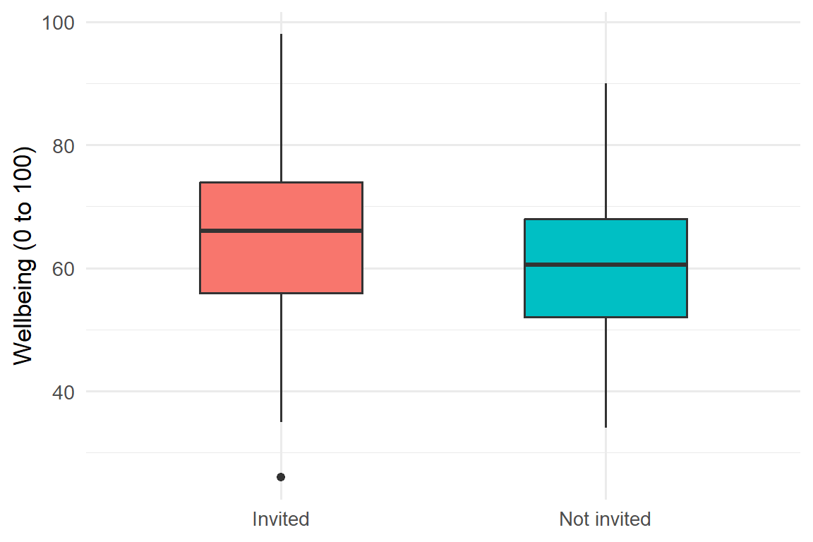
The invited group sits a little higher, but the groups overlap considerably. In the test, the formula wellbeing ~ workshop reads “wellbeing by workshop group”:
result <- t.test(wellbeing ~ workshop, data = semester2)
result
    Welch Two Sample t-test

data:  wellbeing by workshop
t = 5.469, df = 597.52, p-value = 6.66e-08
alternative hypothesis: true difference in means between group Invited and group Not invited is not equal to 0
95 percent confidence interval:
 3.364699 7.135301
sample estimates:
    mean in group Invited mean in group Not invited
                    65.47                     60.22
Invited students scored 5.2 points higher on average (65.5 against 60.2). The 95% confidence interval for the difference runs from 3.4 to 7.1 points, and the p-value is below 0.001, in agreement with the permutation test. Because students were invited at random, the study can conclude that the workshop caused the improvement, not merely that it accompanied it: randomisation makes the two groups alike in everything except the invitation (Chapter 5).
The heading of the output, “Welch Two Sample t-test”, names the version R uses by default. It does not assume that the two groups have equal spread, which makes it the safer choice and the appropriate default.
7.4.3 Effect size
A difference of five points on a 100-point scale is hard to judge on its own. A common standard is Cohen’s d: the difference between the means divided by the standard deviation. It expresses the difference in standard deviations, so it can be compared across studies and scales:
inv <- semester2$wellbeing[semester2$workshop == "Invited"]
not <- semester2$wellbeing[semester2$workshop == "Not invited"]
d <- (mean(inv) - mean(not)) / sqrt((var(inv) + var(not)) / 2)
d
[1] 0.4465413Cohen’s guidelines call 0.2 a small effect, 0.5 medium, and 0.8 large (Cohen 1988). At about 0.45, the workshop’s effect is small to medium: a real improvement, but not a transformation. For a six-week workshop, that is a worthwhile result, and exactly the kind of judgement a thesis discussion should make.
7.5 The paired t-test
The two-sample test compared two different groups of students. A different question concerns change within the same people: whether the invited students’ own wellbeing rose from semester 1 to semester 2. When the same students are measured twice, the two sets of scores are paired. Each student is compared with themselves, which removes the large differences between students and makes the test more sensitive.
The data needs one row per student, with the two semesters side by side (Chapter 3):
library(tidyr)

invited_wide <- semesters |>
  filter(semester %in% c(1, 2)) |>
  left_join(students, join_by(student_id)) |>
  filter(workshop == "Invited") |>
  select(student_id, semester, wellbeing) |>
  pivot_wider(names_from = semester, values_from = wellbeing,
              names_prefix = "semester_")

t.test(invited_wide$semester_2, invited_wide$semester_1, paired = TRUE)
    Paired t-test

data:  invited_wide$semester_2 and invited_wide$semester_1
t = 10.936, df = 299, p-value < 2.2e-16
alternative hypothesis: true mean difference is not equal to 0
95 percent confidence interval:
 3.955360 5.691307
sample estimates:
mean difference
       4.823333
The invited students’ wellbeing rose by 4.8 points on average, and the change is clearly significant.
This test cannot say why wellbeing rose. The rise could come from the workshop, or semester 2 could simply be less stressful than semester 1 for everyone. The paired test has no comparison group; it is the two-sample test, comparing invited with not-invited students, that answers the causal question. Choosing the design that actually answers the question matters as much as running the test correctly.
7.6 Assumptions of the t-test
Every test rests on assumptions, and a result is only as trustworthy as the assumptions behind it. The first assumption of the t-test is independence: each observation comes from a different person, or, for the paired test, each pair does. Independence is a property of the study design rather than of the numbers, so it cannot be tested; it must be secured when the data is collected, which is why the tests in this chapter use one value per student. The second is approximate normality of the data in each group. Thanks to the central limit theorem, this matters little in large samples: with 30 or more students per group, moderate skewness is not a problem. The third, similar spread in the two groups, is required only by the classic version of the two-sample test; Welch’s version, R’s default, does not need it.
Normality is best judged with graphs: a histogram and a Q-Q plot (Chapter 6). Formal tests of normality exist, such as the Shapiro-Wilk test, but they contain a trap:
shapiro.test(first_sem$sleep_hours)
    Shapiro-Wilk normality test

data:  first_sem$sleep_hours
W = 0.99291, p-value = 0.006536
The test declares that sleep is not normal (p < 0.05), yet in Chapter 6 the histogram and Q-Q plot of sleep looked almost perfectly normal. Both are right. With 600 students, the test is sensitive enough to detect tiny departures from normality that make no practical difference. In large samples, normality tests reject almost everything; in small samples, where normality matters most, they can miss real problems. The graphs, together with the sample size, are the better guide.
7.7 Non-parametric tests
When data is clearly not normal and the sample is small, or when the data is ordinal (ranks, or answers on a short scale), non-parametric tests offer an alternative. Instead of the values themselves, they compare the ranks of the values, so extreme values and skewness do not distort them. The price is some loss of power when the data is in fact close to normal.
The Mann-Whitney U test, called the Wilcoxon rank-sum test in R, replaces the two-sample t-test. Caffeine is strongly skewed, which makes the comparison of caffeine intake between women and men a suitable case:
tapply(first_sem$caffeine_mg, first_sem$gender, median, na.rm = TRUE)Female Male
152.5 170.0 wilcox.test(caffeine_mg ~ gender, data = first_sem)
    Wilcoxon rank sum test with continuity correction

data:  caffeine_mg by gender
W = 40551, p-value = 0.06319
alternative hypothesis: true location shift is not equal to 0
The medians differ a little, but the p-value is above 0.05, so there is no clear evidence of a difference. Medians, rather than means, should be reported alongside a non-parametric test.
The Wilcoxon signed-rank test replaces the paired t-test. Applied to the invited students’ wellbeing in semesters 1 and 2, it gives:
wilcox.test(invited_wide$semester_2, invited_wide$semester_1, paired = TRUE)
    Wilcoxon signed rank test with continuity correction

data:  invited_wide$semester_2 and invited_wide$semester_1
V = 33026, p-value < 2.2e-16
alternative hypothesis: true location shift is not equal to 0
The result agrees with the paired t-test. When the parametric and non-parametric tests agree, either can be reported with confidence; when they disagree, the data deserves a second look, and the test whose assumptions fit should be trusted.
7.8 Chi-square tests
The t-test compares averages of a numeric variable. For categorical variables, the chi-square test (\(\chi^2\)) compares counts: how many cases fall into each category, against how many would be expected if the null hypothesis were true.
7.8.1 Test of expected proportions
The first form of the test, usually called the goodness-of-fit test, compares the counts of one categorical variable with proportions stated in advance. Whether the sample is evenly split between women and men is a simple example:
table(students$gender)
Female   Male
312 288 chisq.test(table(students$gender), p = c(0.5, 0.5))
    Chi-squared test for given probabilities

data:  table(students$gender)
X-squared = 0.96, df = 1, p-value = 0.3272
With 312 women and 288 men, the split is a little uneven, but the p-value is large: a difference of this size is quite likely in a random sample from an evenly split population. There is no evidence against a 50/50 split, and a non-significant result of this kind is still a result.
7.8.2 Test of independence
The test of independence examines whether two categorical variables are related, such as having a job and considering dropping out:
jobs <- table(students$employment, students$considering_dropout)
jobs
                 No Yes
  Full-time job  72  25
  None          265  42
Part-time job 173 23prop.table(jobs, margin = 1) |> round(2)
                  No  Yes
  Full-time job 0.74 0.26
  None          0.86 0.14
  Part-time job 0.88 0.12
Dividing by the row totals, with prop.table(..., margin = 1), turns the counts into proportions within each row. About a quarter of students with full-time jobs have considered dropping out, compared with about one in eight of the others. The test shows whether this difference exceeds what chance would produce:
job_test <- chisq.test(jobs)
job_test
    Pearson's Chi-squared test

data:  jobs
X-squared = 10.888, df = 2, p-value = 0.004322
With a p-value of 0.004, the difference is statistically significant: students with full-time jobs are more likely to consider dropping out. The result is an association, not proof that jobs cause thoughts of dropping out, since students who work full-time may differ in other ways too, such as financial pressure.
The chi-square test is reliable when the expected counts, the counts that would appear if the variables were unrelated, are at least 5 in every cell. The test stores them:
round(job_test$expected, 1)
                   No  Yes
  Full-time job  82.4 14.6
  None          261.0 46.0
  Part-time job 166.6 29.4
All are well above 5. When some are not, Fisher’s exact test, fisher.test(), is the appropriate alternative for small counts.
7.9 Choosing a test
Table 7.2 and Figure 7.5 summarise the tests of this chapter and the next.
| Question | Data | Test | In R |
|---|---|---|---|
| Is a mean equal to a value? | Numeric, one group | One-sample t-test | t.test(x, mu = ) |
| Do two groups differ? | Numeric, two independent groups | Two-sample t-test | t.test(y ~ group) |
| Do the same people differ at two times? | Numeric, paired | Paired t-test | t.test(x2, x1, paired = TRUE) |
| Do three or more groups differ? | Numeric, 3+ groups | ANOVA (Chapter 8) | aov() |
| Do two groups differ (skewed or ordinal)? | Ranks, two groups | Mann-Whitney U | wilcox.test(y ~ group) |
| Paired, skewed or ordinal? | Ranks, paired | Wilcoxon signed-rank | wilcox.test(x2, x1, paired = TRUE) |
| Do counts match expected proportions? | One categorical variable | Chi-square goodness of fit | chisq.test(table, p = ) |
| Are two categorical variables related? | Two categorical variables | Chi-square test of independence | chisq.test(table) |
flowchart TD
  A[What is the outcome?] -->|Numeric| B{How many groups?}
  A -->|Categorical| K[Chi-square test]
  B -->|One, against a value| C[One-sample t-test]
  B -->|Two| D{Same people twice?}
  B -->|Three or more| F[ANOVA, Chapter 8]
  D -->|No, different people| G[Two-sample t-test]
  D -->|Yes| H[Paired t-test]
  G -.->|Very skewed, small sample, or ordinal| I[Mann-Whitney U test]
  H -.->|Very skewed, small sample, or ordinal| J[Wilcoxon signed-rank test]
7.10 Reporting the results
A test is reported with the statistic, its degrees of freedom (df, printed by R), the p-value, and, most importantly, the size of the effect with a confidence interval. Exact p-values are given to two or three decimal places, and very small ones as “p < .001”. The report should also return to the hypothesis stated in advance and say whether the data contradicts the null hypothesis. The examples below follow these conventions.
TipWriting it up
One-sample t-test. Students slept less than the recommended 7 hours (M = 6.48, 95% CI [6.40, 6.57]), t(593) = -12.18, p < .001.
Two-sample t-test. Students invited to the wellbeing workshop reported higher wellbeing at the end of semester 2 (M = 65.5) than those not invited (M = 60.2), a difference of 5.2 points, 95% CI [3.4, 7.1], t(598) = 5.47, p < .001, d = 0.45. A permutation test with 5,000 shuffles gave the same conclusion. The null hypothesis of no effect was therefore rejected.
Chi-square test. Considering dropout was related to employment, \(\chi^2\)(2) = 10.89, p = .004: 26% of students with full-time jobs had considered dropping out, compared with 14% of those without a job.
All the numbers in these examples are filled in by the code, so they cannot drift out of step with the analysis.
7.11 Common misconceptions
Several misunderstandings about hypothesis tests are common enough in published research, and in theses, to deserve a list of their own. Each of them has been addressed in this chapter, and each is worth checking against before a results chapter is submitted.
- “The p-value is the probability that the null hypothesis is true.” It is the probability of data at least this extreme if the null hypothesis is true.
- “A non-significant result shows that there is no effect.” A small study can miss a real effect; its power may have been low.
- “A significant result is an important result.” Significance says that an effect is unlikely to be zero, not that it is large. The effect size answers the second question.
- “p = 0.049 and p = 0.051 are different findings.” They are almost identical evidence. The 0.05 threshold is a convention, not a boundary in nature.
- “Normality tests decide whether a t-test may be used.” In large samples they reject trivial departures; graphs and sample size are the better guide.
- “Running many tests is harmless if each one uses α = 0.05.” Each test carries its own 5% risk, and the risks accumulate.
7.12 Chapter review
7.12.1 Summary
- A statistic estimates a population parameter. Its sampling distribution shows how it would vary across samples; its spread is the standard error, \(s / \sqrt{n}\).
- The central limit theorem: averages of reasonably large samples are approximately normal, whatever the shape of the data.
- A 95% confidence interval gives the plausible values of a parameter. The bootstrap gives confidence intervals for almost any statistic.
- A hypothesis test asks how surprising the data would be if the null hypothesis were true. A permutation test answers this directly by shuffling group labels; formal tests use mathematics to reach the same answer.
- The p-value is the probability of a result at least as extreme as the observed one under the null hypothesis; below 0.05 is conventionally called significant. Significance is not importance: always report the size of the effect.
- Type I errors are false alarms (about 5% of tests of true null hypotheses); Type II errors are missed effects. Power, the chance of detecting a real effect, grows with the sample size. Many tests produce false alarms unless the hypotheses are fixed in advance.
- t-tests compare a mean with a value, two independent groups, or paired measurements. Random assignment allows causal conclusions.
- Assumptions are best judged with graphs; in large samples, formal normality tests reject trivial departures.
- Chi-square tests compare counts of categorical variables; Mann-Whitney and Wilcoxon tests are non-parametric alternatives to t-tests.
7.12.2 Key terms
Population, sample, parameter, statistic, sampling distribution, central limit theorem, standard error, confidence interval, bootstrap, null hypothesis, alternative hypothesis, permutation test, null distribution, p-value, significance level, statistically significant, Type I error, Type II error, power, multiple testing, one-tailed test, two-tailed test, one-sample t-test, two-sample t-test, Welch test, paired t-test, effect size, Cohen’s d, independence, chi-square test, expected count, non-parametric test, Mann-Whitney U test, Wilcoxon signed-rank test.
7.13 Exercises
The playground has these and more, with hints and solutions.
- Draw 1,000 samples of 10 students’ first-semester
study_hoursand plot the sample averages. Then try samples of 50. Describe how the two sampling distributions differ. - Calculate a 95% confidence interval for the average first-semester GPA, and explain in one sentence what it tells you.
- Test whether the average first-semester wellbeing differs from 60. State the hypotheses, run the test, and write a one-sentence conclusion.
- Compare the first-semester GPA of full-time and part-time students, first with a permutation test of 5,000 shuffles, then with a two-sample t-test. Calculate Cohen’s d and compare the two p-values.
- Use the
simulate_study()function to find the power of a study with 40 students per group when the true effect is 3 points instead of 5. Explain what the result means for a researcher planning such a study. - Test whether living away from family (
lives_away) is related to considering dropout. Run a chi-square test and check the expected counts.
7.14 Further reading
- Introduction to Modern Statistics (Çetinkaya-Rundel and Hardin 2024), a free online textbook, explains sampling distributions, bootstrapping, permutation tests, and hypothesis tests with many more examples, using simulation throughout.
- Statistical Power Analysis for the Behavioral Sciences (Cohen 1988) on effect sizes and power.
References
Çetinkaya-Rundel, Mine, and Johanna Hardin. 2024. Introduction to Modern Statistics. 2nd ed. OpenIntro. https://openintro-ims.netlify.app.
Cohen, Jacob. 1988. Statistical Power Analysis for the Behavioral Sciences. 2nd ed. Lawrence Erlbaum Associates.
Student. 1908. “The Probable Error of a Mean.” Biometrika 6 (1): 1–25. https://doi.org/10.1093/biomet/6.1.1.