Lecture slides

Data Visualization

Data Visualization

A graph is an instrument and an argument

Chapter 4

Polla Fattah

By the end of today you can

  • explain why graphs are needed alongside numerical summaries;
  • tell exploratory graphs from explanatory ones;
  • explain why position and length are read more accurately than angle, area, or colour;
  • choose a graph from the question and the variables;
  • build graphs with ggplot2 from data, mappings, and layers;
  • judge whether a graph is honest, and improve a misleading one;
  • export figures at the size and resolution a thesis needs.

Summaries can hide almost anything

anscombe_long |>
  summarise(mean_x = mean(x), mean_y = mean(y),
            sd_y = sd(y), correlation = cor(x, y), .by = set)
Set mean x mean y sd y correlation
1 to 4 9 7.5 2.03 0.82

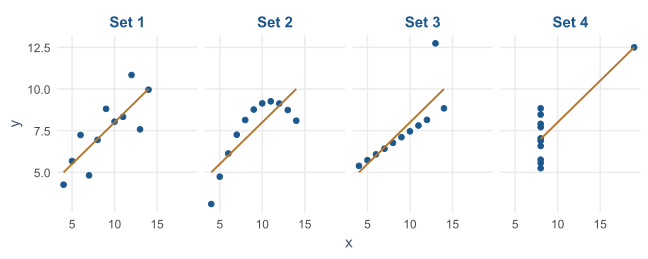
Anscombe’s four datasets share every summary.

Four identical summaries, four different stories

A line, a curve, an outlier, and one point making the whole trend.

Look first

Anyone who analysed these data without looking would draw the same, wrong, conclusion from all four.

Many errors in data, and in reasoning about data, are found only by looking.

Exploring and explaining

Exploratory graph Explanatory graph
for the researcher the reader
purpose understand the data show a known finding
number many, quickly a few, carefully
polish none needed clear message and labels

A thesis contains a few explanatory graphs, chosen from many exploratory ones.

A graph turns numbers into visual properties

flowchart LR
    A["Position on a<br>common scale"] --> B["Length"] --> C["Angle<br>and slope"] --> D["Area"] --> E["Colour<br>shade"]

Cleveland and McGill’s experiments: judged most accurately on the left, least on the right.

Put the most important comparison into position or length.

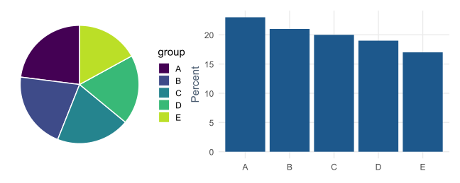
The same five numbers, two ways

In the pie the slices look equal. In the bars the decline from A to E is obvious.

Two more rules of thumb

  • put values to be compared next to each other on the same scale, within one panel;
  • use colour to separate a few categories, not to carry the main message.

Prefer bar charts and dot plots to pie charts, and scatter plots to bubble charts.

Choosing a graph

Question Variables Graph
how are values distributed? one numeric histogram, density
how many in each category? one categorical bar chart
do groups differ? numeric by categorical box plot, points
how are two variables related? two numeric scatter plot
how does it change over time? numeric over time line chart
how do many variables relate? several numeric heat map

The grammar of graphics

flowchart LR
    D["Data<br>a data frame"] --> M["Mappings<br>aes(): variable → property"] --> G["Geoms<br>points, bars, lines"]

Every ggplot2 graph combines these three parts, joined with +.

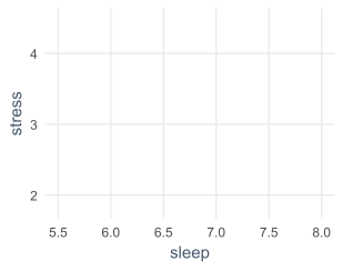
Data and mappings give an empty canvas

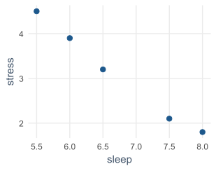
pilot <- tibble(
  sleep  = c(6.5, 7.5, 5.5, 8, 6),
  stress = c(3.2, 2.1, 4.5, 1.8, 3.9)
)

ggplot(pilot, aes(x = sleep, y = stress))

The axes exist, but nothing is drawn yet.
A geom draws the data

ggplot(pilot, aes(x = sleep, y = stress)) +
  geom_point(size = 3)

One point per row. Every further detail is another +.
One row per student

first_sem <- semesters |>
  filter(semester == 1) |>
  left_join(students, join_by(student_id))

Each student’s first-semester record, with their background information.

Most graphs are simplest with one row per case.

Histograms show a distribution

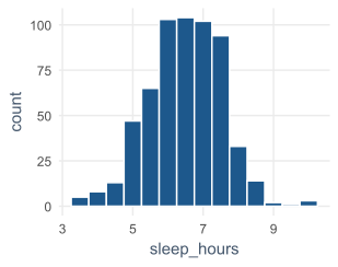
ggplot(first_sem, aes(x = sleep_hours)) +
  geom_histogram(binwidth = 0.5)

Bell-shaped, centred a little above 6 hours.

65% of students sleep less than the recommended 7.
The binwidth changes the picture
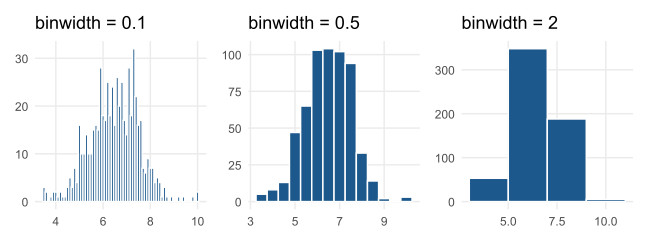
Too narrow is noisy, too wide hides the shape. Try a few widths.

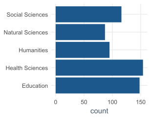
Bar charts count categories

ggplot(students, aes(x = faculty)) +
  geom_bar()

geom_bar() does the counting.

For heights already calculated, such as averages, use geom_col() with y.
Box plots compare groups

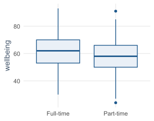
ggplot(first_sem,
       aes(x = study_mode, y = wellbeing)) +
  geom_boxplot()

Part-time students sit a little lower, but the boxes overlap considerably.
Reading a box plot

Part Shows
box the middle half of the values
line inside the median
whiskers the typical range
points beyond unusual values

Whether the study-mode difference is larger than chance is a question for Chapter 8.

Scatter plots show relationships

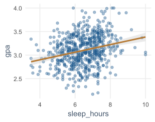
ggplot(first_sem,
       aes(x = sleep_hours, y = gpa)) +
  geom_point(alpha = 0.4) +
  geom_smooth(method = "lm")

alpha makes points transparent, against overplotting.

The line rises, but the points scatter widely.
Line charts show change over time

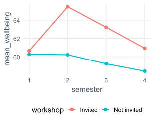
wellbeing_by_sem <- semesters |>
  left_join(students, join_by(student_id)) |>
  summarise(mean_wellbeing = mean(wellbeing),
            .by = c(semester, workshop))

ggplot(wellbeing_by_sem,
       aes(x = semester, y = mean_wellbeing,
           colour = workshop)) +
  geom_line(linewidth = 1) +
  geom_point(size = 2.5)
Mapping and setting

aes(fill = workshop)                          # mapped: depends on the data
geom_histogram(fill = "steelblue")            # set: the same everywhere
Inside aes() Outside aes()
meaning depends on a variable fixed for the whole layer
legend added none

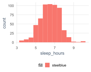
The most common ggplot2 mistake

ggplot(first_sem,
       aes(x = sleep_hours,
           fill = "steelblue")) +
  geom_histogram(binwidth = 0.5)

A fixed colour inside aes() is treated as data: salmon bars and a pointless legend.
fill and colour

Aesthetic Controls
fill the inside of a shape: a bar, a box
colour the outline, or points and lines

A white colour on histogram bars separates them clearly.

From exploratory to explanatory

flowchart LR
    A["Labels"] --> B["Scales and<br>colours"] --> C["Theme"] --> D["Annotations"]

Each addition is a design decision with a reason behind it.

Labels say what was measured

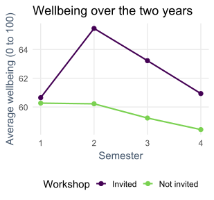
p <- ggplot(wellbeing_by_sem,
            aes(x = semester, y = mean_wellbeing, colour = workshop)) +
  geom_line(linewidth = 1) +
  geom_point(size = 2.5) +
  labs(title    = "Wellbeing over the two years",
       subtitle = "Average score per semester, by workshop group",
       x = "Semester", y = "Average wellbeing (0 to 100)",
       colour = "Workshop")

Units in the axis labels, the message in the title. Storing the graph as p lets you add to it.

Scales and colour-blind-friendly palettes

p <- p +
  scale_x_continuous(breaks = 1:4) +
  scale_colour_viridis_d(end = 0.8)

Whole semesters only: there is no semester 2.5.

Viridis palettes work for colour vision deficiency, about one man in twelve, and print in greyscale.

Colour should never be the only cue

In a printed figure, groups should also differ by:

  • shape or line type;
  • labels placed directly on the lines.

Manual colours: scale_colour_manual(values = c("Invited" = "#1b9e77", "Not invited" = "#7570b3")).

Themes control everything that is not data

p <- p +
  theme_minimal(base_size = 13) +
  theme(legend.position = "bottom")

base_size sets the font size; theme() adjusts details.

The same data, now ready for a thesis.
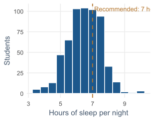
Annotations give a reference

ggplot(first_sem, aes(x = sleep_hours)) +
  geom_histogram(binwidth = 0.5) +
  geom_vline(xintercept = 7,
             linetype = "dashed") +
  annotate("text", x = 7.1, y = Inf,
           label = "Recommended: 7 hours",
           hjust = 0, vjust = 1.5)

y = Inf puts the text at the top, whatever the bar heights.
A graph can be accurate and still mislead

Most misleading graphs are not deliberate. They come from defaults nobody questioned.

Choice The risk
axis range lengths no longer mean their values
aspect ratio the same line looks steep or flat
clutter decoration competes with the data
colour bright bands suggest boundaries

Bar axes start at zero

A bar represents its value by its length.

If the axis starts elsewhere, a bar twice as long no longer means twice as much.

Points and lines use position, so their axes may be zoomed, as long as the reader is told.

Zooming a line chart

The wellbeing line chart’s axis runs only from about 58 to 66, which makes a 5-point gap look large.

p + coord_cartesian(ylim = c(0, 100))

Either say so in the caption, or show the full scale and let readers judge the size.

Aspect ratio, clutter, and colour

  • a graph somewhat wider than tall; the same shape for graphs that will be compared;
  • no heavy grid lines, repeated legends, or three-dimensional effects;
  • qualitative palettes for categories;
  • sequential palettes for quantities in one direction;
  • diverging palettes around a meaningful midpoint such as zero.

A rainbow palette is poor for all of these.

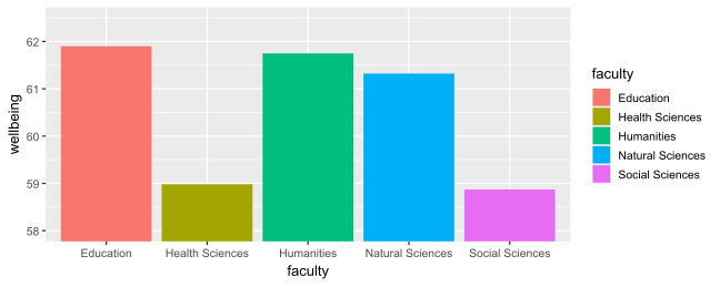
A misleading graph

The Education bar looks several times taller than Social Sciences. The averages differ by about 3 points out of 100.

What is wrong with it

  • the axis starts at 58, so the bar lengths mean nothing;
  • the colours repeat the axis labels, and the legend repeats them again;
  • the faculties are alphabetical, not in a meaningful order;
  • the axis titles are variable names;
  • only averages are shown, hiding how much students differ.

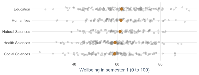
The same data, redesigned

Differences between faculties are small compared with the differences within them.

How the redesign was built

ggplot(first_sem, aes(x = wellbeing, y = reorder(faculty, wellbeing))) +
  geom_jitter(height = 0.15, alpha = 0.25, colour = "grey45") +
  stat_summary(fun = mean, geom = "point", size = 3.5, colour = "#b2182b") +
  labs(x = "Wellbeing in semester 1 (0 to 100)", y = NULL)
Function Job
reorder() order faculties by their average
geom_jitter() spread points so they do not hide each other
stat_summary() calculate and draw each mean

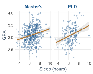
Facets: small multiples

ggplot(first_sem,
       aes(x = sleep_hours, y = gpa)) +
  geom_point(alpha = 0.4) +
  geom_smooth(method = "lm") +
  facet_wrap(~ programme)

One panel per group, with shared axes, so comparison is by position.

facet_grid(rows ~ columns) for two grouping variables.
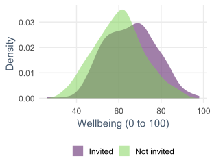
Density plots compare distributions

semesters |>
  filter(semester == 2) |>
  left_join(students, join_by(student_id)) |>
  ggplot(aes(x = wellbeing, fill = workshop)) +
  geom_density(alpha = 0.5) +
  scale_fill_viridis_d(end = 0.8)

The whole distribution moved, not just a few students.
Heat maps show a table of numbers

correlations |>
  as.data.frame() |>
  mutate(var1 = rownames(correlations)) |>
  pivot_longer(-var1, names_to = "var2", values_to = "r") |>
  ggplot(aes(x = var1, y = var2, fill = r)) +
  geom_tile() +
  geom_text(aes(label = round(r, 2))) +
  scale_fill_gradient2(limits = c(-1, 1))

The matrix becomes a long table with one row per pair (Chapter 3).

Reading the heat map

A diverging palette, white at zero. The numbers matter: colour alone is read imprecisely.

Exporting figures

ggsave("figures/wellbeing-lines.png", plot = p,
       width = 16, height = 10, units = "cm", dpi = 300)
ggsave("figures/wellbeing-lines.pdf", plot = p,
       width = 16, height = 10, units = "cm")

The file type follows from the file name.

Save at the printed size

Decision Rule
width about 8 cm for one journal column, 16 cm for a full page
resolution at least 300 dpi for PNG
format PDF or SVG when accepted: sharp at any size
text check it at the final size; adjust base_size

The figure code lives in the script: a supervisor’s request is one changed line.

In your field: economics and business

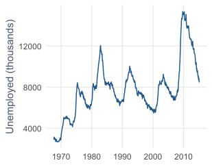
ggplot(economics,
       aes(x = date, y = unemploy)) +
  geom_line()

US unemployment, 1967 to 2015, with each recession a peak.

It shows the number unemployed, not the rate, while the population grew greatly.
Practical lab: the Chapter 4 playground

Work through the playground exercises in your browser, with hints and solutions.

Every exercise also runs in RStudio, from the downloadable chapter project.

Practical exercises 1–3: the basic graphs

  1. A histogram of study hours with binwidths 1, 5, and 10: which shows the shape best?
  2. A bar chart of employment in one colour, ordered from no job to full-time.
  3. Box plots of GPA by faculty, with clear labels.

Practical exercises 4–6: relationships and honesty

  1. Caffeine against sleep, with a trend line: what does it suggest?
  2. Save a graph as a PNG, 16 by 10 cm, at 300 dpi.
  3. Redraw the misleading graph from zero, and choose one of the three for a thesis.

Try this yourself

Pick one variable from your own research.

  • make three exploratory graphs of it in five minutes;
  • choose the one that answers your question;
  • turn it into an explanatory graph: labels, scale, theme, one annotation;
  • save it at 16 cm wide.

Then show it to someone for five seconds and ask what they saw.

Troubleshooting guide (Part 1)

Symptom Likely cause
salmon colour and a strange legend a fixed colour inside aes()
points hide each other overplotting; use alpha or geom_jitter()
categories in alphabetical order factor levels not set, or no reorder()
“semester 2.5” on the axis a numeric axis without breaks

Troubleshooting guide (Part 2)

Symptom Likely cause
small differences look dramatic a zoomed axis on bars
text unreadable in the thesis saved too large, then shrunk
groups vanish in print colour was the only cue
a blurry figure a PNG below 300 dpi

Completion checklist

Misconceptions to leave behind (Part 1)

Misconception Better mental model
summary statistics tell the whole story Anscombe’s sets share every summary
more elements make a graph more informative decoration competes with the data
pie charts are good for proportions bars or dots are almost always clearer

Misconceptions to leave behind (Part 2)

Misconception Better mental model
zooming an axis is always wrong wrong for bars, acceptable for lines if stated
colour makes a graph clearer colour separates a few categories only
a graph is decoration at the end graphs are one of the main instruments

The chapter in one sentence

Look at the data first, then choose a graph that puts the key comparison in position or length and tells the truth about its size.

Next: Chapter 5

The next chapter moves from a topic to a plan:

  • what data analysis is for;
  • from a topic to a research question and a hypothesis;
  • variables, measurement, reliability, and validity;
  • study designs and randomisation;
  • an analysis plan written before the data is seen.

Questions

Think of a graph that convinced you of something.

Would it still convince you with the axis starting at zero?