Dedication
"Dedicated to Tano"
 From Data to Thesis
Full Book
From Data to Thesis
Full Book
Writing a thesis is one of the most intellectually demanding undertakings in an academic life. Yet, for many graduate researchers, the most exhausting hurdle is not formulating hypotheses or collecting observations; it is the daunting chasm between a messy spreadsheet of raw data and a defended, publication-ready results chapter.
For decades, higher education has pushed researchers toward point-and-click statistical packages. While these tools offer an easy first step, they often leave the underlying analysis opaque, create error-prone manual copy-paste rituals, and lock research inside proprietary formats. When an examiner asks for an adjustment or an assumption check, rebuilding the analysis from scratch often becomes a nightmare.
This book was written to offer a different path.
R has evolved into the lingua franca of modern statistical science and reproducible research. Paired with the tidyverse and modern reporting frameworks like Quarto, R gives researchers complete command over their analytical journey—from the first row of survey data to polished, APA-style tables and high-resolution figures.
We now live and research in the age of artificial intelligence. Large language models and AI coding assistants have permanently transformed how we write code, brainstorm models, and explore data. Throughout this book, and particularly in Chapter 18, we treat AI not as a replacement for critical thought, but as a tireless research collaborator. You will learn to use AI assistants to draft and debug R scripts, translate complex errors, and assist with qualitative coding, while maintaining the rigorous verification standards required for academic defense.
Rather than presenting mathematical abstractions in isolation, every statistical and machine learning method in this volume is anchored in a single, realistic running case study following 600 graduate students over four semesters. Every chapter answers a real research question.
For each concept, you will follow a disciplined, five-step roadmap:
To ensure that no software installation stands between you and your first analysis, all companion exercises are hosted in an interactive browser environment. You can test code, experiment with parameters, and verify your answers directly on the book's companion website:
Whether you are embarking on your Master's dissertation, finishing your doctoral dissertation, or publishing your first peer-reviewed paper, may this book serve as your steady desk companion from your first command to your final defense.
Dr. Polla Fattah
*Salahaddin University-Erbil*
Every data analysis is a long chain of decisions. Which cases are kept and which are excluded, how a messy answer is corrected, which variables are combined into a score, which test is used, and how its result is rounded: each choice shapes the final numbers, and each should be open to inspection. When an analysis is done by clicking through menus, most of these decisions leave no trace. Weeks later, not even the researcher can say exactly how a number in the thesis was produced, and an examiner who asks cannot be given a complete answer.
Writing the analysis as code changes this. A script records every step in order, in a form that a supervisor can read, an examiner can check, and the researcher can run again after correcting a mistake or receiving new data. This is the main reason research is increasingly done in a programming language, and it is the reason this book teaches R. The chapter starts from nothing: installing R, finding your way around the program used to write it, and learning the handful of ideas on which everything else rests.
The book follows one research project from its first day to its last. Elaf has just begun a Master’s degree in Educational Psychology. During her first year of graduate study she noticed how tired many of her fellow students were: they slept little, lived on coffee, worried about their supervisors and their money, and a few spoke quietly about leaving. With her supervisor, she turned that observation into a thesis. It asks how sleep, stress, and supervisor support relate to graduate students’ wellbeing, their grades, and their thoughts of dropping out, and whether a short wellbeing workshop can help. Her university agreed to support a two-year study of 600 graduate students from five faculties: a questionnaire at the start, a record of each student’s sleep, study, and wellbeing at the end of every semester, and a six-week workshop to which half of the students would be invited at random.
At their first meeting, her supervisor set out what the thesis would demand. The research questions had to become precise hypotheses before any results were seen. The raw survey export, full of test entries, typing errors, and impossible values, had to be cleaned without losing track of a single change. The sample had to be described honestly, including the students who stopped taking part. Every analysis had to be chosen for a reason and its assumptions checked, and every result reported with its size and its uncertainty, not only with a p-value. At the end, examiners would read the results chapter and could ask how any number in it had been produced. “You should be able to show them,” the supervisor said, “step by step.”
Elaf had used Excel for coursework and had once clicked through an SPSS menu in a statistics class, but she had never written a line of code. Her supervisor suggested R, for exactly the reason given above: an analysis written as code can be shown step by step. The first data has now arrived, and this chapter is Elaf’s first day with R, and yours. Each later chapter takes her one step further, from cleaning the data to the finished thesis. By the end of this one, you will have R running on your computer, you will know your way around the program used to write it, and you will have opened her data and answered a first, simple question about it.
R is a free program for working with data: cleaning it, analysing it, and turning it into tables and graphs. It began in the early 1990s at the University of Auckland, where two statisticians, Ross Ihaka and Robert Gentleman, wrote it for teaching (Ihaka and Gentleman 1996). Its first stable version appeared in 2000. Today it is used in universities, hospitals, governments, and companies around the world.
Four properties make R worth learning for a researcher. It is made for data: statistical tests, models, and graphs are part of the language rather than add-ons. It is free and open source, so you, your students, and anyone who wants to check your work can use it without buying a licence. Its instructions form a written record of the analysis, which anyone can run again to obtain exactly the same results; research that can be repeated in this way is called reproducible, and Chapter 17 returns to the idea. Finally, it is shared by a large community. Thousands of researchers publish free packages, add-ons that give R new abilities, so whatever method your field uses, someone has probably written a package for it.
The price is that R asks you to type instead of click. That feels slow at first. It becomes fast surprisingly quickly, and it pays you back every time you need to repeat, correct, or extend an analysis.
In SPSS or Excel, you click, and the program changes your data or produces output. In R, you write an instruction, and R carries it out. The instructions are saved in a file, so the next time you need the same analysis, you run the file instead of clicking through the menus again. Chapter 2 shows how familiar SPSS and Excel tasks map to R.
Working with R involves two programs. R is the engine that does the work. RStudio is the program in which you drive it: you write R code there, run it, and see the results. You will almost never open R itself; you open RStudio, and RStudio uses R for you.
R must be installed first. Download it from cran.r-project.org, choosing the version for your operating system (Windows, macOS, or Linux), and install it like any other program. Then download the free RStudio Desktop from posit.co and install it. Appendix A walks through both installations step by step, with solutions to common problems.
RStudio is the most widely used editor for R, and this book uses it throughout. Positron, a newer editor from the same company, works with R and Python in one window and is a good alternative if you plan to use both languages. Everything in this book works in either.
The exercises for this chapter run in your web browser. Try them in the playground first, and install R when you are ready.
When you open RStudio, the window is divided into panes. With a script open (you will open one shortly), there are four, described in Table 1.1.
| Where | Pane | What it is for |
|---|---|---|
| Top left | Source | Where you write and save your code, in files called scripts. |
| Bottom left | Console | Where R runs code and shows the results. |
| Top right | Environment | The objects you have created, such as your data. |
| Bottom right | Files, Plots, Packages, Help | Your files, your graphs, your installed packages, and R’s help pages. |
You can type code directly into the Console. Click in it, type 2 + 2, and press Enter. R answers straight away. The [1] at the start of the answer simply means “this is the first value of the result”; you can ignore it for now.
The simplest use of R is as a calculator. Suppose you slept 6.5, 7, and 5.5 hours on three nights last week. Your average is:
(6.5 + 7 + 5.5) / 3[1] 6.333333R follows the usual order of operations: multiplication and division before addition and subtraction, and brackets first of all. Without the brackets, R would divide only the last number by 3:
6.5 + 7 + 5.5 / 3[1] 15.33333The usual arithmetic symbols work as you would expect: +, -, * (multiply), / (divide), and ^ (power).
Typing the same numbers again and again is tiresome and invites mistakes. Instead, you can store a value under a name. The stored value is called an object, and you create it with the assignment arrow <-, which you can read as “gets”:
nights <- 3Nothing is printed, but R now remembers that nights is 3. The object appears in the Environment pane, and you can use it by name:
nights[1] 3nights * 7[1] 21To store several values in one object, combine them with c(), which stands for combine:
sleep <- c(6.5, 7, 5.5)
sleep
[1] 6.5 7.0 5.5Chapter 2 explains these collections, called vectors, in detail. For now, notice how much clearer the code becomes when the numbers have a name:
sum(sleep) / nights[1] 6.333333Names follow a few rules. A name starts with a letter and can contain letters, numbers, dots, and underscores, such as sleep, sleep_week1, or avg.sleep. It cannot contain spaces, so an underscore takes their place: sleep_hours, not sleep hours. R is case-sensitive, which makes Sleep and sleep two different objects. Beyond these rules, the best names say what the object holds: sleep_hours is far better than x, and your future self will be grateful for it.
If you assign a new value to an existing name, the old value is replaced without warning:
nights <- 4
nights
[1] 4Research data is not all numbers. A survey records numbers (hours of sleep), words (the student’s faculty), and yes-or-no answers (whether the student was invited to a workshop). R keeps track of the type of every value, because the type decides what can be done with it: hours of sleep can be averaged, but faculty names cannot. Table 1.2 lists the types you will meet most often.
| Type | Holds | Example |
|---|---|---|
| numeric | numbers, with or without decimals | 6.5, 600 |
| character | text, written inside quotes | "Education" |
| logical | TRUE or FALSE |
TRUE |
The function class() tells you the type of an object:
hours   <- 6.5
faculty <- "Education"
invited <- TRUE

class(hours)
[1] "numeric"class(faculty)[1] "character"class(invited)[1] "logical"Text must be inside quotes. Without them, R thinks you mean an object with that name:
faculty <- EducationError: object 'Education' not foundThis is one of the most common errors for beginners. The message says exactly what went wrong: R looked for an object called Education and did not find one.
Real data always has gaps. A student skips a question, or a value is lost. R marks a missing value with NA, short for not available. It is neither zero nor empty text; it means “we do not know”:
sleep_with_gap <- c(6.5, NA, 5.5)
mean(sleep_with_gap)
[1] NAIf one value is unknown, the average is unknown too, so R returns NA rather than guessing. You will see shortly how to tell R to leave missing values out.
You have already used several functions: c(), sum(), mean(), and class(). A function takes some input, does something with it, and returns a result. You call a function by writing its name followed by brackets, with the input inside:
mean(sleep)[1] 6.333333max(sleep)[1] 7length(sleep)[1] 3Many functions accept more than one input. The inputs are called arguments, and they are separated by commas. The function round(), for example, takes a number and the number of decimal places to keep:
round(6.333333, digits = 1)[1] 6.3Arguments have names. You can leave the names out if you give the arguments in the expected order, so round(6.333333, 1) gives the same result, but writing the names makes your code easier to read.
The missing value from before can now be handled. The function mean() has an argument called na.rm, short for “NA remove”. Set it to TRUE, and R calculates the average of the values it does know:
mean(sleep_with_gap, na.rm = TRUE)[1] 6You can also put one function inside another. R works from the inside out:
round(mean(sleep), digits = 1)[1] 6.3Every function has a help page. Type a question mark before its name in the Console:
?meanThe page opens in the Help pane. Help pages are written for experienced users, so they can look dense at first. Start with three parts: Usage (how to call the function), Arguments (what each input means), and Examples at the bottom, which you can copy and run.
When a search engine or an AI assistant suggests code, treat it like advice from a knowledgeable stranger: often right, sometimes wrong, and always worth checking. Chapter 18 shows how to use AI tools well.
Code typed in the Console is gone once you close RStudio. For real work, write your code in a script: a plain text file, ending in .R, that holds your instructions in order. A new script is created with File > New File > R Script, and it opens in the Source pane. You type one instruction per line, and run the current line, or the lines you have selected, with Ctrl+Enter (Cmd+Enter on a Mac): the code is sent to the Console, and the result appears there. Ctrl+S (Cmd+S) saves the script.
Lines that start with # are comments. R ignores them; they are notes for people. Use them to explain why you did something:
# Sleep last week, in hours per night
sleep <- c(6.5, 7, 5.5)

# Average, rounded for reporting
round(mean(sleep), digits = 1)
[1] 6.3A script is the analysis written down. Months later, when a supervisor asks how a number was obtained, the script is the answer.
Research involves many files: data, scripts, graphs, and drafts. An RStudio Project keeps everything for one piece of work together in one folder, and makes sure R looks for files in that folder.
Create one with File > New Project > New Directory > New Project, give it a name (for example, wellbeing-thesis), and choose where to put it. RStudio creates the folder, with a file ending in .Rproj inside. From then on, double-click that file to open the project, and RStudio starts in the right place with the right files.
The folder R looks in for files is called the working directory. In a project, it is the project folder, so a file stored there can be opened by its name alone:
students <- read.csv("students.csv")As a project grows, it needs subfolders, such as data/ for data and figures/ for graphs. The here package builds file paths that start from the project folder, so the same code works on any computer:
library(here)
students <- read.csv(here("data", "students.csv"))setwd()
Older tutorials start scripts with setwd("C:/Users/Elaf/Documents/thesis"). That line works only on the computer where it was written. Use a project, and your code works for your supervisor too.
R comes with a lot built in, but much of its power comes from packages. Using a package takes two steps. It is installed once on your computer with install.packages(), which downloads it from CRAN, R’s official collection of packages:
install.packages("here")It is then loaded, with library(), in every session in which you want to use it:
library(here)A useful comparison is a library book: installing a package is like buying a book and putting it on your shelf, and loading it is taking it off the shelf to read. You buy it once, but you take it down every time you need it.
The data for this book comes as a package too, called data2thesis. It is not on CRAN, so you install it from this book’s website:
install.packages("https://polla-fattah.github.io/data2thesis_r/downloads/data2thesis_1.1.0.tar.gz",
repos = NULL, type = "source")With R, RStudio, and the package installed, the data can be loaded:
library(data2thesis)Elaf, her study, and her data are fictional. The data was generated by a computer program to look like a realistic survey of graduate students, so that every method in this book has something to find. It describes no real people, and its patterns (for example, that the workshop raised wellbeing, or that students who sleep more have higher grades) were built into the program by the author, not discovered. Nothing in this book is evidence about the wellbeing of real students, and the data and results must not be cited or used as findings about students, universities, or any real situation. The same applies to the counselling service’s records and to the students’ written answers.
The package contains several data frames: tables with one row per case and one column per variable, like a spreadsheet. The main one is students, with one row per student. Two functions give its size:
nrow(students)[1] 600ncol(students)[1] 14There are 600 students and 14 variables. The function head() shows the first six rows:
head(students) student_id supervisor_id age gender faculty programme study_mode
1 S0001 SUP088 31 Female Health Sciences Master's Full-time
2 S0002 SUP116 28 Female Education PhD Full-time
3 S0003 SUP040 33 Male Education PhD Full-time
4 S0004 SUP112 34 Female Health Sciences Master's Part-time
5 S0005 SUP118 35 Female Social Sciences Master's Part-time
6 S0006 SUP028 36 Male Humanities PhD Full-time
employment has_children lives_away financial_worry workshop
1 None No Yes 2 Not invited
2 Part-time job No Yes 2 Invited
3 None No No 4 Invited
4 Full-time job No No 2 Invited
5 None No No 2 Invited
6 Part-time job No Yes 5 Not invited
workshop_sessions considering_dropout
1 0 No
2 0 No
3 5 No
4 6 No
5 2 No
6 0 NoThe names of the variables are listed by names(), and the help page, ?students, describes each one.
names(students) [1] "student_id" "supervisor_id" "age"
[4] "gender" "faculty" "programme"
[7] "study_mode" "employment" "has_children"
[10] "lives_away" "financial_worry" "workshop"
[13] "workshop_sessions" "considering_dropout"To pick out one variable, write the data frame’s name, a dollar sign, and the variable’s name: students$age is the age of every student. A natural first question concerns the age of the students in the study:
mean(students$age)[1] NAThe answer is NA. One student’s age is missing, and R will not guess, but the solution is already familiar:
mean(students$age, na.rm = TRUE)[1] 29.72454The students are 29.7 years old on average. The number of missing values can be counted too: is.na() marks each missing value as TRUE, and sum() counts them, because R counts every TRUE as 1:
sum(is.na(students$age))[1] 1Only 1 age is missing. It is worth knowing: Chapter 3 shows why it is missing, and what to do about it.
Finally, table() counts how many times each value appears. It shows how many students come from each faculty, and how many were invited to the wellbeing workshop:
table(students$faculty)
       Education  Health Sciences       Humanities Natural Sciences
             148              154               95               87
 Social Sciences
116 table(students$workshop)
    Invited Not invited
        300         300
Exactly 300 students, half of the study, were invited. That is not a coincidence: they were chosen at random, and Chapter 5 explains why random assignment matters so much for the conclusions a study can draw.
<- stores a value in an object. c() combines several values.TRUE or FALSE). NA marks a missing value.? opens a function’s help page.install.packages(), and load them each session with library().R, RStudio, Console, script, comment, object, assignment, vector, data type, missing value (NA), function, argument, package, data frame, working directory, RStudio Project, reproducible research.
These short exercises check your understanding. The playground has more, with hints and solutions, which you can run in your browser or download as an RStudio project.
supervisor_sleep and find the average, rounded to one decimal place."600" and 600 with class(), and explain the difference.mean(c(4, NA, 6)) returns NA, and show how to get the average of the two known values.students, find the youngest and the oldest student. (Hint: min() and max() also have an na.rm argument.)table(), find out how many students are studying part-time (the variable is study_mode).Data is the written result of measurement. Each value records one observation about one case: a student’s age, the faculty she belongs to, how many hours she slept in a semester, her answer to a questionnaire item. Before any analysis, a researcher has to know what each value stands for, what kind of measurement produced it, and how the values are arranged. The same questions arise whether the data comes from a questionnaire, a laboratory instrument, or an administrative register, and they decide which summaries and tests make sense later.
Research data rarely arrives in one neat file. In the wellbeing study, the survey tool produced an Excel export, the university’s records office sent the semester results as CSV files, and a colleague who helped with an earlier pilot study works in SPSS, so part of the data exists as an SPSS file too. Before any of these files can be opened, it helps to know how R holds data once it is inside. R has a small number of ways to hold data, called data structures. This chapter introduces them as the tools for recording measurements: vectors for the values of one variable, factors for categories, and data frames for whole tables of cases. It then shows how to bring files of every common format into R, and how to keep track of what each variable means.
Almost all research data can be arranged as a table in which each row is a case and each column a variable. A case is the thing being measured: a student, a patient, a plot of land, a school. A variable is one characteristic measured on every case, such as age or faculty. Each cell then holds one value: the measurement of one variable on one case. This arrangement, sometimes called the data matrix, is the starting point of nearly every method in this book.
What counts as a case depends on the study, and the choice is called the unit of analysis. The wellbeing study has more than one. In the students table, each row is a student. In the semesters table, each row is one student in one semester, so each student appears up to four times:
head(semesters, 5) student_id semester gpa sleep_hours study_hours exercise_days caffeine_mg
1 S0001 1 3.02 7.2 26 5 130
2 S0001 2 3.27 8.4 17 3 80
3 S0001 3 3.17 7.8 25 7 105
4 S0001 4 3.00 7.2 28 4 145
5 S0002 1 3.25 6.4 32 2 210
supervisor_meetings wellbeing
1 0 74
2 1 69
3 3 71
4 2 74
5 3 60The first four rows all belong to student S0001, one for each semester. Confusing the two units is a common source of error. A question about students should count each student once; a question about change over time needs all the semester rows, together with methods that know that rows from the same student belong together (Chapter 10). Chapter 5 returns to the unit of analysis when research questions are turned into data.
In R, the values of one variable are held in a vector. You met vectors in Chapter 1: a set of values combined with c(). They are the basic building block of R, and almost everything else is built from them.
sleep <- c(6.5, 7, 5.5, 8, 6)
sleep
[1] 6.5 7.0 5.5 8.0 6.0A vector holds values of one type only. If you mix types, R quietly converts everything to the most flexible type, which is usually text:
mixed <- c(6.5, "seven", 5.5)
mixed
[1] "6.5" "seven" "5.5" class(mixed)[1] "character"The numbers are now text, in quotes, and they can no longer be averaged. This matters more than it seems. If one person in a survey types “seven” instead of 7, the whole column arrives in R as text. The Excel file later in this chapter shows exactly this.
Most things you do to a vector happen to every value at once. Converting the sleep values from hours into minutes needs only one multiplication:
sleep * 60[1] 390 420 330 480 360Comparisons work the same way, and give one TRUE or FALSE for each value. The nights shorter than the recommended 7 hours are marked by:
sleep < 7[1] TRUE FALSE TRUE FALSE TRUEBecause R counts TRUE as 1 and FALSE as 0, sum() counts the short nights, and mean() gives their share:
sum(sleep < 7)[1] 3mean(sleep < 7)[1] 0.6Three of the five nights, or 60%, were short. The same line of code would work just as well on 2,000 nights.
Square brackets pick values from a vector by their position. Positions start at 1:
sleep[1] # the first night[1] 6.5sleep[c(1, 3)] # the first and third nights[1] 6.5 5.5sleep[-2] # every night except the second[1] 6.5 5.5 8.0 6.0Values can also be picked with a condition, by putting a TRUE/FALSE vector inside the brackets. R keeps the values where the condition is TRUE:
sleep[sleep < 7][1] 6.5 5.5 6.0The line reads aloud as “sleep, where sleep is less than 7”. This way of selecting, called logical indexing, is one of the most useful ideas in R, and you will use it constantly.
Brackets on the left of the arrow change values. Suppose the second night turns out to have been 7.5 hours, not 7:
sleep[2] <- 7.5
sleep
[1] 6.5 7.5 5.5 8.0 6.0Research data is full of categories: faculty, gender, treatment group, agreement on a scale. R stores categories as factors. A factor looks like text but knows the complete set of possible values, called its levels:
faculty <- factor(c("Education", "Humanities", "Education", "Health Sciences"))
faculty
[1] Education Humanities Education Health Sciences
Levels: Education Health Sciences Humanitieslevels(faculty)[1] "Education" "Health Sciences" "Humanities" table(faculty)faculty
Education Health Sciences Humanities
2 1 1 By default, levels are in alphabetical order. When the categories have a natural order, set it yourself with the levels argument, so that tables and graphs show them in that order:
employment <- factor(
  c("None", "Full-time job", "Part-time job", "None"),
  levels = c("None", "Part-time job", "Full-time job")
)
table(employment)
employment
None Part-time job Full-time job
2 1 1 Factors matter most in statistics and graphs. When groups are compared in Chapter 7, or plotted in Chapter 4, R uses the factor’s levels to decide which groups exist and in which order to show them.
The choice between a factor and a number is not a matter of convenience; it follows from the kind of measurement that produced the values. Categories without an order, such as faculty, are nominal. Categories with an order but uneven or unknown distances between them, such as none, part-time, and full-time employment, are ordinal. Measurements on a scale with equal distances, such as hours of sleep or a wellbeing index, are numeric. Table 2.1 shows how each kind is stored in R. Chapter 5 explains these levels of measurement in full, and why they decide which summaries are meaningful.
| Kind of measurement | Example | Stored in R as |
|---|---|---|
| Categories, no order (nominal) | faculty, gender | factor |
| Ordered categories (ordinal) | employment, agreement on a scale | factor with levels in order, or an ordered factor |
| Quantities with equal distances | sleep hours, age, wellbeing | numeric |
| Yes or no | invited to the workshop | logical, or a factor with two levels |
Most research data is a table of this kind: one row for each case, one column for each variable. In R, such a table is a data frame. Each column is a vector, so each column has one type, but different columns can have different types.
A small data frame can be built with data.frame():
pilot <- data.frame(
  student = c("S1", "S2", "S3", "S4"),
  faculty = c("Education", "Humanities", "Education", "Health Sciences"),
  sleep   = c(6.5, 7.5, 5.5, 8),
  invited = c(TRUE, FALSE, TRUE, FALSE)
)
pilot
student faculty sleep invited
1 S1 Education 6.5 TRUE
2 S2 Humanities 7.5 FALSE
3 S3 Education 5.5 TRUE
4 S4 Health Sciences 8.0 FALSEThe quickest way to understand a data frame is str(), short for structure. It lists every column with its type and first few values:
str(pilot)'data.frame': 4 obs. of 4 variables:
$ student: chr "S1" "S2" "S3" "S4"
$ faculty: chr "Education" "Humanities" "Education" "Health Sciences"
$ sleep : num 6.5 7.5 5.5 8
$ invited: logi TRUE FALSE TRUE FALSEA single column is picked with $, as in Chapter 1:
pilot$sleep[1] 6.5 7.5 5.5 8.0Square brackets work on data frames too, with two positions separated by a comma: rows first, then columns. An empty position means “all”:
pilot[2, ] # the second row, all columns student faculty sleep invited
2 S2 Humanities 7.5 FALSEpilot[, c("student", "sleep")] # all rows, two columns student sleep
1 S1 6.5
2 S2 7.5
3 S3 5.5
4 S4 8.0pilot[pilot$sleep < 7, ] # rows where sleep is under 7 student faculty sleep invited
1 S1 Education 6.5 TRUE
3 S3 Education 5.5 TRUEThe last line combines a data frame with logical indexing: “pilot, the rows where sleep is under 7, all columns”. It is the R version of SPSS’s Select Cases.
Assigning to a new column name adds a column:
pilot$short_sleep <- pilot$sleep < 7
pilot
student faculty sleep invited short_sleep
1 S1 Education 6.5 TRUE TRUE
2 S2 Humanities 7.5 FALSE FALSE
3 S3 Education 5.5 TRUE TRUE
4 S4 Health Sciences 8.0 FALSE FALSEThe students data frame from the data2thesis package has the same structure as pilot, only larger:
str(students)'data.frame': 600 obs. of 14 variables:
$ student_id : chr "S0001" "S0002" "S0003" "S0004" ...
$ supervisor_id : chr "SUP088" "SUP116" "SUP040" "SUP112" ...
$ age : int 31 28 33 34 35 36 NA 25 29 26 ...
$ gender : chr "Female" "Female" "Male" "Female" ...
$ faculty : chr "Health Sciences" "Education" "Education" "Health Sciences" ...
$ programme : chr "Master's" "PhD" "PhD" "Master's" ...
$ study_mode : chr "Full-time" "Full-time" "Full-time" "Part-time" ...
$ employment : chr "None" "Part-time job" "None" "Full-time job" ...
$ has_children : chr "No" "No" "No" "No" ...
$ lives_away : chr "Yes" "Yes" "No" "No" ...
$ financial_worry : int 2 2 4 2 2 5 3 NA 2 2 ...
$ workshop : chr "Not invited" "Invited" "Invited" "Invited" ...
$ workshop_sessions : int 0 0 5 6 2 0 4 0 0 0 ...
$ considering_dropout: chr "No" "No" "No" "No" ...In this listing, chr means character, int whole numbers, and num numbers with decimals. The categories, such as faculty, arrive as text, and they are converted into factors when they are needed as categories:
students$faculty <- factor(students$faculty)
levels(students$faculty)
[1] "Education" "Health Sciences" "Humanities" "Natural Sciences"
[5] "Social Sciences" Selection works as before. The number of PhD students in Health Sciences, for example, is found with two conditions:
hs_phd <- students[students$faculty == "Health Sciences" & students$programme == "PhD", ]
nrow(hs_phd)
[1] 44Two symbols are new here. The double equals sign, ==, means “is equal to”; a single = is used for arguments, so comparisons need two. The ampersand, &, means “and”: both conditions must be TRUE. Its partner | means “or”.
In RStudio, View(students) opens the data in a spreadsheet-style viewer, where you can scroll, sort, and filter. It is only for looking: changes you want to keep should be made with code, so they are recorded.
Two more structures appear regularly, even though they are rarely built by hand.
A matrix is a grid of values of one type, usually numbers. Matrices appear most often as results. The function cor(), for example, calculates the correlations between several variables and returns them as a matrix. The correlations below use the first semester only, so that each student counts once:
first_semester <- semesters[semesters$semester == 1, ]
vars <- first_semester[, c("gpa", "sleep_hours", "study_hours", "wellbeing")]
correlations <- cor(vars, use = "complete.obs")
round(correlations, 2)
gpa sleep_hours study_hours wellbeing
gpa 1.00 0.25 0.07 0.31
sleep_hours 0.25 1.00 -0.56 0.46
study_hours 0.07 -0.56 1.00 -0.24
wellbeing 0.31 0.46 -0.24 1.00Every variable correlates perfectly with itself, hence the 1s on the diagonal. Chapter 6 explains how to read correlations. For now, notice that values are picked from a matrix exactly as from a data frame, with [row, column]:
correlations["sleep_hours", "wellbeing"][1] 0.4602433A list is a container that can hold anything: vectors of different lengths, data frames, even other lists. Its parts are usually named:
student <- list(
  id        = "S0001",
  programme = "Master's",
  sleep     = c(7.2, 8.4, 7.8, 7.2)
)
student$sleep
[1] 7.2 8.4 7.8 7.2Lists are rarely built by hand, but R’s statistical functions return their results as lists. A preview of a test from Chapter 7, which examines whether students sleep 7 hours on average in their first semester, shows this:
result <- t.test(first_semester$sleep_hours, mu = 7)
names(result)
[1] "statistic" "parameter" "p.value" "conf.int" "estimate"
[6] "null.value" "stderr" "alternative" "method" "data.name" result$estimatemean of x
6.483502 The function names() lists everything the test calculated, and $ picks out one part, here the students’ average sleep. This is how a number from a statistical test is retrieved for a report.
Each file format has its own function for reading it, and every one of them gives back a data frame. The files used below come with the data2thesis package, and data2thesis_example() finds them on your computer. For your own data, you would put the file in your RStudio Project and give its name instead (see Chapter 1).
A CSV file (comma-separated values) is a plain text table, where commas separate the columns. It is the most common format for sharing data, and R reads it with read.csv():
path <- data2thesis_example("semesters.csv")
semester_file <- read.csv(path)
head(semester_file, 3) student_id semester gpa sleep_hours study_hours exercise_days caffeine_mg
1 S0001 1 3.02 7.2 26 5 130
2 S0001 2 3.27 8.4 17 3 80
3 S0001 3 3.17 7.8 25 7 105
supervisor_meetings wellbeing
1 0 74
2 1 69
3 3 71In your own project, this would simply be read.csv("semesters.csv"), or read.csv(here::here("data", "semesters.csv")) with a data folder.
The readxl package reads Excel files. Install it once with install.packages("readxl"):
library(readxl)
raw <- read_excel(data2thesis_example("wellbeing_raw.xlsx"))
dim(raw)[1] 615 64This is the export from the study’s survey tool, and it shows what real survey exports look like. The function dim() gives its size: 615 rows (more than the 600 students) and 64 columns. The first rows are:
head(raw[, 1:6])# A tibble: 6 × 6
`Response ID` `Q1_Student ID` Q2_Age Q3_Gender Q4_Faculty Q5_Programme
<chr> <chr> <chr> <chr> <chr> <chr>
1 R0001 TEST 99 Female <NA> <NA>
2 R0002 test <NA> <NA> <NA> <NA>
3 R0003 TEST2 30 Male <NA> <NA>
4 R0004 S0191 27 male Humanities Masters
5 R0005 S0015 30 Male Health Sciences Master's
6 R0006 S0474 38 F health sciences Masters The printout looks a little different from before, because read_excel() returns a tibble: a modern kind of data frame that prints more compactly and shows each column’s type under its name. It can be used exactly like a data frame.
Several problems are already visible. There are test responses (TEST), odd codes such as 99 for missing age, and the same answer spelled several ways (Male, male). Every column shown is <chr>, text, even the ages, because a few entries are not plain numbers. Chapter 3 is devoted to cleaning this file; for now, it is enough to be able to open it.
If a workbook has several sheets, choose one with the sheet argument, for example read_excel("file.xlsx", sheet = "Semester 2").
The haven package reads SPSS files (.sav), and also Stata and SAS files:
library(haven)
spss <- read_sav(data2thesis_example("wellbeing.sav"))
spss[1:3, c("student_id", "gender", "faculty", "stress_1")]# A tibble: 3 × 4
student_id gender faculty stress_1
<chr> <dbl+lbl> <dbl+lbl> <dbl+lbl>
1 S0001 1 [Female] 2 [Health Sciences] 3 [Neutral]
2 S0002 1 [Female] 1 [Education] 4 [Agree]
3 S0003 2 [Male] 1 [Education] 4 [Agree] SPSS files carry labels, and haven keeps them. Each value is stored as a number, with its label shown in square brackets: 2 [Health Sciences]. The question behind each variable is kept too:
attr(spss$stress_1, "label")[1] "I feel unable to control important things in my studies."To analyse a labelled variable as categories, turn it into a factor with as_factor(), which uses the labels as levels:
table(as_factor(spss$faculty))
Education Health Sciences Humanities Natural Sciences
148 154 95 87
Social Sciences
116 This is one of the great conveniences for anyone moving from SPSS: the work put into labelling the data is not lost.
A value such as 4 in the column stress_1 means nothing on its own. It becomes a measurement only when the reader knows the question behind it (“I feel unable to control important things in my studies”), the scale of the answers (1 = strongly disagree, 5 = strongly agree), and how missing answers are recorded. A codebook is the document that records this for every variable: its name, its meaning, its type, its possible values, and how it was measured. It is the bridge between the questionnaire that the participants saw and the table that the researcher analyses, and most theses include one in an appendix.
The labels in the SPSS file already contain much of a codebook, and R can collect them into a table. The code below takes the label of every variable, and the type in which it is stored:
codebook <- data.frame(
variable = names(spss),
label = sapply(spss, function(x) attr(x, "label")),
type = sapply(spss, function(x) class(x)[1]),
row.names = NULL
)
head(codebook, 12) variable label type
1 student_id Student identifier character
2 supervisor_id Supervisor identifier character
3 age Age in years at baseline numeric
4 gender Gender haven_labelled
5 faculty Faculty haven_labelled
6 programme Degree programme haven_labelled
7 study_mode Study mode haven_labelled
8 employment Paid work alongside study haven_labelled
9 has_children Has children haven_labelled
10 lives_away Moved away from family to study haven_labelled
11 financial_worry How worried are you about money? haven_labelled
12 workshop Randomly invited to the wellbeing workshop haven_labelledThe function sapply() applies a function to every column in turn and collects the results. A labelled categorical variable also records which number stands for which category, its value labels:
attr(spss$faculty, "labels") Education Health Sciences Humanities Natural Sciences
1 2 3 4
Social Sciences
5 A codebook built in this way can be written to a file with the functions in the next section and completed by hand, adding the answer scales and any notes on how variables were coded. Keeping it next to the data means that anyone who opens the data, including the researcher a year later, can tell what every value means.
A data frame is saved with the matching write function. Each of these creates a file in the project folder:
write.csv(students, "students_clean.csv", row.names = FALSE) # CSV
writexl::write_xlsx(students, "students_clean.xlsx") # Excel (writexl package)
haven::write_sav(spss, "students_clean.sav") # SPSSThe argument row.names = FALSE stops R from adding an extra column of row numbers to the CSV file.
Original data files should stay untouched. Cleaned or changed versions are saved under new names, and the script records how one became the other.
Most tasks done in SPSS or Excel have a direct equivalent in R. Table 2.2 collects the ones from this chapter and the last.
| In SPSS or Excel | In R |
|---|---|
| Open a data file | read_sav(), read_excel(), read.csv() |
| Variable View: names, types, labels | str(); attr(x, "label") for a variable label |
| Data View | View() |
| Select Cases | data[condition, ] |
| Compute Variable | data$new <- ... |
| Frequencies | table() |
| Descriptives | mean(), summary() |
| Save As | write_sav(), write_xlsx(), write.csv() |
The biggest change is not a particular command. In SPSS or Excel, you change the data and the change is saved; the steps you took are forgotten. In R, the data file stays as it was, and the steps are saved in your script. Run the script again, and you get the same result again.
Everyone who writes R sees error messages every day. They are not a sign of failure; they are R reporting precisely what it could not do. The message usually says what went wrong, and often where, so it should always be read. Four messages account for most of the errors a beginner meets.
Object not found. A name is misspelled, or the object was never created (perhaps the line that creates it was not run):
mean(slep)Error: object 'slep' not foundCould not find function. A function name is misspelled, or its package has not been loaded with library():
reed_csv("students.csv")Error in reed_csv("students.csv"): could not find function "reed_csv"Non-numeric argument. A calculation was attempted on text, often because a column arrived as text:
mixed * 2Error in mixed * 2: non-numeric argument to binary operatorUndefined columns selected. A column name in brackets does not exist, often because of a typo or wrong capitals:
students[, "Faculty"]Error in `[.data.frame`(students, , "Faculty"): undefined columns selectedWhen the problem is not obvious, check spelling and capitals first, then check that every line above was run, then read the help page of the function. Copying the error message into a search engine works surprisingly often, because someone has almost always met it before.
With the data open, summary() gives a quick overview of every column: averages and ranges for numbers, counts for factors, and the number of missing values. Here it is for the first semester, one row per student:
summary(first_semester[, c("gpa", "sleep_hours", "study_hours", "wellbeing")]) gpa sleep_hours study_hours wellbeing
Min. :2.170 Min. : 3.500 Min. : 2.00 Min. :24.00
1st Qu.:2.888 1st Qu.: 5.800 1st Qu.:18.00 1st Qu.:52.00
Median :3.100 Median : 6.500 Median :26.00 Median :60.00
Mean :3.102 Mean : 6.484 Mean :27.64 Mean :60.46
3rd Qu.:3.340 3rd Qu.: 7.200 3rd Qu.:37.00 3rd Qu.:69.00
Max. :4.000 Max. :10.000 Max. :67.00 Max. :93.00
NA's :6 NA's :8 Already, the summary shows that the average student sleeps less than 7 hours, and that a few values are missing (NA's). Chapter 6 turns this quick look into a full description of the data.
[ ] picks values by position or by a condition (logical indexing).$ or [rows, columns], and use str() to see its structure.read.csv(), read_excel() (readxl), and read_sav() (haven) import data. haven keeps SPSS labels, and as_factor() turns them into factors. write.csv(), write_xlsx(), and write_sav() export data.Case, variable, data matrix, unit of analysis, data structure, vector, type conversion, logical indexing, factor, level, data frame, tibble, matrix, list, CSV file, variable label, value label, codebook, error message.
The playground has these and more, with hints and solutions, in your browser or as an RStudio project to download.
c("Agree", "Disagree", "Neutral", "Agree") whose levels run from "Disagree" through "Neutral" to "Agree". Check the order with table().students, count the students who are part-time and have children. (Use &.)students called over_30 that is TRUE for students older than 30. Count those students, and explain why the count might need na.rm = TRUE.read_sav() and find the question behind support_3.students, semesters, questionnaire, and supervisors. For each, name one research question it could answer on its own.Raw data is never ready for analysis. Survey tools record test responses alongside real ones, participants submit the same form twice, one person types “female” and another “F”, missing answers are stored as 99, and a slip of the finger turns an age of 25 into 250. None of this is unusual, and none of it is harmless: a single 99 among answers from 1 to 5 can shift an average noticeably, and a duplicated row counts one participant twice. Preparing data for analysis, usually called data cleaning, often takes longer than the analysis itself, and its decisions shape every result that follows.
Cleaning is therefore part of the analysis, not a chore before it, and it deserves the same care. This chapter first sets out what clean data means and the principles that guide cleaning decisions. It then introduces the tools for working with tables in R: choosing cases and variables, creating new variables, summarising by group, reshaping, and combining tables. Finally, it applies them, step by step, to the raw export of the wellbeing survey that Chapter 2 opened: the file with test responses, duplicated rows, the same answer spelled four ways, ages stored as text, and missing values coded as 99.
|>.Data is clean when it can be trusted to represent what was measured. That broad idea can be broken into five qualities, each of which the survey export fails in some way. Clean data is valid: every value is possible for its variable, so there are no ages of 250 or 26 hours of sleep a night. It is accurate: values record what the participant actually meant, so a missing-answer code is not mistaken for a real answer. It is complete as far as possible, and where values are missing, they are marked as missing rather than hidden behind codes. It is consistent: the same answer is always recorded in the same way, so “F”, “female”, and “Female” become one category. And it is unique: each case appears exactly once, with no test entries and no duplicates.
Each failure distorts results in a different way. A missing-answer code that stays in the data is the easiest to see. Suppose five students answered a question on a 1-to-5 scale, and one of them skipped it, which the survey tool recorded as 99:
library(dplyr)
answers <- c(4, 3, 5, 99, 2)
mean(answers)[1] 22.6mean(na_if(answers, 99), na.rm = TRUE)[1] 3.5With the code left in, the average is 22.6, a value that is impossible on a 1-to-5 scale. Marked as missing with na_if(), the code drops out, and the average of the four real answers is 3.5. In a real dataset the distortion is usually smaller and therefore harder to notice, which is exactly what makes it dangerous. Duplicates work in a similar way, but on the sample size and the balance of the sample: a participant who appears twice counts twice.
Three principles follow for every cleaning decision. The raw file is never edited; it stays exactly as it was received, and all changes are made by code that starts from it. Every decision is recorded, in the script and, where it affects the results, in the thesis: how many cases were removed and why, which values were set to missing, how scale scores were built. And the result is checked after every step, because many cleaning mistakes produce no error message at all. The final section of this chapter shows how to report the cleaning in a thesis.
Clean data should also be arranged in a way that makes analysis straightforward. The arrangement used throughout this book is called tidy data (Wickham 2014). In tidy data, each variable forms a column, each observation forms a row, and each value sits in its own cell. The idea is easiest to see in a small example. Table 3.1 stores two semesters of wellbeing for three students side by side, as a spreadsheet often would.
| student | wellbeing_s1 | wellbeing_s2 |
|---|---|---|
| S1 | 58 | 63 |
| S2 | 71 | 70 |
| S3 | 64 | 69 |
The table looks neat, but one variable, wellbeing, is spread over two columns, and a second variable, the semester, is hidden inside the column names. Table 3.2 holds the same six measurements in tidy form.
| student | semester | wellbeing |
|---|---|---|
| S1 | 1 | 58 |
| S1 | 2 | 63 |
| S2 | 1 | 71 |
| S2 | 2 | 70 |
| S3 | 1 | 64 |
| S3 | 2 | 69 |
Now each of the three variables has its own column, and each row is one observation: one student in one semester. Questions such as “average wellbeing in each semester” become a simple grouped summary. The students table in the package is tidy, with one row per student and one column per variable. The survey export is not: it squeezes four semesters of measurements side by side into one row per student. Much of cleaning consists of making data tidy, because once it is tidy, every tool in this chapter works on it.
The tools in this chapter come from the tidyverse, a collection of packages that share one way of working and are designed for tidy data. This chapter uses four of them: dplyr for working with rows and columns, tidyr for reshaping data, stringr for working with text, and readr for turning text into numbers (and for reading and writing files). The whole collection can be installed at once with install.packages("tidyverse") and loaded with library(tidyverse), but this book loads only the packages each chapter needs:
library(dplyr)
library(tidyr)
library(stringr)
library(readr)Analysis is a series of steps: take the data, keep some rows, calculate something, round the result. In Chapter 1, such steps were written by putting functions inside each other:
sleep <- c(6.5, 7, 5.5, 8, 6)
round(mean(sleep), 1)[1] 6.6This reads from the inside out, which gets hard to follow as the steps multiply. The pipe, written |>, writes the steps in the order they happen. It takes the result on its left and passes it as the first argument to the function on its right:
sleep |> mean() |> round(1)[1] 6.6The pipe reads as “and then”: take sleep, and then take the mean, and then round it to one decimal place. In RStudio, Ctrl+Shift+M (Cmd+Shift+M on a Mac) types the pipe for you.
Before R had its own pipe, the tidyverse used %>%, from the magrittr package. You will see it in many tutorials and older scripts. For everything in this book, it does the same job as |>.
The dplyr package provides a small set of verbs, each doing one job. Every verb takes a data frame first and returns a data frame, so verbs can be chained with the pipe. The verbs are easiest to understand on a tiny table. The function tibble() builds one; a tibble is the tidyverse’s version of a data frame, which prints more neatly:
pilot <- tibble(
student = c("S1", "S2", "S3", "S4", "S5"),
faculty = c("Education", "Humanities", "Education", "Health Sciences", "Humanities"),
sleep = c(6.5, 7.5, 5.5, 8, 6),
stress = c(3.2, 2.1, 4.5, 1.8, 3.9)
)
pilot# A tibble: 5 × 4
student faculty sleep stress
<chr> <chr> <dbl> <dbl>
1 S1 Education 6.5 3.2
2 S2 Humanities 7.5 2.1
3 S3 Education 5.5 4.5
4 S4 Health Sciences 8 1.8
5 S5 Humanities 6 3.9Most analyses use only some of the cases: the students of one faculty, the first semester, the participants who completed the study. The verb filter() keeps the rows that meet a condition:
pilot |> filter(sleep < 7)# A tibble: 3 × 4
student faculty sleep stress
<chr> <chr> <dbl> <dbl>
1 S1 Education 6.5 3.2
2 S3 Education 5.5 4.5
3 S5 Humanities 6 3.9Several conditions separated by commas must all be true:
pilot |> filter(sleep < 7, faculty == "Education")# A tibble: 2 × 4
student faculty sleep stress
<chr> <chr> <dbl> <dbl>
1 S1 Education 6.5 3.2
2 S3 Education 5.5 4.5To keep rows matching any of several values, use %in%:
pilot |> filter(faculty %in% c("Education", "Humanities"))# A tibble: 4 × 4
student faculty sleep stress
<chr> <chr> <dbl> <dbl>
1 S1 Education 6.5 3.2
2 S2 Humanities 7.5 2.1
3 S3 Education 5.5 4.5
4 S5 Humanities 6 3.9Every filter is a decision about the sample, and should be reported: an analysis of “students who completed all four semesters” answers a different question from an analysis of all students.
Large datasets have far more variables than any one analysis needs. The verb select() keeps the columns you name, in the order you name them, and a minus sign drops a column instead:
pilot |> select(student, sleep)# A tibble: 5 × 2
student sleep
<chr> <dbl>
1 S1 6.5
2 S2 7.5
3 S3 5.5
4 S4 8
5 S5 6 pilot |> select(-faculty)# A tibble: 5 × 3
student sleep stress
<chr> <dbl> <dbl>
1 S1 6.5 3.2
2 S2 7.5 2.1
3 S3 5.5 4.5
4 S4 8 1.8
5 S5 6 3.9Sorting helps when looking at data, for example to see the most extreme values first. The verb arrange() sorts rows by one or more columns, and desc() sorts from largest to smallest:
pilot |> arrange(desc(stress))# A tibble: 5 × 4
student faculty sleep stress
<chr> <chr> <dbl> <dbl>
1 S3 Education 5.5 4.5
2 S5 Humanities 6 3.9
3 S1 Education 6.5 3.2
4 S2 Humanities 7.5 2.1
5 S4 Health Sciences 8 1.8Many variables used in analysis are calculated from others: a total score, a conversion to other units, a category derived from a number. The verb mutate() adds new columns calculated from existing ones, or changes existing ones:
pilot |> mutate(
sleep_minutes = sleep * 60,
short_sleep = sleep < 7
)# A tibble: 5 × 6
student faculty sleep stress sleep_minutes short_sleep
<chr> <chr> <dbl> <dbl> <dbl> <lgl>
1 S1 Education 6.5 3.2 390 TRUE
2 S2 Humanities 7.5 2.1 450 FALSE
3 S3 Education 5.5 4.5 330 TRUE
4 S4 Health Sciences 8 1.8 480 FALSE
5 S5 Humanities 6 3.9 360 TRUE To sort values into categories, case_when() checks conditions in order and uses the first one that is true, and .default catches everything else:
pilot |> mutate(
stress_level = case_when(
stress >= 4 ~ "High",
stress >= 2.5 ~ "Medium",
.default = "Low"
)
)# A tibble: 5 × 5
student faculty sleep stress stress_level
<chr> <chr> <dbl> <dbl> <chr>
1 S1 Education 6.5 3.2 Medium
2 S2 Humanities 7.5 2.1 Low
3 S3 Education 5.5 4.5 High
4 S4 Health Sciences 8 1.8 Low
5 S5 Humanities 6 3.9 Medium Turning a number into categories in this way loses information, since a stress score of 3.9 and one of 2.6 become the same “Medium”. It is useful for description, but analyses should normally keep the original number.
Summaries reduce many values to a few numbers. The verb summarise() reduces a table to one row of summaries, and n() counts the rows:
pilot |> summarise(
mean_sleep = mean(sleep),
students = n()
)# A tibble: 1 × 2
mean_sleep students
<dbl> <int>
1 6.7 5The real power comes with groups. The .by argument calculates the summary separately for each group:
pilot |> summarise(
mean_sleep = mean(sleep),
students = n(),
.by = faculty
)# A tibble: 3 × 3
faculty mean_sleep students
<chr> <dbl> <int>
1 Education 6 2
2 Humanities 6.75 2
3 Health Sciences 8 1For simple counts, count() is a shortcut:
pilot |> count(faculty)# A tibble: 3 × 2
faculty n
<chr> <int>
1 Education 2
2 Health Sciences 1
3 Humanities 2In many tutorials you will see group_by(faculty) |> summarise(...) instead of the .by argument. Both give the same result. The .by argument is newer and keeps each step self-contained, so this book uses it.
Each verb is simple, but chained together they answer real questions. One such question concerns how average wellbeing changed over the four semesters, separately for students who were and were not invited to the workshop. The semester records are in semesters, and the workshop group is in students, so the workshop group is first added to the semester records. (The left_join() in the first line is explained in Section 3.6.)
semesters |>
left_join(students |> select(student_id, workshop), join_by(student_id)) |>
summarise(
mean_wellbeing = mean(wellbeing),
students = n(),
.by = c(semester, workshop)
) |>
arrange(semester, workshop) semester workshop mean_wellbeing students
1 1 Invited 60.64667 300
2 1 Not invited 60.26667 300
3 2 Invited 65.47000 300
4 2 Not invited 60.22000 300
5 3 Invited 63.22261 283
6 3 Not invited 59.22857 280
7 4 Invited 60.93286 283
8 4 Not invited 58.42500 280Read aloud, the code says: take the semester records, and then add each student’s workshop group, and then calculate the average wellbeing and the number of students for each semester and workshop group, and then sort the result. In semester 1, before the workshop, the two groups are almost level. From semester 2, the invited students are ahead. Chapter 7 tests whether that difference is larger than chance.
The number of students also drops in semesters 3 and 4. Some students left the study, which is worth remembering: it returns later in this chapter and in Chapter 6.
The same data can be laid out in two ways, as the section on tidy data showed. In wide format, repeated measurements sit side by side, one column per occasion. In long format, each measurement has its own row. Here is the wide table from Table 3.1 in R:
wide <- tibble(
student = c("S1", "S2", "S3"),
wellbeing_1 = c(58, 71, 64),
wellbeing_2 = c(63, 70, 69)
)
wide# A tibble: 3 × 3
student wellbeing_1 wellbeing_2
<chr> <dbl> <dbl>
1 S1 58 63
2 S2 71 70
3 S3 64 69Spreadsheets and SPSS often use wide format. For analysis in R, long format is usually easier, because each variable (student, semester, wellbeing) is then one column. The function pivot_longer() turns wide into long:
long <- wide |>
pivot_longer(
cols = c(wellbeing_1, wellbeing_2),
names_to = "semester",
names_prefix = "wellbeing_",
values_to = "wellbeing"
)
long# A tibble: 6 × 3
student semester wellbeing
<chr> <chr> <dbl>
1 S1 1 58
2 S1 2 63
3 S2 1 71
4 S2 2 70
5 S3 1 64
6 S3 2 69The arguments say which columns to stack (cols), where the old column names should go (names_to), which part of the names to drop (names_prefix), and where the values should go (values_to). The result is Table 3.2.
The opposite function, pivot_wider(), is especially useful for presenting results, because a wide table is easier to read:
long |> pivot_wider(names_from = semester, values_from = wellbeing)# A tibble: 3 × 3
student `1` `2`
<chr> <dbl> <dbl>
1 S1 58 63
2 S2 71 70
3 S3 64 69The average wellbeing table from the previous section, for example, reads more easily with one column per workshop group:
semesters |>
left_join(students |> select(student_id, workshop), join_by(student_id)) |>
summarise(mean_wellbeing = round(mean(wellbeing), 1), .by = c(semester, workshop)) |>
pivot_wider(names_from = workshop, values_from = mean_wellbeing)# A tibble: 4 × 3
semester `Not invited` Invited
<int> <dbl> <dbl>
1 1 60.3 60.6
2 2 60.2 65.5
3 3 59.2 63.2
4 4 58.4 60.9Research data is often spread over several tables that share an identifier. The wellbeing study keeps students in one table, their semester records in another, and their supervisors in a third. Joins combine tables by matching the identifier. Two small tables show how:
people <- tibble(
student = c("S1", "S2", "S3"),
faculty = c("Education", "Humanities", "Education")
)
scores <- tibble(
student = c("S1", "S1", "S2", "S4"),
wellbeing = c(58, 63, 71, 66)
)The function left_join() keeps every row of the first table and adds the matching information from the second:
scores |> left_join(people, join_by(student))# A tibble: 4 × 3
student wellbeing faculty
<chr> <dbl> <chr>
1 S1 58 Education
2 S1 63 Education
3 S2 71 Humanities
4 S4 66 <NA> The argument join_by(student) names the column that links the two tables. Student S4 has a score but no entry in people, so their faculty is NA.
The function anti_join() does the opposite: it keeps the rows of the first table that have no match in the second. It is the quickest way to find what is missing, here the students without any scores:
people |> anti_join(scores, join_by(student))# A tibble: 1 × 2
student faculty
<chr> <chr>
1 S3 EducationOn the wellbeing data, joins answer questions that no single table can. Each student’s supervisor has an academic rank, stored in supervisors, and a join brings it next to each student’s answer about dropping out:
by_rank <- students |>
left_join(supervisors |> select(supervisor_id, rank), join_by(supervisor_id)) |>
summarise(
considering_dropout = mean(considering_dropout == "Yes"),
students = n(),
.by = rank
)
by_rank rank considering_dropout students
1 Lecturer 0.1367521 234
2 Professor 0.1217391 115
3 Assistant Professor 0.1752988 251The shares differ a little, from about 12% to about 18%. Differences this small could easily be chance; Chapter 7 shows how to test that. A second join finds the students who have no records for semester 3:
left <- students |>
anti_join(semesters |> filter(semester == 3), join_by(student_id))
nrow(left)[1] 37left |> count(considering_dropout) considering_dropout n
1 No 15
2 Yes 22In all, 37 students have no semester 3 record: they left the study after the first year, and 22 of them had said they were considering dropping out. The students who left are not a random selection, which matters for any analysis of the later semesters. Chapter 6 returns to this.
The survey export can now be cleaned. The steps below are the ones needed for almost any survey data, and each is preceded by the problem it solves. Each step is short. What matters is doing them in a sensible order, and checking the result after each one.
Cleaning starts with looking, because problems that have not been seen cannot be fixed:
library(readxl)
raw <- read_excel(data2thesis_example("wellbeing_raw.xlsx"))
dim(raw)[1] 615 64The file has 615 rows, although there are only 600 students. A few lines of code show what needs fixing:
raw |> count(Q3_Gender)# A tibble: 7 × 2
Q3_Gender n
<chr> <int>
1 F 28
2 Female 233
3 M 46
4 Male 173
5 female 56
6 male 78
7 <NA> 1raw |> filter(str_detect(str_to_upper(`Q1_Student ID`), "TEST")) |> select(1:4)# A tibble: 3 × 4
`Response ID` `Q1_Student ID` Q2_Age Q3_Gender
<chr> <chr> <chr> <chr>
1 R0001 TEST 99 Female
2 R0002 test <NA> <NA>
3 R0003 TEST2 30 Male Gender is spelled six ways (F, female, Female, and so on), plus a blank from a test response, and there are test responses from when the survey was set up. (The raw file also contains "Female " with a trailing space; read_excel() removes such spaces automatically, but other import functions do not, which is why the cleaning below still uses str_trim().) Column names such as Q1_Student ID contain spaces, so they must be written inside backticks (`) in code. And as Chapter 2 showed, many numeric columns arrived as text.
Test responses are not data about students, and duplicated submissions would count some students twice, so both must go before anything else. Test responses have a student ID starting with “TEST”, in upper or lower case. The function str_to_upper() makes the case irrelevant, and str_detect() checks for the pattern. The function distinct() then removes rows that are exact copies of another row. The response ID is different for each submission, even for duplicates, so it is dropped first:
responses <- raw |>
filter(!str_detect(str_to_upper(`Q1_Student ID`), "^TEST")) |>
select(-`Response ID`) |>
distinct()
nrow(responses)[1] 600In the pattern, ! means “not” and ^ means “at the start”. Exactly 600 rows are left: one per student.
Names such as Q10_How worried are you about money? (1-5) are awkward to type and easy to get wrong. Short, consistent names make the code readable and reduce errors. The function rename() changes names, new name first, and the 22 questionnaire items, Q11_1 to Q11_22, are renamed in one go with rename_with(), using the scale each item belongs to:
item_names <- c(paste0("stress_", 1:6), paste0("burnout_", 1:6),
paste0("support_", 1:6), paste0("satisfaction_", 1:4))
responses <- responses |>
rename(
student_id = `Q1_Student ID`,
age = Q2_Age,
gender = Q3_Gender,
faculty = Q4_Faculty,
programme = Q5_Programme,
study_mode = `Q6_Study mode`,
employment = `Q7_Paid work`,
has_children = Q8_Children,
lives_away = `Q9_Moved away from family`,
financial_worry = `Q10_How worried are you about money? (1-5)`,
workshop = `Workshop group`,
workshop_sessions = `Workshop sessions attended`,
considering_dropout = `Y1_Considered leaving?`
) |>
rename_with(~ item_names, .cols = Q11_1:Q11_22)The call paste0("stress_", 1:6) builds the names stress_1 to stress_6, which saves typing them all. The questionnaire’s wording is not lost: it belongs in the codebook (Chapter 2).
If “F”, “female”, and “Female” stay separate, every table and every test treats them as three different groups. Categories are fixed by looking for a pattern rather than listing every spelling, after str_to_lower() and str_trim() have removed differences in case and stray spaces:
responses <- responses |>
mutate(
gender = if_else(str_starts(str_to_lower(str_trim(gender)), "f"), "Female", "Male"),
faculty = case_when(
str_detect(str_to_lower(faculty), "educ") ~ "Education",
str_detect(str_to_lower(faculty), "health") ~ "Health Sciences",
str_detect(str_to_lower(faculty), "humanit") ~ "Humanities",
str_detect(str_to_lower(faculty), "social") ~ "Social Sciences",
str_detect(str_to_lower(faculty), "natural|^sciences$") ~ "Natural Sciences"
),
programme = if_else(str_detect(str_to_lower(programme), "ph"), "PhD", "Master's"),
study_mode = if_else(str_detect(str_to_lower(study_mode), "part"), "Part-time", "Full-time"),
employment = if_else(str_to_lower(employment) %in% c("none", "no job"), "None", employment),
across(c(has_children, lives_away, considering_dropout),
~ if_else(str_starts(str_to_lower(.x), "y"), "Yes", "No"))
)
responses |> count(gender)# A tibble: 2 × 2
gender n
<chr> <int>
1 Female 312
2 Male 288responses |> count(faculty)# A tibble: 5 × 2
faculty n
<chr> <int>
1 Education 148
2 Health Sciences 154
3 Humanities 95
4 Natural Sciences 87
5 Social Sciences 116Two details deserve attention. The order of conditions in case_when() matters: “social sciences” also contains “sciences”, so Social Sciences is checked before Natural Sciences. And across() applies the same change to several columns at once, here turning Yes, yes, and Y into Yes.
After each fix, the categories should be counted again, as above. If a spelling was missed, it shows up immediately.
Survey tools often mark missing answers with codes such as 99 or -9. As the opening example showed, these codes must become NA before any calculation, or R will treat them as real values. The function na_if() turns a code into NA, and as.integer() then turns the text into whole numbers:
responses <- responses |>
mutate(
financial_worry = financial_worry |> na_if("99") |> na_if("-9") |> as.integer(),
across(all_of(item_names), ~ as.integer(na_if(.x, "99"))),
workshop_sessions = as.integer(workshop_sessions),
age = parse_number(age)
)99 everywhere
It is tempting to turn every 99 in the file into NA in one go. But a 99 is not always a code. In a wellbeing score from 0 to 100, it is a perfectly real value. Replace missing codes only in the columns where you know they are codes.
The function parse_number() from readr reads the number out of a text value, ignoring extra text around it. It is useful for the sleep columns, where some students typed "7 hrs". A decimal comma, however, defeats it:
parse_number(c("7 hrs", "6.5", "6,5"))[1] 7.0 6.5 65.0The value "6,5" becomes 65, not 6.5, because in English a comma separates thousands. The comma has to be changed to a point first:
parse_number(str_replace(c("7 hrs", "6.5", "6,5"), ",", "."))[1] 7.0 6.5 6.5Mistakes like this produce no error message. The only protection is to check the data after each step.
Some values cannot be true, such as an age of 250 or 26 hours of sleep a night. Left in the data, a single one can dominate an average or a regression. They are typing mistakes, and since the true value cannot be known, the honest fix is to set them to NA rather than to guess (an age of 250 might have been 25, or 50):
responses |> filter(age > 100) |> select(student_id, age)# A tibble: 1 × 2
student_id age
<chr> <dbl>
1 S0007 250responses <- responses |> mutate(age = if_else(age > 100, NA, age))This is where the missing age in Chapter 1 came from. Unusual but possible values, such as a student who sleeps 4 hours a night, are a different matter: they are real data and are kept. Chapter 6 discusses how to handle them.
A questionnaire scale is scored as the average of its items, and the items must all point in the same direction before they are averaged. One stress item, stress_4 (“I feel confident handling problems in my studies”), is worded in the opposite direction to the others: agreeing with it means less stress. Averaged as it stands, it would cancel part of what the other five items measure. It must first be reversed, so that 1 becomes 5, 2 becomes 4, and so on. On a 1-to-5 scale, subtracting from 6 does exactly that:
questionnaire_clean <- responses |>
select(student_id, all_of(item_names))
scores <- questionnaire_clean |>
mutate(
stress_4 = 6 - stress_4,
stress_score = rowMeans(pick(stress_1:stress_6), na.rm = TRUE),
burnout_score = rowMeans(pick(burnout_1:burnout_6), na.rm = TRUE),
support_score = rowMeans(pick(support_1:support_6), na.rm = TRUE),
satisfaction_score = rowMeans(pick(satisfaction_1:satisfaction_4), na.rm = TRUE)
) |>
select(student_id, ends_with("_score"))
head(scores)# A tibble: 6 × 5
student_id stress_score burnout_score support_score satisfaction_score
<chr> <dbl> <dbl> <dbl> <dbl>
1 S0191 2.83 1.5 3.83 3.33
2 S0015 4.5 3.83 1.67 3
3 S0474 3.5 4.5 1.4 2.75
4 S0418 3.17 3 1.67 3.75
5 S0049 3 3.5 3.17 3.33
6 S0537 2.83 2.5 3.2 4.75The function pick() selects the columns of one scale, and rowMeans() averages each student’s answers across them. With na.rm = TRUE, a student who skipped one item still gets a score from the items they answered. Whether that is acceptable, and how many skipped items is too many, is a decision to report in the thesis. Chapter 9 checks that the items really do measure four separate scales.
The original items should stay in the data, with the scores stored separately as here, because the items are needed again for checking the scales.
The semester measurements sit side by side: GPA_S1, Sleep_S1, …, Wellbeing_S4, 28 columns in all. The data is not tidy, since each row holds four observations, and analyses of change over time need one row per student per semester. This is a pivot_longer() with one extra idea: each column name holds two pieces of information, the variable (GPA) and the semester (1), separated by _S. The special name .value tells R to use the first piece as a column name:
semesters_clean <- responses |>
select(student_id, matches("_S[1-4]$")) |>
pivot_longer(
cols = -student_id,
names_to = c(".value", "semester"),
names_sep = "_S"
)
head(semesters_clean)# A tibble: 6 × 9
student_id semester GPA Sleep Study Exercise Caffeine Meetings Wellbeing
<chr> <chr> <chr> <chr> <chr> <chr> <chr> <chr> <chr>
1 S0191 1 3.07 5.6 31 3 140 2 64
2 S0191 2 3.29 5,7 30 4 140 7 65
3 S0191 3 3.35 5.5 32 3 130 5 60
4 S0191 4 3.58 6.6 29 2 155 7 69
5 S0015 1 2.8 6.5 15 2 210 2 34
6 S0015 2 3.2 6.5 18 0 275 5 38 The selection matches("_S[1-4]$") picks the columns whose names end in _S1 to _S4. The rest is cleaning already familiar from the steps above: tidy names, text to numbers (with the decimal-comma fix for sleep), impossible values to NA, and finally removing the empty rows of students who had left the study:
semesters_clean <- semesters_clean |>
rename(gpa = GPA, sleep_hours = Sleep, study_hours = Study,
exercise_days = Exercise, caffeine_mg = Caffeine,
supervisor_meetings = Meetings, wellbeing = Wellbeing) |>
mutate(
semester = as.integer(semester),
sleep_hours = parse_number(str_replace(sleep_hours, ",", ".")),
across(c(gpa, study_hours, exercise_days, caffeine_mg, supervisor_meetings, wellbeing),
parse_number),
sleep_hours = if_else(sleep_hours > 24, NA, sleep_hours),
study_hours = if_else(study_hours > 168, NA, study_hours),
gpa = if_else(gpa > 4, NA, gpa)
) |>
filter(!if_all(gpa:wellbeing, is.na))
nrow(semesters_clean)[1] 2326The condition if_all(gpa:wellbeing, is.na) is TRUE for rows where every measurement is missing, and ! keeps the others.
The last step checks what the cleaning has produced. The amount of missing data comes first, and across() inside summarise() counts the NAs in every column at once:
semesters_clean |> summarise(across(everything(), ~ sum(is.na(.x))))# A tibble: 1 × 9
student_id semester gpa sleep_hours study_hours exercise_days caffeine_mg
<int> <int> <int> <int> <int> <int> <int>
1 0 0 1 21 23 20 25
# ℹ 2 more variables: supervisor_meetings <int>, wellbeing <int>Up to 25 values per measurement are still missing, about 1% of the records: answers students really did not give, and the impossible values set to NA. These are genuine gaps, and Chapter 6 discusses how to handle them.
The most satisfying check of all is a comparison with a trusted result. The clean tables in the data2thesis package were produced from this same export, so the cleaned data should match them exactly:
same <- function(mine, theirs) {
mine <- as.data.frame(mine)[, names(mine)]
theirs <- as.data.frame(theirs)[, names(mine)]
isTRUE(all.equal(mine, theirs, check.attributes = FALSE))
}
same(questionnaire_clean |> arrange(student_id),
questionnaire |> arrange(student_id))[1] TRUEsame(semesters_clean |> arrange(student_id, semester),
semesters |> arrange(student_id, semester))[1] TRUEBoth are TRUE. The cleaning is complete, and from here on the book uses the clean tables from the package.
A thesis reports the cleaning briefly, usually in the methods chapter, so that a reader can judge what was done to the data. For the survey export, with the numbers filled in by the code:
The survey export contained 615 responses. Test responses (3) and duplicate submissions (12) were removed, leaving 600 students. Inconsistent spellings of categories were standardised, and missing-answer codes (99 and −9) were recoded as missing. Impossible values (4 in all), such as an age of 250 years or 26 hours of sleep a night, were set to missing, because the true values could not be known. The reverse-worded item stress_4 was recoded before scale scores were computed as the mean of each scale’s items, using all items a student had answered.
Put all of these steps in one script, for example 01-clean-data.R, that starts from the raw file and ends by saving the clean tables:
write_csv(semesters_clean, here::here("data", "semesters_clean.csv"))Never edit the raw file by hand. If you find a new problem next month, you fix it in the script and run it again, and every step stays on record.
|> passes a result to the next function: read it as “and then”.filter() chooses cases, select() chooses variables, arrange() sorts, mutate() creates variables, summarise() with .by summarises by group, and count() counts. case_when() sorts values into categories.pivot_longer() and pivot_wider() reshape data between wide and long formats.left_join() combines tables by an identifier; anti_join() finds rows without a match.NA column by column, convert text to numbers (watch decimal commas), set impossible values to NA, reverse reversed items before computing scale scores, and check the result.Data cleaning, tidyverse, tidy data, tibble, pipe, verb, grouped summary, wide format, long format, join, identifier, missing code, reversed item, scale score.
The playground has these and more, with hints and solutions.
students, find the average age of students in each faculty, sorted from oldest to youngest. (Remember na.rm = TRUE.)semesters that is "Short" when sleep_hours is under 6, "Recommended" when it is 7 or more, and "Moderate" otherwise. Count the semester records in each category.semesters, make a table of average GPA with one row per student and one column per semester, using pivot_wider(). Show the first rows.semesters to students and compare the average semester GPA of full-time and part-time students.stress_4 item must be reversed before the stress score is calculated, and describe what would happen to the scores if it were not.A table of 600 numbers says almost nothing at a glance; a well-made graph of the same numbers can show in seconds where most values lie, which values are unusual, how groups differ, and how one variable moves with another. Graphs are therefore not decoration added to an analysis at the end. They are one of its main instruments: the first thing a careful researcher does with new data is look at it, and many errors in data, and in reasoning about data, are found only by looking.
A graph is also an argument. The choices behind it, which graph, which scale, which colours, what to leave out, decide what a reader sees first and what they conclude. Those choices can make a pattern clear or hide it, and they can make a small difference look dramatic or a large one look trivial. This chapter therefore begins with the ideas behind good graphs: what graphs are for, how people read them, how to choose a graph for a question, and what makes a graph honest. It then teaches ggplot2, the most widely used package for graphics in R, as a direct expression of those ideas, and uses it to answer the study’s first research question, what graduate student life looks like (RQ1).
Numerical summaries compress data into a few numbers, and that compression can hide almost anything. The statistician Francis Anscombe made the point with four small datasets that he constructed in 1973 (Anscombe 1973). R includes them as anscombe. Each has 11 pairs of values, and the usual summaries are identical for all four:
library(ggplot2)
library(dplyr)
anscombe_long <- tibble(
set = rep(paste("Set", 1:4), each = 11),
x = c(anscombe$x1, anscombe$x2, anscombe$x3, anscombe$x4),
y = c(anscombe$y1, anscombe$y2, anscombe$y3, anscombe$y4)
)
anscombe_long |>
summarise(mean_x = mean(x), mean_y = mean(y), sd_y = sd(y), correlation = cor(x, y),
.by = set) |>
mutate(across(where(is.numeric), \(v) round(v, 2)))# A tibble: 4 × 5
set mean_x mean_y sd_y correlation
<chr> <dbl> <dbl> <dbl> <dbl>
1 Set 1 9 7.5 2.03 0.82
2 Set 2 9 7.5 2.03 0.82
3 Set 3 9 7.5 2.03 0.82
4 Set 4 9 7.5 2.03 0.82The same means, the same spread, the same correlation of 0.82: judged by the numbers, the four datasets are the same. Figure 4.1 shows that they are not.
ggplot(anscombe_long, aes(x = x, y = y)) +
geom_point(size = 2) +
geom_smooth(method = "lm", se = FALSE, colour = "grey50") +
facet_wrap(~ set) +
theme_minimal(base_size = 12)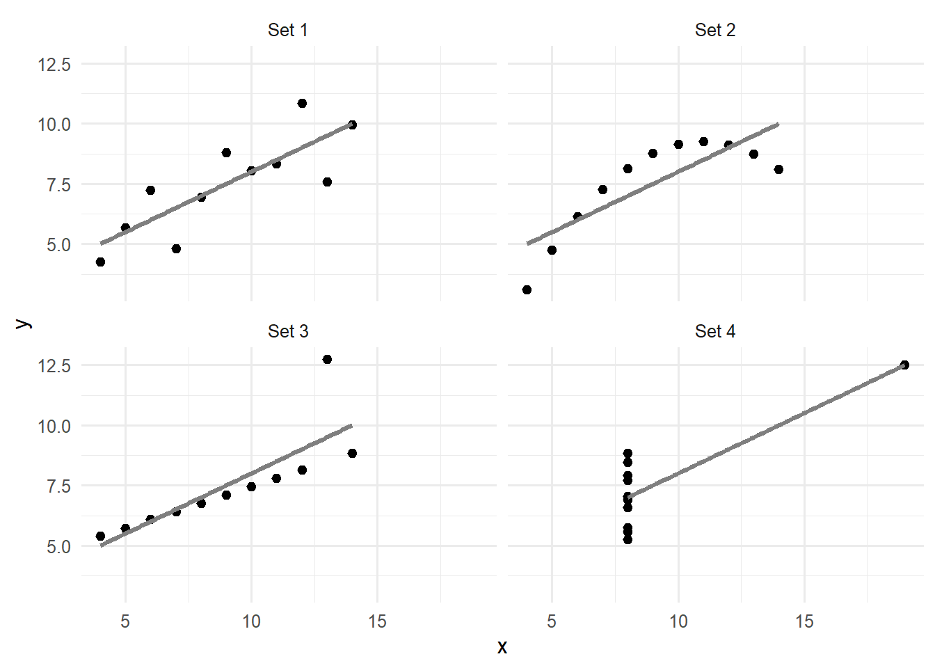
Only the first set is the kind of data the correlation describes well: a straight-line relationship with random scatter. The second is a smooth curve, the third a perfect line spoiled by one outlier, and in the fourth a single unusual point creates the entire relationship. Anyone who analysed these data without looking would draw the same, wrong, conclusion from all four. Looking first is not optional.
Graphs serve two different purposes, and it helps to know which one a graph is for. Exploratory graphs are made for the researcher, quickly and in large numbers, to understand the data: to check distributions, find unusual values, and notice patterns worth testing. They need no polish. Explanatory graphs are made for readers, to show a finding that the researcher already understands, and they need care: a clear message, accurate labels, and nothing that distracts. A thesis contains a few explanatory graphs, chosen from the many exploratory ones made along the way.
A graph works by turning numbers into visual properties: positions, lengths, angles, areas, colours. People do not judge all of these equally well. In a series of experiments, the statisticians William Cleveland and Robert McGill asked people to compare values shown in different ways, and found a clear ranking (Cleveland and McGill 1984). Positions along a common scale are judged most accurately, followed by lengths, then angles and slopes, then areas, and finally shades of colour. A good graph therefore puts its most important comparison into position or length.
The difference is easy to experience. The code below shows the same five percentages, which differ only slightly, as a pie chart and as a bar chart:
library(patchwork)
shares <- tibble(group = LETTERS[1:5], percent = c(23, 21, 20, 19, 17))
pie_chart <- ggplot(shares, aes(x = "", y = percent, fill = group)) +
geom_col(width = 1, colour = "white") +
coord_polar(theta = "y") +
scale_fill_viridis_d(end = 0.9) +
theme_void()
bar_chart <- ggplot(shares, aes(x = group, y = percent)) +
geom_col(fill = "grey50") +
labs(x = NULL, y = "Percent") +
theme_minimal(base_size = 12)
pie_chart + bar_chart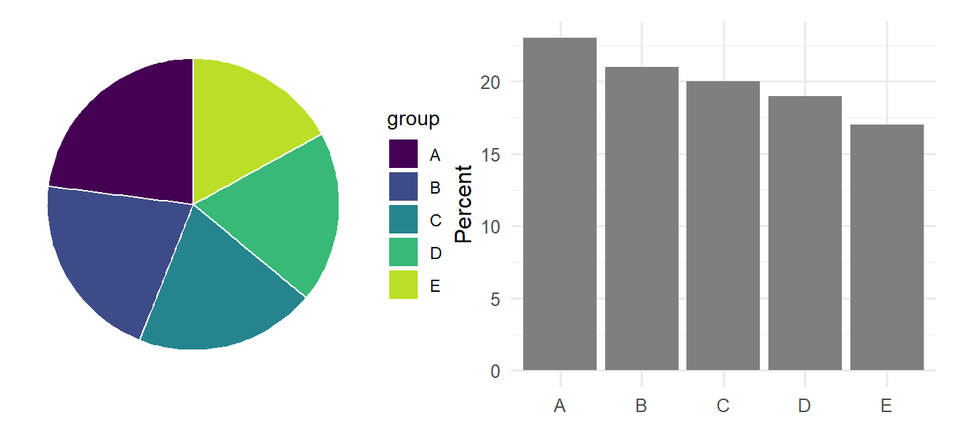
In the pie chart, the slices look almost identical, and ranking them requires reading a legend. In the bar chart, the steady decline from A to E is obvious at once, because the comparison is made by length along a shared axis. For this reason, researchers generally prefer bar charts and dot plots to pie charts, and scatter plots to bubble charts. The patchwork package, loaded above, places ggplot2 graphs side by side with a simple +.
The same research gives two further rules of thumb. Comparisons are easiest when the values to be compared sit next to each other on the same scale, so the most important comparison should be placed within one panel, not across panels. And colour is best used to distinguish a few categories, or to show one quantity that does not need to be read precisely, rather than to carry the main message.
The right graph follows from the research question and from the kinds of variables involved (Chapter 2). A question about the distribution of one numeric variable needs a different graph from a question about the relationship between two. Table 4.1 is a starting point for the graphs in this chapter.
| Question | Variables | Graph | geom |
|---|---|---|---|
| How are the values distributed? | One numeric | Histogram, density plot | geom_histogram(), geom_density() |
| How many cases fall in each category? | One categorical | Bar chart | geom_bar() |
| Do groups differ? | Numeric by categorical | Box plot, points with averages | geom_boxplot(), geom_jitter() |
| How are two variables related? | Two numeric | Scatter plot | geom_point() |
| How does something change over time? | Numeric over time | Line chart | geom_line() |
| How do many variables relate? | Several numeric | Heat map of correlations | geom_tile() |
The ggplot2 package is built on an idea called the grammar of graphics (Wickham 2016). It follows directly from the previous sections: a graph maps variables to visual properties. Every ggplot2 graph therefore combines three parts. The data is a data frame. The aesthetic mappings, written inside aes(), state which variable goes to which visual property: the x axis, the y axis, the colour, and so on. The geometric layers, called geoms, state which shape represents the data, such as points, bars, or lines. The parts are added together with +. Five students from a pilot study show how:
pilot <- tibble(
student = c("S1", "S2", "S3", "S4", "S5"),
sleep = c(6.5, 7.5, 5.5, 8, 6),
stress = c(3.2, 2.1, 4.5, 1.8, 3.9),
invited = c("Yes", "No", "Yes", "No", "Yes")
)The function ggplot(), given the data and the mappings, sets up an empty canvas with the axes:
ggplot(pilot, aes(x = sleep, y = stress))
Adding a geom draws the data. The geom geom_point() draws one point per row:
ggplot(pilot, aes(x = sleep, y = stress)) +
geom_point(size = 3)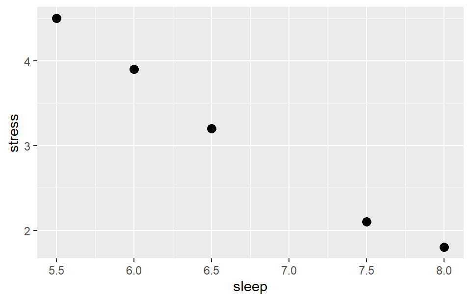
Every further detail is another +: another layer, a label, a colour scale, a theme. That is the whole idea, and every graph in this chapter, however complex it looks, is more of the same.
For the wellbeing data, one row per student makes most graphs simplest. The code below combines each student’s first-semester record with their background information:
first_sem <- semesters |>
filter(semester == 1) |>
left_join(students, join_by(student_id))The first question about any numeric variable concerns its distribution: where most values lie, how widely they spread, and whether some are unusual. A histogram answers it by dividing the values into ranges, called bins, and showing how many cases fall into each. Here is the distribution of sleep:
ggplot(first_sem, aes(x = sleep_hours)) +
geom_histogram(binwidth = 0.5)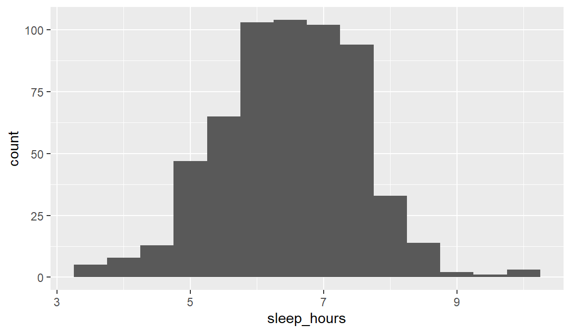
Figure 4.5 shows a roughly symmetrical, bell-shaped distribution, centred a little above 6 hours. Most students sleep less than the recommended 7 hours: 65% of them in the first semester. A few sleep very little, under 4.5 hours; Chapter 6 looks at such unusual values.
The argument binwidth sets the width of each bin, here half an hour. The choice matters: bins that are too wide hide the shape, and bins that are too narrow make it noisy, so it is worth trying a few widths.
A bar chart shows how many cases fall into each category. The geom geom_bar() does the counting:
ggplot(students, aes(x = faculty)) +
geom_bar()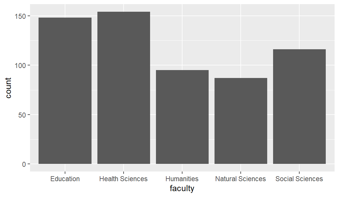
When the heights have already been calculated, for example averages, geom_col() is used instead, with the calculated value mapped to y. Because a bar represents its value by its length, the axis of a bar chart must start at zero; the section on honest graphs returns to this.
A box plot summarises a numeric variable for each group, which makes it the standard graph for comparing groups. The box covers the middle half of the values, the line inside is the median, the whiskers reach out to the typical range, and points beyond the whiskers mark unusual values. The comparison below concerns wellbeing in full-time and part-time students:
ggplot(first_sem, aes(x = study_mode, y = wellbeing)) +
geom_boxplot()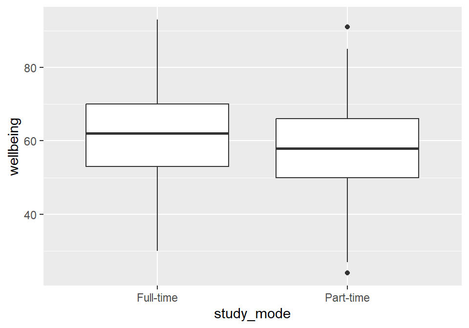
Part-time students’ wellbeing is a little lower, but the boxes overlap considerably: many part-time students are doing better than many full-time students. Whether the difference is larger than chance is a question for Chapter 8.
The relationship between two numeric variables, such as sleep and grades, is shown with a scatter plot, which puts one variable on each axis. With 600 students, points pile on top of each other, a problem called overplotting, so alpha makes them partly transparent, and darker areas show where many students are:
ggplot(first_sem, aes(x = sleep_hours, y = gpa)) +
geom_point(alpha = 0.4) +
geom_smooth(method = "lm")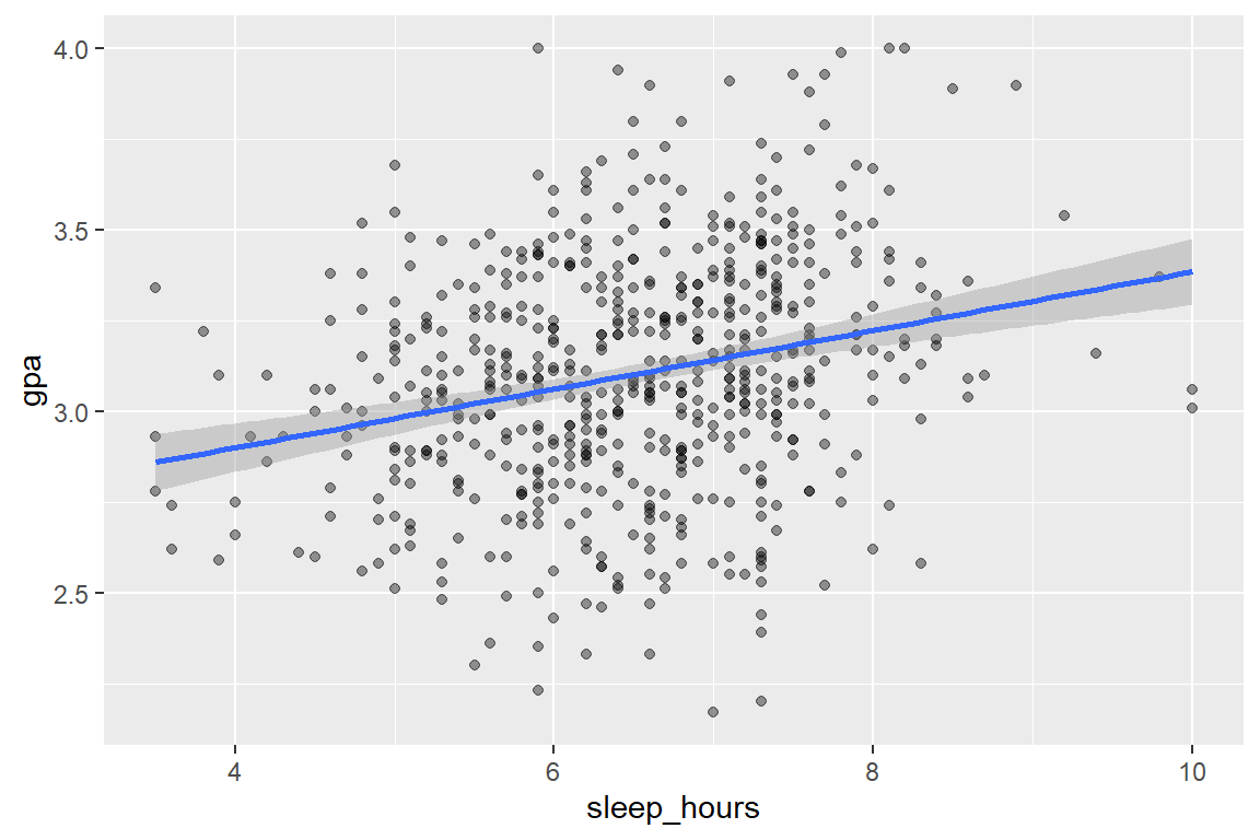
The layer geom_smooth(method = "lm") adds a straight trend line, with a grey band showing its uncertainty. The line rises: students who sleep more tend to have slightly higher GPAs. The points, however, scatter widely around it. Sleep is related to GPA, but it is far from the whole story, and Chapter 8 measures the relationship.
The study followed its students for four semesters, and a line chart shows how the average changed. The averages are calculated first (Chapter 3) and then plotted, with one line per workshop group:
wellbeing_by_sem <- semesters |>
left_join(students, join_by(student_id)) |>
summarise(mean_wellbeing = mean(wellbeing), .by = c(semester, workshop))
ggplot(wellbeing_by_sem, aes(x = semester, y = mean_wellbeing, colour = workshop)) +
geom_line(linewidth = 1) +
geom_point(size = 2.5)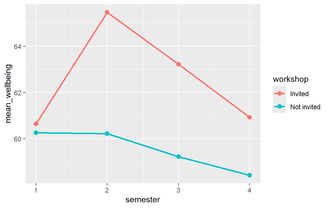
Figure 4.9 tells the story of the workshop at a glance: the groups start level, the invited students pull ahead in semester 2, and the gap narrows afterwards. Chapters 7 and 10 test whether this pattern is real.
In Figure 4.9, colour = workshop sat inside aes(). That maps colour to a variable: each workshop group gets its own colour, and ggplot2 adds a legend to explain them. To make everything one fixed colour, the colour is set outside aes() instead:
ggplot(first_sem, aes(x = sleep_hours)) +
geom_histogram(binwidth = 0.5, fill = "steelblue", colour = "white")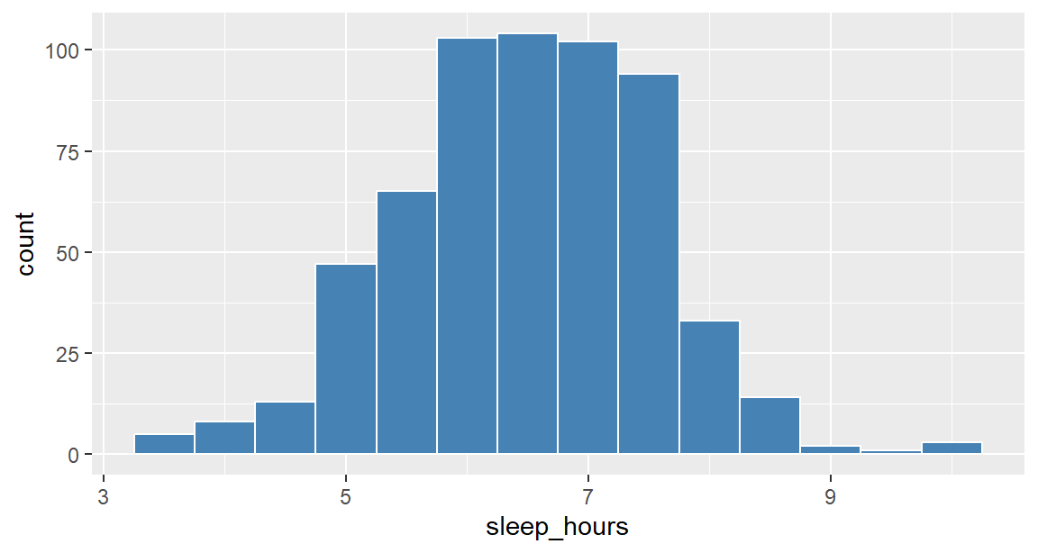
A very common mistake is to put a fixed colour inside aes(). ggplot2 then treats "steelblue" as a variable with one value, colours it with its first default colour (a salmon pink), and adds a pointless legend:
ggplot(first_sem, aes(x = sleep_hours, fill = "steelblue")) +
geom_histogram(binwidth = 0.5)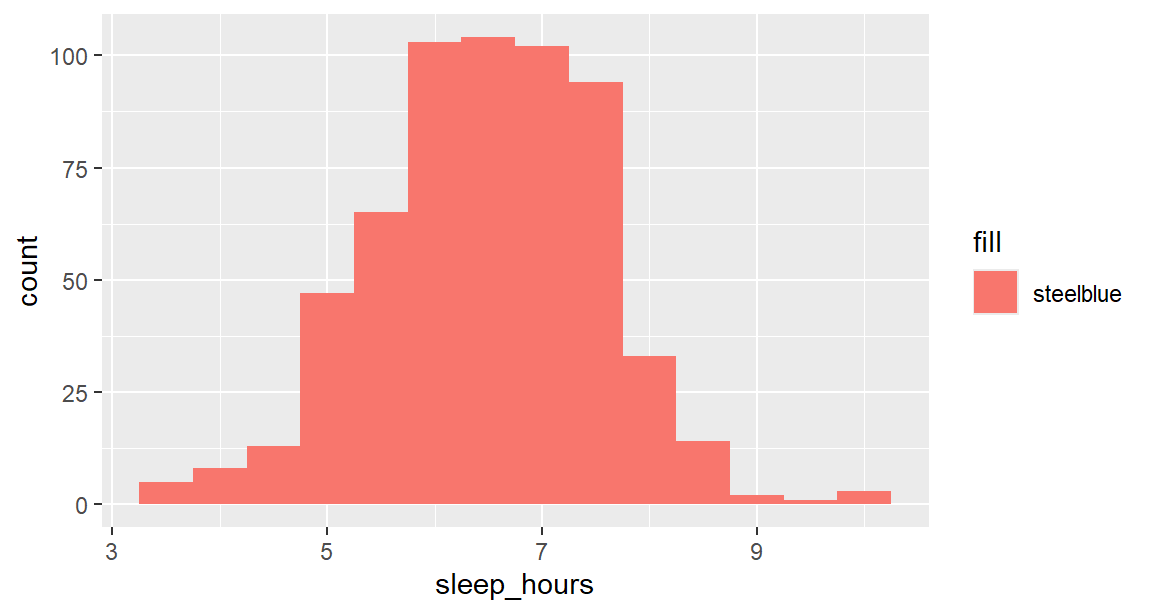
The rule follows from the grammar: inside aes() for anything that should depend on the data, outside for anything that should be the same everywhere. Note also the difference between fill and colour: fill is the inside of a shape such as a bar or box, and colour is its outline, or the colour of points and lines.
The graphs so far are exploratory: good enough for the researcher. An explanatory graph for a thesis or paper needs more care, and every addition below is a design decision with a reason behind it.
A reader cannot interpret a graph whose axes say mean_wellbeing and semester. Axis labels should state what was measured, with units, and the title or caption should state the message. The function labs() sets the title, subtitle, axis labels, legend title, and caption:
p <- ggplot(wellbeing_by_sem, aes(x = semester, y = mean_wellbeing, colour = workshop)) +
geom_line(linewidth = 1) +
geom_point(size = 2.5) +
labs(
title = "Wellbeing over the two years",
subtitle = "Average score per semester, by workshop group",
x = "Semester",
y = "Average wellbeing (0 to 100)",
colour = "Workshop"
)
p
Storing the graph in an object, here p, makes it possible to add to it step by step without repeating the code.
Scales control how data values become positions, colours, and sizes, and each has a scale_ function. Two decisions are needed here. The x axis should show only whole semesters, since there is no semester 2.5. And the colours should come from a palette that people with colour vision deficiency, about one man in twelve, can tell apart. The viridis palettes, built into ggplot2, are designed for exactly that, and they also print well in greyscale:
p <- p +
scale_x_continuous(breaks = 1:4) +
scale_colour_viridis_d(end = 0.8)
p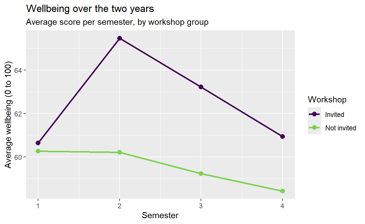
Colours can also be chosen by hand, with scale_colour_manual(values = c("Invited" = "#1b9e77", "Not invited" = "#7570b3")). Whatever the choice, colour should never be the only way to tell groups apart in a printed figure: different shapes or line types, or labels placed directly on the lines, keep the graph readable in black and white.
A theme controls everything that is not data: the background, grid lines, fonts, and the position of the legend. The default grey background of ggplot2 is useful on screen, but most journals prefer a plain look. The complete themes theme_minimal() and theme_bw() provide it, base_size sets the font size, and theme() adjusts individual details:
p <- p +
theme_minimal(base_size = 13) +
theme(legend.position = "bottom")
p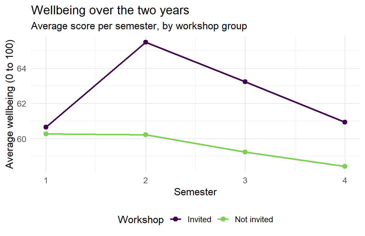
Compared with Figure 4.9, Figure 4.14 shows the same data, but it is now ready for a thesis.
A reference value often helps a reader interpret a graph: a recommended amount, a threshold, a mean. The functions geom_vline() and geom_hline() draw reference lines, and annotate() places text:
ggplot(first_sem, aes(x = sleep_hours)) +
geom_histogram(binwidth = 0.5, fill = "steelblue", colour = "white") +
geom_vline(xintercept = 7, linetype = "dashed") +
annotate("text", x = 7.1, y = Inf, label = "Recommended: 7 hours", hjust = 0, vjust = 1.5) +
labs(x = "Hours of sleep per night", y = "Number of students") +
theme_minimal(base_size = 13)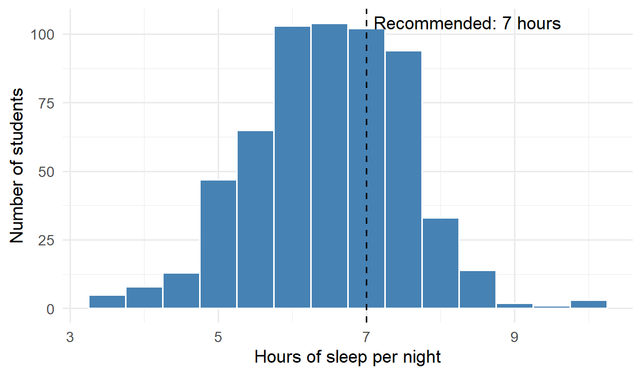
In the annotation, y = Inf places the text at the top of the plot, whatever the height of the bars; hjust = 0 makes it start just right of the line, and vjust = 1.5 moves it slightly down from the edge. The line makes the graph’s message, that most students sleep less than recommended, visible without any further explanation.
A graph can be accurate in every detail and still mislead. Most misleading graphs are not deliberate; they come from defaults that nobody questioned. Four choices deserve particular attention.
The first is the axis range. A bar represents its value by its length, so a bar chart whose axis does not start at zero misrepresents every value: a bar twice as long no longer means twice as much. Points and lines represent values by position, so their axes may be zoomed in to show change clearly, as long as the reader is told. The y axis of Figure 4.14, for example, runs only from about 58 to 66, because ggplot2 zooms in on the data, which makes a 5-point gap look large. Either the caption should say so, or the full range of the scale can be shown with coord_cartesian(ylim = c(0, 100)), letting readers judge the size of the difference themselves.
The second is the aspect ratio, the shape of the graph. The same line looks steep in a tall, narrow graph and flat in a wide, short one. A good default is a graph somewhat wider than it is tall, and the same shape for graphs that will be compared.
The third is clutter. Everything in a graph that does not carry information, such as heavy grid lines, a legend that repeats the axis labels, or three-dimensional effects, competes with the data for the reader’s attention. Three-dimensional bars and pies are worst of all, since the perspective distorts exactly the lengths and angles that carry the values.
The fourth is colour. Colours for categories should be clearly different from each other but none should stand out, since no category is more important than another; a qualitative palette such as viridis does this. Colours for quantities should run in one direction, from light to dark (a sequential palette), or away from a meaningful midpoint such as zero in two directions (a diverging palette, as in the heat map later in this chapter). A rainbow palette is poor for both, because its bright bands suggest boundaries that are not in the data.
The principles are clearest when applied to one graph. Suppose the question is whether wellbeing differs between faculties. A first attempt, using defaults and a zoomed axis, might look like Figure 4.16:
faculty_means <- first_sem |>
summarise(wellbeing = mean(wellbeing), .by = faculty)
ggplot(faculty_means, aes(x = faculty, y = wellbeing, fill = faculty)) +
geom_col() +
coord_cartesian(ylim = c(58, 62.5))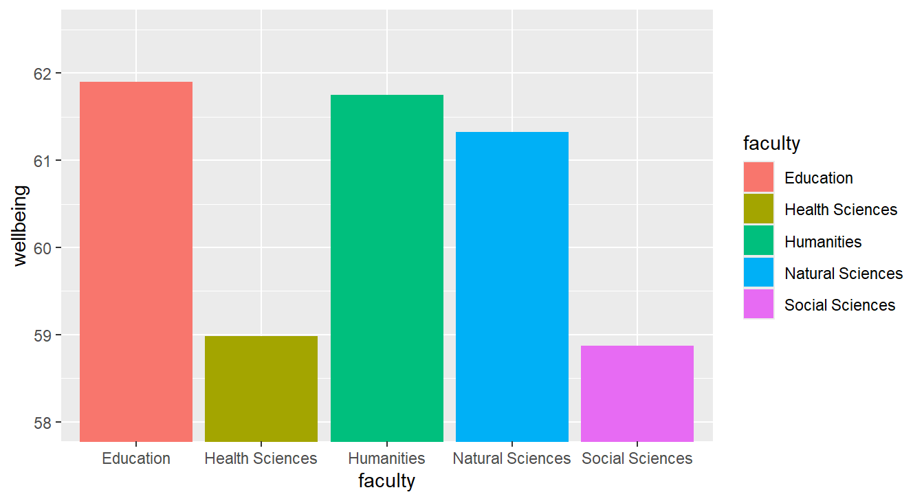
The graph suggests large differences: the Education bar looks several times taller than the Social Sciences bar. But the axis starts at 58, so the lengths of the bars mean nothing; the averages actually differ by about 3 points on a 100-point scale. The colours add nothing that the axis labels do not already say, the legend repeats them a second time, the faculties appear in alphabetical rather than meaningful order, and the axis titles are variable names. Most seriously, the graph shows only averages, and hides how much students within each faculty differ.
Figure 4.17 shows the same data, redesigned. Every student appears as a faint point, so the spread within each faculty is visible, and the average of each faculty is marked in red. The faculties are ordered by their average, the labels say what was measured, and the legend is gone:
ggplot(first_sem, aes(x = wellbeing, y = reorder(faculty, wellbeing))) +
geom_jitter(height = 0.15, alpha = 0.25, colour = "grey45") +
stat_summary(fun = mean, geom = "point", size = 3.5, colour = "#b2182b") +
labs(x = "Wellbeing in semester 1 (0 to 100)", y = NULL) +
theme_minimal(base_size = 12)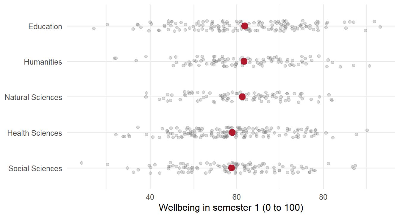
The function reorder() orders the faculties by their average wellbeing, geom_jitter() spreads the points a little vertically so that they do not hide each other, and stat_summary() calculates and draws each faculty’s mean. The redesigned graph tells the truth that the first one hid: the differences between faculties are small compared with the differences between students within each faculty. Chapter 8 tests whether they are larger than chance.
Facets, also called small multiples, split one graph into a panel for each group, all with the same axes, so the groups are easy to compare. The function facet_wrap() takes the variable to split by:
ggplot(first_sem, aes(x = sleep_hours, y = gpa)) +
geom_point(alpha = 0.4) +
geom_smooth(method = "lm") +
facet_wrap(~ programme) +
labs(x = "Hours of sleep per night", y = "GPA") +
theme_minimal(base_size = 12)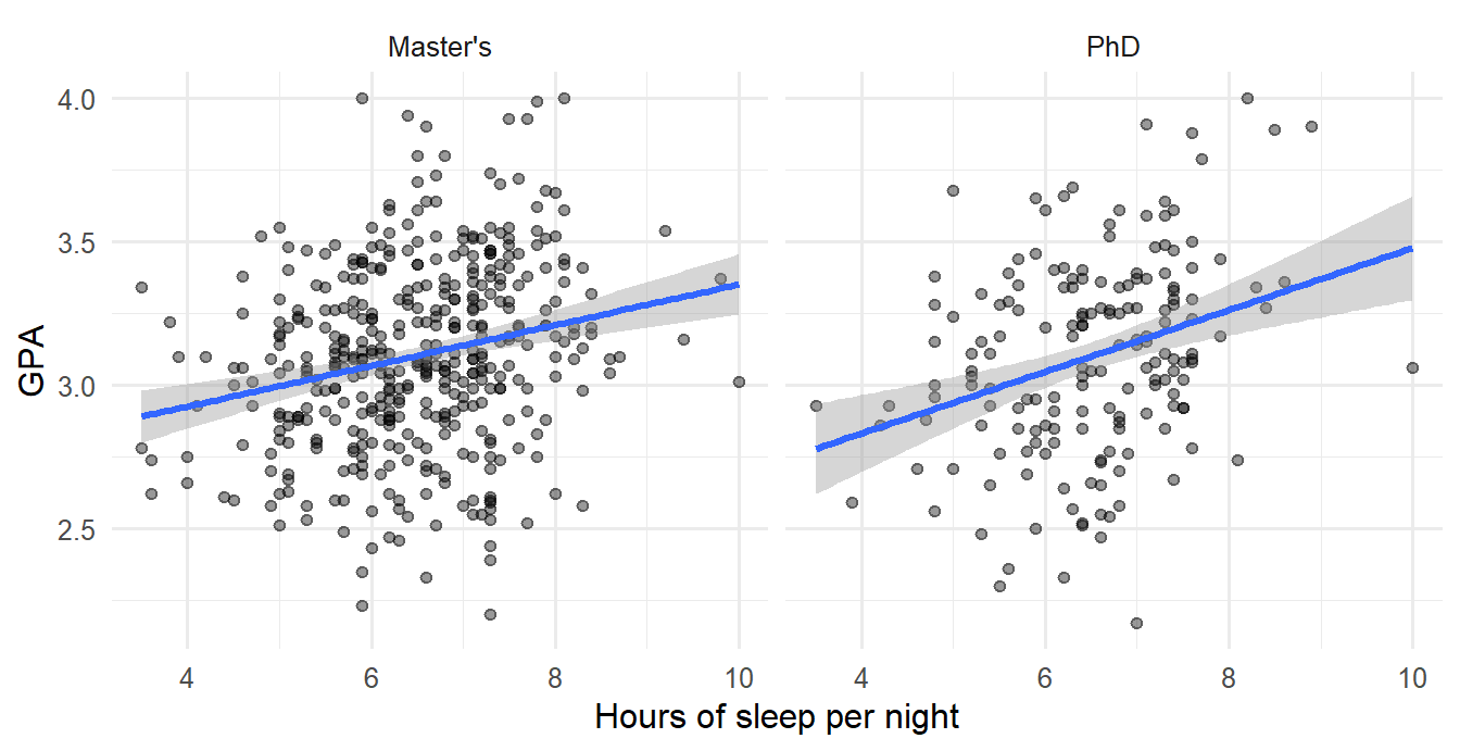
The relationship looks similar in both programmes. For two grouping variables, facet_grid(rows ~ columns) makes a grid of panels. Because the panels share their axes, facets respect the rule from the section on reading graphs: comparisons are made by position on a common scale.
A density plot is a smoothed histogram. Its advantage is that several distributions can be drawn on top of each other and compared. Here, fill is mapped to the workshop group and alpha lets the two curves show through each other:
semesters |>
filter(semester == 2) |>
left_join(students, join_by(student_id)) |>
ggplot(aes(x = wellbeing, fill = workshop)) +
geom_density(alpha = 0.5) +
scale_fill_viridis_d(end = 0.8) +
labs(x = "Wellbeing (0 to 100)", y = "Density", fill = "Workshop") +
theme_minimal(base_size = 13)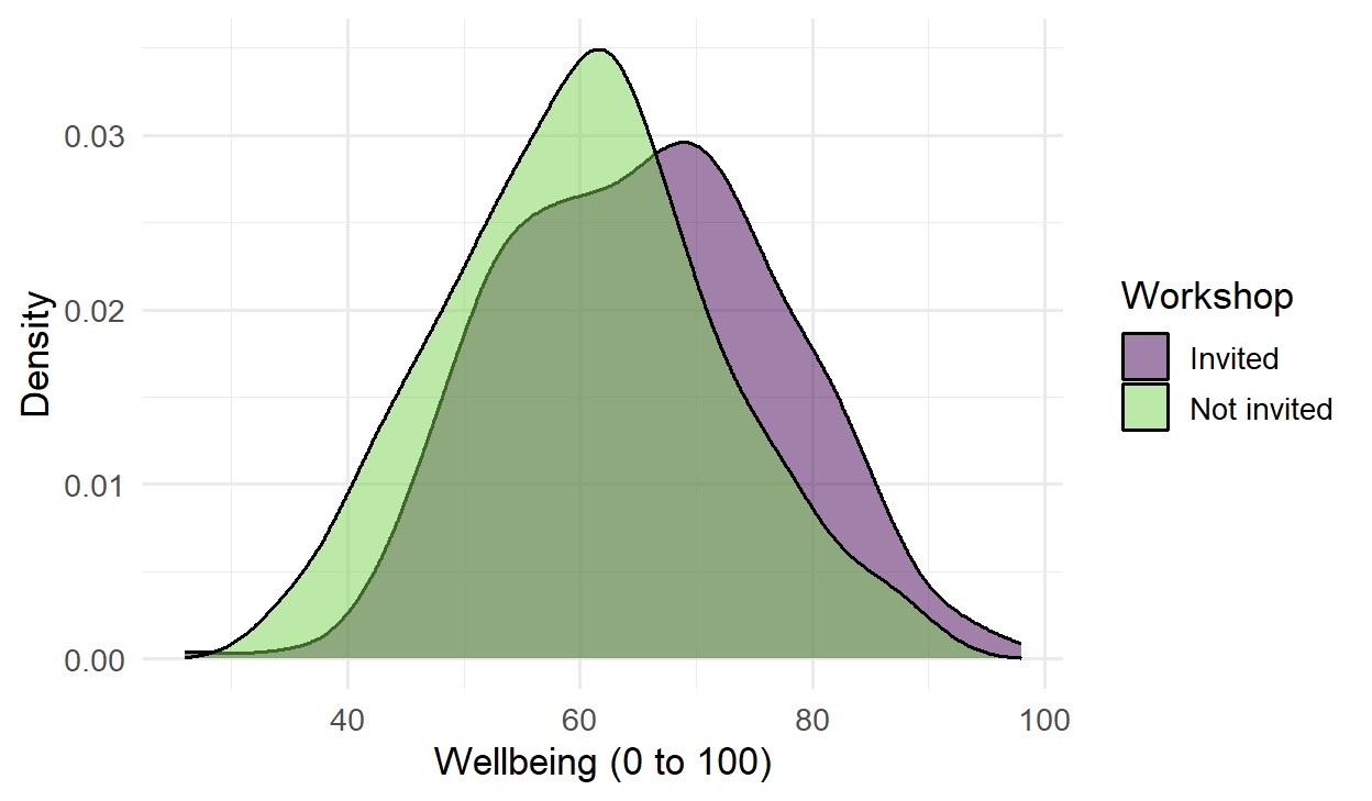
In this code, the data flows straight into ggplot() through the pipe. The two curves have the same shape, but the invited group’s is shifted to the right: the whole distribution moved, not just a few students.
A heat map shows a table of numbers as coloured tiles, and it suits correlation matrices well. Chapter 2 calculated the correlations between four first-semester measurements. To plot them, the matrix is turned into a long table with one row per pair (Chapter 3), and then geom_tile() draws a tile for each pair and geom_text() writes the value on it:
library(tidyr)
correlations <- first_sem |>
select(gpa, sleep_hours, study_hours, wellbeing) |>
cor(use = "complete.obs")
correlations |>
as.data.frame() |>
mutate(var1 = rownames(correlations)) |>
pivot_longer(-var1, names_to = "var2", values_to = "r") |>
ggplot(aes(x = var1, y = var2, fill = r)) +
geom_tile() +
geom_text(aes(label = round(r, 2))) +
scale_fill_gradient2(limits = c(-1, 1)) +
labs(x = NULL, y = NULL, fill = "Correlation") +
theme_minimal(base_size = 12)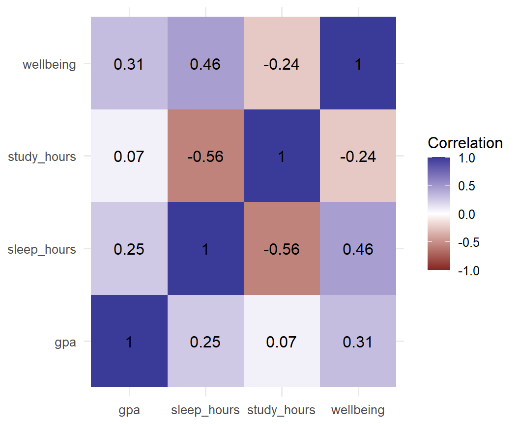
The scale scale_fill_gradient2() is a diverging palette: two colours for negative and positive values, with white at zero, so the direction and strength of each correlation are visible at once. Students who study more hours sleep less (a negative correlation), and students who sleep more report higher wellbeing (positive). The numbers written on the tiles matter, because colour alone is read imprecisely. Chapter 6 explains how to read correlations.
The function ggsave() saves the most recent graph, or one that is named, to a file. The file type follows from the file name:
ggsave("figures/wellbeing-lines.png", plot = p, width = 16, height = 10, units = "cm", dpi = 300)
ggsave("figures/wellbeing-lines.pdf", plot = p, width = 16, height = 10, units = "cm")A figure should be saved at the size at which it will be printed, in the units of the page: a figure for a single column of a journal is often about 8 cm wide, and a full page about 16 cm. Setting the size when saving, rather than stretching the image later, keeps the text readable and the proportions right. Images such as PNG files need a resolution of at least 300 dpi (dots per inch), which is what most journals require, while vector formats such as PDF and SVG stay sharp at any size and are preferable whenever the journal accepts them. Finally, the text should be checked at the final size, since fonts that look fine on screen are often too small in print; base_size in the theme fixes that.
The code that makes each figure belongs in the analysis script. When a supervisor asks for a larger font or a different colour, one line changes and the figure is saved again.
ggplot2 includes economics, real monthly data on the US economy from 1967 to 2015. The same line chart shows the rise and fall of unemployment, with each recession visible as a peak:
ggplot(economics, aes(x = date, y = unemploy)) +
geom_line() +
labs(x = NULL, y = "Unemployed (thousands)") +
theme_minimal(base_size = 12)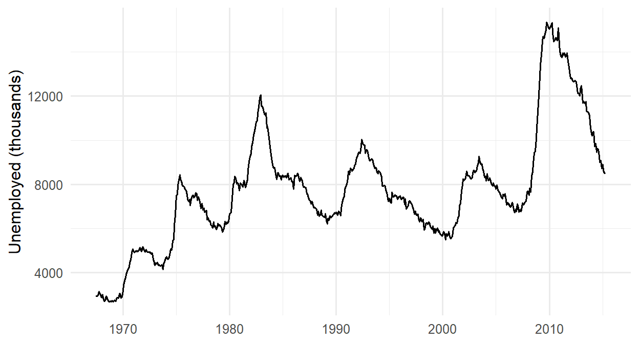
The graph shows the number of unemployed people, not the unemployment rate, and the population grew greatly over these 48 years. A reader comparing 1970 with 2010 should know that, which is why the axis label names exactly what is shown.
Several beliefs about graphs are widespread, and each leads to graphs that mislead or fail to inform.
aes(), and geometric layers, joined with +. Map a colour inside aes() when it should depend on the data; set it outside aes() when it should be fixed.labs() adds labels, scale_ functions control axes and colours (viridis palettes are colour-blind-friendly), and themes control the look.ggsave() exports figures. Set the size in page units, use at least 300 dpi for images, and prefer PDF or SVG when accepted.Exploratory graph, explanatory graph, graphical perception, grammar of graphics, aesthetic mapping, geom, layer, histogram, bin, bar chart, box plot, median, scatter plot, overplotting, trend line, line chart, mapping, setting, scale, theme, annotation, aspect ratio, qualitative palette, sequential palette, diverging palette, facet, density plot, heat map, dpi, vector format.
The playground has these and more, with hints and solutions.
study_hours in the first semester. Try binwidths of 1, 5, and 10, and explain which shows the shape best.employment. Make the bars a single colour of your choice, and order the levels from no job to a full-time job.Part 1 gave you the tools: you can import data, clean it, and draw it. Part 2 uses those tools to answer research questions. Before any statistics, though, comes a step that no software can do for you: deciding what exactly you are asking, what result would answer it, and whether your data can give that answer at all.
Most problems that examiners find in a thesis start here, not in the analysis: a question too vague to answer, a hypothesis that no result could contradict, a questionnaire that measures something other than what the title promises, or a sample that cannot support the conclusion. No statistical test can fix those problems afterwards. This chapter follows the path from a research topic to data that can answer a question, using the student wellbeing study as the example throughout. It is more conceptual than the other chapters, but it still uses R wherever R helps you see an idea: simulations, checks of how variables are measured, and a first calculation of sample size.
In one sentence: data analysis tests claims against evidence.
Research makes claims about the world: graduate students sleep too little; a workshop improves wellbeing; supervisor support protects against dropout. A claim is only as strong as the evidence behind it, and data analysis is the part of research that confronts claims with evidence. It does three kinds of work. Describing establishes what the world looks like: how long graduate students sleep, or how many consider dropping out. Explaining asks why it looks like that: whether the workshop causes higher wellbeing, or which factors go together with a higher GPA. Predicting concerns what will happen in new cases, such as which of next year’s students are likely to consider leaving.
Each kind of work asks a different kind of question, is judged by a different standard, and leads to different methods, as Table 5.1 shows.
| Aim | Example question | Judged by | Methods | Chapters |
|---|---|---|---|---|
| Describe | How long do graduate students sleep? | Accuracy of the summary; who it applies to | Summaries, graphs, confidence intervals | 4, 6, 7 |
| Explain | Does the workshop improve wellbeing? | Whether rival explanations are ruled out | Tests, regression, mixed models | 7 to 10 |
| Predict | Who will consider dropping out? | Accuracy on new cases | Machine learning | 11 to 16 |
Keep the aim in mind, because the same numbers can serve different aims. A regression model can explain GPA (which predictors matter, and how much?) or predict it (how close are the predictions for new students?). The model may be identical; the question, and how the answer is judged, are not.
In one sentence: a research question is a topic narrowed until data can answer it.
Nobody starts with a research question. They start with a topic, something that interests or worries them, such as “the wellbeing of graduate students”. A topic is too broad to study: it contains hundreds of possible questions. The work of the first months of a thesis is narrowing it:
flowchart TD A["<b>Topic</b><br/>Graduate student wellbeing"] --> B["<b>Problem</b><br/>Many graduate students report stress and exhaustion,<br/>and some leave their programmes"] B --> C["<b>Focus</b><br/>Can the university do something about it?"] C --> D["<b>Research question</b><br/>Does a six-week wellbeing workshop improve graduate students'<br/>wellbeing by the end of the following semester?"]
The problem says why the topic matters: something is wrong, unknown, or disputed. The research question says precisely what the study will find out. A good research question is specific: it names who (graduate students at one university), what (wellbeing, measured with an index), and when (the end of semester 2). It is answerable with data, in the sense that the researcher can say what data would answer it and can collect that data. It is not already answered, because the literature leaves a gap or the setting is new. It is feasible within the time, money, skills, and access available. And it is worth answering: someone would act differently depending on the answer. Table 5.2 shows weak questions and how they can be improved.
| Weak question | Problem | Better question |
|---|---|---|
| Are students stressed? | Stressed compared with what? Which students? | Do part-time graduate students report higher stress than full-time students? |
| What affects students’ success? | Too broad; “success” is undefined | Is average sleep in a semester associated with semester GPA, allowing for study hours? |
| Is the workshop good? | “Good” cannot be measured | Does the workshop raise wellbeing scores at the end of the following semester? |
| Why do students drop out? | Needs students who left, and years of follow-up | Which baseline characteristics are associated with considering dropout in the first year? |
Research questions come in three kinds, and each kind needs a different design and analysis. Descriptive questions ask what is, such as how many hours graduate students sleep; they need a sample that represents the population well. Relational questions ask what goes with what, such as whether students who sleep more have higher GPAs; they need measurements of both variables, and they establish association, not cause. Causal questions ask what leads to what, such as whether the workshop improves wellbeing; they need a design that rules out other explanations, ideally an experiment.
The kind of question decides the kind of claim you can make. Much confusion in published research comes from asking a relational question and answering it in causal words (“sleep improves grades”). The section on study designs below returns to this.
In one sentence: a hypothesis is a prediction precise enough to be wrong.
A research question asks; a hypothesis answers in advance. It is the researcher’s best prediction, based on theory and earlier studies, of what the data will show. The workshop question becomes:
Hypothesis: Students invited to the workshop will have higher wellbeing at the end of semester 2 than students not invited.
The hypothesis is useful because the data can disagree with it.
The philosopher Karl Popper argued that what separates a scientific claim from other claims is not that it can be proved, but that it can be refuted: it forbids certain results (Popper 1959). A claim that is compatible with every possible result tells us nothing. Compare:
| Hypothesis | Could any result contradict it? |
|---|---|
| “The workshop affects students in some way.” | No. Whatever happens, some effect on someone can be found. Unfalsifiable. |
| “The workshop helps students who are ready for it.” | No, unless “ready” is defined before the study; otherwise any student who did not improve was “not ready”. Unfalsifiable. |
| “Invited students will have higher wellbeing at the end of semester 2 than students not invited.” | Yes: equal or lower wellbeing in the invited group would contradict it. Falsifiable. |
A good test of your own hypothesis is to write down, before seeing any data, what result would count against it. If you cannot, the hypothesis is not yet precise enough. If you can, you have also protected yourself against a common temptation: finding, after the fact, a reason why the disappointing result supports your idea after all.
A good hypothesis therefore has four properties. It is about a stated population and stated variables: graduate students at this university, and wellbeing measured with the index. It is testable with the data available, because the variables are measured and there are enough cases. It is falsifiable: it names the result that would contradict it. And it is stated before the data is analysed, since a hypothesis written after seeing the data is a description of the data, not a test of it.
A directional hypothesis predicts the direction of an effect (“invited students will have higher wellbeing”). A non-directional hypothesis predicts only that there is a difference (“wellbeing will differ between faculties”). Use a directional hypothesis when theory gives you a clear prediction; use a non-directional one when it does not. Note that the direction of the hypothesis and the choice of a one-tailed or two-tailed test are separate decisions: many researchers state a directional hypothesis but still use a two-tailed test, the cautious choice explained in Chapter 7.
Statistical tests do not test the researcher’s hypothesis directly. They test its opposite, the null hypothesis (\(H_0\)): the claim that nothing is going on, no difference and no relationship. The researcher’s hypothesis becomes the alternative hypothesis (\(H_1\)). For the workshop, \(H_1\) states that invited and not-invited students differ in average wellbeing at the end of semester 2, and \(H_0\) that they have the same average wellbeing.
Testing the opposite of what one believes may seem strange, but the null hypothesis has one great advantage: it is precise enough to calculate with. “The workshop helps” does not say how much, but “the workshop makes no difference” makes a sharp prediction: any difference between the groups is due to chance alone, to which students happened to be invited. If we know how large chance differences usually are, we can ask whether the difference in the data is larger than chance would easily produce.
You can see this world of chance by simulation. Suppose the workshop truly does nothing. Then being invited is just a label on students whose wellbeing is unaffected. The code below creates 300 imaginary students with wellbeing scores similar to those in the study (average 60, standard deviation about 11), splits them into two random groups of 150, and records the difference between the group averages. It then repeats this 5,000 times:
set.seed(2026)
chance_differences <- replicate(5000, {
wellbeing <- rnorm(300, mean = 60, sd = 11)
group <- sample(rep(c("Invited", "Not invited"), 150))
mean(wellbeing[group == "Invited"]) - mean(wellbeing[group == "Not invited"])
})
summary(chance_differences) Min. 1st Qu. Median Mean 3rd Qu. Max.
-5.188460 -0.871667 0.001230 -0.008296 0.838404 4.688888 The function replicate() runs the code in curly brackets many times and collects the results, rnorm() draws random numbers from a normal distribution, and sample() shuffles the labels. Figure 5.2 shows the 5,000 differences:
library(ggplot2)
ggplot(data.frame(difference = chance_differences), aes(x = difference)) +
geom_histogram(binwidth = 0.5, fill = "grey70", colour = "white") +
geom_vline(xintercept = quantile(chance_differences, c(0.025, 0.975)),
linetype = "dashed") +
labs(x = "Difference in average wellbeing (invited minus not invited)",
y = "Number of simulated studies")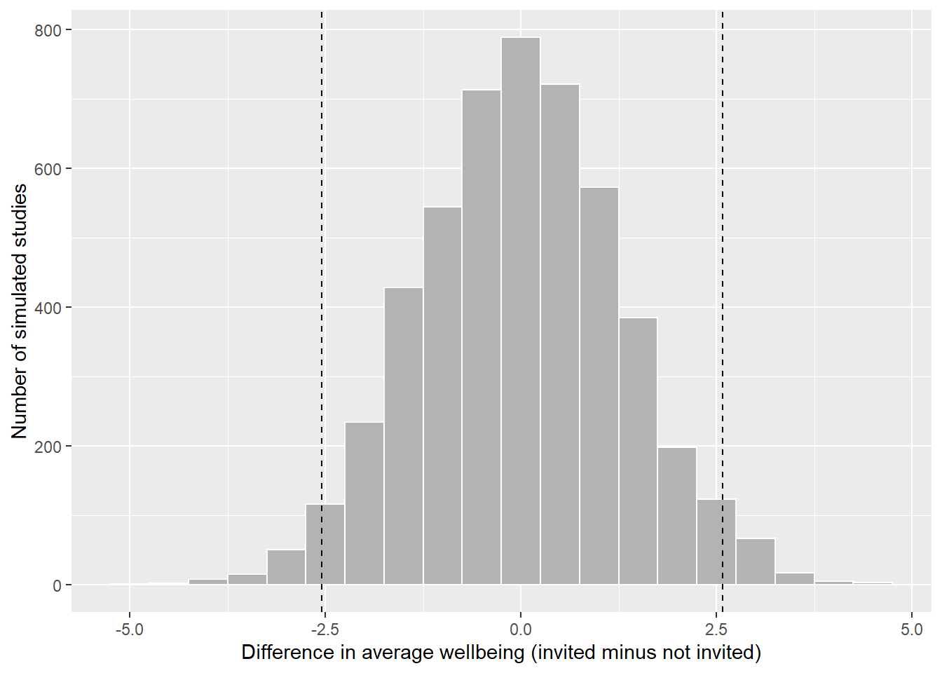
Even when the workshop does nothing, the two groups almost never have exactly the same average: chance alone produces differences, usually small ones. In 95% of the simulated studies, the difference lies between -2.5 and 2.6 points (the dashed lines). A real study that found a difference of 5 points would therefore be hard to explain by chance, and would count as evidence against \(H_0\). A difference of 1 point would not: it is exactly what chance produces. Chapter 7 turns this idea into the p-value, using the real data.
Two things follow from this picture. First, rejecting \(H_0\) is not proving \(H_1\): it says only that “nothing is going on” is a poor explanation of the data. Second, not rejecting \(H_0\) is not proving it: a small study can fail to detect a real effect, just as a blurred photograph can fail to show a real face.
Table 5.4 writes out the study’s research questions in this form. Some questions are confirmatory: they test a hypothesis stated in advance. Others are exploratory: they look for patterns without a prior prediction, and their results suggest hypotheses for future studies rather than confirming them. Both are legitimate, as long as they are labelled honestly.
| Research question | Hypothesis (\(H_1\)) | Null hypothesis (\(H_0\)) | What would count against \(H_1\) | Chapters |
|---|---|---|---|---|
| RQ1 What does graduate life look like? | Descriptive: no hypothesis | none | none | 4, 6 |
| RQ2 Do students sleep less than 7 hours? | Average sleep is below 7 hours | Average sleep is 7 hours | An average of 7 hours or more, or a confidence interval that includes 7 | 7 |
| RQ3 Does the workshop improve wellbeing? | Invited students have higher wellbeing in semester 2 | The groups have the same average wellbeing | A difference near zero or negative, with a narrow confidence interval | 7, 10 |
| RQ4 Do faculties and study modes differ? | Stress differs between faculties (non-directional) | All faculties have the same average stress | Similar averages in every faculty | 7, 8 |
| RQ5 What explains GPA? | More sleep goes with a higher GPA, allowing for study hours, stress, and support | The sleep coefficient is zero | A coefficient near zero or negative | 8 |
| RQ6 Do the questionnaire items measure what they should? | The 22 items form four scales: stress, burnout, support, satisfaction | none (checked by model fit, not a single test) | Items that do not group as intended | 9 |
| RQ7 Are there student profiles? | Exploratory: no hypothesis | none | none | 9, 14 |
| RQ8 How do wellbeing and GPA change? | Wellbeing declines over the two years | The average slope over semesters is zero | A slope near zero or positive | 10 |
| RQ9 Who considers dropping out? | Higher stress raises the odds of considering dropout | The odds ratio for stress is 1 | An odds ratio of 1 or below | 8, 12 |
| RQ10 Can final GPA be predicted? | Predictive: year-1 data predicts better than the average alone | none (judged on new cases) | Test-set error no better than predicting the average | 13 |
| RQ11 What challenges do students describe? | Exploratory: no hypothesis | none | none | 18 |
The later chapters return to this table: each restates its hypothesis before the analysis, and ends by saying whether the data contradicts the null hypothesis.
From this chapter on, every main analysis in the book starts with the same four questions. Answer them in writing, before you run any code:
In one sentence: a variable is a decision about how to turn an idea into a number.
As Chapter 2 showed, data is a table of cases (rows) and variables (columns). The first question about any dataset is what one row represents: the unit of analysis. The wellbeing study has three, in different tables:
nrow(students) # one row per student[1] 600nrow(semesters) # one row per student per semester[1] 2326nrow(supervisors) # one row per supervisor[1] 120The unit of analysis decides what a question means. “Do students who sleep more have higher GPAs?” is a question about students, so each student should count once, for example with their first-semester values or their average over the semesters. Treating the 2326 semester rows as 2326 independent cases would count each student up to four times, and make the evidence look stronger than it is. Chapter 10 shows how to use all the rows correctly.
Many things researchers care about cannot be observed directly: stress, wellbeing, motivation, intelligence, job satisfaction, quality of life. Such ideas are called constructs. To study a construct, you must decide how to measure it, a step called operationalisation. Every operationalisation is a choice, and a different choice could give a different answer.
Table 5.5 shows how the wellbeing study operationalises some of its constructs.
| Construct | Operationalisation | Variable(s) |
|---|---|---|
| Sleep | Self-reported average hours per night in the semester | sleep_hours |
| Stress | The average of six questionnaire items on a 1 to 5 scale | stress_1 to stress_6 |
| Wellbeing | A 0 to 100 wellbeing index, from a validated instrument | wellbeing |
| Academic performance | Semester GPA from university records | gpa |
| Thoughts of dropping out | “Have you seriously considered leaving your programme?” | considering_dropout |
Stress is a good example. No single question captures it, so the questionnaire asks six, each about one aspect, and averages the answers. Look at the items, and at how the answers of the first few students differ from item to item:
library(dplyr)
questionnaire |>
select(student_id, stress_1:stress_6) |>
head(5) student_id stress_1 stress_2 stress_3 stress_4 stress_5 stress_6
1 S0001 3 2 4 4 3 5
2 S0002 4 3 NA 2 5 3
3 S0003 4 4 2 1 4 3
4 S0004 4 5 5 1 4 5
5 S0005 4 4 4 3 4 2One item, stress_4 (“I feel confident handling problems in my studies”), is worded in the opposite direction: agreeing with it means less stress. Before averaging, it must be reversed, so that 5 becomes 1 and 1 becomes 5. You did this in Chapter 3:
stress <- questionnaire |>
mutate(stress_4 = 6 - stress_4,
stress = rowMeans(pick(stress_1:stress_6), na.rm = TRUE)) |>
select(student_id, stress)
summary(stress$stress) Min. 1st Qu. Median Mean 3rd Qu. Max.
1.333 2.667 3.167 3.216 3.667 5.000 The resulting score is the study’s operational definition of stress. Anyone who reads the thesis should be able to see exactly how it was built, which is why the methods chapter of a thesis describes every measure, and why the questionnaire items go in an appendix.
Sleep, study hours, and caffeine in the wellbeing study are self-reported: students estimate them. People tend to overestimate their sleep and underestimate their caffeine, and they may give the answers they think are expected. Records (such as GPA from the university) or devices (such as a sleep tracker) avoid some of these problems, but are more expensive or intrusive. Every measure has weaknesses; say what they are.
Not all numbers are numbers in the same sense. The psychologist S. S. Stevens proposed four levels of measurement, each allowing more than the one before (Stevens 1946):
| Level | What the values mean | Meaningful summaries | Examples in the study | In R |
|---|---|---|---|---|
| Nominal | Categories with no order | Counts, percentages, mode | faculty, gender, workshop |
factor |
| Ordinal | Ordered categories; distances between them unknown | Also median and percentiles | employment, financial_worry, single questionnaire items |
ordered factor, or numbers used with care |
| Interval | Equal distances; no true zero | Also mean, standard deviation, differences | wellbeing (0 to 100 index), scale scores (arguably) |
numeric |
| Ratio | Equal distances and a true zero | Also ratios (“twice as much”) | sleep_hours, study_hours, caffeine_mg, age |
numeric |
The level decides which summaries and tests make sense. The average faculty is meaningless. “Twice as much caffeine” is meaningful (caffeine has a true zero); “twice as much wellbeing” is not (a score of 0 does not mean no wellbeing at all).
R does not know the level of measurement; you have to tell it. Look at how R stores employment:
table(students$employment)
Full-time job None Part-time job
97 307 196 R lists the categories in alphabetical order, which puts “Full-time job” before “None”. For a nominal variable, that would not matter. But employment is ordinal: none, part-time, full-time is a real order, and tables and graphs should show it. Tell R with an ordered factor:
students <- students |>
mutate(employment = factor(employment,
levels = c("None", "Part-time job", "Full-time job"),
ordered = TRUE))
table(students$employment)
None Part-time job Full-time job
307 196 97 Now tables and graphs follow the natural order, and comparisons such as employment > "None" work.
The opposite mistake is more common: an ordinal variable stored as numbers, such as financial_worry (1 = not at all worried, 5 = extremely worried). R will happily calculate its mean, but the distance from “not at all” to “a little” need not equal the distance from “very” to “extremely”. For a single ordinal item, report the distribution or the median:
table(students$financial_worry, useNA = "ifany")
1 2 3 4 5 <NA>
84 139 172 111 56 38 median(students$financial_worry, na.rm = TRUE)[1] 3Scale scores, the average of several items, are usually treated as interval data, and the book does so. Averaging several items smooths out the unequal steps of each one. This is a convention with good support, not a law; if an examiner asks, say that you followed it, and why.
In an analysis, variables also have roles. The outcome, or dependent variable, is what the researcher wants to explain or predict, such as wellbeing, GPA, or considering dropout. A predictor, also called an independent or explanatory variable, is what is used to explain or predict it, such as the workshop, sleep, or stress. Three further roles concern a third variable that affects the relationship between the two. A confounder is related to both the predictor and the outcome, and can create a misleading association between them. A moderator changes the strength or direction of a relationship, so that the effect of the predictor depends on it. A mediator lies on the path between predictor and outcome: it is how the predictor has its effect.
The roles are not properties of the variables; they come from the research question. Stress is an outcome in one question (whether the workshop reduces stress) and a predictor in another (whether stress predicts dropout).
Figure 5.3 draws the three less familiar roles as diagrams, using examples from the study: arrows show which variable is thought to influence which.
flowchart LR
subgraph Confounder
S1[Sleep] --> C1[Caffeine]
S1 --> G1[GPA]
C1 -. "apparent link" .- G1
end
subgraph Moderator
SU[Support] --> G2[GPA]
P[Programme:<br/>Master's or PhD] --> M((" "))
M -.-> G2
end
subgraph Mediator
W[Workshop] --> ST[Lower stress] --> WB[Wellbeing]
end
The confounder is the most important of the three, because it can produce an association that is not a cause. In the wellbeing data, students who take more caffeine have lower GPAs. But students who take more caffeine also sleep less:
first_sem <- semesters |> filter(semester == 1)
first_sem |>
select(caffeine_mg, sleep_hours, gpa) |>
cor(use = "complete.obs") |>
round(2) caffeine_mg sleep_hours gpa
caffeine_mg 1.00 -0.64 -0.18
sleep_hours -0.64 1.00 0.25
gpa -0.18 0.25 1.00Caffeine and GPA are negatively correlated (-0.19), but caffeine and sleep are strongly negatively correlated (-0.64). Caffeine might be harming grades, or short-sleeping students might both drink more coffee and get lower grades; the correlation alone cannot tell which. Chapter 8 answers the question with a regression that compares students with the same amount of sleep. The general lesson is that before you interpret any relationship, you should ask what else could produce it, and measure it if you can.
In one sentence: a reliable measure gives consistent results; a valid measure measures the right thing.
Two properties decide whether a measure can be trusted. Reliability is consistency: a student should get a similar stress score if they filled in the questionnaire again next week, with nothing changed, and the six stress items should agree with each other. Validity is whether the measure captures what it claims to measure: the stress score should reflect stress, and not something else, such as general negativity or tiredness on the day of the survey.
The classic picture is a target. Each shot is a measurement, and the centre is the true value. The code below simulates four measures, each shooting 30 times, and draws them; it is intuition code, written to show an idea rather than to analyse data:
set.seed(1)
shots <- function(label, centre_x, centre_y, spread) {
data.frame(measure = label,
x = rnorm(30, centre_x, spread),
y = rnorm(30, centre_y, spread))
}
target_data <- rbind(
shots("Reliable and valid", 0, 0, 0.15),
shots("Reliable but not valid", 0.9, 0.8, 0.15),
shots("Valid on average, not reliable", 0, 0, 0.7),
shots("Neither reliable nor valid", 0.8, -0.6, 0.7)
)
rings <- expand.grid(angle = seq(0, 2 * pi, length.out = 100), radius = 1:3 / 2)
rings$x <- rings$radius * cos(rings$angle)
rings$y <- rings$radius * sin(rings$angle)
ggplot(target_data, aes(x, y)) +
geom_path(data = rings, aes(group = radius), colour = "grey70") +
geom_point(colour = "#b2182b", alpha = 0.8) +
annotate("point", x = 0, y = 0, shape = 3, size = 4) +
facet_wrap(~ measure) +
coord_equal(xlim = c(-1.7, 1.7), ylim = c(-1.7, 1.7)) +
theme_void() +
theme(strip.text = element_text(size = 11, margin = margin(b = 4)))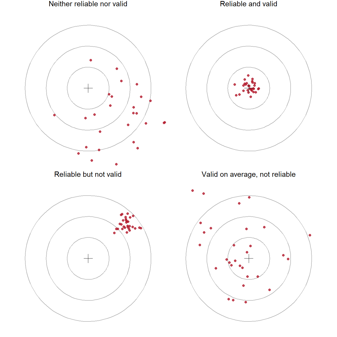
A measure that is reliable but not valid is precise about the wrong thing: a bathroom scale that always shows two kilograms too much. A measure that is unreliable cannot be very valid, because its random errors hide whatever it measures. Reliability is therefore necessary for validity, but not enough.
Reliability can be assessed in three main ways. Internal consistency is the extent to which the items of a scale agree with each other; it is measured with Cronbach’s alpha (Chapter 9). Test-retest reliability is the extent to which the same person gets a similar score on two occasions when nothing has changed. Inter-rater reliability is the extent to which two people who code the same material agree; it is measured with Cohen’s kappa (Chapter 18, where a language model is one of the coders).
Validity has several meanings. For a measure, content validity concerns whether the items cover the whole construct: a stress scale about deadlines only would miss stress about money or family. Construct validity concerns whether the score behaves as the construct should. It should correlate with measures of related constructs (convergent validity) and correlate less with unrelated ones (discriminant validity) (Cronbach and Meehl 1955).
The second kind can be checked in the wellbeing data. If the stress score measures stress, it should correlate strongly with burnout (a closely related construct), less strongly and negatively with supervisor support and satisfaction:
scale_scores <- questionnaire |>
mutate(
stress_4 = 6 - stress_4,
stress = rowMeans(pick(stress_1:stress_6), na.rm = TRUE),
burnout = rowMeans(pick(burnout_1:burnout_6), na.rm = TRUE),
support = rowMeans(pick(support_1:support_6), na.rm = TRUE),
satisfaction = rowMeans(pick(satisfaction_1:satisfaction_4), na.rm = TRUE)
) |>
select(stress, burnout, support, satisfaction)
round(cor(scale_scores), 2) stress burnout support satisfaction
stress 1.00 0.65 -0.33 -0.41
burnout 0.65 1.00 -0.24 -0.38
support -0.33 -0.24 1.00 0.41
satisfaction -0.41 -0.38 0.41 1.00Stress and burnout correlate at 0.65: related, as expected, but far from identical, so the two scales are not measuring the same thing twice. The negative correlations with support and satisfaction fit the idea that stressed students feel less supported and less satisfied. This is not proof of validity, which is built from many pieces of evidence, but it is the kind of evidence a thesis should report. Chapter 9 tests the structure of the whole questionnaire with factor analysis.
For a study as a whole, two further kinds of validity matter. Internal validity is the extent to which a study can rule out other explanations for its results; it is highest in randomised experiments. External validity is the extent to which the results apply beyond the study, to other people, places, and times; it depends on the sample. The next two sections are about these.
In one sentence: the design, not the statistics, decides whether a study can show cause.
A study design is the plan for who is measured, on what, when, and under which conditions. Table 5.7 summarises the main designs.
| Design | What happens | Can it show cause? | In the wellbeing study |
|---|---|---|---|
| Randomised experiment | The researcher assigns the treatment by chance | Yes, for the treatment | The workshop invitation |
| Quasi-experiment | Groups receive different treatments, but not by chance | Only with care; other differences must be ruled out | Comparing students who chose to attend many sessions |
| Observational, cross-sectional | Variables measured once, at one time | No; association only | The baseline questionnaire |
| Observational, longitudinal | The same people measured repeatedly over time | Stronger evidence of order, but still association | The four semesters |
Suppose the workshop had been open to anyone who wanted to come. The students who came would probably have had more energy, more time, and less stress to start with. If the attenders later had higher wellbeing, the cause could be the workshop or who they already were, and the two explanations could not be separated. This is self-selection, a form of confounding.
A simulation makes the problem visible. Take the real stress scores of the 600 students, and imagine that less stressed students are more likely to volunteer. Then compare the baseline stress of volunteers and non-volunteers, and do the same for a random invitation:
set.seed(11)
stress_scores <- scale_scores$stress
# Volunteering: the chance of volunteering falls as stress rises
chance_to_volunteer <- plogis(-2 * (stress_scores - mean(stress_scores)))
volunteered <- runif(600) < chance_to_volunteer
# Random invitation: a coin toss for every student
invited <- sample(rep(c(TRUE, FALSE), 300))
data.frame(
design = c("Volunteers", "Random invitation"),
stress_in = c(mean(stress_scores[volunteered]), mean(stress_scores[invited])),
stress_out = c(mean(stress_scores[!volunteered]), mean(stress_scores[!invited]))
) |>
mutate(difference = stress_in - stress_out) |>
mutate(across(where(is.numeric), \(x) round(x, 2))) design stress_in stress_out difference
1 Volunteers 2.83 3.63 -0.80
2 Random invitation 3.25 3.19 0.06In this code, plogis() turns any number into a probability between 0 and 1, and runif() draws a random number between 0 and 1 for each student; a student volunteers when their random number is below their probability. The volunteers start the study 0.8 points less stressed than the others, before any workshop. Any later difference in wellbeing would mix the workshop’s effect with this head start. With random invitation, the two groups start almost the same, because chance does not favour any kind of student.
Randomisation balances not only the variables you measured, but also the ones you did not: motivation, family support, health, and everything else. That is why a randomised experiment can support a causal claim. The real invitation in the wellbeing study, which was random, can be checked in the same way:
students |>
left_join(stress, join_by(student_id)) |>
group_by(workshop) |>
summarise(students = n(),
average_age = mean(age, na.rm = TRUE),
percent_female = 100 * mean(gender == "Female"),
percent_phd = 100 * mean(programme == "PhD"),
financial_worry = mean(financial_worry, na.rm = TRUE),
stress = mean(stress, na.rm = TRUE)) |>
mutate(across(where(is.double), \(x) round(x, 1)))# A tibble: 2 × 7
workshop students average_age percent_female percent_phd financial_worry
<chr> <int> <dbl> <dbl> <dbl> <dbl>
1 Invited 300 29.6 50.3 28.7 2.8
2 Not invited 300 29.8 53.7 29.3 2.9
# ℹ 1 more variable: stress <dbl>The two groups look very similar at baseline. A balance table like this belongs in any thesis with an experiment: it shows the reader that the randomisation worked.
The random invitation allows causal claims about the workshop invitation, and nothing else. The study’s other questions, about sleep, stress, caffeine, and GPA, are observational: nobody assigned students their sleep. For those, the thesis can report associations, allow for the confounders that were measured, and discuss the ones that were not. Note, too, that what was randomised is the invitation, not attendance: many invited students attended only some sessions. Comparing students by the number of sessions they attended is a quasi-experiment again, because students chose how many sessions to attend.
A cross-sectional design measures everything at one time. It is quick and cheap, but it cannot show which came first: stress might reduce sleep, or short sleep might produce stress. A longitudinal design measures the same people repeatedly, so it can show change and the order of events. The four semesters make the wellbeing study longitudinal, which Chapter 10 uses to model how wellbeing changes. The price is attrition: some people leave the study, and those who leave are rarely a random selection, as the next section shows.
In one sentence: a large sample reduces random error, but not bias.
The population is everyone the conclusions are meant to apply to: graduate students, perhaps at one university, perhaps everywhere. The sample is the people actually studied. Since the results come from the sample and the conclusions are about the population, the central question is always how well the sample represents the population.
In simple random sampling, every member of the population has the same chance of being chosen. It is the ideal, and rarely possible, because it needs a complete list of the population, called a sampling frame. In stratified sampling, the population is divided into groups (strata), such as faculties, and a random sample is drawn from each, to make sure every group is represented. In cluster sampling, whole groups are sampled, such as all the students of randomly chosen supervisors; it is cheaper, but students in the same cluster are alike, which the analysis must allow for (Chapter 10). Convenience sampling takes whoever is easy to reach, such as the people who answer an online survey shared on social media, or the students in the researcher’s own classes. It is very common in theses, and it is the weakest basis for generalising.
A sample estimate can be wrong in two ways. Random error is the difference caused by which people happened to be selected: a different random sample would give a slightly different answer. Bias is a systematic difference: the sampling method tends to select certain kinds of people, so the estimate is off in one direction, every time.
The difference matters because they respond differently to sample size. A simulation shows it. Treat the study’s 600 students as a complete population, whose true average first-semester wellbeing is 60.5. Draw many samples in two ways: at random, and as a convenience sample where students with higher wellbeing are more likely to answer (a common pattern: people who are struggling are less likely to fill in surveys). Try samples of 50 and 200:
population <- first_sem$wellbeing
true_mean <- mean(population)
# A student's chance of answering a voluntary survey rises with their wellbeing
chance_to_answer <- plogis((population - true_mean) / 10)
draw_samples <- function(n, method) {
replicate(2000, {
if (method == "Random") {
chosen <- sample(length(population), n)
} else {
chosen <- sample(length(population), n, prob = chance_to_answer)
}
mean(population[chosen])
})
}
set.seed(5)
sampling_results <- expand.grid(n = c(50, 200), method = c("Random", "Voluntary")) |>
rowwise() |>
mutate(estimate = list(draw_samples(n, method))) |>
tidyr::unnest(estimate) |>
mutate(sample_size = paste(n, "students"))
sampling_results |>
group_by(method, sample_size) |>
summarise(average_estimate = round(mean(estimate), 1),
spread = round(sd(estimate), 2),
.groups = "drop")# A tibble: 4 × 4
method sample_size average_estimate spread
<fct> <chr> <dbl> <dbl>
1 Random 200 students 60.4 0.73
2 Random 50 students 60.5 1.63
3 Voluntary 200 students 65.3 0.6
4 Voluntary 50 students 65.9 1.43In this simulation, sample() with prob chooses students with unequal chances, like a voluntary survey; rowwise() and unnest() run the simulation once for each combination of sample size and method and collect the results in one table. Figure 5.5 draws them:
ggplot(sampling_results, aes(x = estimate, fill = method)) +
geom_histogram(binwidth = 0.4, alpha = 0.7, position = "identity") +
geom_vline(xintercept = true_mean, linetype = "dashed") +
facet_wrap(~ sample_size, ncol = 1) +
scale_fill_manual(values = c(Random = "grey50", Voluntary = "#d6604d")) +
labs(x = "Estimated average wellbeing", y = "Number of samples", fill = "Sample")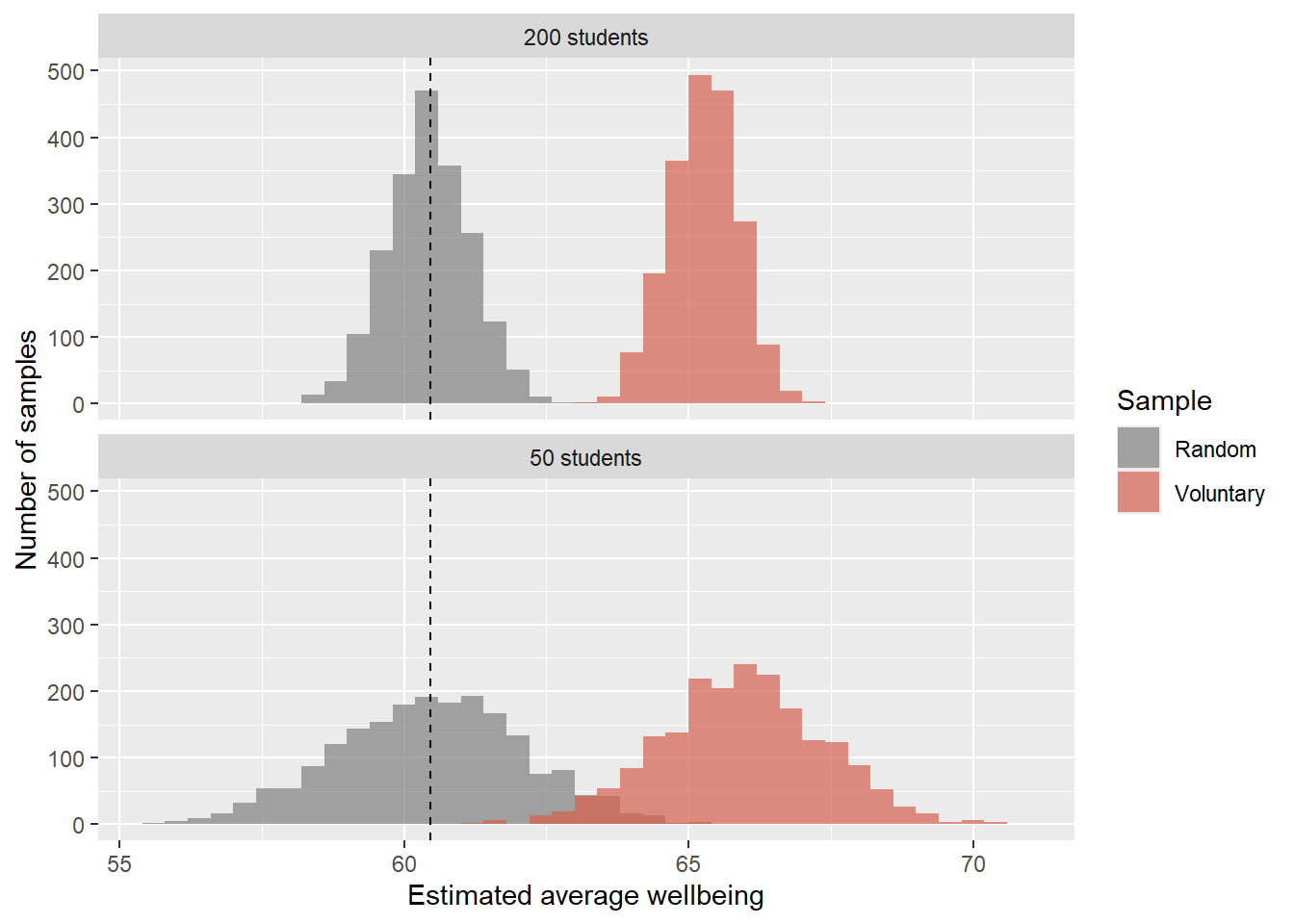
Random samples are centred on the true value; larger random samples are simply more precise. Voluntary samples miss the true value, and the larger voluntary sample misses it just as much, only more confidently. A biased sample cannot be fixed by making it bigger. The only remedies are a better sampling method, or knowing enough about the bias to correct for it.
The same problem appears in the real data. Not every student answered the final open-ended question, and some left the study after the first year. The comparison below shows whether the students who remained are like those who did not:
leavers <- setdiff(students$student_id,
semesters$student_id[semesters$semester == 4])
students |>
mutate(stayed = if_else(student_id %in% leavers, "Left after year 1", "Stayed")) |>
group_by(stayed) |>
summarise(students = n(),
percent_considered_dropout = round(100 * mean(considering_dropout == "Yes")))# A tibble: 2 × 3
stayed students percent_considered_dropout
<chr> <int> <dbl>
1 Left after year 1 37 59
2 Stayed 563 12Of the 37 students who left, 59% had considered dropping out, compared with 12% of those who stayed. Any analysis of semesters 3 and 4 is therefore based on a group that is less likely to be struggling than the students who started. Chapter 6 describes this missing data in detail, and Chapter 10 uses a model that makes the best use of the incomplete records.
The wellbeing study’s sample is all graduate students at one university who agreed to take part. Its results apply most directly to that university, and to others like it, only by argument: similar students, similar programmes, similar pressures. A thesis should say this plainly in its limitations section. Claiming less than the data allows is rarely criticised; claiming more is.
In one sentence: decide how you will judge your hypotheses before the data can influence you.
For every hypothesis, the plan names the variables, the analysis, and what would count as support. Writing it before collecting data forces you to check that you will collect everything you need, in a form you can analyse:
| Hypothesis | Outcome | Predictor(s) | Analysis | Support if |
|---|---|---|---|---|
| Students sleep less than 7 hours | sleep_hours (semester 1) |
none | One-sample t-test against 7 | The 95% confidence interval lies below 7 |
| The workshop raises wellbeing | wellbeing (semester 2) |
workshop |
Two-sample t-test; mixed model over semesters | Invited students higher; interval excludes 0 |
| Stress raises the odds of considering dropout | considering_dropout |
stress score, with background variables | Logistic regression | Odds ratio above 1; interval excludes 1 |
The simulation of the null world showed that chance differences are smaller with larger groups. So the size of the sample decides how small an effect a study can detect. The power of a study is the probability that it detects an effect of a given size, if the effect is real. A common target is 80%.
Power depends on three things: the sample size, the size of the effect, and the significance level. Effect sizes are often expressed as Cohen’s d: the difference between groups divided by the standard deviation (Chapter 7). Before her study, Elaf’s reading suggested that brief wellbeing programmes improve wellbeing by roughly 0.4 to 0.5 standard deviations. Base R’s power.t.test() calculates how many students each group needs to detect \(d = 0.45\) with 80% power:
power.t.test(delta = 0.45, sd = 1, sig.level = 0.05, power = 0.80)
Two-sample t test power calculation
n = 78.49181
delta = 0.45
sd = 1
sig.level = 0.05
power = 0.8
alternative = two.sided
NOTE: n is number in *each* groupWith sd = 1, delta is the effect in standard deviations, which is Cohen’s d. The answer, about 79 students per group, is well below the study’s 300 per group. Smaller effects need far larger samples:
effect_sizes <- c(small = 0.2, medium = 0.5, large = 0.8)
sapply(effect_sizes, \(d) ceiling(power.t.test(delta = d, power = 0.80)$n)) small medium large
394 64 26 Halving the effect size roughly quadruples the sample needed. If the effect you expect is small, and your sample is small, a non-significant result tells you very little: the study could not have detected the effect even if it were there. Plan the sample size before collecting data, and report the calculation in the methods chapter. Chapter 7 returns to power, with a simulation that shows what it means. The pwr package covers many more designs than power.t.test().
Every analysis involves many small decisions: which students to exclude, which variables to control for, how to handle outliers, which test to use. Made after seeing the data, each decision can be nudged, often unconsciously, towards the result the researcher hoped for. With enough such choices, “significant” findings appear from pure noise.
The protection is to decide in advance. Preregistration means writing the hypotheses and analysis plan down, with a date, before analysing the data, for example on the Open Science Framework (Nosek et al. 2018). Afterwards, analyses that follow the plan are reported as confirmatory, and anything else is reported honestly as exploratory. Preregistration does not forbid exploring; it only makes clear which results were predicted and which were found. Chapter 17 returns to this as part of reproducible research.
Research with people requires ethical approval before any data is collected. The committee will ask the questions in this chapter, too: what the question is, why the data is needed, how participants are recruited and informed, and how their data is stored and anonymised. A clear research question and analysis plan make the application much easier, and they justify collecting only the data you need.
The methods chapter of a thesis reports the decisions of this chapter, usually under the headings Design, Participants, Measures, and Analysis. A short example for the wellbeing study, with the numbers filled in by R:
Design. A two-year longitudinal study with an embedded randomised experiment: at the end of semester 1, half the participants were randomly invited to a six-week wellbeing workshop.
Participants. 600 graduate students from 5 faculties took part, supervised by 120 supervisors; 37 (6%) left the study after the first year.
Measures. Stress, burnout, supervisor support, and academic satisfaction were measured at baseline with a 22-item questionnaire (1 = strongly disagree, 5 = strongly agree; items in Appendix A); scale scores are item averages, with one reverse-worded item reversed. Wellbeing (0 to 100), sleep, study hours, caffeine, and exercise were self-reported each semester; GPA was taken from university records.
Analysis. Hypotheses and the analysis plan were written before the data was analysed. With 300 students per group, the workshop comparison had 80% power to detect an effect of d = 0.23 at \(\alpha\) = .05.
The last sentence uses power.t.test() the other way round: given the sample size and the power, it finds the smallest effect the study could reliably detect.
Research question, descriptive question, relational question, causal question, hypothesis, falsifiability, directional hypothesis, non-directional hypothesis, null hypothesis, alternative hypothesis, confirmatory analysis, exploratory analysis, unit of analysis, construct, operationalisation, self-report, level of measurement, nominal, ordinal, interval, ratio, ordered factor, outcome, predictor, confounder, moderator, mediator, reliability, validity, internal consistency, test-retest reliability, inter-rater reliability, content validity, construct validity, internal validity, external validity, study design, randomised experiment, quasi-experiment, self-selection, cross-sectional design, longitudinal design, attrition, population, sample, sampling frame, simple random sampling, stratified sampling, cluster sampling, convenience sampling, random error, bias, power, preregistration.
The playground has these and more, with hints and solutions.
students, give its level of measurement. Then convert financial_worry into an ordered factor with the labels “Not at all”, “A little”, “Moderately”, “Very”, and “Extremely”, and make a table of it.study_mode, has_children, and lives_away.power.t.test() to find how many students per group a study needs to detect a difference of 0.3 standard deviations with 80% power, and with 90% power.Before a study can test anything, it has to say what it found in the plainest sense: who took part, what a typical value of each variable looks like, how much the participants differ, and whether anything in the data is unusual or missing. These are the questions of descriptive statistics, the numbers that summarise what data looks like. They are the first results in almost every thesis, and they are not a formality. The shape of a variable decides which later tests are appropriate, an unusual value can dominate an analysis, and missing data can quietly change who the results are about.
This chapter develops the ideas behind the main descriptive statistics: what “typical” means, what spread measures, why the shape of a distribution matters, how to think about unusual and missing values, and how two variables can be described together. It answers the study’s first research question, what graduate student life looks like (RQ1), with numbers, and checks the data for the problems that could mislead every later analysis. In the story, the data is now clean and has been graphed; Elaf is eager to test her hypotheses, and her supervisor asks her to describe the sample first.
Chapter 5 distinguished three aims of data analysis: describing, explaining, and predicting. They correspond to three kinds of analysis. Exploratory analysis gets to know the data through summaries, graphs, unusual values, and missing values; it is open-ended, it proves nothing, but it often suggests questions worth testing, and this chapter is exploratory. Inferential analysis uses a sample to draw conclusions about a wider population and asks whether a result could be due to chance, such as whether the workshop improves wellbeing for graduate students in general, not just for these 600; Chapters 7 to 10 are inferential. Predictive analysis builds models that make accurate predictions for new cases, such as which students are likely to consider dropping out next year; Part 3 is predictive.
The three fit into one workflow, shown in Figure 6.1. Exploration comes first, and the researcher returns to it whenever a later result is surprising.
flowchart TB A[Research question] --> B[Import] B --> C[Clean] C --> D[Explore:<br/>describe and visualise] D --> E[Test or predict] E --> F[Report] E -. surprising result .-> D
The first thing to know about any variable is its typical value. Three measures describe it. The mean is the average: add up the values and divide by how many there are. In symbols, for values \(x_1, x_2, \ldots, x_n\):
\[ \bar{x} = \frac{1}{n} \sum_{i=1}^{n} x_i \]
The median is the middle value when the values are sorted: half the values are below it and half above. The mode is the most common value, which is mainly useful for categories.
The mean and median can tell very different stories. Here is the daily caffeine intake, in milligrams, of five students:
caffeine <- c(0, 120, 150, 180, 900)
mean(caffeine)[1] 270median(caffeine)[1] 150One student who takes 900 mg a day pulls the mean up to 270 mg, higher than four of the five students. The median, 150 mg, stays with the typical student. The mean is sensitive to extreme values; the median is not.
The same two measures for the study data use each student’s first-semester record, together with their background information:
library(dplyr)
library(ggplot2)
first_sem <- semesters |>
filter(semester == 1) |>
left_join(students, join_by(student_id))
first_sem |>
summarise(
mean_sleep = mean(sleep_hours, na.rm = TRUE),
median_sleep = median(sleep_hours, na.rm = TRUE),
mean_caffeine = mean(caffeine_mg, na.rm = TRUE),
median_caffeine = median(caffeine_mg, na.rm = TRUE)
) mean_sleep median_sleep mean_caffeine median_caffeine
1 6.483502 6.5 189.4054 160For sleep, the mean and median are almost identical. For caffeine, the mean is well above the median, just as in the five-student example: a minority of heavy caffeine users pull the mean up. Figure 6.2 shows why.
ggplot(first_sem, aes(x = caffeine_mg)) +
geom_histogram(binwidth = 50, fill = "grey70", colour = "white") +
geom_vline(xintercept = mean(first_sem$caffeine_mg, na.rm = TRUE), linewidth = 1) +
geom_vline(xintercept = median(first_sem$caffeine_mg, na.rm = TRUE),
linewidth = 1, linetype = "dashed") +
labs(x = "Caffeine per day (mg)", y = "Number of students") +
theme_minimal(base_size = 13)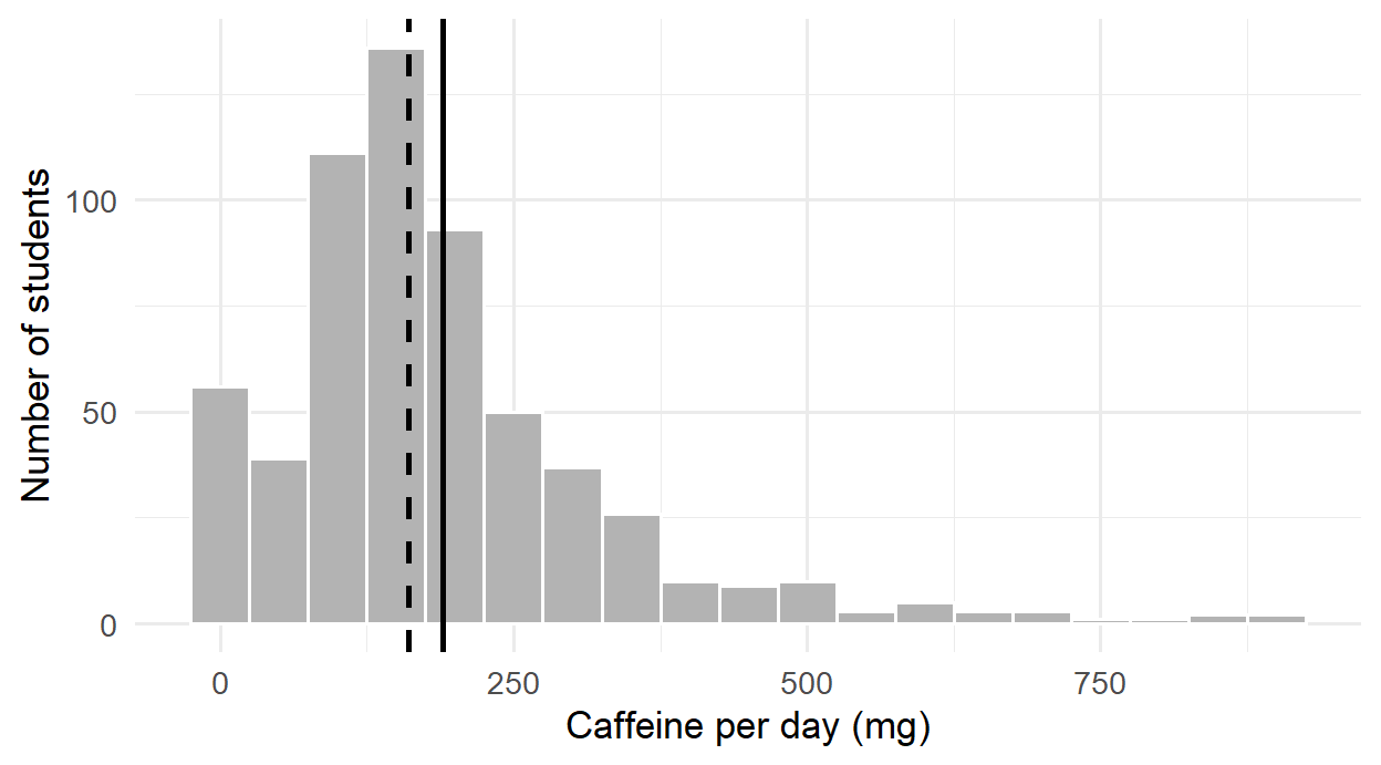
For categories, the mode is simply the most common category, which count() shows at the top when sorted:
students |> count(faculty, sort = TRUE) faculty n
1 Health Sciences 154
2 Education 148
3 Social Sciences 116
4 Humanities 95
5 Natural Sciences 87Which summary is meaningful depends first on the level of measurement of the variable (Chapter 5), and then on its shape. The average faculty does not exist, so a nominal variable is described by counts and percentages. An ordinal variable, such as the five answers to the question about money worries, has a meaningful middle but uneven steps, so the median and percentages suit it better than the mean. Numeric variables can be described by the mean, but only when they are roughly symmetrical and without extreme values; otherwise the median describes the typical case more faithfully. Table 6.1 brings these rules together.
| Variable | Centre | Spread | Examples in the study |
|---|---|---|---|
| Nominal | Mode; percentage in each category | none | faculty, gender |
| Ordinal | Median; percentage in each category | Interquartile range | financial worry, single questionnaire items |
| Numeric, roughly symmetrical | Mean | Standard deviation | sleep, wellbeing |
| Numeric, skewed or with extreme values | Median | Interquartile range | caffeine, age |
Two groups can have the same average and still be very different. The sleep of two small groups of students shows how:
group_a <- c(6.0, 6.5, 6.5, 7.0, 6.5)
group_b <- c(4.0, 8.5, 5.0, 9.0, 6.0)
mean(group_a)[1] 6.5mean(group_b)[1] 6.5Both average 6.5 hours, but in group A everyone sleeps about the same, while group B ranges from 4 to 9 hours. Measures of spread capture this difference, and a mean reported without one hides half of the story.
The range is the difference between the largest and smallest values. It is simple, but it depends only on the two most extreme values:
range(group_b)[1] 4 9The standard deviation (SD) measures how far values typically lie from the mean. The idea is easiest to see in a picture. Figure 6.3 shows the five students of group B, the mean as a dashed line, and each student’s distance from the mean as a red line. These distances are the deviations, \(x_i - \bar{x}\).
deviations <- tibble(student = 1:5, sleep = group_b)
ggplot(deviations, aes(x = student, y = sleep)) +
geom_hline(yintercept = mean(group_b), linetype = "dashed") +
geom_segment(aes(xend = student, yend = mean(group_b)), colour = "#b2182b", linewidth = 1) +
geom_point(size = 3) +
labs(x = "Student", y = "Hours of sleep") +
theme_minimal(base_size = 12)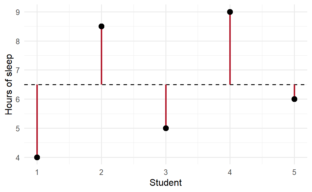
The standard deviation summarises the red lines. Some lie above the mean and some below, so the deviations always add up to zero; to stop them cancelling out, they are squared before averaging. The average squared deviation is the variance, and its square root is the standard deviation:
\[ s = \sqrt{\frac{1}{n-1} \sum_{i=1}^{n} (x_i - \bar{x})^2} \]
Dividing by \(n - 1\) rather than \(n\) gives a slightly better estimate when working with a sample. The square root brings the result back to the original units, so the standard deviation of sleep is measured in hours:
sd(group_a)[1] 0.3535534sd(group_b)[1] 2.179449mean(abs(group_b - mean(group_b))) # the average length of the red lines[1] 1.8The standard deviation of group B, 2.18 hours, is close to the average length of the red lines, 1.8 hours; it is a little larger because squaring gives more weight to the longest lines. Group A’s small standard deviation says that its students hardly differ at all.
The interquartile range (IQR) is the spread of the middle half of the values. The quartiles split the sorted values into four equal parts: a quarter of the values lie below the first quartile (\(Q_1\)), half below the median, and three quarters below the third quartile (\(Q_3\)). The IQR is \(Q_3 - Q_1\). Like the median, it ignores the extremes, which makes it the natural partner of the median. A box plot’s box is exactly the IQR.
quantile(first_sem$caffeine_mg, c(0.25, 0.5, 0.75), na.rm = TRUE)25% 50% 75%
105 160 240 IQR(first_sem$caffeine_mg, na.rm = TRUE)[1] 135The same summarise() calculates spread for several variables at once:
first_sem |>
summarise(
sd_sleep = sd(sleep_hours, na.rm = TRUE),
sd_gpa = sd(gpa, na.rm = TRUE),
iqr_caffeine = IQR(caffeine_mg, na.rm = TRUE)
) sd_sleep sd_gpa iqr_caffeine
1 1.033795 0.329459 135The standard deviation of sleep is about 1 hours: a typical student sleeps within about an hour of the average of 6.5 hours. The mean belongs with the SD, and the median with the IQR.
The centre and spread do not describe everything. The shape of a distribution matters too, because it decides which summaries and which tests are appropriate. A distribution is symmetrical if its two sides mirror each other, in which case the mean and median are about equal. It is skewed to the right, or positively skewed, if it has a long tail of high values, as caffeine does; the mean then lies above the median. It is skewed to the left, or negatively skewed, if it has a long tail of low values, and the mean lies below the median. A distribution with one peak is unimodal, and one with two peaks is bimodal, which often means that two different groups are mixed together. Figure 6.4 compares the shape of sleep and caffeine in the study.
library(tidyr)
first_sem |>
select(sleep_hours, caffeine_mg) |>
pivot_longer(everything(), names_to = "variable", values_to = "value") |>
ggplot(aes(x = value)) +
geom_density(fill = "grey80") +
facet_wrap(~ variable, scales = "free") +
labs(x = NULL, y = "Density") +
theme_minimal(base_size = 12)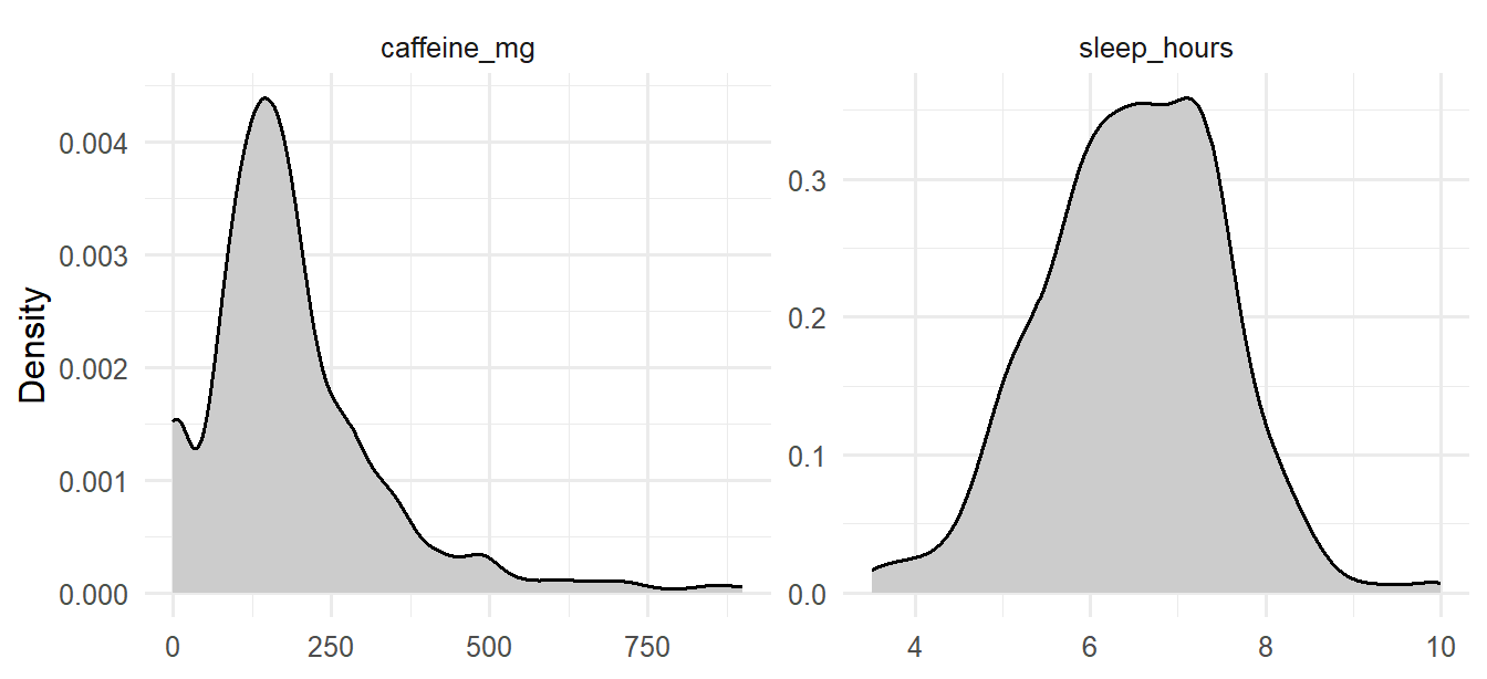
The argument scales = "free" lets each panel have its own axes, since hours and milligrams are on very different scales.
The skewness statistic puts a number on the asymmetry: 0 for perfect symmetry, positive for a tail to the right, negative for a tail to the left. As a rough guide, values between −1 and +1 are mild. The psych package calculates it (install it once with install.packages("psych")):
library(psych)
skew(first_sem$sleep_hours, na.rm = TRUE)[1] -0.09604954skew(first_sem$caffeine_mg, na.rm = TRUE)[1] 1.739451skew(students$age, na.rm = TRUE)[1] 1.340088Sleep is almost perfectly symmetrical, while caffeine and age are clearly skewed to the right: most graduate students are in their twenties, and fewer are older.
Many variables in nature and in research have a similar symmetrical, bell-shaped distribution, called the normal distribution. It matters because many statistical tests assume that data, or at least averages of data, follow it approximately (Chapter 7 explains why).
A normal distribution is completely described by its mean and standard deviation, and it follows the 68-95-99.7 rule: about 68% of values lie within one standard deviation of the mean, 95% within two, and 99.7% within three. The sleep data can be checked against the rule:
sleep <- first_sem$sleep_hours[!is.na(first_sem$sleep_hours)]
z <- (sleep - mean(sleep)) / sd(sleep)
c(within_1_sd = mean(abs(z) < 1),
within_2_sd = mean(abs(z) < 2),
within_3_sd = mean(abs(z) < 3))within_1_sd within_2_sd within_3_sd
0.7070707 0.9579125 0.9949495 The proportions are very close to the rule. The values z are z-scores: how many standard deviations each value is from the mean. They put any variable on the same scale, which makes them useful for spotting unusual values too.
A graph gives a better check than any single number. A Q-Q plot (quantile-quantile plot) compares the data with what a normal distribution would give. If the data is normal, the points fall along a straight line:
first_sem |>
select(sleep_hours, caffeine_mg) |>
pivot_longer(everything(), names_to = "variable", values_to = "value") |>
ggplot(aes(sample = value)) +
stat_qq(alpha = 0.4) +
stat_qq_line() +
facet_wrap(~ variable, scales = "free") +
labs(x = "Expected if normal", y = "Observed") +
theme_minimal(base_size = 12)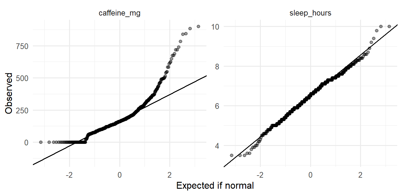
Sleep sits on the line. Caffeine bends away at the upper end, because its largest values are much larger than a normal distribution would produce: the long right tail again.
An outlier is a value far from the rest. Chapter 3 set values that were impossible, such as an age of 250, to missing. Outliers are different: they are possible, just unusual, and they are information before they are a problem. An unusual value may be an error that cleaning missed, a participant who misunderstood a question, or a real case that the research should pay attention to. The first task is therefore to find unusual values and look at them, not to remove them.
Two common rules flag them. The box plot rule flags values more than 1.5 × IQR below the first quartile or above the third quartile; these are the points a box plot draws separately. The z-score rule flags values more than 3 standard deviations from the mean, and suits roughly normal variables. For caffeine, which is skewed, the box plot rule is the better choice:
q1 <- quantile(first_sem$caffeine_mg, 0.25, na.rm = TRUE)
q3 <- quantile(first_sem$caffeine_mg, 0.75, na.rm = TRUE)
upper_fence <- q3 + 1.5 * (q3 - q1)
upper_fence 75%
442.5 sum(first_sem$caffeine_mg > upper_fence, na.rm = TRUE)[1] 35In all, 35 students take more caffeine than the upper fence of 442 mg. For sleep, which is roughly normal, the z-score rule flags 3 students. The most extreme cases combine both:
first_sem |>
filter(sleep_hours <= 4.5, caffeine_mg >= 600) |>
select(student_id, sleep_hours, caffeine_mg, study_hours, wellbeing) student_id sleep_hours caffeine_mg study_hours wellbeing
1 S0105 3.5 740 58 52
2 S0124 4.0 845 46 58
3 S0195 3.6 840 59 58
4 S0310 3.5 885 57 38
5 S0312 3.9 785 67 51
6 S0371 4.1 650 36 53
7 S0530 4.3 720 65 44
8 S0554 3.5 900 26 56
9 S0599 3.6 610 50 47These students sleep very little, take a lot of caffeine, and study long hours. Nothing about these values is impossible, and they describe a real and worrying group of students: exactly the kind of case the thesis is about.
First check whether it is an error (Chapter 3). If it is a real value, keep it: it is part of what you are studying. Report it, and choose summaries and tests that are not thrown off by it, such as the median, or check whether your conclusions change when the unusual cases are left out (a sensitivity analysis). Removing inconvenient values to get a cleaner result is a form of research misconduct.
Almost every dataset has gaps, and the study’s data has three kinds, each with its own lesson. The first step is to count them in every variable:
semesters |> summarise(across(everything(), ~ sum(is.na(.x)))) student_id semester gpa sleep_hours study_hours exercise_days caffeine_mg
1 0 0 1 21 23 20 25
supervisor_meetings wellbeing
1 0 0students |> summarise(across(everything(), ~ sum(is.na(.x)))) student_id supervisor_id age gender faculty programme study_mode employment
1 0 0 1 0 0 0 0 0
has_children lives_away financial_worry workshop workshop_sessions
1 0 0 38 0 0
considering_dropout
1 0A few semester measurements are missing (about 1% each), and 38 students did not answer the question about money worries.
What matters most is not how much is missing, but why. Statisticians distinguish three situations. Data is missing completely at random when the gaps have nothing to do with anything, as when a student skips a question by accident; analyses of the remaining data are then unbiased, just a little less precise. Data is missing at random when the gaps depend on something that was measured, such as study mode; analyses can be corrected for it if they include what it depends on. Data is missing not at random when the gaps depend on the missing value itself. Students with the most serious money worries, for example, might be the least willing to answer the question about money. This is the hardest case, because the students who answered are no longer typical.
The most important gap in the study’s data is not a skipped question: it is the students who left the study after the first year. Chapter 3 found 37 of them. Their first-semester records show whether they resembled everyone else:
left_ids <- setdiff(students$student_id,
semesters$student_id[semesters$semester == 3])
first_sem |>
mutate(left_study = student_id %in% left_ids) |>
summarise(
students = n(),
wellbeing = mean(wellbeing),
gpa = mean(gpa, na.rm = TRUE),
considering_dropout = mean(considering_dropout == "Yes"),
.by = left_study
) left_study students wellbeing gpa considering_dropout
1 FALSE 563 60.66075 3.107620 0.1207815
2 TRUE 37 57.35135 3.012973 0.5945946They did not. The students who left already had lower wellbeing in their first semester, and most of them had said they were considering dropping out. The students still in the study in semesters 3 and 4 are therefore, on average, the ones who were doing better, and a simple average of the later semesters would overestimate how well graduate students were doing.
At a minimum, a thesis should report how many participants left and how they differed, as above. Some methods cope with this kind of gap better than others: the mixed-effects models of Chapter 10 use every observation each student provided, including the first year of those who left. More advanced techniques, such as multiple imputation, are beyond this book, but worth knowing about when a large share of the data is missing.
Descriptive statistics also describe how variables go together. The correlation coefficient, written \(r\), measures how closely two numeric variables follow a straight-line relationship. It runs from −1 to +1. A value near +1 means that as one variable rises, the other rises too; a value near −1 means that as one rises, the other falls; and a value near 0 means that there is no straight-line relationship, although, as Anscombe’s datasets in Chapter 4 showed, there may still be a curved one. In the social and behavioural sciences, correlations of about 0.1, 0.3, and 0.5 (positive or negative) are often described as small, medium, and large (Cohen 1988). These are rough guides, not rules.
The questionnaire scores are needed here. They are calculated as in Chapter 3, reversing stress_4 first:
scores <- questionnaire |>
mutate(
stress_4 = 6 - stress_4,
stress = rowMeans(pick(stress_1:stress_6), na.rm = TRUE),
burnout = rowMeans(pick(burnout_1:burnout_6), na.rm = TRUE),
support = rowMeans(pick(support_1:support_6), na.rm = TRUE),
satisfaction = rowMeans(pick(satisfaction_1:satisfaction_4), na.rm = TRUE)
) |>
select(student_id, stress, burnout, support, satisfaction)
first_sem <- first_sem |> left_join(scores, join_by(student_id))
first_sem |>
select(stress, burnout, support, wellbeing, gpa) |>
cor(use = "pairwise.complete.obs") |>
round(2) stress burnout support wellbeing gpa
stress 1.00 0.65 -0.33 -0.53 -0.31
burnout 0.65 1.00 -0.24 -0.51 -0.27
support -0.33 -0.24 1.00 0.36 0.36
wellbeing -0.53 -0.51 0.36 1.00 0.32
gpa -0.31 -0.27 0.36 0.32 1.00The option use = "pairwise.complete.obs" uses every student who has both values for each pair. The table is rich. Stress and burnout go together strongly; students who feel supported by their supervisor report less stress; stress and burnout go with lower wellbeing; support goes with higher GPA.
A scatter plot matrix shows the same relationships as graphs, one small scatter plot for each pair of variables:
pairs(first_sem[, c("stress", "support", "wellbeing", "gpa")],
pch = 16, col = rgb(0, 0, 0, 0.25))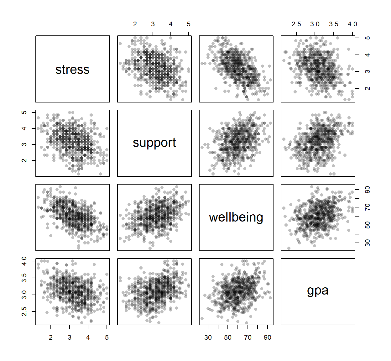
The function pairs() comes with R; pch = 16 draws filled dots, and the rgb() colour makes them transparent.
A correlation says that two variables go together. It does not say that one causes the other. Chapter 5 introduced the example of caffeine and GPA:
first_sem |>
select(caffeine_mg, sleep_hours, gpa) |>
cor(use = "pairwise.complete.obs") |>
round(2) caffeine_mg sleep_hours gpa
caffeine_mg 1.00 -0.64 -0.19
sleep_hours -0.64 1.00 0.25
gpa -0.19 0.25 1.00Students who take more caffeine have lower GPAs, but that does not show that caffeine harms grades. Caffeine also goes strongly with less sleep, and sleep goes with higher grades, so caffeine may only look harmful because heavy caffeine users sleep less. A third variable that produces a misleading correlation like this is a confounder. Chapter 8 shows how regression can separate the two explanations. For now, the lesson is to describe correlations as associations, not as causes.
The methods chapter of almost every thesis includes a description of the sample: who took part, and what the main variables look like. It is usually a table, which dplyr builds directly:
first_sem |>
summarise(
students = n(),
female_pct = 100 * mean(gender == "Female"),
phd_pct = 100 * mean(programme == "PhD"),
part_time_pct = 100 * mean(study_mode == "Part-time"),
age_mean = mean(age, na.rm = TRUE),
age_sd = sd(age, na.rm = TRUE)
) |>
round(1) students female_pct phd_pct part_time_pct age_mean age_sd
1 600 52 29 29.5 29.7 4.8A summary is complete only with its spread and the number of cases it is based on. A mean of 6.4 hours says little until the reader knows whether students differ by minutes or by hours, and whether the mean comes from 20 students or 600. When values are missing, the number of cases also differs from variable to variable, so it must be reported for each. The second table therefore gives, for each main variable, the number of values, the mean and SD for symmetrical variables, the median and IQR for skewed ones, and the number missing:
describe_var <- function(x) {
c(n = sum(!is.na(x)),
mean = mean(x, na.rm = TRUE), sd = sd(x, na.rm = TRUE),
median = median(x, na.rm = TRUE), iqr = IQR(x, na.rm = TRUE),
missing = sum(is.na(x)))
}
sapply(first_sem[, c("sleep_hours", "study_hours", "caffeine_mg", "gpa", "wellbeing")],
describe_var) |>
t() |>
round(2) n mean sd median iqr missing
sleep_hours 594 6.48 1.03 6.5 1.40 6
study_hours 592 27.64 13.06 26.0 19.00 8
caffeine_mg 597 189.41 143.62 160.0 135.00 3
gpa 600 3.10 0.33 3.1 0.45 0
wellbeing 600 60.46 12.01 60.0 17.00 0The small function describe_var(), written for this chapter, calculates the six summaries for one variable, and sapply() applies it to each column; t() turns the result so that each variable is a row. Writing your own functions is a skill for later; for now, you can reuse this one.
In the text, the sample is described in a sentence or two, for example:
The sample consisted of 600 graduate students (52% female; 29% PhD students), aged 23 to 52 (M = 29.7, SD = 4.8). Students slept 6.5 hours per night on average (SD = 1.0), and 65% slept less than the recommended 7 hours.
Every number in that sentence comes from the code, so it cannot drift out of step with the data.
Before any test, check for each variable you will use:
R’s faithful dataset records 272 eruptions of the Old Faithful geyser in Yellowstone National Park. The duration of the eruptions is a classic bimodal distribution: most eruptions last either about 2 minutes or about 4.5 minutes, and few last in between.
ggplot(faithful, aes(x = eruptions)) +
geom_histogram(binwidth = 0.2, fill = "grey70", colour = "white") +
labs(x = "Eruption duration (minutes)", y = "Number of eruptions") +
theme_minimal(base_size = 12)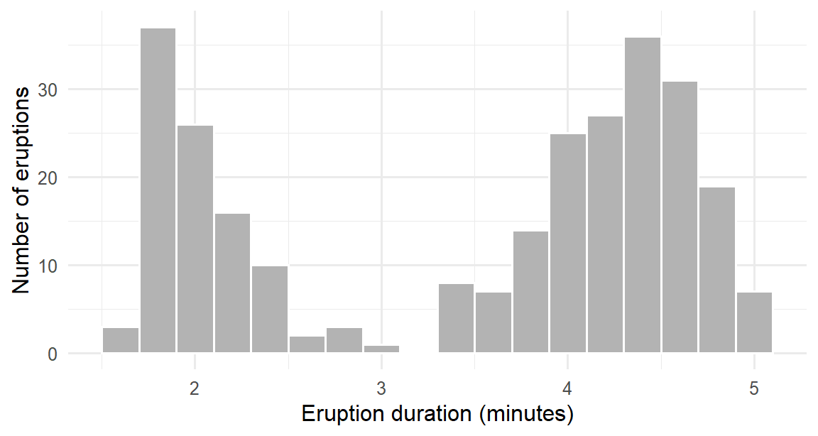
The mean of these durations, about 3.5 minutes, describes almost no actual eruption. For a bimodal variable, report the two groups separately, and look for what separates them.
Descriptive statistics look simple, and that is exactly why their mistakes are common.
Descriptive statistics, exploratory analysis, inferential analysis, predictive analysis, mean, median, mode, range, deviation, variance, standard deviation, quartile, interquartile range, skewness, symmetrical, unimodal, bimodal, normal distribution, z-score, Q-Q plot, outlier, missing completely at random, missing at random, missing not at random, attrition, correlation coefficient, confounder.
The playground has these and more, with hints and solutions.
study_hours. Decide whether the variable is closer to symmetrical or skewed, and which pair of summaries you would report.wellbeing, and judge whether it looks normal.study_hours in the first semester, and look at their other values.sleep_hours of students who later left the study with those who stayed, and say whether they differ in sleep as they did in wellbeing.support and satisfaction, classify it with Cohen’s guidelines, and explain why it does not show that support causes satisfaction.students, choose the summary you would report in a thesis, using Table 6.1, and justify each choice in one sentence.Research is almost always about more people than it can measure. A study of 600 graduate students is interesting because of what it says about graduate students in general, and a clinical trial of 200 patients matters because of the patients who will be treated after it. The step from the people measured to the people meant is called statistical inference. It rests on one uncomfortable fact: a different sample would have given different numbers. Inference is the discipline of saying how different, and of deciding when a pattern in a sample is strong enough to be believed.
This chapter builds that discipline from the ground up. It starts with what happens when samples are drawn again and again, which leads to standard errors and confidence intervals. It then develops the logic of hypothesis testing by simulation, shuffling group labels until the meaning of a p-value can be seen, before turning to the formal tests that appear in almost every thesis. The hypotheses come from Chapter 5: whether graduate students sleep less than the recommended 7 hours (RQ2), and whether the wellbeing workshop improved wellbeing (RQ3).
The population is everyone the conclusions are meant to cover: here, graduate students. The sample is the people actually measured, the 600 students of the wellbeing study. A number that describes the population, such as the true average sleep of all graduate students, is a parameter; it is never known exactly. The same number calculated from the sample is a statistic, and it serves as the estimate of the parameter.
A second sample would give a slightly different estimate, and a third another. The size of this variation cannot be seen in a single study, but it can be seen in a simulation. For a moment, treat the 600 students as if they were the whole population, draw many small samples from them, and watch how the estimates behave.
Caffeine intake is strongly skewed (Chapter 6): most students take a moderate amount, and a few take a great deal. The simulation draws a sample of 5 students and records their average caffeine, repeats this a thousand times, and then does the same with samples of 30. In the code, sample() draws a random sample and replicate() repeats the whole step:
library(dplyr)
library(ggplot2)
first_sem <- semesters |>
filter(semester == 1) |>
left_join(students, join_by(student_id))
caffeine <- first_sem$caffeine_mg[!is.na(first_sem$caffeine_mg)]
set.seed(2026)
means_5 <- replicate(1000, mean(sample(caffeine, 5)))
means_30 <- replicate(1000, mean(sample(caffeine, 30)))The line set.seed(2026) fixes R’s random number generator, so that the “random” samples are the same every time the code runs and the results match this book. Any analysis that involves randomness should fix the seed in this way.
The thousand averages form a sampling distribution: the distribution of a statistic over many possible samples. Figure 7.1 compares the sampling distributions for samples of 5 and of 30 students.
tibble(
mean_caffeine = c(means_5, means_30),
sample_size = rep(c("Samples of 5", "Samples of 30"), each = 1000)
) |>
mutate(sample_size = factor(sample_size, levels = c("Samples of 5", "Samples of 30"))) |>
ggplot(aes(x = mean_caffeine)) +
geom_histogram(bins = 40, fill = "grey70", colour = "white") +
facet_wrap(~ sample_size) +
labs(x = "Average caffeine in the sample (mg)", y = "Number of samples") +
theme_minimal(base_size = 12)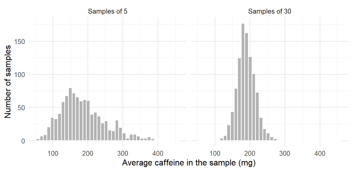
The figure carries the three ideas on which the rest of the chapter depends. Both distributions are centred on the average of all 600 students, 189 mg, which means that a sample average neither overestimates nor underestimates on average: it is an unbiased estimate. The averages of 30 students are packed far more tightly than the averages of 5, so larger samples give more precise estimates. Finally, although caffeine itself is strongly skewed, and so are the averages of 5 students, the averages of 30 students are almost symmetrical and bell-shaped.
This last observation is the central limit theorem: whatever the shape of the data, the averages of reasonably large samples follow an approximately normal distribution. It explains why methods based on the normal distribution work for so many kinds of data. As a rule of thumb, samples of 30 or more are large enough unless the data is extremely skewed.
The spread of a sampling distribution has its own name, the standard error (SE). It measures how much an estimate would vary from sample to sample, which is precisely the uncertainty a researcher needs to know. A real study has only one sample and cannot draw a thousand, but for an average the standard error can be calculated from that single sample:
\[ SE = \frac{s}{\sqrt{n}} \]
where \(s\) is the standard deviation and \(n\) the sample size. The formula and the simulation can be compared directly:
sd(means_30) # spread of the 1,000 simulated averages[1] 25.69209sd(caffeine) / sqrt(30) # the formula, from the data[1] 26.22184The two agree closely. The square root in the formula has a practical consequence that every researcher planning a study should remember: halving the standard error requires four times as many participants.
An estimate on its own says nothing about its precision. A confidence interval (CI) adds that information: a range of values that are plausible for the population parameter, given the data. A 95% confidence interval for a mean is approximately
\[ \bar{x} \pm 2 \times SE \]
where, more precisely, the 2 is a value from the t-distribution that R works out. The function t.test() calculates the interval; here it is for the average first-semester sleep:
t.test(first_sem$sleep_hours)$conf.int[1] 6.400196 6.566808
attr(,"conf.level")
[1] 0.95The average sleep of graduate students is plausibly between 6.40 and 6.57 hours. The interval is narrow because the sample is large.
The “95%” describes the method rather than this particular interval. If the study were repeated many times, and a 95% confidence interval calculated each time, about 95% of those intervals would contain the true population value. Any single interval either contains it or does not; the confidence lies in the procedure that produced it.
Theses often report “mean ± SE” and treat it as if it were a confidence interval. It is not: the SE is only half the width of an approximate 95% CI. Report the confidence interval itself, and say what it is.
The formula above works for averages. For other statistics, such as the median, there is no simple formula. The bootstrap solves this with an idea of remarkable simplicity: treat the sample as if it were the population, and draw many new samples from it with replacement, so that each new sample contains some people twice and leaves others out. The spread of the statistic across these resamples estimates its sampling distribution.
Suppose the survey had reached only 40 students, and a confidence interval were needed for their median caffeine intake:
set.seed(1)
small_sample <- sample(caffeine, 40)
median(small_sample)[1] 150boot_medians <- replicate(2000, median(sample(small_sample, replace = TRUE)))
quantile(boot_medians, c(0.025, 0.975)) 2.5% 97.5%
110.0 177.5 Sampling with replacement, the argument replace = TRUE, is what makes this a bootstrap. The middle 95% of the 2,000 bootstrap medians, from the 2.5th to the 97.5th percentile, forms the 95% bootstrap confidence interval. The median of all 600 students, 160 mg, lies inside it. The same few lines work for almost any statistic.
A confidence interval describes which values are plausible. A hypothesis test addresses a sharper question: whether the data is consistent with a particular claim. The claim that is tested is the null hypothesis, \(H_0\), the statement that nothing is going on: no difference, no relationship. The researcher’s own expectation is the alternative hypothesis, \(H_1\). For the workshop, \(H_0\) states that the workshop has no effect on wellbeing, and \(H_1\) that it does.
Chapter 5 explained why tests are built around the null hypothesis: it is precise enough to calculate with. If the workshop had no effect, any difference between the invited and the not-invited students would be due only to which students happened to receive an invitation. The test asks whether the observed difference is larger than such chance differences usually are. That question can be answered directly, by simulation, before any formula is introduced.
Question: does the workshop improve wellbeing (RQ3)? It is a causal question, and the random invitation allows a causal answer. Unit of analysis: the student, with one wellbeing score each, at the end of semester 2. Variables: wellbeing (0 to 100, interval) is the outcome; the invitation (nominal, two groups) is the predictor. Evidence against \(H_1\): a difference near zero, or in favour of the students who were not invited.
The data needed is each student’s workshop group together with their wellbeing at the end of semester 2:
semester2 <- semesters |>
filter(semester == 2) |>
left_join(students, join_by(student_id))
nrow(semester2)[1] 600observed_gap <- mean(semester2$wellbeing[semester2$workshop == "Invited"]) -
mean(semester2$wellbeing[semester2$workshop == "Not invited"])
observed_gap[1] 5.25Invited students scored 5.2 points higher. If the null hypothesis were true, the labels “Invited” and “Not invited” would carry no information about wellbeing: each student would have had the same score whichever label they had received. Under that assumption the labels can be shuffled at random among the students, and the difference recalculated. Each shuffle shows one difference that chance alone could have produced. Repeating the shuffle thousands of times builds the null distribution, the range of differences to expect when the workshop does nothing:
set.seed(2026)
shuffled_gaps <- replicate(5000, {
shuffled <- sample(semester2$workshop)
mean(semester2$wellbeing[shuffled == "Invited"]) -
mean(semester2$wellbeing[shuffled == "Not invited"])
})
summary(shuffled_gaps) Min. 1st Qu. Median Mean 3rd Qu. Max.
-3.6033 -0.6367 0.0100 0.0130 0.6633 3.2700 Here sample() without a size simply shuffles the whole column. Figure 7.2 places the observed difference against the 5,000 shuffled ones.
ggplot(data.frame(gap = shuffled_gaps), aes(x = gap)) +
geom_histogram(binwidth = 0.25, fill = "grey70", colour = "white") +
geom_vline(xintercept = observed_gap, colour = "#b2182b", linewidth = 1) +
labs(x = "Difference in average wellbeing (invited minus not invited)",
y = "Number of shuffles") +
theme_minimal(base_size = 12)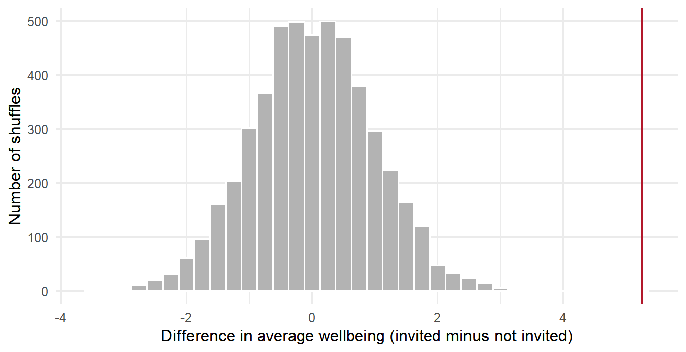
Shuffled differences cluster around zero and rarely exceed 3 points in either direction. The observed difference lies far beyond all of them. The proportion of shuffles that produce a difference at least as large as the observed one, in either direction, is the p-value:
mean(abs(shuffled_gaps) >= abs(observed_gap))[1] 0Not one of the 5,000 shuffles matched the observed difference. The p-value is not literally zero: a finite number of shuffles can only show that it is smaller than about 1 in 5,000, so it is reported as p < .001. Chance alone is a very poor explanation of the data, and the null hypothesis can be rejected.
A test does not always end this way, and the contrast is instructive. Chapter 5 listed GPA by gender as a comparison where no difference was expected. The same shuffling procedure gives a very different picture:
gpa_gap <- mean(first_sem$gpa[first_sem$gender == "Female"]) -
mean(first_sem$gpa[first_sem$gender == "Male"])
set.seed(2026)
shuffled_gpa <- replicate(5000, {
shuffled <- sample(first_sem$gender)
mean(first_sem$gpa[shuffled == "Female"]) - mean(first_sem$gpa[shuffled == "Male"])
})
c(observed = gpa_gap, p_value = mean(abs(shuffled_gpa) >= abs(gpa_gap))) observed p_value
-0.01286325 0.63240000 The average GPA of women and men differs by only 0.01 grade points, and more than half of the shuffles produce a difference at least that large. Such a difference is exactly what chance produces, so the data gives no reason to reject the null hypothesis.
This procedure is a permutation test. It contains the whole logic of hypothesis testing, and every test in the rest of the chapter follows it: assume the null hypothesis, work out which results it makes likely, and see where the observed result falls. The formal tests differ mainly in using mathematics instead of shuffling to find the null distribution, which is faster and, when their assumptions hold, gives almost the same answer.
The p-value is the probability of a result at least as extreme as the one observed, if the null hypothesis were true. A small p-value means the data would be surprising in a world where nothing is going on, and the null hypothesis is rejected. By convention, “small” means below 0.05, a threshold called the significance level, \(\alpha\), and such a result is called statistically significant. A large p-value means the data is consistent with the null hypothesis, which is then not rejected. This is not proof that the null hypothesis is true; it means only that the data does not provide strong evidence against it.
A p-value is not the probability that the null hypothesis is true, and not the probability that the result happened by chance. It is the probability of data like yours, assuming the null hypothesis is true. A p-value of 0.03 means: if the workshop had no effect, a difference at least this large would appear in only 3% of studies like this one.
Because a test works with probabilities, its decision can be wrong in two ways, shown in Table 7.1.
| \(H_0\) is really true | \(H_0\) is really false | |
|---|---|---|
| Reject \(H_0\) | Type I error (a false alarm) | Correct |
| Do not reject \(H_0\) | Correct | Type II error (a missed effect) |
The significance level controls Type I errors: with \(\alpha = 0.05\), about 5% of tests of a true null hypothesis will be “significant” by chance alone. This can be demonstrated. The simulation below splits the students into two groups completely at random, so that no real difference can exist, tests whether their wellbeing differs, and repeats the whole procedure a thousand times:
set.seed(7)
p_values <- replicate(1000, {
random_group <- sample(rep(c("A", "B"), 300))
t.test(first_sem$wellbeing ~ random_group)$p.value
})
mean(p_values < 0.05)[1] 0.065About 6% of the tests are “significant”, even though every difference is pure chance, close to the 5% that the significance level predicts. A single significant result is therefore never the final word.
A Type II error, missing an effect that is really there, depends mainly on two things: the size of the effect and the size of the sample. A stricter significance level also makes effects harder to detect, which is one reason not to lower it without cause. The probability that a study detects an effect of a given size, when the effect is real, is its power (Chapter 5). Power is easiest to understand by simulation. The function below imagines a study of the workshop in which the true effect is 5 points (with a standard deviation of 11, as in the real data), runs a t-test, and reports whether the result was significant. Running it 2,000 times for each group size shows how often studies of that size succeed:
simulate_study <- function(n_per_group, effect = 5, sd = 11) {
invited <- rnorm(n_per_group, mean = 60 + effect, sd = sd)
not_invited <- rnorm(n_per_group, mean = 60, sd = sd)
t.test(invited, not_invited)$p.value < 0.05
}
set.seed(3)
group_sizes <- c(10, 20, 40, 80, 150)
simulated_power <- sapply(group_sizes, \(n) mean(replicate(2000, simulate_study(n))))
data.frame(students_per_group = group_sizes, power = round(simulated_power, 2)) students_per_group power
1 10 0.17
2 20 0.29
3 40 0.53
4 80 0.82
5 150 0.97power_curve <- data.frame(n = 5:160)
power_curve$power <- power.t.test(n = power_curve$n, delta = 5, sd = 11)$power
ggplot(power_curve, aes(x = n, y = power)) +
geom_line(colour = "grey50") +
geom_point(data = data.frame(n = group_sizes, power = simulated_power), size = 2.5) +
geom_hline(yintercept = 0.8, linetype = "dashed") +
labs(x = "Students per group", y = "Power") +
theme_minimal(base_size = 12)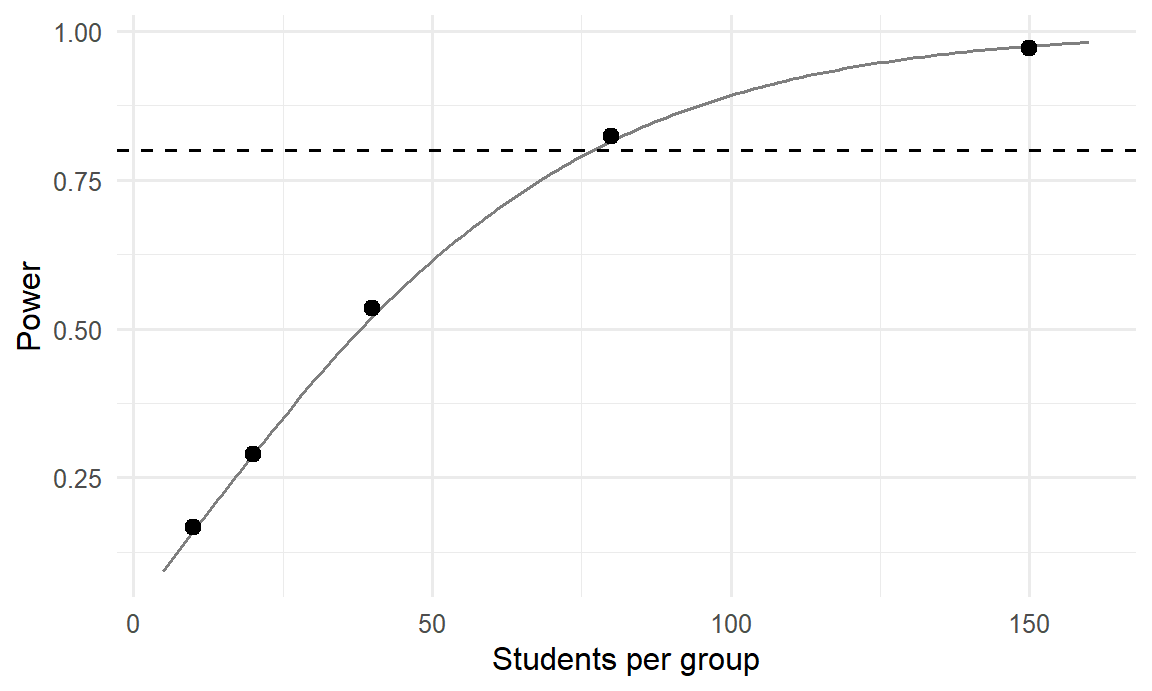
With 10 students per group, a real 5-point effect is detected only about 17% of the time; such a study would usually end with “no significant difference”, even though the workshop works. Around 80 students per group are needed to reach the conventional 80% power, marked by the dashed line. The study’s 300 per group gives power close to 100%. The line, calculated with power.t.test(), agrees with the simulation, which shows what that function computes. A non-significant result from a small study should therefore be read with great caution: it may say more about the size of the study than about the effect.
The 5% false alarm rate applies to each test. A study that runs many tests will almost certainly produce some false alarms. With 20 independent tests of true null hypotheses, the chance of at least one “significant” result is
1 - 0.95^20[1] 0.6415141about 64%. A simulation confirms it. Each simulated study below runs 20 t-tests on pure noise and records whether any of them came out significant:
set.seed(8)
any_false_alarm <- replicate(1000, {
p <- replicate(20, t.test(rnorm(30), rnorm(30))$p.value)
any(p < 0.05)
})
mean(any_false_alarm)[1] 0.653Roughly two studies in three find “something”, although there is nothing to find. This is why the main hypotheses of a thesis should be stated in advance (Chapter 5), why a study that reports only its significant results misleads, and why the tests in Chapter 8 correct for multiple comparisons.
A two-tailed test looks for a difference in either direction: the workshop might raise or lower wellbeing. A one-tailed test looks in one direction only. One-tailed tests are easier to pass, which makes them tempting, but they are justified only when the opposite direction is truly impossible or irrelevant, and when the direction was decided before seeing the data. Two-tailed tests are the standard choice, and R’s tests are two-tailed by default. The permutation test above was two-tailed as well: it counted shuffles that were extreme in either direction.
A statistically significant result is not necessarily an important one. With a large enough sample, even a tiny, meaningless difference becomes significant. Every result should therefore be reported with its size, not only with its significance, and the rest of this chapter does so for each test.
The second research question asks whether graduate students sleep less than the recommended 7 hours (RQ2). Chapter 5 stated the hypothesis with a direction: average sleep is below 7 hours. The test is nevertheless two-tailed, with the null hypothesis that average sleep is 7 hours and the alternative that it is not, the cautious choice explained in the section on one-tailed and two-tailed tests. The direction of the result is then read from the estimate. A one-sample t-test compares a sample average with a fixed value, given by the argument mu:
sleep_test <- t.test(first_sem$sleep_hours, mu = 7)
sleep_test
One Sample t-test
data: first_sem$sleep_hours
t = -12.177, df = 593, p-value < 2.2e-16
alternative hypothesis: true mean is not equal to 7
95 percent confidence interval:
6.400196 6.566808
sample estimates:
mean of x
 6.483502
The output contains three results. The estimate is the sample average, 6.48 hours. The confidence interval runs from 6.40 to 6.57 hours and does not include 7. The test itself reports the t statistic, which measures how far the average lies from 7 in units of standard errors (here 12.2 standard errors below), and a p-value so small that R prints it as “< 2.2e-16”, meaning less than 0.0000000000000002.
Graduate students sleep about half an hour less than recommended, and the difference is far too large to be chance. The confidence interval also answers the practical question: the shortfall is somewhere between about 26 and 36 minutes a night.
The test uses first-semester records only, one value per student. A t-test assumes that the observations are independent. Using all four semesters would count each student up to four times, as if they were four different people, and make the result look more certain than it is. Chapter 10 shows how to analyse repeated measurements properly.
The workshop question (RQ3) compares two independent groups: the students invited at random to the six-week workshop after their first semester, and those who were not invited. The permutation test has already answered it; the two-sample t-test reaches the same answer with a formula.
A small invented example shows the mechanics. Suppose there were only five students in each group, with these wellbeing scores out of 100:
invited <- c(68, 72, 65, 75, 70)
not_invited <- c(62, 66, 60, 69, 64)
mean(invited)[1] 70mean(not_invited)[1] 64.2The invited group is 5.8 points higher on average. A two-sample t-test assesses whether a difference between the averages of two independent groups is larger than chance would produce:
small_test <- t.test(invited, not_invited)
small_test
Welch Two Sample t-test
data: invited and not_invited
t = 2.5099, df = 7.9411, p-value = 0.03658
alternative hypothesis: true difference in means is not equal to 0
95 percent confidence interval:
0.4642934 11.1357066
sample estimates:
mean of x mean of y
70.0 64.2 The p-value is 0.037: if the workshop had no effect, a difference this large would appear in about 4 studies in 100. By the usual 0.05 threshold the result is statistically significant, although with only five students per group it is fragile evidence.
The real study uses the semester2 table built for the permutation test. Before any test, the data should be inspected, and Figure 7.4 shows wellbeing in each group.
ggplot(semester2, aes(x = workshop, y = wellbeing, fill = workshop)) +
geom_boxplot(show.legend = FALSE, width = 0.5) +
labs(x = NULL, y = "Wellbeing (0 to 100)") +
theme_minimal(base_size = 13)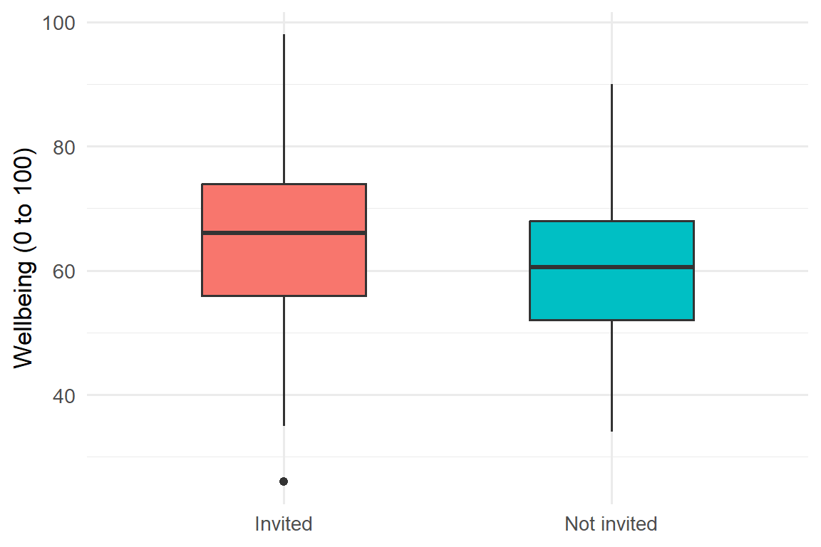
The invited group sits a little higher, but the groups overlap considerably. In the test, the formula wellbeing ~ workshop reads “wellbeing by workshop group”:
result <- t.test(wellbeing ~ workshop, data = semester2)
result
Welch Two Sample t-test
data: wellbeing by workshop
t = 5.469, df = 597.52, p-value = 6.66e-08
alternative hypothesis: true difference in means between group Invited and group Not invited is not equal to 0
95 percent confidence interval:
3.364699 7.135301
sample estimates:
mean in group Invited mean in group Not invited
65.47 60.22 Invited students scored 5.2 points higher on average (65.5 against 60.2). The 95% confidence interval for the difference runs from 3.4 to 7.1 points, and the p-value is below 0.001, in agreement with the permutation test. Because students were invited at random, the study can conclude that the workshop caused the improvement, not merely that it accompanied it: randomisation makes the two groups alike in everything except the invitation (Chapter 5).
The heading of the output, “Welch Two Sample t-test”, names the version R uses by default. It does not assume that the two groups have equal spread, which makes it the safer choice and the appropriate default.
A difference of five points on a 100-point scale is hard to judge on its own. A common standard is Cohen’s d: the difference between the means divided by the standard deviation. It expresses the difference in standard deviations, so it can be compared across studies and scales:
inv <- semester2$wellbeing[semester2$workshop == "Invited"]
not <- semester2$wellbeing[semester2$workshop == "Not invited"]
d <- (mean(inv) - mean(not)) / sqrt((var(inv) + var(not)) / 2)
d[1] 0.4465413Cohen’s guidelines call 0.2 a small effect, 0.5 medium, and 0.8 large (Cohen 1988). At about 0.45, the workshop’s effect is small to medium: a real improvement, but not a transformation. For a six-week workshop, that is a worthwhile result, and exactly the kind of judgement a thesis discussion should make.
The two-sample test compared two different groups of students. A different question concerns change within the same people: whether the invited students’ own wellbeing rose from semester 1 to semester 2. When the same students are measured twice, the two sets of scores are paired. Each student is compared with themselves, which removes the large differences between students and makes the test more sensitive.
The data needs one row per student, with the two semesters side by side (Chapter 3):
library(tidyr)
invited_wide <- semesters |>
filter(semester %in% c(1, 2)) |>
left_join(students, join_by(student_id)) |>
filter(workshop == "Invited") |>
select(student_id, semester, wellbeing) |>
pivot_wider(names_from = semester, values_from = wellbeing,
names_prefix = "semester_")
t.test(invited_wide$semester_2, invited_wide$semester_1, paired = TRUE)
Paired t-test
data: invited_wide$semester_2 and invited_wide$semester_1
t = 10.936, df = 299, p-value < 2.2e-16
alternative hypothesis: true mean difference is not equal to 0
95 percent confidence interval:
3.955360 5.691307
sample estimates:
mean difference
4.823333 The invited students’ wellbeing rose by 4.8 points on average, and the change is clearly significant.
This test cannot say why wellbeing rose. The rise could come from the workshop, or semester 2 could simply be less stressful than semester 1 for everyone. The paired test has no comparison group; it is the two-sample test, comparing invited with not-invited students, that answers the causal question. Choosing the design that actually answers the question matters as much as running the test correctly.
Every test rests on assumptions, and a result is only as trustworthy as the assumptions behind it. The first assumption of the t-test is independence: each observation comes from a different person, or, for the paired test, each pair does. Independence is a property of the study design rather than of the numbers, so it cannot be tested; it must be secured when the data is collected, which is why the tests in this chapter use one value per student. The second is approximate normality of the data in each group. Thanks to the central limit theorem, this matters little in large samples: with 30 or more students per group, moderate skewness is not a problem. The third, similar spread in the two groups, is required only by the classic version of the two-sample test; Welch’s version, R’s default, does not need it.
Normality is best judged with graphs: a histogram and a Q-Q plot (Chapter 6). Formal tests of normality exist, such as the Shapiro-Wilk test, but they contain a trap:
shapiro.test(first_sem$sleep_hours)
Shapiro-Wilk normality test
data: first_sem$sleep_hours
W = 0.99291, p-value = 0.006536The test declares that sleep is not normal (p < 0.05), yet in Chapter 6 the histogram and Q-Q plot of sleep looked almost perfectly normal. Both are right. With 600 students, the test is sensitive enough to detect tiny departures from normality that make no practical difference. In large samples, normality tests reject almost everything; in small samples, where normality matters most, they can miss real problems. The graphs, together with the sample size, are the better guide.
When data is clearly not normal and the sample is small, or when the data is ordinal (ranks, or answers on a short scale), non-parametric tests offer an alternative. Instead of the values themselves, they compare the ranks of the values, so extreme values and skewness do not distort them. The price is some loss of power when the data is in fact close to normal.
The Mann-Whitney U test, called the Wilcoxon rank-sum test in R, replaces the two-sample t-test. Caffeine is strongly skewed, which makes the comparison of caffeine intake between women and men a suitable case:
tapply(first_sem$caffeine_mg, first_sem$gender, median, na.rm = TRUE)Female Male
152.5 170.0 wilcox.test(caffeine_mg ~ gender, data = first_sem)
Wilcoxon rank sum test with continuity correction
data: caffeine_mg by gender
W = 40551, p-value = 0.06319
alternative hypothesis: true location shift is not equal to 0The medians differ a little, but the p-value is above 0.05, so there is no clear evidence of a difference. Medians, rather than means, should be reported alongside a non-parametric test.
The Wilcoxon signed-rank test replaces the paired t-test. Applied to the invited students’ wellbeing in semesters 1 and 2, it gives:
wilcox.test(invited_wide$semester_2, invited_wide$semester_1, paired = TRUE)
Wilcoxon signed rank test with continuity correction
data: invited_wide$semester_2 and invited_wide$semester_1
V = 33026, p-value < 2.2e-16
alternative hypothesis: true location shift is not equal to 0The result agrees with the paired t-test. When the parametric and non-parametric tests agree, either can be reported with confidence; when they disagree, the data deserves a second look, and the test whose assumptions fit should be trusted.
The t-test compares averages of a numeric variable. For categorical variables, the chi-square test (\(\chi^2\)) compares counts: how many cases fall into each category, against how many would be expected if the null hypothesis were true.
The first form of the test, usually called the goodness-of-fit test, compares the counts of one categorical variable with proportions stated in advance. Whether the sample is evenly split between women and men is a simple example:
table(students$gender)
Female Male
312 288 chisq.test(table(students$gender), p = c(0.5, 0.5))
Chi-squared test for given probabilities
data: table(students$gender)
X-squared = 0.96, df = 1, p-value = 0.3272With 312 women and 288 men, the split is a little uneven, but the p-value is large: a difference of this size is quite likely in a random sample from an evenly split population. There is no evidence against a 50/50 split, and a non-significant result of this kind is still a result.
The test of independence examines whether two categorical variables are related, such as having a job and considering dropping out:
jobs <- table(students$employment, students$considering_dropout)
jobs
No Yes
Full-time job 72 25
None 265 42
Part-time job 173 23prop.table(jobs, margin = 1) |> round(2)
No Yes
Full-time job 0.74 0.26
None 0.86 0.14
Part-time job 0.88 0.12Dividing by the row totals, with prop.table(..., margin = 1), turns the counts into proportions within each row. About a quarter of students with full-time jobs have considered dropping out, compared with about one in eight of the others. The test shows whether this difference exceeds what chance would produce:
job_test <- chisq.test(jobs)
job_test
Pearson's Chi-squared test
data: jobs
X-squared = 10.888, df = 2, p-value = 0.004322With a p-value of 0.004, the difference is statistically significant: students with full-time jobs are more likely to consider dropping out. The result is an association, not proof that jobs cause thoughts of dropping out, since students who work full-time may differ in other ways too, such as financial pressure.
The chi-square test is reliable when the expected counts, the counts that would appear if the variables were unrelated, are at least 5 in every cell. The test stores them:
round(job_test$expected, 1)
No Yes
Full-time job 82.4 14.6
None 261.0 46.0
Part-time job 166.6 29.4All are well above 5. When some are not, Fisher’s exact test, fisher.test(), is the appropriate alternative for small counts.
Table 7.2 and Figure 7.5 summarise the tests of this chapter and the next.
| Question | Data | Test | In R |
|---|---|---|---|
| Is a mean equal to a value? | Numeric, one group | One-sample t-test | t.test(x, mu = ) |
| Do two groups differ? | Numeric, two independent groups | Two-sample t-test | t.test(y ~ group) |
| Do the same people differ at two times? | Numeric, paired | Paired t-test | t.test(x2, x1, paired = TRUE) |
| Do three or more groups differ? | Numeric, 3+ groups | ANOVA (Chapter 8) | aov() |
| Do two groups differ (skewed or ordinal)? | Ranks, two groups | Mann-Whitney U | wilcox.test(y ~ group) |
| Paired, skewed or ordinal? | Ranks, paired | Wilcoxon signed-rank | wilcox.test(x2, x1, paired = TRUE) |
| Do counts match expected proportions? | One categorical variable | Chi-square goodness of fit | chisq.test(table, p = ) |
| Are two categorical variables related? | Two categorical variables | Chi-square test of independence | chisq.test(table) |
flowchart TD
A[What is the outcome?] -->|Numeric| B{How many groups?}
A -->|Categorical| K[Chi-square test]
B -->|One, against a value| C[One-sample t-test]
B -->|Two| D{Same people twice?}
B -->|Three or more| F[ANOVA, Chapter 8]
D -->|No, different people| G[Two-sample t-test]
D -->|Yes| H[Paired t-test]
G -.->|Very skewed, small sample, or ordinal| I[Mann-Whitney U test]
H -.->|Very skewed, small sample, or ordinal| J[Wilcoxon signed-rank test]
A test is reported with the statistic, its degrees of freedom (df, printed by R), the p-value, and, most importantly, the size of the effect with a confidence interval. Exact p-values are given to two or three decimal places, and very small ones as “p < .001”. The report should also return to the hypothesis stated in advance and say whether the data contradicts the null hypothesis. The examples below follow these conventions.
One-sample t-test. Students slept less than the recommended 7 hours (M = 6.48, 95% CI [6.40, 6.57]), t(593) = -12.18, p < .001.
Two-sample t-test. Students invited to the wellbeing workshop reported higher wellbeing at the end of semester 2 (M = 65.5) than those not invited (M = 60.2), a difference of 5.2 points, 95% CI [3.4, 7.1], t(598) = 5.47, p < .001, d = 0.45. A permutation test with 5,000 shuffles gave the same conclusion. The null hypothesis of no effect was therefore rejected.
Chi-square test. Considering dropout was related to employment, \(\chi^2\)(2) = 10.89, p = .004: 26% of students with full-time jobs had considered dropping out, compared with 14% of those without a job.
All the numbers in these examples are filled in by the code, so they cannot drift out of step with the analysis.
Several misunderstandings about hypothesis tests are common enough in published research, and in theses, to deserve a list of their own. Each of them has been addressed in this chapter, and each is worth checking against before a results chapter is submitted.
Population, sample, parameter, statistic, sampling distribution, central limit theorem, standard error, confidence interval, bootstrap, null hypothesis, alternative hypothesis, permutation test, null distribution, p-value, significance level, statistically significant, Type I error, Type II error, power, multiple testing, one-tailed test, two-tailed test, one-sample t-test, two-sample t-test, Welch test, paired t-test, effect size, Cohen’s d, independence, chi-square test, expected count, non-parametric test, Mann-Whitney U test, Wilcoxon signed-rank test.
The playground has these and more, with hints and solutions.
study_hours and plot the sample averages. Then try samples of 50. Describe how the two sampling distributions differ.simulate_study() function to find the power of a study with 40 students per group when the true effect is 3 points instead of 5. Explain what the result means for a researcher planning such a study.lives_away) is related to considering dropout. Run a chi-square test and check the expected counts.Most research questions involve more than two groups or more than one explanation. A researcher may want to compare five faculties rather than two, to know which of several factors go together with better grades, or to find what makes a student more likely to consider leaving a programme. Each of these questions asks, in one way or another, how much of the variation in an outcome can be traced to other variables. Students differ in stress, grades, and wellbeing; the task is to find which part of those differences is connected with faculty, sleep, or support, and which part remains unexplained.
This chapter introduces the two families of methods built on that idea, which together are probably the most widely used tools in quantitative research. Analysis of variance (ANOVA) compares the averages of three or more groups by splitting variation into the part between groups and the part within them. Regression models how an outcome depends on one or more predictors: linear regression for numeric outcomes such as GPA, and logistic regression for yes-or-no outcomes such as considering dropout. In the study, they answer three research questions: whether stress differs between faculties and study modes (RQ4), what explains students’ grades (RQ5), and who considers dropping out (RQ9).
The chapter uses each student’s first-semester records, their background information, and their questionnaire scores, calculated as in Chapter 3:
library(dplyr)
library(ggplot2)
scores <- questionnaire |>
mutate(
stress_4 = 6 - stress_4,
stress = rowMeans(pick(stress_1:stress_6), na.rm = TRUE),
support = rowMeans(pick(support_1:support_6), na.rm = TRUE)
) |>
select(student_id, stress, support)
study <- students |>
left_join(scores, join_by(student_id)) |>
left_join(semesters |> filter(semester == 1), join_by(student_id))The first question is whether stress differs between the five faculties. One approach would be a t-test for every pair of faculties, but that is 10 tests. Chapter 7 showed that each test has a 5% chance of a false alarm, and that the risks accumulate: across 10 independent tests, the chance of at least one false alarm is about 40%. Analysis of variance (ANOVA) avoids the problem by asking one question first: whether the faculty averages differ at all.
ANOVA compares two kinds of variation. Stress scores for three small groups show the idea:
group_scores <- tibble(
group = rep(c("A", "B", "C"), each = 4),
stress = c(2.5, 3.0, 2.8, 3.1, 3.4, 3.8, 3.5, 3.9, 2.9, 3.3, 3.0, 3.4)
)
group_scores |> summarise(mean = mean(stress), .by = group)# A tibble: 3 × 2
group mean
<chr> <dbl>
1 A 2.85
2 B 3.65
3 C 3.15Figure 8.1 draws the twelve scores, the average of each group, and the overall average. The group averages differ from the overall average: that is variation between groups. The scores also differ from their own group’s average: that is variation within groups.
group_means <- group_scores |> summarise(mean = mean(stress), .by = group)
ggplot(group_scores, aes(x = group, y = stress)) +
geom_hline(yintercept = mean(group_scores$stress), linetype = "dashed") +
geom_point(size = 2.5, position = position_nudge(x = rep(c(-0.09, -0.03, 0.03, 0.09), 3))) +
geom_errorbar(data = group_means, aes(y = mean, ymin = mean, ymax = mean), width = 0.4,
linewidth = 1) +
labs(x = "Group", y = "Stress score") +
theme_minimal(base_size = 12)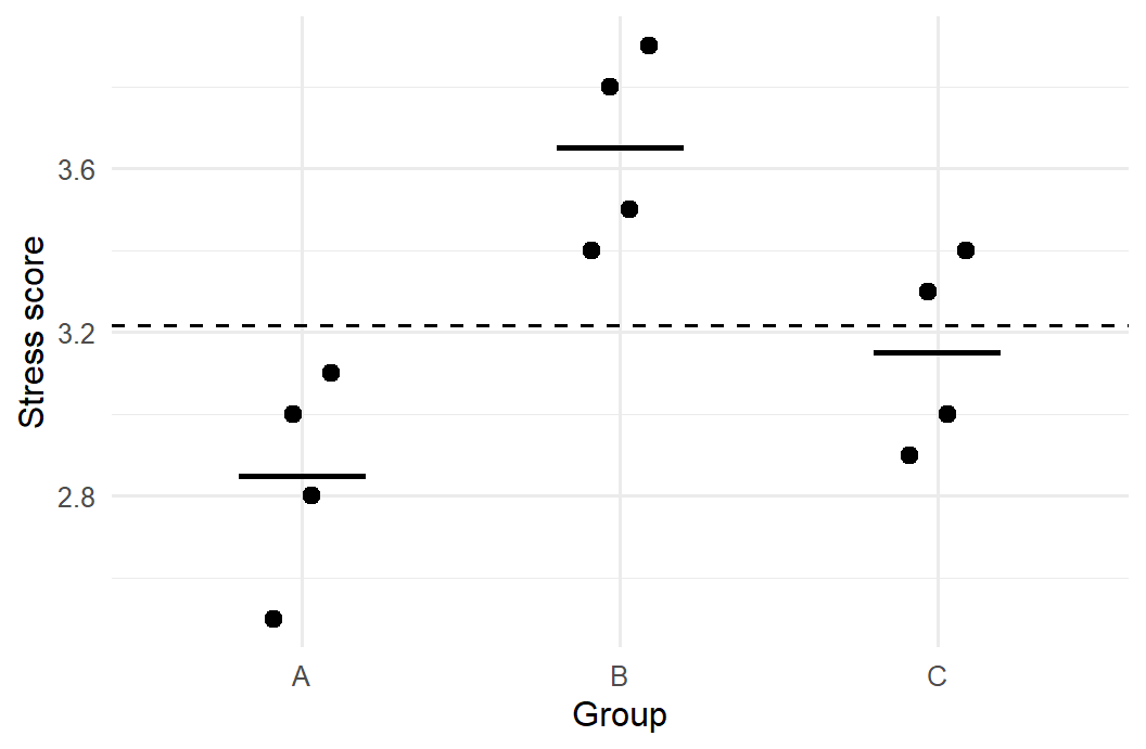
If the groups really come from populations with the same average, the between-group variation should be no larger than the within-group variation would lead one to expect: group averages always differ a little by chance. ANOVA’s F statistic is the ratio of the two:
\[ F = \frac{\text{variation between groups}}{\text{variation within groups}} \]
An F close to 1 means that the group averages differ no more than chance would produce; a large F means that they differ more. The function aov() fits the model, and summary() shows the test:
summary(aov(stress ~ group, data = group_scores)) Df Sum Sq Mean Sq F value Pr(>F)
group 2 1.307 0.6533 10.69 0.00419 **
Residuals 9 0.550 0.0611
---
Signif. codes: 0 '***' 0.001 '**' 0.01 '*' 0.05 '.' 0.1 ' ' 1The p-value is small: these three groups differ.
The ratio matters more than the size of the differences between averages. The next code keeps the three group averages exactly as they are, but places the scores either close to their averages or far from them, and calculates F each time:
offsets <- rep(c(-0.3, -0.1, 0.1, 0.3), 3)
group_avg <- rep(group_means$mean, each = 4)
tight <- group_scores |> mutate(stress = group_avg + 0.5 * offsets)
wide <- group_scores |> mutate(stress = group_avg + 4 * offsets)
c(tight = summary(aov(stress ~ group, data = tight))[[1]][["F value"]][1],
wide = summary(aov(stress ~ group, data = wide))[[1]][["F value"]][1]) tight wide
39.2000 0.6125 The group averages are identical in both versions, yet F is large when the scores cluster tightly around their averages and small when they spread widely. Differences of about half a point between groups are convincing when students within a group hardly differ, and unremarkable when they differ by more than two points. This is the whole logic of ANOVA, and it is why group averages should never be compared without looking at the spread within groups (Chapter 4).
The data comes first. Figure 8.2 shows stress in each faculty.
ggplot(study, aes(x = faculty, y = stress)) +
geom_boxplot() +
labs(x = NULL, y = "Stress score (1 to 5)") +
theme_minimal(base_size = 12)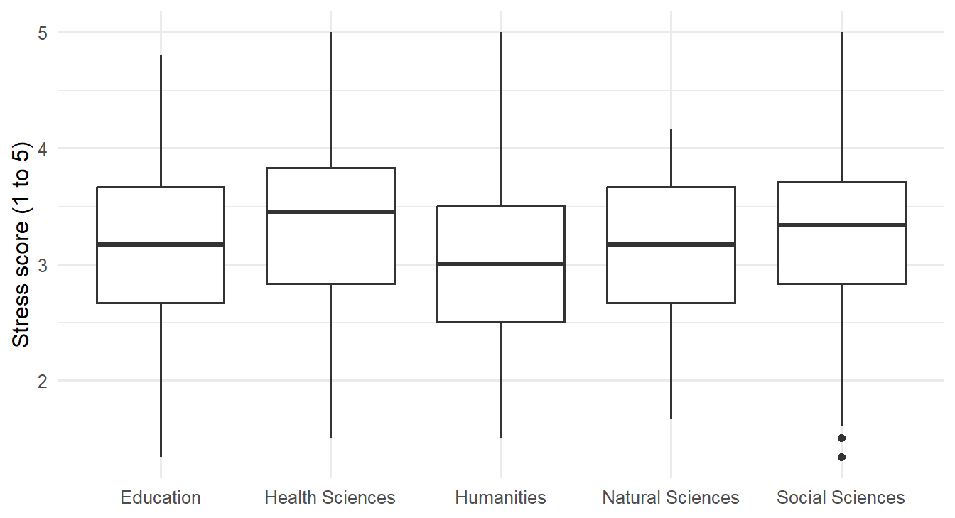
The faculties overlap a lot, but Health Sciences sits a little higher and Humanities a little lower. The ANOVA tests whether these differences exceed what chance would produce:
stress_anova <- aov(stress ~ faculty, data = study)
summary(stress_anova) Df Sum Sq Mean Sq F value Pr(>F)
faculty 4 8.72 2.1788 4.152 0.00252 **
Residuals 595 312.19 0.5247
---
Signif. codes: 0 '***' 0.001 '**' 0.01 '*' 0.05 '.' 0.1 ' ' 1The p-value is 0.003, so the faculties do differ in stress. The size of the difference is measured by eta squared (\(\eta^2\)), the share of all the variation in stress that lies between faculties:
ss <- summary(stress_anova)[[1]][["Sum Sq"]]
ss[1] / sum(ss)[1] 0.02715776Only about 3% of the differences in stress between students have to do with their faculty; the rest is about the individual students. By common guidelines, an \(\eta^2\) of 0.01 is small, 0.06 medium, and 0.14 large (Cohen 1988), so this is a real but small effect. For the research question, the answer is that faculty matters, but knowing a student’s faculty says very little about how stressed that student is.
ANOVA says that the faculties differ, but not which ones. Post-hoc tests compare every pair while keeping the overall chance of a false alarm at 5%. Tukey’s test is the most common:
TukeyHSD(stress_anova) Tukey multiple comparisons of means
95% family-wise confidence level
Fit: aov(formula = stress ~ faculty, data = study)
$faculty
diff lwr upr p adj
Health Sciences-Education 0.19429917 -0.033842346 0.42244068 0.1367660
Humanities-Education -0.14304647 -0.403603347 0.11751041 0.5614602
Natural Sciences-Education -0.05877343 -0.326527149 0.20898029 0.9749738
Social Sciences-Education 0.12216527 -0.123607736 0.36793827 0.6535324
Humanities-Health Sciences -0.33734564 -0.595910542 -0.07878073 0.0035331
Natural Sciences-Health Sciences -0.25307260 -0.518888282 0.01274309 0.0707118
Social Sciences-Health Sciences -0.07213390 -0.315794100 0.17152630 0.9275445
Natural Sciences-Humanities 0.08427304 -0.209834619 0.37838070 0.9352210
Social Sciences-Humanities 0.26521174 -0.009035651 0.53945912 0.0635851
Social Sciences-Natural Sciences 0.18093870 -0.100155231 0.46203263 0.3973784Each row compares two faculties: the difference in average stress, its confidence interval, and an adjusted p-value (p adj). Only one comparison is significant: Health Sciences students are more stressed than Humanities students, by about 0.34 points on the 1-to-5 scale. The other differences are small enough to be chance.
ANOVA makes the same assumptions as the t-test: independent observations, roughly normal data within each group (or large groups), and similar spread in each group. The spread can be checked with Levene’s test, from the car package:
library(car)
leveneTest(stress ~ factor(faculty), data = study)Levene's Test for Homogeneity of Variance (center = median)
Df F value Pr(>F)
group 4 0.9429 0.4386
595 The p-value is large, so there is no evidence that the spread differs between faculties. When the assumptions fail, the Kruskal-Wallis test is the non-parametric alternative, comparing ranks instead of averages:
kruskal.test(stress ~ faculty, data = study)
Kruskal-Wallis rank sum test
data: stress by faculty
Kruskal-Wallis chi-squared = 15.46, df = 4, p-value = 0.003836It agrees with the ANOVA.
Wellbeing might depend on the programme (Master’s or PhD), on study mode (full-time or part-time), or on a combination of both. A two-way ANOVA examines all three possibilities at once. The main effect of programme is the difference between Master’s and PhD students on average, and the main effect of study mode is the difference between full-time and part-time students. The interaction asks whether the effect of study mode depends on the programme: part-time study might, for example, be harder on PhD students than on Master’s students.
An interaction plot shows the group averages as lines. If the lines are parallel, there is no interaction: the effect of study mode is the same in both programmes.
study |>
summarise(wellbeing = mean(wellbeing), .by = c(programme, study_mode)) |>
ggplot(aes(x = programme, y = wellbeing, colour = study_mode, group = study_mode)) +
geom_line(linewidth = 1) +
geom_point(size = 3) +
scale_colour_viridis_d(end = 0.8) +
labs(x = NULL, y = "Average wellbeing", colour = "Study mode") +
theme_minimal(base_size = 13)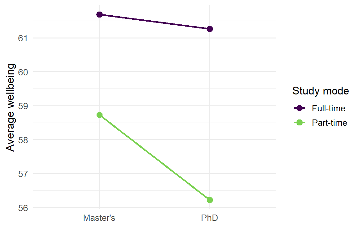
Part-time students have lower wellbeing in both programmes, and the lines are close to parallel. In the formula, programme * study_mode asks for both main effects and their interaction:
summary(aov(wellbeing ~ programme * study_mode, data = study)) Df Sum Sq Mean Sq F value Pr(>F)
programme 1 316 315.6 2.230 0.135913
study_mode 1 1640 1640.2 11.587 0.000709 ***
programme:study_mode 1 119 118.6 0.838 0.360341
Residuals 596 84364 141.6
---
Signif. codes: 0 '***' 0.001 '**' 0.01 '*' 0.05 '.' 0.1 ' ' 1Study mode has a clear effect. Programme does not, and neither does the interaction: part-time study lowers wellbeing by about the same amount whether a student is doing a Master’s or a PhD. When an interaction is significant, it should be interpreted before the main effects, because it means that no single “effect of study mode” describes everyone.
ANOVA compares groups. Regression goes further: it models how an outcome changes with one or more predictors, which can be numeric or categorical. It is the workhorse of quantitative research, and ANOVA is in fact a special case of it.
At its heart, regression describes the average outcome for given values of the predictors. For sleep and GPA, the question is what the average GPA is among students who sleep 5 hours, among those who sleep 6 hours, and so on. These averages can be calculated directly, by grouping students into half-hour bands of sleep:
sleep_bands <- study |>
filter(!is.na(sleep_hours)) |>
mutate(sleep_band = round(sleep_hours * 2) / 2) |>
summarise(mean_gpa = mean(gpa), students = n(), .by = sleep_band) |>
arrange(sleep_band)
sleep_bands sleep_band mean_gpa students
1 3.5 2.882000 5
2 4.0 2.901250 8
3 4.5 2.939231 13
4 5.0 3.022340 47
5 5.5 3.021385 65
6 6.0 3.054951 103
7 6.5 3.094519 104
8 7.0 3.120000 102
9 7.5 3.175957 94
10 8.0 3.320606 33
11 8.5 3.206429 14
12 9.0 3.720000 2
13 9.5 3.160000 1
14 10.0 3.146667 3Figure 8.4 places these averages over the individual students, together with a straight regression line.
ggplot(study, aes(x = sleep_hours, y = gpa)) +
geom_point(alpha = 0.2, colour = "grey40") +
geom_smooth(method = "lm", se = FALSE) +
geom_point(data = sleep_bands, aes(x = sleep_band, y = mean_gpa, size = students),
colour = "#b2182b") +
labs(x = "Hours of sleep per night", y = "GPA", size = "Students") +
theme_minimal(base_size = 12)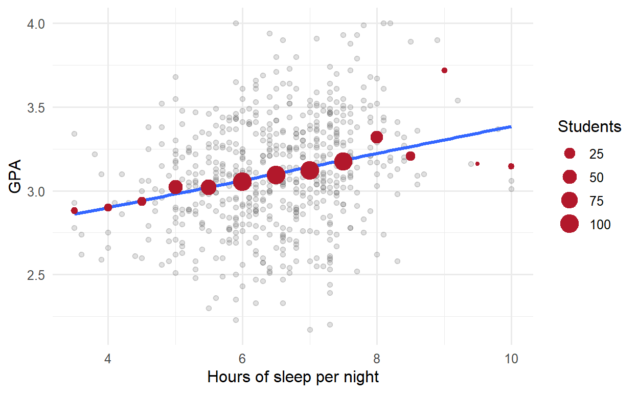
The band averages rise gently with sleep, and the line passes close to them, especially where there are many students. The regression line is a smooth summary of these conditional averages: it assumes that the average GPA changes by the same amount for each extra hour of sleep, and estimates that amount from all the students at once. The spread of the grey points around the line is what the model does not explain.
A small example shows the calculation. Here are five students’ sleep and GPA:
five <- tibble(
sleep = c(5, 6, 6.5, 7, 8),
gpa = c(2.8, 3.0, 3.2, 3.1, 3.4)
)Simple linear regression fits the straight line that best describes how GPA changes with sleep:
\[ \text{GPA} = b_0 + b_1 \times \text{sleep} + \text{error} \]
The coefficient \(b_0\) is the intercept, the predicted GPA for a student who sleeps zero hours, and \(b_1\) is the slope, the change in predicted GPA for each extra hour of sleep. “Best” means the line that makes the squared vertical distances between the points and the line, the residuals, as small as possible, a method called least squares. The function lm(), for linear model, finds it:
lm(gpa ~ sleep, data = five)
Call:
lm(formula = gpa ~ sleep, data = five)
Coefficients:
(Intercept) sleep
1.865 0.190 Each extra hour of sleep goes with a GPA that is about 0.19 higher. The intercept is where the line would cross zero hours of sleep, which no one does; it is needed to place the line, but it rarely means anything on its own.
For all 600 students, summary() gives the full results:
gpa_simple <- lm(gpa ~ sleep_hours, data = study)
summary(gpa_simple)
Call:
lm(formula = gpa ~ sleep_hours, data = study)
Residuals:
Min 1Q Median 3Q Max
-0.97283 -0.20475 -0.00188 0.21898 0.94606
Coefficients:
Estimate Std. Error t value Pr(>|t|)
(Intercept) 2.57713 0.08316 30.99 < 2e-16 ***
sleep_hours 0.08081 0.01267 6.38 3.57e-10 ***
---
Signif. codes: 0 '***' 0.001 '**' 0.01 '*' 0.05 '.' 0.1 ' ' 1
Residual standard error: 0.3189 on 592 degrees of freedom
(6 observations deleted due to missingness)
Multiple R-squared: 0.06433, Adjusted R-squared: 0.06275
F-statistic: 40.7 on 1 and 592 DF, p-value: 3.573e-10The output contains three results that matter for the research question. The coefficients table gives the estimate of each coefficient, its standard error, a t statistic, and a p-value testing whether it is zero. The slope for sleep_hours is about 0.08: each extra hour of sleep goes with a GPA about 0.08 higher, and the p-value shows that this is not chance. R-squared is the share of the variation in GPA that the model explains; here it is only 0.06, so sleep explains about 6% of the differences in GPA. Sleep matters, but it is far from the whole story, as the scatter plot suggested. Finally, the residual standard error is the typical distance between a student’s actual GPA and the line, about 0.32 grade points.
Many things affect grades at once. Multiple regression includes several predictors in one model:
gpa_model <- lm(gpa ~ sleep_hours + study_hours + stress + support, data = study)
summary(gpa_model)
Call:
lm(formula = gpa ~ sleep_hours + study_hours + stress + support,
data = study)
Residuals:
Min 1Q Median 3Q Max
-0.86953 -0.19437 0.00526 0.18957 0.76429
Coefficients:
Estimate Std. Error t value Pr(>|t|)
(Intercept) 2.137403 0.145279 14.712 < 2e-16 ***
sleep_hours 0.106041 0.014163 7.487 2.62e-13 ***
study_hours 0.006928 0.001105 6.270 7.06e-10 ***
stress -0.083526 0.017827 -4.685 3.48e-06 ***
support 0.110733 0.016696 6.632 7.57e-11 ***
---
Signif. codes: 0 '***' 0.001 '**' 0.01 '*' 0.05 '.' 0.1 ' ' 1
Residual standard error: 0.2857 on 582 degrees of freedom
(13 observations deleted due to missingness)
Multiple R-squared: 0.2525, Adjusted R-squared: 0.2473
F-statistic: 49.14 on 4 and 582 DF, p-value: < 2.2e-16Each coefficient now means the change in predicted GPA for a one-unit increase in that predictor, holding the other predictors constant. Among students with the same study hours, stress, and support, each extra hour of sleep goes with a GPA about 0.11 higher. Each extra hour of study per week adds about 0.007, each point of stress lowers GPA by about 0.08, and each point of supervisor support raises it by about 0.11. All four are significant.
Together, the four predictors explain about 25% of the variation in GPA. That may sound modest, but grades depend on many things no survey measures, from ability to luck on exam day. In social and educational research, models that explain a quarter of the variation are common and useful. The adjusted R-squared is slightly lower, because it corrects for the number of predictors: adding any predictor, even a useless one, raises R-squared a little, but only a useful one raises the adjusted version.
The output also contains the line (13 observations deleted due to missingness): lm() leaves out students with a missing value in any variable of the model. The number of students each model is based on should always be reported.
Categorical variables can be predictors too. Gender, for example, can be added to the model to see whether it matters once the other predictors are taken into account:
gpa_gender <- lm(gpa ~ sleep_hours + study_hours + stress + support + gender, data = study)
summary(gpa_gender)$coefficients Estimate Std. Error t value Pr(>|t|)
(Intercept) 2.123737610 0.147260520 14.4216360 1.592391e-40
sleep_hours 0.106600187 0.014203710 7.5050947 2.318148e-13
study_hours 0.006995075 0.001111694 6.2922647 6.163042e-10
stress -0.082830266 0.017877519 -4.6332081 4.447816e-06
support 0.110525008 0.016709773 6.6143931 8.474218e-11
genderMale 0.013815196 0.023831664 0.5796992 5.623422e-01R turns a categorical predictor into a comparison with a reference category, by default the first in alphabetical order: here Female. The coefficient genderMale is the difference between men and women, holding everything else constant. It is tiny and far from significant: there is no evidence that gender affects GPA. That is a finding too, and worth reporting.
For a variable with more categories, such as faculty, R compares each category with the reference, giving one coefficient for each of the others. A different reference is chosen with relevel(factor(faculty), ref = "Humanities").
Chapters 5 and 6 found that students who take more caffeine have lower GPAs, but also sleep less. Two explanations are possible, and Figure 8.5 draws them. In the first, caffeine itself harms grades. In the second, sleep is a common cause: students who sleep less both drink more coffee and get lower grades, and caffeine has no effect of its own.
flowchart LR
subgraph "Caffeine as a cause"
C1[Caffeine] --> G1[GPA]
end
subgraph "Sleep as a confounder"
S2[Sleep] --> C2[Caffeine]
S2 --> G2[GPA]
C2 -. "apparent link" .- G2
end
Regression can tell the two apart, by comparing students who sleep the same amount. Caffeine alone comes first:
summary(lm(gpa ~ caffeine_mg, data = study))$coefficients Estimate Std. Error t value Pr(>|t|)
(Intercept) 3.1849088129 2.195535e-02 145.063026 0.000000e+00
caffeine_mg -0.0004331688 9.239351e-05 -4.688303 3.418851e-06Caffeine has a significant negative association with GPA. Sleep is then added to the model:
summary(lm(gpa ~ caffeine_mg + sleep_hours, data = study))$coefficients Estimate Std. Error t value Pr(>|t|)
(Intercept) 2.6380932284 0.1238298172 21.3041841 4.534485e-75
caffeine_mg -0.0000780726 0.0001194238 -0.6537443 5.135321e-01
sleep_hours 0.0738597698 0.0165663746 4.4584148 9.891313e-06Once sleep is held constant, caffeine’s coefficient shrinks to almost nothing and is no longer significant, while sleep stays significant. Among students who sleep the same amount, caffeine makes no difference to grades. Caffeine looked harmful only because heavy caffeine users sleep less: sleep was a confounder, and the data supports the second explanation.
The general rule is that a confounder is a common cause of the predictor and the outcome. Adjusting for it in a regression compares like with like, students who are the same on the confounder, and removes the misleading part of the association.
Regression can remove the effect of a confounder only if you measured it and put it in the model. It cannot adjust for anything you did not measure. That is why, outside a randomised experiment like the workshop, regression shows associations adjusted for the variables in the model, not proof of cause.
A straight line assumes that every extra hour of study adds the same amount to GPA, which is hard to believe: the difference between 5 and 15 hours a week is probably larger than the difference between 45 and 55. Adding a squared term lets the line curve:
gpa_curve <- lm(gpa ~ study_hours + I(study_hours^2), data = study)
summary(gpa_curve)$coefficients Estimate Std. Error t value Pr(>|t|)
(Intercept) 2.8630064457 5.380474e-02 53.211044 3.718109e-227
study_hours 0.0183480169 3.914705e-03 4.686947 3.448155e-06
I(study_hours^2) -0.0002874497 6.488183e-05 -4.430358 1.121887e-05In the formula, I() tells R to calculate study_hours^2 before fitting. The squared term is negative and significant: the line bends downwards. Figure 8.6 shows the shape.
ggplot(study, aes(x = study_hours, y = gpa)) +
geom_point(alpha = 0.3) +
geom_smooth(method = "lm", formula = y ~ x + I(x^2)) +
labs(x = "Study hours per week", y = "GPA") +
theme_minimal(base_size = 13)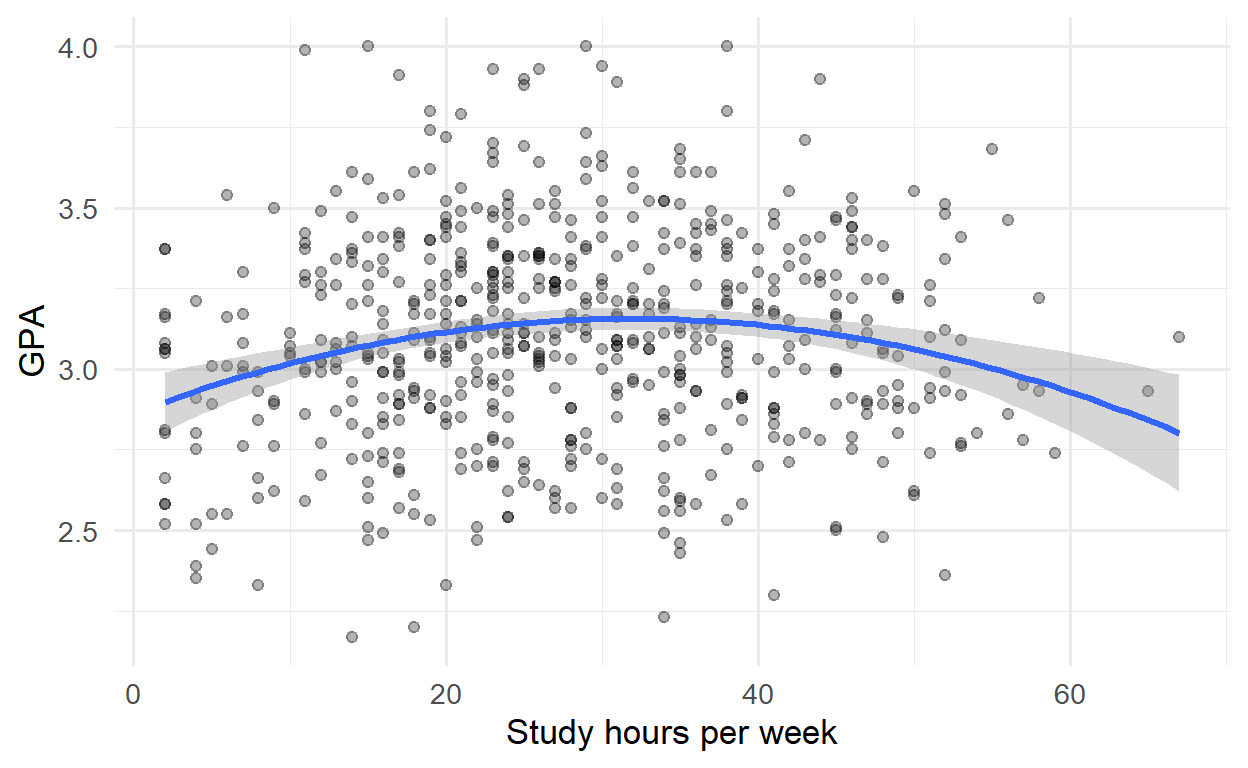
The first hours of study make a real difference; the curve then flattens, and reaches its highest point at about 32 hours a week, beyond which more study brings nothing extra. Economists call this diminishing returns, and it is worth knowing for any student tempted to study all night instead of sleeping.
The effect of supervisor support need not be the same for every student. An interaction term lets the effect of one predictor depend on another. In the formula, support * programme gives the effect of support, the effect of programme, and how the effect of support differs between programmes. To make the coefficients easier to read, support is first centred: the average is subtracted, so that zero means “average support”:
study <- study |> mutate(support_c = support - mean(support))
gpa_interaction <- lm(gpa ~ support_c * programme + sleep_hours + study_hours, data = study)
summary(gpa_interaction)$coefficients Estimate Std. Error t value Pr(>|t|)
(Intercept) 2.15459277 0.112180214 19.2065312 5.044803e-64
support_c 0.10210747 0.018389506 5.5524856 4.288901e-08
programmePhD 0.01173221 0.026136331 0.4488851 6.536819e-01
sleep_hours 0.11771209 0.014038094 8.3851901 3.842792e-16
study_hours 0.00656252 0.001109605 5.9142870 5.691946e-09
support_c:programmePhD 0.13416356 0.035844599 3.7429227 1.999717e-04For Master’s students (the reference category), each point of support goes with a GPA about 0.10 higher. The interaction coefficient, support_c:programmePhD, says that for PhD students the effect is larger, by about 0.13, making it about 0.24. Supervisor support matters about 2.3 times as much for PhD students, which makes sense: a PhD depends more heavily on the supervisor.
Linear regression assumes that the relationship is linear (or modelled as curved, as above), that the residuals have similar spread everywhere, and that they are roughly normal. Violations show up as patterns in a plot of the residuals against the fitted values. It helps to know what those patterns look like before judging a real model, and simulated data can show them. The code below creates three datasets: one that meets the assumptions, one with a curved relationship fitted by a straight line, and one whose spread grows with the predictor. It fits a straight line to each and plots the residuals:
set.seed(10)
x <- runif(200, 0, 10)
simulated <- list(
"Assumptions met" = 2 + 0.5 * x + rnorm(200),
"Curved" = 2 + 0.25 * x^2 + rnorm(200),
"Spread increases" = 2 + 0.5 * x + rnorm(200, sd = 0.2 + 0.3 * x)
)
residual_data <- bind_rows(lapply(names(simulated), function(name) {
fit <- lm(simulated[[name]] ~ x)
tibble(case = name, fitted = fitted(fit), residual = resid(fit))
}))
residual_data$case <- factor(residual_data$case, levels = names(simulated))
ggplot(residual_data, aes(x = fitted, y = residual)) +
geom_hline(yintercept = 0, linetype = "dashed") +
geom_point(alpha = 0.5, size = 1) +
facet_wrap(~ case, scales = "free") +
labs(x = "Fitted values", y = "Residuals") +
theme_minimal(base_size = 11)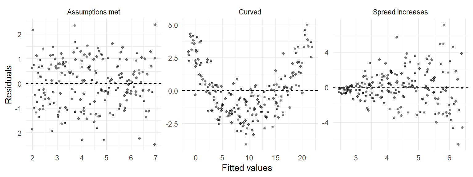
A U-shaped or curved pattern means that the model has missed a curve, and a squared term or a transformation may be needed. A funnel means that the spread is not constant, which makes standard errors, and therefore p-values and confidence intervals, unreliable. With these pictures in mind, the real model can be checked. Calling plot() on a model draws four diagnostic plots, of which the first two matter most:
par(mfrow = c(1, 2))
plot(gpa_model, which = 1:2)
par(mfrow = c(1, 1))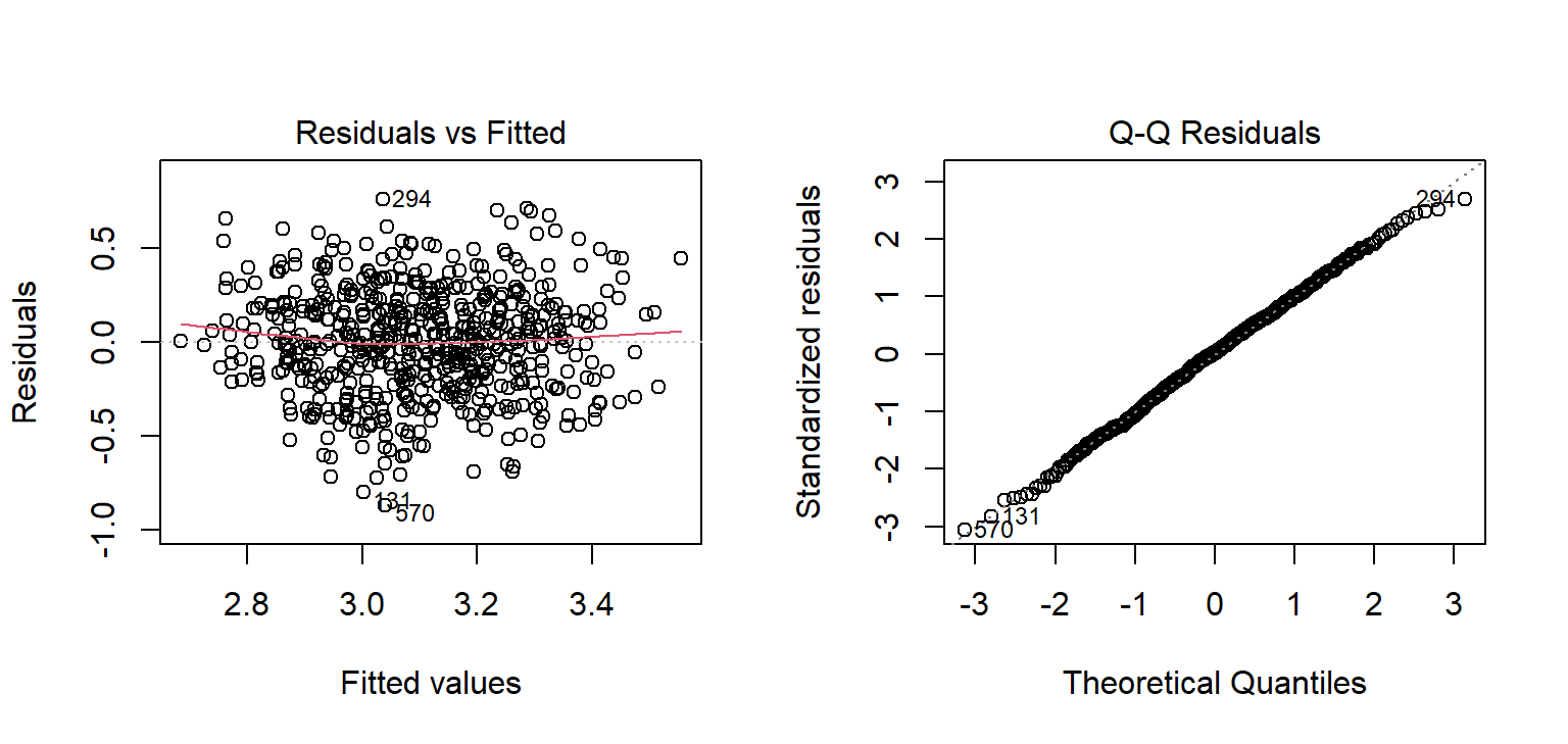
The left plot resembles the first simulated panel: a shapeless band around zero, with no curve and no funnel. In the right plot, the residuals follow the line, so they are close to normal. Both look good for the GPA model. Points far off the line in either plot would point to unusual cases worth looking at.
The broom package turns model results into tidy tables, ready for a thesis. The function tidy() gives the coefficients with confidence intervals, and glance() the overall fit:
library(broom)
tidy(gpa_model, conf.int = TRUE)# A tibble: 5 × 7
term estimate std.error statistic p.value conf.low conf.high
<chr> <dbl> <dbl> <dbl> <dbl> <dbl> <dbl>
1 (Intercept) 2.14 0.145 14.7 6.89e-42 1.85 2.42
2 sleep_hours 0.106 0.0142 7.49 2.62e-13 0.0782 0.134
3 study_hours 0.00693 0.00111 6.27 7.06e-10 0.00476 0.00910
4 stress -0.0835 0.0178 -4.69 3.48e- 6 -0.119 -0.0485
5 support 0.111 0.0167 6.63 7.57e-11 0.0779 0.144 glance(gpa_model)# A tibble: 1 × 12
r.squared adj.r.squared sigma statistic p.value df logLik AIC BIC
<dbl> <dbl> <dbl> <dbl> <dbl> <dbl> <dbl> <dbl> <dbl>
1 0.252 0.247 0.286 49.1 1.25e-35 4 -95.0 202. 228.
# ℹ 3 more variables: deviance <dbl>, df.residual <int>, nobs <int>A multiple regression of first-semester GPA on sleep, study hours, stress, and supervisor support explained 25% of the variance in GPA, F(4, 582) = 49.14, p < .001, N = 587. Holding the other predictors constant, each additional hour of sleep was associated with a GPA 0.11 points higher (95% CI [0.08, 0.13]). The hypothesis that more sleep goes with a higher GPA (Chapter 5) was therefore supported: the null hypothesis of a zero sleep coefficient was rejected.
The third research question concerns a yes-or-no outcome: whether a student has considered dropping out. Linear regression is the wrong tool here, because it could predict probabilities below 0 or above 1, which make no sense. Logistic regression models the probability of a “yes” in a way that always stays between 0 and 1.
Logistic regression works with odds rather than probabilities. The odds of an event are the probability that it happens divided by the probability that it does not. The table from Chapter 7 shows how they are calculated:
jobs <- table(students$employment, students$considering_dropout)
jobs
No Yes
Full-time job 72 25
None 265 42
Part-time job 173 23odds_full <- jobs["Full-time job", "Yes"] / jobs["Full-time job", "No"]
odds_none <- jobs["None", "Yes"] / jobs["None", "No"]
c(full_time_job = odds_full, no_job = odds_none, odds_ratio = odds_full / odds_none)full_time_job no_job odds_ratio
0.3472222 0.1584906 2.1908069 Among students with a full-time job, 25 have considered dropping out and 72 have not, which gives odds of about 0.35. Among students without a job, the odds are 42 to 265, about 0.16. The odds ratio compares the two: students with a full-time job have about 2.2 times the odds of considering dropout. An odds ratio of 1 means no difference, above 1 means higher odds, and below 1 means lower odds.
The function glm(), for generalised linear model, fits logistic regression when told family = binomial. The outcome must be coded 0 and 1:
study <- study |> mutate(dropout = as.integer(considering_dropout == "Yes"))
dropout_model <- glm(
dropout ~ stress + support + financial_worry + employment + study_mode,
data = study, family = binomial
)
summary(dropout_model)$coefficients Estimate Std. Error z value Pr(>|z|)
(Intercept) -4.0185658 1.2316928 -3.262636 1.103811e-03
stress 1.2822937 0.2398794 5.345576 9.012973e-08
support -1.1102419 0.2039547 -5.443572 5.222263e-08
financial_worry 0.4537396 0.1216263 3.730605 1.910209e-04
employmentNone -0.5892840 0.4378768 -1.345776 1.783748e-01
employmentPart-time job -0.5387011 0.4522237 -1.191227 2.335644e-01
study_modePart-time 0.2763818 0.3674127 0.752238 4.519079e-01The coefficients are on the scale of log-odds, which is hard to interpret directly. The function exp() turns them into odds ratios, and confint.default() gives their confidence intervals:
exp(cbind(odds_ratio = coef(dropout_model), confint.default(dropout_model))) |>
round(2) odds_ratio 2.5 % 97.5 %
(Intercept) 0.02 0.00 0.20
stress 3.60 2.25 5.77
support 0.33 0.22 0.49
financial_worry 1.57 1.24 2.00
employmentNone 0.55 0.24 1.31
employmentPart-time job 0.58 0.24 1.42
study_modePart-time 1.32 0.64 2.71Holding the other predictors constant, each extra point of stress multiplies the odds of considering dropout by about 3.6, and each extra point of financial worry by about 1.6. Each extra point of supervisor support multiplies them by about 0.33, which cuts them by about 67%. The hypothesis stated in Chapter 5, that higher stress raises the odds of considering dropout, is supported: the confidence interval for stress lies entirely above 1.
Something interesting has happened to employment. In Chapter 7, and in the odds ratio above, students with full-time jobs had about twice the odds of considering dropping out. In this model, the confidence intervals for both employment categories include 1: once stress and financial worry are taken into account, having a job adds little on its own. The likely explanation is that a full-time job matters because of the stress and money pressure that come with it. This is the kind of insight multiple regression makes possible.
Odds ratios are hard for many readers; predicted probabilities are easier. The model can predict the probability of considering dropout for two example students who are identical except for their stress and support:
examples <- tibble(
stress = c(2.5, 4.0),
support = c(4.0, 2.0),
financial_worry = 3,
employment = "None",
study_mode = "Full-time"
)
predict(dropout_model, newdata = examples, type = "response") |> round(2) 1 2
0.01 0.42 The argument type = "response" asks for probabilities rather than log-odds. A student with low stress and good support has about a 1% chance of considering dropout; a stressed student with little support, about 42%. For a thesis’s recommendations, that contrast is more persuasive than any coefficient.
Whether the model can predict who will consider dropping out, and how that should be tested fairly, is a different question, about prediction rather than explanation. It is the subject of Chapters 11 and 12.
Regression output is easy to produce and easy to misread. Four misreadings are especially common.
exp() of its coefficients gives odds ratios; predict(..., type = "response") gives probabilities.ANOVA, F statistic, between-group variation, within-group variation, eta squared, post-hoc test, Tukey’s test, Levene’s test, Kruskal-Wallis test, two-way ANOVA, main effect, interaction, interaction plot, linear regression, predictor, outcome, intercept, slope, residual, least squares, R-squared, adjusted R-squared, multiple regression, reference category, confounder, quadratic term, diminishing returns, centring, diagnostic plot, logistic regression, odds, odds ratio, log-odds, predicted probability.
The playground has these and more, with hints and solutions.
study_mode to the model from Exercise 3. Name the reference category and explain what its coefficient means.burnout score alone (calculate it from the questionnaire first), report its odds ratio, and explain what it means.Many of the things researchers most want to study cannot be measured directly. Stress, burnout, satisfaction, intelligence, motivation, and quality of life are constructs (Chapter 5): ideas that exist only through their effects on what people say and do. A questionnaire approaches such a construct indirectly, through several items that are each expected to reflect it, and the researcher then has to show that the items really do measure what they are meant to. At the same time, a dataset with many variables often contains patterns that no single variable reveals, such as groups of people with a similar profile across all of them.
Multivariate methods analyse many variables at once, and this chapter introduces three of them. Principal component analysis summarises many variables with a few. Factor analysis checks whether questionnaire items measure the underlying traits they are meant to, and Cronbach’s alpha checks whether they do so consistently. Cluster analysis sorts people into groups with similar profiles. In the study, they answer two research questions: whether the 22 questionnaire items measure stress, burnout, supervisor support, and satisfaction as intended (RQ6), a question every examiner of a questionnaire study will ask, and whether there are distinct profiles of students (RQ7).
A single questionnaire item is a poor measure of a construct. The answer to “I feel unable to control important things in my studies” depends on the student’s stress, but also on how they read the question that day, on their mood, and on how they use the answer scale. Each item therefore carries two things: a signal from the construct, and noise of its own. A latent variable is the construct thought to lie behind the items: it is not observed, but it is assumed to cause part of every answer.
Averaging several items keeps the signal, which all items share, and lets the noise, which differs from item to item, partly cancel out. A simulation shows how much this helps. It creates a “true” stress level for 600 imaginary students, then six items, each equal to the true level plus its own random noise, and compares how closely one item and the average of several items follow the true level:
set.seed(42)
true_stress <- rnorm(600)
simulated_items <- sapply(1:6, function(i) true_stress + rnorm(600, sd = 1))
sapply(1:6, function(k) cor(rowMeans(simulated_items[, 1:k, drop = FALSE]), true_stress)) |>
setNames(paste(1:6, "items")) |>
round(2)1 items 2 items 3 items 4 items 5 items 6 items
0.68 0.81 0.86 0.89 0.91 0.92 In this simulation, one item correlates only about 0.68 with the true stress level, while the average of six items correlates about 0.92. This is why questionnaires use several items for each construct, and why the items are combined into a scale score (Chapter 3).
The approach rests on an assumption that must be checked: that the items of a scale really reflect one common construct, and not several. If some stress items actually measured tiredness, averaging them would mix two things. Chapter 5 called this construct validity. The methods in this chapter provide evidence for it: factor analysis shows whether the items group as intended, and Cronbach’s alpha shows whether the items of each group agree with each other, which Chapter 5 called internal consistency.
The 22 questionnaire items are in questionnaire:
library(dplyr)
library(ggplot2)
items <- questionnaire |> select(-student_id)
ncol(items)[1] 22With 22 items, there are 231 correlations between pairs of items, far too many to read one by one. A picture helps. The corrplot package draws a correlation matrix as a grid of coloured squares, and order = "hclust" sorts the items so that those that correlate strongly sit together:
library(corrplot)
corrplot(cor(items, use = "pairwise.complete.obs"),
method = "color", order = "hclust", tl.col = "black", tl.cex = 0.7)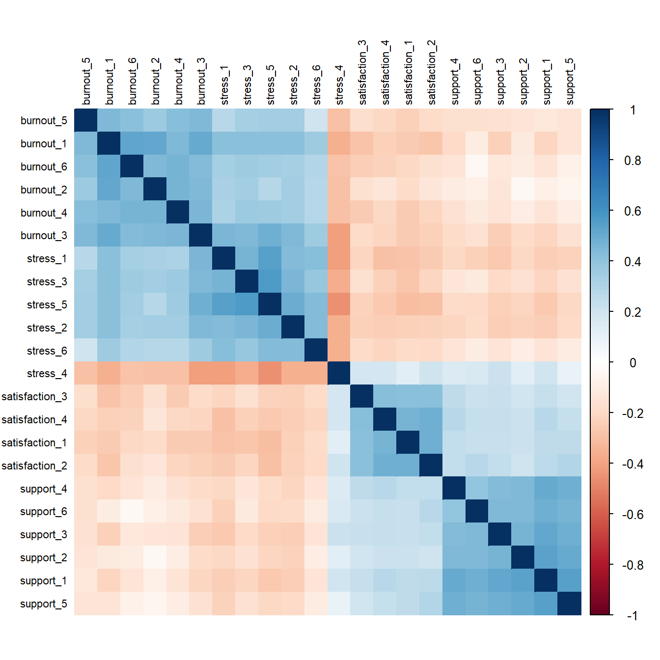
Blocks of related items stand out along the diagonal, one for each scale, just as the idea of latent variables predicts: items that share a construct correlate with each other. Blue squares show positive correlations and red negative. The stress and burnout blocks also correlate with each other, and one item, stress_4, is red against the other stress items, because it is worded the other way round. The methods in this chapter turn this picture into numbers.
Principal component analysis (PCA) replaces many correlated variables with a few new ones, called principal components, that together keep most of the information. The first component is the combination of the variables that captures as much of their variation as possible. The second captures as much as possible of what is left, and so on.
Two items that correlate strongly, such as “I feel emotionally drained by my studies” and “I feel exhausted when I think about my thesis”, illustrate the idea. Most students who score high on one score high on the other, so one combined score, their average for example, keeps most of what the two items tell. PCA does this for all the variables at once, and finds the best combinations automatically.
The function prcomp() runs PCA, and scale. = TRUE puts every variable on the same scale first, which is almost always wanted. PCA needs complete data, so na.omit() keeps only the students who answered every item:
items_complete <- na.omit(items)
nrow(items_complete)[1] 396pca <- prcomp(items_complete, scale. = TRUE)
summary(pca)$importance[, 1:6] |> round(3) PC1 PC2 PC3 PC4 PC5 PC6
Standard deviation 2.580 1.694 1.250 1.110 0.899 0.852
Proportion of Variance 0.302 0.130 0.071 0.056 0.037 0.033
Cumulative Proportion 0.302 0.433 0.504 0.560 0.597 0.630Only 396 of the 600 students answered all 22 items: a small share of missing answers per item adds up to many incomplete students. Factor analysis, below, can use the incomplete students too.
The table shows how much of the total variation each component captures. The first component alone captures 30%, and the first four together 56%.
No single rule decides how many components to keep, so researchers use several. The Kaiser rule keeps components whose eigenvalue, the amount of variation they capture, is greater than 1, that is, more than one original variable’s worth; here, 4 components pass. The scree plot shows the eigenvalues in order, and the researcher looks for the “elbow” where the line flattens out. Parallel analysis compares the eigenvalues with those from random data of the same size, and keeps the components that beat random data; it is the most reliable of the three.
The factoextra package draws a scree plot directly:
library(factoextra)
fviz_eig(pca, addlabels = TRUE, ncp = 10)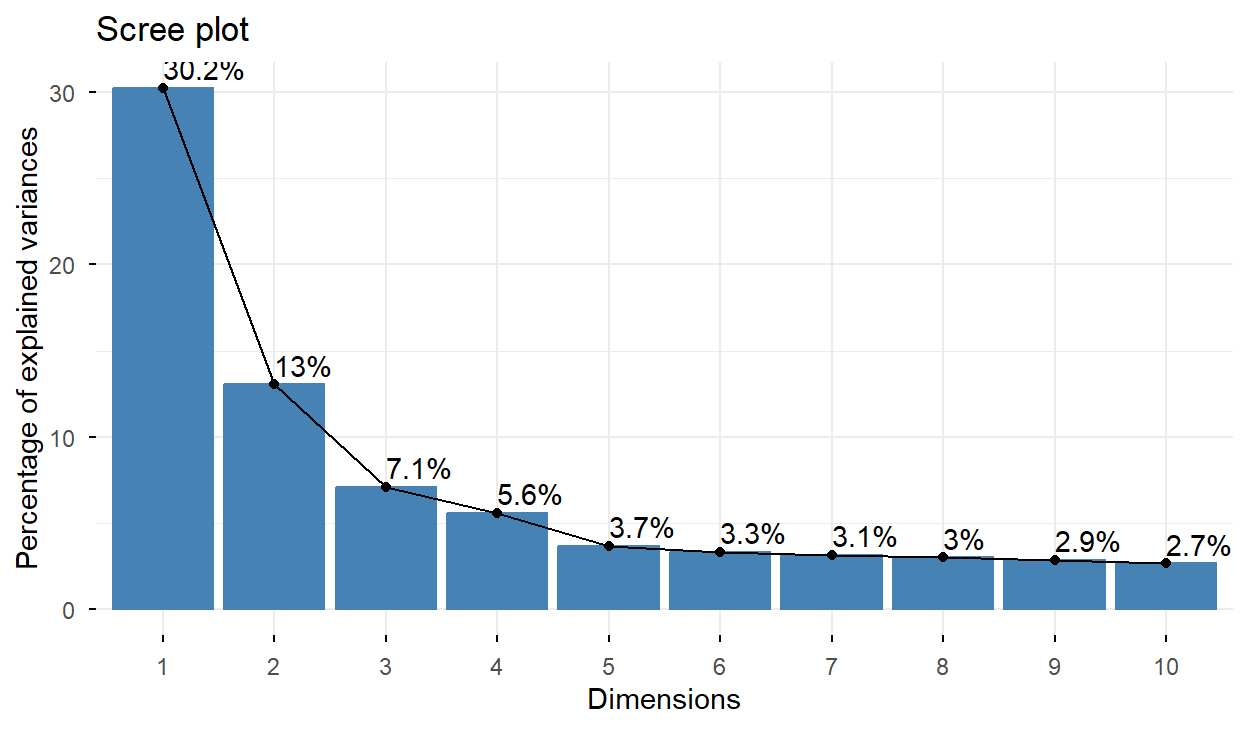
The line drops steeply for four components and flattens after that. Parallel analysis, from the psych package, agrees:
library(psych)
set.seed(1)
parallel <- fa.parallel(items, fa = "fa", plot = FALSE)Parallel analysis suggests that the number of factors = 4 and the number of components = NA parallel$nfact[1] 4All three methods point to four dimensions, matching the four scales the questionnaire was designed to measure.
PCA and factor analysis are often confused, and many theses use one when they mean the other. The difference lies in what they assume. PCA simply summarises the variables: the components are combinations of the items, with no claim about why the items are related, and it is used to reduce many variables to a few, for example before a further analysis. Factor analysis assumes the model of the first section: that each item is caused by one or more latent variables, called factors, plus error of its own. A student answers the stress items the way they do because they are stressed. Factor analysis is therefore the method for checking whether a questionnaire measures the constructs it is meant to, and that is the study’s question.
Exploratory factor analysis (EFA) estimates how strongly each item is related to each factor. These relationships are called loadings. Loadings run roughly from −1 to 1: close to 0 means that the item is unrelated to the factor, and a value above about 0.4 in size is usually considered a clear relationship.
The function fa() from the psych package runs the analysis. Its main arguments are the number of factors (four, from parallel analysis), the rotation, and the estimation method. Rotation turns the factors to make them easier to interpret; “oblimin” allows the factors to correlate with each other, which is realistic, since stress and burnout surely go together. The option fm = "ml" uses maximum likelihood, a common estimation method:
efa <- fa(items, nfactors = 4, rotate = "oblimin", fm = "ml")
print(efa$loadings, cutoff = 0.3, sort = TRUE)
Loadings:
ML1 ML3 ML2 ML4
support_1 0.749
support_2 0.718
support_3 0.669
support_4 0.638
support_5 0.726
support_6 0.619
stress_1 0.623
stress_3 0.627
stress_4 -0.503
stress_5 0.827
stress_6 0.547
burnout_1 0.647
burnout_2 0.719
burnout_4 0.622
burnout_5 0.544
burnout_6 0.675
satisfaction_1 0.659
satisfaction_2 0.684
satisfaction_3 0.585
satisfaction_4 0.673
stress_2 0.496
burnout_3 0.325 0.446
ML1 ML3 ML2 ML4
SS loadings 2.87 2.41 2.384 1.735
Proportion Var 0.13 0.11 0.108 0.079
Cumulative Var 0.13 0.24 0.348 0.427In the printout, cutoff = 0.3 hides small loadings so that the pattern is easy to see, and sort = TRUE groups the items by the factor they load on most. Unlike PCA, fa() uses every student, including those who skipped an item.
The table shows four clear factors. Each collects the items of one scale: the six support items on one, the stress items on another, the burnout items on a third, and the four satisfaction items on the fourth. The names ML1 to ML4 are only labels; naming the factors is the researcher’s job. The reversed item, stress_4 (“I feel confident handling problems in my studies”), loads negatively on the stress factor, which is exactly right for a reversed item: agreeing with it means less stress, and it is why the item must be reversed before the stress score is calculated (Chapter 3). One item, burnout_3 (“Deadlines make me feel overwhelmed”), loads on both the burnout and the stress factor. Reading the item, that makes sense: feeling overwhelmed by deadlines is both. Such a cross-loading item is worth discussing in a thesis, and sometimes worth rewording or removing in future studies.
Because the rotation allowed the factors to correlate, fa() also estimates how strongly they do:
round(efa$Phi, 2) ML1 ML3 ML2 ML4
ML1 1.00 -0.37 -0.23 0.48
ML3 -0.37 1.00 0.66 -0.44
ML2 -0.23 0.66 1.00 -0.39
ML4 0.48 -0.44 -0.39 1.00The stress and burnout factors correlate strongly (about 0.66), but not so strongly that they are the same thing. The support and satisfaction factors correlate positively with each other and negatively with stress and burnout. These relationships make sense, which is itself evidence that the scales measure what they should.
Factor analysis shows that the items of each scale belong together. Reliability asks a related question: whether the items of a scale give consistent results (Chapter 5). The most common measure of this internal consistency is Cronbach’s alpha, which ranges from 0 to 1. It rises when the items correlate strongly with each other, and also when there are more items, for the reason shown by the simulation at the start of the chapter. As a rough guide, 0.7 or above is acceptable and 0.8 or above good for research use. The function alpha() from the psych package calculates it, after reversed items have been reversed:
q <- questionnaire
q$stress_4 <- 6 - q$stress_4
psych::alpha(q[, paste0("stress_", 1:6)])$total$raw_alpha[1] 0.826084psych::alpha(q[, paste0("burnout_", 1:6)])$total$raw_alpha[1] 0.8313142psych::alpha(q[, paste0("support_", 1:6)])$total$raw_alpha[1] 0.8454391psych::alpha(q[, paste0("satisfaction_", 1:4)])$total$raw_alpha[1] 0.7642397All four scales are reliable, with alphas between 0.76 and 0.85. The full output of alpha() also shows what alpha would be if each item were dropped, which helps to spot a weak item.
The code writes psych::alpha() rather than alpha() because ggplot2 also has a function called alpha(), for making colours transparent. Whichever package is loaded last wins, so after loading ggplot2 (or a package that loads it, such as factoextra) a plain alpha() no longer calculates Cronbach’s alpha. The package::function() form always calls the intended function, whether or not the package is loaded.
A high alpha shows consistency, not validity. A scale can be highly reliable and still measure the wrong thing, as the target picture in Chapter 5 showed; the factor structure and the relationships with other constructs are the evidence for validity.
A typical report: “An exploratory factor analysis (maximum likelihood, oblimin rotation) supported four factors, as indicated by parallel analysis. All items loaded on their intended factor (loadings 0.45 to 0.83 in absolute value), with one item (burnout_3) also loading on the stress factor. Internal consistency was acceptable to good (Cronbach’s α = 0.76 to 0.85).”
A further step, confirmatory factor analysis, tests whether a structure decided in advance fits the data, rather than exploring it. It is done with the lavaan package and is beyond this book.
Factor analysis groups variables. Cluster analysis groups people: it looks for groups of students whose profiles are similar to each other and different from other groups. It is a descriptive method. It does not test a hypothesis, and the groups it finds are summaries of the data, useful for describing and thinking about students, not discoveries of natural kinds of student. The study’s question about student profiles (RQ7) is accordingly exploratory (Chapter 5).
Each student is described by their average sleep, study hours, caffeine, and exercise across the semesters, and their stress, support, and satisfaction scores:
scores <- q |>
mutate(
stress = rowMeans(pick(stress_1:stress_6), na.rm = TRUE),
support = rowMeans(pick(support_1:support_6), na.rm = TRUE),
satisfaction = rowMeans(pick(satisfaction_1:satisfaction_4), na.rm = TRUE)
) |>
select(student_id, stress, support, satisfaction)
profiles <- semesters |>
summarise(across(c(sleep_hours, study_hours, caffeine_mg, exercise_days),
~ mean(.x, na.rm = TRUE)),
.by = student_id) |>
left_join(scores, join_by(student_id)) |>
na.omit()
profile_data <- scale(profiles |> select(-student_id))Clustering works with distances between students: how different two students’ profiles are. Caffeine is measured in hundreds of milligrams and sleep in single hours, so without adjustment caffeine would dominate every distance. The function scale() turns every variable into z-scores (Chapter 6), so each counts equally.
k-means is the most widely used clustering method. The researcher chooses the number of clusters, \(k\), and the algorithm places \(k\) starting points at random, assigns each student to the nearest point, moves each point to the centre (the mean) of its students, and repeats the last two steps until nothing changes. Because the result depends on the random start, nstart = 25 runs the algorithm from 25 different starts and keeps the best result.
As with components, no single rule decides the number of clusters, and two guides are common. The elbow method uses the fact that the total distance of students from their cluster centres always falls as \(k\) grows, and looks for the point where adding clusters stops helping much. The silhouette measures, for each student, how much closer they are to their own cluster than to the next nearest one, from −1 to 1; a higher average silhouette means clearer clusters.
set.seed(123)
fviz_nbclust(profile_data, kmeans, method = "wss", nstart = 25)
fviz_nbclust(profile_data, kmeans, method = "silhouette", nstart = 25)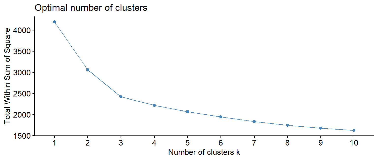
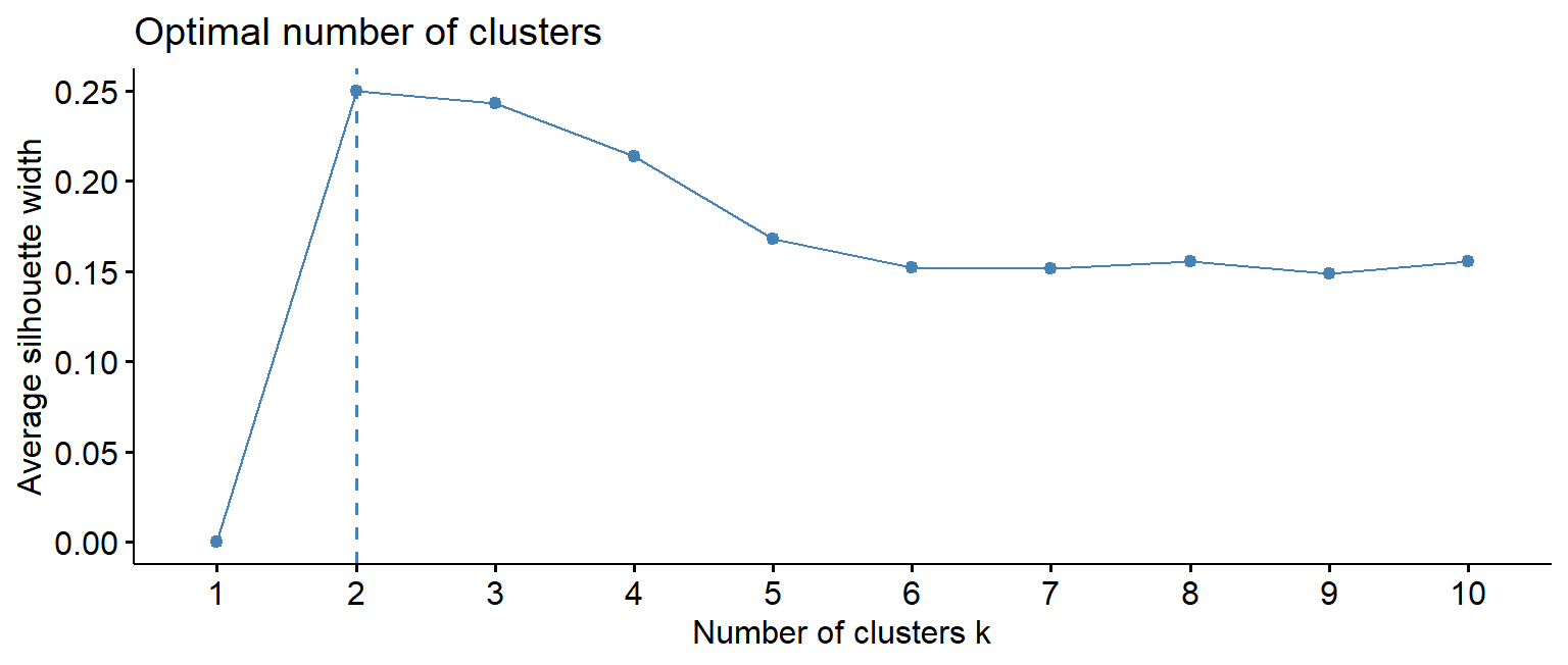
The honest conclusion is that the data does not point clearly to one number. The elbow is gentle, and the silhouette is highest for 2 clusters but only a little lower for 3 or 4. This is common with real data: groups of people overlap, and there are no sharp boundaries. The choice then rests on what is useful and interpretable, and on prior theory. The thesis, based on earlier research, expects around four student profiles, so \(k = 4\) is tried:
set.seed(123)
clusters <- kmeans(profile_data, centers = 4, nstart = 25)
table(clusters$cluster)
1 2 3 4
85 197 200 117 A cluster is only useful if its meaning can be stated. Adding the cluster to the original, unscaled data and averaging each variable by cluster shows each group’s profile:
profiles |>
mutate(cluster = clusters$cluster) |>
summarise(students = n(), across(sleep_hours:satisfaction, ~ round(mean(.x), 1)),
.by = cluster) |>
arrange(cluster) cluster students sleep_hours study_hours caffeine_mg exercise_days stress
1 1 85 5.1 41.6 423.7 1.2 3.6
2 2 197 6.7 18.0 149.8 2.2 3.4
3 3 200 7.2 23.6 122.9 3.5 2.6
4 4 117 5.8 40.8 188.1 1.5 3.6
support satisfaction
1 2.9 3.0
2 2.7 2.5
3 3.6 3.8
4 3.5 3.3The averages describe the groups. One is clearly balanced: the most sleep, moderate study, the most exercise, low stress, and good support. Two are overloaded: long study weeks, little sleep and exercise, high stress, and one of them (the smaller) with very high caffeine intake. The fourth combines low study hours with low support and low satisfaction: students who seem disengaged or isolated. Cluster numbers are arbitrary labels, and can change if the code is run with a different seed.
Figure 9.4 shows the clusters on the first two principal components of the profile data, a common way to see many variables in two dimensions:
fviz_cluster(clusters, data = profile_data, geom = "point", ellipse.type = "convex",
ggtheme = theme_minimal())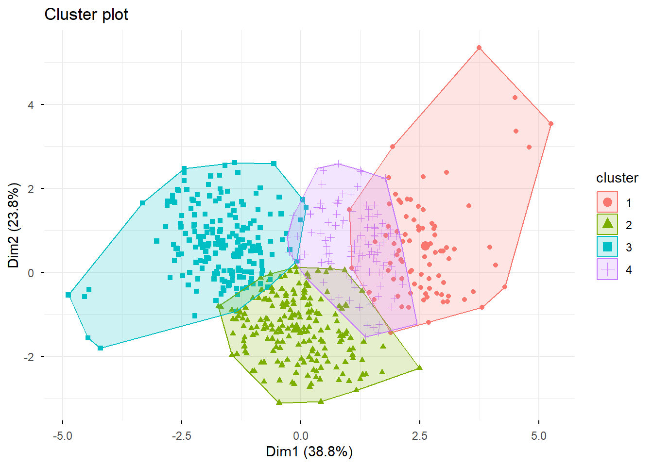
The clusters overlap. That is not a failure: real students do not fall into neat boxes. The profiles are useful summaries, not natural categories.
Hierarchical clustering takes a different approach. It starts with every student as their own cluster and repeatedly merges the two most similar clusters, until everyone is in one. The result is a tree, called a dendrogram, which can be cut at any height to give any number of clusters, without choosing \(k\) in advance. Ward’s method ("ward.D2") merges clusters so that they stay as compact as possible:
tree <- hclust(dist(profile_data), method = "ward.D2")
fviz_dend(tree, k = 4, show_labels = FALSE, rect = TRUE)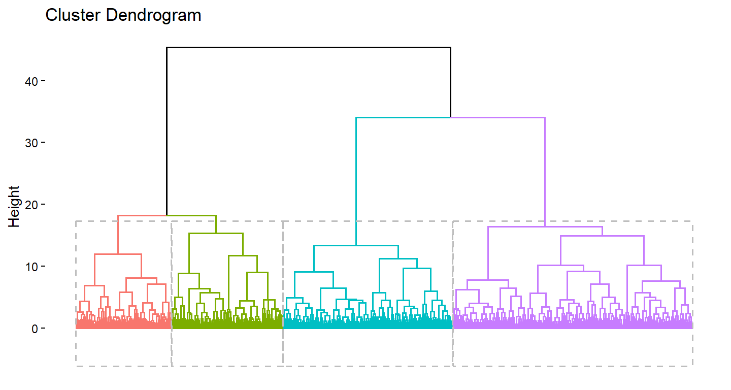
The function dist() calculates the distances between all pairs of students, and cutree() cuts the tree into groups. A cross-table shows how far the two methods agree:
hier_clusters <- cutree(tree, k = 4)
table(hierarchical = hier_clusters, kmeans = clusters$cluster) kmeans
hierarchical 1 2 3 4
1 6 152 4 3
2 0 43 186 4
3 7 1 10 75
4 72 1 0 35They agree on the broad picture, most clearly on the balanced students, but many students switch groups between the two methods. When two reasonable methods disagree about a student, that student is near a boundary. The clearer groups, found by both methods, are the ones to trust most.
A clustering method will split any data into groups, even data that contains no groups at all. The final code makes the point with 300 points drawn entirely at random, with no structure of any kind, and asks k-means for four clusters:
set.seed(7)
random_points <- tibble(x = rnorm(300), y = rnorm(300))
random_points$cluster <- factor(kmeans(random_points, centers = 4, nstart = 25)$cluster)
ggplot(random_points, aes(x, y, colour = cluster)) +
geom_point() +
scale_colour_viridis_d(end = 0.9) +
coord_equal() +
theme_minimal(base_size = 12)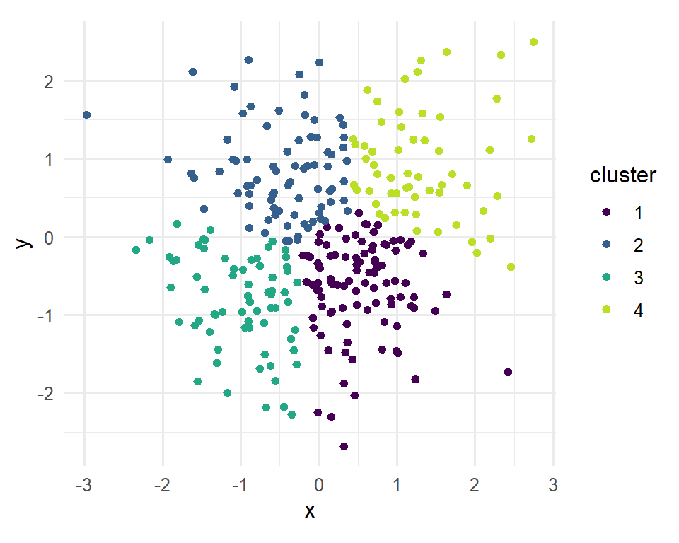
The method obliges, and divides one round cloud into four neat regions. Nothing in its output says that the groups are artificial. The existence of clusters therefore proves nothing on its own. Before clusters are reported as meaningful, it should be checked that they make sense, that different methods broadly agree, and that the groups differ in ways that matter for the research. Chapter 14 introduces methods that allow for overlapping groups and for students who fit no group at all.
Multivariate methods produce impressive output, which makes their limits easy to forget.
Multivariate analysis, construct, latent variable, correlation matrix, principal component analysis, principal component, eigenvalue, Kaiser rule, scree plot, parallel analysis, factor analysis, factor, loading, rotation, oblique rotation, cross-loading, reversed item, reliability, internal consistency, Cronbach’s alpha, confirmatory factor analysis, cluster analysis, distance, scaling, k-means, elbow method, silhouette, hierarchical clustering, dendrogram, Ward’s method.
The playground has these and more, with hints and solutions.
stress_4 first, and explain what happens.sd = 2). Find how many items are now needed for the average to correlate at least 0.8 with the true stress level.Every test in the previous chapters assumed that the observations were independent: that knowing one observation tells nothing about another. Much research data breaks this rule by design. When the same people are measured several times, a person who scores high on one occasion is likely to score high on the next. When people belong to groups, such as students with the same supervisor, pupils in the same class, or patients in the same hospital, members of a group tend to resemble each other. Such data contains less independent information than its number of rows suggests, and methods that ignore this get the uncertainty wrong, sometimes badly.
Mixed-effects models, also called multilevel models, are designed for exactly this kind of data. They separate what is common to a group from what varies within it, and so can study change within people and differences between groups at the same time. The wellbeing study was built this way: its students were followed for two years, and they share supervisors. The chapter answers the question of how wellbeing and GPA change over the two years and how much supervisors matter (RQ8), and returns to the workshop to ask whether its effect faded.
Two kinds of structure are common in research. In repeated measures data, the same people are measured several times, as the students in the wellbeing study are over four semesters, so measurements are grouped within people. In nested data, people belong to groups, such as students within supervisors, pupils within classes within schools, or patients within hospitals. In both cases, observations within a group are more alike than observations from different groups.
The consequence of ignoring such structure is easiest to see in a simulation. Imagine a study in which 20 supervisors each have 10 students, and half of the supervisors, chosen at random, attend a training course. Suppose the course has no effect at all. Students of the same supervisor are somewhat alike, because each supervisor has a style of their own. The code below creates such a study, analyses it in two ways, and repeats the whole study 500 times. The first analysis is an ordinary regression that treats the 200 students as independent; the second is a mixed-effects model that knows which students share a supervisor:
library(lme4)
library(dplyr)
library(ggplot2)
simulate_clustered <- function() {
supervisor <- rep(1:20, each = 10)
trained <- rep(rep(c(0, 1), 10), each = 10) # half the supervisors, no real effect
style <- rnorm(20, sd = 5)[supervisor] # what students of one supervisor share
wellbeing <- 60 + style + rnorm(200, sd = 10)
p_ordinary <- summary(lm(wellbeing ~ trained))$coefficients["trained", 4]
mixed <- suppressMessages(lmer(wellbeing ~ trained + (1 | supervisor)))
t_mixed <- coef(summary(mixed))["trained", "t value"]
c(ordinary = p_ordinary < 0.05, mixed = 2 * pnorm(-abs(t_mixed)) < 0.05)
}
set.seed(12)
false_alarms <- replicate(500, simulate_clustered())
rowMeans(false_alarms)ordinary mixed
0.268 0.074 The course has no effect, so a correct analysis should declare it significant in about 5% of the simulated studies. The ordinary regression does so in 27% of them. The mixed model, which allows for the supervisors, comes close to the intended rate, at 7%. It is slightly above 5% because the quick p-value used in the simulation ignores that there are only 20 supervisors; the lmerTest package, introduced later in the chapter, corrects for this.
The reason is that the 200 students are not 200 independent pieces of evidence about the course. The course was given to supervisors, and there are only 20 of them; students of the same supervisor largely repeat each other’s information. The ordinary regression counts every student as new evidence, underestimates the standard error, and finds “effects” that are really differences between a few supervisors. The mixed model builds the grouping into the model and gets the uncertainty right. In other situations, as later sections show, ignoring the structure can also hide a real effect. Either way, ordinary regression gets the uncertainty wrong for grouped data.
A small real study shows how mixed models work. R’s sleepstudy data, from the lme4 package, records the reaction times of 18 people over 10 days of sleep restriction, one measurement per person per day (Belenky et al. 2003):
head(sleepstudy) Reaction Days Subject
1 249.5600 0 308
2 258.7047 1 308
3 250.8006 2 308
4 321.4398 3 308
5 356.8519 4 308
6 414.6901 5 308Figure 10.1 shows each person’s reaction times, with their own trend line.
ggplot(sleepstudy, aes(x = Days, y = Reaction)) +
geom_point(size = 1) +
geom_smooth(method = "lm", se = FALSE, linewidth = 0.7) +
facet_wrap(~ Subject, ncol = 6) +
labs(x = "Days of sleep restriction", y = "Reaction time (ms)") +
theme_minimal(base_size = 10)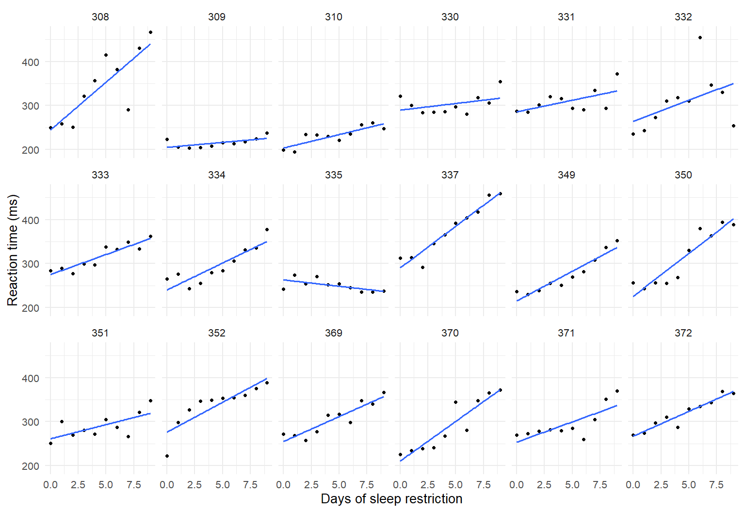
Two things are clear. Almost everyone gets slower as the days go by. And people differ: some start faster than others (different intercepts), and some slow down more than others (different slopes).
An ordinary regression would fit one line through all 180 points, as if they came from 180 different people. A random intercept model fits one average line, but lets each person have their own starting level. In the formula, (1 | Subject) means “a separate intercept for each subject”, and lmer() fits the model:
sleep_ri <- lmer(Reaction ~ Days + (1 | Subject), data = sleepstudy)
summary(sleep_ri)Linear mixed model fit by REML ['lmerMod']
Formula: Reaction ~ Days + (1 | Subject)
Data: sleepstudy
REML criterion at convergence: 1786.5
Scaled residuals:
Min 1Q Median 3Q Max
-3.2257 -0.5529 0.0109 0.5188 4.2506
Random effects:
Groups Name Variance Std.Dev.
Subject (Intercept) 1378.2 37.12
Residual 960.5 30.99
Number of obs: 180, groups: Subject, 18
Fixed effects:
Estimate Std. Error t value
(Intercept) 251.4051 9.7467 25.79
Days 10.4673 0.8042 13.02
Correlation of Fixed Effects:
(Intr)
Days -0.371The output has two important parts. The fixed effects describe the average line, as in ordinary regression: on day 0, the average reaction time is about 251 ms, and each day of sleep restriction adds about 10.5 ms. The random effects describe how much people vary around the average line. The standard deviation of the intercepts, about 37 ms, says that people’s starting levels typically differ from the average by that much; the residual standard deviation, about 31 ms, is the day-to-day variation within a person.
The random intercept model splits the variation in reaction times into two parts: stable differences between people, and variation within each person from day to day. The intraclass correlation (ICC) compares them:
\[ \text{ICC} = \frac{\text{variance between groups}}{\text{variance between groups} + \text{variance within groups}} \]
The function VarCorr() extracts the variances:
vc <- as.data.frame(VarCorr(sleep_ri))
vc$vcov[1] / sum(vc$vcov)[1] 0.5893089About 59% of the variation in reaction times is due to stable differences between people. The ICC can be read as a comparison of how much people differ from each other with how much each person varies. An ICC of 0 would mean the grouping does not matter: two measurements of the same person are no more alike than measurements of two different people. The higher the ICC, the more the measurements of one person repeat each other, and the more wrong an ordinary regression would be.
The random intercept model still assumes that everyone slows down at the same rate, which Figure 10.1 shows is not true. A random slope model lets each person have their own slope as well. In the formula, (Days | Subject) means “a separate intercept and slope of Days for each subject”:
sleep_rs <- lmer(Reaction ~ Days + (Days | Subject), data = sleepstudy)
summary(sleep_rs)$coefficients Estimate Std. Error t value
(Intercept) 251.40510 6.824597 36.838090
Days 10.46729 1.545790 6.771481VarCorr(sleep_rs) Groups Name Std.Dev. Corr
Subject (Intercept) 24.7407
Days 5.9221 0.066
Residual 25.5918 The average effect of a day of sleep restriction is the same, about 10.5 ms, but its standard error has grown from 0.8 to 1.55. People’s slopes vary with a standard deviation of about 5.9 ms per day, so for most people a day of sleep restriction adds somewhere between about 5 and 16 ms. Ignoring that variation made the random intercept model too confident about the average.
A likelihood ratio test, run with anova(), shows whether the random slope is worth adding:
anova(sleep_ri, sleep_rs)Data: sleepstudy
Models:
sleep_ri: Reaction ~ Days + (1 | Subject)
sleep_rs: Reaction ~ Days + (Days | Subject)
npar AIC BIC logLik -2*log(L) Chisq Df Pr(>Chisq)
sleep_ri 4 1802.1 1814.8 -897.04 1794.1
sleep_rs 6 1763.9 1783.1 -875.97 1751.9 42.139 2 7.072e-10 ***
---
Signif. codes: 0 '***' 0.001 '**' 0.01 '*' 0.05 '.' 0.1 ' ' 1The p-value is tiny: the random slopes improve the model clearly. The AIC column agrees. AIC balances fit against complexity, and lower is better.
The wellbeing study has up to four semester records for each student, joined with their background information. The variable time counts semesters from the first, so that time 0 is semester 1:
panel <- semesters |>
left_join(students, join_by(student_id)) |>
mutate(time = semester - 1)
nrow(panel)[1] 2326Figure 10.2 shows the wellbeing of 30 randomly chosen students across the four semesters.
set.seed(9)
some_students <- sample(unique(panel$student_id), 30)
panel |>
filter(student_id %in% some_students) |>
ggplot(aes(x = semester, y = wellbeing, group = student_id)) +
geom_line(alpha = 0.6) +
labs(x = "Semester", y = "Wellbeing (0 to 100)") +
theme_minimal(base_size = 13)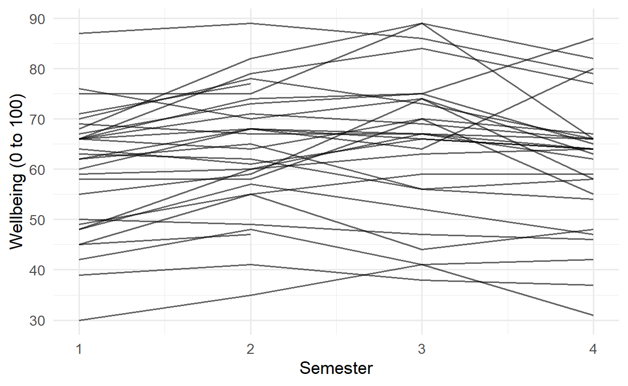
Students differ enormously in their overall level, much more than any student changes from one semester to the next. A model with no predictors, only a random intercept for each student, puts a number on this through the ICC:
wb_null <- lmer(wellbeing ~ 1 + (1 | student_id), data = panel)
vc_null <- as.data.frame(VarCorr(wb_null))
vc_null$vcov[1] / sum(vc_null$vcov)[1] 0.7809117About 78% of all the variation in wellbeing is between students: students differ from each other far more than they change. The consequence for the amount of information in the data can be calculated. The design effect, \(1 + (m - 1) \times \text{ICC}\), where \(m\) is the number of records per student, says how many times more records are needed to give the same information as independent observations:
icc <- vc_null$vcov[1] / sum(vc_null$vcov)
records_per_student <- nrow(panel) / n_distinct(panel$student_id)
design_effect <- 1 + (records_per_student - 1) * icc
c(records = nrow(panel), design_effect = design_effect,
independent_equivalent = nrow(panel) / design_effect) records design_effect independent_equivalent
2326.000000 3.246423 716.480955 The 2326 semester records carry about as much information about average wellbeing as 716 independent observations would. Treating them as 2326 independent records would therefore be seriously wrong.
The first question about change is whether wellbeing declines over time. The wrong way to answer it is an ordinary regression that ignores the structure:
summary(lm(wellbeing ~ time, data = panel))$coefficients Estimate Std. Error t value Pr(>|t|)
(Intercept) 61.6319636 0.4124650 149.423511 0.00000000
time -0.3794867 0.2235408 -1.697618 0.08971384The slope is slightly negative, but not significant. The mixed model, with a random intercept and slope for each student, gives a different result:
wb_growth <- lmer(wellbeing ~ time + (time | student_id), data = panel)
summary(wb_growth)$coefficients Estimate Std. Error t value
(Intercept) 61.6455545 0.4764479 129.385717
time -0.4342392 0.1107653 -3.920355The average slope is similar, about -0.43 points per semester, but its standard error has fallen from 0.22 to 0.11, and the decline is now clearly significant (a t value of about -3.9). The reason is that the ordinary regression lumps the large, stable differences between students into its error term, which drowns the small change within each student. The mixed model separates the two, and sees the change clearly.
In the simulation at the start of the chapter, ignoring the structure made a non-existent effect look significant; in the sleep study, ignoring the differences in slopes made the average look more certain than it was; here, ignoring the structure makes a real decline look uncertain. The direction of the error depends on the data, but the error is always there.
The lme4 package deliberately prints no p-values for fixed effects, because calculating them exactly for mixed models is not straightforward. There are three common solutions. The first is to report confidence intervals, which are often more informative than p-values anyway. The function confint() calculates them, and method = "Wald" is quick:
confint(wb_growth, parm = "beta_", method = "Wald") 2.5 % 97.5 %
(Intercept) 60.7117337 62.5793752
time -0.6513351 -0.2171432The argument parm = "beta_" asks for the fixed effects only. The interval for time lies entirely below zero: wellbeing declines.
The second solution is a likelihood ratio test, comparing models with and without a term with anova(), as for the random slopes above. The third is the lmerTest package, which adds p-values to the summary() output and is used in most published research. Once it is loaded, lmer() models fitted afterwards include a p-value for each fixed effect:
library(lmerTest)
wb_growth_p <- lmer(wellbeing ~ time + (time | student_id), data = panel)
summary(wb_growth_p)$coefficients Estimate Std. Error df t value Pr(>|t|)
(Intercept) 61.6455545 0.4764479 598.9342 129.385717 0.000000e+00
time -0.4342392 0.1107653 571.4997 -3.920355 9.914491e-05The new columns are the degrees of freedom (estimated by Satterthwaite’s method) and the p-value, Pr(>|t|). The decline over time is clearly significant, in agreement with the confidence interval. Chapter 5’s hypothesis for RQ8, that wellbeing declines over the two years, is supported.
Chapter 7 showed that the workshop raised wellbeing in semester 2. A mixed model can compare the two groups in every semester at once, using every record, including the first year of the students who later left. Treating semester as a factor lets each semester have its own average, and the interaction with workshop lets the gap between the groups differ from semester to semester:
wb_workshop <- lmer(wellbeing ~ factor(semester) * workshop + (time | student_id),
data = panel)
round(summary(wb_workshop)$coefficients, 2) Estimate Std. Error df t value
(Intercept) 60.65 0.69 667.20 87.89
factor(semester)2 4.82 0.42 1452.39 11.38
factor(semester)3 2.49 0.45 1595.59 5.51
factor(semester)4 0.21 0.48 667.71 0.43
workshopNot invited -0.38 0.98 667.20 -0.39
factor(semester)2:workshopNot invited -4.87 0.60 1452.39 -8.13
factor(semester)3:workshopNot invited -3.75 0.64 1597.01 -5.85
factor(semester)4:workshopNot invited -2.26 0.68 668.47 -3.30
Pr(>|t|)
(Intercept) 0.00
factor(semester)2 0.00
factor(semester)3 0.00
factor(semester)4 0.67
workshopNot invited 0.70
factor(semester)2:workshopNot invited 0.00
factor(semester)3:workshopNot invited 0.00
factor(semester)4:workshopNot invited 0.00The coefficients are easier to understand as predicted averages. The function predict() with re.form = NA gives the predictions for the average student, ignoring the random effects:
predicted <- expand.grid(semester = 1:4, workshop = c("Invited", "Not invited")) |>
mutate(time = semester - 1)
predicted$wellbeing <- predict(wb_workshop, newdata = predicted, re.form = NA)
ggplot(predicted, aes(x = semester, y = wellbeing, colour = workshop)) +
geom_line(linewidth = 1) +
geom_point(size = 2.5) +
scale_colour_viridis_d(end = 0.8) +
labs(x = "Semester", y = "Predicted wellbeing", colour = "Workshop") +
theme_minimal(base_size = 13)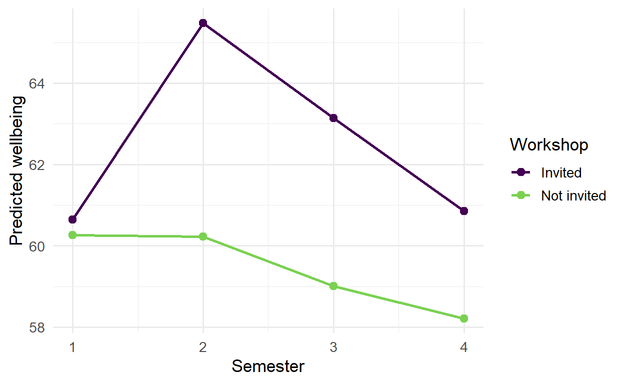
The gap between the groups is 0.4 points in semester 1, before the workshop, 5.2 in semester 2, 4.1 in semester 3, and 2.6 in semester 4. The workshop’s effect is real, but it fades over the following year. For the thesis’s recommendations, that matters: a short follow-up session each year might keep the benefit going.
The interaction coefficients test whether the gap in each semester differs from the gap in semester 1. All three do (the largest p-value is 0.001).
The same growth model can be fitted to GPA:
gpa_growth <- lmer(gpa ~ time + (time | student_id), data = panel)boundary (singular) fit: see help('isSingular')R warns that the fit is singular. This message is common, and worth understanding. It means the model is more complex than the data supports: here, the students’ GPA slopes hardly vary at all, so the model cannot estimate their spread. The solution is to simplify, keeping only the random intercept:
gpa_growth <- lmer(gpa ~ time + (1 | student_id), data = panel)
summary(gpa_growth)$coefficients Estimate Std. Error df t value Pr(>|t|)
(Intercept) 3.0921628374 0.013015341 806.5702 237.5783101 0.0000000
time -0.0004749256 0.003392086 1738.6474 -0.1400099 0.8886684The slope of time is almost exactly zero: grades stay stable over the two years, even though wellbeing falls. A non-change is a finding too, and here an interesting one.
The students are also nested within supervisors, and a model can include random intercepts for both levels at once:
wb_levels <- lmer(wellbeing ~ time + (1 | supervisor_id) + (1 | student_id), data = panel)
VarCorr(wb_levels) Groups Name Std.Dev.
student_id (Intercept) 9.7748
supervisor_id (Intercept) 4.4098
Residual 5.6189 Because every student ID is unique, R knows that students are nested within supervisors. Dividing each variance by the total shows where the variation lies:
vc_levels <- as.data.frame(VarCorr(wb_levels))
data.frame(level = vc_levels$grp, share = round(vc_levels$vcov / sum(vc_levels$vcov), 2)) level share
1 student_id 0.65
2 supervisor_id 0.13
3 Residual 0.22About 13% of all the variation in wellbeing lies between supervisors: students of the same supervisor are noticeably more alike. Most of the variation, 65%, lies between students within the same supervisor, and the remaining 22% is change within students from semester to semester. For the university, the supervisor share is a practical finding: who supervises a student makes a measurable difference to their wellbeing. It also means that any comparison of supervisors, or of anything assigned to supervisors, must allow for this grouping, as the simulation at the start of the chapter showed.
Like ordinary regression, mixed models extend to other kinds of outcome. The function glmer() fits a generalised linear mixed model: family = binomial for yes-or-no outcomes, as in Chapter 8’s logistic regression, and family = poisson for counts, such as the number of meetings a student had with their supervisor each semester.
The model below examines whether students who feel more supported meet their supervisor more often. Support is calculated from the questionnaire, as before:
support_scores <- questionnaire |>
mutate(support = rowMeans(pick(support_1:support_6), na.rm = TRUE)) |>
select(student_id, support)
meetings_model <- glmer(
supervisor_meetings ~ support + programme + (1 | supervisor_id) + (1 | student_id),
data = panel |> left_join(support_scores, join_by(student_id)),
family = poisson
)
summary(meetings_model)$coefficients Estimate Std. Error z value Pr(>|z|)
(Intercept) 0.06224346 0.07134373 0.8724446 3.829659e-01
support 0.39258255 0.01975713 19.8704237 7.338090e-88
programmePhD 0.17676057 0.02881998 6.1332638 8.609423e-10Poisson coefficients are on a log scale, and exp() turns them into rate ratios:
exp(fixef(meetings_model)) (Intercept) support programmePhD
1.064221 1.480800 1.193345 Each extra point of support goes with about 48% more meetings per semester, and PhD students have about 19% more meetings than Master’s students, holding support constant. As always with observational data, the direction is not certain: more meetings may also make students feel more supported.
Chapter 6 found that the students who left after the first year were not a random group. Mixed models handle this better than most methods: they use every record each student provided, including the first year of those who left, instead of dropping those students entirely. The results remain trustworthy as long as leaving depends on things the model can see, such as the students’ earlier wellbeing, which is the “missing at random” situation of Chapter 6.
A mixed-effects model is reported with both of its parts: the fixed effects, with confidence intervals, and the random effects, as standard deviations or variance shares. The report should also say how many observations and groups the model used, and which random effects it included.
A linear mixed-effects model with random intercepts and slopes for students (2326 observations of 600 students) showed that wellbeing declined slightly over the four semesters, by 0.43 points per semester (95% CI [0.22, 0.65]). Students differed considerably in their overall wellbeing (SD of intercepts = 10.7); 78% of the variation in wellbeing was between students.
Mixed models are powerful, and several misunderstandings about grouped data survive even among experienced researchers.
(1 | group) gives each group its own intercept; (x | group) also its own slope of x.anova(), or the lmerTest package.predict(..., re.form = NA) gives predictions for the average case.glmer() fits mixed models for yes-or-no outcomes (binomial) and counts (poisson; exp() of the coefficients gives rate ratios).Repeated measures, nested data, mixed-effects model, multilevel model, fixed effect, random effect, random intercept, random slope, intraclass correlation, design effect, likelihood ratio test, AIC, singular fit, generalised linear mixed model, Poisson model, count outcome, rate ratio.
The playground has these and more, with hints and solutions.
sleep_hours over time (sleep_hours ~ time + (1 | student_id)). Calculate the ICC, and describe whether sleep changes over the semesters.time to the model in Exercise 1, and compare the two models with anova(). Decide whether the random slope is worth keeping.wellbeing ~ time * study_mode + (time | student_id), and describe whether part-time students’ wellbeing changes at a different rate.study_hours, and calculate how much of its variation lies between supervisors.sd = 10 for style). Describe what happens to the false alarm rate of the ordinary regression, and explain why.Some research questions are not about why something happens, but about what will happen. A hospital wants to know which patients are likely to be readmitted, a bank which loans are likely to fail, a university which students are likely to struggle. The goal is not to understand the causes, although that may help, but to make accurate predictions for new cases, early enough to act on them. Such questions need a different standard of evidence. For explanation, a model is judged by whether its coefficients are well estimated and make sense. For prediction, a model is judged by one thing only: how well it works on cases it has never seen.
Machine learning is the set of methods and practices for building predictive models and testing them fairly. This chapter introduces its core ideas: the difference between prediction and explanation, why a model must be tested on new data, how models overfit, and how cross-validation and tuning choose a model honestly. It uses the tidymodels framework, whose steps are best understood as the design of a fair test. In the story, Chapter 8 used logistic regression to explain who considers dropping out; Elaf’s supervisor now asks whether the university could identify, at the end of a student’s first semester, the students at risk, so that help could be offered in time (RQ9).
Machine learning covers methods that learn patterns from data in order to make predictions or find structure. In supervised learning, the data includes the outcome to be predicted, and the model learns the relationship between the predictors and that outcome. If the outcome is a category, such as “considering dropout: yes or no”, it is a classification problem; if it is a number, such as next semester’s GPA, it is a regression problem. Chapters 11 to 13 and Chapter 15 are about supervised learning. In unsupervised learning, there is no outcome, and the model looks for structure in the data itself. The clustering of Chapter 9 is unsupervised, and Chapter 14 returns to it.
Many machine learning methods are familiar statistics: logistic regression is both a statistical model and one of the most useful classifiers. What changes is the goal, and with it the way models are judged. Table 11.1 sets the two aims side by side.
| Explanation (Chapters 7 to 10) | Prediction (Chapters 11 to 16) | |
|---|---|---|
| Question | Why does something happen? | What will happen for a new case? |
| Judged by | Sensible, well-estimated effects | Accuracy on new data |
| Typical models | Simple, interpretable | Anything that predicts well |
| Main danger | Confounding | Overfitting |
A predictive model does not need to be causally correct to be useful: a model can predict dropout well from variables that do not cause it. Equally, a model that explains well may predict poorly, because the effects it estimates are small compared with everything it cannot see. Chapter 5 described prediction as a third aim of analysis, alongside description and explanation; this part of the book develops it.
The central idea of machine learning is generalisation: a model is useful only if what it learned from one set of data carries over to new data. Any dataset contains two things, the pattern that would appear again in new data and the noise that belongs to this sample only. A model that learns the pattern generalises; a model that also learns the noise overfits, and looks better on its own data than it will ever be on new data.
A simulation makes the idea visible. The code below draws 15 points from a smooth curve with random noise added, and fits three models of increasing flexibility: a straight line, a gentle curve, and a very flexible curve (polynomials of degree 1, 3, and 12). It then draws new points from the same process, within the same range, to see how each model does on data it has not seen:
library(dplyr)
library(ggplot2)
true_curve <- function(x) sin(2 * x)
make_points <- function(n) {
x <- runif(n, 0, 3)
tibble(x = x, y = true_curve(x) + rnorm(n, sd = 0.3))
}
set.seed(3)
train_points <- make_points(15)
new_points <- make_points(300) |>
filter(x >= min(train_points$x), x <= max(train_points$x)) # same range as training
grid <- tibble(x = seq(min(train_points$x), max(train_points$x), length.out = 300))
curves <- bind_rows(lapply(c(1, 3, 12), function(d) {
fit <- lm(y ~ poly(x, d), data = train_points)
tibble(grid, y = predict(fit, grid), model = paste("Degree", d))
}))
curves$model <- factor(curves$model, levels = paste("Degree", c(1, 3, 12)))ggplot() +
geom_point(data = new_points, aes(x, y), colour = "grey75", size = 0.8) +
geom_point(data = train_points, aes(x, y), size = 2) +
geom_line(data = curves, aes(x, y), colour = "#b2182b", linewidth = 0.9) +
facet_wrap(~ model) +
coord_cartesian(ylim = c(-2, 2)) +
theme_minimal(base_size = 11)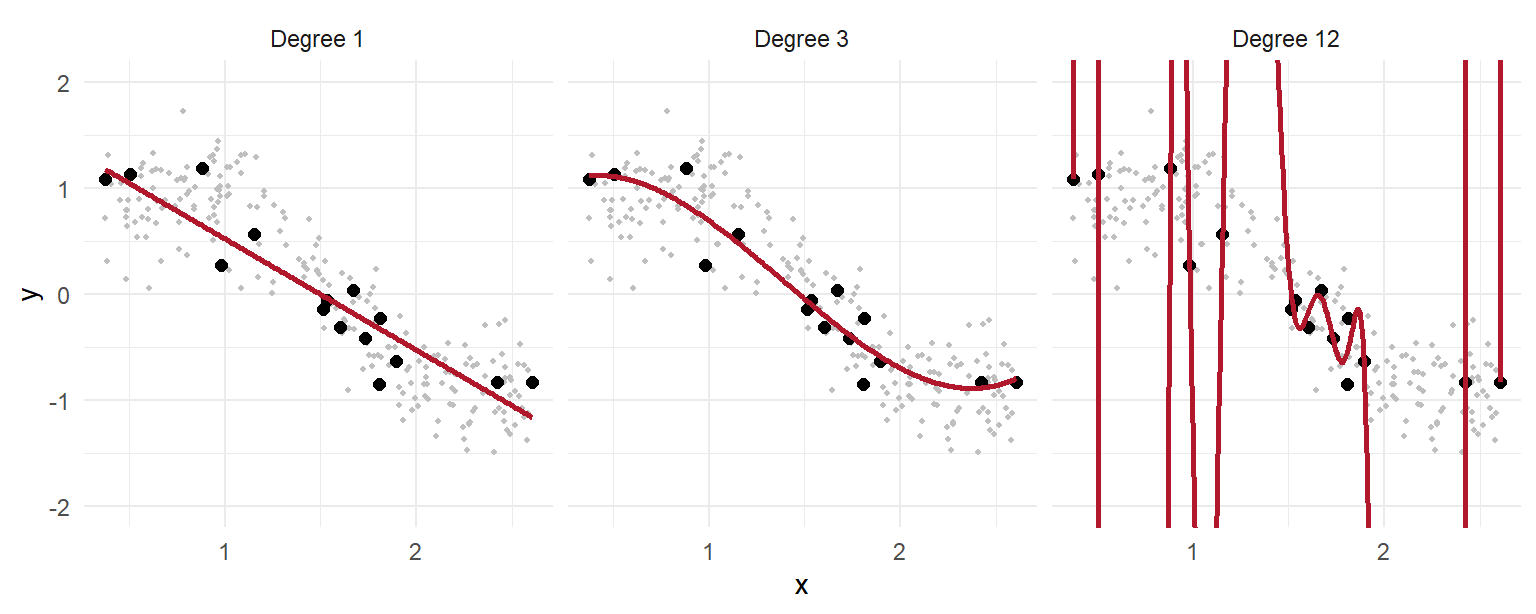
The straight line is too simple to follow the wave: it underfits. The degree-3 curve captures the pattern. The degree-12 curve bends to pass close to every training point, and in doing so follows the noise, swinging far away from where new points actually lie. Measured on the training points, it would look like the best model; measured on new points, it is the worst. The prediction error of every degree from 1 to 12 shows the general pattern:
rmse <- function(observed, predicted) sqrt(mean((observed - predicted)^2))
errors <- bind_rows(lapply(1:12, function(d) {
fit <- lm(y ~ poly(x, d), data = train_points)
tibble(degree = d,
training = rmse(train_points$y, predict(fit, train_points)),
new_data = rmse(new_points$y, predict(fit, new_points)))
}))errors |>
tidyr::pivot_longer(-degree, names_to = "data", values_to = "error") |>
ggplot(aes(x = degree, y = error, colour = data)) +
geom_line(linewidth = 1) +
geom_point() +
scale_x_continuous(breaks = 1:12) +
scale_colour_manual(values = c(training = "grey50", new_data = "#b2182b"),
labels = c(training = "Training points", new_data = "New points")) +
scale_y_log10() +
labs(x = "Flexibility (polynomial degree)", y = "Prediction error (RMSE, log scale)",
colour = NULL) +
theme_minimal(base_size = 12)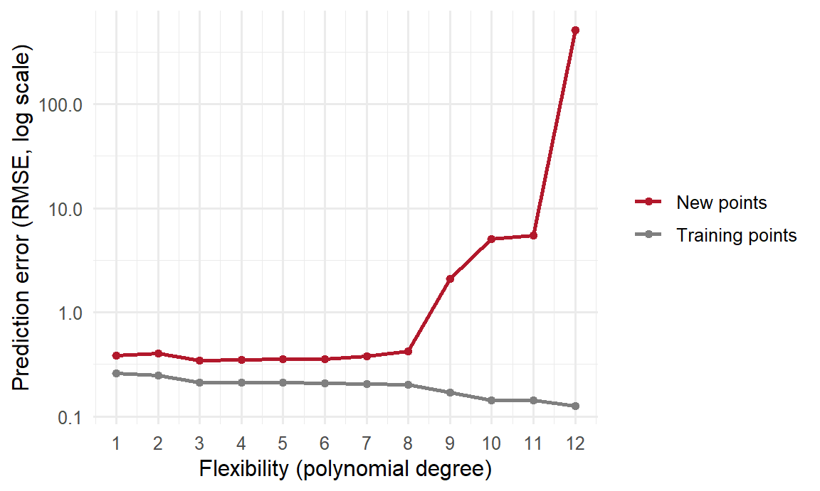
The training error falls steadily as the model becomes more flexible: a more flexible model can always fit its own data more closely. The error on new data falls at first, reaches its minimum at degree 3, and then rises. This U shape is known as the bias-variance trade-off. A model that is too simple has high bias: it misses part of the real pattern, whatever data it is given. A model that is too flexible has high variance: it changes a great deal from one sample to another, because it follows each sample’s noise. The best predictions come from a model in between, and the only way to find it is to measure performance on data the model did not learn from. The rest of the chapter builds that measurement into every step.
The tidymodels framework is a collection of packages that together make a fair test of a predictive model easy to carry out. Each package handles one part of the design: rsample splits the data, recipes prepares it, parsnip specifies models, workflows combines the pieces, tune tunes models, and yardstick measures performance. Loading tidymodels loads them all:
library(tidymodels)
tidymodels_prefer()The function tidymodels_prefer() settles a few name clashes between packages in favour of tidymodels. Figure 11.3 shows how the pieces fit together: the test data is set aside before anything else happens, all choices are made with the training data alone, and the test data is used once, at the end. The rest of the chapter works through each step.
flowchart TB A[All data] --> B[Split:<br/>training and test] B --> C[Training data] B --> T[Test data,<br/>set aside] C --> D[Recipe:<br/>prepare the data] D --> E[Model:<br/>fit and tune with<br/>cross-validation] E --> F[Final model] T --> G[Evaluate once<br/>on the test data] F --> G
A predictive model can only use information that would be available when the prediction is made. The university wants to act at the end of the first semester, so the model may use the students’ background, their questionnaire scores from the start of the year, and their first-semester records, but nothing from later. The questionnaire scores are calculated as before:
scores <- questionnaire |>
mutate(
stress_4 = 6 - stress_4,
stress = rowMeans(pick(stress_1:stress_6), na.rm = TRUE),
burnout = rowMeans(pick(burnout_1:burnout_6), na.rm = TRUE),
support = rowMeans(pick(support_1:support_6), na.rm = TRUE),
satisfaction = rowMeans(pick(satisfaction_1:satisfaction_4), na.rm = TRUE)
) |>
select(student_id, stress, burnout, support, satisfaction)
dropout_data <- students |>
left_join(scores, join_by(student_id)) |>
left_join(semesters |> filter(semester == 1) |> select(-semester), join_by(student_id)) |>
mutate(considering_dropout = factor(considering_dropout, levels = c("Yes", "No"))) |>
select(-student_id, -supervisor_id, -workshop, -workshop_sessions)
dim(dropout_data)[1] 600 21Two details matter. The outcome must be a factor, and its first level is treated as the event to predict, so the levels are set to put "Yes" first. And the workshop variables are removed: the workshop took place after the first semester, so it would not be known when the prediction is made. Using information that would not be available at the time of prediction is a form of data leakage, and it makes a model look better than it can ever be in practice.
dropout_data |> count(considering_dropout) |> mutate(share = n / sum(n)) considering_dropout n share
1 Yes 90 0.15
2 No 510 0.85Only about 15% of students answer “Yes”. Such an imbalanced outcome is common in real prediction problems, from rare diseases to fraud, and, as the evaluation below shows, it catches out anyone who judges a model by accuracy alone.
The most important rule of machine learning follows from the simulation above: never judge a model on the data it learned from. The first step is therefore to split the data. The training set is used to build and tune the model. The test set is locked away and used only once, at the very end, to estimate how the final model will perform on new students. The function initial_split() does the split, and strata makes sure that both sets have the same share of “Yes” answers:
set.seed(2026)
dropout_split <- initial_split(dropout_data, prop = 0.75, strata = considering_dropout)
dropout_train <- training(dropout_split)
dropout_test <- testing(dropout_split)
nrow(dropout_train)[1] 449nrow(dropout_test)[1] 151Three quarters of the students are used for training and a quarter are set aside for the final test.
Most models need the data prepared first: missing values filled in, categories turned into numbers, and numeric predictors put on a common scale. A recipe lists these steps:
dropout_recipe <- recipe(considering_dropout ~ ., data = dropout_train) |>
step_impute_median(all_numeric_predictors()) |>
step_dummy(all_nominal_predictors()) |>
step_normalize(all_numeric_predictors())The first line says that considering_dropout is the outcome and every other column (.) is a predictor. The step step_impute_median() then replaces each missing numeric value with the median of that variable. The step step_dummy() turns each categorical predictor into dummy variables: 0/1 columns, one per category except a reference category, as lm() did automatically in Chapter 8. Finally, step_normalize() turns every numeric predictor into z-scores, so they are on the same scale; some models, such as k-nearest neighbours below, depend on distances and need this.
The recipe only describes the steps. To see what it produces, prep() estimates what it needs from the training data (the medians, the means and standard deviations), and bake() applies it:
dropout_recipe |>
prep() |>
bake(new_data = NULL) |>
glimpse()Rows: 449
Columns: 25
$ age <dbl> 0.24508282, -0.38372967, 0.87389531, 1.293103…
$ financial_worry <dbl> -0.7012103, -0.7012103, -0.7012103, 1.9008013…
$ stress <dbl> -0.07328352, 0.78371678, 1.95645404, -0.29880…
$ burnout <dbl> -0.5660882, 0.1216109, 2.1847084, 1.0385432, …
$ support <dbl> -1.48927219, -1.70433127, 0.66131866, -0.8440…
$ satisfaction <dbl> -1.1166487, -1.1166487, -0.4684583, -0.792553…
$ gpa <dbl> -0.20629899, 0.49821479, -1.55406449, -0.7576…
$ sleep_hours <dbl> 0.705824008, -0.090694948, -1.185908512, -0.5…
$ study_hours <dbl> -0.09621851, 0.36256496, 0.89781234, -0.78439…
$ exercise_days <dbl> 1.5418905, -0.1263236, -0.1263236, -0.1263236…
$ caffeine_mg <dbl> -0.41150631, 0.17158271, 1.00977318, -0.15640…
$ supervisor_meetings <dbl> -1.50209363, -0.42757418, -0.06940103, 2.0796…
$ wellbeing <dbl> 1.13636876, -0.04432777, -1.22502430, -0.2973…
$ considering_dropout <fct> No, No, No, No, No, No, No, No, No, No, No, N…
$ gender_Male <dbl> -0.9489638, -0.9489638, -0.9489638, 1.0514340…
$ faculty_Health.Sciences <dbl> 1.6539530, -0.6032655, 1.6539530, -0.6032655,…
$ faculty_Humanities <dbl> -0.4072635, -0.4072635, -0.4072635, 2.4499443…
$ faculty_Natural.Sciences <dbl> -0.4365273, -0.4365273, -0.4365273, -0.436527…
$ faculty_Social.Sciences <dbl> -0.4861964, -0.4861964, -0.4861964, -0.486196…
$ programme_PhD <dbl> -0.6445746, 1.5479556, -0.6445746, 1.5479556,…
$ study_mode_Part.time <dbl> -0.6342138, -0.6342138, 1.5732436, -0.6342138…
$ employment_None <dbl> 0.9966636, -1.0011130, -1.0011130, -1.0011130…
$ employment_Part.time.job <dbl> -0.7039606, 1.4173703, -0.7039606, 1.4173703,…
$ has_children_Yes <dbl> -0.5449999, -0.5449999, -0.5449999, -0.544999…
$ lives_away_Yes <dbl> 1.1662426, 1.1662426, -0.8555448, 1.1662426, …In this code, new_data = NULL means “the training data the recipe was prepared on”. In the result, gender has become gender_Male, faculty has become four dummy columns, and all the numbers are now z-scores.
The medians, means, and standard deviations are estimated from the training data only, and then applied unchanged to the test data. If they were calculated from all the data, information from the test set would leak into the model, and the test would no longer be a fair one. Recipes and workflows handle this automatically, which is one of the best reasons to use them.
The parsnip package specifies models in one consistent way, whatever package does the actual work. Here is logistic regression:
logistic_spec <- logistic_reg()
logistic_specLogistic Regression Model Specification (classification)
Computational engine: glm A workflow combines the recipe and the model, so they always travel together:
logistic_wf <- workflow() |>
add_recipe(dropout_recipe) |>
add_model(logistic_spec)
logistic_fit <- fit(logistic_wf, data = dropout_train)The function fit() prepares the recipe on the training data and fits the model to the prepared data, in one step.
The model is now judged on the test students. The function augment() adds the model’s predictions to the test data: the predicted class (.pred_class) and the predicted probability of each class (.pred_Yes, .pred_No):
test_results <- augment(logistic_fit, new_data = dropout_test)
test_results |>
select(considering_dropout, .pred_class, .pred_Yes) |>
head()# A tibble: 6 × 3
considering_dropout .pred_class .pred_Yes
<fct> <fct> <dbl>
1 No No 0.216
2 No No 0.0279
3 No No 0.00744
4 Yes No 0.424
5 No No 0.0114
6 No No 0.0298 The simplest measure is accuracy: the share of students classified correctly. The yardstick package calculates it:
test_results |> accuracy(truth = considering_dropout, estimate = .pred_class)# A tibble: 1 × 3
.metric .estimator .estimate
<chr> <chr> <dbl>
1 accuracy binary 0.834An accuracy of 83% sounds good. But a “model” that ignores every predictor and says “No” for every student would be right 85% of the time, because most students answer “No”, while finding not one of the students at risk. For an imbalanced outcome, accuracy is a misleading measure.
A better measure is the ROC AUC (the area under the ROC curve). It is the probability that, of one student who considered dropping out and one who did not, the model gives the first a higher predicted probability than the second. An AUC of 0.5 is no better than a coin toss, and 1.0 is perfect. Unlike accuracy, it is not fooled by an imbalanced outcome. It uses the predicted probabilities:
test_results |> roc_auc(truth = considering_dropout, .pred_Yes)# A tibble: 1 × 3
.metric .estimator .estimate
<chr> <chr> <dbl>
1 roc_auc binary 0.840An AUC of 0.84 means the model ranks an at-risk student above a not-at-risk student about 84% of the time: a useful model. Chapter 12 looks at classification measures in much more detail, including how to choose the threshold at which a student is flagged.
The simulation at the start of the chapter showed overfitting with a flexible curve. The same happens with real data. A dramatic example is k-nearest neighbours (k-NN) with \(k = 1\). It predicts each student’s outcome by finding the single most similar student in the training data and copying their answer. On the training data, every student’s nearest neighbour is themselves, so it can never be wrong:
knn1_wf <- workflow() |>
add_recipe(dropout_recipe) |>
add_model(nearest_neighbor(neighbors = 1) |> set_mode("classification"))
knn1_fit <- fit(knn1_wf, data = dropout_train)
augment(knn1_fit, new_data = dropout_train) |> roc_auc(considering_dropout, .pred_Yes)# A tibble: 1 × 3
.metric .estimator .estimate
<chr> <chr> <dbl>
1 roc_auc binary 1augment(knn1_fit, new_data = dropout_test) |> roc_auc(considering_dropout, .pred_Yes)# A tibble: 1 × 3
.metric .estimator .estimate
<chr> <chr> <dbl>
1 roc_auc binary 0.671The model scores perfectly on the training data, and much more poorly on new students. The training score was an illusion: the model had memorised the training students, not learned anything that carries over. It is the degree-12 curve again, and the reason every model in this book is tested on data it has not seen.
The test set is used only once, at the end. During model building, however, models and settings often need to be compared, and neither the training data (that would reward overfitting) nor the test set (that would use it up) can be used to judge them. Cross-validation solves this by reusing the training data. The training data is split into, say, 10 equal parts, called folds. The model is fitted on 9 folds and its performance measured on the fold left out; this is repeated 10 times, leaving out each fold in turn, and the 10 performance measures are averaged. Every student is used for evaluation exactly once, always by a model that did not see them during fitting. Figure 11.4 shows the idea with 5 folds.
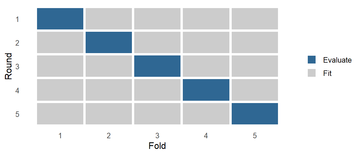
The function vfold_cv() creates the folds, and fit_resamples() fits and evaluates the workflow on each:
set.seed(2026)
dropout_folds <- vfold_cv(dropout_train, v = 10, strata = considering_dropout)
logistic_cv <- fit_resamples(logistic_wf, resamples = dropout_folds,
metrics = metric_set(roc_auc, accuracy))
collect_metrics(logistic_cv)# A tibble: 2 × 6
.metric .estimator mean n std_err .config
<chr> <chr> <dbl> <int> <dbl> <chr>
1 accuracy binary 0.862 10 0.00806 pre0_mod0_post0
2 roc_auc binary 0.804 10 0.0303 pre0_mod0_post0The cross-validated AUC, about 0.8, is an honest estimate of how the model will perform on new students, obtained without touching the test set. The standard error (std_err) shows how much the estimate varies across folds.
Many models have settings that are not learned from the data but must be chosen beforehand, such as \(k\) in k-nearest neighbours or the degree of the polynomials in the simulation. They are called hyperparameters, to distinguish them from the parameters, such as regression coefficients, that the model learns. The best value is found by tuning: trying several values and comparing them with cross-validation.
A decision tree (explained fully in Chapter 12) predicts by asking a series of yes-or-no questions, such as whether stress is above 3.5. Its depth, the number of questions in a row, is a hyperparameter that controls its flexibility. A shallow tree is too simple to capture the patterns and underfits; a very deep tree can fit the training data closely, noise included, and overfits. In the model specification, tune() marks the hyperparameter to be tuned:
tree_spec <- decision_tree(tree_depth = tune(), min_n = 10, cost_complexity = 0) |>
set_mode("classification")
tree_wf <- workflow() |>
add_recipe(dropout_recipe) |>
add_model(tree_spec)The function tune_grid() tries each value in a grid, using the same cross-validation folds:
set.seed(2026)
tree_tuning <- tune_grid(tree_wf, resamples = dropout_folds,
grid = tibble(tree_depth = 1:10),
metrics = metric_set(roc_auc))autoplot(tree_tuning) + theme_minimal(base_size = 12)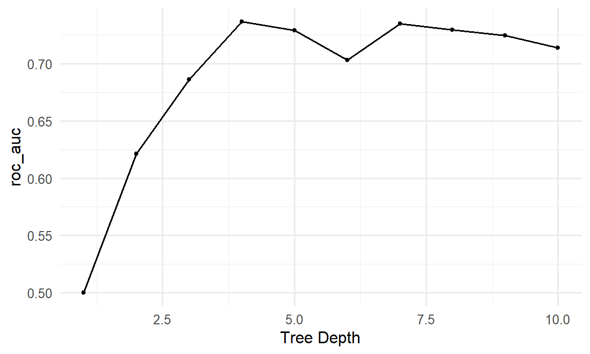
The pattern is the new-data curve of Figure 11.2 seen from the other side: a tree of depth 1 is no better than chance, the AUC rises as the tree grows, and beyond a moderate depth it levels off and dips slightly as the deeper trees start to overfit. The function select_best() picks the best depth, here 4:
best_depth <- select_best(tree_tuning, metric = "roc_auc")
best_depth# A tibble: 1 × 2
tree_depth .config
<int> <chr>
1 4 pre0_mod04_post0Only now, with the model chosen, is the test set used. The function finalize_workflow() plugs the best depth into the workflow, and last_fit() fits it on the whole training set and evaluates it once on the test set:
final_tree <- tree_wf |>
finalize_workflow(best_depth) |>
last_fit(dropout_split, metrics = metric_set(roc_auc, accuracy))
collect_metrics(final_tree)# A tibble: 2 × 4
.metric .estimator .estimate .config
<chr> <chr> <dbl> <chr>
1 accuracy binary 0.828 pre0_mod0_post0
2 roc_auc binary 0.815 pre0_mod0_post0The same is done for logistic regression, for comparison:
final_logistic <- last_fit(logistic_wf, dropout_split, metrics = metric_set(roc_auc, accuracy))
collect_metrics(final_logistic)# A tibble: 2 × 4
.metric .estimator .estimate .config
<chr> <chr> <dbl> <chr>
1 accuracy binary 0.834 pre0_mod0_post0
2 roc_auc binary 0.840 pre0_mod0_post0The tuned tree reaches an AUC of 0.81; plain logistic regression, 0.84. The more flexible model is not the better one. In this data, the risk of dropout rises steadily with stress and falls steadily with support, so a simple smooth model captures the pattern well, while a tree, which splits the data into boxes, captures it less well. Trying a simple model first, and making a complex one earn its place, is one of the most useful habits in machine learning.
A model that flags students “at risk” affects real people. Before such a model is used, the consequences of its errors must be considered: a student flagged by mistake may be treated differently, and a student who is missed receives no help. The model should be checked separately for different groups, such as women and men or part-time and full-time students, because a model with a good AUC overall can still be unfair to a particular group. And its purpose matters: in this study, the right use is to offer support earlier, never to penalise.
Predictive modelling has its own characteristic mistakes, most of them versions of testing a model on what it already knows.
Machine learning, supervised learning, unsupervised learning, classification, regression, prediction, explanation, generalisation, overfitting, underfitting, bias-variance trade-off, imbalanced outcome, training set, test set, stratified split, recipe, imputation, dummy variable, normalisation, data leakage, model specification, workflow, accuracy, ROC AUC, k-nearest neighbours, cross-validation, fold, hyperparameter, parameter, tuning, decision tree.
The playground has these and more, with hints and solutions.
stress, burnout, support, satisfaction) from dropout_data and fit the logistic regression workflow again. Report how much the cross-validated AUC falls, and what that says about the questionnaire.neighbors = c(5, 11, 21, 41) with cross-validation. Identify the best value, and compare its AUC with logistic regression.step_zv(all_predictors()) to the recipe (it removes predictors with only one value). Look up what “zero variance” means, and explain when this step is useful.A classification model is built to support decisions: which patients to screen further, which applications to review, which students to contact. Two questions follow. The first is technical: whether more flexible methods than logistic regression would rank the cases better. The second matters more, and is often forgotten: what happens when the model’s predictions are turned into decisions. Every decision rule flags some cases wrongly and misses others, and the balance between those two errors is not a statistical matter alone. It depends on what each error costs, and on whom.
This chapter addresses both questions. It introduces four widely used families of classification models, decision trees, random forests, k-nearest neighbours, and support vector machines, each through the idea behind it and the way it separates the classes, and compares them fairly on the wellbeing data. It then looks beyond the AUC at how a model is used: the confusion matrix, precision and recall, the choice of the threshold at which a student is flagged, and what to do when one outcome is rare. In the story, Elaf shows her logistic regression to the student counselling service, which asks whether more powerful methods exist, and how many of the students it would contact are really at risk.
The data, split, recipe, and folds are exactly those of Chapter 11, so every model in this chapter is trained and tested on the same students:
library(tidymodels)
tidymodels_prefer()
scores <- questionnaire |>
mutate(
stress_4 = 6 - stress_4,
stress = rowMeans(pick(stress_1:stress_6), na.rm = TRUE),
burnout = rowMeans(pick(burnout_1:burnout_6), na.rm = TRUE),
support = rowMeans(pick(support_1:support_6), na.rm = TRUE),
satisfaction = rowMeans(pick(satisfaction_1:satisfaction_4), na.rm = TRUE)
) |>
select(student_id, stress, burnout, support, satisfaction)
dropout_data <- students |>
left_join(scores, join_by(student_id)) |>
left_join(semesters |> filter(semester == 1) |> select(-semester), join_by(student_id)) |>
mutate(considering_dropout = factor(considering_dropout, levels = c("Yes", "No"))) |>
select(-student_id, -supervisor_id, -workshop, -workshop_sessions)
set.seed(2026)
dropout_split <- initial_split(dropout_data, prop = 0.75, strata = considering_dropout)
dropout_train <- training(dropout_split)
dropout_test <- testing(dropout_split)
dropout_recipe <- recipe(considering_dropout ~ ., data = dropout_train) |>
step_impute_median(all_numeric_predictors()) |>
step_dummy(all_nominal_predictors()) |>
step_normalize(all_numeric_predictors())
set.seed(2026)
dropout_folds <- vfold_cv(dropout_train, v = 10, strata = considering_dropout)A decision tree classifies by asking a series of yes-or-no questions, like a flowchart. To see how a tree chooses its questions, take twelve imaginary students:
tiny <- tibble(
stress = c(1.5, 2.0, 2.2, 2.8, 3.0, 3.1, 3.4, 3.6, 3.8, 4.0, 4.2, 4.5),
support = c(4.5, 3.0, 4.0, 2.0, 4.2, 3.8, 2.1, 4.4, 1.8, 2.5, 3.9, 1.5),
dropout = factor(c("No", "No", "No", "No", "No", "No",
"Yes", "No", "Yes", "Yes", "No", "Yes"))
)Four of the twelve consider dropping out. The tree looks for the single question that best separates the “Yes” students from the “No” students. “Is support below 2.75?” puts seven students, all “No”, on one side, and five students, four “Yes” and one “No”, on the other. The one “No” student among the low-support group has the lowest stress, so a second question, “Is stress 3.1 or more?”, separates the rest perfectly:
library(rpart)
tiny_tree <- rpart(dropout ~ stress + support, data = tiny, method = "class",
control = rpart.control(minsplit = 2, cp = 0))
tiny_treen= 12
node), split, n, loss, yval, (yprob)
* denotes terminal node
1) root 12 4 No (0.6666667 0.3333333)
2) support>=2.75 7 0 No (1.0000000 0.0000000) *
3) support< 2.75 5 1 Yes (0.2000000 0.8000000)
6) stress< 3.1 1 0 No (1.0000000 0.0000000) *
7) stress>=3.1 4 0 Yes (0.0000000 1.0000000) *Each line is a node: the question that led to it, the number of students, the number misclassified, and the predicted class. The final nodes, marked *, are the leaves. To classify a new student, you follow the questions from the top until you reach a leaf. To choose each question, the tree tries every predictor and every possible cut-off and picks the one that makes the two groups most “pure”, usually measured by the Gini impurity (0 when a group contains only one class).
Decision trees have attractive properties: they are easy to explain, they need no dummy variables or normalisation (a question such as “is stress 3.1 or more?” works the same on any scale), and they capture interactions automatically (stress matters here only for low-support students). For the wellbeing data, a recipe that only fills in missing values is enough:
tree_recipe <- recipe(considering_dropout ~ ., data = dropout_train) |>
step_impute_median(all_numeric_predictors())
tree_wf <- workflow() |>
add_recipe(tree_recipe) |>
add_model(decision_tree(tree_depth = 3, min_n = 10) |> set_mode("classification"))
tree_fit <- fit(tree_wf, data = dropout_train)A depth of 3 keeps the tree small enough to read. Figure 12.1 draws it with plot() and text() from rpart; the rpart.plot package draws nicer trees if you install it.
tree_engine <- extract_fit_engine(tree_fit)
plot(tree_engine, uniform = TRUE, margin = 0.08)
text(tree_engine, use.n = TRUE, cex = 0.75)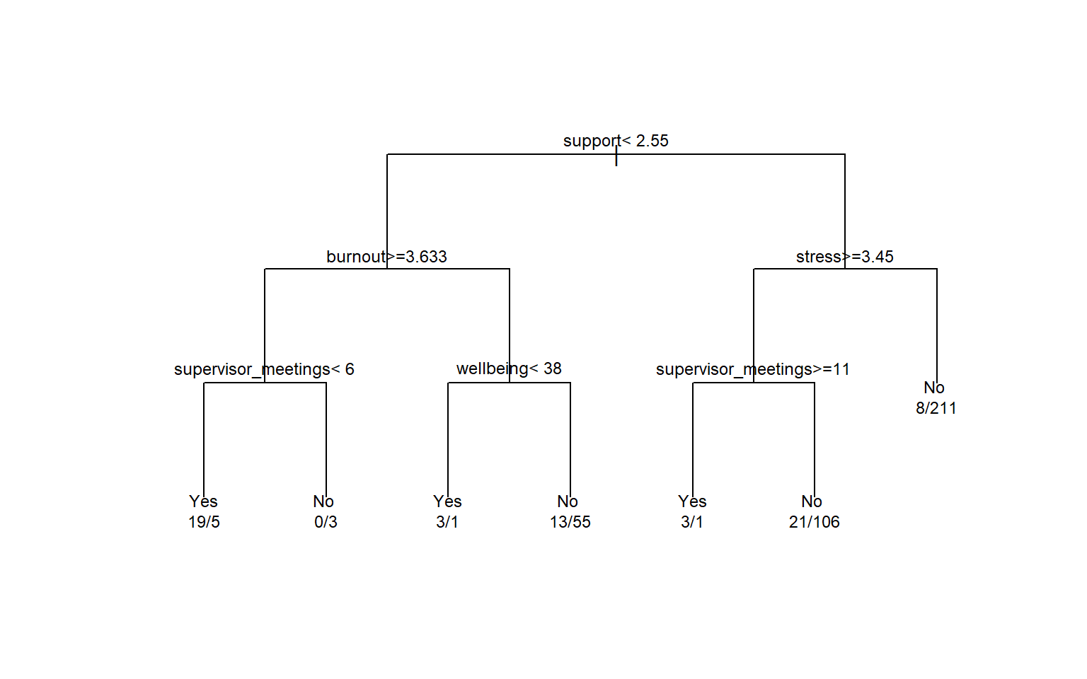
The first question is about support, the strongest single predictor. The numbers under each leaf are the training students in it (Yes/No). The tree is easy to read, but a single tree has a serious weakness: it is unstable. A slightly different sample of students can produce a completely different tree, and, as Chapter 11 showed, a deep tree overfits. The next method turns this weakness into a strength.
A random forest grows hundreds of trees, each on a slightly different version of the data, and lets them vote. Two sources of randomness make the trees different. Each tree is grown on a bootstrap sample of the training data (Chapter 7), students drawn at random with replacement. And at each split, the tree may only choose from a random subset of the predictors; the size of this subset, mtry, is a hyperparameter.
Each individual tree overfits in its own way, but because the trees differ, many of their errors cancel out when the trees vote. The predicted probability of “Yes” is the share of trees that vote “Yes”. Averaging many models in this way is called an ensemble; a random forest is an ensemble of trees (Breiman 2001).
The ranger package fits random forests quickly. importance = "permutation" asks it to also measure how much each predictor matters:
forest_spec <- rand_forest(trees = 500) |>
set_engine("ranger", importance = "permutation") |>
set_mode("classification")
forest_wf <- workflow() |>
add_recipe(tree_recipe) |>
add_model(forest_spec)
set.seed(2026)
forest_fit <- fit(forest_wf, data = dropout_train)A forest of 500 trees cannot be drawn, so it is a “black box”. Permutation importance opens it a little: for each predictor in turn, the values are shuffled randomly, and the drop in the model’s accuracy is recorded. Shuffling an important predictor hurts the predictions; shuffling an unimportant one does not. Figure 12.2 shows the result.
importance <- extract_fit_engine(forest_fit)$variable.importance
tibble(predictor = names(importance), importance = importance) |>
ggplot(aes(x = importance, y = reorder(predictor, importance))) +
geom_col(fill = "#2f6793") +
labs(x = "Permutation importance (drop in accuracy)", y = NULL) +
theme_minimal(base_size = 12)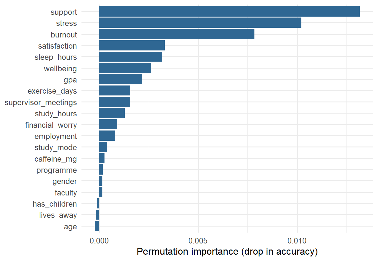
The forest relies most on support, stress, and burnout, and hardly at all on the students’ background, which agrees with the logistic regression of Chapter 8. Importance says which predictors the model uses, not what causes dropout; everything Chapter 8 said about confounding still applies.
k-nearest neighbours (k-NN), met briefly in Chapter 11, classifies a new student by finding the \(k\) most similar students in the training data and letting them vote. “Similar” means close together when the predictors are drawn as a map. Suppose a new student in the tiny example has a stress score of 3.5 and a support score of 3.0. The distance to each training student is the straight-line distance on the stress-support map:
tiny |>
mutate(distance = sqrt((stress - 3.5)^2 + (support - 3.0)^2)) |>
arrange(distance) |>
head(3)# A tibble: 3 × 4
stress support dropout distance
<dbl> <dbl> <fct> <dbl>
1 4 2.5 Yes 0.707
2 3.1 3.8 No 0.894
3 3.4 2.1 Yes 0.906With \(k = 3\), two of the three nearest students considered dropping out, so the predicted probability of “Yes” is 2/3. Figure 12.3 shows the picture.
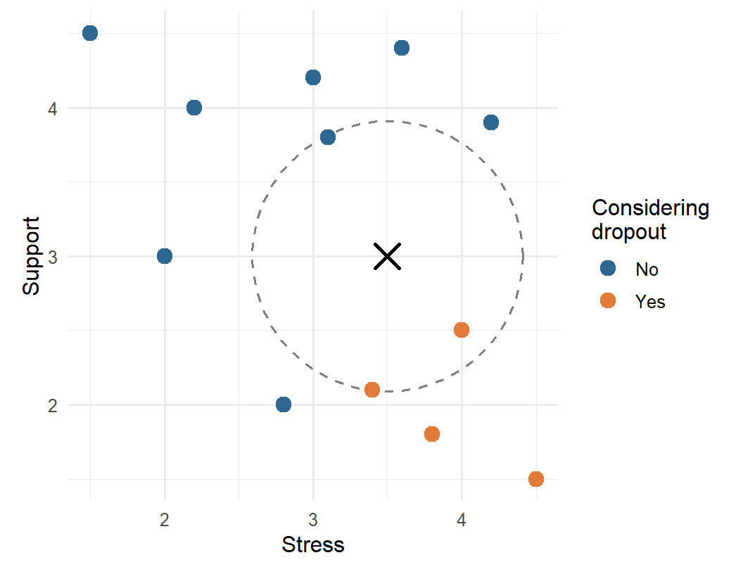
Because k-NN is based on distances, the predictors must be on the same scale. Otherwise a variable measured in large numbers, such as caffeine in milligrams, would dominate the distance, and a variable measured on a 1-5 scale would hardly count. That is why the recipe normalises every predictor.
The number of neighbours, \(k\), is a hyperparameter. With \(k = 1\), the model copies the nearest student and overfits badly (Chapter 11); with a large \(k\), it averages over many students and becomes smoother. Tuning shows which works best for the wellbeing data:
knn_wf <- workflow() |>
add_recipe(dropout_recipe) |>
add_model(nearest_neighbor(neighbors = tune()) |> set_mode("classification"))
set.seed(2026)
knn_tuning <- tune_grid(knn_wf, resamples = dropout_folds,
grid = tibble(neighbors = c(1, 5, 11, 21, 41, 81)),
metrics = metric_set(roc_auc))
collect_metrics(knn_tuning) |> select(neighbors, mean, std_err)# A tibble: 6 × 3
neighbors mean std_err
<dbl> <dbl> <dbl>
1 1 0.525 0.0200
2 5 0.623 0.0222
3 11 0.673 0.0256
4 21 0.708 0.0266
5 41 0.734 0.0286
6 81 0.746 0.0303The AUC keeps rising up to the largest \(k\) tried. When the best value lies at the edge of the grid, the usual advice is to extend the grid, but here the result is informative in itself: the more neighbours k-NN averages over, the smoother its predictions become, and the better it does. The wellbeing data has a smooth pattern (risk rises steadily with stress and falls steadily with support), which a smooth model such as logistic regression captures directly. k-NN is at its best when the pattern is irregular and there is a lot of data.
A support vector machine (SVM) separates the two classes with a boundary that is as far as possible from the students on either side. Imagine drawing a line between the “Yes” and “No” points on the stress-support map: of all the lines that separate them, the SVM picks the one with the widest empty “street” around it, the margin. Only the students closest to the boundary, the support vectors, determine where it goes. When the classes overlap, as they always do in real data, some students are allowed inside the margin or on the wrong side, at a cost set by a hyperparameter.
A straight boundary is a linear SVM. With a kernel, the SVM can draw curved boundaries: the popular radial basis function (RBF) kernel lets the boundary bend around groups of points. Both are available in tidymodels through the kernlab package:
svm_linear_spec <- svm_linear() |>
set_engine("kernlab") |>
set_mode("classification")
svm_rbf_spec <- svm_rbf() |>
set_mode("classification")Like k-NN, SVMs are based on distances, so they need normalised predictors. Figure 12.4 shows how differently the four families draw their boundaries, using just stress and support so the result can be drawn as a map.
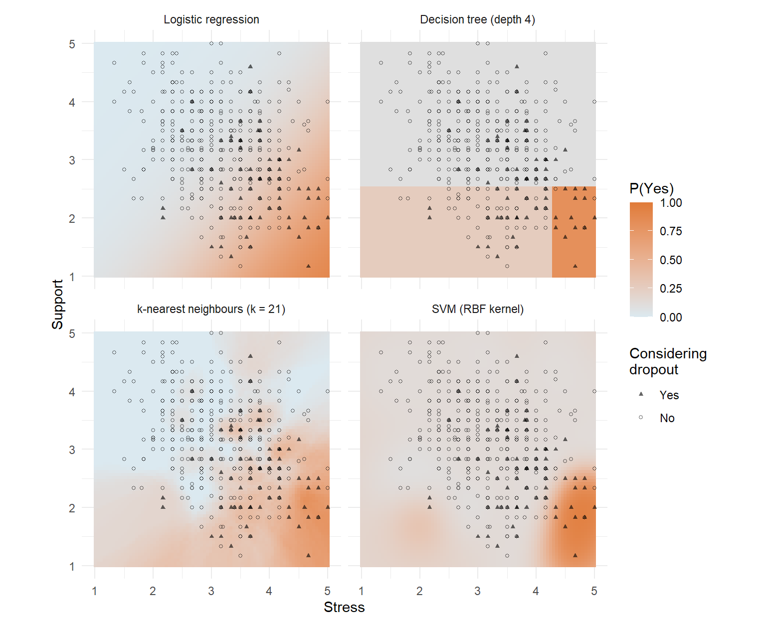
The fair way to compare the models is cross-validation on the same folds, and the workflowsets package (part of tidymodels) does it for several models at once. workflow_set() combines each recipe with each model, and workflow_map() runs cross-validation for every combination:
dropout_models <- workflow_set(
preproc = list(tree_data = tree_recipe),
models = list(
tree = decision_tree(tree_depth = 4, min_n = 10) |> set_mode("classification"),
forest = rand_forest(trees = 500) |> set_engine("ranger") |> set_mode("classification")
)
) |>
bind_rows(workflow_set(
preproc = list(normalised = dropout_recipe),
models = list(
logistic = logistic_reg(),
knn = nearest_neighbor(neighbors = 41) |> set_mode("classification"),
svm_linear = svm_linear_spec,
svm_rbf = svm_rbf_spec
)
))
dropout_comparison <- workflow_map(dropout_models, "fit_resamples",
resamples = dropout_folds,
metrics = metric_set(roc_auc), seed = 2026)
rank_results(dropout_comparison, rank_metric = "roc_auc") |>
select(wflow_id, mean, std_err)# A tibble: 6 × 3
wflow_id mean std_err
<chr> <dbl> <dbl>
1 normalised_logistic 0.804 0.0303
2 normalised_svm_linear 0.787 0.0313
3 tree_data_forest 0.781 0.0380
4 normalised_svm_rbf 0.762 0.0393
5 normalised_knn 0.734 0.0286
6 tree_data_tree 0.728 0.0250The trees and forest use the simple recipe, and the others the normalised one. bind_rows() joins the two sets of workflows into one.
The winner, with a cross-validated AUC of 0.80, is plain logistic regression. The linear SVM (0.79), which also draws a straight boundary, comes close, followed by the random forest (0.78). The standard errors, between 0.02 and 0.04, show that the smaller differences at the top could be due to chance, but none of the flexible models beats the simple one. This is not a failure of the methods: it says something about the data. The risk of considering dropout rises smoothly with stress and falls smoothly with support, with no sharp thresholds or complicated interactions for a tree or a forest to find. On data with such structure, and with larger samples, forests and SVMs often do win. The lesson is the one from Chapter 11: compare, and let the simpler model stand unless a complex one clearly does better.
Logistic regression is therefore kept. It predicts as well as any model here, and it can be explained to the counselling service in one sentence.
The AUC measures how well a model ranks students. But the counselling service needs a decision: contact this student or not. A model makes a decision by comparing each predicted probability with a threshold; by default, a student is classified “Yes” when the probability of “Yes” is above 0.5. The confusion matrix counts how those decisions turn out.
Take a tiny example first. A screening questionnaire is given to 100 students, 10 of whom are truly at risk. It flags 12 students, 8 of whom are among the 10 at risk:
| Truly at risk | Not at risk | Total | |
|---|---|---|---|
| Flagged | 8 (true positives) | 4 (false positives) | 12 |
| Not flagged | 2 (false negatives) | 86 (true negatives) | 88 |
| Total | 10 | 90 | 100 |
Every classification ends in one of four cells. A true positive is a student at risk who is flagged; a false negative is a student at risk who is missed; a false positive is a student flagged by mistake; a true negative is a student correctly left alone.
The key measures come from these four counts, and each answers a different practical question. Sensitivity, also called recall, is the share of students at risk who are flagged, here 8/10 = 80%: it measures how many of the students who need help are found. Specificity is the share of students not at risk who are left alone, 86/90 = 96%. Precision is the share of flagged students who are truly at risk, 8/12 = 67%: it measures how often a contact is justified. The F1 score balances precision and recall in a single number (their harmonic mean), here 0.73, and it is high only when both are high. Accuracy, the share classified correctly, is (8 + 86)/100 = 94%, but, as Chapter 11 showed, it is dominated by the large “No” group.
For the study’s logistic regression, conf_mat() produces the confusion matrix for the test students:
logistic_wf <- workflow() |>
add_recipe(dropout_recipe) |>
add_model(logistic_reg())
logistic_fit <- fit(logistic_wf, data = dropout_train)
test_results <- augment(logistic_fit, new_data = dropout_test)
test_results |> conf_mat(truth = considering_dropout, estimate = .pred_class) Truth
Prediction Yes No
Yes 5 7
No 18 121The yardstick package calculates the measures. The function metric_set() bundles several, and because “Yes” is the first level of the outcome, they treat “Yes” as the event of interest:
class_metrics <- metric_set(accuracy, sensitivity, specificity, precision, f_meas)
test_results |> class_metrics(truth = considering_dropout, estimate = .pred_class)# A tibble: 5 × 3
.metric .estimator .estimate
<chr> <chr> <dbl>
1 accuracy binary 0.834
2 sensitivity binary 0.217
3 specificity binary 0.945
4 precision binary 0.417
5 f_meas binary 0.286This is sobering. Of the 23 test students who considered dropping out, the model flags only 5: a sensitivity of 22%. The high accuracy and high specificity come almost entirely from correctly leaving alone the large majority who were never at risk. The AUC showed the model ranks students well, so the problem is not the model but the threshold: with only 15% of students at risk, few students ever get a predicted probability above 0.5.
The threshold of 0.5 is a default, not a law. Lowering it flags more students: more of those at risk are found (higher recall), at the price of more false alarms (lower precision). Which balance is right depends on what the decision costs. Here, a flagged student is offered a conversation with a counsellor: cheap, and harmless if unnecessary. Missing a student who then leaves is costly. So a threshold well below 0.5 makes sense. If the decision were costly or stigmatising, a high threshold would be needed.
The threshold is a choice made while building the model, so it must be chosen without the test set. Cross-validation can provide predictions for every training student from a model that did not see them; save_pred = TRUE keeps them:
set.seed(2026)
logistic_cv <- fit_resamples(logistic_wf, resamples = dropout_folds,
control = control_resamples(save_pred = TRUE))
cv_predictions <- collect_predictions(logistic_cv)The ROC curve shows every possible threshold at once. For each threshold, it plots the sensitivity against the false-positive rate (1 − specificity). A useless model follows the diagonal; a good one bends towards the top-left corner, and the AUC is the area under the curve:
roc_points <- cv_predictions |>
roc_curve(truth = considering_dropout, .pred_Yes)
marked <- roc_points |>
slice(sapply(c(0.5, 0.2), \(t) which.min(abs(.threshold - t))))
ggplot(roc_points, aes(x = 1 - specificity, y = sensitivity)) +
geom_path(colour = "#2f6793", linewidth = 1) +
geom_abline(linetype = "dashed", colour = "grey60") +
geom_point(data = marked, size = 3, colour = "#e07b39") +
geom_text(data = marked, aes(label = paste("threshold", round(.threshold, 1))),
hjust = -0.15, vjust = 1.2) +
coord_equal() +
labs(x = "False positive rate (1 - specificity)", y = "Sensitivity (recall)") +
theme_minimal(base_size = 12)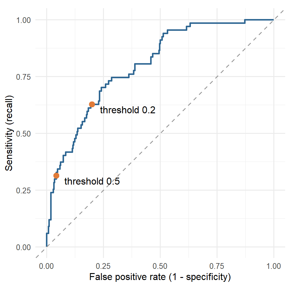
A table makes the trade-off concrete. For several thresholds, it shows the share of students flagged, and the resulting recall, precision, and specificity:
threshold_table <- map(c(0.5, 0.4, 0.3, 0.2, 0.15, 0.1), \(t) {
cv_predictions |>
mutate(flag = factor(if_else(.pred_Yes >= t, "Yes", "No"), levels = c("Yes", "No"))) |>
summarise(
threshold = t,
flagged = mean(flag == "Yes"),
recall = sensitivity_vec(considering_dropout, flag),
precision = precision_vec(considering_dropout, flag),
specificity = specificity_vec(considering_dropout, flag)
)
}) |>
list_rbind()
threshold_table# A tibble: 6 × 5
threshold flagged recall precision specificity
<dbl> <dbl> <dbl> <dbl> <dbl>
1 0.5 0.0824 0.313 0.568 0.958
2 0.4 0.127 0.403 0.474 0.921
3 0.3 0.183 0.493 0.402 0.872
4 0.2 0.263 0.627 0.356 0.801
5 0.15 0.327 0.716 0.327 0.741
6 0.1 0.419 0.746 0.266 0.639The function map() runs the same calculation for each threshold, and list_rbind() stacks the results into one table. The _vec() versions of the yardstick functions take two vectors instead of a data frame.
Moving the threshold trades one error for the other, so the choice depends on how much each error costs. The costs are not statistical quantities; they are judgements about consequences, and they should be made explicitly. Suppose the counselling service judges that missing a student who is at risk is ten times as costly as an unnecessary conversation. The total cost of each threshold can then be calculated from the cross-validated predictions:
cost_miss <- 10 # a student at risk who is not contacted
cost_false_alarm <- 1 # an unnecessary conversation
cost_curve <- map(seq(0.02, 0.6, by = 0.02), \(t) {
cv_predictions |>
summarise(threshold = t,
misses = sum(.pred_Yes < t & considering_dropout == "Yes"),
false_alarms = sum(.pred_Yes >= t & considering_dropout == "No"),
flagged = mean(.pred_Yes >= t))
}) |>
list_rbind() |>
mutate(total_cost = cost_miss * misses + cost_false_alarm * false_alarms)
best_cost <- cost_curve |> slice_min(total_cost, n = 1, with_ties = FALSE)
best_cost# A tibble: 1 × 5
threshold misses false_alarms flagged total_cost
<dbl> <int> <int> <dbl> <dbl>
1 0.04 5 195 0.572 245ggplot(cost_curve, aes(x = threshold, y = total_cost)) +
geom_line(linewidth = 1, colour = "#2f6793") +
geom_point(data = best_cost, size = 3, colour = "#e07b39") +
labs(x = "Threshold", y = "Total cost (arbitrary units)") +
theme_minimal(base_size = 12)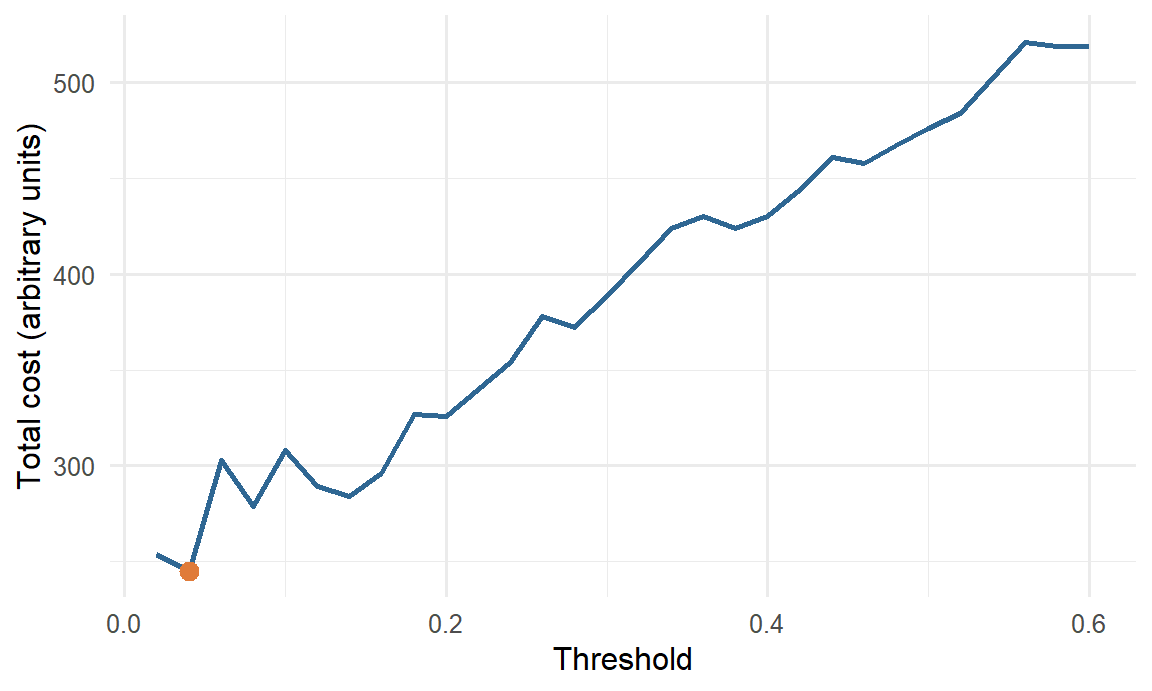
With these costs, the cheapest threshold is about 0.04, at which the model flags 57% of students. A simple rule from decision theory points in the same direction: when the predicted probabilities are accurate, the cost-minimising threshold is the cost of a false alarm divided by the sum of the two costs, here \(1 / (1 + 10) \approx 0.09\). The two do not match exactly. The rule assumes perfectly accurate probabilities, and the cost curve is estimated from only 67 students at risk, so its minimum is not precise: a threshold of 0.10, for example, costs 26% more. Both approaches agree on what matters for the decision: with these costs, the threshold belongs far below 0.5. Different costs give different thresholds. If a false alarm carried a real cost, such as a letter that stigmatised the student, the threshold would rise; if missing a student carried a greater one, it would fall further.
The costs, and therefore the threshold, are a research decision with an ethical side. They should be set with the people who will use the model, stated in the thesis, and, where the consequences are serious, examined for their effects on different groups of students.
Practical limits matter as well. The counselling service cannot talk to every student the cost analysis would flag, and after discussing the table with Elaf it settles on a threshold of 0.2: the model then flags about 26% of students, finds about 63% of those at risk, and about 36% of the students it flags are truly at risk. Only now is the chosen threshold applied to the test students:
test_results <- test_results |>
mutate(flag = factor(if_else(.pred_Yes >= 0.2, "Yes", "No"), levels = c("Yes", "No")))
test_results |> conf_mat(truth = considering_dropout, estimate = flag) Truth
Prediction Yes No
Yes 13 22
No 10 106test_results |> class_metrics(truth = considering_dropout, estimate = flag)# A tibble: 5 × 3
.metric .estimator .estimate
<chr> <chr> <dbl>
1 accuracy binary 0.788
2 sensitivity binary 0.565
3 specificity binary 0.828
4 precision binary 0.371
5 f_meas binary 0.448On new students, the model now finds 13 of the 23 at risk instead of 5, while flagging 35 students in all. About one flagged student in 3 is truly at risk. The test numbers are a little lower than the cross-validated ones, as expected with only 23 at-risk students in the test set. Accuracy has fallen, and it does not matter: accuracy was never the goal.
Sensitivity, specificity, precision, and F1 all depend on the threshold, so a paper that reports them must say which threshold was used, and why. The AUC does not depend on the threshold, which is why it is the standard measure for comparing models, and the threshold-dependent measures are the ones for describing how a model will be used.
When one outcome is rare, as considering dropout is, models tend to predict the common one. Besides moving the threshold, there are two other common remedies. Resampling changes the training data so that the classes are balanced: upsampling repeats rare-class students, downsampling drops common-class students, and SMOTE creates new, artificial rare-class students between existing ones. The themis package adds all three to a recipe. Class weights instead make mistakes on the rare class count more when the model is fitted, and some model engines support them directly.
Upsampling with themis looks like this; over_ratio = 1 repeats “Yes” students until there are as many as “No” students:
library(themis)
upsample_recipe <- dropout_recipe |>
step_upsample(considering_dropout, over_ratio = 1)
upsample_wf <- workflow() |>
add_recipe(upsample_recipe) |>
add_model(logistic_reg())
set.seed(2026)
upsample_cv <- fit_resamples(upsample_wf, resamples = dropout_folds,
metrics = metric_set(roc_auc, sensitivity, precision))
collect_metrics(upsample_cv) |> select(.metric, mean)# A tibble: 3 × 2
.metric mean
<chr> <dbl>
1 precision 0.314
2 roc_auc 0.789
3 sensitivity 0.671Resampling steps are applied only to the training data; when the model predicts for new students, the step is skipped automatically, so the test set keeps its real balance.
With the usual 0.5 threshold, the upsampled model has a sensitivity of about 67%, far higher than before. But its AUC, 0.79, has not improved. Upsampling did not make the model better at telling students apart; it pushed all the predicted probabilities upwards, which has much the same effect as lowering the threshold. That is often how it works out, and for a model that produces probabilities, choosing the threshold directly is simpler and keeps the probabilities meaningful (after upsampling, a “probability” of 0.6 no longer means a 60% chance). Resampling is most useful for models that do not produce good probabilities, and when the rare class is very rare.
Among the test students, the model with a threshold of 0.2 finds 7 of the 13 at-risk women and 6 of the 10 at-risk men, similar shares; but with only 23 at-risk students in the test set, any difference would be hard to detect. Before a model like this is used, its sensitivity and precision should be checked for each group that matters (gender, faculty, full- and part-time study) on as much data as possible, as Chapter 11 recommended. A threshold that works on average can still miss one group of students much more often than another.
workflow_set()). On the wellbeing data, with its smooth pattern, logistic regression predicts as well as any flexible model.Decision tree, node, leaf, Gini impurity, random forest, bootstrap sample, ensemble, mtry, permutation importance, k-nearest neighbours, distance, support vector machine, margin, support vector, kernel, radial basis function, workflow set, threshold, confusion matrix, true positive, false positive, true negative, false negative, sensitivity, recall, specificity, precision, F1 score, ROC curve, misclassification cost, upsampling, downsampling, SMOTE, class weights.
The playground has these and more, with hints and solutions.
tree_depth = 2. Name the predictors it uses, and explain the tree in plain words, as you would to a counsellor.mtry over c(2, 5, 10) with cross-validation, and compare the best value with the default.neighbors = c(81, 161, 301), describe what happens to the AUC, and explain what happens to a k-NN model as \(k\) approaches the number of training students.threshold_table, recommend a threshold and report the recall and precision it would give.step_upsample() with step_downsample(), and compare the sensitivity and AUC with upsampling.Research data often contains many possible predictors for rather few cases. A questionnaire with dozens of items, several rounds of measurement, and a background survey can easily supply 50 predictors for a sample of 60 or 100 people. Ordinary regression estimates a coefficient for every predictor, and with that much freedom it can fit its own data almost perfectly while predicting new cases badly: the overfitting of Chapter 11, now in its most common form. The problem is made worse when predictors are correlated, as questionnaire items usually are.
This chapter introduces two families of methods that make many predictors usable. Regularised regression (ridge, lasso, and elastic net) keeps the familiar linear model but shrinks its coefficients towards zero, trading a little fit on the training data for much better predictions. Boosting builds a flexible model from many small decision trees, each correcting the errors of the ones before. The chapter also introduces the measures used to judge numeric predictions. The outcome is now a number, so this is a regression problem in the machine learning sense of Chapter 11. In the study, it answers the tenth research question (RQ10): the university’s academic advisers meet every student at the end of the first year, and would like to know from year-one information which students are heading for a low final GPA, so that extra support can be planned.
The advisers meet students at the end of year one, so the model may use only what is known by then: the students’ background, their questionnaire answers, and their records from semesters 1 and 2. The outcome is GPA in semester 4.
This time, every questionnaire item is used as a separate predictor, rather than the four scale scores, to show how the methods cope with many related predictors. The semester records are in long format (one row per student per semester); for prediction, they are needed in wide format, one row per student, with a column for each measure in each semester. pivot_wider() from Chapter 3 does this:
library(tidymodels)
tidymodels_prefer()
year_one <- semesters |>
filter(semester <= 2) |>
pivot_wider(id_cols = student_id, names_from = semester,
values_from = gpa:wellbeing, names_glue = "{.value}_s{semester}")
final_gpa <- semesters |>
filter(semester == 4, !is.na(gpa)) |>
select(student_id, final_gpa = gpa)
gpa_data <- students |>
left_join(questionnaire, join_by(student_id)) |>
left_join(year_one, join_by(student_id)) |>
inner_join(final_gpa, join_by(student_id)) |>
select(-student_id, -supervisor_id, -considering_dropout)
dim(gpa_data)[1] 563 48The argument names_glue builds the new column names, such as gpa_s1 and sleep_hours_s2, and inner_join() keeps only students who have a final GPA. That is an important limitation: the 37 students who left the programme have no final GPA, so the model can only predict the final GPA of students who stay. (Chapter 6 showed that the leavers were not a random group, so the model should not be used to judge them.)
The split, folds, and recipe follow Chapter 11. With a numeric outcome, strata splits the outcome into quartiles and samples within each, so that both sets cover the full range of GPAs. The recipe adds step_impute_mode() to fill in any missing categories:
set.seed(2026)
gpa_split <- initial_split(gpa_data, prop = 0.75, strata = final_gpa)
gpa_train <- training(gpa_split)
gpa_test <- testing(gpa_split)
set.seed(2026)
gpa_folds <- vfold_cv(gpa_train, v = 10, strata = final_gpa)
gpa_recipe <- recipe(final_gpa ~ ., data = gpa_train) |>
step_impute_median(all_numeric_predictors()) |>
step_impute_mode(all_nominal_predictors()) |>
step_dummy(all_nominal_predictors()) |>
step_normalize(all_numeric_predictors())
gpa_recipe |> prep() |> bake(new_data = NULL) |> ncol()[1] 52After the dummy variables are created, there are 51 predictors, plus the outcome.
The quality of a numeric prediction is judged by its errors. Five students whose final GPA a model has predicted show how:
tiny <- tibble(
actual = c(3.2, 2.8, 3.6, 3.0, 2.5),
predicted = c(3.0, 2.9, 3.3, 3.1, 2.9)
)
tiny |> mutate(error = actual - predicted)# A tibble: 5 × 3
actual predicted error
<dbl> <dbl> <dbl>
1 3.2 3 0.200
2 2.8 2.9 -0.100
3 3.6 3.3 0.300
4 3 3.1 -0.100
5 2.5 2.9 -0.4 Each error (or residual) is the actual value minus the prediction, and three measures summarise them. The MAE (mean absolute error) is the average size of the errors, ignoring their sign; here, (0.2 + 0.1 + 0.3 + 0.1 + 0.4) / 5 = 0.22 GPA points. The RMSE (root mean squared error) squares the errors, averages them, and takes the square root. Squaring gives large errors more weight, so the RMSE is always at least as large as the MAE, and much larger when there are a few big misses. R², in yardstick, is the squared correlation between the predictions and the actual values: as in Chapter 8, the share of the variation in the outcome that the predictions capture, from 0 to 1. The yardstick package calculates all three:
regression_metrics <- metric_set(rmse, mae, rsq)
tiny |> regression_metrics(truth = actual, estimate = predicted)# A tibble: 3 × 3
.metric .estimator .estimate
<chr> <chr> <dbl>
1 rmse standard 0.249
2 mae standard 0.220
3 rsq standard 0.785MAE and RMSE are in the units of the outcome, here GPA points, which makes them easy to explain: “the model’s predictions are typically off by about 0.2 GPA points”. Lower is better. R² has no units; higher is better.
A number on its own means little, so every model should be compared with a baseline: the simplest possible prediction. For a numeric outcome, the baseline predicts the same value, the training mean, for everyone, which is what parsnip’s null_model() does:
null_wf <- workflow(gpa_recipe, null_model(mode = "regression"))
set.seed(2026)
null_cv <- fit_resamples(null_wf, resamples = gpa_folds, metrics = metric_set(rmse, mae))
collect_metrics(null_cv)# A tibble: 2 × 6
.metric .estimator mean n std_err .config
<chr> <chr> <dbl> <int> <dbl> <chr>
1 mae standard 0.256 10 0.00738 pre0_mod0_post0
2 rmse standard 0.323 10 0.0104 pre0_mod0_post0Predicting the average GPA for everyone gives an RMSE of 0.32. Any useful model must do clearly better. (The R² of the baseline cannot be calculated, because its predictions do not vary, so it is left out here.)
The obvious model is the multiple regression of Chapter 8, using every predictor:
lm_wf <- workflow(gpa_recipe, linear_reg())
set.seed(2026)
lm_cv <- fit_resamples(lm_wf, resamples = gpa_folds, metrics = regression_metrics)
collect_metrics(lm_cv)# A tibble: 3 × 6
.metric .estimator mean n std_err .config
<chr> <chr> <dbl> <int> <dbl> <chr>
1 mae standard 0.172 10 0.00615 pre0_mod0_post0
2 rmse standard 0.218 10 0.0105 pre0_mod0_post0
3 rsq standard 0.564 10 0.0420 pre0_mod0_post0A cross-validated RMSE of 0.218, much better than the baseline. With 422 training students and 51 predictors, ordinary regression works reasonably well. But watch what happens with fewer students. Many theses have samples of 50 or 60, so here is the same model fitted to 60 randomly chosen training students, and tested on the test set:
set.seed(3)
small_train <- gpa_train |> slice_sample(n = 60)
lm_small <- fit(lm_wf, data = small_train)
augment(lm_small, new_data = small_train) |> regression_metrics(final_gpa, .pred)# A tibble: 3 × 3
.metric .estimator .estimate
<chr> <chr> <dbl>
1 rmse standard 0.115
2 mae standard 0.0918
3 rsq standard 0.876 augment(lm_small, new_data = gpa_test) |> regression_metrics(final_gpa, .pred)# A tibble: 3 × 3
.metric .estimator .estimate
<chr> <chr> <dbl>
1 rmse standard 0.526
2 mae standard 0.430
3 rsq standard 0.0456On its own 60 students, the model looks excellent: an RMSE of 0.11. On new students, its RMSE is 0.53, worse than predicting the average GPA for everyone. With 51 coefficients estimated from 60 students, the model has enough freedom to fit the noise in its sample, and the coefficients that fit the noise do not carry over. In the extreme, with as many predictors as students, a regression can fit its data perfectly and predict nothing.
The problem is made worse by multicollinearity: many of the predictors are strongly correlated (six stress items, two semesters of GPA), and regression struggles to divide the credit between correlated predictors. Their coefficients become large, unstable, and sometimes of opposite signs, cancelling each other out on the training data but not on new data.
Regularisation tackles this directly: it fits the regression while penalising large coefficients. Ordinary regression chooses the coefficients that minimise the sum of squared errors. Regularised regression minimises
\[ \text{sum of squared errors} + \lambda \times \text{size of the coefficients}. \]
The penalty \(\lambda\) (lambda) sets how much large coefficients cost. With \(\lambda = 0\), this is ordinary regression; as \(\lambda\) grows, the coefficients are pulled, or shrunk, towards zero. A little shrinkage costs almost nothing in fit to the training data, but makes the model much more stable on new data. Because the penalty depends on the size of the coefficients, the predictors must be on the same scale, which the recipe’s step_normalize() ensures. There are three versions, which differ in how “size” is measured. Ridge regression uses the sum of the squared coefficients: it shrinks all coefficients towards zero and shares the credit among correlated predictors, but keeps every predictor in the model. The lasso (least absolute shrinkage and selection operator) uses the sum of the absolute coefficients (Tibshirani 1996). It shrinks too, but it also sets some coefficients to exactly zero, removing those predictors, so it also selects predictors and leaves a simpler model. The elastic net mixes the two, with a mixture parameter that runs from 0 (pure ridge) to 1 (pure lasso).
In tidymodels, all three are linear_reg() with the glmnet engine, with penalty for \(\lambda\) and mixture for the mix. The 60 students are now refitted with a lasso:
lasso_small <- workflow(gpa_recipe,
linear_reg(penalty = 0.03, mixture = 1) |> set_engine("glmnet")) |>
fit(data = small_train)
augment(lasso_small, new_data = gpa_test) |> regression_metrics(final_gpa, .pred)# A tibble: 3 × 3
.metric .estimator .estimate
<chr> <chr> <dbl>
1 rmse standard 0.204
2 mae standard 0.168
3 rsq standard 0.616From the same 60 students, the lasso’s RMSE on new students is 0.20, against 0.53 for ordinary regression. The penalty kept the model from chasing noise.
The difference lies in the coefficients. Figure 13.1 compares, predictor by predictor, the coefficients that ordinary regression and the lasso estimated from the same 60 students:
coefficient_comparison <- tidy(lm_small) |>
select(term, ordinary = estimate) |>
inner_join(tidy(lasso_small) |> select(term, lasso = estimate), join_by(term)) |>
filter(term != "(Intercept)")
ggplot(coefficient_comparison, aes(x = ordinary, y = lasso)) +
geom_hline(yintercept = 0, colour = "grey70") +
geom_vline(xintercept = 0, colour = "grey70") +
geom_point(size = 2, alpha = 0.7, colour = "#2f6793") +
labs(x = "Ordinary regression coefficient", y = "Lasso coefficient") +
theme_minimal(base_size = 12)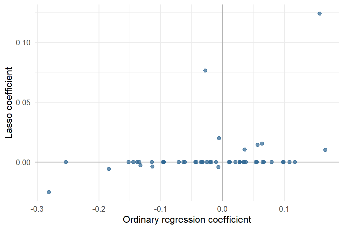
Ordinary regression gives every predictor a coefficient, many of them large and in both directions: with 60 students, it cannot tell real effects from the chance patterns of this sample, so it fits both. Some of its coefficients make no sense. Semester 1 GPA, one of the best predictors of final GPA, receives a negative coefficient (-0.03), and caffeine in semester 2 receives a larger one (0.17) than semester 2 GPA (0.16). The lasso gives both GPA measures positive coefficients (0.08 and 0.12) and almost nothing to caffeine. The lasso keeps only 12 of the 51 predictors and shrinks even those. This is the sense in which shrinkage trades fit for stability: coefficients pulled towards zero cannot chase the noise of one sample, so they carry over better to the next.
The penalty and mixture are hyperparameters, so they are tuned with cross-validation, now on the full training set. The grid tries 20 penalties, spread evenly on a logarithmic scale from 0.0001 to 1, for ridge, an even elastic net, and lasso:
glmnet_wf <- workflow(gpa_recipe,
linear_reg(penalty = tune(), mixture = tune()) |> set_engine("glmnet"))
glmnet_grid <- expand_grid(penalty = 10^seq(-4, 0, length.out = 20),
mixture = c(0, 0.5, 1))
set.seed(2026)
glmnet_tuning <- tune_grid(glmnet_wf, resamples = gpa_folds, grid = glmnet_grid,
metrics = metric_set(rmse))autoplot(glmnet_tuning) + theme_minimal(base_size = 12)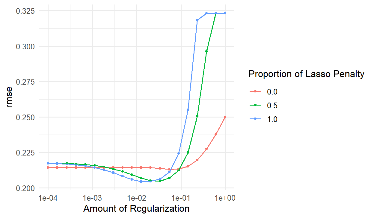
Figure 13.2 shows the typical pattern. With a tiny penalty, all three behave like ordinary regression. As the penalty grows, the RMSE improves, reaches a minimum, and then rises steeply once the penalty is so large that it shrinks away real effects too. At the far right, the lasso has shrunk every coefficient to zero and predicts the mean for everyone: its RMSE equals the baseline’s.
show_best(glmnet_tuning, metric = "rmse", n = 3)# A tibble: 3 × 8
penalty mixture .metric .estimator mean n std_err .config
<dbl> <dbl> <chr> <chr> <dbl> <int> <dbl> <chr>
1 0.0127 1 rmse standard 0.204 10 0.00871 pre0_mod33_post0
2 0.0207 1 rmse standard 0.205 10 0.00811 pre0_mod36_post0
3 0.0336 0.5 rmse standard 0.205 10 0.00813 pre0_mod38_post0The best combination is a mixture of 1 with a penalty of 0.013, but the top few are nearly identical. The function select_best() picks the winner, and finalize_workflow() plugs it in:
best_penalty <- select_best(glmnet_tuning, metric = "rmse")
lasso_fit <- glmnet_wf |>
finalize_workflow(best_penalty) |>
fit(data = gpa_train)The function tidy() lists the coefficients, most of which are exactly zero:
lasso_coefs <- tidy(lasso_fit)
lasso_coefs |>
filter(estimate != 0) |>
arrange(desc(abs(estimate)))# A tibble: 11 × 3
term estimate penalty
<chr> <dbl> <dbl>
1 (Intercept) 3.10 0.0127
2 gpa_s2 0.145 0.0127
3 gpa_s1 0.106 0.0127
4 satisfaction_2 0.00986 0.0127
5 stress_3 -0.00890 0.0127
6 study_mode_Part.time 0.00812 0.0127
7 burnout_1 -0.00688 0.0127
8 burnout_4 -0.00622 0.0127
9 study_hours_s2 0.00557 0.0127
10 burnout_6 -0.00210 0.0127
11 support_3 -0.000169 0.0127Of 51 predictors, the lasso keeps 10. Because the predictors are normalised, the coefficients are comparable: the change in predicted final GPA for a one-standard-deviation difference in the predictor. Year-one GPA dominates. A student whose semester 2 GPA is one standard deviation above average is predicted to finish about 0.15 GPA points higher; the other predictors add small adjustments.
Figure 13.3 shows how the lasso arrives at this. As the penalty decreases from left to right, predictors enter the model one by one, and the two GPA measures enter first.
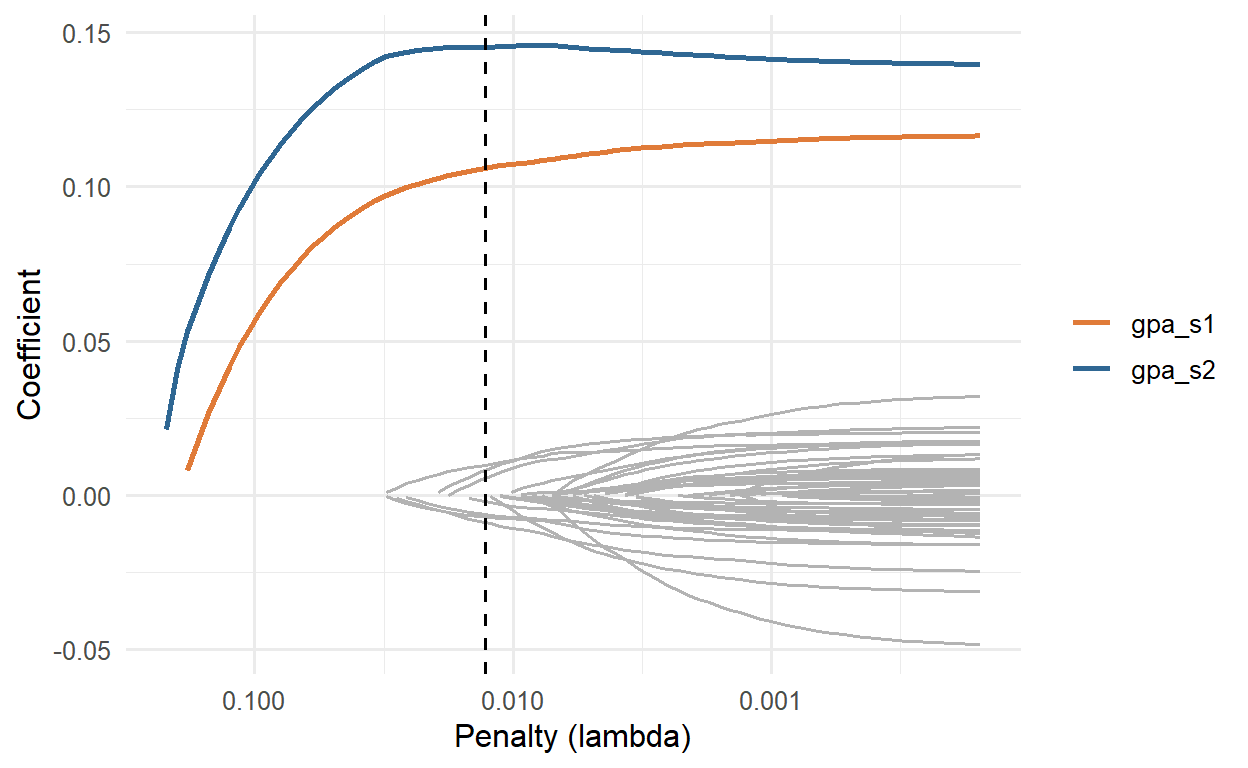
It is tempting to read the lasso’s choice as a list of what matters for grades. It is not. Sleep affects GPA in the wellbeing data (Chapter 8), yet the lasso drops the sleep variables, because their effect is already reflected in year-one GPA: once the model knows a student’s past grades, knowing their sleep adds little to the prediction. Among correlated predictors, the lasso tends to keep one and drop the others, and which one it keeps can change from sample to sample. Use the lasso to predict, and use the methods of Chapters 8 and 10 to explain.
The second family builds a model in a completely different way. Boosting starts with a very simple prediction, the average, and then adds small decision trees one at a time, each fitted to the errors of the model so far. The first tree learns the biggest pattern in the errors; the next tree learns what the first missed; and so on. Each tree’s contribution is scaled down by a learning rate (for example 0.1), so the model improves in small steps and no single tree dominates. Hundreds of trees, each weak on its own, add up to a strong model.
Figure 13.4 shows the idea with a single predictor, semester 2 GPA, and trees with a single split. After one tree, the prediction is a single step; after ten, a staircase; after a hundred, a curve that follows the data.
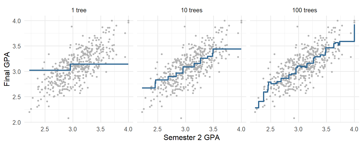
Boosting is closely related to the random forests of Chapter 12, which also combine many trees. The difference is that a forest grows its trees independently and averages them, while boosting grows them in sequence, each correcting the last. XGBoost (“extreme gradient boosting”) is a fast, popular implementation (Chen and Guestrin 2016), and one of the most successful methods for tables of data. Its main hyperparameters are the number of trees, the learning rate, and the depth of each tree. A small learning rate needs more trees; deeper trees capture interactions between predictors. Here, 500 trees are used, and the learning rate and depth are tuned:
xgb_wf <- workflow(gpa_recipe,
boost_tree(trees = 500, learn_rate = tune(), tree_depth = tune()) |>
set_engine("xgboost") |>
set_mode("regression"))
set.seed(2026)
xgb_tuning <- tune_grid(xgb_wf, resamples = gpa_folds,
grid = expand_grid(learn_rate = c(0.01, 0.03, 0.1),
tree_depth = c(1, 2, 4)),
metrics = metric_set(rmse))
show_best(xgb_tuning, metric = "rmse", n = 3)# A tibble: 3 × 8
tree_depth learn_rate .metric .estimator mean n std_err .config
<dbl> <dbl> <chr> <chr> <dbl> <int> <dbl> <chr>
1 1 0.03 rmse standard 0.212 10 0.00968 pre0_mod2_post0
2 2 0.01 rmse standard 0.213 10 0.00928 pre0_mod4_post0
3 1 0.01 rmse standard 0.213 10 0.00834 pre0_mod1_post0The best settings use trees of depth 1, and the best RMSE is 0.212. Trees of depth 1 use one predictor each, so a boosted model built from them adds up separate effects of each predictor, with no interactions. That the shallowest trees work best is another sign that the wellbeing data has no strong interactions for the trees to find.
All the models were evaluated with the same folds, so their cross-validated RMSEs can be compared directly:
bind_rows(
collect_metrics(null_cv) |> mutate(model = "Baseline (mean)"),
collect_metrics(lm_cv) |> mutate(model = "Linear regression"),
show_best(glmnet_tuning |> filter_parameters(mixture == 0), metric = "rmse", n = 1) |>
mutate(model = "Ridge"),
show_best(glmnet_tuning |> filter_parameters(mixture == 0.5), metric = "rmse", n = 1) |>
mutate(model = "Elastic net"),
show_best(glmnet_tuning |> filter_parameters(mixture == 1), metric = "rmse", n = 1) |>
mutate(model = "Lasso"),
show_best(xgb_tuning, metric = "rmse", n = 1) |> mutate(model = "XGBoost")
) |>
filter(.metric == "rmse") |>
select(model, rmse = mean, std_err) |>
arrange(rmse)# A tibble: 6 × 3
model rmse std_err
<chr> <dbl> <dbl>
1 Lasso 0.204 0.00871
2 Elastic net 0.205 0.00813
3 XGBoost 0.212 0.00968
4 Ridge 0.213 0.00938
5 Linear regression 0.218 0.0105
6 Baseline (mean) 0.323 0.0104 The function filter_parameters() keeps only the tuning results with a given mixture, so the best ridge, elastic net, and lasso can be picked out separately.
The regularised models come out on top, followed closely by XGBoost, and all of them improve on ordinary regression. The differences between the best models are smaller than their standard errors. The lasso is chosen: it predicts as well as any, and it uses only 10 predictors, which makes it the easiest to explain and to use.
As always, the test set is used once, at the end. The function last_fit() fits the chosen model on the full training set and evaluates it on the test students:
final_lasso <- glmnet_wf |>
finalize_workflow(best_penalty) |>
last_fit(gpa_split, metrics = regression_metrics)
collect_metrics(final_lasso)# A tibble: 3 × 4
.metric .estimator .estimate .config
<chr> <chr> <dbl> <chr>
1 rmse standard 0.192 pre0_mod0_post0
2 mae standard 0.161 pre0_mod0_post0
3 rsq standard 0.648 pre0_mod0_post0On new students, the lasso’s predictions are off by 0.16 GPA points on average (MAE), with an RMSE of 0.19, and they capture 65% of the variation in final GPA. Figure 13.5 compares the predictions with the actual final GPAs.
collect_predictions(final_lasso) |>
ggplot(aes(x = .pred, y = final_gpa)) +
geom_abline(linetype = "dashed", colour = "grey50") +
geom_point(alpha = 0.6, colour = "#2f6793") +
coord_obs_pred() +
labs(x = "Predicted final GPA", y = "Actual final GPA") +
theme_minimal(base_size = 12)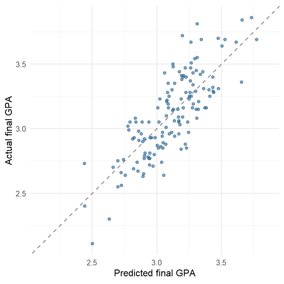
The function coord_obs_pred() from tune gives both axes the same range, so the diagonal is at 45 degrees. The predictions are less spread out than the actual values: the model predicts the most extreme students closer to the average than they turn out to be. This is normal for any model that cannot predict perfectly, and it means that the model is most reliable for students in the middle of the range.
A last comparison shows how much all the year-one measures add to past grades. A plain regression on the two year-one GPAs alone gives:
gpa_only_wf <- workflow(recipe(final_gpa ~ gpa_s1 + gpa_s2, data = gpa_train), linear_reg())
gpa_only_fit <- last_fit(gpa_only_wf, gpa_split, metrics = regression_metrics)
collect_metrics(gpa_only_fit)# A tibble: 3 × 4
.metric .estimator .estimate .config
<chr> <chr> <dbl> <chr>
1 rmse standard 0.193 pre0_mod0_post0
2 mae standard 0.163 pre0_mod0_post0
3 rsq standard 0.641 pre0_mod0_post0Its test RMSE, 0.193, is practically the same as the lasso’s 0.192. For the advisers, this is a useful, if humbling, result: past grades are by far the best predictor of future grades, and the questionnaire and semester records add little on top. That does not make sleep, stress, or support irrelevant to grades (Chapter 8 showed that they matter), but their influence is already visible in the year-one grades.
Predictive regression invites a few characteristic misreadings.
Regression (prediction), error, residual, MAE, RMSE, R², baseline model, overfitting, multicollinearity, regularisation, penalty (lambda), shrinkage, ridge regression, lasso, elastic net, mixture, coefficient path, variable selection, boosting, weak learner, learning rate, XGBoost, tree depth.
The playground has these and more, with hints and solutions.
trees = c(100, 500, 1000) and a learning rate of 0.03, and describe what happens to the RMSE as trees are added.Every clustering method carries a definition of what a group is, usually without saying so. One definition says that a group is a set of cases close to a common centre. Another says that a group is a population with its own distribution, so that cases between groups can belong partly to each. A third says that a group is a dense region of data, separated from other groups by sparse regions, which leaves room for cases that belong to no group at all. The definition chosen decides what the method can find, and a clustering is only as meaningful as the definition behind it.
Chapter 9 used k-means, which takes the first definition. It divided the students of the wellbeing study into four lifestyle profiles, but left open questions that any examiner might ask: how sure one can be about which profile a student belongs to, whether four is really the right number, and whether some students fit no profile. This chapter addresses them with two methods that relax the assumptions of k-means. Gaussian mixture models give each student a probability of belonging to each profile, and choose the number of profiles with a statistical criterion. DBSCAN defines clusters as dense regions of data, and labels students in sparse regions as noise: people who fit no group. The chapter ends with the question behind all clustering: how to judge whether a clustering is any good.
The data is exactly that of Chapter 9: each student’s average sleep, study hours, caffeine, and exercise across the semesters, and their stress, support, and satisfaction scores, scaled to z-scores.
library(dplyr)
library(ggplot2)
q <- questionnaire
q$stress_4 <- 6 - q$stress_4
scores <- q |>
mutate(
stress = rowMeans(pick(stress_1:stress_6), na.rm = TRUE),
support = rowMeans(pick(support_1:support_6), na.rm = TRUE),
satisfaction = rowMeans(pick(satisfaction_1:satisfaction_4), na.rm = TRUE)
) |>
select(student_id, stress, support, satisfaction)
profiles <- semesters |>
summarise(across(c(sleep_hours, study_hours, caffeine_mg, exercise_days),
~ mean(.x, na.rm = TRUE)),
.by = student_id) |>
left_join(scores, join_by(student_id)) |>
na.omit()
profile_data <- scale(profiles |> select(-student_id))
set.seed(123)
kmeans_clusters <- kmeans(profile_data, centers = 4, nstart = 25)The last two lines repeat Chapter 9’s k-means solution, for comparison.
k-means is simple and fast, but its definition of a group brings three strong assumptions. It assumes that every case belongs to exactly one cluster, with complete certainty, so a student halfway between two profiles is assigned to one of them as firmly as a student at the centre. It assumes that clusters are round and similar in size: because each case goes to the nearest centre, k-means draws straight boundaries halfway between centres, and elongated or unequal clusters are cut up wrongly. And it assumes that every case belongs to some cluster, with no way to say that a student fits nowhere. Real groups of people rarely satisfy these assumptions.
A simulation shows how much the definition matters. The code below creates data with a known structure: a small round group, a long thin group, and 15 scattered points that belong to neither. It then clusters the data in three ways, with k-means (groups around centres), a Gaussian mixture model (groups as distributions), and DBSCAN (groups as dense regions), the two methods this chapter introduces:
library(mclust)
library(dbscan)
set.seed(8)
shapes <- bind_rows(
tibble(x = rnorm(100, 0, 0.4), y = rnorm(100, 0, 0.4), truth = "Round group"),
tibble(x = rnorm(100, 3, 2), y = rnorm(100, 1.4, 0.2), truth = "Long group"),
tibble(x = runif(15, -2, 7), y = runif(15, -2, 4), truth = "Scattered")
)
xy <- shapes |> select(x, y)
shape_clusters <- bind_rows(
shapes |> mutate(method = "k-means", cluster = factor(kmeans(xy, 2, nstart = 25)$cluster)),
shapes |> mutate(method = "Mixture model", cluster = factor(Mclust(xy, G = 2, verbose = FALSE)$classification)),
shapes |> mutate(method = "DBSCAN", cluster = factor(dbscan(xy, eps = 0.5, minPts = 5)$cluster))
) |>
mutate(method = factor(method, levels = c("k-means", "Mixture model", "DBSCAN")),
cluster = forcats::fct_recode(cluster, noise = "0"))ggplot(shape_clusters, aes(x, y, colour = cluster)) +
geom_point(size = 1.2) +
facet_wrap(~ method) +
scale_colour_manual(values = c("1" = "#2f6793", "2" = "#e07b39", "3" = "#36a269",
"4" = "#8b68b5", noise = "grey65")) +
coord_equal() +
theme_minimal(base_size = 11)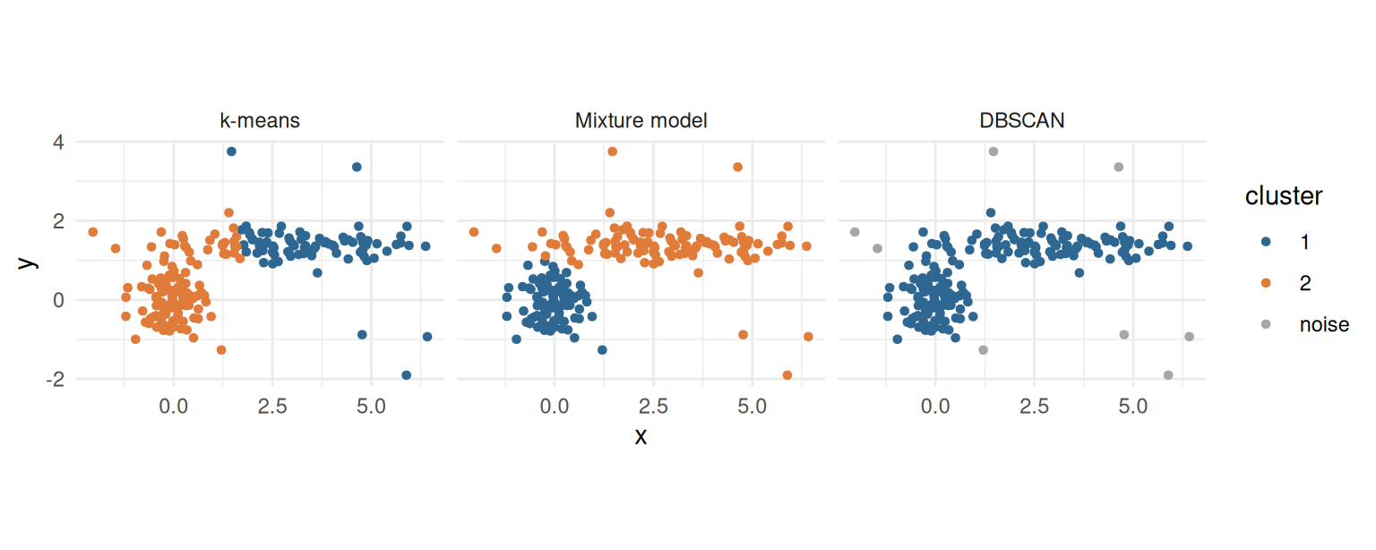
The three methods see different groups in the same data. Their agreement with the two real groups can be measured with the adjusted Rand index, introduced at the end of the chapter, where 1 means perfect agreement and 0 means no more than chance. k-means scores 0.53: looking for round groups around two centres, it draws a straight boundary through the long group and gives its left end to the round group. The mixture model scores 0.98, because it allows the long group its elongated shape. DBSCAN scores 0.00, for a different reason: the end of the long group touches the round group, so the two form one continuous dense region, and by DBSCAN’s definition that is one group. DBSCAN is, however, the only method that can say that points belong to no group: it labels 6 of the 15 scattered points as noise, while the other two methods must place every one of them in a group. No method is right in general. Each is right for data whose groups match its definition, which is why the definition should be chosen deliberately, and stated.
A Gaussian mixture model (GMM) assumes that the data comes from a mix of several groups, each with its own normal (Gaussian) distribution, and estimates each group’s centre, spread, and size from the data.
The idea is easiest to see with one variable. R’s faithful data records the waiting time, in minutes, between 272 eruptions of the Old Faithful geyser in Yellowstone National Park. The histogram in Figure 14.2 has two humps: short waits and long waits. The mclust package fits a mixture model with Mclust():
geyser <- Mclust(faithful$waiting)
summary(geyser, parameters = TRUE)----------------------------------------------------
Gaussian finite mixture model fitted by EM algorithm
----------------------------------------------------
Mclust E (univariate, equal variance) model with 2 components:
log-likelihood n df BIC ICL
-1034.002 272 4 -2090.427 -2099.576
Clustering table:
1 2
99 173
Mixing probabilities:
1 2
0.3609461 0.6390539
Means:
1 2
54.61675 80.09239
Variances:
1 2
34.44093 34.44093 The function tried mixtures of one to nine groups and chose 2. The output describes them: the mixing probabilities are the sizes of the groups (about 36% and 64% of eruptions), the means are their centres (about 55 and 80 minutes), and the variances their spreads. Figure 14.2 draws the two fitted normal curves over the data.
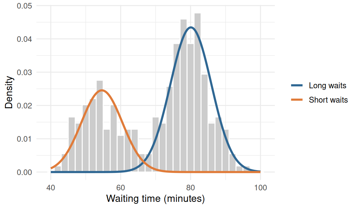
The key difference from k-means appears between the groups. A waiting time of 67 minutes lies between them. Instead of forcing it into one, the model gives the probability that it came from each:
predict(geyser, newdata = c(50, 67, 85))$z |> round(2) 1 2
[1,] 1.00 0.00
[2,] 0.42 0.58
[3,] 0.00 1.00A wait of 50 minutes almost certainly belongs to the short group, and 85 minutes to the long group, but 67 minutes is uncertain. These membership probabilities (also called soft assignments) are the main advantage of mixture models: they say not just which group a case is in, but how sure that is.
With more variables, each group is described by a centre and a covariance matrix, which sets its shape: round or elongated, and tilted in any direction. Groups can be allowed to differ in size (volume), shape, and orientation, or forced to be the same. mclust names each combination with three letters, such as EEE (all equal) or VVV (all variable), and fits them all for each number of groups.
To choose among them, it uses the Bayesian information criterion (BIC). BIC rewards a model for fitting the data well and penalises it for every parameter it needs, so a more complex model must earn its extra parameters. In mclust, higher BIC is better. For the profile data:
set.seed(123)
profile_gmm <- Mclust(profile_data, G = 1:8)
summary(profile_gmm)----------------------------------------------------
Gaussian finite mixture model fitted by EM algorithm
----------------------------------------------------
Mclust EVE (ellipsoidal, equal volume and orientation) model with 3 components:
log-likelihood n df BIC ICL
-5128.189 599 63 -10659.28 -10752.69
Clustering table:
1 2 3
231 174 194 library(factoextra)
fviz_mclust(profile_gmm, what = "BIC")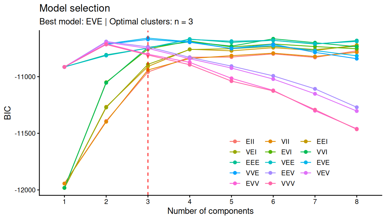
BIC chooses 3 clusters with the EVE structure (ellipsoidal clusters of equal size and orientation, but different shapes). The best four-cluster model is about 8.7 BIC points behind. A common rule of thumb reads a BIC difference above 6 as strong evidence and above 10 as very strong, so the data favours three profiles, although four remain a reasonable alternative (exercise 1 explores them).
As in Chapter 9, a cluster means something only once it is described:
profiles <- profiles |>
mutate(gmm_cluster = profile_gmm$classification)
profiles |>
summarise(students = n(), across(sleep_hours:satisfaction, ~ round(mean(.x), 1)),
.by = gmm_cluster) |>
arrange(gmm_cluster) gmm_cluster students sleep_hours study_hours caffeine_mg exercise_days stress
1 1 231 6.7 17.9 151.7 2.2 3.3
2 2 174 7.2 25.0 126.2 3.7 2.6
3 3 194 5.5 41.7 284.1 1.3 3.6
support satisfaction
1 2.8 2.7
2 3.6 3.9
3 3.3 3.1The three profiles are clear. One is balanced: the most sleep and exercise, the least stress, and the highest support and satisfaction. One is overloaded: long study weeks, short sleep, a lot of caffeine, little exercise, and the most stress. The third, the largest, combines few study hours with low support and low satisfaction: students who seem disengaged or isolated. The cluster numbers are arbitrary labels. A cross-table compares the solution with k-means:
table(gmm = profile_gmm$classification, kmeans = kmeans_clusters$cluster) kmeans
gmm 1 2 3 4
1 5 191 34 1
2 0 3 166 5
3 80 3 0 111The mixture model’s three profiles correspond closely to Chapter 9’s four k-means clusters: the balanced and disengaged groups largely match, and the two k-means “overloaded” clusters, one of them with very high caffeine, are joined into one. The mixture model, with its more flexible cluster shapes, did not need to split the overloaded students in two.
The matrix profile_gmm$z holds each student’s membership probabilities, one column per cluster, and profile_gmm$uncertainty is 1 minus the largest of them.
head(round(profile_gmm$z, 2)) [,1] [,2] [,3]
1 0.63 0.37 0
2 0.99 0.00 0
3 0.14 0.86 0
4 0.00 0.00 1
5 0.10 0.90 0
6 1.00 0.00 0certainty <- apply(profile_gmm$z, 1, max)
sum(certainty < 0.8)[1] 79The call apply(..., 1, max) takes the maximum of each row. Most students belong clearly to one profile, but 79 have less than an 80% probability for their most likely profile. Figure 14.4 shows where they are.
fviz_mclust(profile_gmm, what = "uncertainty")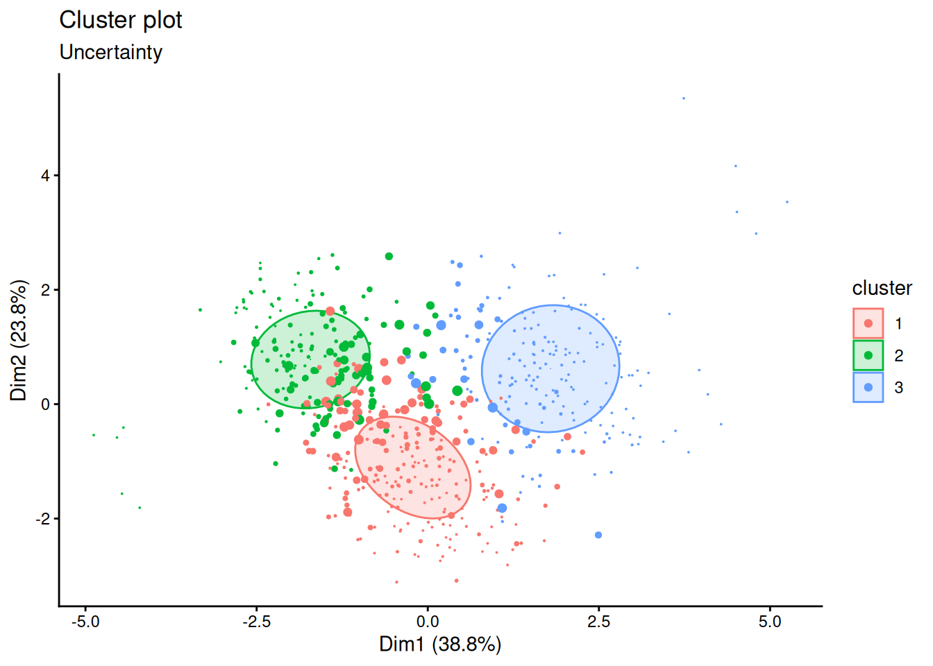
The uncertain students lie where the profiles meet. For a thesis, this is honest and useful: instead of claiming that every student has one profile, it can report the share of students who clearly fit a profile, and treat the rest as mixtures. A later analysis could use the probabilities themselves, for example as weights, rather than the hard labels.
DBSCAN (density-based spatial clustering of applications with noise) takes a different view. A cluster is a region where cases are packed closely together, separated from other clusters by sparser regions. Cases in sparse regions belong to no cluster; they are noise. DBSCAN does not need the number of clusters in advance, can find clusters of any shape, and can say “this case fits nowhere”.
It needs two settings: eps (epsilon), the radius of the neighbourhood around each case, and minPts, the number of cases a neighbourhood must contain for the case to be at the heart of a cluster. A case with at least minPts cases within eps is a core point. Core points within eps of each other are joined into the same cluster, and cases near a core point are added to its cluster as border points. Everything else is noise.
Twelve points show how it works: two tight groups of five, and two isolated points.
tiny <- tibble(
x = c(1.0, 1.2, 1.1, 0.9, 1.3, 4.0, 4.2, 3.9, 4.1, 4.3, 2.5, 5.5),
y = c(1.0, 1.1, 1.3, 1.2, 0.9, 3.0, 3.2, 3.1, 2.8, 3.0, 4.5, 0.5)
)
tiny_db <- dbscan(tiny, eps = 0.5, minPts = 3)
tiny_db$cluster [1] 1 1 1 1 1 2 2 2 2 2 0 0The two tight groups become clusters 1 and 2, and the two isolated points are labelled 0: noise. k-means with two clusters would have had to put the isolated points into one of the groups.
The result depends heavily on eps. A common guide is the k-nearest-neighbour distance plot: for each case, the distance to its \(k\)-th nearest neighbour, sorted from smallest to largest. Most cases have close neighbours; the curve bends sharply upwards where the isolated cases begin, and that bend suggests a value for eps. With minPts set to 8, a common choice for data with seven variables (about the number of variables plus one or more), the plot uses \(k = 7\):
kNNdistplot(profile_data, k = 7)
abline(h = 2, lty = "dashed")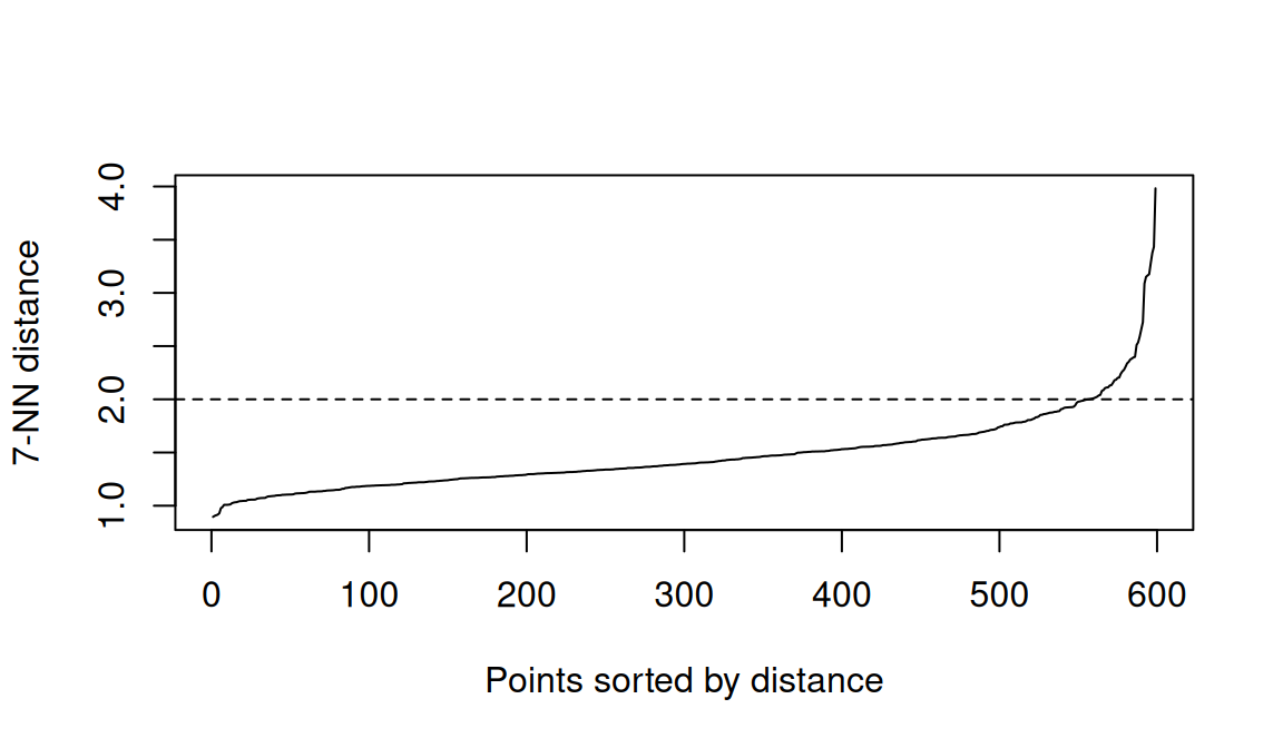
The curve bends at a distance of about 2, so eps = 2 is used:
profile_db <- dbscan(profile_data, eps = 2, minPts = 8)
profile_dbDBSCAN clustering for 599 objects.
Parameters: eps = 2, minPts = 8
Using euclidean distances and borderpoints = TRUE
The clustering contains 1 cluster(s) and 13 noise points.
0 1
13 586
Available fields: cluster, eps, minPts, metric, borderPointsDBSCAN finds 1 cluster and 13 noise points. At first this looks like a failure: no profiles at all. But it is an informative result. DBSCAN looks for dense regions separated by gaps, and the students form one continuous cloud, in which the profiles found by k-means and the mixture model overlap without gaps between them. (Smaller values of eps break the cloud into fragments and label hundreds of students as noise; try it in the exercises.) The profiles are real differences in where students sit in the cloud, not separate islands.
The noise points answer the last of the open questions: whether some students fit no profile. Their values are:
profiles |>
filter(profile_db$cluster == 0) |>
select(sleep_hours:satisfaction) |>
round(1) sleep_hours study_hours caffeine_mg exercise_days stress support
1 3.6 60.5 772.5 0.5 3.2 4.0
2 4.6 45.8 592.5 2.5 2.8 2.7
3 9.7 2.2 26.2 5.2 1.7 2.7
4 3.7 61.5 842.5 0.0 3.5 3.7
5 9.4 5.5 23.8 6.2 2.7 3.7
6 3.8 63.0 780.0 0.5 2.0 3.5
7 3.7 63.2 742.5 0.0 1.8 4.3
8 9.6 4.2 21.2 5.0 2.7 3.5
9 9.8 5.2 18.8 5.8 2.6 2.2
10 9.5 2.0 20.0 6.2 2.5 2.5
11 4.0 65.5 735.0 0.5 3.2 3.3
12 4.4 30.2 703.8 0.8 3.2 4.6
13 3.8 35.8 641.2 1.0 3.0 1.8
satisfaction
1 4.2
2 4.0
3 4.2
4 3.8
5 3.7
6 2.8
7 4.7
8 4.2
9 3.5
10 3.5
11 3.2
12 3.0
13 2.8Two kinds of unusual student stand out. Among the noise points, 5 students study around 60 hours a week, sleep about 4 hours a night or less, drink over 700 mg of caffeine a day (about seven cups of coffee), and hardly exercise: more extreme than anyone in the overloaded profile. 5 others are the opposite: close to 10 hours of sleep, very few study hours, very little caffeine, and exercise almost every day. The remaining few are extreme versions of the overloaded profile. In Chapter 6, extreme values were checked one variable at a time; DBSCAN finds students who are unusual in their combination of values.
These students should not be deleted: they are real students, and the extreme workers are exactly the students a wellbeing service would want to know about. They are reported separately, as students who do not fit the profiles, and the profiles are checked for whether they change when these students are left out.
In supervised learning, a model is judged against the true answers. In clustering there are usually no true answers, so evaluation rests on several kinds of evidence, none decisive on its own.
Internal measures judge how compact and well separated the clusters are, using the data alone. The silhouette of Chapter 9 is the most common, and BIC plays this role for mixture models. The silhouette() function from the cluster package calculates it for any clustering:
library(cluster)
profile_distances <- dist(profile_data)
mean(silhouette(kmeans_clusters$cluster, profile_distances)[, "sil_width"])[1] 0.2135627mean(silhouette(profile_gmm$classification, profile_distances)[, "sil_width"])[1] 0.2272005Both averages are low (the silhouette runs from −1 to 1), which confirms what DBSCAN suggested: the profiles overlap, and no clustering of this data will be crisp.
Agreement between methods asks whether different reasonable methods find similar groups. The adjusted Rand index (ARI) measures the agreement between two clusterings. It counts the pairs of cases that both clusterings put together or both put apart, and adjusts for the agreement expected by chance: 1 means identical groupings (whatever the labels), and 0 means no more agreement than chance. A tiny example shows that the labels themselves do not matter:
first <- c(1, 1, 1, 2, 2, 2)
second <- c("B", "B", "B", "A", "A", "A")
third <- c(1, 1, 2, 2, 3, 3)
adjustedRandIndex(first, second)[1] 1adjustedRandIndex(first, third)[1] 0.2424242The first two clusterings group the six people identically, so their ARI is 1, even though the labels differ. The third splits them differently, so its ARI is much lower. For the two methods applied to the profile data:
adjustedRandIndex(kmeans_clusters$cluster, profile_gmm$classification)[1] 0.6534227An ARI of 0.65: substantial agreement, especially given that one solution has four clusters and the other three.
External validation compares clusters with known categories, also using the ARI. It is only possible when such categories exist, for example when clustering flowers of known species to test a method. For real profiles there is no answer key, which is exactly why they are being sought.
Stability asks whether the clusters survive small changes: a different random start, a bootstrap sample of the students, or leaving out the unusual students. Clusters that appear only under one setting should not be reported.
Interpretability and usefulness matter most in the end. The clusters should make sense in the light of theory, and they should differ on outcomes they were not built from, such as GPA or considering dropout. The second point can be checked directly:
profiles |>
left_join(students |> select(student_id, considering_dropout), join_by(student_id)) |>
summarise(students = n(),
considering_dropout = round(mean(considering_dropout == "Yes"), 2),
.by = gmm_cluster) |>
arrange(gmm_cluster) gmm_cluster students considering_dropout
1 1 231 0.21
2 2 174 0.04
3 3 194 0.17The profiles differ clearly in how many students consider dropping out, although dropout played no part in finding them. That is good evidence that they capture something real about students’ situations.
A clustering depends on choices: which variables, how they are scaled, which method, how many clusters, and settings such as eps. Different reasonable choices can give different answers. In a thesis, report each choice and why it was made, show the evidence for the number of clusters (BIC, silhouette), say how clearly students fit (for example, the share with a membership probability above 0.8), and describe how robust the profiles are to other reasonable choices.
DBSCAN was designed for spatial data, where clusters can have any shape. R’s quakes data records the location of 1,000 earthquakes near Fiji since 1964. Plotted on a map, they follow the long, curved lines of two ocean trenches: clusters that are neither round nor of equal size.
quake_db <- dbscan(quakes[, c("long", "lat")], eps = 1.5, minPts = 10)
table(quake_db$cluster)
0 1 2
28 785 187 quakes |>
mutate(cluster = factor(quake_db$cluster)) |>
ggplot(aes(x = long, y = lat, colour = cluster, shape = cluster == "0")) +
geom_point(alpha = 0.7) +
scale_colour_manual(values = c("0" = "grey60", "1" = "#2f6793", "2" = "#e07b39")) +
scale_shape_manual(values = c(`FALSE` = 16, `TRUE` = 4), guide = "none") +
coord_quickmap() +
labs(x = "Longitude", y = "Latitude", colour = "Cluster") +
theme_minimal(base_size = 12)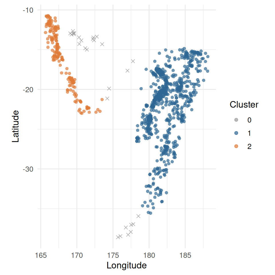
DBSCAN follows the two curved trenches and leaves the scattered earthquakes between and beyond them as noise. Here, unlike in the wellbeing data, there really are dense regions separated by empty space, which is exactly when DBSCAN works best. The function coord_quickmap() gives longitude and latitude the right proportions for a map.
Advanced clustering methods answer some of the weaknesses of k-means, but not the underlying question of whether the groups are real.
eps and minPts; the k-nearest-neighbour distance plot helps choose eps. It works best when clusters are separated by gaps.Gaussian mixture model, mixture component, mixing probability, membership probability, soft assignment, covariance matrix, Bayesian information criterion (BIC), uncertainty, DBSCAN, density, eps, minPts, core point, border point, noise, k-nearest-neighbour distance plot, internal validation, silhouette, adjusted Rand index, external validation, stability.
The playground has these and more, with hints and solutions.
Mclust(profile_data, G = 4) and describe the four profiles. Identify which of the three-cluster profiles has been split, and compare the new solution with Chapter 9’s k-means.eps of 1.2, 1.6, and 2.4, describe how the number of clusters and noise points change, and explain why a small eps labels so many students as noise.adjustedRandIndex() to compare the three-cluster mixture model with hierarchical clustering (Ward’s method, cut into three clusters) from Chapter 9.y) so that a gap separates it from the round group. Describe how each method’s result changes, and explain why DBSCAN now behaves differently.Neural networks are the method behind most of what is called artificial intelligence today: image recognition, speech recognition, translation, and the large language models of Chapter 18. Their reputation leads many researchers to assume that a neural network must predict better than a traditional model on any data. The assumption deserves to be tested rather than accepted, and testing it requires understanding what a neural network is. The answer is less mysterious than the reputation suggests: a neural network is built from units that each perform a logistic regression, and it learns by repeatedly adjusting its weights to reduce its errors.
This chapter builds a neural network from a single “neuron”, shows by hand what training does, fits a network to the dropout data with the same tidymodels workflow as Chapters 11 and 12, and compares it fairly with the simpler models. It ends with deep learning: what it is, when it helps, and where to learn more. In the story, a member of Elaf’s research group asks why she does not simply use AI, since a neural network would surely do better than logistic regression, and her supervisor suggests that she find out, carefully.
mlp()), using weight decay to prevent overfitting.A neuron (or unit) in a neural network does three things. It multiplies each input by a weight, adds up the results together with a constant called the bias, and passes the total through an activation function, which turns it into the neuron’s output.
Take a neuron with two inputs, a student’s stress and support scores, with weights 1.2 and −0.8 and a bias of −4. For a student with stress 4 and support 2, the total is
\[ -4 + 1.2 \times 4 - 0.8 \times 2 = -0.8. \]
The activation function here is the sigmoid (also called the logistic function), which squeezes any number into the range 0 to 1:
\[ \text{sigmoid}(z) = \frac{1}{1 + e^{-z}}. \]
In R:
sigmoid <- function(z) 1 / (1 + exp(-z))
neuron <- function(stress, support) {
sigmoid(-4 + 1.2 * stress - 0.8 * support)
}
neuron(stress = 4, support = 2)[1] 0.3100255neuron(stress = 2, support = 4)[1] 0.008162571The high-stress, low-support student gets an output of 0.31; the low-stress, high-support student, 0.008. If the output is read as the probability of considering dropout, this neuron is exactly a logistic regression (Chapter 8): the bias is the intercept, the weights are the coefficients, and the sigmoid turns the log odds into a probability. Everything a single neuron can do, Chapter 8 has already done.
The power of neural networks comes from connecting many neurons in layers. In the most common design, the multilayer perceptron, the inputs feed into a hidden layer of neurons, each with its own weights; the outputs of the hidden neurons then feed into an output layer, which produces the prediction. Figure 15.1 shows a network with three inputs and three hidden neurons.
flowchart LR I1((Stress)) --> H1((H1)) I1 --> H2((H2)) I1 --> H3((H3)) I2((Support)) --> H1 I2 --> H2 I2 --> H3 I3((Sleep)) --> H1 I3 --> H2 I3 --> H3 H1 --> O((P of<br/>dropout)) H2 --> O H3 --> O
Each hidden neuron learns its own combination of the inputs: one might respond to high stress, another to the combination of low support and short sleep. The output neuron then combines these. Because each neuron applies a curved activation function, the network as a whole can represent curved relationships and interactions that a single logistic regression cannot. With enough hidden neurons, a network can approximate almost any relationship between inputs and output. That flexibility is its strength, and, as you will see, its danger.
The activation function matters. Figure 15.2 shows the two most common: the sigmoid, used in this chapter, and the ReLU (rectified linear unit), which simply replaces negative totals with zero and is the standard choice in deep networks.
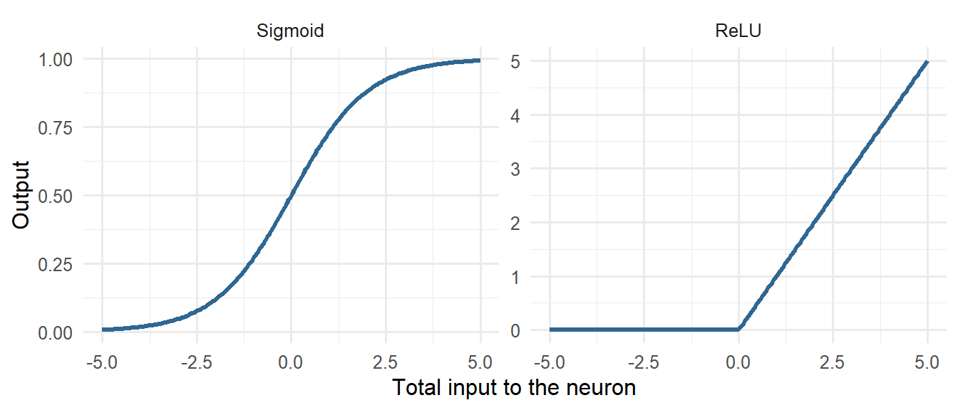
A network starts with small random weights, so its first predictions are useless. Training adjusts the weights step by step to reduce the prediction error on the training data. At each step, an algorithm works out, for every weight, whether a small increase or decrease would reduce the error (the gradient), and moves all the weights a little in the helpful direction. This is gradient descent. One pass through the training data is an epoch, and training usually runs for hundreds of epochs.
The idea is clearest when one step is worked by hand. Take a single neuron, which is a logistic regression, and six students, with their stress measured from the group’s average:
six <- data.frame(stress = c(2.0, 2.5, 3.0, 3.5, 4.0, 4.5) - 3.25,
dropout = c(0, 0, 1, 0, 1, 1))The error to be reduced is the log loss, the measure of fit that logistic regression uses: it is small when the neuron gives high probabilities to the students who did consider dropping out and low probabilities to those who did not. Training starts with both weights at zero, so every student receives a probability of 0.5:
log_loss <- function(b0, b1) {
p <- sigmoid(b0 + b1 * six$stress)
-mean(six$dropout * log(p) + (1 - six$dropout) * log(1 - p))
}
b0 <- 0
b1 <- 0
log_loss(b0, b1)[1] 0.6931472For this neuron, the gradient has a simple form: for each weight, the average of the prediction errors (predicted probability minus the actual outcome), each multiplied by the input that the weight belongs to (1 for the bias):
p <- sigmoid(b0 + b1 * six$stress)
gradient_b0 <- mean(p - six$dropout)
gradient_b1 <- mean((p - six$dropout) * six$stress)
c(gradient_b0, gradient_b1)[1] 0.0000000 -0.2916667The gradient for the stress weight is negative, which means that increasing the weight would reduce the error: the students who considered dropping out have higher stress, and the neuron does not yet know it. One step of gradient descent moves each weight against its gradient, by an amount set by the learning rate:
learning_rate <- 1
b0 <- b0 - learning_rate * gradient_b0
b1 <- b1 - learning_rate * gradient_b1
c(b0 = b0, b1 = b1, loss = log_loss(b0, b1)) b0 b1 loss
0.0000000 0.2916667 0.6157970 After one step, the stress weight has become positive and the loss has fallen from 0.693 to 0.616. Training is nothing more than this step, repeated. The loop below repeats it 2,000 times and records the loss:
b0 <- 0
b1 <- 0
loss_history <- numeric(2000)
for (step in 1:2000) {
p <- sigmoid(b0 + b1 * six$stress)
b0 <- b0 - learning_rate * mean(p - six$dropout)
b1 <- b1 - learning_rate * mean((p - six$dropout) * six$stress)
loss_history[step] <- log_loss(b0, b1)
}
rbind(gradient_descent = c(b0, b1),
glm = coef(glm(dropout ~ stress, data = six, family = binomial))) (Intercept) stress
gradient_descent 6.111907e-17 2.428055
glm -1.790641e-16 2.428055ggplot(data.frame(step = 1:2000, loss = loss_history), aes(x = step, y = loss)) +
geom_line(colour = "#2f6793", linewidth = 1) +
scale_x_log10() +
labs(x = "Training step", y = "Log loss") +
theme_minimal(base_size = 12)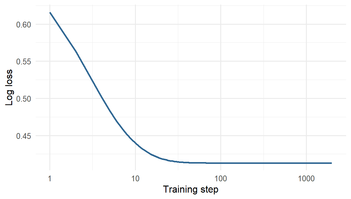
After 2,000 small steps, the weights found by gradient descent are the coefficients that R’s glm() calculates for the same logistic regression. A neural network with thousands of weights is trained in exactly this way. The gradients are harder to write down, and a method called backpropagation calculates them efficiently, but each step still moves every weight a little in the direction that reduces the error.
Two consequences follow. First, because training starts from random weights, two runs can give slightly different networks, so set.seed() matters. Second, a network with many weights can keep reducing its training error long after it has learned the real pattern, by memorising the noise. The usual defence is weight decay: a penalty on large weights, exactly like the ridge penalty of Chapter 13. In tidymodels it is called penalty.
The data, split, recipe, and folds are those of Chapters 11 and 12. Neural networks need normalised inputs, like the penalised regressions of Chapter 13, and the recipe already provides them.
library(tidymodels)
tidymodels_prefer()
scores <- questionnaire |>
mutate(
stress_4 = 6 - stress_4,
stress = rowMeans(pick(stress_1:stress_6), na.rm = TRUE),
burnout = rowMeans(pick(burnout_1:burnout_6), na.rm = TRUE),
support = rowMeans(pick(support_1:support_6), na.rm = TRUE),
satisfaction = rowMeans(pick(satisfaction_1:satisfaction_4), na.rm = TRUE)
) |>
select(student_id, stress, burnout, support, satisfaction)
dropout_data <- students |>
left_join(scores, join_by(student_id)) |>
left_join(semesters |> filter(semester == 1) |> select(-semester), join_by(student_id)) |>
mutate(considering_dropout = factor(considering_dropout, levels = c("Yes", "No"))) |>
select(-student_id, -supervisor_id, -workshop, -workshop_sessions)
set.seed(2026)
dropout_split <- initial_split(dropout_data, prop = 0.75, strata = considering_dropout)
dropout_train <- training(dropout_split)
dropout_test <- testing(dropout_split)
dropout_recipe <- recipe(considering_dropout ~ ., data = dropout_train) |>
step_impute_median(all_numeric_predictors()) |>
step_dummy(all_nominal_predictors()) |>
step_normalize(all_numeric_predictors())
set.seed(2026)
dropout_folds <- vfold_cv(dropout_train, v = 10, strata = considering_dropout)In tidymodels, a multilayer perceptron is mlp(). Its main arguments are hidden_units (the number of neurons in the hidden layer), penalty (the weight decay), and epochs. The nnet engine, which comes with R, fits networks with one hidden layer; MaxNWts raises its limit on the number of weights.
A network with 20 hidden neurons and no weight decay comes first, as a warning:
big_net <- mlp(hidden_units = 20, penalty = 0, epochs = 1000) |>
set_engine("nnet", MaxNWts = 5000) |>
set_mode("classification")
set.seed(2026)
big_fit <- fit(workflow(dropout_recipe, big_net), data = dropout_train)
augment(big_fit, new_data = dropout_train) |> roc_auc(considering_dropout, .pred_Yes)# A tibble: 1 × 3
.metric .estimator .estimate
<chr> <chr> <dbl>
1 roc_auc binary 1augment(big_fit, new_data = dropout_test) |> roc_auc(considering_dropout, .pred_Yes)# A tibble: 1 × 3
.metric .estimator .estimate
<chr> <chr> <dbl>
1 roc_auc binary 0.641A perfect AUC on the training data, and 0.64 on new students: the same overfitting as the one-nearest-neighbour model of Chapter 11. The network has 521 weights and only 449 training students, so it has more than enough freedom to memorise every one of them.
The number of hidden neurons and the weight decay are hyperparameters, tuned with cross-validation as in Chapters 11 to 13. Weight decay is tried on a logarithmic scale from 0.01 to about 30:
net_spec <- mlp(hidden_units = tune(), penalty = tune(), epochs = 500) |>
set_engine("nnet", MaxNWts = 5000) |>
set_mode("classification")
net_wf <- workflow(dropout_recipe, net_spec)
net_grid <- expand_grid(hidden_units = c(1, 3, 5, 10, 20),
penalty = 10^seq(-2, 1.5, by = 0.5))
set.seed(2026)
net_tuning <- tune_grid(net_wf, resamples = dropout_folds, grid = net_grid,
metrics = metric_set(roc_auc))autoplot(net_tuning) + theme_minimal(base_size = 12)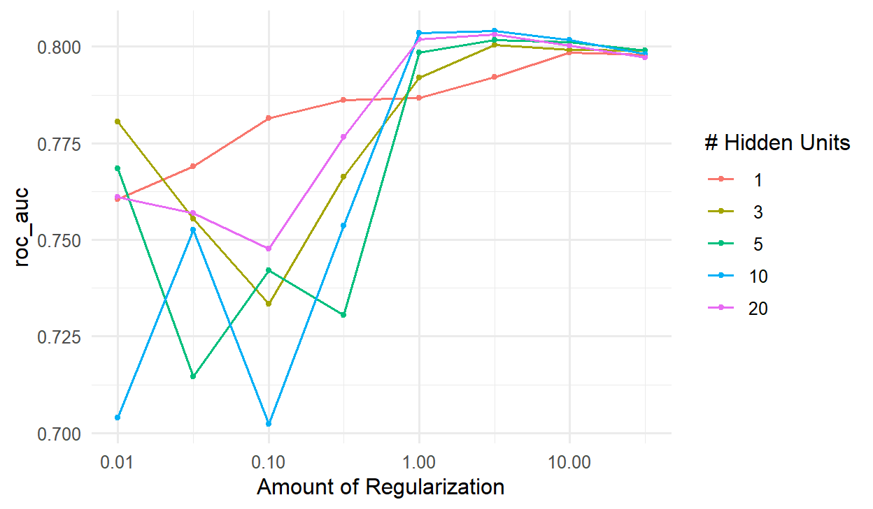
Figure 15.4 tells a clear story. With little weight decay, the networks overfit, and the bigger networks overfit most. With enough weight decay, networks of every size do about equally well. The penalty, not the size, is what matters most here.
show_best(net_tuning, metric = "roc_auc", n = 3)# A tibble: 3 × 8
hidden_units penalty .metric .estimator mean n std_err .config
<dbl> <dbl> <chr> <chr> <dbl> <int> <dbl> <chr>
1 10 3.16 roc_auc binary 0.804 10 0.0300 pre0_mod30_post0
2 10 1 roc_auc binary 0.804 10 0.0298 pre0_mod29_post0
3 20 3.16 roc_auc binary 0.803 10 0.0299 pre0_mod38_post0best_net <- select_best(net_tuning, metric = "roc_auc")The best network has a cross-validated AUC of 0.804. For comparison, logistic regression on the same folds:
set.seed(2026)
logistic_cv <- fit_resamples(workflow(dropout_recipe, logistic_reg()),
resamples = dropout_folds, metrics = metric_set(roc_auc))
collect_metrics(logistic_cv)# A tibble: 1 × 6
.metric .estimator mean n std_err .config
<chr> <chr> <dbl> <int> <dbl> <chr>
1 roc_auc binary 0.804 10 0.0303 pre0_mod0_post0The two are practically identical: 0.804 for the network and 0.804 for logistic regression. The final test on the held-out students confirms it:
set.seed(2026)
final_net <- net_wf |>
finalize_workflow(best_net) |>
last_fit(dropout_split, metrics = metric_set(roc_auc, accuracy))
collect_metrics(final_net)# A tibble: 2 × 4
.metric .estimator .estimate .config
<chr> <chr> <dbl> <chr>
1 accuracy binary 0.841 pre0_mod0_post0
2 roc_auc binary 0.853 pre0_mod0_post0The network reaches a test AUC of 0.85, against 0.84 for logistic regression on the same test students (Chapter 11). With only 151 test students, of whom 23 considered dropping out, a difference of this size is well within chance. The answer to the research group is therefore that a neural network does not predict dropout better. Chapters 12 and 13 found the same for random forests, support vector machines, and boosting. The wellbeing data has a smooth pattern, which logistic regression captures fully, leaving nothing extra for a more flexible model to find.
And the neural network has real costs. Even the tuned network, with 10 hidden neurons, has 261 weights, which cannot be interpreted: there is no equivalent of an odds ratio saying how much each predictor matters. Without strong weight decay, its results depend on the random starting weights. And it needed careful tuning to avoid overfitting. Logistic regression is kept, and the thesis reports that a neural network was tried and did not improve on it, which is itself a useful finding.
Neural networks are not magic, but they are not overrated either; they are powerful in particular situations. They excel with unstructured data, such as images, sound, and text, where the raw inputs (pixels, sound samples, words) mean little on their own and the useful features must be learned from them; here they outperform every other method by a wide margin. They need very large datasets, with many thousands or millions of cases, to fit models with thousands of weights reliably. And they can capture complex, non-linear relationships that simpler models miss, as the “In your field” box below shows.
For typical research data, a table with a few hundred cases and a few dozen variables, well-tuned regression, random forests, and boosting usually do as well or better, and are easier to explain. That is the situation of most theses.
Deep learning means neural networks with many hidden layers, often dozens or hundreds, and millions or billions of weights. Each layer learns features built on the features of the layer before: in an image network, the first layers detect edges, later layers shapes, and the last layers whole objects. Special architectures suit special data: convolutional networks for images, and transformers for text. The large language models behind ChatGPT and Claude (Chapter 18) are transformer networks with billions of weights, trained on enormous amounts of text.
Deep learning needs more data, more computing power (often a graphics card), and more technical setup than anything else in this book. In R, there are two main tools. The keras3 package is an interface to the Keras library, which runs on Python’s TensorFlow, JAX, or PyTorch; it is the most widely documented route, but it requires Python to be installed alongside R. The torch package runs the same engine as Python’s PyTorch without needing Python, and the brulee package lets tidymodels fit deep networks through torch, with the same mlp() interface used in this chapter.
For most researchers, the practical way to use deep learning is not to train a network from scratch, but to use a pretrained model, already trained by someone else on huge datasets, for a task such as transcribing interviews, recognising objects in images, or classifying text. Chapter 18 does exactly this with a language model, to code the study’s open-ended survey answers.
The reputation of neural networks produces several misconceptions that a thesis should avoid.
mlp() with the nnet engine fits a network with one hidden layer; tune hidden_units and penalty with cross-validation.Neural network, neuron (unit), weight, bias, activation function, sigmoid, ReLU, multilayer perceptron, input layer, hidden layer, output layer, training, log loss, gradient, gradient descent, learning rate, epoch, weight decay, deep learning, convolutional network, transformer, pretrained model.
The playground has these and more, with hints and solutions.
hidden_units = 1 and a weight decay of 1, compare its cross-validated AUC with logistic regression, and explain why they might be so similar.Much of the data that organisations keep is recorded over time: patients admitted each day, products sold each month, rainfall each week. Such a sequence of measurements taken at regular intervals is a time series, and it calls for a different way of thinking from the surveys of the previous chapters. The observations are not independent: this week’s value is related to last week’s, and the order of the observations carries information. The patterns are also of a particular kind. A series usually combines a slow trend, a seasonal pattern that repeats over a fixed period, and irregular noise, and understanding a series largely means separating these parts. Finally, the future of a series can never be known exactly, so a forecast is honestly a range of plausible values, not a single number.
This chapter develops these ideas and the methods built on them, using the fable family of packages. The example comes from outside the thesis. The doctors at the university counselling service have heard about Elaf’s wellbeing study and ask her to analyse their records: five years of weekly visit counts, with the service overwhelmed before exams and quiet in the summer, and staffing planned by guesswork. They want to know how many visits to expect next year, week by week. This is an internal analysis, done for the service rather than for publication, and a common situation for anyone who knows some data analysis: being asked to analyse someone else’s data.
Most of this book’s methods assume that observations are independent: one student’s answers tell you nothing about another’s. In a time series the opposite is true. The number of visits this week is closely related to the number last week, and the order of the observations is essential. The methods of this chapter are built around that dependence.
Two weeks of daily visits to a small clinic, starting on a Monday, show how a time series is stored:
library(dplyr)
library(ggplot2)
library(tsibble)
library(fable)
library(feasts)
clinic <- tsibble(
day = 1:14,
visits = c(12, 10, 9, 11, 7, 3, 2, 14, 11, 10, 12, 8, 4, 2),
index = day
)
clinic# A tsibble: 14 x 2 [1]
day visits
<int> <dbl>
1 1 12
2 2 10
3 3 9
4 4 11
5 5 7
6 6 3
7 7 2
8 8 14
9 9 11
10 10 10
11 11 12
12 12 8
13 13 4
14 14 2A tsibble (time series tibble) is a data frame that knows which column is time, its index. Here the index is the day number; the output header shows that the observations are one unit apart ([1]). tsibbles check that each time appears only once, and fable’s functions use the index to keep everything in order. There is a clear weekly pattern: busy at the start of the week, quiet at the weekend.
A time series is easiest to understand as a sum of parts. The code below builds an artificial weekly series for three years from three ingredients: a trend that rises slowly, a seasonal pattern that repeats every 52 weeks, and random noise. Figure 16.1 shows each part and their sum.
set.seed(4)
week <- 1:156
parts <- tibble(
week = week,
trend = 30 + 0.05 * week,
seasonal = 12 * sin(2 * pi * week / 52),
noise = rnorm(156, sd = 3)
) |>
mutate(series = trend + seasonal + noise)
parts |>
tidyr::pivot_longer(-week, names_to = "part", values_to = "value") |>
mutate(part = factor(part, levels = c("trend", "seasonal", "noise", "series"))) |>
ggplot(aes(x = week, y = value)) +
geom_line(colour = "#2f6793") +
facet_wrap(~ part, ncol = 1, scales = "free_y") +
labs(x = "Week", y = NULL) +
theme_minimal(base_size = 11)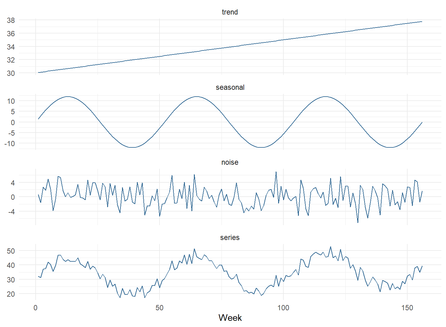
In a real series, only the bottom panel is observed; the parts must be recovered from it. The trend says where the series is heading, the seasonal pattern says what happens at each point in the year, and the noise is what no pattern explains. Forecasting extends the trend and the seasonal pattern into the future. The noise cannot be forecast, and it is the main reason every forecast comes with a range. The decomposition later in this chapter recovers these parts from the counselling data.
The counselling records are in counselling_visits: the date of the Monday of each week, and the number of visits that week.
counselling_visits |> head() week_start visits
1 2020-09-07 32
2 2020-09-14 28
3 2020-09-21 24
4 2020-09-28 37
5 2020-10-05 32
6 2020-10-12 39range(counselling_visits$week_start)[1] "2020-09-07" "2025-08-25"The data covers five academic years, from September 2020 to August 2025, 260 weeks in all. The function yearweek() turns each date into a week, which becomes the index:
visits <- counselling_visits |>
mutate(week = yearweek(week_start)) |>
as_tsibble(index = week)
visits# A tsibble: 260 x 3 [1W]
week_start visits week
<date> <int> <week>
1 2020-09-07 32 2020 W37
2 2020-09-14 28 2020 W38
3 2020-09-21 24 2020 W39
4 2020-09-28 37 2020 W40
5 2020-10-05 32 2020 W41
6 2020-10-12 39 2020 W42
7 2020-10-19 31 2020 W43
8 2020-10-26 36 2020 W44
9 2020-11-02 37 2020 W45
10 2020-11-09 34 2020 W46
# ℹ 250 more rowsThe header now reads [1W]: one week between observations. The first step with any time series is to plot it, and autoplot() from the fable family draws a time plot:
autoplot(visits, visits) +
labs(x = NULL, y = "Visits per week") +
theme_minimal(base_size = 12)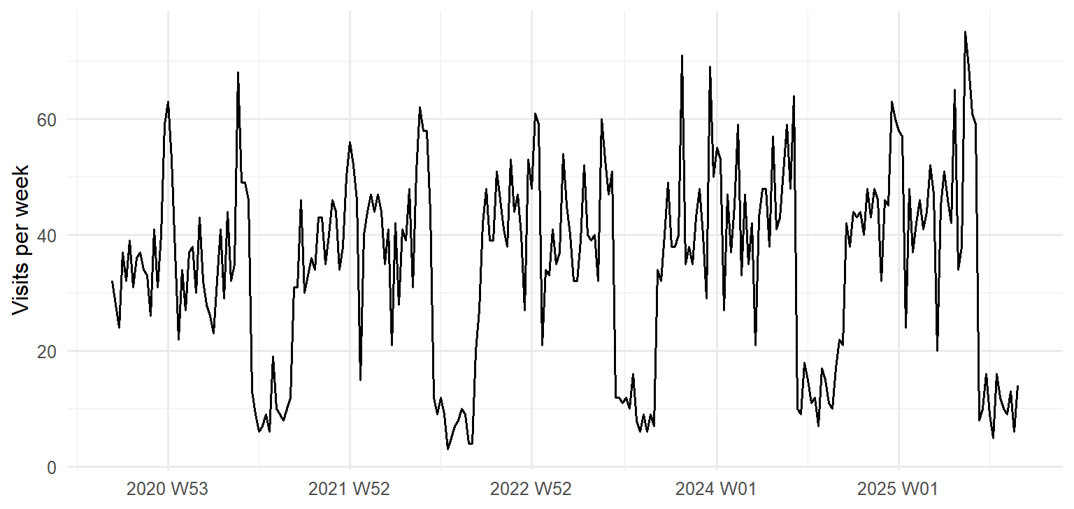
Figure 16.2 shows the parts of a pattern described above, and one feature the doctors did not mention. There is a seasonal pattern that repeats every academic year: peaks before and during the two exam periods, dips during the breaks, and very few visits in the summer, when the service is reduced. There is a gentle upward trend, each year a little busier than the last, and there is noise, week-to-week variation that follows no pattern. Finally, there is one unusual week, in the autumn of 2023, far busier than the weeks around it.
A seasonal plot puts the years on top of each other, so the seasonal pattern and the differences between years are easier to see. The academic year starts in September, so the weeks are numbered from the start of each academic year:
visits |>
mutate(academic_year = paste0(20 + (row_number() - 1) %/% 52, "/", 21 + (row_number() - 1) %/% 52),
week_of_year = (row_number() - 1) %% 52 + 1) |>
ggplot(aes(x = week_of_year, y = visits, colour = academic_year)) +
geom_line() +
scale_colour_viridis_d(end = 0.9) +
labs(x = "Week of the academic year", y = "Visits per week", colour = "Academic year") +
theme_minimal(base_size = 12)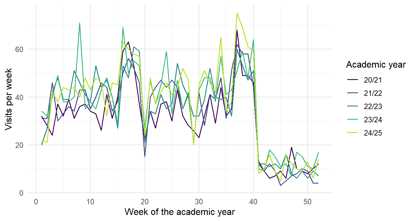
Every year has the same shape, and later years lie slightly above earlier ones. The period of the seasonal pattern is 52 weeks.
Dependence over time can be seen directly by plotting each week’s visits against the visits one week earlier, as in Figure 16.4.
visits |>
mutate(last_week = lag(visits)) |>
ggplot(aes(x = last_week, y = visits)) +
geom_point(alpha = 0.6, colour = "#2f6793") +
labs(x = "Visits in the previous week", y = "Visits this week") +
theme_minimal(base_size = 12)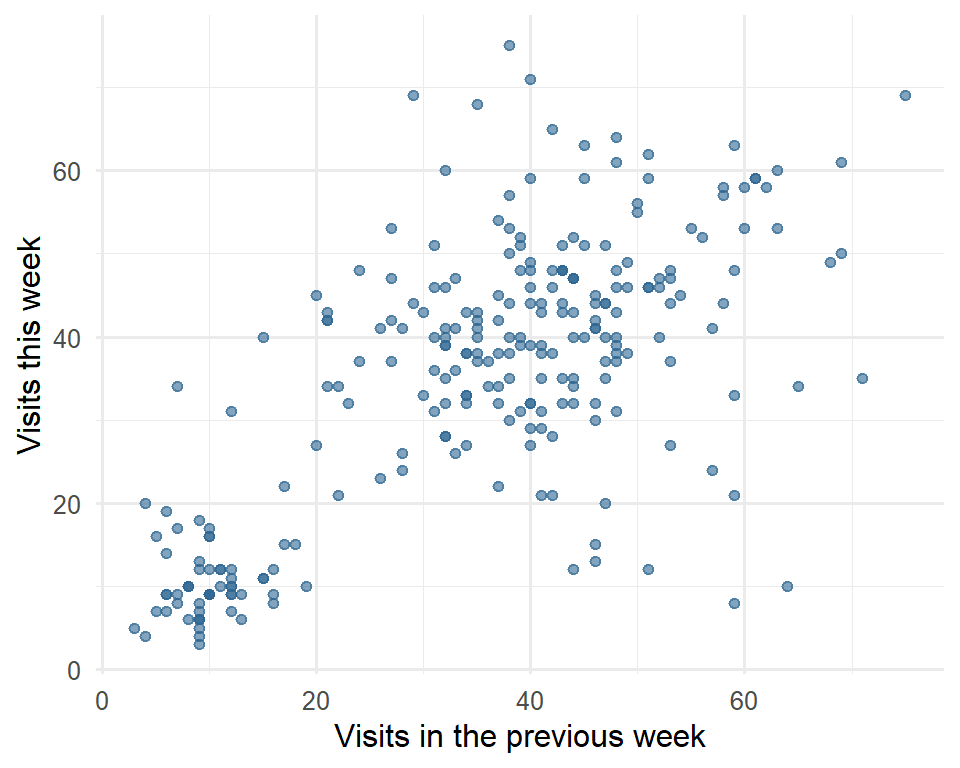
The points rise from left to right: knowing last week’s visits says a good deal about this week’s. The autocorrelation at lag \(k\) puts a number on this relationship: it is the correlation between the series and itself \(k\) steps earlier, between each week and the week before (lag 1), two weeks before (lag 2), and so on. The function ACF() calculates it:
visits_acf <- visits |> ACF(visits, lag_max = 60)
visits_acf |> slice(c(1, 2, 26, 52))# A tsibble: 4 x 2 [1W]
lag acf
<cf_lag> <dbl>
1 1W 0.690
2 2W 0.572
3 26W -0.244
4 52W 0.684The autocorrelation is 0.69 at lag 1, as the scatter plot suggested, and 0.68 at lag 52: a week tends to be like the same week a year earlier. At lag 26 it is negative: half a year apart, a busy term week is often matched with a quiet summer week. Figure 16.5 shows all the lags. Strong autocorrelation at the seasonal lag is the signature of seasonality; if a series had no autocorrelation at all, there would be nothing to forecast beyond its average.
autoplot(visits_acf) + theme_minimal(base_size = 12)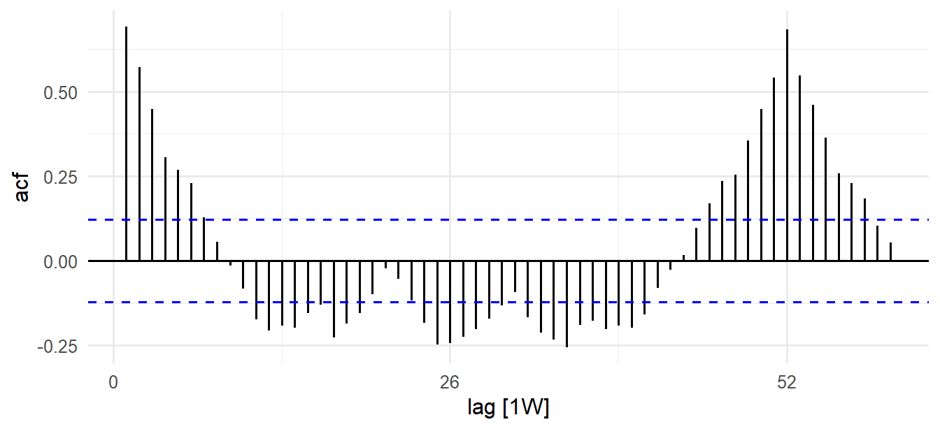
Decomposition recovers the parts of a pattern from an observed series: a smooth trend, a repeating seasonal component, and the remainder, what is left over, which corresponds to the noise of Figure 16.1. STL (seasonal and trend decomposition using loess) is a flexible, widely used method. season(period = 52) tells it the length of the seasonal pattern, and robust = TRUE stops unusual weeks from distorting the trend and season:
visits_stl <- visits |>
model(STL(visits ~ season(period = 52), robust = TRUE)) |>
components()autoplot(visits_stl) + theme_minimal(base_size = 11)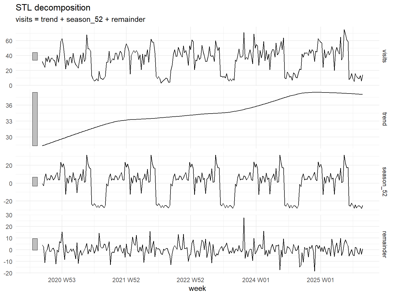
In Figure 16.6 the series is the sum of the three components below it, just as in the artificial example. The trend rises from about 28 to about 38 visits a week, levelling off in the last year; the seasonal component repeats the academic year; and the remainder is mostly small noise. The largest remainder is the unusual week:
visits_stl |>
as_tibble() |>
slice_max(abs(remainder), n = 3) |>
select(week, visits, trend, season_52, remainder)# A tibble: 3 × 5
week visits trend season_52 remainder
<week> <int> <dbl> <dbl> <dbl>
1 2023 W43 71 35.2 8.08 27.7
2 2024 W48 32 38.4 12.1 -18.5
3 2024 W20 51 37.1 31.3 -17.5In the week of 23 October 2023, there were 71 visits, about 28 more than trend and season would predict. When asked, the doctors remember at once: it was the university’s mental health awareness week, with posters everywhere encouraging students to seek help. The remainder is where such events show up. It is a real week, not an error, so it is kept, and the robust decomposition makes sure it does not distort the forecasts.
Notice also that the seasonal swings grow slightly as the trend rises: the peaks get higher and the summer lows stay low. When the seasonal pattern grows in proportion to the level of the series, it is usual to model the logarithm of the series, on which the swings become constant. fable handles this automatically: write log(visits) in the model, and the forecasts are transformed back to visits.
Every forecasting method should be compared with simple benchmark methods, just as every predictive model in Chapters 11 to 13 was compared with a baseline. The three most common are the mean method, which forecasts the average of all past observations; the naive method, which forecasts the last observed value; and the seasonal naive method, which forecasts the value from the same season in the last cycle (the same day last week, or the same week last year). For the clinic example, with its weekly cycle of 7 days, they give:
clinic_fc <- clinic |>
model(
mean = MEAN(visits),
naive = NAIVE(visits),
snaive = SNAIVE(visits ~ lag(7))
) |>
forecast(h = 7)
clinic_fc |>
as_tibble() |>
select(.model, day, .mean) |>
tidyr::pivot_wider(names_from = .model, values_from = .mean)# A tibble: 7 × 4
day mean naive snaive
<dbl> <dbl> <dbl> <dbl>
1 15 8.21 2 14
2 16 8.21 2 11
3 17 8.21 2 10
4 18 8.21 2 12
5 19 8.21 2 8
6 20 8.21 2 4
7 21 8.21 2 2The function model() fits several models at once, each named; forecast(h = 7) forecasts 7 steps ahead; and .mean holds the point forecasts. The mean method forecasts 8.2 visits every day; the naive method repeats the last value, a quiet Sunday, for the whole week; and the seasonal naive method repeats last week’s pattern, which for this series is clearly the most sensible.
Two families of models go beyond the benchmarks. Exponential smoothing (ETS) forecasts with weighted averages of past observations, with weights that decrease the further back the observations are, so that recent weeks count most. ETS models can track a changing level, a trend, and a seasonal pattern, each estimated from the data; the name stands for the three components it models, error, trend, and season. ARIMA models describe how each observation depends on earlier observations and on earlier random shocks, and use the autocorrelation of the series to forecast it.
The functions ETS() and ARIMA() in fable choose the details of each model automatically, by a criterion like the BIC of Chapter 14. Both work best with short seasonal periods, such as 4 quarters, 7 days, or 12 months. A 52-week season is long, so two strategies are common for weekly data. The first is to decompose first: remove the seasonal pattern with STL, forecast the seasonally adjusted series (trend and remainder) with ETS, and add the seasonal pattern back, all of which decomposition_model() does in one step. The second uses Fourier terms: the seasonal pattern is described with a few smooth waves (sines and cosines) of different lengths, used as predictors in an ARIMA model; fourier(period = 52, K = 6) uses six pairs of waves.
As in machine learning, forecasts must be judged on data the model has not seen. For time series, the test data must come after the training data, because a forecast can only use the past. The models are trained on the first four academic years and tested on the fifth:
visits_train <- visits |> filter(week_start < as.Date("2024-09-01"))
visits_test <- visits |> filter(week_start >= as.Date("2024-09-01"))
visits_fit <- visits_train |>
model(
mean = MEAN(visits),
naive = NAIVE(visits),
snaive = SNAIVE(visits ~ lag(52)),
stl_ets = decomposition_model(
STL(log(visits) ~ season(period = 52), robust = TRUE),
ETS(season_adjust ~ season("N"))
),
fourier = ARIMA(log(visits) ~ fourier(period = 52, K = 6) + PDQ(0, 0, 0))
)In the STL model, ETS(season_adjust ~ season("N")) forecasts the seasonally adjusted series with no seasonal component of its own (“N” for none), because the seasonal pattern is added back from the decomposition. In the Fourier model, PDQ(0, 0, 0) tells ARIMA not to model the season itself, because the Fourier terms do that.
Each model forecasts the 52 weeks of the test year, and accuracy() compares the forecasts with what actually happened, using the RMSE and MAE of Chapter 13:
visits_fc <- visits_fit |> forecast(h = 52)
visits_fc |>
accuracy(visits) |>
select(.model, RMSE, MAE) |>
arrange(RMSE)# A tibble: 5 × 3
.model RMSE MAE
<chr> <dbl> <dbl>
1 stl_ets 7.40 5.57
2 snaive 9.16 6.96
3 fourier 10.3 7.81
4 mean 18.7 16.3
5 naive 27.5 23.5 The STL and ETS model is best: its forecasts are off by 5.6 visits a week on average (MAE), against 7.0 for the seasonal naive benchmark, which simply repeats the previous year. The mean and naive methods, which ignore the seasonal pattern, are far worse. The Fourier model does worse than the seasonal naive benchmark: the counselling service’s pattern has sharp steps (the summer drop happens from one week to the next), and smooth waves struggle to follow them. Figure 16.7 compares the two best models with the actual visits.
visits_fc |>
filter(.model %in% c("stl_ets", "snaive")) |>
autoplot(visits_test, level = NULL) +
labs(x = NULL, y = "Visits per week", colour = "Model") +
theme_minimal(base_size = 12)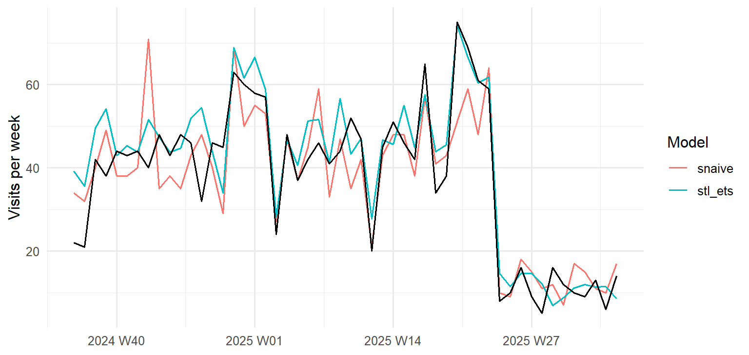
The seasonal naive forecast copies last year’s noise along with its pattern: it even repeats the awareness week of October 2023 as a spike in October 2024. The STL and ETS model smooths the noise away and adds the trend, so its forecasts are both smoother and closer.
With the model chosen, it is refitted on all five years, so the forecasts use the most recent information, and the next 52 weeks are forecast:
final_fit <- visits |>
model(stl_ets = decomposition_model(
STL(log(visits) ~ season(period = 52), robust = TRUE),
ETS(season_adjust ~ season("N"))
))
next_year <- final_fit |> forecast(h = 52)next_year |>
autoplot(visits |> filter(week_start >= as.Date("2023-09-01"))) +
labs(x = NULL, y = "Visits per week") +
theme_minimal(base_size = 12)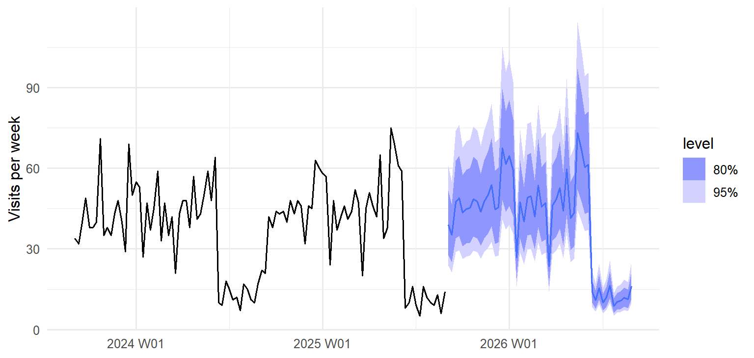
A forecast is never a single number. The shaded bands in Figure 16.8 are prediction intervals: the ranges within which the actual visits are expected to fall with 80% and 95% probability. The function hilo() shows them as numbers:
next_year |>
hilo(95) |>
select(week, .mean, `95%`) |>
head(4)# A tsibble: 4 x 3 [1W]
week .mean `95%`
<week> <dbl> <hilo>
1 2025 W36 39.0 [23.60596, 60.76414]95
2 2025 W37 35.2 [21.32399, 54.89014]95
3 2025 W38 47.5 [28.74758, 73.99921]95
4 2025 W39 48.8 [29.58119, 76.14503]95In the first week of the new year, about 39 visits are expected, but anything from about 24 to 61 would not be surprising. The doctors also asked for the year as a whole. Adding up the weekly forecasts gives the expected total, but not its uncertainty, because weeks do not vary independently. The function generate() solves this by simulation: it produces 1,000 possible futures from the model, and the totals of those futures show the range of likely totals:
set.seed(2026)
futures <- final_fit |> generate(h = 52, times = 1000)
yearly_totals <- futures |>
as_tibble() |>
summarise(total = sum(.sim), .by = .rep)
quantile(yearly_totals$total, c(0.025, 0.5, 0.975)) |> round() 2.5% 50% 97.5%
1952 2111 2286 The report to the service therefore says: about 2,111 visits are expected in 2025/26 (95% interval 1,952 to 2,286), compared with 1,954 in 2024/25; the busiest weeks will again be just before and during the two exam periods, when they should plan the most staff; and an awareness campaign can raise demand sharply for a week, so extra capacity should be planned for any such event.
Every forecast in this chapter assumes that the patterns of the last five years continue. A change the data cannot know about, such as a new online booking system, a change in the exam calendar, or a crisis like the COVID-19 pandemic, can make any forecast wrong. Report forecasts with their intervals, say what they assume, and update them as new data arrives. (You may also meet Prophet, a forecasting tool from Meta that was popular for business data; it is no longer actively developed, and fable’s models are a well-supported alternative.)
Time series have their own traps, most of them versions of forgetting that time has an order.
generate() gives intervals for totals.Time series, tsibble, index, time plot, trend, seasonality, seasonal period, seasonal plot, autocorrelation, lag, decomposition, STL, remainder, seasonally adjusted series, benchmark forecast, mean method, naive method, seasonal naive method, exponential smoothing (ETS), ARIMA, Fourier terms, forecast horizon, prediction interval, simulation.
The playground has these and more, with hints and solutions.
clinic after adding a steady increase of one visit a day.season_adjust in visits_stl), and describe what it shows that the original series hides.K = 2 and K = 12, and explain how and why the test accuracy changes.generate() to estimate how many visits to expect in the four weeks before the first exam period of 2025/26, with a 95% interval.A research finding is credible only if it can be checked. A reader who doubts a result should be able to see exactly how it was obtained, and a second researcher who repeats the analysis should arrive at the same numbers. When that is not possible, the reader has to take the result on trust, and science is built on not having to. The failures that make results uncheckable are rarely dramatic. A table is copied into a draft before the data is corrected, a decision made while exploring is forgotten, a package changes its behaviour between versions, and nobody can say afterwards which of several analyses produced the published number. Reproducibility is therefore a matter of research integrity, not of technical tidiness.
The problem is easy to meet in a thesis. Three weeks before the deadline, Elaf’s supervisor spots that twelve students appear twice in an early version of the survey export. They were removed in Chapter 3, but some tables were copied into the thesis draft before that, and now every table, figure, and number copied by hand from R into Word must be checked and replaced, one at a time, with the risk of missing one. This chapter shows a way of working in which that problem cannot happen. In a reproducible workflow, the text, the code, and the results live together, and the whole report is rebuilt from the raw data with one command, so every number is always up to date. The chapter introduces Quarto for writing such documents, from a single page to a thesis chapter; renv for keeping the same package versions; Shiny for turning an analysis into an interactive dashboard; and the practices of open science that make research checkable by others. An optional section introduces git for keeping the history of a project.
An analysis is reproducible if someone else, or you in a year’s time, can take the same data and code and get exactly the same results. It is replicable if a new study, with new data, reaches the same conclusions. Reproducibility is the minimum standard: if the original results cannot even be recomputed, there is little point asking whether they replicate (Peng 2011).
Most irreproducibility is not fraud but everyday friction: a table copied before the data was corrected, a spreadsheet cell edited by hand, a result produced by clicking through menus that nobody wrote down, a package that changed its default between versions. The previous chapters have already built good habits against these. Every step is written as code, in scripts, so it can be rerun (Chapter 1). Each analysis lives in an RStudio Project with relative paths, so it runs on any computer (Chapter 1). The raw data is never edited by hand, and every cleaning decision is made and recorded in code (Chapter 3). Random steps use set.seed(), so they give the same answer every time (Chapter 7).
This chapter adds the last links: putting the results into the report automatically, fixing the software versions, and sharing everything responsibly. Good practices do not need to be perfect to be useful; even a few of them make research far easier to check (Wilson et al. 2017).
Quarto is a publishing system for documents that mix text and code. A Quarto document is a plain text file with the extension .qmd. When it is rendered, the code is run, and its results (numbers, tables, figures) are placed into the finished document, which can be a web page, a Word document, a PDF, a slide show, or a whole book. This book is written in Quarto: every number, table, and figure in it was produced by the code shown next to it.
Before Quarto, the same job was done by R Markdown (.Rmd files), and you will meet it in many older projects, templates, and journal guides. The two are very similar: the text, code chunks, and inline code of this chapter work almost unchanged in R Markdown, where documents are rendered with the Knit button or rmarkdown::render(). Quarto is its successor, from the same developers, and works with Python and other languages as well as R. For new work, use Quarto.
A complete Quarto document can be very short:
---
title: "Three friends' sleep"
author: "Elaf"
format: html
---
My three friends slept `r mean(sleep)` hours on average last night.
```{r}
sleep <- c(6.5, 7, 5.5)
mean(sleep)
```It has the three parts of every Quarto document. The YAML header, between the two --- lines, holds settings: the title, the author, and the output format. The text is written in Markdown, a simple way of marking formatting: **bold**, *italic*, # Heading, and - for a bullet point. The code chunks, between ```{r} and ```, are run when the document is rendered, and their code and output appear in the document.
The text also contains inline code, r mean(sleep): R code inside a sentence, written between backticks and starting with the letter r and a space. When the document is rendered, the inline code is replaced by its result, so the sentence reads “My three friends slept 6.3333333 hours on average last night.” (Rounding it, with round(mean(sleep), 1), would be better.) If a friend’s number changes, the sentence changes with it. Inline code is the cure for the problem at the start of the chapter: numbers in the text are never typed by hand.
In RStudio, create a Quarto document with File > New File > Quarto Document, and render it with the Render button. RStudio also offers a visual editor, which shows the formatting as in a word processor while writing the same .qmd file underneath.
Figure 17.1 shows the steps. The knitr package runs the R code and writes a Markdown file with the results in place; Pandoc, a universal document converter, then turns the Markdown into the requested format.
flowchart TB A[report.qmd<br/>text + code] --> B[knitr runs<br/>the R code] B --> C[report.md<br/>text + results] C --> D[Pandoc<br/>converts] D --> E[HTML] D --> F[Word] D --> G[PDF]
Because the code is run from the beginning every time, a rendered document is a test of reproducibility in itself: if the code depends on something that is not in the document or the project, such as an object created by hand in the Console, rendering fails.
The descriptive results chapter of the thesis, rewritten as a Quarto document, begins like this:
---
title: "Chapter 4: Results"
author: "Elaf"
format: docx
bibliography: references.bib
execute:
echo: false
---
```{r}
#| label: setup
#| message: false
library(dplyr)
library(ggplot2)
library(data2thesis)
```
The sample included `r nrow(students)` graduate students from
`r n_distinct(students$faculty)` faculties. Their average wellbeing in the
first semester was `r round(mean(semesters$wellbeing[semesters$semester == 1], na.rm = TRUE), 1)`
on the wellbeing index (0 to 100). @tbl-faculty shows wellbeing by faculty.
```{r}
#| label: tbl-faculty
#| tbl-cap: "Wellbeing in the first semester, by faculty."
semesters |>
filter(semester == 1) |>
left_join(students, join_by(student_id)) |>
summarise(Students = n(),
Mean = mean(wellbeing, na.rm = TRUE),
SD = sd(wellbeing, na.rm = TRUE),
.by = faculty) |>
arrange(faculty) |>
knitr::kable(digits = 1, col.names = c("Faculty", "Students", "Mean", "SD"))
```
Wellbeing declined over the programme (@fig-wellbeing), as found in
earlier studies [@author2020].Several new features appear. In the header, format: docx produces a Word document, the format most supervisors want for comments, and bibliography: names a file of references. The setting execute: echo: false hides the code in the finished document, so that a thesis shows only the results; the code is still in the .qmd file for anyone who wants to check it.
In the body, chunk options, the lines starting with #|, control each chunk: label names it, message: false hides package messages, and tbl-cap or fig-cap gives a caption. A chunk labelled tbl-... or fig-... becomes a numbered table or figure, and @tbl-faculty in the text becomes a cross-reference, “Table 1”, with the number filled in automatically. The function knitr::kable() turns a data frame into a formatted table. Finally, [@author2020] is a citation: Quarto looks up the key in the bibliography file, formats the citation, and adds the reference list at the end.
When the document is rendered, the first paragraph becomes:
The sample included 600 graduate students from 5 faculties. Their average wellbeing in the first semester was 60.5 on the wellbeing index (0 to 100). Table 1 shows wellbeing by faculty.
and the table chunk produces Table 17.1:
| Faculty | Students | Mean | SD |
|---|---|---|---|
| Education | 148 | 61.9 | 13.2 |
| Health Sciences | 154 | 59.0 | 11.6 |
| Humanities | 95 | 61.7 | 11.7 |
| Natural Sciences | 87 | 61.3 | 10.5 |
| Social Sciences | 116 | 58.9 | 12.1 |
If the data changes, the document is rendered again, and every number, table, and figure is updated. The supervisor’s problem from the start of the chapter now takes one click to fix.
The bibliography file uses the BibTeX format, which almost every reference manager (Zotero, Mendeley, EndNote) can export, and Google Scholar can provide for any paper. One entry looks like this:
@book{kuhn2022,
author = {Kuhn, Max and Silge, Julia},
title = {Tidy Modeling with R},
publisher = {O'Reilly Media},
year = {2022}
}The key, kuhn2022, is what goes after the @ in the text. A csl: line in the YAML header chooses the citation style (APA, Vancouver, Harvard, or any of thousands of journal styles from the Citation Style Language collection), so switching styles never means retyping references. With Zotero, RStudio’s visual editor can insert citations directly from your library.
Equations are written in LaTeX notation between dollar signs: $\bar{x} = \frac{1}{n}\sum x_i$ inside a sentence gives \(\bar{x} = \frac{1}{n}\sum x_i\), and double dollar signs set an equation on its own line:
$$
\text{logit}(p) = \beta_0 + \beta_1 \times \text{stress} + \beta_2 \times \text{support}
$$\[ \text{logit}(p) = \beta_0 + \beta_1 \times \text{stress} + \beta_2 \times \text{support} \]
The same notation works in HTML, Word, and PDF output. The equations in this book are all written this way.
Changing one line of the YAML header changes the output:
| Format | YAML | Notes |
|---|---|---|
| Web page | format: html |
Interactive; good for sharing results online |
| Word | format: docx |
For comments from supervisors; reference-doc: template.docx applies your university’s styles |
format: pdf |
Needs a LaTeX installation: run quarto install tinytex once in the Terminal |
|
| Slides | format: revealjs |
For presentations |
Several formats can be listed at once, and one render then produces all of them. Many journals and universities provide Quarto templates, installed as extensions, that format a document to their requirements. A whole thesis can be written as a Quarto book (project: type: book), with one .qmd file per chapter, exactly like this book.
The dean of each faculty would like a one-page summary for their own faculty. Rather than five reports, one report with a parameter serves them all:
---
title: "Wellbeing report"
format: html
params:
faculty: "Education"
---
```{r}
faculty_semesters <- semesters |>
left_join(students, join_by(student_id)) |>
filter(faculty == params$faculty)
```
This report describes the `r n_distinct(faculty_semesters$student_id)` students
of the Faculty of `r params$faculty`.The value params$faculty is used in the code like any other value. Rendering from the Terminal with a different value produces each faculty’s version:
quarto render faculty-report.qmd -P faculty:"Health Sciences"Packages change. A function’s default may change between versions, or a function may be removed, so an analysis that runs today may give different results, or fail, in two years. renv records the exact version of every package a project uses, and can restore them later on any computer. It has three main commands, run in the Console:
renv::init() # once: give the project its own package library
renv::snapshot() # after installing or updating packages: record the versions
renv::restore() # on another computer, or later: install the recorded versionsThe first command, renv::init(), creates a file called renv.lock, which lists every package and its version, and gives the project its own private library of packages, so updating a package for one project does not affect the others. Share renv.lock with your code, and anyone can rebuild your exact set of packages.
Even without renv, report the versions of R and the key packages in your methods section. R can tell you:
R.version.string[1] "R version 4.4.3 (2025-02-28 ucrt)"packageVersion("lme4")[1] '1.1.37'The function sessionInfo() lists everything that is loaded, for a full record.
A report answers the questions its author thought of. Sometimes readers want to ask their own: “what about my faculty?”, “what about sleep instead of wellbeing?”. Shiny turns R code into an interactive web application, without any knowledge of web programming.
A Shiny app rests on three ideas. Inputs are the controls the reader uses, such as drop-down menus, buttons, and sliders. Outputs are what the app shows in response, such as plots and tables. Every app therefore has two parts: the user interface (ui), which describes what the user sees, the inputs and the places for the outputs, and the server function, which contains the R code that produces the outputs from the inputs. The third idea is what makes Shiny work: reactivity. Whenever an input changes, Shiny works out which outputs depend on it and reruns only their code. Figure 17.2 shows the connections in a wellbeing dashboard: choosing a different faculty updates both the plot and the table, while choosing a different measure updates them without refiltering the data.
flowchart LR F[Input:<br/>faculty] --> S["selected()<br/>filter the data"] S --> P[Output:<br/>trend plot] S --> T[Output:<br/>summary table] M[Input:<br/>measure] --> P M --> T
The complete app, saved as a file called app.R, is:
library(shiny)
library(bslib)
library(dplyr)
library(ggplot2)
library(data2thesis)
# Semester records with each student's faculty and study mode
wellbeing_data <- semesters |>
left_join(students |> select(student_id, faculty, study_mode), join_by(student_id))
measures <- c("Wellbeing (0-100)" = "wellbeing",
"Sleep (hours a night)" = "sleep_hours",
"Study (hours a week)" = "study_hours")
ui <- page_sidebar(
title = "Graduate student wellbeing",
sidebar = sidebar(
selectInput("faculty", "Faculty", choices = sort(unique(wellbeing_data$faculty))),
radioButtons("measure", "Measure", choices = measures)
),
card(plotOutput("trend")),
card(tableOutput("summary"))
)
server <- function(input, output, session) {
selected <- reactive({
wellbeing_data |> filter(faculty == input$faculty)
})
output$trend <- renderPlot({
selected() |>
summarise(mean = mean(.data[[input$measure]], na.rm = TRUE),
.by = c(semester, study_mode)) |>
ggplot(aes(x = semester, y = mean, colour = study_mode)) +
geom_line(linewidth = 1) +
geom_point(size = 3) +
labs(x = "Semester", y = names(measures)[measures == input$measure],
colour = "Study mode") +
theme_minimal(base_size = 14)
})
output$summary <- renderTable({
selected() |>
summarise(students = n_distinct(student_id),
mean = mean(.data[[input$measure]], na.rm = TRUE),
.by = semester)
})
}
shinyApp(ui, server)The code follows the three ideas. The layout comes first: the function page_sidebar() from the bslib package lays out the page, with a title, a sidebar with the inputs, and the main area with two cards, one for the plot and one for the table. The inputs are created by selectInput(), a drop-down menu whose value is available in the server as input$faculty, and by radioButtons(), which creates the input$measure choice; the names in measures are shown to the user, and the values are the column names. The outputs are reserved by plotOutput("trend") and tableOutput("summary"), and the server fills them by assigning to output$trend and output$summary with renderPlot() and renderTable().
Reactivity is handled by reactive(), which creates selected(), the data for the chosen faculty. It is recalculated only when input$faculty changes, and both outputs use it. Finally, the expression .data[[input$measure]] picks the column whose name is stored in input$measure, the usual way to use a column chosen by the user inside dplyr and ggplot2.
Click Run App in RStudio, and the dashboard opens in a window. Figure 17.3 shows the plot it draws for the Faculty of Education and the wellbeing measure.
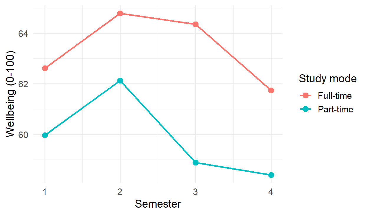
To share an app with people who do not use R, it must run on a server: shinyapps.io offers free hosting for small apps, and many universities run Posit Connect. Shinylive can even turn a simple app into a web page that runs entirely in the reader’s browser, with no server, using the same webR technology as this book’s playground. Like any published result, a dashboard must protect participants: this one shows only averages, never individual students.
Reproducibility inside your own project is the first step. Open science goes further: making research checkable and reusable by others.
Share the code that produced every result, and the data if you can. Repositories such as OSF (the Open Science Framework) and Zenodo store them permanently and give them a DOI, a permanent identifier that can be cited in the thesis. A good package includes the raw data (or instructions for obtaining it), the cleaning and analysis code, the Quarto source of the report, the renv.lock file, and a codebook describing every variable, like the specification of the wellbeing dataset. A licence tells others what they may do with it: CC BY for data and text, and the MIT licence for code, are common choices.
Research data about people can only be shared if the people cannot be identified. Removing names and student numbers is not enough: combinations of ordinary variables can identify someone. In the wellbeing data, a few combinations of faculty, study mode, gender, and having children describe only a handful of students:
small_cells <- students |>
count(faculty, study_mode, gender, has_children) |>
arrange(n)
head(small_cells, 4) faculty study_mode gender has_children n
1 Education Part-time Male Yes 3
2 Health Sciences Part-time Male Yes 3
3 Humanities Part-time Female Yes 3
4 Education Part-time Female Yes 4Only 3 students are, for example, part-time male students with children in the Faculty of Education; in a small department, such a description may point to recognisable people. Before sharing, such small cells are protected, for example by grouping categories, removing variables that are not needed, or sharing only summary data. Ethics approval and the consent form set what may be shared: if the consent form told students that only anonymised data would be shared, that is all that may be shared. When the real data cannot be shared at all, a synthetic dataset with the same structure, like the one in this book, lets others run the code.
Every analysis involves choices that are reasonable either way: whether to exclude outliers, whether to transform a skewed variable, which test to use, which control variables to include. Chapter 5 warned that when these choices are made after seeing the data, they can be steered, often unconsciously, towards a significant result. A simulation shows how much this matters. The code below creates data with no real difference between two groups, analyses it in five defensible ways, and records whether the first analysis, and whether any of the five, gives a p-value below 0.05:
forking_paths <- function() {
group <- rep(c("A", "B"), each = 30)
score <- rexp(60, rate = 1 / 10) # a skewed score, no real group difference
covariate <- rnorm(60)
z <- abs(as.numeric(scale(score)))
p <- c(
t_test = t.test(score ~ group)$p.value,
no_outliers = t.test(score[z < 2] ~ group[z < 2])$p.value,
log_scale = t.test(log(score) ~ group)$p.value,
rank_test = wilcox.test(score ~ group)$p.value,
with_covariate = summary(lm(score ~ group + covariate))$coefficients[2, 4]
)
c(first_analysis = p[["t_test"]] < 0.05, any_analysis = any(p < 0.05))
}
set.seed(17)
false_positives <- rowMeans(replicate(2000, forking_paths()))
false_positivesfirst_analysis any_analysis
0.0545 0.1085 A single planned analysis gives a false positive in about 5% of the simulated studies, as intended. Choosing afterwards among five reasonable analyses raises the rate to about 11%, although there is nothing to find. No individual choice is wrong; the problem is choosing after seeing the result. This is sometimes called the garden of forking paths, and preregistration is the way out of it.
Preregistration means recording the hypotheses, the design, and the planned analysis before seeing the data, in a time-stamped public registry such as OSF Registries or AsPredicted. It separates confirmatory analyses, planned in advance, from exploratory ones, found along the way, and protects against the temptation, conscious or not, to try analyses until one gives a significant result (Chapter 7). Exploratory findings are still welcome, but they are reported as such. In a registered report, a journal reviews and accepts the plan before the data is collected, so publication does not depend on the results.
R and its packages are the work of researchers who depend on being cited. The function citation() gives the recommended citation for R itself, and citation("lme4") for a package:
citation("lme4")To cite lme4 in publications use:
Douglas Bates, Martin Maechler, Ben Bolker, Steve Walker (2015).
Fitting Linear Mixed-Effects Models Using lme4. Journal of
Statistical Software, 67(1), 1-48. doi:10.18637/jss.v067.i01.
A BibTeX entry for LaTeX users is
@Article{,
title = {Fitting Linear Mixed-Effects Models Using {lme4}},
author = {Douglas Bates and Martin M{\"a}chler and Ben Bolker and Steve Walker},
journal = {Journal of Statistical Software},
year = {2015},
volume = {67},
number = {1},
pages = {1--48},
doi = {10.18637/jss.v067.i01},
}A methods section might say: “Analyses were carried out in R version 4.4.3 [R Core Team], with mixed models fitted using lme4 version 1.1.37 [Bates et al., 2015].” Chapter 18 adds the question of disclosing the use of AI tools.
As a project grows, files multiply: analysis.R, analysis_v2.R, analysis_final.R, analysis_final_really.R. Version control replaces this with a single copy of each file and a complete history of every change. git is the standard version control system, and GitHub is a website for storing git projects online, sharing them, and working on them with others (Bryan 2018).
git is not required for anything in this book, and it has a learning curve, so this section is an introduction for when you are ready. A repository is a project folder whose history git keeps. A commit is a saved snapshot of the project, with a short message saying what changed (“Remove duplicate survey rows”), and any commit can be returned to. Pushing copies the commits to GitHub, which is also an off-site backup, and pulling brings down changes made elsewhere.
RStudio has a Git pane that does all of this with buttons: tick the changed files, click Commit, write a message, and click Push. The usethis package sets things up from the Console: usethis::use_git() turns the current project into a repository, and usethis::use_github() connects it to GitHub. Never commit private data: list data files in the project’s .gitignore file, and git will leave them out.
Reproducibility is often mistaken for something narrower or more technical than it is.
Reproducibility, replicability, Quarto, R Markdown, render, YAML header, Markdown, code chunk, inline code, chunk option, knitr, Pandoc, cross-reference, citation, BibTeX, citation style (CSL), LaTeX, output format, parameter, renv, lockfile, Shiny, user interface, server, input, output, reactivity, reactive expression, open science, DOI, codebook, licence, anonymisation, small cells, synthetic data, garden of forking paths, preregistration, confirmatory analysis, exploratory analysis, registered report, version control, git, repository, commit, push, GitHub.
The playground has these and more, with hints and solutions.
references.bib file, cite them in the document, and switch the citation style with a csl: file.forking_paths(), such as a t-test that excludes the five highest scores, and describe how the rate of false positives for any analysis changes.Much research data is text: answers to open questions, interview transcripts, clinical notes, documents. To analyse it quantitatively, researchers use qualitative coding: reading each text and assigning it to one of a set of themes defined in a codebook. Coding is an act of judgement, and judgements differ. A central methodological question is therefore how to know whether a coder, whether a person, a keyword list, or a computer program, codes reliably. The standard answer is to compare the coder with another, and to measure how far they agree beyond what chance alone would produce.
In the wellbeing study, the final survey asked one open question: “What has been your biggest challenge during your studies?” 535 students answered in their own words, and the eleventh research question (RQ11) asks what those challenges are. Elaf coded 200 answers by hand, which took her most of two weeks, and the question is whether an AI tool could code the rest reliably.
Artificial intelligence (AI) tools now appear everywhere in research: assistants that write and explain code, and language models that read, summarise, and classify text. This chapter looks at both uses. It explains what these tools are and why they make mistakes, shows how to use an AI assistant to write R code and how to check what it produces, and then calls a language model from R with the ellmer package to code the students’ answers, testing the results against the hand coding exactly as Chapter 12 tested a classifier. It ends with the rules for using AI responsibly in research.
Two coders who read the same answers will not always choose the same theme. Their raw agreement, the share of answers on which they agree, seems the natural measure of reliability, but it can mislead. When one theme is very common, two coders will often agree simply because both choose it most of the time, even if they are guessing. A small example shows how much this matters. Two coders read 20 answers, 16 of which one coder puts under Workload:
coder_a <- c(rep("Workload", 16), rep("Family", 4))
coder_b <- c(rep("Workload", 14), rep("Family", 2), # the first 16 answers
rep("Workload", 2), rep("Family", 2)) # the last 4 answers
observed <- mean(coder_a == coder_b)
chance <- sum(prop.table(table(coder_a)) * prop.table(table(coder_b)))
c(observed = observed, chance = chance, kappa = (observed - chance) / (1 - chance))observed chance kappa
0.800 0.680 0.375 The coders agree on 80% of the answers, which sounds good. But each coder puts 80% of the answers under Workload, so two coders who assigned themes at random in those proportions would agree on 68% of them by chance alone. Cohen’s kappa measures agreement beyond chance: the observed agreement minus the chance agreement, as a share of the most that could be gained over chance (Cohen 1960). Here it is only 0.37. A kappa of 0 means no better than chance, and 1 means perfect agreement. A common rule of thumb calls 0.41 to 0.60 moderate, 0.61 to 0.80 substantial, and above 0.80 almost perfect agreement (Landis and Koch 1977). The function kap() from the yardstick package gives the same result:
kap(tibble(a = factor(coder_a), b = factor(coder_b)), truth = a, estimate = b)# A tibble: 1 × 3
.metric .estimator .estimate
<chr> <chr> <dbl>
1 kap binary 0.375Kappa is the standard measure of inter-rater reliability (Chapter 5), and it applies to any pair of coders. Later in this chapter, one of the coders is a keyword list and then a language model, and the other is Elaf.
The AI assistants that researchers use, such as ChatGPT, Claude, Gemini, and Copilot, are built on large language models (LLMs). A language model is a neural network (Chapter 15), with billions of weights, trained on an enormous amount of text: books, websites, and code. During training it learns to do one thing extremely well: predict the next word (strictly, the next token, a word or part of a word) given the text so far. Answering a question means generating a reply one token at a time, each time choosing a likely continuation. Further training on examples of helpful answers turns this into an assistant that follows instructions.
This explains both their strengths and their weaknesses. They are fluent in R, because a huge amount of R code and documentation was in their training text, so they can write, explain, and fix code well, especially for common tasks. But they produce what is plausible, not what is verified: a made-up function name that looks like a real one, a wrong argument, or an outdated way of doing something can be delivered with complete confidence. Such invented content is called a hallucination. Their knowledge also stops at the date their training data was collected, so packages that changed since then, as tidymodels and ggplot2 have, may be described as they used to be. And they know nothing about your data unless you tell them, and cannot run your code unless the tool is designed to do so.
The practical rule follows directly: use AI to draft, and check everything it produces. The checking is your job, and you remain responsible for the result.
An assistant can only be as specific as the question. A good request for R code states the goal in words, such as “For each faculty, I want the percentage of students who considered dropping out”. It describes the data: the names and types of the relevant columns, for which the output of glimpse(students) (Chapter 3) is ideal, although real, identifiable data should never be pasted. It names the tools, such as “Use dplyr with the native pipe |>”, so that the answer matches a familiar style. And for errors, it gives the exact error message and the code that produced it.
Suppose an assistant is asked for the percentage of students in each faculty who considered dropping out, and suggests:
students |>
summarise(percent = 100 * sum(considering_dropout == "Yes") / nrow(students),
.by = faculty) faculty percent
1 Health Sciences 4.833333
2 Education 2.666667
3 Social Sciences 3.500000
4 Humanities 2.166667
5 Natural Sciences 1.833333The code runs without an error and the numbers look reasonable. But they add up to only 15, the percentage of all students who considered dropping out: nrow(students) counts every student, not the students in each faculty. The question asked for the share within each faculty:
students |>
summarise(percent = 100 * mean(considering_dropout == "Yes"),
.by = faculty) faculty percent
1 Health Sciences 18.83117
2 Education 10.81081
3 Social Sciences 18.10345
4 Humanities 13.68421
5 Natural Sciences 12.64368The mean of a TRUE/FALSE condition is the proportion of TRUE values (Chapter 6), calculated here within each faculty. The first answer was not a hallucination; it was a plausible misunderstanding, the most dangerous kind of error, because nothing looks wrong. Four checks catch most such errors. Code can be run on a tiny example whose answer is known, as every chapter of this book does. A number can be checked by another route; here, students |> count(faculty, considering_dropout) gives the counts to check against. The help page of any unfamiliar function (?summarise) confirms that it exists and does what the assistant says. And the assistant can be asked to explain each line, to see whether the explanation matches what was wanted.
Assistants are also excellent teachers: “explain this code line by line”, “why does this give NA?”, and “what does this error mean?” are among their most useful questions.
Assistants can also work inside RStudio and Positron. GitHub Copilot, which can be switched on in RStudio’s options, suggests code as you type, completing a line or a whole block from a comment such as # plot wellbeing by semester. Positron Assistant and similar tools add a chat that can see your open files and, with permission, your data’s structure. Such suggestions arrive quickly and look authoritative, so the same rule applies: read each suggestion before accepting it. These tools change fast; the ideas in this chapter apply to whichever one you use.
A few of the answers show what the coding must handle:
open_responses |>
slice(c(5, 9, 15, 55)) |>
pull(biggest_challenge)[1] "most of my income goes on tuition fees. Besides that, I work alone all the time. Things are slowly improving."
[2] "I moved to a city where I know no one for my studies and I feel lonely. And I never have enough time."
[3] "Supervisor."
[4] "The direction of my thesis changed twice after comments from my supervsor. Sometimes I rewrite the same section again and again without knowing if it is right."They vary in length and style, often mention more than one challenge, and sometimes contain spelling mistakes, as real answers do. The codebook has seven themes, and Elaf coded a random sample of 200 answers into the theme that each student presents as their main challenge:
open_responses_coded |>
count(theme, sort = TRUE) theme n
1 Supervision 68
2 Workload 45
3 Isolation 31
4 Health 20
5 Family 14
6 Finances 14
7 Other 8The hand-coded sample is the benchmark for any automatic method, exactly like the test set of Chapter 11.
The simplest automatic method is a dictionary: a list of keywords for each theme. Each answer is assigned to the theme whose keywords it contains most often, and to “Other” if it contains none. The function str_count() from stringr counts the matches of a regular expression, a text pattern in which | means “or” and \\b marks the start of a word:
keywords <- c(
Supervision = "\\b(supervis|feedback|guidance|meeting)",
Workload = "\\b(time|deadline|workload|too much|assignment|reading|busy)",
Finances = "\\b(money|fee|scholarship|rent|afford|salary|income|funding|stipend|loan)",
Family = "\\b(famil|child|kid|son\\b|daughter|baby|parent|mother|father|husband|wife)",
Health = "\\b(sleep|tired|stress|anxi|health|ill\\b|burnout|headache|coffee|exhaust)",
Isolation = "\\b(lonel|alone|friends|outsider|miss (home|my)|far from|know no one)",
Other = "\\b(ethic|participant|statistic|library|procedure|english|power cut|laptop|internet|software)"
)
code_by_keywords <- function(answer) {
hits <- sapply(keywords, \(pattern) str_count(str_to_lower(answer), pattern))
if (all(hits == 0)) "Other" else names(keywords)[which.max(hits)]
}
code_by_keywords("I miss my family and I cannot afford the fees.")[1] "Finances"The example answer matches one Family keyword (“family”), one Isolation phrase (“miss my”), and two Finances keywords (“afford” and “fees”), so it is coded as Finances, although a human reader might well code it differently. Applying the function to the hand-coded answers:
themes <- names(keywords)
keyword_check <- open_responses_coded |>
mutate(keyword_theme = sapply(biggest_challenge, code_by_keywords),
theme = factor(theme, levels = themes),
keyword_theme = factor(keyword_theme, levels = themes))
keyword_check |> accuracy(truth = theme, estimate = keyword_theme)# A tibble: 1 × 3
.metric .estimator .estimate
<chr> <chr> <dbl>
1 accuracy multiclass 0.61keyword_check |> kap(truth = theme, estimate = keyword_theme)# A tibble: 1 × 3
.metric .estimator .estimate
<chr> <chr> <dbl>
1 kap multiclass 0.512The keywords agree with the hand coding for 61% of the answers, and their Cohen’s kappa, the agreement beyond chance explained at the start of the chapter, is 0.51: moderate agreement. They fail because meaning is not in single words: “my supervisor” in “I feel I am letting down both my family and my supervisor” is about family, and “I never have enough time” can be about workload or about children. Reading for meaning is exactly what language models are good at.
The ellmer package connects R to language models of two kinds.
Online models from providers: chat_anthropic() for Claude, chat_openai() for ChatGPT’s models, and chat_google_gemini() for Gemini. They are the most capable, but using them from code requires an API key, a secret password linked to your account, and each request costs a small amount. Store the key in your personal .Renviron file (usethis::edit_r_environ() opens it), never in a script that others may see:
ANTHROPIC_API_KEY=your-key-hereLocal models, which run on your own computer through Ollama (ollama.com), a free program that downloads and runs open models. They need no key and cost nothing, and the text never leaves your computer. Install Ollama, download a model once in the Terminal (for example ollama pull gemma4:e4b, a model of about 10 GB), and use chat_ollama(). A computer with a graphics card (GPU) makes them much faster.
Either way, a chat then works much like a chat website, from R:
library(ellmer)
chat <- chat_ollama(model = "gemma4:e4b") # local
# chat <- chat_anthropic(model = "claude-sonnet-5") # online, needs a key
chat$chat("In one sentence, what does Cohen's kappa measure?")The model argument names the exact model. Always set it explicitly and record it: models are updated and retired, and different models give different answers.
For the study, a local model was chosen, Google’s Gemma 4 (the e4b version), for two reasons: the students’ answers never leave the computer, and anyone can repeat the analysis for free.
Coding needs two things that a chat on a website does not give: the same instructions for every answer, and a reply in a fixed format that R can use. The system prompt holds the instructions: the task and the codebook, with a definition of each theme. With an online model, a type describes the required answer: here, an object with one field, theme, which must be one of the seven themes:
codebook <- "
You are helping a researcher code open-ended survey answers from graduate
students, who were asked: 'What has been your biggest challenge during your
studies?' Assign each answer to exactly ONE theme: the main challenge the
student describes. If several challenges are mentioned, choose the one the
student presents first or as most important.
Themes:
- Supervision: the supervisor; feedback, guidance, meetings, disagreements.
- Workload: too much work or too little time; deadlines, coursework, reading.
- Finances: money, fees, scholarships, living costs, paid work to pay for study.
- Family: children, partners, parents, caring duties, studying at home.
- Health: physical or mental health, sleep, stress, anxiety, burnout, illness.
- Isolation: loneliness, being far from home, no colleagues or friends.
- Other: anything else, such as ethics approval, statistics, academic English.
"
theme_type <- type_object(
theme = type_enum(themes, "The single main theme of the answer.")
)
chat <- chat_anthropic(system_prompt = codebook, model = "claude-sonnet-5",
params = params(temperature = 0))
ai_codes <- parallel_chat_structured(
chat,
prompts = as.list(open_responses$biggest_challenge),
type = theme_type
)The function type_enum() restricts the answer to the listed themes, so the model cannot invent a new one or reply with a paragraph. The setting temperature = 0 asks the model to choose its most likely answer every time, rather than sampling more freely, which makes the results as repeatable as possible. parallel_chat_structured() sends one request per answer, several at a time, and returns a data frame with one row per answer and a theme column.
Smaller local models do not always follow such a format. When parallel_chat_structured() was tried with the local model, it answered correctly (“Finances”, “Workload”) but as plain words, not in the structured format, and ellmer could not read the replies. The solution is to add one line to the end of the codebook, “Reply with the name of the theme only”, to ask for plain text with parallel_chat_text(), and to let R check each reply against the list of themes:
chat <- chat_ollama(system_prompt = codebook, model = "gemma4:e4b",
params = params(temperature = 0))
replies <- parallel_chat_text(chat, as.list(open_responses$biggest_challenge))
ai_codes <- themes[match(tolower(gsub("[^A-Za-z]", "", replies)), tolower(themes))]The function gsub() removes anything that is not a letter, such as a full stop, and match() finds the reply in the list of themes, ignoring capital letters. A reply that is not one of the themes becomes NA, so it is counted rather than silently accepted. Checking a model’s output in code like this is good practice with any model.
The full script, data-raw/run_ai_coding.R in the book’s repository, also records the provider, the model, the date, the software versions, and the time taken, and codes the 200 hand-coded answers a second time to check that the model gives the same answers when asked again. It was run once, and the results were saved to a file, so that this chapter can analyse them without calling the model again.
The script used the model gemma4:e4b, run locally through Ollama, on 24 September 2026. The 735 requests took about 3 minutes, at no cost, and every reply was one of the seven themes. The results are joined to the hand-coded answers:
ai <- read.csv(ai_file)
ai_check <- open_responses_coded |>
left_join(ai, join_by(student_id)) |>
mutate(across(c(theme, ai_theme, ai_theme_rerun), \(x) factor(x, levels = themes)))
ai_check |> accuracy(truth = theme, estimate = ai_theme)# A tibble: 1 × 3
.metric .estimator .estimate
<chr> <chr> <dbl>
1 accuracy multiclass 0.9ai_check |> kap(truth = theme, estimate = ai_theme)# A tibble: 1 × 3
.metric .estimator .estimate
<chr> <chr> <dbl>
1 kap multiclass 0.874The model agrees with the hand coding on 90% of the answers, with a kappa of 0.87 (almost perfect agreement), against 61% and 0.51 for the keywords. The confusion matrix of Chapter 12 shows where the two disagree:
ai_check |> conf_mat(truth = theme, estimate = ai_theme) Truth
Prediction Supervision Workload Finances Family Health Isolation Other
Supervision 60 2 0 0 0 2 0
Workload 2 39 0 0 1 0 0
Finances 1 0 14 0 0 0 0
Family 2 1 0 14 1 0 0
Health 2 1 0 0 16 0 0
Isolation 1 2 0 0 1 29 0
Other 0 0 0 0 1 0 8The diagonal holds the answers on which the hand coding and the model agree. The disagreements are worth reading one by one, because they show whether the model is wrong, the codebook is unclear, or the answer is genuinely ambiguous:
ai_check |>
filter(theme != ai_theme) |>
select(Answer = biggest_challenge, `Hand coding` = theme, Model = ai_theme) |>
head(5) |>
knitr::kable()| Answer | Hand coding | Model |
|---|---|---|
| Getting feedback on my draft took over a month, and by then I had lost momentum. Also, home is not a quiet place to study. | Supervision | Isolation |
| Combining coursework, my job at a school and my thesis leaves me no time to rest. And my mental health has suffered. Things are slowly improving. | Workload | Health |
| I stopped exercising and I can feel the difference. The doctor told me to slow down, but I do not see how. On top of that, the university paperwork is slow. Things are slowly improving. | Health | Other |
| Writing my literature review took far longer than I planned. And I do not have friends in the department. I am coping, but only just. | Workload | Isolation |
| Nobody in my group works on anything close to my topic. At the same time, my supervisor is hard to reach. Otherwise the programme is fine. | Isolation | Supervision |
Look especially at answers that mention two challenges. If the model and the human coder chose different ones as the main challenge, that is a question for the codebook, not only for the model: a clearer rule (“code the challenge mentioned first”) helps both human and machine coders.
Asked a second time, the model gave exactly the same theme for every answer: with a temperature of 0, this local model is repeatable. That is not guaranteed for every model or setting (online models, in particular, can be updated between runs), which is why the outputs are saved and analysed from the file.
With its agreement checked, the model’s coding is used for all 535 answers:
ai |>
count(ai_theme) |>
mutate(share = n / sum(n)) |>
ggplot(aes(x = share, y = reorder(ai_theme, share))) +
geom_col(fill = "#2f6793") +
scale_x_continuous(labels = scales::label_percent()) +
labs(x = "Share of answers", y = NULL) +
theme_minimal(base_size = 12)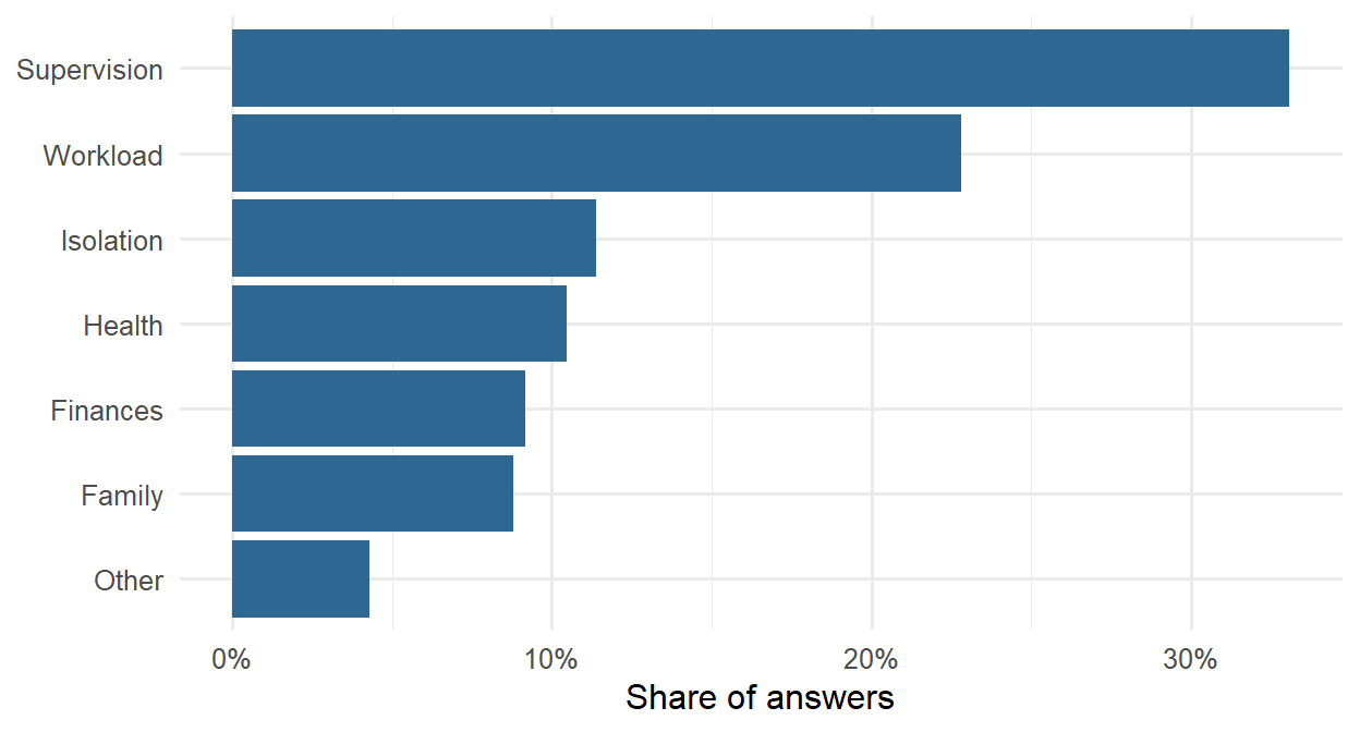
Because the themes are now data, they can be linked to the rest of the study. Students whose main challenge is supervision should report less supervisor support in the questionnaire:
q_support <- questionnaire |>
mutate(support = rowMeans(pick(support_1:support_6), na.rm = TRUE)) |>
select(student_id, support)
ai |>
left_join(q_support, join_by(student_id)) |>
summarise(students = n(), support = round(mean(support, na.rm = TRUE), 2),
.by = ai_theme) |>
arrange(support) ai_theme students support
1 Supervision 177 2.82
2 Isolation 61 3.30
3 Other 23 3.31
4 Health 56 3.33
5 Family 47 3.43
6 Finances 49 3.45
7 Workload 122 3.46This is a check of validity: the text and the numbers tell the same story. It also answers RQ11 in a way neither source could alone: what students struggle with, in their own words, and how that relates to their situation.
Everything an AI tool produces is a draft. Check code by running it on known cases, check facts and references against their sources (assistants are known to invent plausible references that do not exist), and check coding against human coding, as this chapter did. Whatever appears in your thesis is your responsibility, whoever or whatever drafted it.
Text sent to an online AI service leaves your computer and is processed, and possibly stored, by the provider. Before research data is sent, the ethics approval and consent forms must be checked: participants who agreed to have their answers read by the research team did not necessarily agree to have them sent to a company. The provider’s terms matter too; many offer research or enterprise agreements under which data is not stored or used for training, but free accounts often do not. Identifying information must be removed before anything is sent: names, places, and details that could identify a person (Chapter 17). For sensitive data, a local model that runs on your own computer, through Ollama and chat_ollama(), keeps the data on the machine; local models are smaller and usually less accurate, so they must be validated in the same way.
The answers in the wellbeing study are anonymous, but a local model was used anyway, so they never left the computer: the simplest way to stay within any consent form.
Language models can give different answers to the same question on different days, and models are updated and retired. To keep AI-assisted work reproducible, the provider, the exact model name, the date, and the settings (such as the temperature) should be recorded, and the prompts (the system prompt and codebook) saved with the code. The model’s outputs should be saved too, as in this chapter, and the saved outputs analysed rather than the model called again. Coding a sample twice checks consistency.
Journals and universities increasingly require authors to disclose how they used AI. The consensus of publishers and of the Committee on Publication Ethics (COPE) is that an AI tool cannot be an author, because it cannot take responsibility for the work, and that its use must be described. A methods section might say: “Answers were coded into seven themes by a large language model (Gemma 4, e4b version, run locally with Ollama and the ellmer R package, temperature 0) using the codebook in Appendix X. Agreement with the author’s hand coding of a random sample of 200 answers was assessed with Cohen’s kappa.” For help with code or language, a sentence in the acknowledgements or methods is usually enough; check your university’s and journal’s policy.
Language models learn from human text, and they can reproduce its biases: in how they describe groups of people, in which answers they find typical, and in how well they understand non-standard English or answers written by non-native speakers. Check whether the model’s accuracy differs between groups, as Chapter 11 recommended for any model that makes decisions about people.
AI tools invite both too much trust and too little, and a few misunderstandings are especially common.
.Renviron; set the model explicitly; use a system prompt with a codebook, a type to fix the format of the answer, and parallel_chat_structured() for many texts.Artificial intelligence, large language model, token, hallucination, training cut-off, prompt, system prompt, AI coding assistant, qualitative coding, codebook, inter-rater reliability, dictionary method, regular expression, Cohen’s kappa, API, API key, structured output, temperature, local model, disclosure.
The playground has these and more, with hints and solutions.
A thesis is an argument, and its results chapter is the evidence. Each claim in it rests on a chain of reasoning that runs from a research question, through a hypothesis, a design, measured variables, and an analysis, to a result, a conclusion, and the limits of that conclusion. A thesis convinces when every link in that chain can be seen and checked, and every number in the text can be traced back to the raw data. The methods of this book are the links; this chapter joins them.
In the story, it is the final semester. Elaf’s analyses are spread over two years of scripts, written as she learned each method, and her supervisor’s advice for the last stretch is simple: “Before you write the results chapter, rebuild the whole thing, from the raw export to the last table, as one project that runs from start to finish. Then you will know that every number in your thesis is right, and you can answer any examiner’s question by pointing to the code.” This chapter does exactly that. It sets up a complete research project, runs the analysis from the messy survey export to the tables, figures, and sentences of a results chapter, and traces the chain of reasoning behind three of the research questions. It then steps back: how to report results to the standards journals expect, how to choose a method for a new question, the problems that every researcher meets, and where to go next.
Every quantitative project follows roughly the same path, and this book has followed it too (Figure 19.1).
flowchart TB A[Question and<br/>design<br/>Ch 5] --> B[Import<br/>Ch 1-2] B --> C[Clean and<br/>reshape<br/>Ch 3] C --> D[Explore and<br/>describe<br/>Ch 4, 6] D --> E[Test and<br/>model<br/>Ch 7-10] D --> F[Predict and<br/>discover<br/>Ch 11-16] E --> G[Report and<br/>share<br/>Ch 17-18] F --> G
The path is not a straight line in practice. Exploring the data sends you back to cleaning when you find a problem; a model’s diagnostics send you back to exploring. What matters is that each step is written in code, so that going back and rerunning everything is easy.
A project that others (and your future self) can follow has a predictable structure. The final thesis project looks like this:
wellbeing-thesis/
├── wellbeing-thesis.Rproj the RStudio Project (Chapter 1)
├── README.txt what the project is and how to run it
├── data-raw/
│ └── wellbeing_raw.xlsx the survey export, never edited by hand
├── data/ clean data, created by the scripts
├── R/
│ ├── 01-clean-data.R raw export -> clean tables (Chapter 3)
│ └── 02-analysis.R models and figures
├── output/ figures and tables, created by the scripts
├── results.qmd the results chapter (Chapter 17)
├── references.bib
└── renv.lock package versions (Chapter 17)Four principles lie behind it. Raw data is read-only: everything in data/ and output/ can be deleted and recreated by running the scripts. Scripts are numbered in the order they run, and each does one job. Paths are relative to the project, using here::here() (Chapter 1), so the project runs on any computer. And the README says in a few lines what the project is and how to run it.
The downloadable project for this chapter has the same structure, with working scripts (its data/ and output/ folders are created when the scripts run, and it has no renv.lock, which you create with renv::init() for your own project). The rest of the chapter walks through what the scripts do.
The cleaning of Chapter 3, gathered into one script, runs in a few seconds. Here is its core, reading the raw export and producing the clean questionnaire and semester tables:
library(dplyr)
library(tidyr)
library(stringr)
library(readr)
library(readxl)
raw <- read_excel(data2thesis_example("wellbeing_raw.xlsx"))
item_names <- c(paste0("stress_", 1:6), paste0("burnout_", 1:6),
paste0("support_", 1:6), paste0("satisfaction_", 1:4))
responses <- raw |>
filter(!str_detect(str_to_upper(`Q1_Student ID`), "^TEST")) |>
select(-`Response ID`) |>
distinct() |>
rename(student_id = `Q1_Student ID`, workshop = `Workshop group`,
considering_dropout = `Y1_Considered leaving?`) |>
rename_with(~ item_names, .cols = Q11_1:Q11_22) |>
mutate(across(all_of(item_names), ~ as.integer(na_if(.x, "99"))))
questionnaire_clean <- responses |>
select(student_id, all_of(item_names))
semesters_clean <- responses |>
select(student_id, matches("_S[1-4]$")) |>
pivot_longer(-student_id, names_to = c(".value", "semester"), names_sep = "_S") |>
rename(gpa = GPA, sleep_hours = Sleep, study_hours = Study,
exercise_days = Exercise, caffeine_mg = Caffeine,
supervisor_meetings = Meetings, wellbeing = Wellbeing) |>
mutate(
semester = as.integer(semester),
sleep_hours = parse_number(str_replace(sleep_hours, ",", ".")),
across(c(gpa, study_hours, exercise_days, caffeine_mg, supervisor_meetings, wellbeing),
parse_number),
sleep_hours = if_else(sleep_hours > 24, NA, sleep_hours),
study_hours = if_else(study_hours > 168, NA, study_hours),
gpa = if_else(gpa > 4, NA, gpa)
) |>
filter(!if_all(gpa:wellbeing, is.na))Each step is explained in Chapter 3; the full script in the downloadable project also cleans the background variables. The most important line of any cleaning script is the check at the end, here a comparison with the clean data:
same <- function(mine, theirs) {
  mine   <- as.data.frame(mine)[, names(mine)]
  theirs <- as.data.frame(theirs)[, names(mine)]
  isTRUE(all.equal(mine, theirs, check.attributes = FALSE))
}
same(questionnaire_clean |> arrange(student_id),
     questionnaire |> arrange(student_id))
[1] TRUEsame(semesters_clean |> arrange(student_id, semester), semesters |> arrange(student_id, semester))[1] TRUEBoth are TRUE. In a real project there is no package to compare with, so the checks are the ones from Chapters 3 and 6: counts of categories, ranges of values, numbers of missing values, and a look at a few rows. From here on, the chapter uses the clean tables, together with the scale scores:
scores <- questionnaire |>
mutate(
stress_4 = 6 - stress_4,
stress = rowMeans(pick(stress_1:stress_6), na.rm = TRUE),
burnout = rowMeans(pick(burnout_1:burnout_6), na.rm = TRUE),
support = rowMeans(pick(support_1:support_6), na.rm = TRUE)
) |>
select(student_id, stress, burnout, support)
study <- students |>
left_join(scores, join_by(student_id)) |>
left_join(semesters |> filter(semester == 1), join_by(student_id))The table study has one row per student, with background, questionnaire scores, and first-semester records, as in Chapter 8.
Every results chapter begins by describing the participants, often in a table known as “Table 1”. Here the sample is described by programme:
mean_sd <- function(x) sprintf("%.1f (%.1f)", mean(x, na.rm = TRUE), sd(x, na.rm = TRUE))
percent <- function(x) sprintf("%.0f%%", 100 * mean(x, na.rm = TRUE))
describe <- function(d) {
tibble(
Characteristic = c("Students", "Age, mean (SD)", "Women", "Part-time",
"Stress (1-5), mean (SD)", "Support (1-5), mean (SD)",
"Wellbeing in semester 1, mean (SD)", "Considered dropping out"),
Value = c(nrow(d), mean_sd(d$age), percent(d$gender == "Female"),
percent(d$study_mode == "Part-time"), mean_sd(d$stress),
mean_sd(d$support), mean_sd(d$wellbeing),
percent(d$considering_dropout == "Yes"))
)
}
describe(filter(study, programme == "Master's")) |>
rename(`Master's` = Value) |>
left_join(describe(filter(study, programme == "PhD")) |> rename(PhD = Value),
join_by(Characteristic)) |>
left_join(describe(study) |> rename(All = Value), join_by(Characteristic)) |>
knitr::kable(align = "lrrr")| Characteristic | Master’s | PhD | All |
|---|---|---|---|
| Students | 426 | 174 | 600 |
| Age, mean (SD) | 27.9 (3.3) | 34.2 (5.1) | 29.7 (4.8) |
| Women | 52% | 53% | 52% |
| Part-time | 26% | 39% | 30% |
| Stress (1-5), mean (SD) | 3.2 (0.7) | 3.2 (0.7) | 3.2 (0.7) |
| Support (1-5), mean (SD) | 3.2 (0.8) | 3.2 (0.7) | 3.2 (0.8) |
| Wellbeing in semester 1, mean (SD) | 60.9 (12.1) | 59.3 (11.9) | 60.5 (12.0) |
| Considered dropping out | 15% | 14% | 15% |
Two small helper functions, mean_sd() and percent(), format the numbers the way theses report them, and describe() builds the column for any group of students, so the same code makes all three columns. Writing a small function whenever you would otherwise copy and paste code is one of the best habits to take from this book. (The gtsummary package produces such tables automatically, with many options, if you prefer.)
Three of the research questions are answered below with the methods of Parts 2 and 3, each with a sentence written the way it will appear in the thesis. A small function formats p-values in the usual style:
format_p <- function(p) if (p < 0.001) "p < .001" else paste("p =", sub("^0", "", sprintf("%.3f", p)))Students were randomly invited to the wellbeing workshop after the first semester. The mixed-effects model of Chapter 10 uses all four semesters and every student:
library(lme4)
panel <- semesters |>
left_join(students, join_by(student_id)) |>
mutate(time = semester - 1)
workshop_model <- lmer(wellbeing ~ factor(semester) * workshop + (time | student_id),
data = panel)
gaps <- expand.grid(semester = 1:4, workshop = c("Invited", "Not invited")) |>
mutate(time = semester - 1)
gaps$wellbeing <- predict(workshop_model, newdata = gaps, re.form = NA)
gaps <- gaps |>
pivot_wider(id_cols = semester, names_from = workshop, values_from = wellbeing) |>
mutate(gap = Invited - `Not invited`)
gaps# A tibble: 4 × 4
semester Invited `Not invited` gap
<int> <dbl> <dbl> <dbl>
1 1 60.6 60.3 0.380
2 2 65.5 60.2 5.25
3 3 63.1 59.0 4.13
4 4 60.9 58.2 2.64 Wellbeing was similar in the two groups before the workshop (difference 0.4 points). After the workshop, invited students’ wellbeing was 5.3 points higher in semester 2, but the difference narrowed to 4.1 points in semester 3 and 2.6 in semester 4.
The multiple regression of Chapter 8, with broom’s tidy() giving the coefficients and their confidence intervals as a data frame:
library(broom)
gpa_model <- lm(gpa ~ sleep_hours + study_hours + stress + support, data = study)
gpa_table <- tidy(gpa_model, conf.int = TRUE)
gpa_table |>
mutate(across(where(is.numeric), \(x) round(x, 3)))# A tibble: 5 × 7
term estimate std.error statistic p.value conf.low conf.high
<chr> <dbl> <dbl> <dbl> <dbl> <dbl> <dbl>
1 (Intercept) 2.14 0.145 14.7 0 1.85 2.42
2 sleep_hours 0.106 0.014 7.49 0 0.078 0.134
3 study_hours 0.007 0.001 6.27 0 0.005 0.009
4 stress -0.084 0.018 -4.68 0 -0.119 -0.049
5 support 0.111 0.017 6.63 0 0.078 0.144Each additional hour of sleep was associated with a GPA 0.11 points higher (95% CI 0.08 to 0.13, p < .001), holding study hours, stress, and support constant. Together, the four predictors explained 25% of the variation in first-semester GPA (n = 587).
The logistic regression of Chapter 8, with odds ratios:
dropout_model <- glm(
I(considering_dropout == "Yes") ~ stress + support + financial_worry + employment + study_mode,
data = study, family = binomial
)
dropout_table <- tidy(dropout_model, conf.int = TRUE, exponentiate = TRUE)
dropout_table |>
mutate(across(where(is.numeric), \(x) round(x, 2)))# A tibble: 7 × 7
term estimate std.error statistic p.value conf.low conf.high
<chr> <dbl> <dbl> <dbl> <dbl> <dbl> <dbl>
1 (Intercept) 0.02 1.23 -3.26 0 0 0.19
2 stress 3.6 0.24 5.35 0 2.29 5.87
3 support 0.33 0.2 -5.44 0 0.22 0.49
4 financial_worry 1.57 0.12 3.73 0 1.25 2.01
5 employmentNone 0.55 0.44 -1.35 0.18 0.23 1.31
6 employmentPart-time j… 0.58 0.45 -1.19 0.23 0.24 1.41
7 study_modePart-time 1.32 0.37 0.75 0.45 0.63 2.68The wrapper I() lets a condition be used directly as the outcome, and exponentiate = TRUE turns the log-odds into odds ratios and their confidence intervals.
Each one-point increase in stress (on the 1 to 5 scale) was associated with 3.6 times the odds of considering dropping out (95% CI 2.3 to 5.9), and each one-point increase in supervisor support with 0.33 times the odds (95% CI 0.22 to 0.49).
Chapters 11 to 15 went further with this question, asking how well dropout can be predicted; the thesis reports that logistic regression predicted as well as any machine learning model (a test AUC of about 0.84 in Chapter 11), which is itself a finding worth stating.
A thesis figure often combines panels. The patchwork package joins ggplot2 plots with + (side by side) and / (one above the other), and plot_annotation() labels the panels:
library(ggplot2)
library(patchwork)
panel_a <- gaps |>
pivot_longer(c(Invited, `Not invited`), names_to = "workshop", values_to = "wellbeing") |>
ggplot(aes(x = semester, y = wellbeing, colour = workshop)) +
geom_line(linewidth = 1) +
geom_point(size = 2.5) +
scale_colour_viridis_d(end = 0.8) +
labs(x = "Semester", y = "Predicted wellbeing (0-100)", colour = "Workshop")
panel_b <- ggplot(study, aes(x = sleep_hours, y = gpa)) +
geom_point(alpha = 0.3) +
geom_smooth(method = "lm", formula = y ~ x, colour = "#2f6793") +
labs(x = "Sleep (hours a night)", y = "GPA (semester 1)")
(panel_a + panel_b) +
plot_annotation(tag_levels = "A") &
theme_minimal(base_size = 12)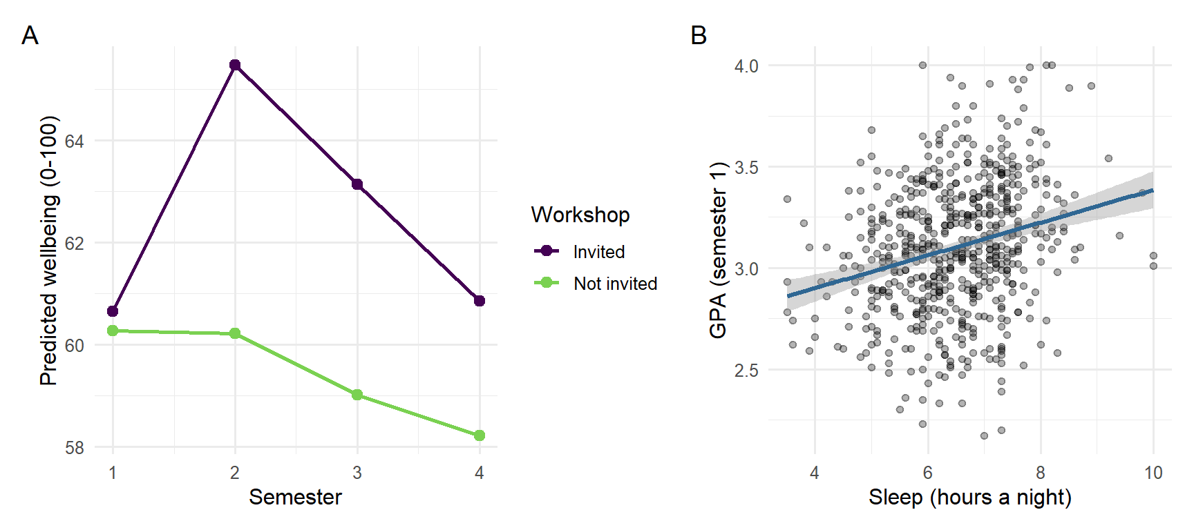
The operator & applies the theme to both panels, and ggsave() saves the figure at the size and resolution a thesis or journal requires (Chapter 4):
ggsave(here::here("output", "figure-1.png"), width = 18, height = 8, units = "cm", dpi = 300)A result on its own is not yet a conclusion. Between the two lie the design that produced the data, the way the variables were measured, and the limits of both. Table 19.2 traces the whole chain for the three research questions answered above, from the hypotheses stated in Chapter 5 to the limitations that a thesis discussion must acknowledge. Every result in it is filled in by the code of this chapter.
| Step | Workshop (RQ3) | GPA (RQ5) | Considering dropout (RQ9) |
|---|---|---|---|
| Question | Does the workshop improve wellbeing? | What explains students’ GPA? | Who considers dropping out? |
| Hypothesis (Chapter 5) | Invited students have higher wellbeing in semester 2 | More sleep goes with a higher GPA, allowing for study hours, stress, and support | Higher stress raises the odds of considering dropout |
| Design | Randomised invitation within a longitudinal study | Observational, first semester | Observational, baseline and end of year 1 |
| Variables | Wellbeing (0 to 100), invitation, semester | GPA, sleep, study hours, stress, support | Considering dropout (yes/no), stress, support, financial worry, employment, study mode |
| Analysis | Mixed-effects model (Chapter 10) | Multiple regression (Chapter 8) | Logistic regression (Chapter 8) |
| Result | 5.3 points higher in semester 2, narrowing to 2.6 by semester 4 | 0.11 GPA points per hour of sleep (95% CI 0.08 to 0.13) | Odds ratio 3.6 per point of stress (95% CI 2.3 to 5.9) |
| Conclusion | The workshop raised wellbeing, and the effect faded; because the invitation was random, the effect is causal | Sleep is associated with GPA, independently of the other predictors; the null hypothesis is rejected, but the design does not show cause | Stress is associated with higher odds of considering dropout; the null hypothesis is rejected |
| Limitation | One university; the invitation, not attendance, was randomised | Sleep is self-reported, and unmeasured confounders may remain | The outcome is considering dropout, not leaving; stress and the outcome were measured close together |
Reading the table by columns shows how different the three conclusions are, although all three rest on “significant” results. Only the workshop conclusion is causal, because only the workshop was assigned at random (Chapter 5). The GPA and dropout conclusions are associations, and the limitations say what could still explain them. A discussion chapter that keeps each result attached to its design, in this way, claims exactly what the evidence supports.
The final step is the one Chapter 17 prepared: the tables, figures, and sentences above go into a Quarto document, results.qmd, in which every number is written with inline code. The downloadable project contains such a document, built from this chapter.
What a results chapter must contain is not left to taste. Reporting standards list the information that readers need in order to judge a study. For quantitative research in psychology and neighbouring fields, the American Psychological Association’s Journal Article Reporting Standards (JARS) set out what to report about the participants, the measures, the analysis, and the results, including effect sizes and confidence intervals (Appelbaum et al. 2018). Randomised trials in health research follow CONSORT, and observational studies follow STROBE (von Elm et al. 2007). Checking a draft against the relevant standard is one of the most useful things a student can do before submission, and many journals require it. When the data changes, or an examiner asks for a different model, the code is changed and rendered again, and the whole chapter is updated.
The choice of method for a new research question depends on the goal, on the kind of outcome, and on how the observations are related. Figure 19.3 summarises the methods of this book as a guide.
%%{init: {"flowchart": {"nodeSpacing": 18, "rankSpacing": 45}}}%%
flowchart TD
Q{What is the goal?} -->|Describe| D[Summaries and plots<br/>Ch 4, 6]
Q -->|Explain or compare| O{Outcome type?}
Q -->|Predict new cases| P[Machine learning<br/>Ch 11-15]
Q -->|Find groups or<br/>structure| U[PCA, factor analysis,<br/>clustering<br/>Ch 9, 14]
Q -->|Forecast over time| T[Time series<br/>Ch 16]
O -->|Numeric| N{Repeated or<br/>nested data?}
O -->|Yes / No| L[Chi-square, logistic<br/>regression<br/>Ch 7-8]
N -->|No| R[t-test, ANOVA,<br/>regression<br/>Ch 7-8]
N -->|Yes| M[Mixed-effects<br/>models<br/>Ch 10]
Table 19.3 shows how each of the study’s research questions was answered.
| Research question | Method | Chapters |
|---|---|---|
| RQ1 What does graduate life look like? | Plots, descriptive statistics | 4, 6 |
| RQ2 Do students sleep less than 7 hours? | One-sample t-test, confidence interval | 7 |
| RQ3 Does the workshop improve wellbeing? | Two-sample t-test; mixed-effects model | 7, 10 |
| RQ4 Do faculties and study modes differ? | ANOVA, post-hoc tests | 7, 8 |
| RQ5 What explains GPA? | Multiple regression | 8, 13 |
| RQ6 Does the questionnaire measure what it should? | Factor analysis, Cronbach’s alpha | 9 |
| RQ7 Are there student profiles? | Cluster analysis, mixture models | 9, 14 |
| RQ8 How do wellbeing and GPA change? | Mixed-effects models | 10 |
| RQ9 Who considers dropping out? | Logistic regression; classification | 8, 11, 12, 15 |
| RQ10 Can final GPA be predicted? | Regularised regression, boosting | 13 |
| RQ11 What challenges do students describe? | Text coding with a language model | 18 |
| RQ12 How many counselling visits next year? | Time series forecasting | 16 |
Real projects rarely go as planned, and some problems are almost universal. Every real dataset is messy and needs cleaning, which takes longer than the analysis; it is done in code, checked after every step, and never applied to the raw file itself (Chapter 3). Missing data raises the question of why it is missing before anything is done about it, because dropping incomplete cases can bias results when the missing data is not random, as with the students who left the programme (Chapter 6). Small samples give wide confidence intervals and low power (Chapter 7) and make complex models overfit (Chapter 13); the remedies are to report effect sizes with intervals, keep models simple, and plan the sample size before collecting data with a power analysis (Chapter 5).
Analysis brings its own problems. Many tests produce many false alarms, so the main analyses are decided in advance, multiple comparisons are corrected where needed, and exploratory results are reported as exploratory (Chapters 7, 8, and 17). Assumptions are checked with plots rather than with tests alone, with robust tests, non-parametric tests, transformations, and mixed models as the alternatives (Chapters 7, 8, and 10). Correlation is not causation: observational data rarely proves causes, so confounders must be thought through, as sleep was behind the caffeine effect, and randomised designs used where possible, as in the workshop study (Chapters 5 and 8). Prediction and explanation are different aims: a model that predicts well may explain little, and the reverse (Chapter 11). Finally, results must be communicated to supervisors, co-authors, and examiners who may use other software; a clear results chapter with tables, figures, and an appendix of code serves them all, and data can be exported with write_csv() or haven::write_sav() when they need it (Chapter 2).
This book is a beginning. Depending on your field, the next methods to learn may be:
| Topic | What it is for | Packages |
|---|---|---|
| Structural equation modelling | Confirmatory factor analysis, path models, latent variables | lavaan |
| Bayesian statistics | Models with prior knowledge and full uncertainty | brms, rstanarm |
| Survival analysis | Time until an event, such as dropping out | survival |
| Meta-analysis | Combining results from several studies | metafor |
| Text analysis | Words, sentiment, and topics in documents | tidytext, quanteda |
| Spatial data | Maps and geographic data | sf |
| Publication tables | Automatic, formatted tables of results | gtsummary, modelsummary |
| Interpreting models | Predictions and effects from any model | marginaleffects |
Some of the best resources are free online: R for Data Science (Wickham et al. 2023) for data skills, Regression and Other Stories (Gelman et al. 2020) for regression, An Introduction to Statistical Learning (James et al. 2021) and Tidy Modeling with R (Kuhn and Silge 2022) for machine learning, Forecasting: Principles and Practice (Hyndman and Athanasopoulos 2021) for time series, and Mastering Shiny (Wickham 2021) for dashboards. Appendix E lists more.
You do not have to learn alone. The R community is known for being welcoming to beginners: the Posit Community forum and Stack Overflow answer questions; R-Ladies and local R user groups run meetings around the world; TidyTuesday publishes a new dataset every week for people to practise on and share their plots; and R Weekly collects news and tutorials. Asking a clear question, with a small reproducible example, is itself a skill, and the same skill that makes an AI assistant useful (Chapter 18).
A few misunderstandings are common at the stage of writing up.
Research workflow, project structure, raw data, pipeline, sample description (“Table 1”), helper function, broom, patchwork, reporting sentence, chain of reasoning, reporting standard, method choice.
The playground has these and more, and the downloadable project contains the complete thesis project.
R/01-clean-data.R and R/02-analysis.R, and render results.qmd. Then change one cleaning rule (for example, treat ages above 70 as impossible), render again, and note which numbers change.This appendix explains how to install everything the book uses, and how to fix the problems that most often get in the way. If you only want to start, the short version is: install R, then RStudio, then run the package installation command in Section 1.5. If you are not ready to install anything yet, every chapter’s exercises also run in your web browser, in the playground.
Installers and websites change their appearance from year to year, so this appendix describes each step in words rather than with screenshots. The choices that matter are the same in every version.
| Software | What it is | Required? |
|---|---|---|
| R | The programming language and the engine that runs your code | Yes |
| RStudio Desktop | The program you work in: editor, console, plots, and help in one window | Yes (or Positron) |
| Positron | A newer editor from the makers of RStudio, an alternative to it | Optional |
| Quarto | Turns documents with code into reports and books (Chapter 17) | Comes with RStudio |
| R packages | Add-ons for specific tasks, installed from within R | Yes, as needed |
| Rtools (Windows) or Xcode command line tools (macOS) | Compilers for building packages from source | Only if asked |
All of it is free. R must be installed first, because RStudio and Positron are programs for R: they need R to run your code. Install R, then the editor.
R is downloaded from CRAN, the Comprehensive R Archive Network, at cran.r-project.org. Always download the latest release. This book was built with R 4.4.3; any later version works.
R-4.x.y-win.exe).C:\Program Files\R\ and register it so that RStudio finds it automatically..pkg file and follow the installer, accepting the defaults.R is available in the package manager of every major Linux distribution, but the version there is often out of date. CRAN’s Download R for Linux page gives up-to-date instructions for Ubuntu, Debian, Fedora, and others. On Ubuntu, for example, the instructions add CRAN’s repository and then install R with sudo apt install r-base r-base-dev. Follow the page for your distribution, because the exact commands change with each release.
Open R (from the Start menu on Windows or the Applications folder on macOS) and type:
R.version.string[1] "R version 4.4.3 (2025-02-28 ucrt)"If it prints a version number, R is working. You will rarely open R on its own again; from now on you will work in RStudio.
RStudio includes Quarto, so the reports of Chapter 17 work without installing anything else. For PDF output, Quarto also needs LaTeX; install a small version once by typing quarto install tinytex in RStudio’s Terminal tab.
Positron (positron.posit.co) is a newer editor from Posit, the company behind RStudio, built for both R and Python. Everything in this book works in Positron as well. RStudio is used in the book’s instructions because it is still the most widely used, and most tutorials and university courses assume it.
If you cannot install software, for example on a locked-down computer, two options need only a web browser:
A few settings make RStudio work the way this book recommends. Open Tools > Global Options:
Packages are installed once, with install.packages(), and loaded in every session with library() (Chapter 1). Each chapter lists the packages it uses at the start; Table 1.2 collects them all.
| Chapters | Packages |
|---|---|
| 1-3 | here, readxl, haven, writexl, dplyr, tidyr, stringr, readr (or the whole tidyverse) |
| 4, 6-7 | ggplot2, psych |
| 8 | broom, car |
| 9 | psych, GPArotation, corrplot, factoextra |
| 10 | lme4, lmerTest |
| 11-13 | tidymodels, kknn, ranger, kernlab, themis, glmnet, xgboost |
| 14 | mclust, dbscan, factoextra, cluster |
| 15 | tidymodels (nnet comes with R) |
| 16 | tsibble, fable, feasts, urca |
| 17 | rmarkdown, knitr, shiny, bslib, renv, usethis |
| 18 | ellmer, stringr, yardstick |
| 19 | patchwork, broom, lme4 |
To install everything at once, copy this command into the Console. It downloads a few hundred megabytes and can take ten minutes or more, so it is best done on a good connection:
install.packages(c(
"tidyverse", "here", "readxl", "haven", "writexl",
"psych", "GPArotation", "corrplot", "factoextra", "broom", "car",
"lme4", "lmerTest",
"tidymodels", "kknn", "ranger", "kernlab", "themis", "glmnet", "xgboost",
"mclust", "dbscan", "patchwork",
"tsibble", "fable", "feasts", "urca",
"rmarkdown", "shiny", "bslib", "renv", "usethis",
"ellmer"
))The tidyverse package installs dplyr, tidyr, stringr, readr, ggplot2, and several others in one go. The first time you install packages, R may ask you to choose a CRAN mirror (choose 0-Cloud, which is fast everywhere) and whether to use a personal library (answer Yes).
Elaf’s data is in the data2thesis package, which is installed from this book’s website rather than from CRAN:
install.packages("https://polla-fattah.github.io/data2thesis_r/downloads/data2thesis_1.1.0.tar.gz",
repos = NULL, type = "source")The package contains only data, so it installs on every system without compiling anything. Check that it works:
library(data2thesis)
nrow(students)[1] 600The same data is also available as ordinary files (CSV, Excel, and SPSS) on the book’s website, for readers who prefer to import files, as Chapter 2 does.
The results in this book were produced with these versions. Newer versions usually give the same results, but if a number in your output differs slightly from the book, a different package version is a likely reason.
| Software | Version |
|---|---|
| R | 4.4.3 |
| dplyr | 1.2.1 |
| tidyr | 1.3.2 |
| ggplot2 | 4.0.3 |
| lme4 | 1.1.37 |
| tidymodels | 1.5.0 |
| fable | 0.5.0 |
| ellmer | 0.4.0 |
| data2thesis | 1.1.0 |
GPArotation, not gparotation). Install it with install.packages("name"), then load it with library(name).
xcode-select --install in the macOS Terminal).
C:\research\, avoids most of these problems.
chooseCRANmirror()), another network, or ask your IT service whether a proxy must be set.
Update your packages every few months with update.packages(), or the Update button in RStudio’s Packages pane. Update R itself once or twice a year by installing the new version exactly as the first time; your scripts keep working, but packages must be reinstalled for the new version, which the command in Section 1.5 does in one go. Tools such as rig (github.com/r-lib/rig) can install and switch between several R versions, useful if an old project needs an old version. For projects that must keep exactly the same package versions, use renv (Chapter 17).
Two things do not belong in any script. API keys for AI services (Chapter 18) go in your personal .Renviron file, opened with usethis::edit_r_environ(); and passwords never go into code at all.
This appendix collects the key terms from every chapter’s review, with a short definition of each and the chapters where it is introduced or used, followed by a table of the R functions used most often in the book. Definitions are written in plain language; the chapters give the full explanations and examples.
.Renviron, never in a script. (Chapter 18)
na.rm = TRUE, that controls what the function does. (Chapter 1)
<-, as in x <- 5. (Chapter 1)
tidy(), glance(), and augment(). (Chapter 19)
#| option: value, such as echo: false. (Chapter 17)
[@key]. (Chapter 17)
#, which R ignores; used to explain the code. (Chapter 1)
minPts cases within distance eps. (Chapter 14)
@fig-wellbeing, that becomes a numbered link. (Chapter 17)
10.1126/science.1213847. (Chapter 17)
facet_wrap() makes one panel per group. (Chapter 4)
mean(). (Chapter 1)
summarise(.by = ...). (Chapter 3)
student_id. (Chapter 3)
student_id. (Chapter 3)
eps for DBSCAN. (Chapter 14)
$\bar{x}$. (Chapter 17)
+, such as a set of points or a trend line. In a neural network, a group of neurons. (Chapter 4)
renv.lock, that records the exact package versions of a project. (Chapter 17)
x[x > 5]. (Chapter 2)
**bold** and # Heading. (Chapter 17)
99 or -9 used in raw data to mark a missing answer. (Chapter 3)
NA)mtryfactor(..., ordered = TRUE). (Chapter 5)
|>, which passes the result on its left to the function on its right. (Chapter 3)
data-raw/, R/, and output/. (Chapter 19)
.Rmd) that combine text and R code. (Chapter 17)
reactive(), that is updated automatically when its inputs change. (Chapter 17)
"\\b(money|fee)". (Chapter 18)
colour = "blue", rather than mapping it to a variable. (Chapter 4)
filter() or mutate(). (Chapter 3)
--- lines. (Chapter 17)
Table 1.1 lists the functions used most often in the book, grouped by task, with the package they come from and the chapters that use them. base R functions are available without loading any package. For any function, ?name in the Console opens its help page.
| Task | Function | Package | What it does | Chapters |
|---|---|---|---|---|
| Getting started | install.packages() |
base R | Install a package from CRAN (once) | 1 |
| Getting started | library() |
base R | Load an installed package (every session) | 1, 2, 3, and later |
| Getting started | c() |
base R | Combine values into a vector | 1, 2, 3, and later |
| Getting started | round() |
base R | Round numbers to a number of decimal places | 1, 2, 3, and later |
| Getting started | head() |
base R | Show the first rows of a data frame or first values of a vector | 1, 2, 3, and later |
| Getting started | str() |
base R | Show the structure of an object | 2 |
| Getting started | summary() |
base R | Summarise a data frame or a model | 2, 5, 7, and later |
| Getting started | here() |
here | Build a file path from the project’s folder | 1, 3, 19 |
| Importing and exporting | read.csv() |
base R | Read a CSV file | 1, 2 |
| Importing and exporting | read_excel() |
readxl | Read an Excel file | 2, 3, 19 |
| Importing and exporting | read_sav() |
haven | Read an SPSS file, with its labels | 2 |
| Importing and exporting | write_csv() |
readr | Save a data frame as a CSV file | 3 |
| Importing and exporting | factor() |
base R | Create a categorical variable with levels | 2, 5, 7, and later |
| Cleaning and reshaping | filter() |
dplyr | Keep the rows that meet a condition | 3, 4, 5, and later |
| Cleaning and reshaping | select() |
dplyr | Keep or drop columns | 3, 4, 5, and later |
| Cleaning and reshaping | arrange() |
dplyr | Sort rows | 3, 8, 9, and later |
| Cleaning and reshaping | mutate() |
dplyr | Create or change columns | 3, 4, 5, and later |
| Cleaning and reshaping | summarise() |
dplyr | Calculate summaries, optionally by group (.by) |
3, 4, 5, and later |
| Cleaning and reshaping | count() |
dplyr | Count the rows in each group | 3, 6, 11, and later |
| Cleaning and reshaping | case_when() |
dplyr | Recode values with a series of conditions | 3 |
| Cleaning and reshaping | left_join() |
dplyr | Add columns from another table by matching a key | 3, 4, 5, and later |
| Cleaning and reshaping | distinct() |
dplyr | Remove duplicate rows | 3, 19 |
| Cleaning and reshaping | pivot_longer() |
tidyr | Reshape from wide to long format | 3, 4, 6, and later |
| Cleaning and reshaping | pivot_wider() |
tidyr | Reshape from long to wide format | 3, 7, 10, and later |
| Cleaning and reshaping | str_detect() |
stringr | Test whether text matches a pattern | 3, 19 |
| Cleaning and reshaping | parse_number() |
readr | Extract a number from text | 3, 19 |
| Visualising | ggplot() |
ggplot2 | Start a plot from data and aesthetic mappings | 4, 5, 6, and later |
| Visualising | geom_histogram() |
ggplot2 | Draw a histogram | 4, 5, 6, and later |
| Visualising | geom_point() |
ggplot2 | Draw points (a scatter plot) | 4, 5, 6, and later |
| Visualising | geom_boxplot() |
ggplot2 | Draw box plots | 4, 7, 8 |
| Visualising | geom_smooth() |
ggplot2 | Add a trend line | 4, 8, 10, 19 |
| Visualising | facet_wrap() |
ggplot2 | Split a plot into panels by group | 4, 5, 6, and later |
| Visualising | labs() |
ggplot2 | Set titles and axis labels | 4, 5, 6, and later |
| Visualising | ggsave() |
ggplot2 | Save a plot to a file | 4, 19 |
| Describing | mean() |
base R | Mean | 1, 2, 3, and later |
| Describing | median() |
base R | Median | 5, 6, 7 |
| Describing | sd() |
base R | Standard deviation | 4, 5, 6, and later |
| Describing | quantile() |
base R | Quantiles, such as quartiles | 5, 6, 7, 16 |
| Describing | cor() |
base R | Correlation coefficients | 2, 4, 5, and later |
| Describing | scale() |
base R | Convert to z-scores | 9, 14, 17 |
| Testing | set.seed() |
base R | Make random results repeatable | 5, 7, 8, and later |
| Testing | t.test() |
base R | One-sample, two-sample, and paired t-tests | 2, 7, 17 |
| Testing | chisq.test() |
base R | Chi-square tests | 7 |
| Testing | wilcox.test() |
base R | Mann-Whitney and Wilcoxon signed-rank tests | 7, 17 |
| Modelling | aov() |
base R | Analysis of variance | 8, 19 |
| Modelling | TukeyHSD() |
base R | Tukey’s post-hoc comparisons | 8 |
| Modelling | lm() |
base R | Linear regression | 8, 10, 11, and later |
| Modelling | glm() |
base R | Logistic and other generalised linear models | 8, 15, 19 |
| Modelling | confint() |
base R | Confidence intervals for model coefficients | 10 |
| Modelling | predict() |
base R | Predictions from a model | 8, 10, 11, and later |
| Modelling | tidy() |
broom | Model results as a data frame | 8, 13, 19 |
| Modelling | lmer() |
lme4 | Linear mixed-effects model | 10, 19 |
| Modelling | glmer() |
lme4 | Generalised linear mixed-effects model | 10 |
| Many variables | prcomp() |
base R | Principal component analysis | 9 |
| Many variables | fa() |
psych | Exploratory factor analysis | 9 |
| Many variables | kmeans() |
base R | k-means clustering | 9, 14 |
| Many variables | hclust() |
base R | Hierarchical clustering | 9 |
| Many variables | Mclust() |
mclust | Gaussian mixture model | 14 |
| Many variables | dbscan() |
dbscan | DBSCAN clustering | 14 |
| Machine learning | initial_split() |
rsample (tidymodels) | Split data into training and test sets | 11, 12, 13, 15 |
| Machine learning | vfold_cv() |
rsample (tidymodels) | Create cross-validation folds | 11, 12, 13, 15 |
| Machine learning | recipe() |
recipes (tidymodels) | Start a data preparation recipe | 11, 12, 13, 15 |
| Machine learning | workflow() |
workflows (tidymodels) | Combine a recipe and a model | 11, 12, 13, 15 |
| Machine learning | fit() |
parsnip (tidymodels) | Fit a model or workflow | 11, 12, 13, 15 |
| Machine learning | tune_grid() |
tune (tidymodels) | Tune hyperparameters with cross-validation | 11, 12, 13, 15 |
| Machine learning | last_fit() |
tune (tidymodels) | Fit on the training set and evaluate once on the test set | 11, 12, 13, 15 |
| Machine learning | roc_auc() |
yardstick (tidymodels) | Area under the ROC curve | 11, 15 |
| Machine learning | conf_mat() |
yardstick (tidymodels) | Confusion matrix | 12 |
| Time series | as_tsibble() |
tsibble | Create a time series data frame | 16 |
| Time series | model() |
fabletools | Fit one or more forecasting models | 16 |
| Time series | forecast() |
fabletools | Forecast from fitted models | 16 |
| Reporting and sharing | kable() |
knitr | Format a table for a report | 17, 19 |
| Reporting and sharing | citation() |
base R | How to cite R or a package | 17 |
| Reporting and sharing | shinyApp() |
shiny | Create a Shiny app from a user interface and server | 17 |
| Reporting and sharing | chat_anthropic() |
ellmer | Start a chat with a language model (Claude) | 18 |
This appendix lists every R package used in the book: what it is for, the chapters that use it, and the version used when the book was built. Appendix A shows how to install them all with one command. A dash in the Version column marks a package that is recommended to readers but was not needed to build the book itself.
A package is a collection of functions, data, and documentation that someone has written and shared. R comes with a set of base packages, such as stats (t.test(), lm()) and utils (read.csv()), which are always available; everything else is installed once with install.packages() and loaded in each session with library() (Chapter 1).
| Area | Package | What it is for | Chapters | Version |
|---|---|---|---|---|
| Data | data2thesis | Elaf’s Graduate Wellbeing Study: the case-study data of this book | 1, 2, 3, 4, 5, and later | 1.1.0 |
| Data | modeldata | Example datasets for modelling, such as credit applications, concrete strength, and penguins | 11, 12, 13, 15 | 1.6.0 |
| Importing and exporting | readr | Reading and writing CSV and other text files, and parse_number() |
3, 19 | 2.1.5 |
| Importing and exporting | readxl | Reading Excel files | 2, 3, 19 | 1.4.5 |
| Importing and exporting | haven | Reading and writing SPSS, Stata, and SAS files, with their labels | 2, 19 | 2.5.5 |
| Importing and exporting | writexl | Writing Excel files | 2 | 1.5.4 |
| Importing and exporting | here | File paths relative to the project folder | 1, 2, 3, 19 | 1.0.1 |
| Data handling | tidyverse | Installs and loads the core tidyverse packages in one go | 3 | - |
| Data handling | dplyr | Filtering, selecting, creating, summarising, and joining data | 3, 4, 5, 6, 7, and later | 1.2.1 |
| Data handling | tidyr | Reshaping data between wide and long formats | 3, 4, 5, 6, 7, and later | 1.3.2 |
| Data handling | stringr | Working with text: detecting, replacing, and counting patterns | 3, 18, 19 | 1.5.1 |
| Data handling | purrr | Applying a function to each element of a list or vector | 12, 13 | 1.2.2 |
| Visualisation | ggplot2 | Plots built from data, mappings, and layers | 4, 5, 6, 7, 8, and later | 4.0.3 |
| Visualisation | scales | Formatting axis labels, such as percentages | 13 | 1.4.0 |
| Visualisation | patchwork | Combining several plots into one figure | 4, 19 | 1.3.2 |
| Visualisation | corrplot | Plotting correlation matrices | 9 | 0.95 |
| Statistics | psych | Descriptive statistics, factor analysis, and Cronbach’s alpha | 6, 9 | 2.6.5 |
| Statistics | GPArotation | Factor rotations, such as oblimin, used by psych | 9 | 2026.8.2 |
| Statistics | car | Regression tools, including Levene’s test | 8 | 3.1.3 |
| Statistics | broom | Model results as tidy data frames | 8, 19 | 1.0.13 |
| Statistics | lme4 | Linear and generalised linear mixed-effects models | 10, 19 | 1.1.37 |
| Statistics | lmerTest | p-values for mixed-effects models | 10 | 3.2.1 |
| Multivariate and clustering | factoextra | Plots for PCA and cluster analysis | 9, 14 | 1.0.7 |
| Multivariate and clustering | cluster | Clustering tools, including the silhouette | 14 | 2.1.8 |
| Multivariate and clustering | mclust | Gaussian mixture models | 14 | 6.1.2 |
| Multivariate and clustering | dbscan | Density-based clustering (DBSCAN) and related methods | 14 | 1.2.4 |
| Machine learning | tidymodels | Installs and loads the tidymodels packages: rsample, recipes, parsnip, workflows, tune, yardstick, and others | 11, 12, 13, 15 | 1.5.0 |
| Machine learning | yardstick | Measures of model performance, such as accuracy, ROC AUC, and kappa (part of tidymodels) | 11, 12, 13, 15, 18 | 1.4.0 |
| Machine learning | rpart | Decision trees | 12 | 4.1.24 |
| Machine learning | ranger | Fast random forests | 12 | 0.18.0 |
| Machine learning | kknn | k-nearest neighbours, the default engine for nearest_neighbor() |
11, 12 | 1.4.1 |
| Machine learning | kernlab | Support vector machines | 12 | 0.9.33 |
| Machine learning | themis | Resampling steps for imbalanced outcomes, such as upsampling and SMOTE | 12 | 1.1.0 |
| Machine learning | glmnet | Ridge, lasso, and elastic net regression | 13 | 4.1.10 |
| Machine learning | xgboost | Gradient boosting (XGBoost) | 13 | 3.2.1.1 |
| Machine learning | nnet | Neural networks with one hidden layer | 15 | 7.3.20 |
| Time series | tsibble | Data frames for time series | 16 | 1.2.0 |
| Time series | fable | Forecasting models: benchmarks, ETS, and ARIMA | 16 | 0.5.0 |
| Time series | feasts | Time series features, decomposition (STL), and autocorrelation | 16 | 0.5.0 |
| Time series | urca | Unit-root tests, needed by ARIMA() |
16 | 1.3.4 |
| Reporting and sharing | knitr | Running the code in Quarto documents, and kable() tables |
17, 19 | 1.50 |
| Reporting and sharing | rmarkdown | R Markdown documents, the predecessor of Quarto | 17 | 2.29 |
| Reporting and sharing | shiny | Interactive web applications and dashboards | 17 | 1.10.0 |
| Reporting and sharing | bslib | Modern page layouts for Shiny apps | 17 | 0.9.0 |
| Reporting and sharing | renv | Recording and restoring package versions | 17, 19 | 1.1.4 |
| Reporting and sharing | usethis | Project setup tasks, such as editing .Renviron and connecting to git |
17, 18 | - |
| AI | ellmer | Calling large language models from R | 18 | 0.4.0 |
Two entries are collections rather than single packages. tidyverse installs and loads dplyr, tidyr, stringr, readr, ggplot2, purrr, and a few others; tidymodels does the same for the modelling packages of Chapters 11 to 15 (rsample, recipes, parsnip, workflows, tune, and yardstick, among others). Several model packages (ranger, kknn, kernlab, glmnet, xgboost, nnet) are rarely loaded by name: tidymodels calls them as engines, as in set_engine("ranger"), but they must be installed.
CRAN, R’s official package archive, holds more than 20,000 packages, and many more are shared on GitHub. A few ways to find the right one:
browseVignettes("dplyr") lists them. Many packages also have a website with examples.Before relying on a package for your thesis, a few signs show whether it is trustworthy: it is on CRAN (which checks that packages install and run); it was updated in the last year or two; it has documentation and examples; it is described in a published paper or widely used in your field; and its authors are known in the area. The packages in this book meet all or most of these.
Package authors are researchers too, and citing their work is how they receive credit. citation() gives the recommended reference for R itself, and citation("package") for a package:
citation("psych")To cite package 'psych' in publications use:
William Revelle (2026). _psych: Procedures for Psychological,
Psychometric, and Personality Research_. Northwestern University,
Evanston, Illinois. R package version 2.6.4,
<https://CRAN.R-project.org/package=psych>.
A BibTeX entry for LaTeX users is
@Manual{,
title = {psych: Procedures for Psychological, Psychometric, and Personality Research},
author = {{William Revelle}},
organization = {Northwestern University},
address = {Evanston, Illinois},
year = {2026},
note = {R package version 2.6.4},
url = {https://CRAN.R-project.org/package=psych},
}Cite the packages that did substantial work in your analysis, and give their version numbers (Chapter 17). packageVersion("psych") shows the version installed on your computer.
Everyone who writes R code sees error messages every day, experts included. An error is not a sign that you are doing badly; it is R telling you, as precisely as it can, what it could not do. This appendix collects the messages that readers of this book are most likely to meet, what each one means, and how to fix it. The messages below are real: each example was run when the book was built, so the wording is what your R will show (it can differ slightly between versions).
R produces three kinds of messages:
Error.Warning. Never ignore a warning without understanding it: several below mean your results contain missing values or were calculated differently from what you intended.When a long message appears, read it from the end: the last lines usually say what went wrong, and lines starting with ℹ point to where. Newer packages (dplyr, ggplot2, tidymodels) write especially helpful messages, often with a suggestion (Did you mean ...?).
mean(sleep_hours)Error in h(simpleError(msg, call)): error in evaluating the argument 'x' in selecting a method for function 'mean': object 'sleep_hours' not foundR does not know the name. The usual causes: a typing mistake (names are case-sensitive: Sleep_hours is not sleep_hours); the object was never created, because the line that creates it was not run; or the name is a column inside a data frame, which must be reached through the data frame, as in mean(semesters$sleep_hours) or inside a dplyr verb. If a document fails to render with this error although the code works in the Console, the object was created in the Console but not in the document (Chapter 17).
Mean(c(6.5, 7, 5.5))Error in Mean(c(6.5, 7, 5.5)): could not find function "Mean"Either the function name is misspelled (here, mean with a capital M), or it belongs to a package that is not loaded. Load the package with library(), or write package::function(). The pipe %>% from older code gives the same error until dplyr or magrittr is loaded; the native pipe |> needs no package.
library(ggplot)Error in library(ggplot): there is no package called 'ggplot'The package is not installed, or its name is misspelled (the package is ggplot2). Install it once with install.packages("ggplot2"), then load it with library(ggplot2). Appendix A lists every package the book uses.
mean(c(6.5, 7) na.rm = TRUE)Error in parse(text = input): <text>:1:16: unexpected symbol
1: mean(c(6.5, 7) na.rm
^A syntax error: R cannot read the line at all. The ^ marks where R got lost; the mistake is usually just before it. Here a comma is missing before na.rm. Other common causes are an extra or missing bracket (unexpected ')'), a missing comma between two pieces of text (unexpected string constant), and a missing quotation mark. RStudio highlights matching brackets and marks syntax errors with a red cross in the margin before you even run the code.
+ and nothing happensR is waiting for the rest of an unfinished command, usually because a bracket or quotation mark is not closed. Press Esc to cancel, fix the line, and run it again.
rnorm()Error in rnorm(): argument "n" is missing, with no defaultA required argument was not given. The help page (?rnorm) lists the arguments; those without a default value (here n, the number of values) must be supplied.
mean(c(6.5, NA, 7), na_rm = TRUE)[1] NANot every mistake produces a message. The argument is na.rm, not na_rm, and because mean() accepts extra arguments, the misspelled one is silently ignored: the missing value is not removed, and the answer is NA. When a result looks wrong, check the spelling of every argument against the help page.
read.csv("studnets.csv")Warning in file(file, "rt"): cannot open file 'studnets.csv': No such file or
directoryError in file(file, "rt"): cannot open the connectionR looked for the file in the working directory and did not find it. Check the spelling of the file name (here studnets), check that the file is in the project folder, and build paths with here::here() inside an RStudio Project (Chapter 1), so they work on any computer. list.files() shows the files R can see.
setwd("C:/Users/Elaf/Documents/thesis")Error in setwd("C:/Users/Elaf/Documents/thesis"): cannot change working directoryThe folder does not exist on this computer, which is exactly why setwd() with a full path breaks as soon as a script is shared or moved. Use an RStudio Project and relative paths instead (Chapter 1).
"7" + 1Error in "7" + 1: non-numeric argument to binary operatorArithmetic on text. The quotation marks make "7" a piece of text, not a number. In real data, this happens when a numeric column was imported as text, often because of one stray value such as "7 hrs" or a missing-value code. Check with str() or glimpse(), and convert with as.numeric() or readr::parse_number() (Chapters 2 and 3).
mean(c("6.5", "7"))Warning in mean.default(c("6.5", "7")): argument is not numeric or logical:
returning NA[1] NAA warning, not an error, and the result is NA: the same problem as above, a numeric column stored as text. Convert the column first.
as.numeric(c("6.5", "7 hrs", "six"))Warning: NAs introduced by coercion[1] 6.5 NA NAValues that could not be converted to numbers became NA. Look at which ones ("7 hrs" and "six" here) before going on: parse_number() can rescue "7 hrs", but "six" needs a decision (Chapter 3). Losing data silently through this warning is one of the most common problems in real analyses.
mean(c(6.5, NA, 7))[1] NANot an error: any calculation that includes a missing value gives NA, because the true answer is unknown. Add na.rm = TRUE to calculate from the available values, and report how many were missing (Chapter 6).
students |> filter(facultty == "Education")Error in `filter()`:
ℹ In argument: `facultty == "Education"`.
Caused by error:
! object 'facultty' not foundA column name is misspelled. dplyr says in which argument the problem is (ℹ In argument: ...) and which name it could not find. names(students) lists the correct names.
data.frame(student = 1:3, sleep = c(6.5, 7))Error in data.frame(student = 1:3, sleep = c(6.5, 7)): arguments imply differing number of rows: 3, 2Every column of a data frame must have the same length. The data behind a new column has more or fewer values than the data frame has rows; check the lengths with length() and nrow().
x <- c(sleep = 6.5, study = 30)
x$sleepError in x$sleep: $ operator is invalid for atomic vectors$ works on data frames and lists, but x is a vector. Use x["sleep"] for a vector, and check what kind of object you have with class() or str().
results <- list(6.5, 7)
results[[3]]Error in results[[3]]: subscript out of boundsYou asked for an element that does not exist: the third element of a list with two. Check the length with length(), and the names with names().
answer <- factor(c("Yes", "No"))
answer[1] <- "Maybe"Warning in `[<-.factor`(`*tmp*`, 1, value = "Maybe"): invalid factor level, NA
generatedanswer[1] <NA> No
Levels: No YesA factor accepts only its existing levels (Chapter 2); any other value becomes NA. Add the level first with levels(), or work with the column as text and convert it to a factor at the end.
students_small <- data.frame(id = c(1, 1), group = c("A", "B"))
scores_small <- data.frame(id = c(1, 1), score = c(3.2, 4.1))
left_join(students_small, scores_small, join_by(id))Warning in left_join(students_small, scores_small, join_by(id)): Detected an unexpected many-to-many relationship between `x` and `y`.
ℹ Row 1 of `x` matches multiple rows in `y`.
ℹ Row 1 of `y` matches multiple rows in `x`.
ℹ If a many-to-many relationship is expected, set `relationship =
"many-to-many"` to silence this warning. id group score
1 1 A 3.2
2 1 A 4.1
3 1 B 3.2
4 1 B 4.1A join (Chapter 3) found identifiers that appear more than once in both tables, so every copy was matched with every other, multiplying rows. Usually one of the tables should have had one row per identifier: check for duplicates with count(id) |> filter(n > 1), and remove them or join by more columns.
tidyr::pivot_longer(students, cols = c(age, gender))Error in `tidyr::pivot_longer()`:
! Can't combine `age` <integer> and `gender` <character>.pivot_longer() puts the chosen columns into one column, so they must be of the same type: here a number and a text column. Reshape only columns of the same type, or convert them first.
+ with a single argumentplot <- ggplot(students, aes(x = age))
+ geom_histogram()Error:
! Cannot use `+` with a single argument.
ℹ Did you accidentally put `+` on a new line?In ggplot2, the + must come at the end of a line, not the start of the next one. Otherwise R thinks the first line is complete, and the second line starts with a stray +. The message even asks: “Did you accidentally put + on a new line?”
mapping must be created by aes() … Did you use %>% or |> instead of +?ggplot(students, aes(x = age)) |> geom_histogram()Error in `geom_histogram()`:
! `mapping` must be created by `aes()`.
✖ You've supplied a <ggplot2::ggplot> object.
ℹ Did you use `%>%` or `|>` instead of `+`?Layers of a ggplot are added with +, not with the pipe. The pipe passes data into ggplot(); after that, it is + all the way.
ggplot(students) + geom_point(x = age, y = financial_worry)Error: object 'age' not foundColumns must be mapped inside aes(): geom_point(aes(x = age, y = financial_worry)). Outside aes(), R looks for objects called age and financial_worry and does not find them (Chapter 4 on mapping versus setting).
stat_count() must only have an x or y aestheticggplot(students, aes(x = faculty, y = age)) + geom_bar()Error in `geom_bar()`:
! Problem while computing stat.
ℹ Error occurred in the 1st layer.
Caused by error in `setup_params()`:
! `stat_count()` must only have an x or y aesthetic.geom_bar() counts the rows in each category, so it takes only x. To plot a value you have calculated, such as a mean per faculty, use geom_col().
t.test(age ~ faculty, data = students)Error in t.test.formula(age ~ faculty, data = students): grouping factor must have exactly 2 levelsA two-sample t-test compares exactly two groups, but faculty has five. Use ANOVA for more than two groups (Chapter 8), or filter the data to the two groups you want to compare.
t.test(c(6.5))Error in t.test.default(c(6.5)): not enough 'x' observationsThe test needs more data than it was given, often because filtering or missing values left too few cases. Check the number of cases with nrow() or sum(!is.na(x)).
lm(age ~ gender, data = filter(students, gender == "Female"))Error in `contrasts<-`(`*tmp*`, value = contr.funs[1 + isOF[nn]]): contrasts can be applied only to factors with 2 or more levelsA categorical predictor has only one value in the data used, here because the data was filtered to women only, so there is nothing to compare. Remove the predictor, or check the filtering.
chisq.test(matrix(c(3, 1, 2, 4), nrow = 2))Warning in chisq.test(matrix(c(3, 1, 2, 4), nrow = 2)): Chi-squared
approximation may be incorrect
Pearson's Chi-squared test with Yates' continuity correction
data: matrix(c(3, 1, 2, 4), nrow = 2)
X-squared = 0.41667, df = 1, p-value = 0.5186Some expected counts are below 5, so the chi-square test’s p-value may be inaccurate (Chapter 7). Use Fisher’s exact test (fisher.test()), or combine small categories.
glm(passed ~ hours, family = binomial,
data = data.frame(hours = 1:10, passed = c(0, 0, 0, 0, 0, 1, 1, 1, 1, 1)))Warning: glm.fit: algorithm did not convergeWarning: glm.fit: fitted probabilities numerically 0 or 1 occurredIn a logistic regression, a predictor separates the outcomes perfectly (here, everyone above 5 hours passed), so the coefficients become enormous and meaningless, and the fitting algorithm may also report that it did not converge. With real data, this usually means a very small group or a predictor that is almost the outcome itself. Check the cross-table of the outcome and the predictor, and consider simplifying the model.
lmer(wellbeing ~ semester + (semester | supervisor_id),
data = left_join(semesters, students, join_by(student_id)))boundary (singular) fit: see help('isSingular')A mixed-effects model estimated some random-effect variance as zero, or a correlation as exactly ±1: the random effects part is too complex for the data (Chapter 10). Simplify it, for example by removing the random slope: (1 | supervisor_id).
Not an error, but a line in the output of summary() for lm() and glm(): rows with a missing value in any variable of the model are left out. Check how many with nobs(model), report the number used, and think about whether the missing rows differ from the others (Chapters 6 and 8).
library(tidymodels)
fit(logistic_reg(), considering_dropout ~ age, data = students)Error in `check_outcome()`:
! For a classification model, the outcome should be a <factor>, not a
character vector.tidymodels needs a categorical outcome to be a factor. Convert it first, and set the event of interest as the first level (Chapter 11): mutate(considering_dropout = factor(considering_dropout, levels = c("Yes", "No"))).
.pred_Yestibble(truth = factor(c("Yes", "No")), probability = c(0.2, 0.8)) |>
roc_auc(truth, .pred_Yes)Error in `roc_auc()`:
! Can't select columns that don't exist.
✖ Column `.pred_Yes` doesn't exist.A column name does not exist in the data given to a yardstick function. The prediction columns created by augment() are named after the outcome’s levels (.pred_Yes, .pred_No), so check the names with names(), and check that the predictions were added to the data.
str(), glimpse(), or summary(): wrong types and unexpected missing values cause most errors in real analyses.This book is a starting point. This appendix suggests where to go next: books, courses, and communities, almost all of them free. The books cited in the chapters are listed first, by topic; the rest are chosen because they suit researchers who are not programmers.
The Big Book of R (bigbookofr.com) indexes hundreds of free R books by topic, from psychology and ecology to economics and text analysis: a good way to find a book for your own field.
install.packages("swirl"), then library(swirl) and swirl().You do not have to learn alone, and the R community is known for welcoming beginners.
Whatever you learn from, the most effective way to learn R is to use it on your own data, a little every day, one question at a time, as Elaf did.